Navigating the Environment
|
Topics: |
This topic introduces the Business User Edition environment. It describes how to navigate the Business User Edition portal, the Administration Console, and InfoAssist+.
It is also important to understand that Manager users, Developers, Advanced users, and Basic users have different access to environment options. That access is determined by the group of users to which you are assigned.
Navigating the Business User Edition Portal
|
Topics: |
When you access the Business User Edition, using the Sign-in page or browser URL, you are presented with the Business User Edition portal. From the portal, depending on your user role, you can create and edit content, view content that other users published or shared, create and edit personal pages, manage users, configure the system, upload files to the repository, connect to data and edit data, and access interactive help and instructional materials.
The main components of the Business User Edition portal include a Home page, Resources tree, and Menu bar.
Home Page
The Home page, which is shown in the following image, is the first page that you see when you sign in.
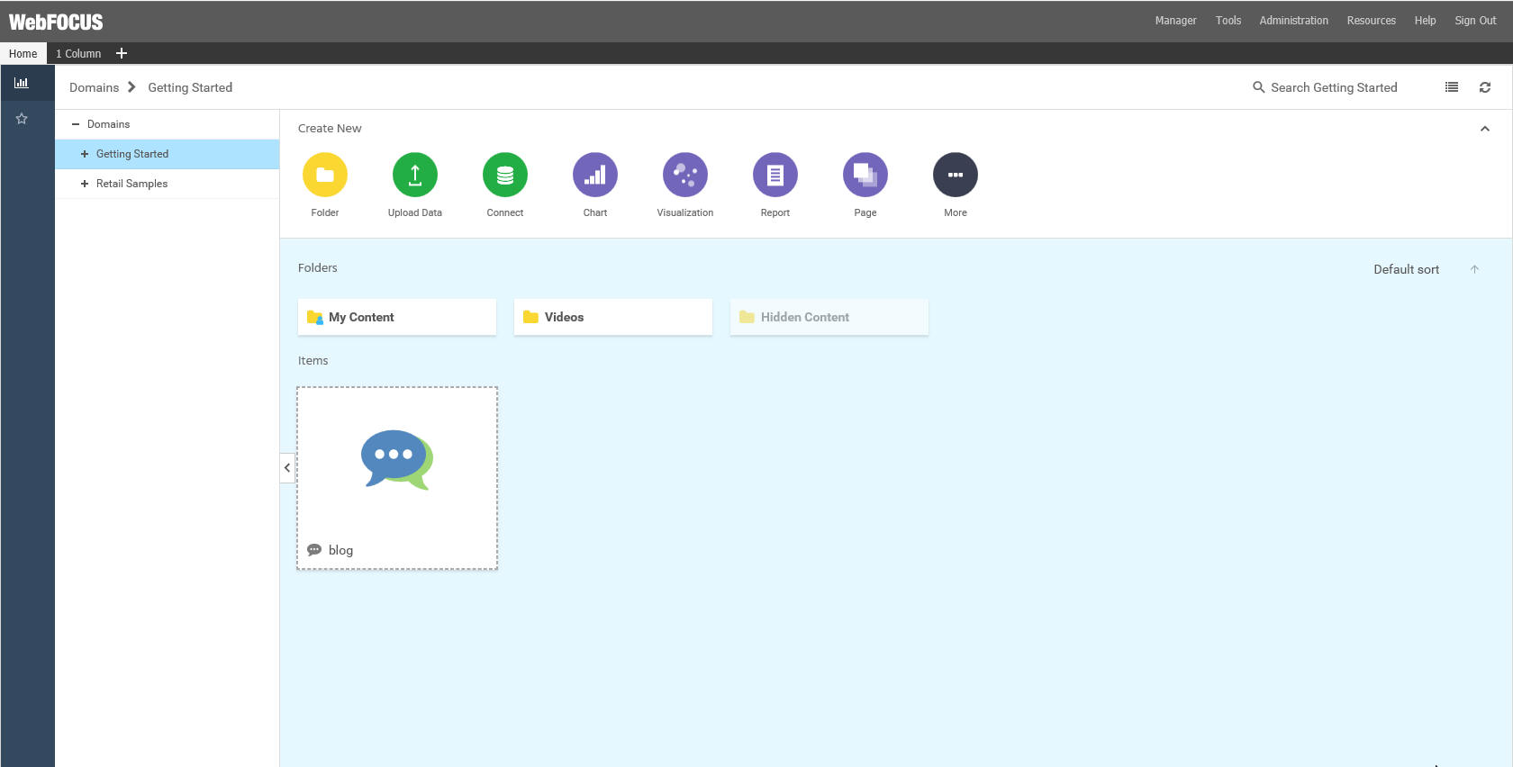
The Home page has three sections with which you can interact:
- Menu bar
- Sidebar
- Explorer
The content in these sections varies, depending on your user type.
Menu Bar
The Menu bar is located in the upper-right section of the screen, inside the top banner. The following image shows the Menu bar that appears when you are signed in as a Manager.
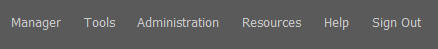
The Menu bar gives you access to the following options:
- Change your password (click your username).
- Tools:
- View the status of deferred reports, and manage them.
- Stop your outstanding interactive requests that are running.
- Access Session Viewer, where you can visualize the exploratory analysis of the current web session.
- Access the ReportCaster Status, where you view the status of your scheduled jobs and log reports.
- Administration:
- Access the Security Center, where you define users and groups and grant access permissions.
- Access the Administration Console, where you configure, administer, and monitor the components of the application.
- Access the Reporting Server Console, where you can view and manage the server environment.
- View and administer the private resources for groups and users.
- Switch between Normal mode (seeing your own content) and Manager mode (managing other user content).
- Open the WebFOCUS Resources panel on the right side of the window, so you can manage content on personal portal pages.
- Access the online Help, additional Technical Content resources, Information Builders Home page, as well as information about the Business User Edition application, version, and available licenses.
- Sign out
Sidebar
- Content. Displays your repository content and provides options so you can create, share, and modify domains and content. Here, you can also upload files and spreadsheets, connect to data, create portals and pages, and generate sample content.
- Favorites. Displays the items that you designate as favorites. To designate an item as a Favorite, right-click the item, and click Favorites.
Explorer
|
Topics: |
The Explorer is the main component of the Home page. Here, you can create and interact with content, work with data, create sample content, organize your repository structure and perform other essential tasks. The Explorer is shown in the following image.
- Navigation bar
- Resources tree
- Actions bar
- Content area
Navigation Bar
The navigation bar is located beneath the banner and above the explorer area. You can use the navigation bar to move between folders in your repository, search the contents of a domain or folder, change the view of items in the content area, and refresh content in a domain or folder you select.
A domain node is the highest level of folder organization in the Resources tree. All of the domains that a user is authorized to access are displayed in the tree. Domains contain all of the components and content that you can create.
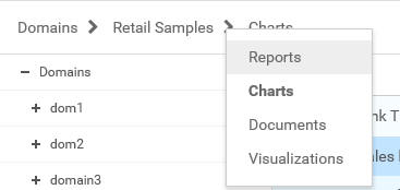
When you drill down into folders in your repository, the navigation bar generates a breadcrumb trail that you can use to move between folders . You can move back one folder or multiple folders in a single click. You can click a folder name to view the contents of that folder. You can also click arrows between the folders, to see the file structure that is currently displayed, as shown in the following image. The selected folder appears in bold text.
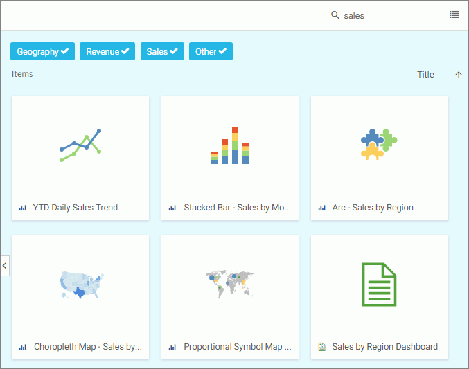
From the navigation bar, you can also search for items in your repository. To search for an item, type a keyword in the Search field and press Enter. The results of your search display in the content area. If the items in your results contain tags, these tags display with your search results. An example of user-defined tags in a search is shown in the following image.
Note: Until you enter text, the Search field contains the name of the domain or folder as placeholder text. When you enter text into the Search field, an X appears. Click the X to clear the Search field. The X does not appear if you use a Firefox browser.
You also can toggle the view of your content between Grid View and List View, and refresh all content in a domain or folder.
By default, content displays in Grid View. Click the Grid view icon  or List view icon
  to change your view.
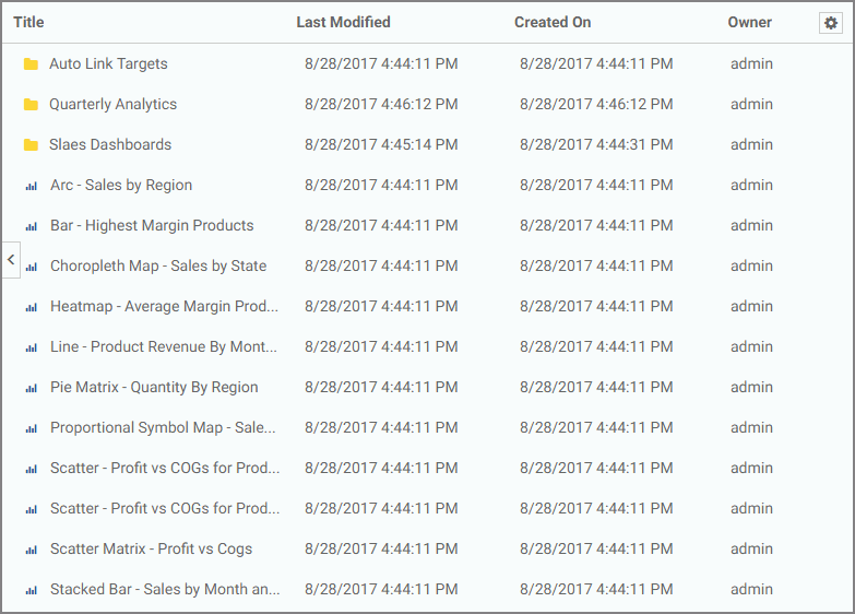
Grid View allows you to see the thumbnails of your items, which you can customize to add transparency to your display. The List View is useful when you need to see a large number of items at a glance. You can sort your items by various criteria. An example of a List View is shown in the following image.
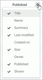
You can sort the list by clicking any column title. Each column features a three-step toggle sorting: ascending, descending, and back to default. You can also specify which columns display in the content area by clicking the Settings button, and selecting the desired columns from the list. An example of an expanded settings menu is shown in the following image.
To refresh all content in a selected domain or folder,
click Refresh  .
.
Resources Tree
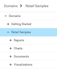
The Resources tree provides a way to view your repository structure and navigate between domains and folders that are available to you. The following image shows an example of a Resources tree.
You can expand or collapse folders by clicking the plus (+) or minus (-) sign . When you click a folder, its contents display in the content area. You can also right-click a folder to access a shortcut menu of available options. From the shortcut menu, you can perform the following actions:
- Expand or collapse a folder
- Duplicate a folder
- Cut or copy a folder
- Paste content or another folder inside a folder
- Delete a folder
- Allow or suppress access to a folder
- Show or hide a folder
- Configure security rules for a folder
- View and edit properties for a folder
You can customize the width of the Resources tree. To do so, put your cursor on top of the left edge of the Resources tree area, as shown in the following image, and drag the edge to achieve the desired width. Your new width is remembered, and displays the next time you sign in.
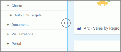
You can also collapse the Resources tree to allow more room for the content area. To collapse the Resources tree, click the arrow on the left side of the tree. Click the arrow again to expand the Resources tree.
Actions Bar
|
Topics: |
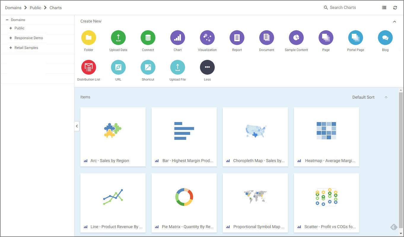
You can use the actions bar to create analytical content, upload files and spreadsheets, connect to data, build portals and pages, schedule procedures, and generate sample content using the options available to you for a domain or folder. The following image shows an example of the actions bar an advanced or basic user has access to for a domain or folder.
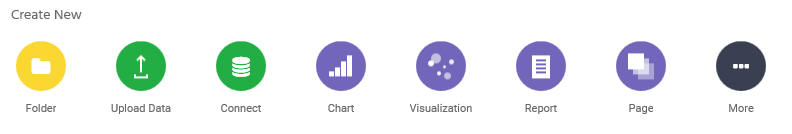
The default view of the actions bar displays the most common options available to you. You can access additional options by clicking More.
The actions bar only displays the items that you can create for the domain or folder that is currently selected. If you click the Domains node, the actions bar only displays the Domain and Folder options. The items that display on the actions bar are also a subject to permissions. You can only see the items that are available to you based on your role.
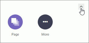
Similar to the Resources tree, you can collapse the actions bar to make more room for the content area. To collapse the actions bar, click the arrow in the upper-right corner of the actions bar, as shown in the following image.
Types of Content You Can Create in the Business User Edition
There are many types of content that you can create in the Business User Edition, using the action bar on the Home page. The most common content items include: charts, visualizations, reports, and pages. To access more options, click More.
Note: Access to all options on the actions bar is determined by your role in a domain. Contact your administrator to obtain access to additional options.
The following table lists and describes all of the content items that you can create from the Home page.
|
Action Button |
Description |
|---|---|
 |
Chart. Creates a graphical representation of your data. |
 |
Visualization. Creates a graphical representation of your data, comprised of one or more visuals. Visuals can be charts, maps, or grids. |
 |
Report. Creates a tabular representation of your data. |
 |
Document. Creates a customized document. |
 |
Sample Content. A set of sample charts, reports, and dashboard that is generated automatically based on uploaded Excel workbooks, CSV files, or existing single-segment Master Files in your repository. |
 |
Page. Launches WebFOCUS Designer, where you can create a flexible interactive application for various BI content, including charts, visualization, reports, maps, URLs, and other resources. |
 |
Portal Page. Creates a domain portal page from which you can organizes dynamic content. Domain portal pages can be added to the portal. |
 |
Blog. Creates an interactive item that operates as commonly seen blogs on the internet, and allows users to post and view comments. |
 |
Distribution List. Specifies the email addresses, directory locations, or printers that you can configure to distribute a schedule. This includes Email, FTP, or Printer. |
 |
URL. Creates a link to a webpage that can be displayed inside a portal or page or within the Repository. |
 |
Shortcut. Creates a shortcut to a repository file or a Master file. |
 |
Upload File. Uploads files such as images and office documents to the repository. |
Content Area
The content area displays the items contained within a domain or folder that is currently selected. An example of a content area is shown in the following image.
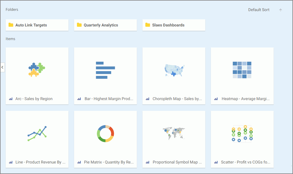
If a resource contains folders and items, the folders are always displayed first, followed by the items. Items shown in the content area include reports, charts, pages, portals, and more.
You can sort your content by using the two sorting menus in the upper-left corner of the Content Area. One allows you to sort by various criteria, such as title, summary, size, last modified and published dates. The other menu toggles between the descending and an ascending orders. You can also create a customized sorting order, by configuring the Sort Order property for the item. If the sort order is configures, the Default Sort option is added to the menu.
You can right-click any folder or item to access a shortcut menu of options. The following options are available when you right-click a folder or item in the content area.
- Expand/Collapse
-
Expands or collapses a folder. This option is only available for folders.
- Run
-
Runs the report procedure or schedule.
- Run in new window
-
Runs the item in a new window.
- Run deferred
-
Submits a report procedure or a schedule for deferred execution.
- Schedule
-
Launches the scheduling tool, where you can schedules a report procedure to be run. Scheduling options include Email, Printer, and Repository.
- View log
-
Launches the Schedule Log Options dialog box, where you can select whether to view the most recent log report for the schedule, or specify a time range for which to obtain log reports. This option is only available for schedules.
- View
-
Enables you to launch the URL or download a copy of the file to your browser. This option is available for URLs, Excel Workbooks, PDF, HTML, and Image Files.
- Edit
-
Edits an item with the tool that was used to create it.
- Duplicate
-
Makes a copy of the folder or item with an underscore and number appended to the title, for example, duplicating Sales_Report creates Sales_Report_1 in the same location. The number is incremented each time a duplicate is created.
- Cut, Copy, and Paste
-
Cuts, copies, or pastes the folder and its contents or item.
- Create shortcut
-
Creates a shortcut to this item.
- Delete
- Deletes the folder and its contents or item.
- Publish/Unpublish
-
Allows or suppresses public access to the content.
- Show/Hide
-
Shows or hides the folder or item.
- Share/Unshare
-
Shares content with all users that are permitted to access this content. Unshare stops sharing content with all users.
- Comments
-
Provides access to the following options:
- View comments
-
Opens the blog item and expands all comments.
- Remove all comments
-
Clears all comments from the blog.
Note: These options are only available for blogs.
- Add to favorites
-
Adds the item to the Favorites folder.
- Remove favorite
-
Removes the Favorite from the list. This option is only available for Favorites.
- Security
-
Provide access to the Owner option, which allows you to set the resource owner, either Published (no specific owner), or a specific group or user.
- Properties
-
Shows the properties of the folder or item.
Folder and Item Properties
Authorized users can select the Properties option to review information about a folder or item, including when it was created, the date it was last modified, title, name, and settings that control the functionality available to users when they access the folder, run, or schedule an item.
The General Properties tab includes the following settings:
- Language. Indicates the current language of your environment.
- View All. Opens the Language Properties dialog box, where you can select a language.
- Title. Displays the value that you can use to identify the content in the Resources tree.
-
Name. Refers to the unique name of the item or folder. Click the
Edit button
 to change the name.
- Summary. Detailed explanation that provides additional information about the item.
- Path. Full path of the folder or item in the Repository.
- Created. Shows the date the folder or item was created.
- Modified. Shows the date the folder or item properties were last modified, and identifies the user that modified them.
- Accessed Shows the date the folder or item was last opened, and identifies the user that opened it.
- Tool. Specifies the type of an item.
- Owner. Identifies the user who created the folder or item.
- Size. Displays N/A bytes for folders. For items, displays the size in bytes.
- Publish. Provides an option to publish or unpublish the folder or item.
- Show. Provides an option to show or hide the folder or item.
The Advanced tab allows you to customize the functionality and behavior of the folder or item.
The Advanced Properties tab includes the following properties.
Explorer/Portal Properties:
- Thumbnail. Allows you to preview and change the thumbnail for an item.
- Tags. Adds tag values to the item that display in the search results.
- Sort order. Specifies the order to list the folder in the tree or item within other items in a folder.
- Load in iFrame. Grants or suppresses a permission to load an item in an iFrame container.
- Default width. Sets a default width value for the item, when it is displayed inside the portal at run time.
- Default height. Sets a default height value for the item, when it is displayed inside the portal at run time.
Interactive Reporting Properties:
- Prompt for parameters. Indicates whether to display the Autoprompt HTML page to allow the user to view and select parameter values. When this check box is clear, users will still be prompted if there are any parameters that do not have a value supplied.
- Enable AutoLinking. Establishes drill-down links from column data to the target reports that you link together.
-
AutoLink
target. Identifies a report as the target report that is run when the
drill-down link is triggered.
Note: The AutoLinking between reports only works if it the target report contains a parameterized field that corresponds to one of the fields in the primary AutoLink report.
- Enable AutoDrill. Creates drill-down links in reports and charts that contain hierarchical data.
- Use title for deferred report description. Indicates whether or not to prompt for a custom deferred report description. If selected, this option gives you an alternative to being prompted for a custom deferred report description.
- Only run as deferred report. Runs the report in deferred mode.
The Query Detail Properties tab, is only available for reports, charts, and visualizations. It shows which data elements, parameters, and conditions were used in an item.
Navigating the Administration Console
|
Topics: |
The Administration Console contains four tabs and a menu bar that help you navigate to its settings and other features.
These tabs organize administration activities into the following categories:
- Configuration. Configures Reporting Server Connections, Application Settings, Custom Settings, NLS Settings, Dynamic Language Switch, Redirection Settings, and InfoAssist+ Properties.
- Security. Configures general security settings for Internal and External Authentication.
- ReportCaster. Opens the ReportCaster Console, where you can configure ReportCaster, restart the Distribution Server, configure environment parameters, and turn traces on and off. The Administration Console authenticates to ReportCaster with the value of the user ID, IBIMR_RC_SVCUSER. If this authentication fails, users are prompted for their credentials.
-
Diagnostics. Displays component installation
and configuration details, turns session logging on or off, and
enables Managers to view or delete log files.
You can view traces with the Session Viewer, which is accessible from the Tools option on the Menu bar in the Portal.
Options on the menu bar connect you to basic tasks, such as reviewing Business User Edition and third-party licensing information, clearing the cache, closing the Administration Console, or opening the online Help.
To update or review an Administration Console setting, click a tab, and then click the folder or page icon from the main menu on your selected tab. The main window refreshes and the individual settings assigned to your selected page become available.
Navigating the Configuration Tab
The Configuration tab contains settings and features that describe Reporting Server connections and other application settings, which are listed and described in the following table.
|
Folder [Page] |
Available Functionality |
|---|---|
|
Reporting Servers |
The Reporting Servers subfolders contain the tools that manage all connections from the client to remote servers. Using the following sub-folders, you can:
|
|
Configuration [Application Settings] |
Pages in the Application Settings folder of the Configuration tab manage settings for the WebFOCUS Business User Edition application. Pages in this folder include settings for the following functional areas:
|
|
Configuration [Custom Settings] |
The Custom Settings page of the Configuration tab contains a text-based input field where you can define advanced customization settings for the Client. Using this page, you can:
|
|
Configuration [NLS Settings] |
The NLS Settings page of the Configuration tab contains National Language Support settings. |
|
Configuration [Dynamic Language Switch] |
The Dynamic Language Switch page of the Configuration tab contains a list of languages that can be included in this feature. In WebFOCUS Business User Edition, Dynamic Language Switch settings are stored in the ibimultilanguage.js file located in the drive:/ibi/WebFOCUS_BUE82/WebFOCUS/ibi_html/javaassist/intl directory. |
|
Configuration [Redirection Settings] |
The Redirection Settings page of the Configuration tab contains settings that manage the redirection of report output. |
|
Configuration [InfoAssist+ Properties] |
The InfoAssist+ Properties page of the Configuration tab contains properties that configure reporting options in the InfoAssist+ reporting tool. |
|
Configuration [HTML5 Chart Extensions] |
The HTML5 Chart Extensions page of the Configuration tab contains all HTML5 chart extensions currently installed in your local installation of WebFOCUS Business User Edition. |
Navigating the Security Tab
The Security tab contains internal and external security settings, which are listed and described in the following table.
|
Folder [Page] |
Available Functionality |
|---|---|
|
Security Configuration [Internal] |
The Internal page of the Security tab contains sign-in and password settings for authentication and authorization managed within WebFOCUS Business User Edition. |
|
Security Configuration [External] |
The External page of the Security tab contains settings that define the method and location of authentication and authorization activities managed by third-party applications outside of WebFOCUS Business User Edition. |
Navigating the ReportCaster Tab
When you click the ReportCaster tab, the ReportCaster Server Status page opens, by default. Features on that page identify the current status of ReportCaster Server operations. For more information, see Using the ReportCaster Console.
Navigating the Diagnostics Tab
The Diagnostics tab contains settings and features that describe system performance and activities, which are listed and described in the following table.
|
Folder [Page] |
Available Functionality |
|---|---|
|
Diagnostics |
The Diagnostics section of the Administration Console contains the following functional areas:
|
Reviewing Version Information
|
Topics: |
The About WebFOCUS page displays information about the release you are using and the optional components installed with it.
You can use the information on this page to identify your current product release and service pack when corresponding with the Information Builders Customer Support team.
When you click About WebFOCUS, the following information appears in the main window:
Edition. Name of the edition of WebFOCUS, for example, WebFOCUS Business User Edition.
Product Release. Release number, for example, 8.2.
Service Pack. Service pack number, for example, 0.2.
Package Name. Installation file package name, for example, wb102417b.
Release ID. Product release number, for example, 8202.
Build/GEN Number. Specific product build number, for example, 88.
Build/GEN Date. Date and time the build number was generated, for example, October 24, 2017 9:09:01 PM EDT.
Application Server. Application Server, for example, Apache Tomcat/8.5.20.
This version of the About WebFOCUS page, that opens from the Diagnostics tab, is only available to those users whose privileges allow them to open and review the Administration Console.
However, the information on this page is also available to those users whose privileges allow them to view the About WebFOCUS Business Intelligence window. To open this other window, in the Business User Edition Portal, on the Menu bar, click Help, and then click About.
Reviewing Client Verification
|
How to: |
The Client Verification page displays the current status of client configuration and application settings. When you open this page, the client automatically conducts the test required to verify that configuration and application settings are open and available.
Settings marked pass are available for use. Settings marked fail are not available for use.
The automated verification process includes checking web server aliases and directory permissions for each type of client communication mode (CGI, WFServlet, or ISAPI).
The Client verification tools, by default, place the verification logs in the \logs directory. These tools test read, write, and remove permissions for the logs directory. They also test read and write permissions for the \config directory.
To test a Reporting Server connection and the current status of the Graph or Table functionality it can deliver, you must open the Configuration tab, and right-click the icon for the Reporting Server you wish to test. All three tests are available on the shortcut menu assigned to each server icon.
Procedure: How to Verify WebFOCUS Business User Edition
From the Administration Console, click Diagnostics, and then click Client Verification.
The Client Verification page displays your directory permissions, such as creating and deleting applications, signing in as the administrator, reading and writing from the standard directories, creating and deleting domains, and creating and deleting reports.
Note: If you run this test immediately after performing the installation procedure, there might be a delay resulting from a slow or delayed first time initialization of the Tomcat Web Application that supports client operations.
HTTP Request Headers and JVM Property Information
The Diagnostics tab also contains information about HTTP request headers and your Java VM environment.
- Settings on the HTTP Request Info page display information about the HTTP or HTTPS headers returned to your browser. This information is useful for troubleshooting and configuring HTTP headers, especially if you integrate web or application server security with WebFOCUS Business User Edition or if your web or application server uses virtual hosts (HTTP headers).
- Settings on the JVM Property Info page display information about your Java VM environment. This information is useful for troubleshooting and configuring the Java environment for web applications and for resolving memory or resource issues.
Navigating the InfoAssist+ Interface
|
Topics: |
InfoAssist+ provides an intelligent, flexible layout for creating reports, charts, visualizations, and documents.
The application window provides intuitive menus and toolbars, a versatile ribbon that provides access to specialized groups for different functional areas of report design, a taskbar for selecting output, and a status bar for directing output.
The application window also provides a resources area for selecting and sorting data, and a multi-faceted results area that can display report design, a preview of report output, or actual report output.
InfoAssist+ Application Window
The components of the InfoAssist+ Application window are shown in the following image.
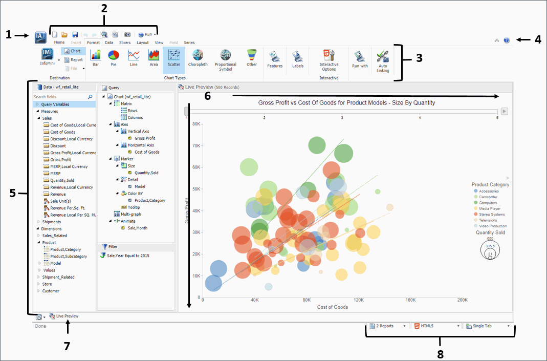
The main interface components are explained as follows:
- Application button. Provides access to the Application menu of procedure-related commands.
- Quick Access Toolbar. Displays frequently-used commands, such as New, Open, Save, Undo, Redo, View code, Run, and Preview, in a toolbar that remains visible. For more information, see Quick Access Toolbar.
- Ribbon. Displays the commands you need to create reports, charts, visualizations, and documents. It also displays the Help menu. For details, see Ribbon.
- Help. Provides access to the online technical content for InfoAssist+ in a new browser window.
- Resources panel. Displays the Data pane, Query pane, and Filter pane.
-
Canvas. Displays the results of your report.
In Live Preview mode, the canvas displays a preview of the file
as it is developed.
Depending on the type of file that you are developing, the canvas may display differently. For example, when creating a document, the canvas includes rulers around the development area. This is to assist you in placing the components on to the document.
- Navigation taskbar. Displays groups and icons that provide different views and quick access to all active reports and report output. For details, see Using the Navigation Taskbar.
- Status bar. Provides an output format button that you click to see the selected format and an output target button that you click to view the selected option for displaying new output windows or tabs. For more information, see Using the Status Bar.
Application Main Menu
|
Reference: |
In the upper-left corner of the InfoAssist+ interface,
click the IA button  to open the Application main menu.
You can run the following commands from the Application main menu:
-
New. Opens the InfoAssist+ splash screen,
where you can create a new report, chart, visualization, or document.
The exact functionality of the New command depends on your current
InfoAssist+ session.
When you open a new session of InfoAssist+ and then click New, a new report is created. You are prompted to choose a data source.
- Open. Opens an existing report, chart, visualization, or document.
- Save. Saves a report, chart, visualization, or document.
- Save As. Saves a report, chart, visualization, or document with a new name.
- Run. Runs a report, chart, visualization, or document.
- Run Deferred. Submits a report, chart, or document for processing in the background while you continue to work on other tasks.
- Close. Closes the currently active report, chart, visualization, or document.
-
Recent Items. Displays recent reports, charts,
visualizations, and documents and those items that have been pinned
to the menu. The Recent Items area of the InfoAssist+ Application
main menu is shown in the following image.
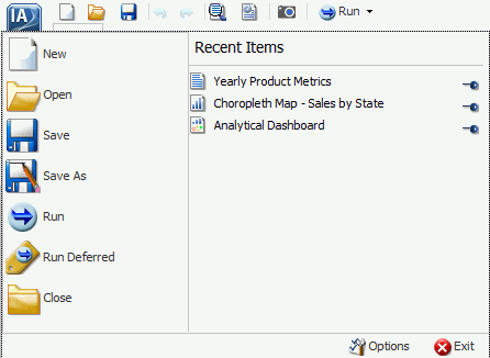
Pinned reports, charts, visualizations, and documents are represented by a blue pin
 icon. Pinned items appear at the
top of the list in alphabetical order.
icon. Pinned items appear at the
top of the list in alphabetical order.
Recent reports, charts, visualizations, and documents are represented by a sideways blue pin icon
 . Recent items
appear below the separator bar in the order in which they were created,
with the most recently created item at the top.
. Recent items
appear below the separator bar in the order in which they were created,
with the most recently created item at the top.
You can pin important reports, charts, visualizations, and documents to the top of the Recent Reports section of the Application main menu for quick and easy access. To promote a recent report to pinned report, click the sideways blue pin icon. The icon turns upright and the report is moved to the pinned report area of the Recent Items window, where it stays until it is unpinned.
To demote a pinned report, click the blue pin icon. The icon turns sideways and the report is moved below the separator bar.
A shortcut menu is available when right-clicking a recent item, as shown in the following image.
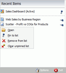
The options in the menu are:
- Open. Opens the selected report, chart, visualization, or document.
- Pin to list. Pins or unpins a recent report, chart, visualization, or document to the pinned reports list above the separator bar.
- Remove from list. Unpins a pinned report, chart, visualization, or document from the pinned reports list.
- Clear unpinned list. Clears all unpinned reports, charts, visualization, or documents from the Recent Items list.
- Options. Opens the Options window to customize your user preferences.
- Exit. Exits the application.
Reference: Open Dialog Box
The Open dialog box displays when you launch InfoAssist+. It also displays when you join and blend data. You can use this dialog box to do the following:
- Select data sources for creating reports, charts, visualizations, and documents.
- Select data sources for joining and blending data.
- Configure data adapters for connecting to an existing database and creating synonyms.
- Upload user data.
- Connect to Data
-
Opens the Connect to Data wizard, where you can configure a Data Adapter to connect to an existing database and create synonyms.
- Upload Data
-
Opens the Upload wizard, where you can upload user data from a machine to which you have access. This data can be used with WebFOCUS reporting.
- Open
-
Opens the selected Master File.
Quick Access Toolbar
The Quick Access Toolbar provides access to the most commonly used functions. It is located to the right of the Application main menu button and is always visible no matter which options are selected.
- Create a new report, chart, document, or visualization. Opens the InfoAssist+ splash screen, where you can create a new report, chart, document, or visualization.
- Open existing item. Opens the Open dialog box, where you can select an existing item.
- Save. Saves a report, chart, document, or visualization.
-
Undo and Redo. The Undo icon undoes your
last action. The Redo icon repeats your last action.
The Undo icon is enabled (blue) when there is an action to undo. Otherwise, the icon is unavailable (gray). The Redo icon is enabled (blue) when there is an action to redo. Otherwise, the icon is unavailable (gray).
For example, if you add a database field to a report, the Undo icon turns blue. You can now click the Undo icon to remove the database field from the report. The Undo icon turns gray, and the Redo icon turns blue. To restore the field to the report, click the blue Redo icon.
You can also press Ctrl+Z to undo an action, or Ctrl+Y to redo an action.
You can undo and redo up to 25 actions per session. InfoAssist+ maintains the undo and redo list of actions even when you switch between reports.
When a dialog box is open in the application window, you cannot use the Undo and Redo icons. However, when you click OK and close the dialog box, the icons become available for use. With a single click of Undo, you can undo all the actions that you performed in the dialog box, and you can reinstate them with a single click of Redo.
- View code. View the underlying code for the report.
- Procedure Settings. Click the Procedure Settings button to specify and control items for inclusion in a procedure. The Procedure Settings dialog box presents various SET commands which are useful when you need to tailor your report, chart, or document presentation or content to meet your individual needs. For more information, see Using Procedure Settings.
- Create Thumbnail. In InfoAssist+, you can create and store thumbnail images for use in the Business Intelligence Portal. Thumbnail images
allow you to see a snapshot of a report or chart without opening the file. In InfoAssist+, you can create a thumbnail image
by clicking on the Create Thumbnail icon, which is located on the Quick Access toolbar.
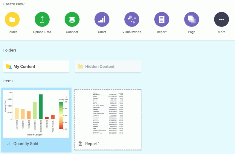
You can create thumbnail images when working in Report and Chart mode in InfoAssist+. These images are smaller renditions (220x160px) of your actual report or chart as it displays in Live Preview. Once you create the thumbnail and save the report or chart, you can access the thumbnail image from the file list on the Home page, as shown in the following image.
Note: Thumbnail images are stored as part of the procedure when it is saved in the repository. For more information, see How to Create a Thumbnail Image of a Report or Chart.
- Run. Click the Run button to run a report,
chart, visualization, or document immediately. Click the down arrow
to open the Run menu, which contains the following additional options:
- Preview. Runs the report, chart, or document in the selected format with the limited number of records as set in the Design group on the Home tab.
- Run with Default Parameter Values. Runs a report or chart using the default parameter values. If you have parameters defined, the default value is the first data field defined for the parameter. If you do not have parameters defined, the report or chart will run, regardless.
- SQL Trace. Returns the SQL commands for the request.
- SQL Preview Trace. Returns the SQL commands for the Live Preview run.
Ribbon
|
Topics: |
The ribbon is a rectangular area of distinct groups of buttons that spans the top of the InfoAssist+ application window.
The ribbon is contextual and changes depending on the type of file that you are developing. For example, in Chart mode, the ribbon is made up of nine tabs, whereas when working in Visualization mode, the ribbon consists of five tabs. Each tab contains a subset of InfoAssist+ functionality organized in logically-related groups of controls and commands graphically represented by distinctive icons.
Working With the Ribbon
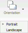
The ribbon contains two types of arrow-based buttons. The first type of button opens a menu when you click it. The Orientation button is an example of this type of button. Clicking the Orientation button opens a menu of options, as shown in the following image.
The second type of button is a split button. Clicking the left side of the split button performs a default action. Clicking the down arrow, on the right side of the button, opens a menu of options. The Header & Footer button is an example of a split button. It is shown in the following image.
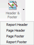
Clicking the Header & Footer button on the left opens the Header & Footer dialog box. Clicking the down arrow on the right opens a menu of options.
Some options open dialog boxes of additional commands and option lists.
The ribbon displays all controls and commands using different sized icons and groups, depending on the size of the monitor and application window.
When you reduce the size of the application window, some groups are collapsed into single icons as determined by the amount of available space.
When a group is collapsed into a single icon, the individual icons are removed from view, but are still available. Clicking a collapsed group icon restores the group to its normal full size and displays all of the individual icons.
When expanding a collapsed group, the ribbon collapses a neighboring group to make enough room to expand the selected group.
When an icon, button, or option in a menu or dialog box appears dimmed, that functionality is not available for that report as it currently exists. Some functionality is available for reports only, charts only, visualizations only, or documents only.
In some situations, selecting one or more options makes other options incompatible with the previously selected ones. As a result, the incompatible options are dimmed and unavailable for selection. InfoAssist+ automatically makes incompatible options unavailable as you create and modify a report.
Note: If you do not have access to a particular option, contact your administrator.
Home Tab
The Home tab contains the most commonly used commands and options, which you can use when developing reports, charts, documents, or visualizations. The following list highlights the features on the Home tab for each mode.
- For reports, the Format, Design, Filter, and Report groups offer options for changing the output format of your report, as well as styling it.
- For charts, the Format, Design, Filter, and Report groups enable you to change the theme or your chart or add a header and footer.
- For documents, options are enabled in the Format and Design groups only. Available options for documents include changing the data source for the document and changing the output format.
- For visualizations, the Clipboard, Data, Visual, and Storyboard groups enable you to perform some of the more basic functions, such as copy and paste. You also use the Home tab to change your visual type.
Related Information for Reports, Charts, and Documents:
Related Information for Visualizations:
Insert Tab
The Insert tab contains options to add reports, charts, existing reports, text, images, and active form controls (for active reports only) to a canvas in Document mode.
Note: The Insert tab is only available in Document mode.
Related Information for Documents:
Format Tab
The Format tab provides options for formatting your report, chart, document, or visualization. Depending on the mode you are using, you can perform tasks such as selecting a chart type, enabling Auto Linking, or adding navigational aspects to a report.
The following list highlights the features on the Format tab for each mode.
- For reports, the Format tab provides access to the Destination, Navigation, Features, Run with, and Auto Linking groups. These options enable you to perform many functions related to reports, including Auto Drill or any other report navigation feature.
- For charts, the Format tab provides access to the Destination, Chart Types, Features, Labels, Interactive, Run with, and Auto Linking groups. These options enable you to perform a variety of charting tasks, including changing the chart type and adding interactive options.
- For documents, the Format tab enables you to change to Report or Chart mode. You can also access InfoMini.
- For visualizations, the Format tab provides access to the Report, Features, Labels, and Interactive groups. These options enable you to format your visualization. Also included are grid commands, as well as various features and label commands.
Related Information for Reports, Charts, and Documents:
- Customizing Reports
- Formatting a Series
- Formatting Data Labels
- Formatting a Legend
- How to Style and Customize a Report
- How to Style and Customize a Chart
- Using Auto Drill
- Using the Auto Linking Feature to Link Content
Related Information for Visualizations:
Data Tab
The Data tab contains data manipulation and data display options. For example, you can access Join functionality and work with Defines and Computes. The Data tab is available in the Report, Chart, and Document mode. It is not available in Visualization mode.
The following list highlights the features on the Data tab for each available mode.
- For reports, the Data tab provides access to the Calculation, Join, Filter, Display, and Data Source groups. When working with reports, you can join data sources or create Defines and Computes. You can also filter data.
- For charts, the Data tab provides access to the Calculation, Join, Filter, Display, and Data Source groups. When working with charts, these options enable you to join data sources, create a Define or Compute, and filter data.
- For documents, the Data tab provides access to the Calculation, Join, Filter, Display, and Data Source groups. When working with a document, you can create a define or join data sources. You can also add or switch data sources.
Related Information for Reports, Charts, and Documents:
Slicers Tab
The Slicers tab provides the ability to create and edit slicers. Slicers are dynamic filters that you can use with reports, charts, and documents.
Note: The Slicers tab is unavailable in Visualization mode.
The features on the Slicers tab are the same for reports, charts, and documents. You can perform the following functions with the slicer functionality:
- Add slicers to your report, chart, or document to create dynamic filters.
- Set a record limit for the display of your data.
- Create groups of slicers to filter your data.
- Add fields to existing slicers.
- Clear slicers to clear all selected values from existing slicers.
Related Information for Reports, Charts, and Documents:
Note: The slicer capabilities are only available in the full version of InfoAssist+.
Layout Tab
The Layout tab provides access to page display and layout options. These include page orientation and AutoFit, which is a feature that limits the width of columns in a report to be no wider than the largest value in each column.
The Layout tab is available in Report, Chart, and Document mode.
Note: The Layout tab is unavailable in Visualization mode.
The following list highlights the features on the Layout tab for each available mode.
- For reports, the Layout tab provides access to the Page Setup and Report groups. These options allow you to change the size or orientation of your report. You can also add page numbers.
- For charts, the Layout tab provides access to the Page Setup and Size & Arrange groups. These options allow you to change the orientation or size of your chart. You can also set a height and width for your chart, and enable the AutoFit functionality.
- For documents, Layout tab provides access to the Page Setup and Size & Arrange groups. You can change the size of your document and adjust its orientation. You can also lock the height and width aspect ratio of your document.
Related Information for Reports, Charts, and Documents:
View Tab
The View tab provides access to reporting options, including design and display options. Some of the options on the View tab control how information is displayed, whether it be in structured view or list view. The View tab is available in all modes of InfoAssist+.
The following list highlights the features on the View tab for each mode.
- For reports, the View tab provides access to the Design, Show/Hide, Data Panel, Query Panel, Output Window and Report groups. When creating your report, you can change the way your data displays or switch to another mode, such as document.
- For charts, the View tab provides access to the Design, Show/Hide, Data Panel, Query Panel, Output Window and Report groups. When creating your chart, you can change the output location for the chart or switch to another report or chart.
- For documents, the View tab provides access to the Design, Show/Hide, Data Panel, Query Panel, Output Window and Report groups. When working with your document, you may want to change the display of data in the Data pane or Query pane.
- For visualizations, the View tab provides access to the Show/Hide, Data Panel, and Report groups. When creating your visualization, you can use these options to show or hide the resources panel. You can also change the display of your data to either logical, list or structured.
Related Information for Reports, Charts, and Documents:
Field Tab
The Field tab is enabled in the ribbon when you select a data source field. The options available in the Field tab are specific to the data type that is selected. The options available for numeric fields are different from the options available for non-numeric and date fields. The Field tab provides access to the Filter, Sort, Break, Style, Format, Display, and Links groups.
The following list highlights the features on the Field tab for each mode.
- For reports, the Field tab provides options for filtering and styling your report. It also provides you with access to the Traffic Lights and Within functionality, making your reports more robust and customized.
- For charts, the Field tab enables you to hide a particular field or group values in your chart. You can also use the filter options to limit the display of information in your chart.
- For documents, the Field tab provides options for filtering, as well as Traffic Light functionality. You can also hide fields and add aggregations.
- For visualizations, the Field tab provides options for filtering and sorting, as well as access to the Multi Drill feature. You can also hide fields and add aggregations.
Related Information for Reports, Charts, and Documents:
Series Tab
The Series tab provides access to chart options through the Select, Style, Properties, Line, and Pie groups. The Series tab is available in Document, Chart, and Visualization mode. It is not available in Report mode.
The following list highlights the features on the Series tab for each available mode.
- For charts, the Series tab enables you to add such features as a trendline or data labels to your chart. If multiple series are specified, you can select a series and specify options specific to that series.
- For documents, the Series tab displays once you have specified fields within your document or embedded chart. You can use the options on the Series tab to add markers, smoothlines, or trendlines to your data.
- For visualizations, the Series tab enables you to switch between series, style the selected series, or add any other property or line features, as required.
Related Information for Reports, Charts, and Documents:
Related Information for Visualizations:
Understanding the Canvas
|
Topics: |
The canvas displays a preview of the report being created or modified on the canvas when you are in the default Live Preview. To select Live Preview, go to Home tab, and in the Design group, click Live Preview, or on the View tab, in the Design group, click Live Preview. The canvas is always fully maximized and cannot be minimized, cascaded, or tiled. However, a blank canvas opens when there is no report.
The canvas displays either live data or sample data.
- To display live data, on the Home tab,
in the Design group, click Data
from Source (default).
When you select Data from Source, a live preview of the report being built is refreshed on the canvas as you add, remove, and style data source fields in the report.
- To display sample data, on the Home tab,
in the Design group, click Use
Sample Data.
When you select Use Sample Data, the canvas displays sample data based on the field type, with the same formatting and styling used to display live data.
When you execute a report, the canvas displays the Output window. If the Output is minimized, or if there is no report to preview, the canvas is blank. To change the canvas view, you can select Query Design view or Live Preview from the Design group of the View tab or Home tab.
When working with a report in Live Preview, you can rearrange the columns of the report by dragging them to the left or right, depending on your display preference. If the column is numeric, you are presented with the option to Drop as Sum or Drop as Sort.
Note: If you select Drop as Sort, the values are listed individually and they are sorted. If you select Drop as Sum, the values are summed for that particular row. The default is Drop as Sum.
When placing the column in a new location, a red indicator bar displays, indicating the location of placement for the moved column. This allows you to see where the column will be placed before you actually perform the operation.
Note: Column sort order can also be rearranged by dragging the fields in the Query field containers of the Query pane to reorder them.
If you create a filter, then the filter appears in the Filter pane.
Using the Query Pane and Filter Pane on the Canvas
If you click Query on the Home tab, in the Design group, the Query and Filter panes expand in to the canvas.
This provides a larger area for displaying the Query and Filter panes. This feature is useful when you are designing a report with multiple filters or numerous fields.
Depending on whether you are creating a report or a chart, the Query pane displays selected data source fields using different types of Query field containers.
Related Information:
Understanding Output Options
|
Reference: |
When you run a report, the output appears, either in a tab on the canvas, or in a new browser window. You can create and display output in several different ways, depending on the following options. You can select these options on the View tab, in the Output Window group:
- Cascade
- Tile Horizontally
- Tile Vertically
- Single Tab
- New Tab
- Single Window
- New Window
- Switch Output
Output window and tab options are also available in the status bar, and output window display options are also available in the Navigation taskbar.
Note: When you run a report, tab focus is not on the output window and pressing the Tab key does not move the selection. To move the Tab focus out of the output window, press F6.
Reference: Output Target Options
The following are output target options that you can select.
- Single Tab. When you click Single Tab and run a report, a new output window is created on the canvas, a report instance is created, and an output tab is placed on the Navigation taskbar. As you modify a report, the same output window is refreshed each time the report is run. This option, which is the default, is ideal when you are working with just one report.
- New Tab. When you click New Tab, each time you run a report, a new output window is created on the canvas. A new report instance is also created and preserved by the addition of a new output tab on the Navigation taskbar. Each output tab maintains the output of the report that generated the corresponding output window. Selecting an output tab on the Navigation taskbar loads the associated output instance into the output window.
- Single Window. When you click Single Window and run a report, a new browser window is opened and populated with the report output. As you modify the report, the same browser window is refreshed each time the report is run. If the browser window is closed and the report is run, a new browser window is opened again and is refreshed for each subsequent run. The output is not displayed on the canvas, and an output tab is not added to the Navigation taskbar.
- New Window. When you click New Window, each time you run a report, a new browser window is opened and populated with the report output. The output is not displayed on the canvas, and an output tab is not added to the Navigation Taskbar.
Reference: Output View Options
The following are output view options (Arrange) that you can select.
- Cascade. When you click Cascade, if multiple output windows exist, they are cascaded diagonally across the canvas. This option does not affect open browser windows when you select New Window or Single Window.
- Tile Horizontally. When you click Tile Horizontally, if multiple output windows exist, they are tiled horizontally, one above another, across the canvas. This option does not affect open browser windows when you select New Window or Single Window.
- Tile Vertically. When you click Tile Vertically, if multiple output windows exist, they are tiled vertically, side by side, across the canvas. This option does not affect open browser windows when you select New Window or Single Window.
- Switch Output. When you click Switch Output, a drop-down menu opens, where you can select any active report to view the output. The selected report is loaded into the output window or browser window, depending on the selected output window or tab option.
Reference: Output Format Options
The Output window can display report output in the following formats: HTML, HTML5, active report, and PDF.
Note: Excel and PowerPoint formats open in their native programs in a window external to InfoAssist+.
Using the Navigation Taskbar
The Navigation taskbar provides quick access to all active output windows and to the report design that generated the output. You can return to the last report that you edited in the Query pane by clicking Display Design View on the taskbar. The Navigation taskbar is always visible. It is located near the bottom of the application window, just above the status bar.
Each of the active output windows displays a tab on the Navigation taskbar. Selecting the tab displays that output window on the canvas. If you save a report with a unique name each time you modify it, when the report is executed and a new output window is generated, the unique name appears as a tab on the taskbar. If you continue to modify and execute a report without saving it with a unique name, a number in parentheses is appended to the original, saved report name to differentiate it among the multiple output windows.
The ability to select report output from the Navigation taskbar depends on the output window option selected from the status bar or from the Output Window group of the View tab. For more information, see Using the Status Bar, or Understanding Output Options.
Each report tab on the Navigation taskbar has a shortcut menu with the following options:
- Restore
- Minimize
- Maximize
- Close
- Auto Resize
Restore, Minimize, Maximize, and Close are standard options available in any browser window or software application. Minimize, Maximize (if the window is not maximized), or Restore (if the window is maximized), and Close can also be found in the top-right corner of the output window.
The Auto Resize option enables automatic resizing of an output window as needed when you add or remove fields.
The Window Options menu at the far left of the Navigation taskbar provides options for displaying all active output windows on the canvas. The display options that you can select are Cascade, Tile Horizontally, Tile Vertically, Restore All, Minimize All, Maximize All, or Close All. The name of each active output window appears at the bottom of the menu.
The Window Options menu options are directly linked to the options available in the Output Window group of the View tab.
Using the Status Bar
The status bar displays the status of the last selected action, a reports button that shows the number of open reports, an output format button that shows the selected format, as well as a list of the available formats, and an output target button that shows the selected option for displaying new output windows or tabs.
When you click the reports button, a menu opens, with options for selecting any of the open reports. Each report is listed by name and an icon which represents the report type (report, chart, visualization, document). The report you select becomes active.
When you click the output format button, a menu opens, with options for selecting a different output format. For a complete list of options, see Understanding Output Options.
When you click the output target button, a menu opens, with options for Single Tab (default), New Tab, Single Window, and New Window. For more information, see Understanding Output Options.
Understanding the Resources Panel
|
Topics: |
|
Reference: |
The Resources panel is comprised of the Data pane, the Filter pane, and the Query pane. It is located on the left side of the InfoAssist+ interface and is visible by default. You can customize how the Resources panel displays by using the options on the Home tab and View tab. For example, on the View tab, in the Design group, click Query to display only the Query and Filter panes.
The Data pane, which contains all the fields from the selected data sources, is always displayed.
You can manually adjust the size of the Resources panel. To do so, move the mouse pointer over the border. When the pointer changes to a two-way arrow, drag the border.
Reference: Field Image List
In the Resources panel, each field has an image associated with it. The following table displays each image and describes what it represents.
|
Icon |
Type |
|---|---|
|
|
Blob |
|
|
Calculated Date Field |
|
|
Calculated Numeric Field |
|
|
Calculated Other Field |
|
|
Calculated Text Field |
|
|
Cube Property |
|
|
Date or Date and Time Field |
|
|
Dimension Field (Standalone or Drillable) |
|
|
Dimension Field (Drillable, Second-level) |
|
|
Dimension Field (Drillable, Third-level) Note: There are 17 dimension field levels. Level 0 is specific to certain databases. |
|
|
Geographic Role Dimension Field (Standalone or Drillable) |
|
|
Geographic Role Dimension Field (Drillable, Second-level) |
|
|
Geographic Role Dimension Field (Drillable, Third-level) Note: There are 17 geographic role dimension field levels. Level 0 is specific to certain databases. |
|
|
Funnel (filter) |
|
|
Geolocation |
|
|
Index Field |
|
|
Key Field |
|
|
Measure |
|
|
Numeric Field |
|
|
Text or Alpha Field |


Note: This list of icons changes based on the type of database that is in use.
Reference: Filter Pane
Using the Data Pane
The Data pane contains the data fields that are used to construct reports, charts, or visualizations. The default structure of data in the Data pane displays your data by field type, for example, measure field or dimension field. You can explore this structure using the sample retail database that is included with InfoAssist+. The structure of this sample database, which is a cube database, includes measure groups, measure fields, dimension hierarchies, dimension fields, and attributes.
The data fields that display in the Data pane may vary. Depending on the underlying structure of your metadata, these fields may be organized and presented differently. For example, you may have just measures and dimensions, or you may have fields that represent multiple drill levels. You can also have any combination of these field types.
The structure of your metadata dictates the order of the fields, as well as the hierarchy that they employ. InfoAssist+ displays this hierarchy based on the structure defined for the master file that you choose. For more information on the specific field types, see Field Image List.
If you are using a Business View Plus (BV+) data source, which is built based on a pre-determined targeted hierarchy or structure, the view of your Data pane will be set to Structured, by default. When using a BV+ data source, Logical view is disabled. These options are available on the View tab, in the Data Panel group.
Note: When you open a BV+ data source, you will have access to common components, such as measures, dimensions, and filters, but values are not supported.
The fields in the database structure are displayed in Logical view, by default. You can use the commands in the View tab to change how your data fields are organized in the Data pane. These commands display the data fields in a Logical, List, or Structured view. All three views provide options for displaying each data source field as a Title, Description, Field, or Alias. The List view also includes options to show the Alias, Format, and Reference of each field.
Field list search functionality is also available in the Data pane, which you can use to search for specific fields within a tree or list. When conducting a search in the Tree view, the search functionality searches only the attribute that is displayed.
When searching in List view, all attributes are searched at once.
Note: There are additional options on which you can search, including Name, Title, Alias, Format, Segment, Filename, Description, and Reference.
As you enter search criteria, InfoAssist+ begins the search process. When you enter just a few letters, the list of records that is returned is typically long. As your search criteria gets more specific, the list of returned fields narrows.
If you are conducting a search that you wish to cancel, click the X icon in the field list search tool to abort the search.
Note: The X icon displays only when you have search criteria specified in the Search fields box.
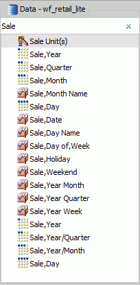
The following is an example of the default Logical view, displaying the Title of each field.
Using the Data Pane to Add Fields to a Report
There are several ways that you can add data source fields to a report. You can drag, double-click, or right-click data source fields in the Data pane to add them to a Query field container or the Filter pane.
After you add data source fields to a Query field container, you can change the order of the fields by dragging and dropping one field above or below another field.
Drag. This method provides the most control. You can drag data source fields from the Data pane to the appropriate Query field container or Filter pane.
For a larger work area in which to drop data source fields in the appropriate Query field container, make sure that Query Design view is selected, and then, on the View tab, in the Query Panel group, click Areas 2x2 or Areas 1x4.
You can select Query Design view on the Home tab, in the Design group, by clicking Query or on the View tab, in the Design group by clicking Query. That selection expands the Query and Filter panes.
Multi-Select. You can multi-select data source fields that you want to add to a report in Live Preview, Query Design view, and Document mode. To select multiple data source fields to add to a report, click the appropriate fields while holding the Ctrl key on the keyboard. You can drag fields onto the canvas, or add them to the Query field container.
Double-Click. To automatically add a field to the appropriate Query field container in the Query pane, you can double-click a data source field in the Data pane.
- When you double-click a measure field in the Data pane, it is automatically added to the Sum Query field container.
- When you double-click a dimension field in the Data pane, it is added to the By (Row Label) Query field container for a report, or to the X-axis Query field container for a chart.
You cannot automatically add a field to the Across (Column Label) Query field container for a report, or to the Legend (Series) and Multi-graph Query field containers for a chart.
Right-Click. You can right-click a field in the Data pane to add it to the Filter area or a Query field container in the Query pane. For reports, the available shortcut menu options are as follows:
- Across. For dimension fields.
- Add to Query. Opens a menu of available Query field containers, to which you can add your data.
- Create Group. Allows you to create a group of elements based on the field data type that you select.
- Include as Category Axis. For dimension fields.
- Include as Coordinated. Only available in Document mode.
- Include as Legends Series. For dimension fields.
- Filter. For all types of fields.
- Slicers. For all types of fields.
- Sort. Adds the field to the Sort field container. This is for all types of fields.
- Sum. For measure fields.
- Create Bins. Allows you to create a bin for the selected measure. Bins are used with the Binning functionality. For more information, see Binning.
A measure is a numeric value, such as Gross Profit or Cost of Goods Sold, that you may want to aggregate. All numeric values that can be summed are measures. Numeric fields that cannot be summed, such as product number and miles per gallon, are not treated as measures. Instead, they may be used in the same way as dimension fields to analyze measures. It is up to you to understand your data and determine whether each numeric field can be summed. Related measures can be organized into measure groups. For example, Gross Profit and Cost of Goods Sold can be part of a Sales measure group.
A dimension is a way to categorize data. You can use a dimension to analyze and compare measures. Generally, any field that is not a measure, usually an alphanumeric field such as product, is a dimension. Dimensions can be organized into hierarchies to define the relationships between the fields in the hierarchies. For example, a Geography hierarchy can contain the Continent, Country, State, and City dimensions. You can also define dimension fields that are not part of a dimension hierarchy.
Using the Query Pane and Filter Pane
The Query and Filter panes appear to the right of the Data pane, except when you select Query Design view, which expands the size of the Query and Filter panes. There are different Query field containers for reports and charts.
Note: If you have more than one item in either Sum, By, or Across Query field containers (for reports) or Measure (Sum) or X-axis Query field containers (for charts), you can drag them up or down in the Query pane to rearrange the order in which they display in your report or chart. When you drag fields to rearrange them, an indicator line displays, providing guidance as to where the field will be placed. The color of this line is determined by the theme. Once you have performed the rearrangement, the Live Preview refreshes based on the newly indicated order.
Reports. For all reports, the Query field containers in the Query pane include Sum, By, and Across.
- Use the Sum
 field container
to aggregate or display numeric measure fields. Its context menu
provides options to Sum (default), Print, Count, or List the fields
in the report.
field container
to aggregate or display numeric measure fields. Its context menu
provides options to Sum (default), Print, Count, or List the fields
in the report.
- Use the By Query field container to vertically sort dimension fields to produce row labels in the report output. Dimension fields are normally non-numeric or date fields.
- Use the Across Query field container to horizontally sort dimension fields to produce column labels in the report output.
Charts. For most charts, the Query field containers in the Query pane include Measure (Sum), X Axis, Legend (Series), Multi-graph and Coordinated. More complex charts that require additional dimension fields have alternative Query field containers.
- Measure (Sum). Use this Query field container to aggregate or display numeric measure field values.
- Location. Use this Query field container to display a location field. This Query field container displays for maps only.
- X Axis. Use this Query field container to sort dimension fields in the chart output.
- Legend (Series). Use this Query field container to display dimension fields as color-coded values (lines, bars, areas, scatter plots) that match the color-coded dimension values displayed in the legend below the chart. Legend (Series) provides functionality that is similar to an Across field in a report.
- Multi-graph. Use this Query field container to create outermost sort fields and to serve as a page break for working with multiple charts. The sort field added to this Multi-graph Query field container is not plotted on the chart, but each unique sort field value is listed for every chart.
- Coordinated. Use this Query field container to collectively sort and collate by a common sort group (for documents only).
For pie charts, the Query field containers in the Query pane include Measure (Sum), Slices, Category, Multi-graph, and Coordinated.
- Measure (Sum). Use this Query field container to aggregate or display numeric measure field values in the pie.
- Pie slices. Use this Query field container to display dimension fields as color-coded pie slices that match the color-coded dimension values displayed in the legend below the chart. The Pie slices Query field container is equivalent to the Legend (Series) Query field container used for other chart types.
- Multi-graph. Use this Query field container to create outermost sort fields and to serve as a page break for working with multiple charts. The sort field added to this Multi-graph Query field container is not plotted on the chart, but each unique sort field value is listed for every chart.
- Category. Use this Query field container to sort dimension fields in the chart output. Category is equivalent to the X-axis Query field container used for other chart types.
- Coordinated. Use this Query field container to collectively sort and collate by a common sort group (for documents only).
Using Field Containers
|
Topics: |
Field containers are used to hold fields that you select based on the function that you want it to perform. For example, in Chart and Visualization mode, you can add a field to the Color field container, which will color your data based on the selected field.
For reports, the available field containers are different than those presented for charts and visualizations. This section reviews all of the field containers, providing you with a reference point when working with field containers.
Field Containers for Reports
The following field containers display when creating reports.
- Across
-
Enables you to display column headings across the top of the report for the measure or dimension that is placed in this field container.
- By
-
Enables you to specify sort fields for your report.
Note: You can rearrange the display order of your By sorts by dragging them into the desired order in the Query pane.
- Sum
-
Displays numeric totals for numeric (measure) fields that are added to this field container.
Field Containers for Charts and Visualizations
The following field containers display when creating charts and visualizations.
- Animate
-
Enables you to animate time progression using a slider control. As you move the control along the slider bar, an animation effect results. The slider control has a Play button that allows you to play and pause the animation. When you click Play, the Pause option is activated, enabling you to pause the progression and analyze your data. Slider controls are limited to one sort field and should be time or sequence related, such as month or year. This field container displays for many different chart types.
- By
-
Use this field container to differentiate data types in a field that contains multiple categorical values. For example, when creating a gauge chart, the field that you specify in this field container becomes a By field, by which all values are displayed as a separate chart.
- Category
-
Enables you to display data categorically in a chart. This field container displays for Tag Cloud charts, which are available in the Other charts category.
- Category Axis
-
Use this field container to specify a field that contains categorical data. These categories display on the categorical portion of a 3D bar chart. The other axis, Series Axis, is plotted against the categorical data.
- Close
-
Enables you to specify a numeric field to indicate the closing value of a stock. Other required values include: Open, High, and Low. This field container displays for Stock charts, which are available in the Other charts category.
- Color
-
Enables the application of different colors based on the underlying data set for the field in this field container. When you place a numeric field in the Color field container, the legend displays as a heat scale. When you place an alphanumeric or a date field (non-measure) in the Color field container, the legend displays as colored markers. To change how the legend displays, right-click the Color field container and click Color BY.
- Columns
-
Enables you to specify a field to display column data in a matrix chart in a visual. The use of measure fields is supported. Column data is displayed at the top of the visual, along the X axis. This field container is available for charts and visualizations.
- Detail
-
Use this field container to add detail to your visual by adding a data field to it. For example, if you add Sale,Quarter to the Detail field container in your Scatter plot, the points on the plot are quadrupled, one for each quarter. In addition, the field that you specify in the Detail field container also displays on the hover menu for each point in the plot.
- Grouping
-
Enables you to specify a field by which to present your data in categories or groups. For example, this data field controls how a treemap is grouped.
- High
-
Enables you to specify a numeric field to indicate the high value of a stock. Other required values include: Open, Low, and Close. This field container displays for Stock charts, which are available in the Other charts category.
- Horizontal Axis
-
Displays the data for the selected along the X axis. This field container is available for charts and visualizations.
Note: You can specify up to three fields on the horizontal axis.
- Layer
-
Enables you to specify a Geolocation field for use in a map.
Note: Geolocation fields are listed in the Data pane with a Geolocation icon
 .
.
- Legend (Series)
-
Enables you to add a field to specify for the legend of the chart. This field container displays for a number of charts that are available in the Other chart category.
- Low
-
Enables you to specify a numeric field to indicate the low value of a stock. Other required values include: Open, High, and Close. This field container displays for Stock charts, which are available in the Other charts category.
- Lower Limit
-
Enables you to specify a numeric (measure) field by which to establish a lower limit. This field container displays for Vertical Box Plot charts, which are available in the Other chart category.
- Lower quartile
-
Enables you to specify a numeric (measure) field by which to establish a lower quartile. This field container displays for Vertical Box Plot charts, which are available in the Other chart category.
- Measure
-
Use this field container to specify a measure that will serve as the basis for a pie chart. The Measure metric is used with the Color field container for pie charts to create sections based on your field selections. It is also used with Gauge charts.
- Measure (Sum)
-
Enables you to specify a numeric (measure field) by which to sum data. This field container displays for a number of charts that are available in the Other chart category.
- Median
-
Enables you to specify a numeric (measure) field by which to establish an median. This field container displays for Vertical Box Plot charts, which are available in the Other chart category.
- Multi-graph
-
Enables the creation of multiple graphs based on the field that you place in this field container. This field container displays for many different chart types, including Spectral Heatmaps, which are available from the Other dialog box.
- Open
-
Enables you to specify a numeric field to indicate the opening value of a stock. Other required values include: High, Low, and Close. This field container displays for Stock charts, which are available in the Other charts category.
- Rows
-
Enables you to specify a field to display row data in a matrix chart in a visual. The use of measure fields is supported. Row data is displayed on the left side of the visual, along the Y axis. This field container is available for charts and visualizations.
- Series Axis
-
Use this field container to specify a series to plot against the data presented on the Categorical Axis. This field container displays for 3D bar charts.
- Size
-
Controls the size of markers or other data points.
- Size (Sum)
-
Enables you to specify a numeric (measure) field, which will control the size of the data presented in a chart. This field container displays for Tag Cloud charts, which are available in the Other charts category.
- Slices
-
Enables you to specify a field whose data values will dictate the size of the slices in a chart. This field container is available for Funnel charts, which are available in the Other chart category.
- Tooltip
-
When you place a field in this field container, InfoAssist+ enables you to view additional information in the tooltip for a chart or visual.
- Upper limit
-
Enables you to specify a numeric (measure) field by which to establish an upper limit. This field container displays for Vertical Box Plot charts, which are available in the Other chart category.
- Upper quartile
-
Enables you to specify a numeric (measure) field by which to establish an upper quartile. This field container displays for Vertical Box Plot charts, which are available in the Other chart category.
- Vertical Axis
-
Displays the data for the selected field along the Y axis. This field container is available for charts and visualizations.
- X Axis
-
Enables the specification of a field on the X Axis of certain chart types. For example, XY Polar. This field container displays for a number of charts that are available in the Other chart category.
- Y1 Measure (Sum)
-
Enables you to specify a measure (numeric) field for the Y Axis in a Pareto and certain line charts, which can be accessed from the Other chart category.
- Y2 Measure
-
Use this field container to indicate a measure to serve as the basis for second Y axis. This field is used in various line charts, which can be accessed from the Other chart category.
Using Shortcut Menu Options in the Query Pane
|
Topics: |
|
Reference: |
In the Query pane, you can right-click any field and select from a list of available options that are displayed in the menu that appears. The options that you can select vary, depending on the type of Query field container in which the field is located and the type of report that you are creating.
You can also rename the content type in the Query pane. You can right-click the component and click Rename to change the title.
This allows you to customize the title in the Query pane. In addition, when working in Excel format, the name that you provide is used as the worksheet name in the workbook that is generated at run-time.
Note: If you are working with a report or chart in HTML format, you can also access Sum, Print, List, and Count aggregations from the shortcut menu on the report or chart component.
Related Information:
Reference: Right-Click Field Options in the Query and Filter Panes
The following table lists and describes all the right-click field options available in the Query and Filter panes for a selected field.
|
Option |
Description |
|---|---|
|
# of Columns |
Opens the Number of Columns dialog box, where you can indicate the number of columns in which you wish to display multiple graphs. |
|
Aggregation Functions |
Provides a menu for selecting options to assign an aggregation type value to a selected numeric field in a report. |
|
Break |
Provides a menu of options to enable page breaks and subtotals, and resetting page numbers. |
|
Create Group |
Allows you to create a group of elements based on the field data type that you select. Once you define a new group, a higher-level field is created that contains the selected elements. For more information, see How to Create a Dynamic Group. |
|
Change Title |
Opens the Edit Title dialog box, where you can change the title of the selected field by typing the new title in the Enter Title field. Note: When changing the title of a column heading, you can place a comma between words in the Enter Title field to create a multi-line header. |
|
Color BY |
Changes the Color field container to Color BY. The field container also changes to Color BY when you place a field into the Color field container. You can disable Color BY, which changes a dimension field into a measure field. This option is only available for charts and visualizations. |
|
Data Bars |
Provides a menu for enabling the data bar representation functionality. Selecting On adds a data visualization column to the right of a selected numeric field. The column displays values in each row using horizontal bars that extend from left to right in varying lengths, depending on the corresponding data values. |
|
Delete |
Deletes the selected field. Note: In the Query and Filter panes, you can select and delete multiple data fields at one time. Using the CTRL key, select two or more data fields, right-mouse click, and then click Delete. |
|
Drill Down |
Opens the Drill Down dialog box, where you can create multiple drilldown links on a data field to external procedures or websites. |
|
Edit Format |
Opens the Field Format Options dialog box, where you can edit the field type and display options. This option is available for fields within the Sum field container in a report, as well as measure fields in a chart or visualization. Note: Any changes to the format of a field will be reflected in the tooltip for charts at run time, as well as for visualizations at design and run time. |
|
Filter Values |
Opens the Filter dialog box for creating WHERE statements, which enable you to select only the data that you want and to exclude all unwanted data. |
|
Missing |
Allows you to show or hide fields with no value. |
|
Multi-Y Split |
Allows you to display individual charts for each measure field where multiple measures are specified. Located on the Vertical Axis, this option is available for charts and visualizations. |
|
New Parameter |
Allows you to add new parameters to your report or chart, which creates parameter options for selection at run time. You can create a new parameter in a report or chart in any field container. Note: When working with charts, a new parameter can only be added for charts that use the new attribute syntax. |
|
Sort |
Provides access to the Sort, Rank, and Limit menus. The Sort menu allows you to sort your data either in ascending or descending order. The Limit menu allows you to specify the number of unique values displayed for a sort group that has been added. The Rank menu allows you to insert a rank column immediately to the left if a Sort By field is selected and adds a rank column to the left of the Sort By field if a Measure field is selected. Ranking a Measure field results in two copies of the field, the original Measure field and the Sort By field that is created during ranking. |
|
Sub Footer |
Opens the Sub Header & Sub Footer dialog box where you can edit and style your footers. |
|
Sub Header |
Opens the Sub Header & Sub Footer dialog box where you can edit and style your headers. |
|
Suppress Empty Group |
Suppresses any part of your chart that is empty. You can deselect this option, which is enabled by default. This option is available on the Horizontal axis in both Chart and Visualization mode. |
|
Sort by Total Value |
Enables you to sort the output in a chart or visualization using the values from the y-axis (Horizontal axis) of a stacked bar chart. While this feature was implemented specifically for Stacked Bar charts, it also applies to regular bar charts, as well as line and area charts. This enables you to view your data as ranked, or sorted, from highest value to lowest value. Accordingly, this option sorts the output by the bar (or other) with the highest total. This option is set to Off by default, but you can select Ascending or Descending to sort your data. This option is available on the Horizontal axis in both Chart and Visualization mode. Note: If you rotate your chart horizontally, the Sort By Total Value menu option displays on the Vertical Axis. For more information, see How to Sort a Chart by Total Value. |
|
Traffic Light Conditions |
Opens the Traffic Light Condition dialog box, where you can add new conditional styling or modify existing conditional styling by applying traffic light (and other) colors to a selected field in the report output when the field meets specified criteria. |
|
Visibility |
Provides a menu for controlling the visibility of the selected field. Clicking Hide removes the selected field from the report output. Clicking Show (default) displays the selected field in the report output. |
All of the shortcut menu options that are available in the Query and Filter panes are also available in the Field tab. For more information, see Field Tab.
Dynamic Grouping
|
How to: |
Dynamic grouping allows you to create groups of elements based on the field data type that you select. For example, in the wf_retail_lite database, there are a number of brands of televisions. Using the dynamic grouping functionality, you can create groups based on the popularity of a particular brand. The first group might include top sellers such as LG and Sony. The second group might contain the remaining brands (Panasonic, GPX, Supersonic, Tivax, and Audiovox). This would allow you to group top sellers into one group, and the remaining brands into another group.
Note: The Create Group option is only available for dimension fields of non-numeric format or attribute.
You can also specify multiple, unique groupings in the same session. For example, you might want to group the data to indicate groups or products, or specific regions.
Note: If you want to exclude a specific data element from your analysis, you can use the filter functionality.
The grouping that you specify is applied and this new group then replaces the original field that you selected in the Query pane. The name that you specify when creating the group is reflected in the Query pane.
Note: You can edit the group once it has been created by right-clicking on the higher-level field and clicking Edit Group.
Procedure: How to Create a Dynamic Group
- From the Data pane, add one or more
data fields to your report or chart.
Note: You can use the dynamic grouping functionality on non-numeric dimension fields only.
- In the Query pane, right-click the data field for which
you want to apply dynamic grouping.
Note: The Create Group option is also available in the Data pane shortcut menu.
- Click Create Group.
The Create a Group dialog box displays.
- In the Field text box, optionally type a name for the
new group.
Note: The fully qualified field name is displayed in the Field Origin text field. This field is enabled and has a read-only attribute. The display of the fully qualified field name is particularly useful when renaming or editing a group, as it identifies the data source followed by the hierarchical location of the field within a data set. For example, WF_RETAIL_LITE.WF_RETAIL_PRODUCT.BRAND.
- Select the data values that you want to group. Use CTRL
+ click to select more than one value, as shown in the following
image.
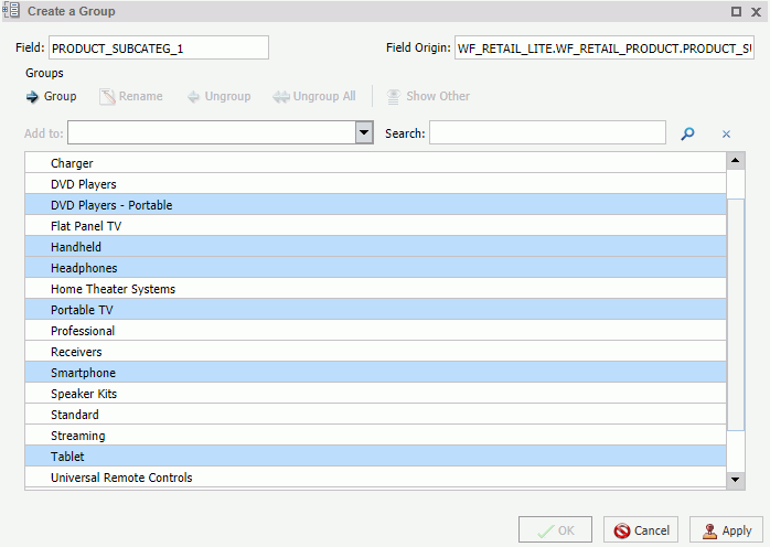
- Click Group.
Note: To ungroup values, click a group and then click Ungroup.
- Optionally, create additional groups, as shown in the
following image.
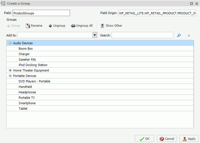
- Click OK.
Your grouped data will display in the Data pane when your report, chart, or visualization refreshes, as shown in the following image.
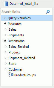
| WebFOCUS | |
|
Feedback |