Building Visualizations
|
Topics: |
Visualizations centralize information by providing different views of data that are pertinent to a particular objective. For example, reviewing trends or fluctuations in data over a period of time or within a region. A visualization provides you with a quick glance of information on a single screen.
Visualizations support the use of different types of charts, maps, and grids. For example, you may want to use a bar, pie, and line chart to show different views of the same data. Alternatively, you may want to offset a particular visual by showing other types of related data that employ a different type of visual. You can also add a text cell to your visualization to provide explanatory text or information that other users can reference.
Visualizations allow you to monitor changes in data. They also serve to provide information in real-time, based on changes in underlying data or other components. A visualization can be updated, changed, or revised at any time to account for shifts in data needs.
Creating a Visual
|
Topics: |
|
How to: |
You can create charts, maps, and grids to visually represent your data. You can add multiple visuals to the canvas to create a complete visualization.
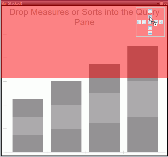
The default visual is a bar stacked chart. You can use the Change option in the Visual group on the Home tab to change the visual type.
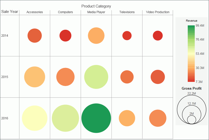
The following visual is a matrix marker chart that shows sales data for a range of electronic products.
Procedure: How to Create a Visualization From InfoAssist+
You can have multiple file types opened at once. To create a visualization:
- On the Quick Access toolbar, click New.
or
Click the Application Main Menu button, and click New.
The InfoAssist+ splash screen displays.
- Click Build a Visualization.
- In the Open dialog box, select a data source and click Open.
InfoAssist+ switches to visualization mode.
Changing the Visual Type
|
How to: |
You can create a visual using the default chart type, which is a stacked bar chart. You can add your data to this chart and then change the chart type, or you can change the chart type prior to making your data selections.
Once you have started exploring your data, you can switch between the different types to obtain the graphical image that you wish to display.
You change the visual type from the Home tab.
Procedure: How to Change the Visual Type
- On the Home tab,
in the Visual group, click Change,
as shown in the following image.
Note: The Change icon updates depending on the chart, map, or grid that you select from the Select a Visual menu. By default, the Change icon displays a stacked bar chart.
The Select a Visual menu displays.
- On the Select a Visual menu, click the type of visual
that you want to use.
Your canvas refreshes and displays the visual that you selected.
Note: Depending on the type of visual that you select, you may need to select additional or different data fields.
Selecting a Visual
|
Topics: |
It is important that you select a chart, grid, or map that appropriately displays a meaningful view of your data. InfoAssist+ provides a library of visuals.
You can select a visual type from the Select a Visual menu, on the Home tab, in the Visual group. The following table describes the types of charts available.
|
Icon |
Visual Type |
Description |
|---|---|---|
 |
Grid |
Grids provide a tabular view of data. They allow you to review data in a row and column format, similar to a printed report. |
 |
Bar chart |
Bar charts plot numerical data by displaying rectangular blocks against a scale (numbers or variable measure fields that appear along the axis). |
 |
Stacked bar chart |
A stacked bar chart is the default visual. |
 |
Histogram |
Histograms graphically represent the distribution of numeric data. They facilitate the identification and discovery of the underlying frequency distribution within a set of continuous data. You can use histograms to identify trends and illustrate categorizations, or groupings, also known as bins. For more information, see Binning. |
 |
Absolute line chart |
Line charts allow you to trace the evolution of a data point by working backwards or interpolating. Highs and lows, rapid or slow movement, or a tendency towards stability are all types of trends well suited for a line chart. |
 |
Area chart |
Area charts analyze trends over time and look for differences in values. |
 |
Stacked area chart |
Stacked area charts allow you to stack data on top of each other. |
 |
Pie chart |
Pie charts are circular charts that represent parts of a whole. A pie chart emphasizes where your data fits, in relation to the other components in the pie. |
 |
Ring pie chart |
Ring pie charts are useful when you want to review the value of each segment, which represents the measure value for the selected dimension, as it relates to the total for the selected measure. |
 |
Scatter Plot |
Scatter charts enable you to plot data using variable scales on both axes. When you use a scatter chart, the data is plotted with a hollow marker, so that you can visualize the density of individual data values around particular points, or discern patterns in the data. |
 |
Bubble chart |
Bubble charts can have two column fields representing X and Y data values, or have three column fields representing X, Y, and Z data values. The third variable (Z) represents size. The size of each bubble is used to show the relative importance of the data. |
 |
Matrix Marker chart |
Matrix marker charts are useful for analyzing one or two measures against a crosstab of two categorical dimensions. The result is a color-scaled matrix chart that shows categorized trends. |
 |
Treemap |
Treemaps are used to display large amounts of hierarchically structured data. Using a set of nested rectangles to illustrate data relationships, sections of a treemap represent branches of a tree. |
 |
Gauge |
Gauges are used to display the value of a measure. In particular, circular gauges are used to represent a single data value within a given spectrum. You can create a single circular gauge for a measure or a matrix circular gauge, which shows the value of the selected measure across different dimensions, such as product category or yearly sales. |
 |
Choropleth map |
A geographically-based heat map. It is useful for visualizing location-based data, trends, and distributions across a geographic area. |
 |
Proportional symbol map |
A technique that uses symbols of different sizes to represent data associated with different areas or locations within the map. |
 |
Heatmap |
A heatmap is a graphical representation of data where the individual values that comprise a matrix are represented as colors. Using radiant hues, you can track the intensity of a data relationship using the colors defined in the legend. |
Note: When new data is added to a bar, line, area, pie, scatter, bubble, gauge, or treemap chart, the chart will morph and rebuild, revealing the new values in a smooth transition.
Use the topics in this section to select and create your visuals.
Grids
|
How to: |
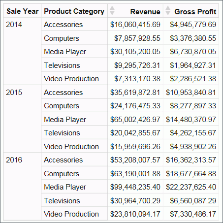
Grids provide a tabular view of data. They allow you to review data in a row and column format, similar to a printed report.
In the following example, we review the Sale Year and Product Category data for the following measure fields:
- Revenue
- Gross Profit
Procedure: How to Create a Grid
- Change the visual to a grid, or insert a new grid.
- Drag data fields to the canvas or to the Query field
containers to add them to your visual. The following Query field
containers must be populated for this visual:
- Rows or Columns - one or more data fields
- Measure - one or more data fields
As you add, edit, or rearrange the fields in your Query field containers, your canvas refreshes.
Bar Charts
|
How to: |
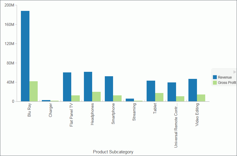
Bar charts plot numerical data by displaying rectangular blocks against a scale (numbers or variable measure fields that appear along the axis). The length of a bar corresponds to a value or amount. You can clearly compare data series (fields) by the relative heights of the bars. Use a bar chart to display the distribution of numerical data. You can create horizontal and vertical bar charts.
Note: If you are working with a large dataset, a scroll bar displays under your chart, enabling you to easily scroll through your data from left to right. In visualization mode, scroll bars are automatically enabled, but if you want to disable or re-enable scroll bars, click the Format tab and then click Interactive Options. In the Interactive Options dialog box, select the Auto Enable X-Axis Scrolling check box. If you are working in any other mode, you must enable this functionality.
Use a bar chart when individual values are important. For example, the following image is a basic vertical bar chart that compares the individual products sold to the total amount in sales for each product. A retailer would find it important to know which pieces of inventory are selling and how much revenue each item is generating for the company.
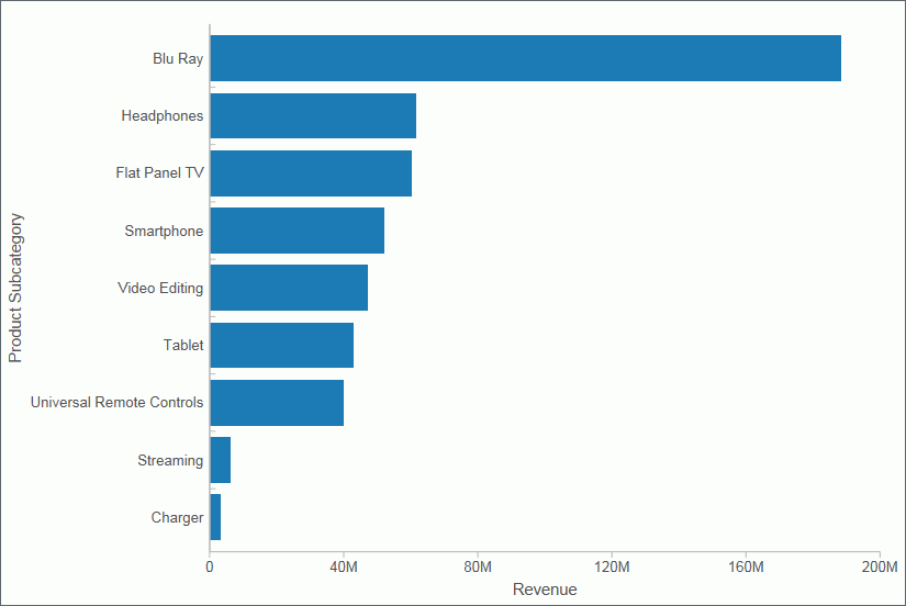
A horizontal bar chart becomes useful when you want to emphasize a ranking relationship in descending order, or the X-axis labels are too long to fit legibly side-by-side. For example, the following image is a basic horizontal bar chart that ranks which products are generating the most revenue for the retailer.
Note: You can swap the orientation of your data in a bar chart. To do so, on the Home tab, in the Visual group, click Swap.
Procedure: How to Insert a New Bar Chart
- Change the visual to a bar chart or insert a new bar chart.
- Drag data fields to the canvas or to the Query field
containers to add them to your visual. The following Query field
containers must be populated for this visual:
- Vertical Axis - one or more data fields
- Horizontal Axis - one data field
Note: You can also double-click a data field to add it to your Query field containers.
The bar chart displays on the canvas. You can add additional data fields for comparative purposes. You can also view underlying data by hovering over any particular point on the bar chart.
Procedure: How to Create a Stacked Bar Chart
The bar stacked visual is the default visual.
- Change the visual to a stacked bar chart or insert a new stacked bar chart.
- Drag data fields to the canvas or to the Query field
containers to add them to your visual. The following Query field
containers must be populated for this visual:
- Vertical Axis - one or more data fields
- Horizontal Axis - one or more data fields
- Color - one data field
Note: You can also double-click a data field to add it to your Query field containers.
The stacked bar chart displays on the canvas. You can add additional data fields for comparative purposes. You can also view underlying data by hovering over any particular point on the stacked bar chart.
Line Charts
|
How to: |
Line charts allow you to trace the evolution of a data point by working backwards or interpolating. Highs and lows, rapid or slow movement, or a tendency towards stability are all types of trends well suited for a line chart.
You can also plot line charts with two or more scales to present a comparison of the same value, or set of values, in different time periods.
Note: If you are working with a large dataset, a scroll bar displays under your chart, enabling you to easily scroll through your data from left to right. In visualization mode, scroll bars are automatically enabled, but if you want to disable or re-enable scroll bars, click the Format tab and then click Interactive Options. In the Interactive Options dialog box, select the Auto Enable X-Axis Scrolling check box. If you are working in any other mode, you must enable this functionality.
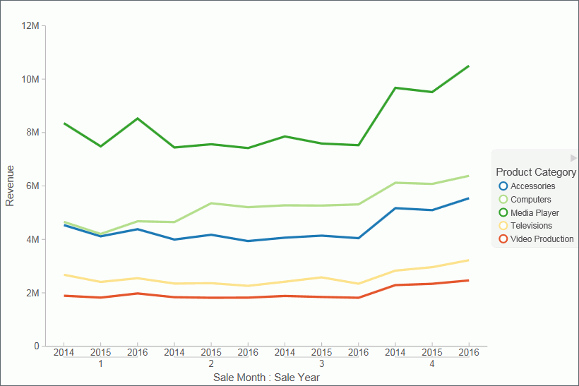
Use a line chart when you want to trend data over time, for example, monthly changes in employment figures, or yearly sales of an item in your inventory. The following image is a line visual that shows the gross profit in monthly sales for products.
Procedure: How to Create a Line Chart
- Change the visual type to a line chart or insert a new line chart.
- Drag data fields to the canvas or to the Query field
containers to add them to your visual. The following Query field
containers must be populated for this visual:
- Vertical Axis - one or more data fields
- Horizontal Axis - one data field
- Color - one data field (optional)
Note: You can also double-click a data field to add it to your Query field containers.
To add insight, you can drag a data field to the color Query field container. This displays the values for this field using color.
The line chart displays on the canvas. You can add additional data fields for comparative purposes. You can also view underlying data by hovering over any particular point on the line chart.
Area Charts
|
How to: |
Area charts analyze trends over time and look for differences in values by using the see-thru nature of the area fills. Stacked area charts allow you to stack data on top of each other. Stacking allows you to highlight the relationship between data series, showing how some data series approach a second series.
Note: If you are working with a large dataset, a scroll bar displays under your chart, enabling you to easily scroll through your data from left to right. In visualization mode, scroll bars are automatically enabled, but if you want to disable or re-enable scroll bars, click the Format tab and then click Interactive Options. In the Interactive Options dialog box, select the Auto Enable X-Axis Scrolling check box. If you are working in any other mode, you must enable this functionality.
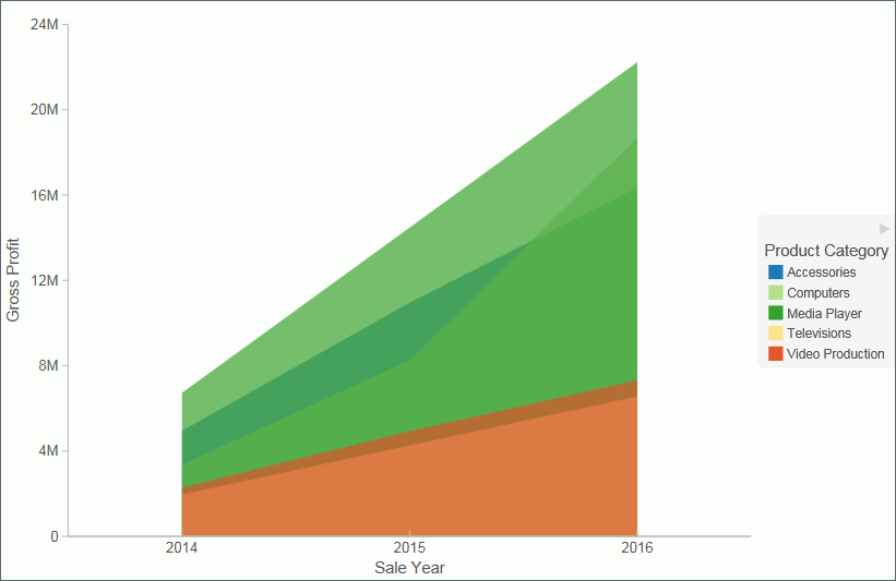
Use an area chart when you want to distinguish the data more dramatically by highlighting volume with color. For example, the following image is a basic area chart that depicts the yearly gross profit for various electronic products.
Procedure: How to Create an Area Chart
- Change the visual type to an area chart or insert a new area chart.
- Drag data fields to the canvas or to the Query field
containers to add them to your visual. The following Query field
containers must be populated for this visual:
- Vertical Axis - one or more data fields
- Horizontal Axis - one data field
- Color - one data field (optional)
Note: You can also double-click a data field to add it to your Query field containers.
The area chart displays on the canvas. You can add additional data fields for comparative purposes. You can also view underlying data by hovering over any particular point on the area chart.
Procedure: How to Create a Stacked Area Chart
- Change the visual type to a stacked area chart or insert a new stacked area chart.
- Drag data fields to the canvas or to the Query field
containers to add them to your visual. The following Query field
containers must be populated for this visual:
- Vertical Axis - one or more data fields
- Horizontal Axis - one data field
- Color - one data field (optional)
Note: You can also double-click a data field to add it to your Query field containers.
The stacked area chart displays on the canvas. You can add additional data fields for comparative purposes. You can also view underlying data by hovering over any particular point on the stacked area chart.
Pie Charts
|
How to: |
Pie charts are circular charts that represent parts of a whole. A pie chart emphasizes where your data fits, in relation to the other components in the pie. Pie charts work best when there are a limited number of slices (for example, less than 10) and the slices are all of a sufficient value as to reveal their fill color inside their wedge.
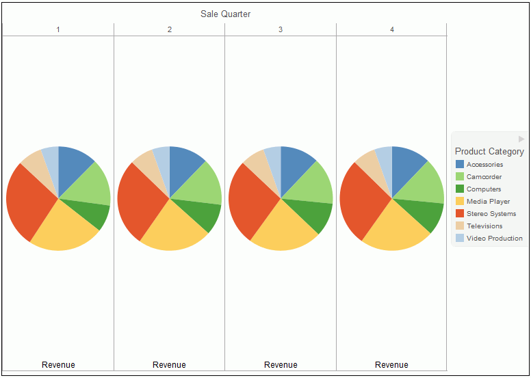
Use a pie chart when you have segments of data that you want to display as a whole. For example, the following image is a pie chart that shows the proportions of various electronic products based on the quarterly revenue.
You can add one or more measures to the Measure field container. Each measure will be used to create a separate, unique pie chart, to which you can add a measure or dimension to the Color field container to add color to your chart.
Note: When working with pie charts, you can add one measure field to the Color field container. This adds the measure as a By field, and determines how the pie chart is colored. Depending on your measure data, this may result in a large number of pie segments.
Procedure: How to Create a Pie Chart
- Change the visual type to a pie chart or insert a new pie chart.
- Drag data fields to the canvas or to the Query field
containers to add them to your visual. The following Query field
containers must be populated for this visual:
- Measure - one data field. Data in this category is used to indicate the size of the pie slice for the relevant category.
- Color - one data field. Data in this category indicates the colors in your pie chart.
Note: You can also double-click a data field to add it to your Query field containers.
The pie chart displays on the canvas. You can add additional data fields for comparative purposes, or to create another pie chart on the same canvas. You can also view underlying data by hovering over any particular point on the pie chart.
Ring Pie Charts
|
How to: |
Ring pie charts are circular charts that display the total for the selected measure, as well as the individual segments that comprise the ring pie chart. You can hover over each segment to review the underlying data values. This is useful when comparing the measure value for an individual segment against the total for the measure, which displays in the center of the ring pie.
You can add one or more measures to the Measure field container. Each measure will be used to create a separate, unique ring pie chart, to which you can add a measure or dimension to the Color field container to add color to your chart.
Note: The font size of the value label in the middle of the ring is automatically set by the chart engine.
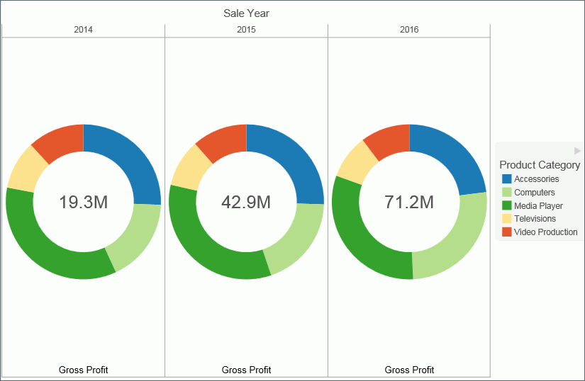
Use a ring pie chart when you want to review the value of each segment, which represents the measure value for the selected dimension, as it relates to the total for the selected measure. The following image is an example of a ring pie chart.
Procedure: How to Create a Ring Pie Chart
- Change the visual type to a ring pie chart or insert a new ring pie chart.
- Drag data fields to the canvas or to the Query field
containers to add them to your visual. The following Query field
containers must be populated for this visual:
- Measure - one data field. Data in this category is used to indicate the size of the ring pie segment for the relevant category.
- Color - one data field. Data in this category indicates the colors in your ring pie chart.
Note: You can also double-click a data field to add it to your Query field containers.
The ring pie chart displays on the canvas. The total for the selected measure displays in the center of the ring pie chart. You can view underlying data by hovering over any of the ring pie chart segments.
Scatter Charts
|
How to: |
Scatter charts enable you to plot data using variable scales on both axes. When you use a scatter chart, the data is plotted with a hollow marker, so that you can visualize the density of individual data values around particular points, or discern patterns in the data. A numeric X axis, or sort field, always yields a scatter chart, by default.
Note: You can specify a non-measure (dimension) data field on the horizontal or vertical axis, or both.
If your chart reveals clouds of points, there is a strong relationship between X and Y values. If data points are scattered, there is a weak relationship, or no relationship.
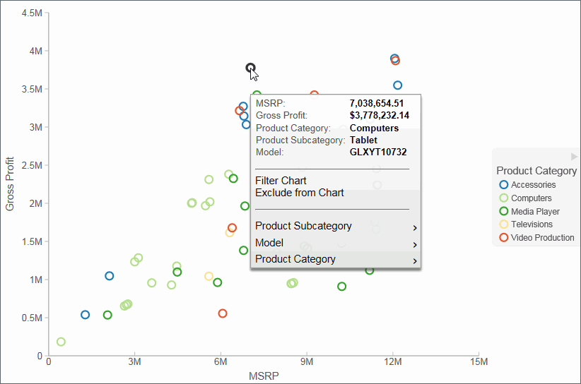
Adding data fields to the Detail Query field container creates additional BY fields on the scatter chart. For example, the following image shows the results when adding the Product,SubCategory and Model dimension fields to Detail Query field container in a scatter chart which showed gross profit and MSRP data.
Procedure: How to Create a Scatter Chart
- Change the visual type to a scatter chart or insert a new scatter chart.
- Drag data fields to the canvas or to the Query field
containers to add them to your visual. The following Query field
containers must be populated for this visual:
- Vertical Axis - one data field
- Horizontal Axis - one data field
- Detail - one or more data fields
- Color - one data field
Note: You can also double-click a data field to add it to your Query field containers.
The scatter chart displays on the canvas. You can also view underlying data by hovering over any particular point on the scatter chart.
Bubble Charts
|
How to: |
A bubble chart is a chart in which the data points are represented by bubbles. Bubble charts can have two column fields representing X and Y data values, or have three column fields representing X, Y, and Z data values, in that order. The Z variable represents size. The size of each bubble is used to show the relative importance of the data.
When you add a data field to the Size field container, this value is represented as the Z Axis Title in the legend. It displays as an empty Z Axis Title when a size data field is not specified. If you choose to indicate a Z, or size, data value, the data label displays in the legend. A Size Legend also displays, showing the estimated data value for a range of circle sizes. This allows you to estimate the value of the data based on the size of the circle.
- You can hover over the circles in the visual to obtain exact data values for any given point.
- You can specify a non-measure (dimension) data field on the horizontal or vertical axis, or both.
- In Visualization mode and for HTML5 charts, if you select the No fill option for your Series style when creating a bubble chart, the series displays in shades of black. For active charts, you must enable the Show Border Color option in order to view the bubbles in your chart at run time, otherwise the bubbles are invisible.
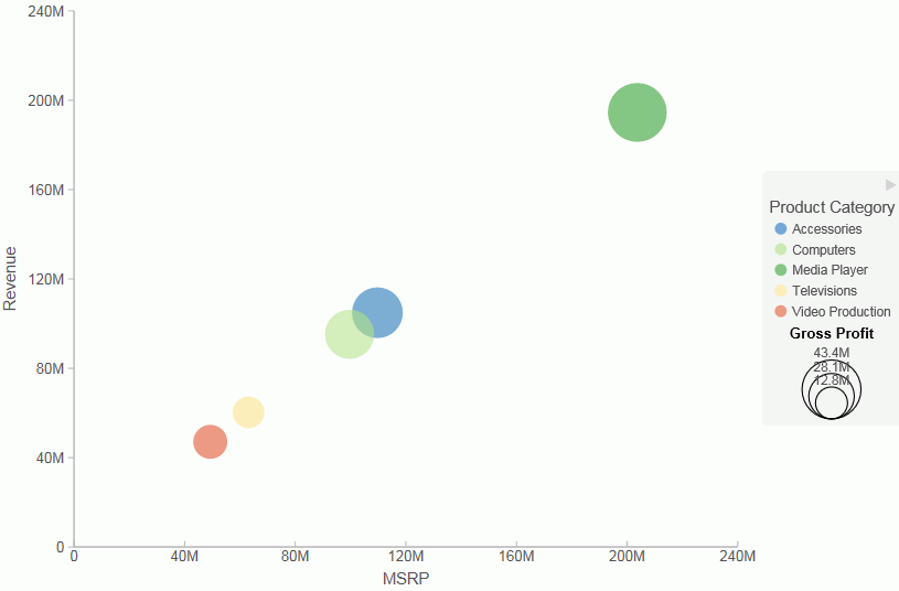
In the following image, a bubble chart is used to show the Manufacturers Suggested Retail Price (MSRP) plotted against Revenue for a variety of electronics products. It also shows the values for Gross Profit, which was specified in the Size field container in the Query pane.
Procedure: How to Create a Bubble Chart
- Change the visual to a bubble chart or insert a new bubble chart.
- Drag data fields to the canvas or to the Query field
containers to add them to your visual. The following Query field
containers must be populated for this visual:
- Vertical Axis - one data field
- Horizontal Axis - one data field
- Detail - one or more data fields
- Size - one data field
- Color - one data field (optional). Labels for the values in this data field will comprise the legend.
Note: You can also double-click a data field to add it to your Query field containers.
The bubble chart displays on the canvas. You can also view underlying data by hovering over any particular point on the bar chart.
Matrix Marker
|
How to: |
Matrix marker charts are useful for analyzing one or two measures against a crosstab of two categorical dimensions. You can use the Size Query field container for one measure and the Color Query field container for a second measure. The result is a color-scaled matrix chart that shows categorized trends, as shown in the following image.
Procedure: How to Create a Matrix Marker Chart
- Change the visual to a matrix marker chart or insert a new matrix marker chart.
- Drag data fields to the canvas or to the Query field
containers to add them to your visual. The following Query field
containers must be populated for this visual:
- Matrix Rows - one data field
- Matrix Column - one data field
- Size - one data field. The data for this field determines the size of the marker.
- Color - one data field. The data in this field determines the color of the marker.
The matrix marker chart displays.
Treemaps
|
How to: |
Treemaps are used to display large amounts of hierarchically structured data. Using a set of nested rectangles to illustrate data relationships, sections of a treemap represent branches of a tree. Each branch is given a rectangle, to which any number of smaller sub-branches can be assigned. The size of each branch is proportional to the summed values of the elements inside the branch.
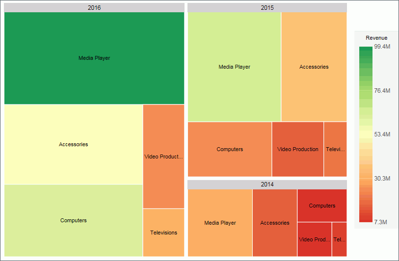
The following treemap shows the categories of the selected dimension fields, using two data fields to determine the size and color of the treemap segments.
Procedure: How to Create a Treemap
- Change the visual to a treemap or insert a new treemap.
- Drag data fields to the canvas or to the Query field
containers to add them to your visual. The following Query field
containers must be populated for this visual:
- Grouping - one or more data fields, which establishes the hierarchy of the Treemap grouping.
- Size - one data field. This data controls the size of the branches that display.
- Color - one data field. This data controls the colors that display based on the accompanying gradient.
The treemap displays.
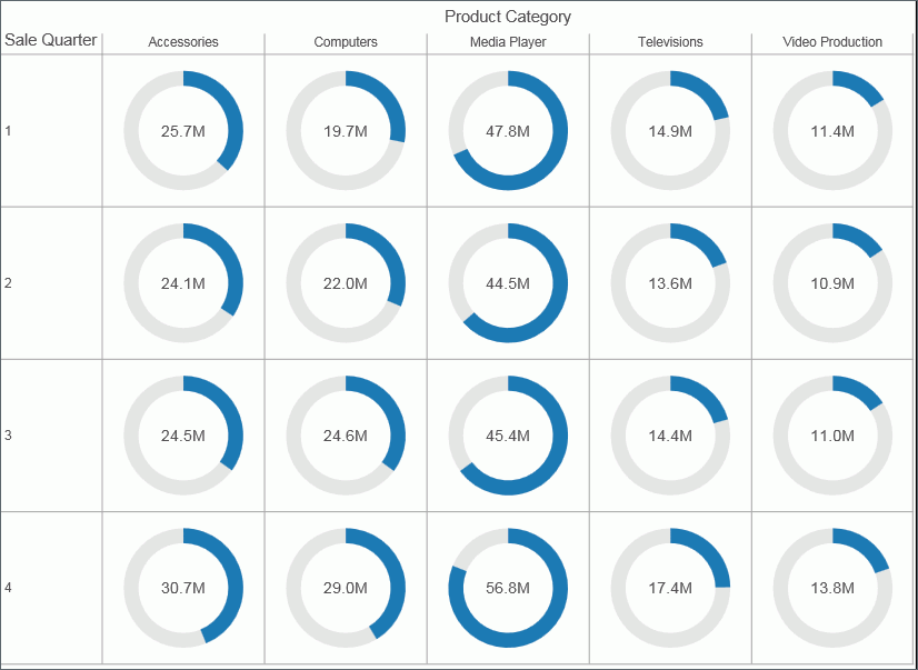
Gauges
|
How to: |
Gauges are used to display the value of a measure. In particular, circular gauges are used to represent a single data value within a given spectrum. These gauges have a circular shape. You can create a single circular gauge for a measure or a matrix circular gauge, which shows the value of the selected measure across different dimensions, such as product category or yearly sales. The value of the measure that displays in a circular gauge is determined by the underlying data stored for that measure in the database.
The circular gauge functionality uses only one measure in its presentation. The legend reflects the color of the measure within the circular gauge.
In the following example, we review revenue data for each product category by quarterly sales in a matrix circular gauge chart.
Procedure: How to Create a Circular Gauge
- Change the visual type to a gauge or insert a new gauge.
- Drag data fields to the canvas or to the Query field
containers to add them to your visual. The following query field
containers must be populated for this visual:
- Measure - one data field. Data in this category is used to indicate the value of the selected measure, which displays within the gauge.
- Tooltip - one or more data fields. The fields that you add provide you with the ability to review additional related, underlying data for different measures. Tooltips are optional.
Note: You can also double-click a data field to add it to your Query field containers.
The circular gauge displays on the canvas. You can select additional measure fields for which to include in the tooltip.
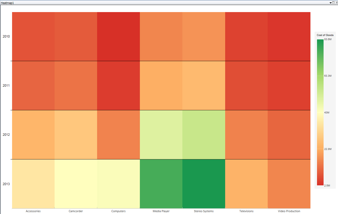
Heatmaps
|
How to: |
A heatmap is a graphical representation of data where the individual values that comprise a matrix are represented as colors. Using radiant hues, you can track the intensity of a data relationship using the colors defined in the legend.
Heatmaps are useful when you are looking for hot spots in your data, or areas of focus or interest, as shown in the following image.
Procedure: How to Create a Heatmap
- Change the visual to a heatmap or insert a new heatmap.
- Drag data fields to the canvas or to the Query field
containers to add them to your visual. The following Query field
containers must be populated for this visual:
- Color - one data field. This data controls the colors that display based on the accompanying gradient.
- Horizontal field container - one data field.
- Vertical field container - one data field
Note: You can optionally populate the Matrix Row and Column fields to increase the segmentation of your heatmap.
The heatmap displays.
Interacting With Visualizations
|
Topics: |
|
How to: |
A visualization is comprised of one or more visuals, such as charts, maps, or grids and text. You can create different views of your data in a single visualization, and share that visualization with others in your enterprise.
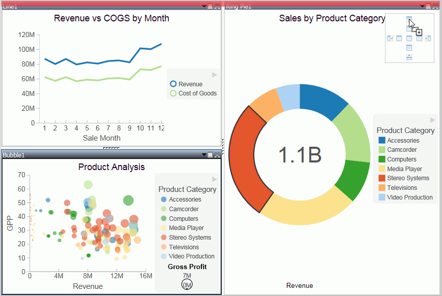
The following image shows a sample visualization. This visualization includes a map, a matrix grid, and a stacked area chart.
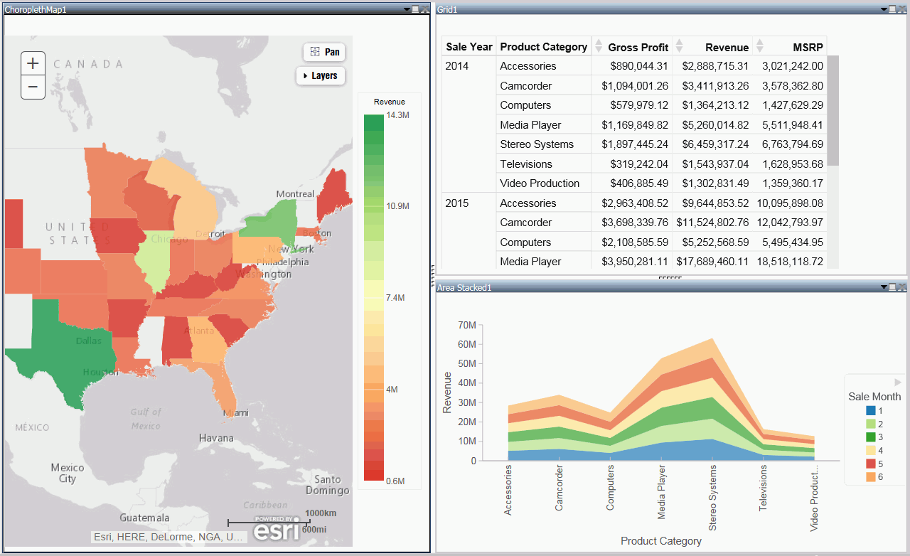
This section summarizes the tasks that are available to you when working with visuals. It provides centralized instructional information on performing each task and offers links to the most common topics when working with visuals.
|
Task |
How To |
|---|---|
|
Change visual |
On the Home tab, in the Visual group, click Change. Note: The Change icon updates depending on the chart, map, or grid that you select from the Select a Visual menu. By default, the Change icon displays a stacked bar chart. Select a chart, map, or grid from the Select a Visual menu. |
|
Insert new visual |
On the Home tab, in the Visual group, click Insert. Use the default stacked bar chart or click Change to select a different chart, map, or grid from the Select a Visual menu. Note: You can also add additional charts, maps, or grids to a visualization by dragging a data field onto the canvas and placing it using the handles that are available. |
|
Rearrange visuals |
Drag a visual on top of another visual to activate a shaded area that contains handles, which can be used to indicate placement. |
|
Copying a visual |
On the canvas, select a visual. On the Home tab, in the Clipboard group, click Copy. Note: You can also press CTRL+C to copy a selected visual. |
|
Pasting a visual |
Copy a visual. On the Home tab, in the Clipboard group, click Paste. Note: You can also press CTRL+V to paste a copied visual on the canvas. |
|
Duplicating a visual |
On the canvas, select a visual. On the Home tab in the Clipboard group, click Duplicate. A duplicate visual is created and a sequential number is assigned based on the type of visual. |
|
Delete visual |
Select a visual. On the Home tab, in the Clipboard group, click Cut. You can click the Close button in the upper-right corner of the current visual. From the Query pane, right-click a visual and click Delete. You can also press the Delete key when a visual is selected. |
|
Apply Filter |
Drag a dimension field or measure field into the Filter pane to access the filter options that are available. To add filter options for a field that is already in the Query pane, select the field and on the Field tab, in the Filter group, click Filter. |
|
Add visuals to the storyboard |
Create a visual. On the Home tab, in the Storyboard group, click Add. |
Procedure: How to Insert a New Visual
- On the Home tab, in the Visual group, click the down arrow next to Insert.
- On the menu, click one of the following options:
- Chart. Inserts a stacked bar chart visual.
- Grid. Inserts a grid visual.
- Text. Inserts a blank text cell.
- Populate your visual with data or add text to the text
cell.
Note:
- By default, when you click Insert, a stacked bar chart visual is inserted.
- You can also drag a data field from the Data pane to the canvas to insert a new visual. This inserts the default visual, a stacked bar chart. You can use the placement handles to position your new visual on the canvas, for example, above an existing visual or to the side of an existing visual.
Procedure: How to Add Text to Your Visualization
- On the Home Tab, in the Visual group, click the down arrow on next to Insert.
- On the menu, click Text.
A text cell opens on the canvas.
- Add text to your visualization.
Note: You can resize the text cell and use the text formatting options to customize the display of any text that you add, as shown in the following image.
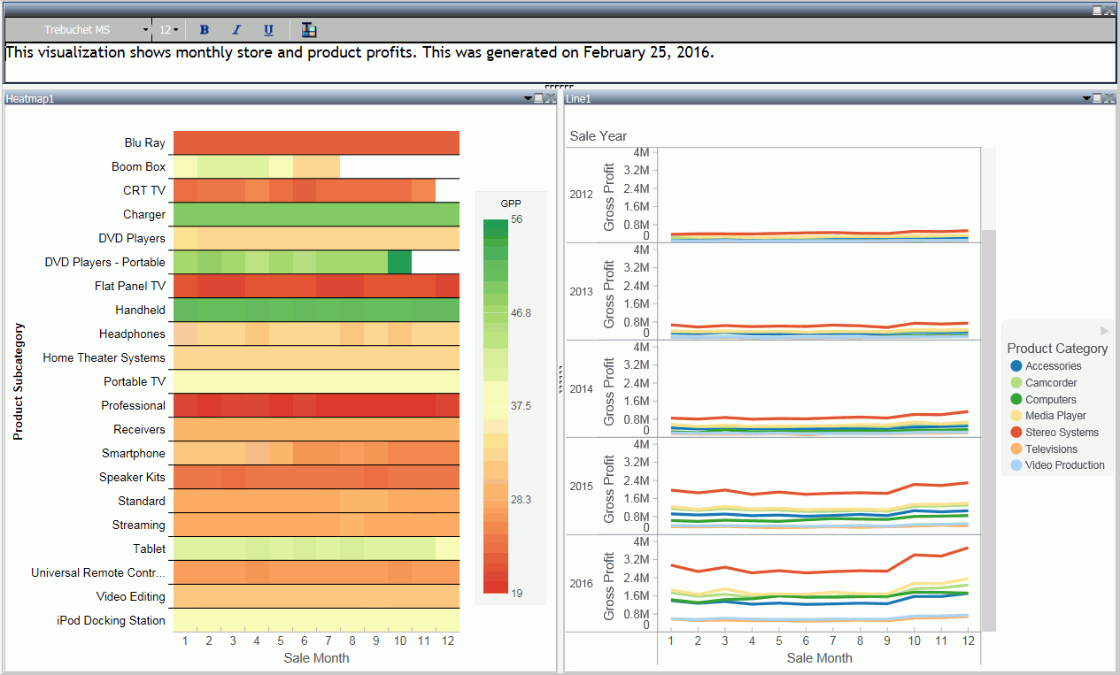
You can also position the text cell in your visualization by dragging the text cell on top of a visual. Use the placement handles to indicate placement of the text cell.
Procedure: How to Create a Visualization
- Begin with the default canvas, which consists of a stacked bar chart template.
- Insert a new visual in one of the following ways:
- Drag a data field from the Data pane onto
the canvas. Handles display, which allow you to select the location
for the new visual, for example, top (above) or left of the current
visual, as shown in the following image.
- On the Home tab, in the Visual group,
click Insert.
Note: You can optionally click the down arrow on the Insert button to specify the addition of a chart, grid, or text.
- Drag a data field from the Data pane onto
the canvas. Handles display, which allow you to select the location
for the new visual, for example, top (above) or left of the current
visual, as shown in the following image.
- Add another visual.
Now, three visual cells display side-by-side.
- Click a visual to select it.
Note: You can click a visual to activate it, or double-click on the visual number or name in the Query pane.
- Reorganize your visuals using the handles.
- Once you have organized the placement of your visuals,
select one and specify the visual type.
- On the Home tab,
in the Visual group, click Change.
Note: The Change icon updates depending on the chart, map, or grid that you select from the Select a Visual menu. By default, the Change icon displays a stacked bar chart.
- In the Select a Visual menu, click the type of visual you want to use. For example, Line, Area, or Map.
- Repeat these steps for all three visuals on your canvas.
- On the Home tab,
in the Visual group, click Change.
- Populate each visual with your data.
You can change the type of visual that you previously selected at any time. You can also resize or reorganize the position of each visual as you add data.
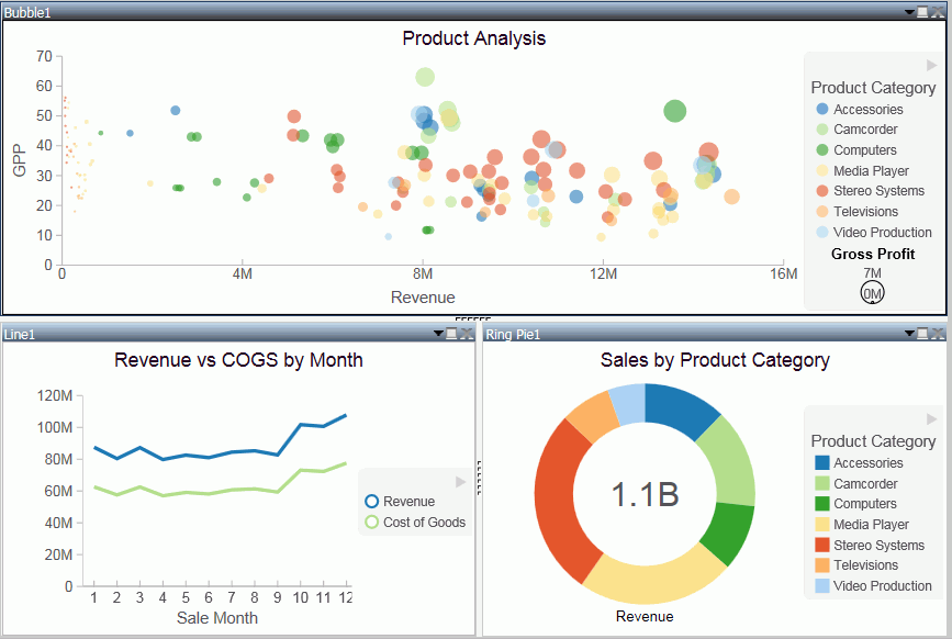
For example, move the lower-left visual to the top of the visualization.
The bubble chart now runs across the top of the visualization.
- Click Save to save your visualization.
Minimizing or Maximizing a Visual
|
How to: |
When working on a visualization with more than one chart, map, or grid, you can maximize and minimize individual visuals. This allows you to focus on one visual at a time, and then minimize it to view it alongside the other visuals.
The maximize and minimize icons are located in the top-right corner of each visual, next to the Close button. When you click the Maximize icon, the current visual moves to the foreground and is the only visual that displays on the canvas. You can work on this visual, and then minimize it to view the other visuals.
Note: You can view other visuals in the maximized mode by selecting a different visual in the Query pane.
Procedure: How to Minimize or Maximize a Visual
- Create a visualization with two or more visuals.
- Perform the following actions to minimize or maximize
your visual:
- Click the maximize icon or double-click on the Title bar to maximize your visual.
- Click the minimize icon or double-click on the Title bar to minimize your visual.
You can maximize one visual at a time, and you can switch between visuals in this mode by double-clicking a different visual in the Query pane.
Procedure: How to Delete a Visual
- In your visualization, select the chart, map, or grid that you want to delete.
- Perform one of the following tasks to delete the visual:
- Press the Delete key.
- On the Home tab, in the Clipboard group, click Cut.
- Click the Close button in the upper-right corner of the current visual.
- From the Query pane, right-click on a visual, and click Delete.
Note: You can use the Undo and Redo options on the Quick Access Toolbar to reverse or redo any prior actions.
Renaming a Visual
|
How to: |
You can rename a visual on the canvas or within your visualization. You may want to do this for presentation and organizational purposes, as each visual has a default label (for example, Bar 1, Bar 2, and Bar 3). You can change these labels by renaming the visual in the Query pane.
Once new labels are in place, it is easier to recognize which visual you want to select at any given time.
Using the shortcut menu for a visual in the Query pane, you can also rename your visual.
Procedure: How to Rename a Visual
- Create a visualization with one or more chart, map, or grid.
- In the Query pane, right-click the visual number for which you want to modify the title.
- Click Rename.
- In the Edit Title dialog box, enter a new name for the visual.
- Click OK.The visual is renamed in the Query pane and the new title is reflected at the top of the selected visual.
Using Paper-Clipping to Group Values in a Visual
|
How to: |
Paper-clipping gives you the advantage of lassoing values in a visual to create logical groups within your selected dimension. Paper-clipping uses the core functionality of dynamic grouping, giving you access to grouping capabilities that meet your business needs. You can also add additional groupings or fields to an existing group, and rename the groups and values, giving you control over how the information displays.
When you paper-clip values together, a new group is created using the naming convention of dimensiongroup_1. You can add values to this group by lassoing this grouped component, along with any additional components you want to add. These new values become part of that existing group.
Note: If you group two values and then add another value to that grouping, you must manually rename the group in order to update its display.
If you lasso other values in your visualization, and you do not capture or include a previously defined grouping, a new grouping is created for the selected fields in the current dimension. It is labeled using the original dimension label (dimensiongroup_1), but a new, unique grouping is created for these values. You can see the groupings by right-clicking the group in the Query pane and selecting Edit Group. If you want to add new values to an existing group, you must lasso the existing group, in addition to the fields that you want to add to it, in order to combine the additional fields into the existing grouping.
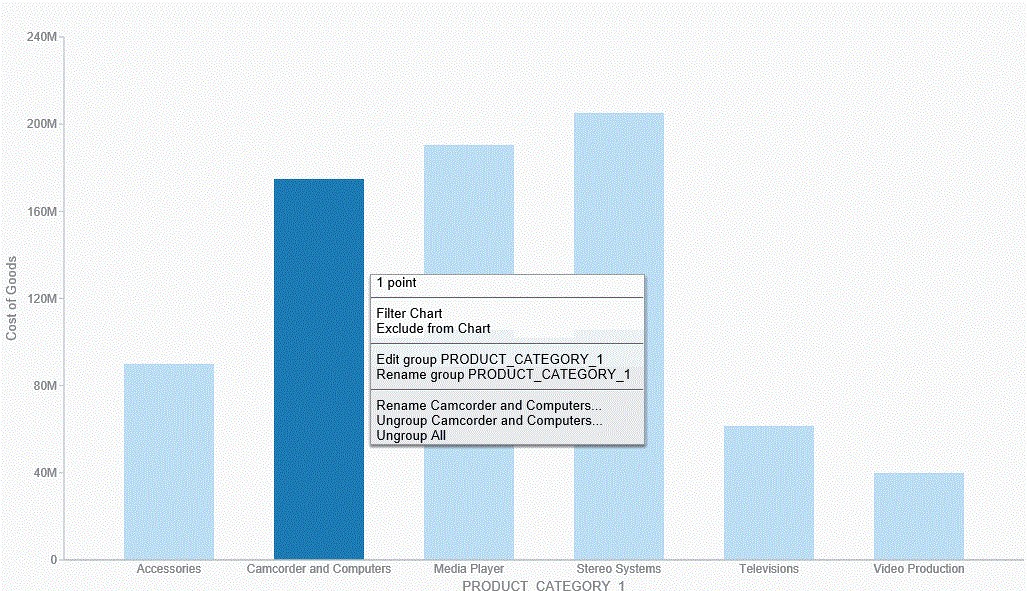
To enable paper-clipping, lasso the values that you want to group, release the mouse, and from the menu that displays, select Group n Selection, where n is the dimension associated with the values you select. This menu is shown in the following image.
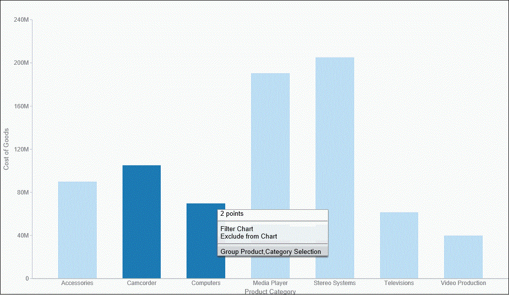
Note: Paper-clipping allows you to group on the first BY field only. In the example above, the first BY field is Product Category. If you are working with a matrix chart and you apply this rule, you are only able to group on the first BY field. In addition, you cannot group on a numeric field (for example, Sales_Year). In this case, if the numeric field was the first BY field, grouping is not available.
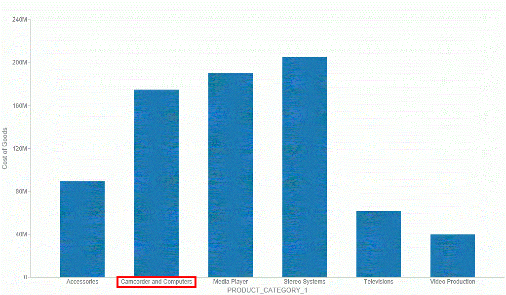
Once you group the values, they display in a unique group on the relevant axis. The group label is based on the original values stored for those components. For example, in the previous image, we grouped Camcorder and Computers in the PRODUCT_CATEGORY_1 group, as shown in the following image.
- Edit group. Opens the Edit Group dialog box, where you can edit the values in the current group. For example, you can add additional values into the current group or delete them. For more information on editing an existing group, see Dynamic Grouping.
- Rename group. Enables you to rename the group using the Rename Group dialog box. The revised name displays along the relevant axis and replaces the existing field name in the Query pane.
- Rename x. Enables you to rename the group name (x) that is assigned based on your grouping. This is particularly useful in cases where space is an issue in your visualization. This revised value also replaces the original group name in the Edit Group dialog box.
- Ungroup x. Ungroups the values of the group (x) that were previously grouped.
- Ungroup All. Ungroups all existing groups, returning the visualization to its original state.
Note: Upon ungrouping all groups, the original dimension displays as a group in the Query pane, by default. However, no grouping is applied.
These options are shown in the following image.
Note: You can also edit an existing group by right-clicking the group in the Query pane and selecting Edit Group.
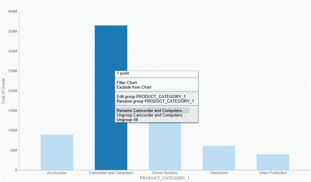
If you want to add another value to an existing group, lasso the existing group and the new value. From the menu, click Merge with x, where x is the value of the existing group, as shown in the following image.
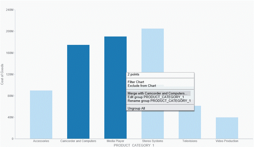
The new value is added to the existing group. You can then rename the group so that its label contains all values in the group. You can optionally label it with a new, unique name. This option is shown in the following image.
Note: You can also use the Edit Group dialog box to rename groups or groupings. For more information, see Dynamic Grouping.
You can use the following procedures to create and manage your paper-clipped values.
Procedure: How to Paper-Clip Two or More Values Together
- In visualization mode, create a bar chart with one measure and one dimension. The bar chart displays.
- Lasso two or more columns in the visualization.
- From the menu that displays, click Group n Selection, where n is the name of the dimension in your bar chart.The two values are paper-clipped together, or grouped, as indicated on the x-axis.
Note: If you have swapped the orientation of your visualization, the paper-clipped values display on the y-axis.
Procedure: How to Merge an Additional Value into an Existing Group
- In visualization mode, create a bar chart with one measure and one dimension. The bar chart displays.
- Lasso two or more columns in the visualization.
- From the menu that displays, click Group n Selection, where n is the name of the dimension in your bar chart.The two values are paper-clipped together, or grouped, as indicated on the x-axis.
Note: If you have swapped the orientation of your visualization, the paper-clipped values will display on the y-axis.
- Lasso this existing group, as well another column, to merge this additional value into the group.
- From the menu that displays, click Merge with x, where x is the name of the group you originally created.This value is merged into the existing group.
Note: The name of the group is not dynamically updated. In order to reflect the contents of the revised group, you must edit the group using the right-click menu option or the Edit Group option that is available in the Query pane.
Procedure: How to Rename an Existing Group
- In visualization mode, create a bar chart with one measure and one dimension. The bar chart displays.
- Lasso two or more columns in the visualization.
- From the menu that displays, click Group n Selection, where n is the name of the dimension in your bar chart.The two values are paper-clipped together, or grouped, as indicated on the relevant axis.
- Lasso the grouped column and from the menu that displays, click Rename x, where x is the existing label of the group.
- In the Rename Value dialog box, enter the new name for the group.
- Click OK.The group is renamed, as shown on the relevant axis.
Note: Optionally, you can rename a group using the Edit Group dialog box. This is available when you right-click on a grouped value in the Query pane and click Edit Group. For more information, see Dynamic Grouping.
Using Multi Drill in Visualization Mode
Similar to the functionality that is available in Chart mode, you can create multiple drill down links on a measure field in a visualization. This enables you to define custom links to other reports or websites, making it easy to link content from internal and external sources. Once defined, these links display on the shortcut menu that displays when you hover over a riser, as shown in the following image.
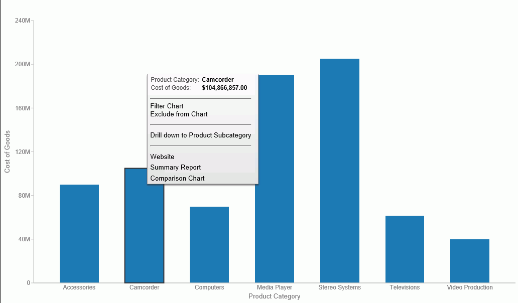
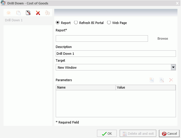
You create multiple drill downs using the Drill Down dialog box, which you can access from the Links group on the Field tab. In the Query pane, click a measure to enable the Field tab. In the Links group, click Drill Down. The Drill Down dialog box displays, as shown in the following image.
Note: When creating a drill down in Visualization mode, the Auto Link Target option is not available.
For more information and instructional guidance, see Using Multi Drill.
| WebFOCUS | |
|
Feedback |