Chart Attribute Syntax Concepts
Chart attribute syntax uses TYPE=DATA declarations in a WebFOCUS StyleSheet to assign the fields in a request to attribute categories. Some examples of attribute categories are x-axis, y-axis, size, and color.
The categories available depend on the chart type being generated and the number of sort fields and measure fields in the request. Sort fields must be assigned to categories in a specific order. This order depends on the order of sort fields in the request and on the types of categories being used. For more information about sort order and attribute categories, see Order of Attribute Category Assignments for Sort Fields.
Note: Only BY sort fields are supported with this syntax. ACROSS sort fields are not supported.
Understanding How Fields Are Assigned to Attribute Categories
|
Reference: |
When you use chart attribute syntax, the WebFOCUS StyleSheet contains declarations for each field in a request (TYPE=DATA declarations). These declarations assign fields to the appropriate attribute categories. The StyleSheet can also contain global (TYPE=REPORT) declarations that set the chart orientation and layout (for bar, line, and area charts).
For complete syntax, see Assign Data to Attribute Categories. For information on assigning chart orientation and layout, see Specifying Chart Orientation and Specifying Chart Layout for Bar, Line, and Area Charts.
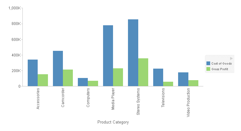
Following is a simple example of a bar chart using chart attribute syntax.
Example: Sample Bar Chart Using Chart Attribute Syntax
The following request generates a bar chart. The sort field (PRODUCT_CATEGORY) is assigned to the x-axis, and both measures (COGS_US and GROSS_PROFIT_US) are assigned to the y-axis. The chart type is BAR.
GRAPH FILE WF_RETAIL_LITE
SUM COGS_US GROSS_PROFIT_US
BY PRODUCT_CATEGORY
ON GRAPH PCHOLD FORMAT JSCHART
ON GRAPH SET LOOKGRAPH BAR
ON GRAPH SET STYLE *
INCLUDE=IBFS:/FILE/IBI_HTML_DIR/javaassist/intl/EN/combine_templates/ENWarm.sty,$
TYPE=DATA, COLUMN=COGS_US, BUCKET=y-axis, $
TYPE=DATA, COLUMN=GROSS_PROFIT_US, BUCKET=y-axis, $
TYPE=DATA, COLUMN=PRODUCT_CATEGORY, BUCKET=x-axis, $
ENDSTYLE
END
The output is shown in the following image:
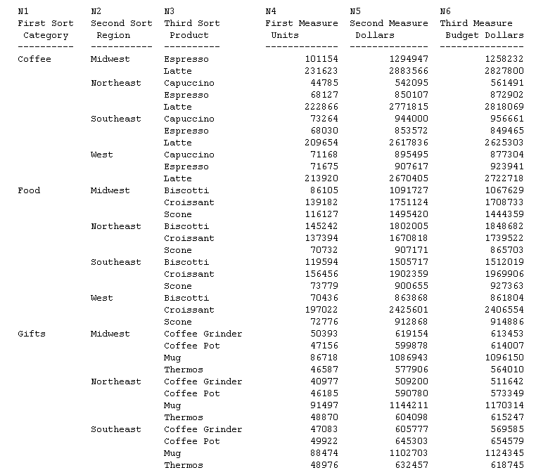
Reference: Understanding Column Sequence Numbers
Every WebFOCUS request generates an output data record in which each column is associated with a sequence number. Some fields in a request generate multiple output columns, and some are not displayed on the output. These extra columns will be ignored in this discussion.
You can use these sequence numbers to refer to fields in a WebFOCUS StyleSheet. Sort fields, starting with the highest level sort come first, then measure fields. The fields are referred to as N1, N2, N3, and so on in the StyleSheet.
Note: If you use one of the WebFOCUS tools to generate your charts, it will assign fields to categories using column sequence numbers, not field names.
For more information about WebFOCUS StyleSheet syntax and column sequence numbers, see the Creating Reports With WebFOCUS Language manual.
To see how columns are sequenced, consider the following simple request that has three sort fields and three measures:
TABLE FILE GGSALES
HEADING
"N1           N2           N3                N4             N5              N6"
SUM UNITS AS 'First Measure, Units'
DOLLARS AS 'Second Measure, Dollars'
BUDDOLLARS AS 'Third Measure, Budget Dollars'
BY CATEGORY AS 'First Sort, Category'
BY REGION AS 'Second Sort, Region'
BY PRODUCT AS 'Third Sort, Product'
ON TABLE SET PAGE NOPAGE
ON TABLE PCHOLD FORMAT WP
END
The partial output shown in the following image illustrates the arrangement of fields on the output and the sequence number assigned to each. The first (high-order) sort field is column 1, the second sort field is 2, and so on. After all sort fields are displayed, the measure fields are displayed in their order in the request:
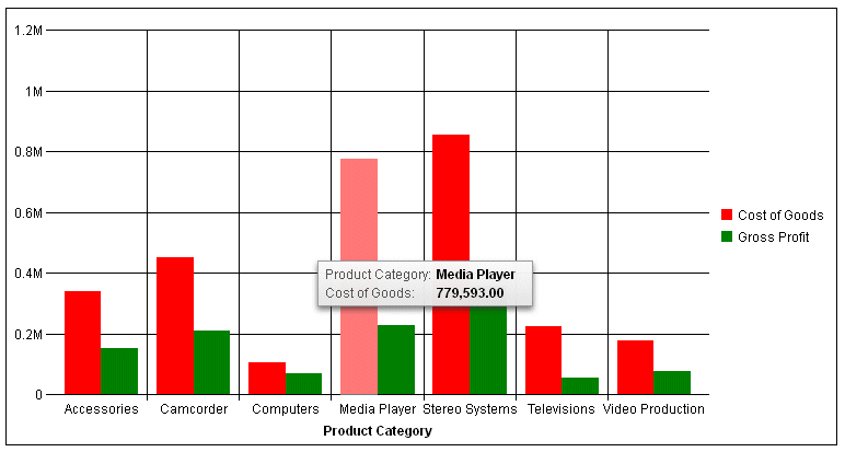
Example: Sample Bar Chart Using Column Sequence Numbers
The following request generates the same bar chart as the previous example, but using column sequence numbers. The sort field (PRODUCT_CATEGORY, field N1) is assigned to the x-axis, and each measure field is assigned to the y-axis. The chart type is BAR:
GRAPH FILE WF_RETAIL_LITE
SUM COGS_US GROSS_PROFIT_US
BY PRODUCT_CATEGORY
ON GRAPH PCHOLD FORMAT JSCHART
ON GRAPH SET LOOKGRAPH BAR
ON GRAPH SET STYLE *
INCLUDE=IBFS:/FILE/IBI_HTML_DIR/javaassist/intl/EN/combine_templates/ENWarm.sty,$
TYPE=DATA, COLUMN=N2, BUCKET=y-axis, $
TYPE=DATA, COLUMN=N3, BUCKET=y-axis, $
TYPE=DATA, COLUMN=N1, BUCKET=x-axis, $
ENDSTYLE
END
The output is shown in the following image:
Overriding Server-Generated Properties
When you use chart attribute syntax in a request, the WebFOCUS Reporting Server generates some of the text that displays on the output. For example, the server generates row labels, column labels, axis labels, and tooltips. The server generates these labels after the chart engine has finished rendering the chart.
You can change the default row, column, and axis labels in the request using an AS phrase (for example SUM COGS_US AS ‘Cost’). This causes the server to use your custom labels instead of its default labels.
You can also override server-generated properties by placing the affected properties in a *GRAPH_JS_FINAL block in the WebFOCUS StyleSheet. For certain components, such as tooltips, the only way to override default server properties is to add a *GRAPH_JS_FINAL block in the WebFOCUS StyleSheet. This tells the chart engine that the properties in that block should be rendered after server processing has been completed.
The WebFOCUS StyleSheet can have multiple *GRAPH_JS and *GRAPH_JS_FINAL blocks. The *GRAPH_JS blocks will be processed in their order in the StyleSheet, prior to server processing. The *GRAPH_JS_FINAL blocks will be processed in their order in the StyleSheet, after server processing is complete.
Example: Generating Custom Tooltips With Chart Attribute Syntax
The following request generates a bar chart and contains a customized tooltip:
GRAPH FILE WF_RETAIL_LITE
SUM COGS_US GROSS_PROFIT_US
BY PRODUCT_CATEGORY
ON GRAPH PCHOLD FORMAT JSCHART
ON GRAPH SET LOOKGRAPH BAR
ON GRAPH SET STYLE *
TYPE=DATA, COLUMN=COGS_US , BUCKET=y-axis, $
TYPE=DATA, COLUMN=GROSS_PROFIT_US, BUCKET=y-axis, $
TYPE=DATA, COLUMN=PRODUCT_CATEGORY, BUCKET=x-axis, $
*GRAPH_JS
"series": [
	{"series": "reset", "tooltip": "This is my custom tooltip"}
]
*END
ENDSTYLE
END
The custom tooltip text is overridden by server-generated properties as shown in the following image:
The following is the same request with a *GRAPH_JS_FINAL block instead of a *GRAPH_JS block in the WebFOCUS StyleSheet:
GRAPH FILE WF_RETAIL_LITE
SUM COGS_US GROSS_PROFIT_US
BY PRODUCT_CATEGORY
ON GRAPH PCHOLD FORMAT JSCHART
ON GRAPH SET LOOKGRAPH BAR
ON GRAPH SET STYLE *
TYPE=DATA, COLUMN=COGS_US , BUCKET=y-axis, $
TYPE=DATA, COLUMN=GROSS_PROFIT_US, BUCKET=y-axis, $
TYPE=DATA, COLUMN=PRODUCT_CATEGORY, BUCKET=x-axis, $
*GRAPH_JS_FINAL
"series": [
	{"series": "reset", "tooltip": "This is my custom tooltip"}
]
*END
ENDSTYLE
END
The custom tooltip displays, as shown in the following image:

You can use the chart template engine to customize tooltips with macros, as described in Introduction to JSON Properties for HTML5 Charts.
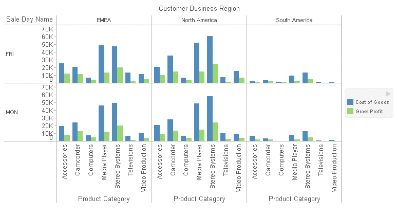
Displaying Multiple Charts in a Matrix Array
In addition to assigning fields in the request to specific chart components, you can create multiple charts by assigning fields to the row and column categories in order to generate a matrix of charts.
You can assign multiple fields to the row and column attribute categories, and you can specify only rows or only columns, to create finely tuned groups of charts.
Example: Creating A Matrix of Bar Charts
The following request generates a new bar chart for each combination of business region and day name:
GRAPH FILE WF_RETAIL_LITE
SUM COGS_US GROSS_PROFIT_US
BY TIME_DAYNAME
BY BUSINESS_REGION
BY PRODUCT_CATEGORY
WHERE TIME_DAYNAME EQ 'FRI' OR 'MON'
WHERE BUSINESS_REGION NE 'Oceania'
ON GRAPH PCHOLD FORMAT JSCHART
ON GRAPH SET LOOKGRAPH BAR
ON GRAPH SET STYLE *
INCLUDE=IBFS:/FILE/IBI_HTML_DIR/javaassist/intl/EN/combine_templates/ENWarm.sty,$
TYPE=DATA, COLUMN=TIME_DAYNAME, BUCKET=row, $
TYPE=DATA, COLUMN=BUSINESS_REGION, BUCKET=column, $
TYPE=DATA, COLUMN=COGS_US, BUCKET=y-axis, $
TYPE=DATA, COLUMN=GROSS_PROFIT_US, BUCKET=y-axis, $
TYPE=DATA, COLUMN=PRODUCT_CATEGORY, BUCKET=x-axis, $
ENDSTYLE
END
The output is shown in the following image:
Matrix Marker Charts
Although all matrix charts require the use of chart attribute syntax, one type of chart, called a matrix marker chart, was developed specifically to use with the matrix capabilities of this syntax.
A matrix marker chart is a graphical representation of tabular data. It displays a marker in each cell of the matrix. This marker can be sized by one measure and colored by a second measure. The LOOKGRAPH value is MARKER.
Example: Creating a Matrix Marker Chart Using Chart Attribute Syntax
The following request generates a matrix marker chart. The rows represent product categories. The columns represent business regions. The marker in each cell is sized by the gross profit measure and colored by the cost of goods measure. When the field assigned to the color category is a measure, the legend is visualized as a gradient:
GRAPH FILE WF_RETAIL_LITE
SUM COGS_US
GROSS_PROFIT_US
BY PRODUCT_CATEGORY
BY BUSINESS_REGION
WHERE BUSINESS_REGION NE 'Oceania'
WHERE PRODUCT_CATEGORY LE 'D'
ON GRAPH PCHOLD FORMAT JSCHART
ON GRAPH SET LOOKGRAPH MARKER
ON GRAPH SET STYLE *
TYPE=DATA, COLUMN=COGS_US, BUCKET=color, $
TYPE=DATA, COLUMN=PRODUCT_CATEGORY, BUCKET=row, $
TYPE=DATA, COLUMN=BUSINESS_REGION, BUCKET=column, $
TYPE=DATA, COLUMN=GROSS_PROFIT_US, BUCKET=size, $
ENDSTYLE
END
The output is shown in the following image:

Generating Data Grids
A data grid is a tabular representation of data, similar to a tabular report. The grid can have multiple rows, columns, and measures. Unlike the tabular reports generated with the WebFOCUS TABLE FILE command, data grids are generated in a GRAPH FILE request using PCHOLD FORMAT JSCHART. The LOOKGRAPH value is DATAGRID.
Using the data grid properties, you can format the grid and display column totals for measures in the grid. The rows and columns in a data grid are numbered starting with zero (0). For information about properties you can use to format data grids, see Chart-Specific Properties.
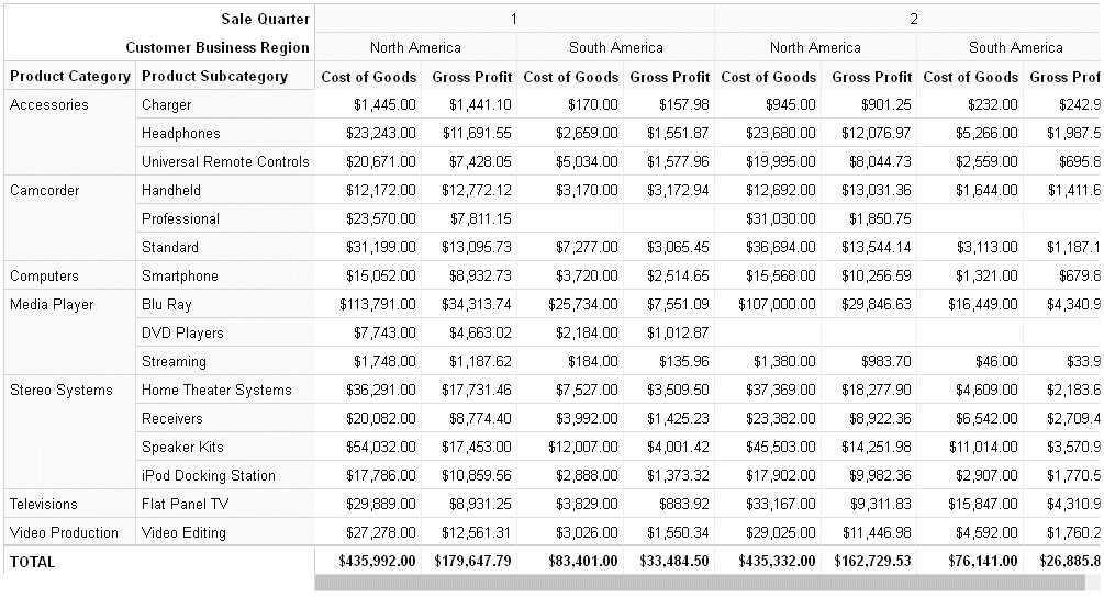
Example: Generating a Data Grid
The following request generates a data grid with column totals. The rows represent product categories and product sub-categories. The columns represent the first two quarters of the year and the North America and South America business regions. The measures are cost of goods and gross profit.
GRAPH FILE WF_RETAIL_LITE
SUM COGS_US GROSS_PROFIT_US
BY PRODUCT_CATEGORY
BY PRODUCT_SUBCATEG
BY TIME_QTR
BY BUSINESS_REGION
WHERE (BUSINESS_REGION NE 'Oceania' OR 'EMEA') AND (TIME_QTR EQ 1 OR 2)
ON GRAPH PCHOLD FORMAT JSCHART
ON GRAPH SET LOOKGRAPH DATAGRID
ON GRAPH SET AUTOFIT ON
ON GRAPH SET STYLE *
type=data, column=product_category, bucket=row, $
type=data, column=product_subcateg, bucket=row, $
type=data, column=time_qtr, bucket=column, $
type=data, column=business_region, bucket=column, $
type=data, column=cogs_us, bucket=measure, $
type=data, column=gross_profit_us, bucket=measure, $
*GRAPH_JS
"dataGridProperties": {
	"columnTotals": {"visible": true}}
*END
ENDSTYLE
END
The output is shown in the following image.
Adding Levels of Detail to a Bubble or Scatter Chart
For bubble and scatter charts, you can add additional low-level sort fields to the request and assign these fields to the detail category. The effect of these additional sort fields is to add more data points to the chart.
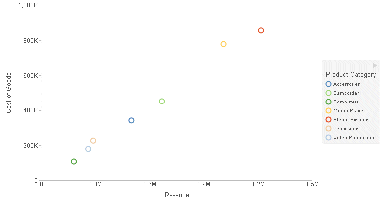
Example: Adding a Detail Category to a Scatter Chart
The following request generates a scatter chart showing cost of goods compared to revenue. The markers are colored by the product category:
GRAPH FILE WF_RETAIL_LITE
SUM COGS_US
REVENUE_US
BY PRODUCT_CATEGORY
ON GRAPH PCHOLD FORMAT JSCHART
ON GRAPH SET LOOKGRAPH SCATTER
ON GRAPH SET STYLE *
INCLUDE=IBFS:/FILE/IBI_HTML_DIR/javaassist/intl/EN/combine_templates/ENWarm.sty,$
TYPE=DATA, COLUMN=COGS_US, BUCKET=y-axis, $
TYPE=DATA, COLUMN=REVENUE_US, BUCKET=x-axis, $
TYPE=DATA, COLUMN=PRODUCT_CATEGORY, BUCKET=color, $
ENDSTYLE
END
The output is shown in the following image:
Adding the business region field as a low-level sort field and assigning it to the detail category adds an additional level of detail to the chart:
GRAPH FILE WF_RETAIL_LITE
SUM COGS_US
REVENUE_US
BY PRODUCT_CATEGORY
  BY BUSINESS_REGION
ON GRAPH PCHOLD FORMAT JSCHART
ON GRAPH SET LOOKGRAPH SCATTER
ON GRAPH SET STYLE *
INCLUDE=IBFS:/FILE/IBI_HTML_DIR/javaassist/intl/EN/combine_templates/ENWarm.sty,$
TYPE=DATA, COLUMN=COGS_US, BUCKET=y-axis, $
TYPE=DATA, COLUMN=REVENUE_US, BUCKET=x-axis, $
TYPE=DATA, COLUMN=PRODUCT_CATEGORY, BUCKET=color, $
TYPE=DATA, COLUMN=BUSINESS_REGION, BUCKET=detail, $
ENDSTYLE
END
The output is shown in the following image:

Adding Color-By and Size-By Fields
For some types of charts, such as bubble charts, a size category is inherent in the chart type. The bubble size varies with the value of the measure assigned to the size category.
Some chart types have no inherent size category. For example, the height of a bar in a bar chart shows the size of the measure it represents. The measures that represent bar heights are assigned to the y-axis category.
However, with chart attribute syntax, you can add an additional measure and assign it to the size category. This size will be reflected in the width of the bars.
In addition, bars are normally assigned a color based on the series they represent. With chart attribute syntax, you can add an additional field, assign it to the color category, and have the bars colored by the value of the that additional field. If a color-by field is a measure, the bar and legend colors will be visualized as a gradient. If a color-by field is a dimension, the bar and legend colors will be visualized as discrete colors.
Line charts can also have size and color categories when using chart attribute syntax. If the markers are visible, their size is varied to represent the size measure value. If the markers are not visible, the line width is varied to represent the size measure value. The color-by field can be a measure or dimension field. The color is reflected in the markers, lines, and legend. If a color-by field is a measure, the colors are visualized as a gradient. If it is a dimension, the colors are visualized as discrete colors.
Pie charts displayed in a matrix array can also be sized by a measure added to the request and assigned to the size category. The size of the pie chart in each cell of the matrix will represent the value of this additional measure.
For information about each supported chart type, see Chart Types for Chart Attribute Syntax. For a table listing the attribute categories supported for each type of chart, see Summary of Supported Attribute Categories for Each Chart Type.
Example: Using a Size-By Measure in a Bar Chart
The following request generates a bar chart. The bar heights represent the COGS_US and GROSS_PROFIT_US measures, and the bar widths represent the MSRP_US measure.
GRAPH FILE WF_RETAIL_LITE
SUM COGS_US
GROSS_PROFIT_US  MSRP_US
BY PRODUCT_CATEGORY
ON GRAPH PCHOLD FORMAT JSCHART
ON GRAPH SET LOOKGRAPH BAR
ON GRAPH SET STYLE *
INCLUDE=IBFS:/FILE/IBI_HTML_DIR/javaassist/intl/EN/combine_templates/ENWarm.sty,$
TYPE=DATA, COLUMN=PRODUCT_CATEGORY, BUCKET=x-axis, $
TYPE=DATA, COLUMN=COGS_US, BUCKET=y-axis, $
TYPE=DATA, COLUMN=GROSS_PROFIT_US, BUCKET=y-axis, $
TYPE=DATA, COLUMN=MSRP_US, BUCKET=size, $
ENDSTYLE
END
The output is shown in the following image:

Example: Using Color-By and Size-By Measures in a Line Chart
The following request generates a line chart. The lines and markers are colored by the MSRP_US measure. The markers for series 1 are sized by the SIZE1 virtual measure. For series 0, the markers are not visible, so the line width represents the SIZE1 virtual measure:
DEFINE FILE WF_RETAIL_LITE
SIZE1 WITH WF_RETAIL_SALES.COGS_US =
	IF WF_RETAIL_TIME_SALES.TIME_YEARQTR LT 200902 THEN 5
	ELSE IF WF_RETAIL_TIME_SALES.TIME_YEARQTR LT 200903 THEN 50
	ELSE 200;
END
GRAPH FILE WF_RETAIL_LITE
SUM COGS_US GROSS_PROFIT_US MSRP_US SIZE1
BY WF_RETAIL_TIME_SALES.TIME_YEARQTR
ON GRAPH PCHOLD FORMAT JSCHART
ON GRAPH SET LOOKGRAPH LINE
ON GRAPH SET STYLE *
INCLUDE=IBFS:/FILE/IBI_HTML_DIR/javaassist/intl/EN/combine_templates/ENWarm.sty,$
TYPE=DATA, COLUMN=WF_RETAIL_TIME_SALES.TIME_YEARQTR, BUCKET=x-axis, $
TYPE=DATA, COLUMN=COGS_US, BUCKET=y-axis, $
TYPE=DATA, COLUMN=GROSS_PROFIT_US, BUCKET=y-axis, $
TYPE=DATA, COLUMN=MSRP_US, BUCKET=color, $
TYPE=DATA, COLUMN=SIZE1, BUCKET=size, $
*GRAPH_JS
"series": [
	{"series": 0, "marker": {"visible": false}},
	{"series": 1, "marker": {"visible": true, "shape": "circle"}}]
*END
ENDSTYLE
END
The output is shown in the following image:

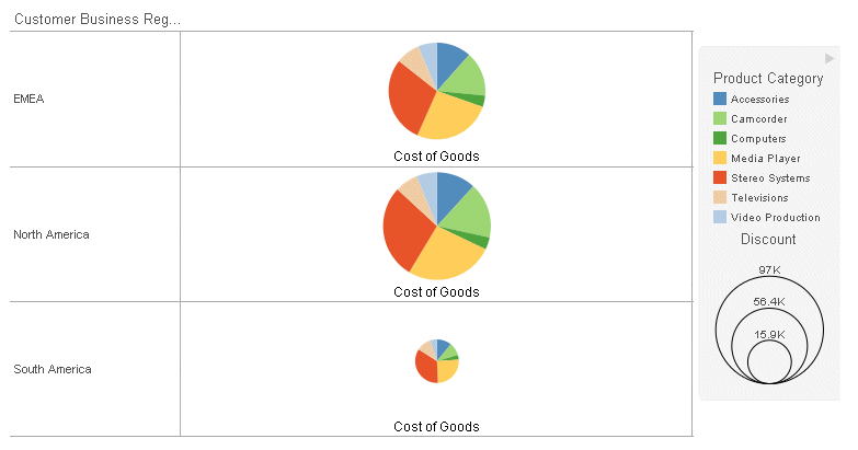
Example: Sizing Pie Charts in a Matrix
The following request generates pie charts in a matrix whose rows represent business regions. The pie chart in each row is sized by the DISCOUNT_US measure.
GRAPH FILE WF_RETAIL_LITE
SUM COGS_US DISCOUNT_US
BY BUSINESS_REGION
BY PRODUCT_CATEGORY
WHERE BUSINESS_REGION NE 'Oceania'
ON GRAPH PCHOLD FORMAT JSCHART
ON GRAPH SET LOOKGRAPH PIE
ON GRAPH SET STYLE *
INCLUDE=IBFS:/FILE/IBI_HTML_DIR/javaassist/intl/EN/combine_templates/ENWarm.sty,$
TYPE=DATA, COLUMN=BUSINESS_REGION, BUCKET=row, $
TYPE=DATA, COLUMN=PRODUCT_CATEGORY, BUCKET=color, $
TYPE=DATA, COLUMN=COGS_US, BUCKET=measure, $
TYPE=DATA, COLUMN=DISCOUNT_US, BUCKET=size, $
ENDSTYLE
END
The output is shown in the following image:
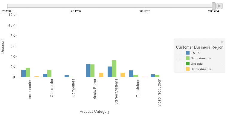
Animating Time Progression Using a Slider Control
A slider control on a chart creates an animation effect as the control moves along the slider bar. You can drag the control along the slider bar or click the slider play button to make the slider automatically move from value to value. A slider is limited to one sort field only and should preferably be something time or sequence related such as YEAR.
You can control the speed at which the slider moves when the play button is clicked. For information, see Special Topics.
Example: Adding a Slider Control to a Chart
The following request generates a bar chart with one measure for each product category. There is a slider control assigned to the TIME_YEARQTR field and a color-by field assigned to the BUSINESS_REGION dimension. These fields have been added to the request as the highest level sort fields. A new bar chart will be generated for each quarter as the slider moves from one quarter to the next:
GRAPH FILE WF_RETAIL_LITE
SUM DISCOUNT_US
BY WF_RETAIL_TIME_SALES.TIME_YEARQTR
BY BUSINESS_REGION
BY PRODUCT_CATEGORY
ON GRAPH PCHOLD FORMAT JSCHART
ON GRAPH SET LOOKGRAPH BAR
ON GRAPH SET STYLE *
INCLUDE=IBFS:/FILE/IBI_HTML_DIR/javaassist/intl/EN/combine_templates/ENWarm.sty,$
TYPE=DATA, COLUMN=DISCOUNT_US , BUCKET=y-axis, $
TYPE=DATA, COLUMN=BUSINESS_REGION, BUCKET=color, $
TYPE=DATA, COLUMN=PRODUCT_CATEGORY, BUCKET=x-axis, $
TYPE=DATA, COLUMN=WF_RETAIL_TIME_SALES.TIME_YEARQTR, BUCKET=slider, $
ENDSTYLE
END
The output is shown in the following image. Initially, the slider control is positioned at the left:
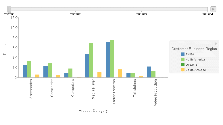
You can click the control and drag it, or you can click the right arrow to animate the progression of the slider through the sort field values from left to right.
The following image shows the control dragged to Quarter 4:
Adding Fields to the Tooltip
Fields that represent chart components are automatically included in the default tooltip. You can add additional fields to the tooltip using the tooltip attribute category.
Formatting of the value in the tooltip is derived from the format of the field in the metadata and request.
Items can be added to the tooltip attribute category in any order. They will be displayed in the order in which they are added to the tooltip category, below the fields that are automatically displayed.
If you place a sort field in the tooltip attribute category, the value of the sort field that is displayed in the tooltip is the value that corresponds to the riser on which the tooltip is displayed.
Note: Sort fields represent chart components that are automatically included in the tooltip, so you do not normally have to add them. This includes sort fields assigned to the page, row, and column attribute categories.
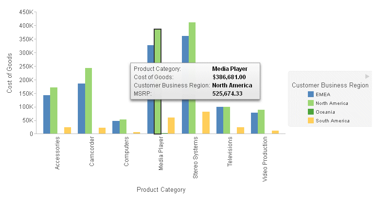
Example: Adding a Field to the Tooltip
The following bar chart shows cost of goods for each product category, colored by the business region. The manufacturer suggested retail price is added to the tooltip:
GRAPH FILE WF_RETAIL_LITE
SUM COGS_US MSRP_US
BY BUSINESS_REGION
BY PRODUCT_CATEGORY
ON GRAPH PCHOLD FORMAT JSCHART
ON GRAPH SET LOOKGRAPH BAR
ON GRAPH SET STYLE *
INCLUDE=IBFS:/FILE/IBI_HTML_DIR/javaassist/intl/EN/combine_templates/ENWarm.sty,$
TYPE=DATA, COLUMN=COGS_US, BUCKET=y-axis, $
TYPE=DATA, COLUMN=BUSINESS_REGION, BUCKET=color, $
TYPE=DATA, COLUMN=MSRP_US, BUCKET=tooltip,$
TYPE=DATA, COLUMN=PRODUCT_CATEGORY, BUCKET=x-axis, $
ENDSTYLE
END
The output is shown in the following image. The MSRP value displays in the tooltip, but is not represented by a bar on the chart:
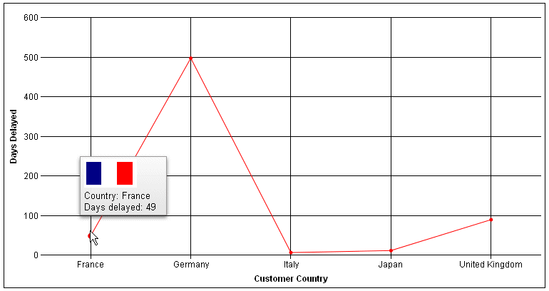
Example: Using the Chart Template Engine to Add an Image to the Tooltip
The following request adds a flag image for each country to the tooltip. If creates a DEFINE field to associate the image names with the country names in the data source. If they were the same, this step would not be needed. In the request, the DEFINE field named FLAG is added to the tooltip attribute category. This value can be inserted into the tooltip using the {{tooltip1}} macro, as it is the first field in the tooltip category. For information about the chart template engine and built-in macros, see Introduction to JSON Properties for HTML5 Charts.
An HTML img tag is added to the custom tooltip in the *GRAPH_JS_FINAL block of the WebFOCUS StyleSheet:
DEFINE FILE WF_RETAIL_LITE
FLAG/A12=
DECODE COUNTRY_NAME ( 'United Kingdom' 'uk' 'Germany' 'germany'
	'Italy' 'italy' 'France' 'france' 'Japan' 'japan' );
END
GRAPH FILE WF_RETAIL_LITE
SUM DAYSDELAYED FLAG
BY COUNTRY_NAME
WHERE COUNTRY_NAME EQ 'United Kingdom' OR 'Italy' OR 'Germany' OR 'France' OR
'Japan'
ON GRAPH PCHOLD FORMAT JSCHART
ON GRAPH SET LOOKGRAPH LINE
ON GRAPH SET STYLE *
type=data, column=country_name, bucket=x-axis, $
type=data, column=n2, bucket=y-axis, $
type=data, column=flag, bucket=tooltip, $
*GRAPH_JS_FINAL
"series": [{"series": 0,
	"tooltip": "<img src=\"http://ecl.informationbuilders.com/jschart/
		{{tooltip1}}.gif\"><br>Country: {{group_label}}<br>Days delayed: {{value}}"
	}]
END
The tooltip for France is shown in the following image:
Adding an Image With a Drilldown Link to a Heading
Chart attribute syntax supports fields with HTML in embedded headings. Embedded headings are implemented with the command ON GRAPH SET EMBEDHEADING ON.
A field with HTML can be included in an embedded heading, since for embedded headings HTML chart titles are generated.
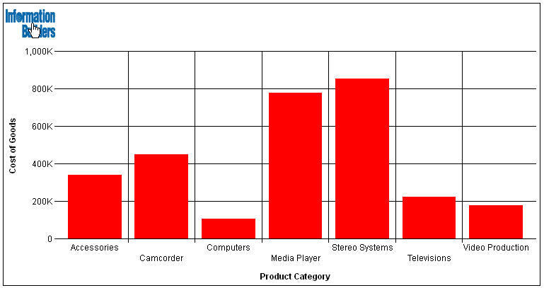
Example: Adding an Image With a Link to a Chart Title
The following request defines a field that contains an HTML image and a link from the image to the Information Builders web site. It then adds this field to the heading. The heading is embedded in the chart using the ON GRAPH SET EMBEDHEADING ON command.
Note: The page width of this document causes the HTML code to wrap onto multiple lines in the example below. In order to run the example, you must remove any line breaks within the single quotation marks.
DEFINE FILE WF_RETAIL_LITE
IMG_TAG/A300 =
'<a href="http://www.informationbuilders.com"><img src="http://ecl.informationbuilders.com/jschart/ibilogo_blue.gif" width=70 height=40></a>';
END
GRAPH FILE WF_RETAIL_LITE
HEADING
" "
"<IMG_TAG"
SUM COGS_US
BY PRODUCT_CATEGORY
ON GRAPH SET LOOKGRAPH BAR
ON GRAPH PCHOLD FORMAT JSCHART
ON GRAPH SET EMBEDHEADING ON
ON GRAPH SET STYLE *
type=data, column=product_category, bucket=x-axis, $
type=data, column=cogs_us, bucket=y-axis, $
END
The output is shown in the following image. The hand-shaped cursor pointing to the image indicates that the image has a link.
Binding Colors to Field Values in a Chart
|
How to: |
Color binding enables you to associate (bind) BY field values to particular colors so that the same value will appear in the same color on different charts, regardless of the sequence or filter conditions. The BY field for which color binding is specified must be assigned to the color attribute category. For example, if the BY field is COUNTRY, that field should be assigned to the color attribute category. Then you can specify that the value France of the COUNTRY field should be red in every chart on every page of a report. The legend markers will also be bound to these colors.
Syntax: How to Bind a Color to a Field Value
type=data, marker-color=color, when=field eq value, $
where:
- color
-
Specifies a color for the chart and legend marker when the condition in the WHEN phrase is satisfied. Color names, RGB color values, and hex color values are supported.
- field
-
Is the name of the BY field that is assigned to the color attribute category whose values will be bound to specific colors.
- value
-
Is the value that is bound to the color specified by the marker-color attribute.
Reference: Usage Notes for Color Binding
- Color binding is supported when only one field is assigned to the color attribute category.
- The only operator supported in the WHEN condition is EQ.
- Color binding is only supported with chart attribute syntax.
- The COLUMN attribute, which is generally required when applying conditional styling to charts, is optional for color binding, making it easier to reuse color mappings in separate procedures.
- If there are BY values for which no color is explicitly specified, their colors are whatever series color is specified by the StyleSheet (or by chart engine defaults, if there is no StyleSheet).
Example: Binding Field Values to Colors in a Bar Chart
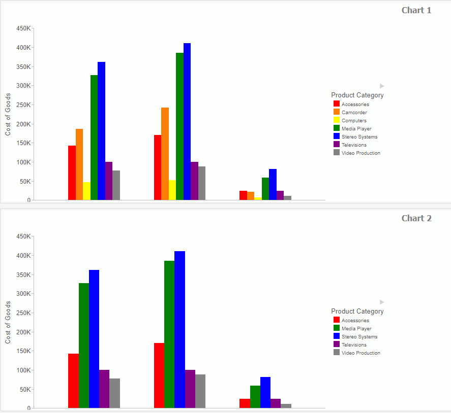
The following request binds the field values of the PRODUCT_CATEGORY field to specific colors.
GRAPH FILE WF_RETAIL_LITE
SUM COGS_US
BY PRODUCT_CATEGORY
BY BUSINESS_REGION
WHERE BUSINESS_REGION NE 'Oceania'
ON GRAPH PCHOLD FORMAT JSCHART
ON GRAPH SET LOOKGRAPH BAR
ON GRAPH SET STYLE *
INCLUDE=IBFS:/FILE/IBI_HTML_DIR/ibi_themes/Warm.sty,$
TYPE=DATA, COLUMN=BUSINESS_REGION, BUCKET=X-AXIS, $
TYPE=DATA, COLUMN=COGS_US, BUCKET=y-axis, $
TYPE=DATA, COLUMN=PRODUCT_CATEGORY, BUCKET=COLOR, $
TYPE=DATA, MARKER-COLOR=red, WHEN=PRODUCT_CATEGORY EQ 'Accessories',$
TYPE=DATA, MARKER-COLOR=orange, WHEN=PRODUCT_CATEGORY EQ 'Camcorder',$
TYPE=DATA, MARKER-COLOR=yellow, WHEN=PRODUCT_CATEGORY EQ 'Computers',$
TYPE=DATA, MARKER-COLOR=green, WHEN=PRODUCT_CATEGORY EQ 'Media Player',$
TYPE=DATA, MARKER-COLOR=blue, WHEN=PRODUCT_CATEGORY EQ 'Stereo Systems',$
TYPE=DATA, MARKER-COLOR=purple, WHEN=PRODUCT_CATEGORY EQ 'Televisions',$
TYPE=DATA, MARKER-COLOR=gray, WHEN=PRODUCT_CATEGORY EQ 'Video Production',$
ENDSTYLE
END
The following version of the request binds the field values of the PRODUCT_CATEGORY field to the same colors, but filters out the product categories that start with the letter C.
GRAPH FILE WF_RETAIL_LITE
SUM COGS_US
BY PRODUCT_CATEGORY
BY BUSINESS_REGION
WHERE PRODUCT_CATEGORY NOT LIKE 'C%'
WHERE BUSINESS_REGION NE 'Oceania'
ON GRAPH PCHOLD FORMAT JSCHART
ON GRAPH SET LOOKGRAPH BAR
ON GRAPH SET STYLE *
INCLUDE=IBFS:/FILE/IBI_HTML_DIR/ibi_themes/Warm.sty,$
TYPE=DATA, COLUMN=BUSINESS_REGION, BUCKET=X-AXIS, $
TYPE=DATA, COLUMN=COGS_US, BUCKET=y-axis, $
TYPE=DATA, COLUMN=PRODUCT_CATEGORY, BUCKET=COLOR, $
TYPE=DATA, MARKER-COLOR=red, WHEN=PRODUCT_CATEGORY EQ 'Accessories',$
TYPE=DATA, MARKER-COLOR=orange, WHEN=PRODUCT_CATEGORY EQ 'Camcorder',$
TYPE=DATA, MARKER-COLOR=yellow, WHEN=PRODUCT_CATEGORY EQ 'Computers',$
TYPE=DATA, MARKER-COLOR=green, WHEN=PRODUCT_CATEGORY EQ 'Media Player',$
TYPE=DATA, MARKER-COLOR=blue, WHEN=PRODUCT_CATEGORY EQ 'Stereo Systems',$
TYPE=DATA, MARKER-COLOR=purple, WHEN=PRODUCT_CATEGORY EQ 'Televisions',$
TYPE=DATA, MARKER-COLOR=gray, WHEN=PRODUCT_CATEGORY EQ 'Video Production',$
ENDSTYLE
END
Both charts are shown in the following image. Note that, although Media Player is represented by the fourth riser on chart 1 and the second riser on chart 2, it is green on both charts.
| WebFOCUS | |
|
Feedback |