Chart Types for Chart Attribute Syntax
|
Topics: |
Without chart attribute syntax, the chart types for vertical charts are different from those for horizontal versions of those charts. For example, VBAR is used for vertical bar charts, while HBAR is used for horizontal bar charts.
With chart attribute syntax, the chart type BAR is used for any type of bar chart, and the ORIENTATION attribute in the TYPE=REPORT declaration of the WebFOCUS StyleSheet differentiates between horizontal and vertical charts. For more information, see Specifying Chart Orientation.
Similarly, stacked bar, line, and area charts are distinguished from side-by-side charts using the CHART-SERIES-LAYOUT attribute in the TYPE=REPORT declaration of the WebFOCUS StyleSheet. For more information, see Specifying Chart Layout for Bar, Line, and Area Charts.
The available chart types (LOOKGRAPH values) are:
- AREA. Area charts are similar to line charts in that they demonstrate the movement of numeric data. In an area chart, however, the area between the data line and the zero line (or axis) is usually colored or textured.
- BAR. A bar chart plots numeric data by displaying rectangular blocks against a scale. The length of a bar corresponds to a value or amount. You can develop a clear mental image of comparisons among data series by distinguishing the relative heights of the bars.
- BOXPLOT. A boxplot shows data broken into quartiles. In a boxplot, each series and group requires five values. For a given series and group box, the first value is the minimum (lower hat), the second defines the box bottom (first quartile), the third value is the median (second quartile), the fourth value defines the box top (third quartile), and the fifth value defines the top hat (maximum value).
- BUBBLE. A bubble chart is an enhanced scatter plot in which the size of each marker is proportional to the value of a third measure.
- BUBBLEMAP. A bubblemap is a proportional symbol map chart, in which the markers are positioned on a geographic point or area and are sized depending on the value of a measure. They can be colored by a measure or dimension field.
- CHOROPLETH. A choropleth is a map chart in which polygonal areas that map to geographic locations are colored depending on a measure or dimension.
- DATAGRID. A data grid is a tabular representation of data with rows, columns, and cells.
- FUNNEL. A funnel chart is basically a pie chart that shows only one group of data at a time. The series in the group are stacked in the funnel, with the first series at the top and the last series at the bottom.
- GAUGE. Gauge charts identify a single value along an axis that is usually displayed in a circle. They are often used in dashboards to display progress or quantity.
- HEATMAP. Heatmaps contain a row or column matrix of rectangles that are displayed in different colors depending on the data values.
- LINE. Line charts are useful for emphasizing the movement or trend of numeric data over time, since they allow a viewer to trace the evolution of a particular point by working backwards or interpolating. Highs and lows, rapid or slow movement, or a tendency toward stability are all types of trends that are well suited to a line chart.
- MARKER. A matrix marker chart is a graphical representation of tabular data. It displays a marker in each cell of the matrix. This marker can be sized by one measure and colored by a second measure.
- MEKKO. A mekko (also called marimekko) chart is a percent bar chart, except that the width of each bar riser is based on the overall value of the stack. The widths are automatically sorted high-to-low.
- PIE. A pie chart emphasizes where your data fits in relation to a larger whole. Each slice represents a percentage of the whole. If the hole size is zero, a pie chart is generated. If the hole size is greater than zero, a pie ring chart is generated.
- SCATTER. Scatter charts typically show the relationship between numeric measures. Use a scatter plot to visualize the density of individual data values around particular points or to demonstrate patterns in your data. With chart attribute syntax, dimensions as well as measures are supported.
- STREAM. A streamgraph is a simplified version of a stacked area chart. In a streamgraph, the x-axis is often turned off, and there are no gridlines or frames. A streamgraph does not use data text labels.
- TAGCLOUD. A tagcloud chart is a visual representation of group labels. The size of each label is proportional to its data value. Tagclouds are used by social media to measure the frequency of words in order to quantify sentiments.
- TREEMAP. A treemap chart displays hierarchical data as a set of nested rectangles.
Sample Charts Using Chart Attribute Syntax
This section gives a brief description and example of each chart type that supports chart attribute syntax.
In addition to the attributes listed for each chart type, all charts can be generated in a matrix, have fields added to the tooltip, and can be generated as separate pages. In addition, certain chart types can be generated with a slider control.
Area Charts Using Chart Attribute Syntax
Area charts are similar to line charts in that they demonstrate the movement of numeric data, except that the area between the data line and the zero line (or axis) is usually colored or textured. Area charts allow you to stack data on top of each other. Stacking allows you to highlight the relationship between data series, showing how some data series approach or shadow a second series.
The chart type is AREA. AREA attribute categories are:
- x-axis for the sort field, typically a time-based field such as YEAR.
- y-axis for the measures.
- color for the colors of the areas and legend (optional).
If the field is a measure, the colors will be visualized as a gradient. If it is a dimension, the colors will be visualized as discrete colors. Multiples are supported.
Example: Sample Area Chart Using Chart Attribute Syntax
The following request generates an area chart. The sort field (TIME_YEARQTR) is assigned to the color category, the sort field PRODUCT_CATEGORY is assigned to the x-axis category, and the measure field is assigned to the y-axis. The chart type is AREA:
GRAPH FILE WF_RETAIL_LITE
SUM COGS_US
BY WF_RETAIL_TIME_SALES.TIME_YEARQTR
BY PRODUCT_CATEGORY
ON GRAPH PCHOLD FORMAT JSCHART
ON GRAPH SET LOOKGRAPH AREA
ON GRAPH SET STYLE *
INCLUDE=IBFS:/FILE/IBI_HTML_DIR/javaassist/intl/EN/combine_templates/ENWarm.sty,$
TYPE=DATA, COLUMN=COGS_US, BUCKET=y-axis, $
TYPE=DATA, COLUMN=PRODUCT_CATEGORY, BUCKET=x-axis, $
TYPE=DATA, COLUMN=WF_RETAIL_TIME_SALES.TIME_YEARQTR, BUCKET=color, $
ENDSTYLE
END
The output is shown in the following image:

Bar Charts Using Chart Attribute Syntax
A bar chart plots numeric data by displaying rectangular blocks against a scale. The length of a bar corresponds to a value or amount. You can develop a clear mental image of comparisons among data series by distinguishing the relative heights of the bars. Use a bar chart to display numeric data when you want to present comparisons of data.
The chart type is BAR. BAR attribute categories are:
- x-axis for the sort field.
- y-axis for the measures.
- color for the colors of the bars and legend (optional).
If the field is a measure, the colors will be visualized as a gradient. If it is a dimension, the colors will be visualized as discrete colors. Multiples are supported.
- size for the width of the bars (optional).
Example: Sample Stacked Bar Chart Using Chart Attribute Syntax
The following request generates a stacked bar chart. The sort field (PRODUCT_CATEGORY) is assigned to the x-axis, the sort field BUSINESS_REGION is assigned to the color category, and the measure COGS_US is assigned to the y-axis. (For information about creating stacked bar charts, see Specifying Chart Layout for Bar, Line, and Area Charts.)
The chart type is BAR:
GRAPH FILE WF_RETAIL_LITE
SUM COGS_US
BY BUSINESS_REGION
BY PRODUCT_CATEGORY
ON GRAPH PCHOLD FORMAT JSCHART
ON GRAPH SET LOOKGRAPH BAR
ON GRAPH SET STYLE *
INCLUDE=IBFS:/FILE/IBI_HTML_DIR/javaassist/intl/EN/combine_templates/ENWarm.sty,$
TYPE=REPORT, CHART-SERIES-LAYOUT=stacked,$
TYPE=DATA, COLUMN=COGS_US, BUCKET=y-axis, $
TYPE=DATA, COLUMN=BUSINESS_REGION, BUCKET=color, $
TYPE=DATA, COLUMN=PRODUCT_CATEGORY, BUCKET=x-axis, $
ENDSTYLE
END
The output is shown in the following image:

Boxplot Charts Using Chart Attribute Syntax
A boxplot shows data broken down into quartiles. In a boxplot, each series and group requires five values. For a given series and group box, the first value is the minimum (lower hat), the second defines the box bottom (first quartile), the third value is the median (second quartile), the fourth value defines the box top (third quartile), and the fifth value defines the location of the top hat (maximum value). Box plot fill color and border are defined by the series color and border.
The chart type is BOXPLOT. BOXPLOT attribute categories are:
- x-axis for the sort field.
- min for the measure that represents the minimum value.
- lower for the measure that represents the box bottom.
- median for the measure that represents the median.
- upper for the measure that represents the box top.
- max for the measure that represents the maximum value.
- color for a sort field used to color the boxes and legend
(optional).
If the field is a measure the colors will be visualized as a gradient. If the field is a dimension, the color will be visualized as discrete colors.
Example: Sample Boxplot Using Chart Attribute Syntax
The following request generates a boxplot.
DEFINE FILE WF_RETAIL_LITE
DIFF1 = COGS_US -100000;
DIFF2 = COGS_US -200000;
DIFF3 = COGS_US +100000;
DIFF4 = COGS_US +200000;
END
GRAPH FILE WF_RETAIL_LITE
SUM DIFF1 DIFF2 MDN.COGS_US DIFF3 DIFF4
BY PRODUCT_CATEGORY
ON GRAPH PCHOLD FORMAT JSCHART
ON GRAPH SET LOOKGRAPH BOXPLOT
ON GRAPH SET STYLE *
INCLUDE=IBFS:/FILE/IBI_HTML_DIR/javaassist/intl/EN/combine_templates/ENWarm.sty,$
type=data, column=product_category, bucket=x-axis,$
type=data, column=diff2, bucket=min,$
type=data, column=diff1, bucket=lower,$
type=data, column=c4, bucket=median,$
type=data, column=diff3, bucket=upper,$
type=data, column=diff4, bucket=max,$
*GRAPH_JS
"boxPlotProperties": {"drawHatAsBox": false}
*END
ENDSTYLE
END
The output is shown in the following image.

Bubble Charts Using Chart Attribute Syntax
A bubble chart is an enhanced scatter plot in which the size of each marker is proportional to the value of a measure. Therefore, a bubble chart requires three values, (x-position, y-position, and size) to draw each bubble marker.
The chart type is BUBBLE. BUBBLE attribute categories are:
- x-axis for the sort field. If the sort field is a measure, it determines the bubble intercept on the x-axis
- y-axis for the measure that represents the bubble intercept on the y-axis.
- size for the measure representing bubble size.
- color for a field used to color the bubbles and legend
(optional).
If the field is a measure the colors will be visualized as a gradient. If the field is a dimension, the color will be visualized as discrete colors.
- detail for low-level sort fields used to add data points to the chart (optional).
Example: Sample Bubble Chart Using Chart Attribute Syntax
The following request generates a bubble chart. The sort field (PRODUCT_CATEGORY) is assigned to the color attribute category and generates the legend, the first measure (COGS_US) is assigned to the y-axis, the second measure (GROSS_PROFIT_US) is assigned to the x-axis, and the third measure (REVENUE_US) is assigned to the size category and generates a size indicator in the legend area. The chart type is BUBBLE:
GRAPH FILE WF_RETAIL_LITE
SUM COGS_US
GROSS_PROFIT_US
REVENUE_US
BY PRODUCT_CATEGORY
ON GRAPH PCHOLD FORMAT JSCHART
ON GRAPH SET LOOKGRAPH BUBBLE
ON GRAPH SET STYLE *
INCLUDE=IBFS:/FILE/IBI_HTML_DIR/javaassist/intl/EN/combine_templates/ENWarm.sty,$
TYPE=DATA, COLUMN=COGS_US, BUCKET=y-axis, $
TYPE=DATA, COLUMN=GROSS_PROFIT_US, BUCKET=x-axis, $
TYPE=DATA, COLUMN=PRODUCT_CATEGORY, BUCKET=color, $
TYPE=DATA, COLUMN=REVENUE_US, BUCKET=size, $
ENDSTYLE
END
The output is shown in the following image:

Bubblemap Charts Using Chart Attribute Syntax
A bubblemap is a proportional symbol map chart, in which the markers are positioned on a geographic point or area and are sized depending on the value of a measure.
The chart type is BUBBLEMAP. BUBBLEMAP attribute categories are:
- location for the sort field containing the geolocation at which the symbols on the map should appear. Either location or latitude and longitude can be used.
- latitude for the sort field or measure containing the latitude for the symbols. Either location or latitude and longitude can be used.
- longitude for the sort field or measure containing the longitude for the symbols. Either location or latitude and longitude can be used.
- size for the measure that represents the size of the symbols.
- color for the field used to visualize symbol and legend
color (optional).
If the field is a measure, the color will be visualized as a gradient. If it is a sort field, the colors will be discrete.
Example: Sample Bubblemap Using a Location With Chart Attribute Syntax
The following request generates a proportional symbol chart using an Esri map as the base layer. The markers are located using the COUNTRY_NAME sort field, are colored by the MIN.CITY_POPULATION measure, and are sized by the MAX.DAYSDELAYED measure. The JSON property bubbleMarker:maxSize scales the markers to 10%. Other properties in the StyleSheet specify the map type, map layers, and other map properties. For more information, see Lightweight Map Support:
GRAPH FILE WF_RETAIL_LITE
SUM MIN.CITY_POPULATION MAX.DAYSDELAYED
BY COUNTRY_NAME
WHERE COUNTRY_NAME NE 'Taiwan'
ON GRAPH PCHOLD FORMAT JSCHART
ON GRAPH SET LOOKGRAPH BUBBLEMAP
ON GRAPH SET AUTOFIT ON
ON GRAPH SET STYLE *
TYPE=REPORT, CHART-LOOK=com.esri.map, $
TYPE=DATA, COLUMN=COUNTRY_NAME, BUCKET=location, $
TYPE=DATA, COLUMN=MIN.CITY_POPULATION, BUCKET=size, $
TYPE=DATA, COLUMN=MAX.DAYSDELAYED, BUCKET=color, $
*GRAPH_JS
"legend": {
    "visible": true
},
 "bubbleMarker": {"maxSize": "10%" },
"extensions": {
    "com.esri.map": {
        "overlayLayers":             [
                {
                    "title": "Population",
                    "layerType": "bubble",
                    "geometrySourceType": "esri",
                    "geometryLocateField": ["Country"],
                    "geometryDataField": "name",
                    "url": "http://services.arcgis.com/P3ePLMYs2RVChkJx/arcgis/rest/services/World_Countries_(Generalized)/FeatureServer/0"
                }
            ],
        "baseLayer": {
            "basemap": "streets"
        }
    }
}
*END
ENDSTYLE
END
The output is shown in the following image:

Example: Sample Bubblemap Using Latitude and Longitude With Chart Attribute Syntax
The following request generates a proportional symbol chart using an Esri map as the base layer. The markers are located using the COUNTRY_LATITUDE and COUNTRY_LONGITUDE sort fields and are sized by the MIN.CITY_POPULATION measure. The JSON property bubbleMarker:maxSize scales the markers to 10%. Other properties in the StyleSheet specify the map type, map layers, and other map properties. For more information, see Lightweight Map Support:
GRAPH FILE WF_RETAIL_LITE
SUM MIN.CITY_POPULATION
BY COUNTRY_LATITUDE
BY COUNTRY_LONGITUDE
ON GRAPH PCHOLD FORMAT JSCHART
ON GRAPH SET LOOKGRAPH BUBBLEMAP
ON GRAPH SET AUTOFIT ON
ON GRAPH SET STYLE *
INCLUDE=IBFS:/FILE/IBI_HTML_DIR/javaassist/intl/EN/combine_templates/ENWarm.sty,$
TYPE=REPORT, CHART-LOOK=com.esri.map, $
TYPE=DATA, COLUMN=COUNTRY_LATITUDE, BUCKET=latitude, $
TYPE=DATA, COLUMN=COUNTRY_LONGITUDE, BUCKET=longitude, $
TYPE=DATA, COLUMN=MIN.CITY_POPULATION, BUCKET=size, $
*GRAPH_JS
  "bubbleMarker":{"maxSize":"10%"},
"legend": {
    "visible": false
},
"extensions": {
    "com.esri.map": {
        "overlayLayers":             [
                {
                    "title": "Population",
                    "layerType": "bubble",
                    "geometryXY": {
                        "y": "lat",
                        "x": "lng"
                    },
                    "geometrySourceType": "seriesdata"
                }
            ],
        "baseLayer": {
            "basemap": "streets"
        }
    }
}

*END
ENDSTYLE
END
The output is shown in the following image:

Choropleth Charts Using Chart Attribute Syntax
A choropleth is a map chart in which polygonal areas that map to geographic locations are colored depending on a measure or dimension.
The chart type is CHOROPLETH. CHOROPLETH attribute categories are:
- location for the sort field containing the geolocation at which the symbols on the map should appear.
- color for the polygon color.
If the field is a measure, the color will be visualized as a gradient. If it is a dimension, the colors will be discrete.
Example: Sample Choropleth Using Chart Attribute Syntax
The following request generates a choropleth chart using an Esri map as the base layer. The colored polygons represent the COUNTRY_NAME sort field and are colored by the MIN.CITY_POPULATION measure. The JSON property colorScale establishes the color scale for the polygons. Other properties in the StyleSheet specify the map type, map layers, and other map properties. For more information, see Lightweight Map Support:
GRAPH FILE WF_RETAIL_LITE
SUM MIN.CITY_POPULATION
BY COUNTRY_NAME
WHERE COUNTRY_NAME NE 'Taiwan'
ON GRAPH PCHOLD FORMAT JSCHART
ON GRAPH SET LOOKGRAPH CHOROPLETH
ON GRAPH SET AUTOFIT ON
ON GRAPH SET STYLE *
TYPE=REPORT, CHART-LOOK=com.esri.map, $
TYPE=DATA, COLUMN=COUNTRY_NAME, BUCKET=location, $
TYPE=DATA, COLUMN=MIN.CITY_POPULATION, BUCKET=color, $
*GRAPH_JS
legend: {
    "visible": true
},
 "colorScale": {"colors":["navy", "green", "teal", "cyan"]},
"extensions": {
    "com.esri.map": {
        "overlayLayers":             [
                {
                    "title": "WF_RETAIL_LITE Countries",
                    "layerType": "choropleth",
                    "geometrySourceType": "esri",
                    "geometryLocateField": ["Country"],
                    "geometryDataField": "name",
                    "url": "http://services.arcgis.com/P3ePLMYs2RVChkJx/arcgis/rest/services/World_Countries_(Generalized)/FeatureServer/0"
                }
            ],
        "baseLayer": {
            "basemap": "streets"
        }
    }
}

*END
ENDSTYLE
END
The output is shown in the following image:

Data Grids Using Chart Attribute Syntax
Data grids display data in a table with rows and columns. Unlike the tabular reports generated with the WebFOCUS TABLE FILE command, data grids are generated in a GRAPH FILE request using PCHOLD FORMAT JSCHART.
Using the data grid properties, you can format the grid and display column totals for measures in the grid.
The chart type is DATAGRID. The DATAGRID attribute categories are:
- measure for the measure fields whose values are displayed in the cells of the grid.
- row for the measure or dimension fields representing rows of the grid.
- column for the measure or dimension fields representing columns of the grid.
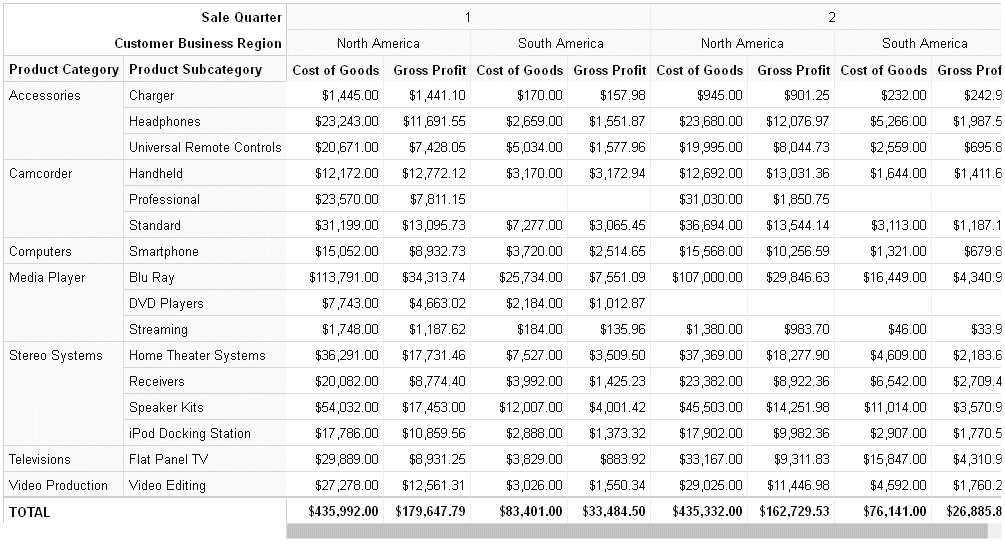
Example: Generating a Data Grid
The following request generates a data grid with column totals. The rows represent product categories and product sub-categories. The columns represent the first two quarters of the year and the North America and South America business regions. The measures are cost of goods and gross profit. By default, scroll bars are added when the entire grid does not fit in the draw area.
GRAPH FILE WF_RETAIL_LITE
SUM COGS_US GROSS_PROFIT_US
BY PRODUCT_CATEGORY
BY PRODUCT_SUBCATEG
BY TIME_QTR
BY BUSINESS_REGION
WHERE (BUSINESS_REGION NE 'Oceania' OR 'EMEA') AND (TIME_QTR EQ 1 OR 2)
ON GRAPH PCHOLD FORMAT JSCHART
ON GRAPH SET LOOKGRAPH DATAGRID
ON GRAPH SET AUTOFIT ON
ON GRAPH SET STYLE *
type=data, column=product_category,  bucket=row, $
type=data, column=product_subcateg,  bucket=row, $
type=data, column=time_qtr,          bucket=column, $
type=data, column=business_region,   bucket=column, $
type=data, column=cogs_us,           bucket=measure, $
type=data, column=gross_profit_us,   bucket=measure, $
*GRAPH_JS
"dataGridProperties": {"columnTotals": {"visible": true}}
*END
ENDSTYLE
END
The output is shown in the following image.
Funnel Charts Using Chart Attribute Syntax
A funnel chart is basically a pie chart that shows only one group of data at a time. The series in the group are stacked in the funnel, with the first series at the top and the last series at the bottom. In the funnel chart, the display field functions as the group, and the sort fields function as the series.
The chart type is FUNNEL. FUNNEL attribute categories are:
- color for the sort field.
- measure for the measure used to generate the funnel slices.
Example: Sample Funnel Chart Using Chart Attribute Syntax
The following request generates a funnel chart.
GRAPH FILE WF_RETAIL_LITE
SUM COGS_US
BY PRODUCT_CATEGORY
ON GRAPH PCHOLD FORMAT JSCHART
ON GRAPH SET LOOKGRAPH FUNNEL
ON GRAPH SET STYLE *
INCLUDE=IBFS:/FILE/IBI_HTML_DIR/javaassist/intl/EN/combine_templates/ENWarm.sty,$
TYPE=DATA, COLUMN=PRODUCT_CATEGORY, BUCKET=color, $
TYPE=DATA, COLUMN=COGS_US, BUCKET=measure, $
ENDSTYLE
END
The output is shown in the following image.

Gauge Charts Using Chart Attribute Syntax
Gauge charts identify a single value along an axis that is usually displayed in a circle. They are often used in dashboards to display progress or quantity.
The chart type is GAUGE. The GAUGE attribute category is:
- measure for the field containing the value represented on the gauge.
Example: Sample Gauge Chart Using Chart Attribute Syntax
The following request generates a gauge chart. The chart type is GAUGE:
GRAPH FILE WF_RETAIL_LITE
SUM REVENUE_US
BY PRODUCT_CATEGORY
WHERE PRODUCT_CATEGORY EQ 'Computers'
ON GRAPH PCHOLD FORMAT JSCHART
ON GRAPH SET LOOKGRAPH GAUGE
ON GRAPH SET STYLE *
type=data, column=revenue_us, bucket=measure,$
*GRAPH_JS
"gaugeProperties": {
	"groupLabel": {"visible": false},
	"totalLabel": {"visible": false}
	}
*END
ENDSTYLE
END
The output is shown in the following image:

Heatmap Charts Using Chart Attribute Syntax
Heatmap charts contain a row or column matrix of rectangles that are displayed in different colors depending on the data values. They use the same kind of data as bar, line, and area charts.
The chart type is HEATMAP. HEATMAP attribute categories are:
- y-axis for the first sort field.
- x-axis for the second sort field.
- color for the measure.
Rectangle color will depend on the value of this measure. The color will be visualized as a gradient.
Example: Sample Heatmap Using Chart Attribute Syntax
The following request generates a heatmap where the rectangles are colored by the measure COGS_US (color category), the rows represent the first BY field (y-axis category), and the columns represent the second BY field (x-axis category). The chart type is HEATMAP:
GRAPH FILE WF_RETAIL_LITE
SUM COGS_US
BY PRODUCT_CATEGORY
BY BUSINESS_REGION
WHERE BUSINESS_REGION NE 'Oceania'
ON GRAPH SET LOOKGRAPH HEATMAP
ON GRAPH PCHOLD FORMAT JSCHART
ON GRAPH SET STYLE *
type=data, column=product_category, bucket=y-axis, $
type=data, column=business_region, bucket=x-axis, $
type=data, column=cogs_us, bucket=color, $
END
The output is shown in the following image:

Line Charts Using Chart Attribute Syntax
Line charts are useful for emphasizing the movement or trend of numeric data over time, since they allow a viewer to trace the evolution of a particular point by working backwards or interpolating. Highs and lows, rapid or slow movement, or a tendency toward stability are all types of trends that are well suited to a line chart.
Line charts can also be plotted with two or more scales to suggest a comparison of the same value, or set of values, in different time periods. The number of scales your chart has depends on the type of chart you select.
The chart type is LINE. LINE attribute categories are:
- x-axis for the sort field, typically a time-based dimension, such as YEAR.
- y-axis for the measures.
- color for the colors of the lines, markers, and legend
(optional).
If the field is a measure, the colors will be visualized as a gradient. If it is a dimension, the colors will be visualized as discrete colors. Multiples are supported.
- size for the measure representing the width of the markers
or lines (optional).
If markers are visible, this measure is used to vary the size of the markers. If markers are not visible, this measure is used to vary the width of the lines.
Example: Sample Line Chart
The following request creates a line chart. The sort field TIME_YEARMTH is assigned to the x-axis category. The measure COGS_US is assigned to the y-axis category. The measure DISCOUNT_US is assigned to the color category and is used to color the line, markers, and legend. Since the color field is a measure, the colors are visualized as a gradient. The chart type is LINE:
GRAPH FILE WF_RETAIL_LITE
SUM COGS_US DISCOUNT_US
BY WF_RETAIL_TIME_SALES.TIME_YEARMTH
ON GRAPH PCHOLD FORMAT JSCHART
ON GRAPH SET LOOKGRAPH LINE
ON GRAPH SET STYLE *
TYPE=DATA, COLUMN=WF_RETAIL_TIME_SALES.TIME_YEARMTH, BUCKET=x-axis,$
TYPE=DATA, COLUMN=COGS_US, BUCKET=y-axis,$
TYPE=DATA, COLUMN=DISCOUNT_US, BUCKET=color,$
INCLUDE=IBFS:/FILE/IBI_HTML_DIR/javaassist/intl/EN/combine_templates/ENWarm.sty,$
ENDSTYLE
END
The output is shown in the following image:

Matrix Marker Charts Using Chart Attribute Syntax
A matrix marker chart is a matrix chart that displays a marker in each cell of the matrix.
The chart type is MARKER. MARKER attribute categories are:
- row for the fields representing rows of the matrix.
- column for the fields representing columns of the matrix.
- size for the measure representing the size of the marker.
- color for the measure representing the colors of the
markers.
The color will be visualized as a gradient.
Example: Sample Matrix Marker Chart Using Chart Attribute Syntax
The following request generates a matrix marker chart. The rows represent product categories. The columns represent business regions. The marker in each cell is sized by the GROSS_PROFIT_US measure and colored by the COGS_US measure. The marker and legend colors are visualized as a gradient.
The JSON properties change the marker shape to a square. The chart type is MARKER:
GRAPH FILE WF_RETAIL_LITE
SUM COGS_US
GROSS_PROFIT_US
BY PRODUCT_CATEGORY
BY BUSINESS_REGION
WHERE BUSINESS_REGION NE 'Oceania'
WHERE PRODUCT_CATEGORY LE 'D'
ON GRAPH PCHOLD FORMAT JSCHART
ON GRAPH SET LOOKGRAPH MARKER
ON GRAPH SET STYLE *
INCLUDE=IBFS:/FILE/IBI_HTML_DIR/javaassist/intl/EN/combine_templates/ENWarm.sty,$
TYPE=DATA, COLUMN=COGS_US, BUCKET=color, $
TYPE=DATA, COLUMN=PRODUCT_CATEGORY, BUCKET=row, $
TYPE=DATA, COLUMN=BUSINESS_REGION, BUCKET=column, $
TYPE=DATA, COLUMN=GROSS_PROFIT_US, BUCKET=size, $
*GRAPH_JS
"series": [{"series": 0, "marker": {"shape": "square"}}]
*END
ENDSTYLE
END
The output is shown in the following image:

Mekko Charts Using Chart Attribute Syntax
A mekko (also called marimekko) chart is a percent bar chart, except that the width of each bar riser is based on the overall value of the stack. The widths are automatically sorted in high-to-low order. The default tooltips show the value and percentage of the measure within the group.
The chart type is MEKKO. Mekko attribute categories are:
- x-axis for the sort field.
- y-axis for the measures.
- color for the colors of the bars and legend (optional).
If the field is a measure, the colors will be visualized as a gradient. If it is a dimension, the colors will be visualized as discrete colors. Multiples are supported.
Example: Sample Mekko Chart Using Chart Attribute Syntax
The following request generates a mekko chart with one measure, one sort field for the x-axis, and one sort field for the color category.
GRAPH FILE WF_RETAIL_LITE
SUM COGS_US
BY BUSINESS_SUB_REGION
BY PRODUCT_CATEGORY
WHERE COUNTRY_NAME EQ 'United States'
ON TABLE PCHOLD FORMAT JSCHART
ON GRAPH SET LOOKGRAPH MEKKO
ON GRAPH SET STYLE *
INCLUDE=IBFS:/FILE/IBI_HTML_DIR/javaassist/intl/EN/combine_templates/ENWarm.sty,$
type=data, column=cogs_us, bucket=y-axis,$
type=data, column=BUSINESS_SUB_REGION, bucket=color,$
type=data, column=product_category, bucket=x-axis,$
ENDSTYLE
END
The output is shown in the following image.

Pie Charts Using Chart Attribute Syntax
A pie chart emphasizes where your data fits in relation to a larger whole. Each slice represents a percentage of the whole. Keep in mind that pie charts work best when your data falls into a limited number of groups. Too many groups divide the pie into small segments that are difficult to see. Use color or texture on individual segments to create visual contrast.
If the hole size is zero, a pie chart is generated. If the hole size is greater than zero, a pie ring chart is generated.
The chart type is PIE. PIE attribute categories are:
- color for the sort field.
- measure for the measure used to generate the pie slices.
- size for the measure used to size the pie charts if they are generated in a matrix (optional).
Note: A pie chart that is built by adding a measure to the measure category and a BY field to the color category results in a single pie chart where the measure name is placed at the bottom of the chart.
Example: Sample Pie Chart Using Chart Attribute Syntax
The basic components of a pie chart are a measure and a sort field. The sort field generates the colors for the slices and the legend. The chart type is PIE:
GRAPH FILE WF_RETAIL_LITE
SUM COGS_US
BY PRODUCT_CATEGORY
ON GRAPH PCHOLD FORMAT JSCHART
ON GRAPH SET LOOKGRAPH PIE
ON GRAPH SET STYLE *
TYPE=DATA, COLUMN=PRODUCT_CATEGORY, BUCKET=color, $
TYPE=DATA, COLUMN=COGS_US, BUCKET=measure, $
ENDSTYLE
END
The output is shown in the following image:

To generate a pie chart with a hole, add the JSON holeSize property:
GRAPH FILE WF_RETAIL_LITE
SUM COGS_US
BY PRODUCT_CATEGORY
ON GRAPH PCHOLD FORMAT JSCHART
ON GRAPH SET LOOKGRAPH PIE
ON GRAPH SET STYLE *
TYPE=DATA, COLUMN=PRODUCT_CATEGORY, BUCKET=color, $
TYPE=DATA, COLUMN=COGS_US, BUCKET=measure, $
*GRAPH_JS
"pieProperties": {"holeSize": "25%"}
*END
ENDSTYLE
END
The output is shown in the following image. By default, the total label displays in the hole:

Scatter Charts Using Chart Attribute Syntax
Scatter charts typically show the relationship between two numeric measures. Chart attribute syntax supports dimensions as well as measures. Use a scatter plot to visualize the density of individual data values around particular points or to demonstrate patterns in your data.
The chart type is SCATTER. SCATTER attribute categories are:
- x-axis for the sort field (either a measure or dimension).
- y-axis for the measure or dimension that defines the y-axis intercepts for the markers.
- size for the measure that represents the size of the markers (optional).
- color for the field that represents the colors of the
markers (optional).
If the field is a measure, the colors will be visualized as a gradient. If it is a dimension, the colors will be visualized as discrete colors.
- detail for low-level sort fields that can be used to generate additional data points on the chart (optional).
Example: Sample Scatter Chart Using Chart Attribute Syntax
The following request creates a scatter chart. The sort field TIME_YEARMTH is assigned to the x-axis category. The measure COGS_US is assigned to the y-axis category. The chart type is SCATTER:
GRAPH FILE WF_RETAIL_LITE
SUM COGS_US
BY WF_RETAIL_TIME_SALES.TIME_YEARMTH
ON GRAPH PCHOLD FORMAT JSCHART
ON GRAPH SET LOOKGRAPH SCATTER
ON GRAPH SET STYLE *
TYPE=DATA, COLUMN=WF_RETAIL_TIME_SALES.TIME_YEARMTH, BUCKET=x-axis,$
TYPE=DATA, COLUMN=COGS_US, BUCKET=y-axis,$
INCLUDE=IBFS:/FILE/IBI_HTML_DIR/javaassist/intl/EN/combine_templates/ENWarm.sty,$
ENDSTYLE
END
The output is shown in the following image:

Streamgraph Charts Using Chart Attribute Syntax
A streamgraph is a simplified version of a stacked area chart. In a streamgraph, often the x-axis is turned off, and there are no gridlines or frames. A streamgraph does not use data text labels. The data required to draw a streamgraph is the same format required to draw an area chart. However, streamgraphs are normally given many series (10 or more), each with many data point points (100 or more). A typical streamgraph would include 20 series with 400 data points in each series.
The chart type is STREAM. STREAM attribute categories are:
- x-axis for the sort field.
- y-axis for the measures.
- color for the colors of the areas and legend (optional).
If the field is a measure, the colors will be visualized as a gradient. If it is a dimension, the colors will be visualized as discrete colors. Multiples are supported.
Example: Sample Streamgraph Colored by a Dimension
The following request generates a streamgraph where the areas are colored by the BUSINESS_SUB_REGION dimension.
GRAPH FILE WF_RETAIL_LITE
SUM COGS_US
BY BUSINESS_SUB_REGION
BY TIME_MTH
ON TABLE PCHOLD FORMAT JSCHART
ON GRAPH SET LOOKGRAPH STREAM
ON GRAPH SET STYLE *
INCLUDE=IBFS:/FILE/IBI_HTML_DIR/javaassist/intl/EN/combine_templates/ENWarm.sty,$
type=data, column=cogs_us, bucket=y-axis,$
type=data, column=time_mth, bucket=x-axis,$
type=data, column=business_sub_region, bucket=color,$
ENDSTYLE
END
The output is shown in the following image.

Tagcloud Charts Using Chart Attribute Syntax
A tagcloud chart is a visual representation of group labels. The size of each label is proportional to its data value. Tagclouds are used by social media to measure the frequency of words in order to quantify sentiments.
The chart type is TAGCLOUD. TAGCLOUD attribute categories are:
- detail for the sort field that contains the tags to be displayed.
- size for the measure that controls the size of the tags.
- color for the measure that controls the color of the tags. Tagclouds do not support multiple series and legends, so this category cannot be assigned to a sort field.
Tagclouds are not supported in a matrix.
Example: Sample Tagcloud Using Chart Attribute Syntax
The following request generates a tagcloud in which the tags are the brand names, the color of the tags is controlled by the quantity sold, and the size of the tags is controlled by the gross profit.
GRAPH FILE WF_RETAIL_LITE
SUM QUANTITY_SOLD  GROSS_PROFIT_US
BY BRAND
ON GRAPH PCHOLD FORMAT JSCHART
ON GRAPH SET LOOKGRAPH TAGCLOUD
ON GRAPH SET STYLE *
INCLUDE=IBFS:/FILE/IBI_HTML_DIR/javaassist/intl/EN/combine_templates/ENWarm.sty,$
type=data, column=brand, bucket=detail,$
type=data, column=quantity_sold, bucket=color,$
type=data, column=gross_profit_us, bucket=size,$
*GRAPH_JS
"tagcloudProperties": {"engine": "new"}
*END
ENDSTYLE
END
The output is shown in the following image.

Treemap Charts Using Chart Attribute Syntax
A treemap chart displays hierarchical data as a set of nested rectangles.
An object can be nested arbitrarily deep.
The chart type is TREEMAP. TREEMAP attribute categories are:
- detail for the sort fields that define the hierarchy.
- size for a measure used to determine rectangle size (optional).
- color for the field that represents area color (optional).
If the field is a measure, the colors will be visualized as a gradient. If it is a dimension, the colors will be visualized as discrete colors.
Example: Sample Treemap Colored by a Measure
The following example generates a treemap colored by the measure MSRP_US and sized by the measure COGS_US. Since the color-by field is a measure, the colors in the rectangles and legend are visualized as a gradient. The chart type is TREEMAP:
GRAPH FILE WF_RETAIL_LITE
SUM COGS_US MSRP_US
BY PRODUCT_CATEGORY
BY BRAND
ON GRAPH SET LOOKGRAPH TREEMAP
ON GRAPH PCHOLD FORMAT JSCHART
ON GRAPH SET STYLE *
type=report, column=COGS_US,   bucket=size, $
type=report, column=MSRP_US,   bucket=color, $
type=report, column=PRODUCT_CATEGORY, bucket=detail, $
type=report, column=BRAND,   bucket=detail, $
END
The output is shown in the following image:

Example: Sample Treemap Colored by a Dimension
The following example generates a treemap colored by the first BY field. Since the color-by field is a dimension, discrete colors are generated for the rectangles and the legend. The second BY field (detail attribute category) accounts for the subdivisions of the colored boxes. Note that the prefix operator used in the request is also used when assigning the field to the category:
GRAPH FILE WF_RETAIL_LITE
SUM CNT.COGS_US
BY PRODUCT_CATEGORY
BY BRAND
ON GRAPH SET LOOKGRAPH TREEMAP
ON GRAPH PCHOLD FORMAT JSCHART
ON GRAPH SET STYLE *
type=report, column=product_category, bucket=color, $
type=report, column=brand, bucket=detail, $
type=report, column=cnt.cogs_us, bucket=size, $
END
The output is shown in the following image:

| WebFOCUS | |
|
Feedback |