Creating Charts
|
Topics: |
|
How to: |
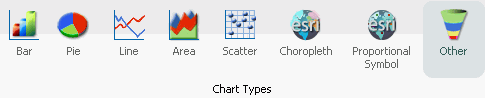
On the Format tab, the Chart Types group provides buttons for each of the five most commonly-used chart types. These include Bar (default), Pie, Line, Area, and Scatter. You also have access to Esri Choropleth and Proportional Symbol maps. A button labeled Other gives you access to the complete chart library of advanced charts.
The Chart Types group is shown in the following image.
When switching between chart formats that use a different syntax, you are prompted with a message that allows you to proceed with the change, or cancel your request. This message is shown in the following image.
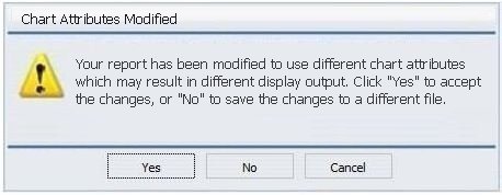
On the Chart Attributes Modified dialog box, you can click Yes to accept the changes or click No to save the changes to a different file and preserve the originating procedure (.fex).
Procedure: How to Create a Basic Chart
You can run this procedure in Query Design view or Live Preview.
- On the Format tab, in the Chart Types group, click
the button of the chart that you want to create. Bar chart is the
default.
The chart appears on the canvas.
- Populate the chart with your data in one of the following
ways:
- Drag the dimension fields and measure fields onto the chart.
- Drag the dimension fields and measure fields into the appropriate Query field containers in the Query pane.
Procedure: How to Create an Advanced Chart
You can run this procedure in Query Design view or Live Preview.
- On the Format tab, in the Chart Types group, click Other.
The Select a chart dialog box opens. The chart types, depicted by icons, display on the left side of the dialog box.
- To display the name of a chart type, hover over the chart
type with the mouse.
From top to bottom, the chart type categories are Bar, Line, Area, Pie, XY Plots, 3D, Stock, Special, HTML5, Map, and HTML5 Extension.
Note: For streamgraphs, which are in the HTML5 category, the tooltip has been enhanced to display specific information, by data point, depending on the underlying data source.
- Click a chart type.
All supported variations of the chart type appear as thumbnail images in the dialog box.
- Click an image to display a detailed description of that
chart type.
If you are not familiar with a chart type, be sure to read the description carefully before finalizing your selection. Some chart types require a certain number of data values, or a certain type of data values. If your data does not satisfy the requirements, the chart will not accurately represent the data.
You can also hover over an image with your mouse to display the chart type name.
- In the Select a chart dialog box, click OK to finalize your selection and close the dialog box.
- Populate the chart with your data in one of the following
ways:
- Drag the dimension fields and measure fields onto the chart.
- Drag the dimension fields and measure fields into the appropriate Query field containers in the Query pane.
Procedure: How to Create a Combination Chart
You can run this procedure in Query Design view or Live Preview.
- On the Format tab, in the Chart Types group, click
the button of the chart that you want to create. Bar chart is the
default.
The chart appears on the canvas.
- Populate the chart with your data in one of the following
ways:
- Drag the dimension fields and measure fields onto the chart.
- Drag the dimension fields and measure fields into the appropriate Query field containers in the Query pane.
- Change a series type in one of the following ways:
- Ribbon: On the Series tab, in the Select group, select the series that you want to display in a different chart type. Then, in the Properties group, from the Type drop-down menu, select the chart type.
- Shortcut Menu: Right-click the series that you want to display in a different chart type, point to Series Type, and click the chart type.
The series appears in the new chart type.
Procedure: How to Create a Dual-Axis Chart
When you create a dual-axis chart, you assign one data series to the Y1 axis and another data series to the Y2 axis.
Note: This applies to charts in HTML format. If you are creating a dual-axis chart in HTML5 format, the field containers are labeled Vertical Axis 1 and Vertical Axis 2. If your chart is horizontal, the field containers are labeled Horizontal 1 and Horizontal 2.
- Create a chart.
- On the Format tab, in the Chart Types group,
click Other.
The Select a chart dialog box opens.
- Select a dual-axis chart, such as dual-axis bar, and then click OK.
- Drag one field onto the Y1 field, and then drag another field onto the Y2 field.
Procedure: How to Create a Multi-Axis Chart
When you create a multi-axis chart, you assign one data series to the Y1 axis and another data series to the Y2, Y3, Y4, and Y5 axes (as needed).
Note: This procedure is specific to HTML format.
- Create a chart.
- On the Format tab, in the Chart Types group,
click Other.
The Select a chart dialog box opens.
- Select a multi-axis chart, and then click OK.
- Drag fields onto the Y1, Y2, Y3, Y4, and Y5 fields, as needed.
Chart Outputs
You can create charts using one of the following output formats:
- HTML
- HTML5 (default)
- active report
- Excel
- PowerPoint
The HTML5 output format allows you to render a chart in the browser using a built-in JavaScript engine. Charts with this output format utilize the very latest capabilities of the HTML5 Web standard, including animation, high-quality vector output, and attractive alpha-channel and gradient effects.
Note: Not every chart type can be output in every format listed here. To make sure that the chart that you are creating can be output in the format that you want, please see the topic for that particular chart type.
Binning
|
Topics: |
|
How to: |
Binning is a powerful tool for analyzing your data using ranges that you define.
Binning enables you to determine the frequency of values across the entire range of values. It is used for analyzing a frequency distribution. With binning, you can create discrete buckets of continuous data that control how groups of your data display. In addition, binning gives you the ability to review trends and spot outliers.
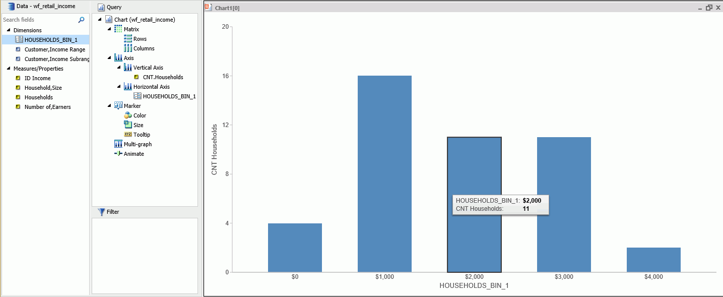
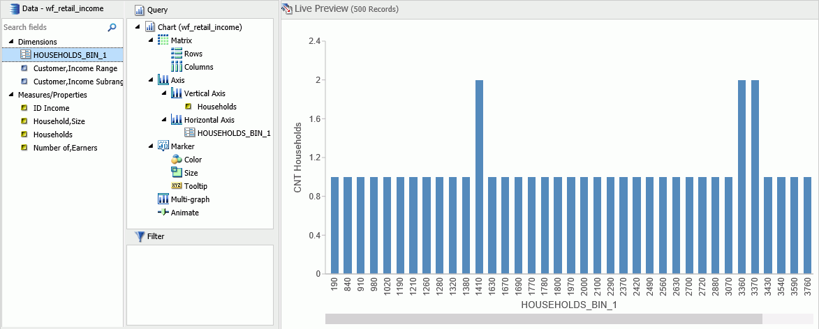
For example, you can review the range of expenses incurred by households. In the following example, these ranges are represented by bins that are grouped by $1000. In this case, you can see that the largest number of households had the smallest expense (16) while the trend declines as the bin size gets larger. With binning, you can see the frequency of how often values in a range appear across the different groupings, as shown in the following image.
In InfoAssist, bins are automatically created for Histograms. You can change the size of your bins to meet the requirements of your data. For example, if your data has very large values (for example, in billions) you might want to create larger bins. You can also create bins manually in Vertical bar charts and reports.
Note: When creating a bin, the format of the bin and the value set for the Width of Bins must be compatible. If the Width of Bins is a large decimal value, define the field format to match the format of the field being converted so that the bins can be successfully generated with the appropriate numeric precision.
Binning is available for the different output types, including reports, charts, and visualizations, depending on how you choose to display and analyze your data.
Procedure: How to Use Binning in a Vertical Bar Chart
- Open InfoAssist in Chart mode.
- In the Query pane, right-click the chart component and change Sum to Count, as shown in the following image.
- Add a measure, such as Households, to the Vertical Axis field container.
- From the Data Pane, right-click the same measure and click Create Bins.
- In the Create Bins dialog box, accept the default bin value and click OK.
- From the Data pane, drag the bin into the Horizontal Axis field container.The chart displays showing the bins along the x-axis, as shown in the following image.
- Save the chart.You can edit the bin size to meet your requirements for grouping and display.
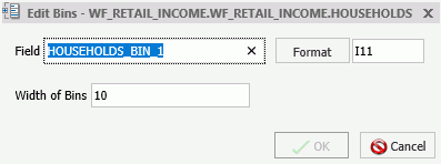
Procedure: How to Edit an Existing Bin
- Open a report, chart, or visualization that contains a bin.
- From the Dimensions group, in the Data pane, right-click the existing bin and click Edit Bins.The Edit Bins dialog box opens, as shown in the following image.
Note: If you are working with a report, chart, or visualization where the bin is specified and therefore displays in the Query pane, the position of the Edit Bins field in the shortcut menu appears in a different location.
- Optionally, change the name of the field for the bin, and click Format to edit the formatting that you want to change (for example, currency).
- In the Width of Bins field, specify a value that meets your display requirements.
- Click OK.
Procedure: How to Create Bins for Reporting
You can create bins in reports, which lets you view the detail behind a chart or histogram. You can optionally switch between report and chart as you perform your analysis. This allows you to review the actual values that fall into each bin.
- Create a report.
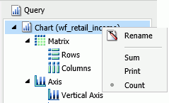
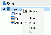
- In the Query pane, on the Report component, change Sum to Print, as shown in the following image.
- Right-click the measure on which to bin, and click Create Bins.
- In the Create Bins dialog box, set the width of the bins and change any formatting options (for example, currency).
- Click OK.
- In the Data pane, double-click the bin to add it to your report.The report displays showing the bin assignments per value, as shown in the following image.
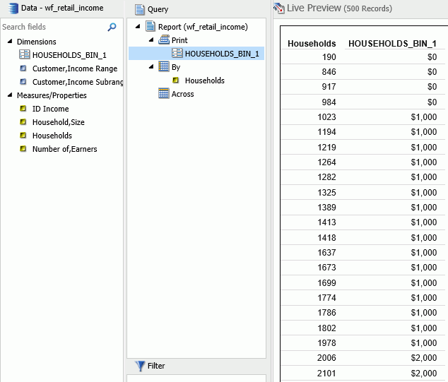
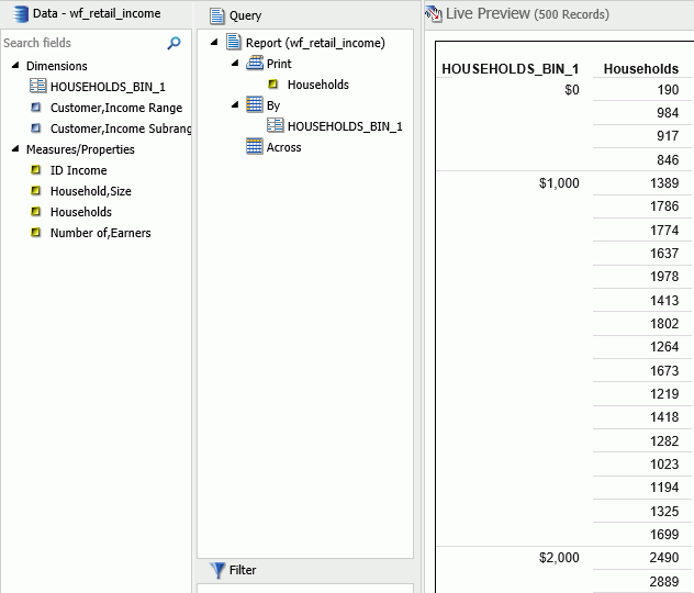
- Optionally, you can change the Print and By field assignments to view the Households values by bin, as shown in the following
image.
Binning Values in a Histogram
|
How to: |
Histograms graphically represent the distribution of numeric data. They facilitate the identification and discovery of the underlying frequency distribution within a set of continuous data. You can use histograms to identify trends and illustrate categorizations, or groupings, also known as bins. For more information, see Binning.
Histograms use bins to group data. Bins allow you to establish a range of values for your data. For example, you can review how the bins are designated when you consider the age of everyone in your company. In the first table, you can review the bins (using the default value of 10) and counts for each bin.
|
AGE |
COUNT |
|---|---|
|
0-9 |
0 |
|
10-19 |
5 |
|
20-29 |
26 |
|
30-39 |
351 |
|
40-49 |
460 |
|
50-59 |
310 |
|
60-69 |
285 |
|
70-79 |
22 |
|
80-89 |
3 |
|
Total |
1462 |
In the second table, you can review the same data for the bins (with a bin width of 15) and counts for each bin. Notice that as the bin size gets larger, more employees fall into these different ranges.
|
AGE |
COUNT |
|---|---|
|
0-14 |
0 |
|
15-29 |
31 |
|
30-44 |
611 |
|
45-59 |
510 |
|
60-74 |
296 |
|
75-89 |
14 |
|
Total |
1462 |
When you create a histogram in either Chart or Visualization mode, a bin is created automatically for the measure you select. When working with bins, you can change the width of the bin by editing it. In the Query or Data pane, right-click a bin field and click Edit Bins to change the value that dictates the width or format of the contents of the bin.
The bin value is designated as a dimension field, since it is a limited field with a discrete set of possible values that was created from a field with an unlimited, continuous range of values. The measure displays as a count (.CNT) field and the related bin is created in the Query pane. It is also placed in the Data Pane for future use.
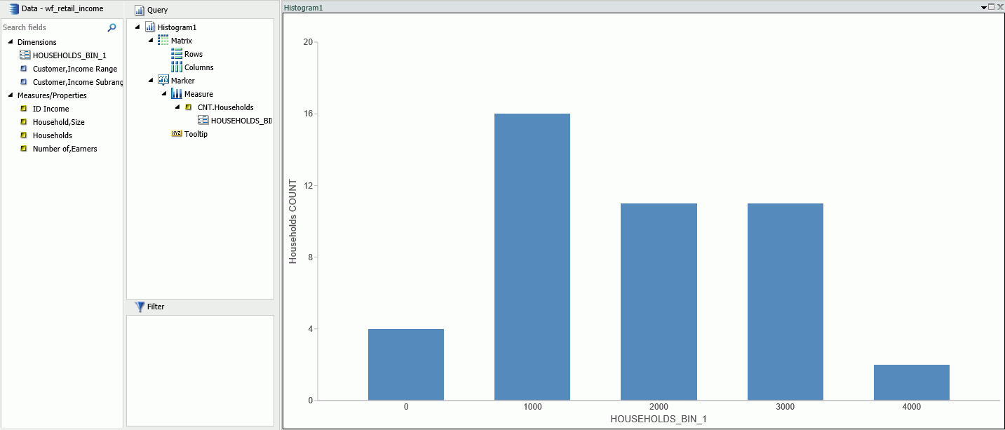
Procedure: How to Create a Histogram with Automatic Binning in Chart Mode
- Open InfoAssist in Chart mode.
- On the Format tab in the Chart Types group, click Other.
- In the Bar group of charts, click Vertical Histogram.
- Click OK.
- From the Data pane, drag a measure into the Measure field container in the Query pane.A histogram is automatically created using the measure you selected along with a generated bin, as shown in the following image.

Note: This process produces the same results as if you had created the histogram manually, however it automatically converts the measure to a count (.CNT) field. It also creates the bin for you, placing it on the x-axis, accordingly.
Procedure: How to Create a Histogram with Automatic Binning in Visualization Mode
- Open InfoAssist in Visualization mode.
- On the Home tab, in the Visual group, click Change.
- In the Select a Visual dialog box, click Histogram.
- From the Data pane, drag a measure into the Measure field container in the Query pane.A histogram is automatically created using the measure you selected along with a generated bin, as shown in the following image.
You can optionally edit the bin to change its width or format. For information on building a histogram manually, in Chart mode, see Binning.
| WebFOCUS | |
|
Feedback |