Customizing Charts and Visualizations
|
Topics: |
Once you have created a visualization or chart, you can customize and style your content. For example, you can add axis titles or a header. The customization options vary depending on the type of chart or visual you are developing.
Chart Features
The options on the Format tab, in the Features group allow you to add effects and different functionality to your charts.
Note: When working with maps, all options in the Features group are disabled with the exception of Frame & Background and Accessibility.
-
3D Effect. Sets the three-dimensional view
to on or off. The 3D Effect feature is disabled for 3D, stock, gauge,
gauge thermometer, Pareto, spectral map, and funnel chart types.
By default, 3D effect is off for all chart types.
Note: When working with charts in HTML5 format, the 3D Effect option is not supported.
- Rotate. Toggles between a vertical display or horizontal display of a chart. For more information, see How to Rotate a Chart. The Rotate feature is disabled for pie, scatter, 3D, stock, gauge, gauge thermometer, Pareto, spectral map, and funnel chart types.
- Reference. Opens a drop-down menu that provides the Add Reference Line to Y-Axis and Add Reference Line to X-Axis options. Selecting one of these options opens the appropriate Reference Line dialog box, where you can set the specific X-axis or Y-axis value, type the text that you want, and position the reference line on a chart. For more information, see How to Display a Static Reference Line. The Reference feature is disabled for pie, 3D, stock, gauge, gauge thermometer, Pareto, spectral map, and funnel chart types.
- Annotate. Opens a drop-down menu that provides the Add an annotation option. Selecting this option opens the Annotation dialog box, where you can type the text that you want and position the annotation on a chart.
- Grid. Opens a drop-down menu allowing you to expand options for Horizontal or Vertical Gridlines. Both selections allow you to enable or disable Major and Minor Gridlines. Clicking More Options opens the Format Grid Lines dialog box. For more information, see Formatting Gridlines.
- Frame & Background. Opens the Frame & Background dialog box where you can edit the background style and frames for charts. The dialog contains different options depending on the chart type selected. For more information, see Formatting a Frame and a Background.
- Gauges. Opens the Gauge dialog box where you can edit your gauge chart. This button is only available when a gauge chart type is selected. For more information, see How to Style a Gauge Needle.
-
active report Options. Opens the active report
options dialog box where you can configure your active report options,
such as menu items, graph engine, and colors. This button is available
when the output type is set to active report.
Note: Annotate is not available in HTML5.
- Accessibility. Allows a title to be added to a report, chart, or document that is Section 508-compliant.
Labeling Charts
You can add labels to charts and visualizations using the Labels group on the Format tab.
Note: When working with maps, the Axes option is disabled.
- Axes. Opens a drop-down menu, where you can enable, stagger, and rotate horizontal and vertical axis labels. You can also edit the axis labels by clicking More Horizontal Axis Options or More Vertical Axis Options. For more information, see Formatting Axis Labels.
- Legend. Opens a drop-down menu, where you can select the Show Legend option to display the legend on the chart, or clear your selection to hide the legend, change the default legend position, and change the default legend orientation. For more information, see Format Legend Dialog Box.
Accessing Chart Formatting Tools
|
Topics: |
Using Live Preview
In Live Preview, the canvas on the right of the window provides a preview of the content that you can interact with. The preview is context sensitive, meaning that depending on what portion you select different options become available.
In Live Preview, when you hover the mouse over a graph element (for example, legend, axis label, title), the bounding area is highlighted with a dotted line.
In Live Preview, when you select a graph element (for example, legend, axis label, title), the bounding area is highlighted with a solid line.
Once you select a chart element, you can access all available design options on the ribbon, or you can right-click an element to open a shortcut menu of frequently-used design options. Once you have selected your design option from the ribbon or the menu, InfoAssist instantly applies it to the chart element, so that you see the result immediately.
Shortcut menus are enabled for charts that are generated with either sample data, or live data from your data source.
The following sections describe the chart elements and the ribbon options that you can work with to design your charts in Live Preview.
Related Information:
Formatting a Series
|
Topics: |
A series is a measure field that is included in a chart or visualization. You can format a series in a variety of ways. For example, you can change the color of a series, add a trendline to a series, or change the appearance of markers on a series.
You can access the full set of formatting options on the Series tab and Field tab. For more information, see Series Tab and Field Tab.
You can also access a subset of frequently-used options by right-clicking a series element on a chart to open a menu of those options.
Tip: The options that you see on the menu depend on the type of chart that you are creating. For example, the Series Type option would not appear on the menu for a pie chart, but it would appear for a bar, line, and area chart.
Associated Dialog Boxes
|
Topics: |
Whether you access series options from the ribbon or the shortcut menu, you are presented with a dialog box of options. The following dialog boxes are commonly used for formatting a series:
- Format Series
- Edit Title
- Traffic Light Condition
For Instructions on how to open these dialog boxes, see the procedures in Using Series Properties.
Format Series Dialog Box
The Format Series dialog box contains options to format the fill and border of each series on a chart. To access this dialog box, on the Series tab, in the Style group, click Style.
The Format Series dialog box contains the following tabs:
- Fill
- Border
- Effect (for HTML5 charts only)
Use the Fill tab to modify the color of a chart series.
The Fill tab contains the following options:
- No fill. Select this option to remove the color from the series.
-
Solid fill. Select this option to display the Color and
Transparency options.
- Color. Click this icon to open the Color dialog box, where you can select a color for the series.
- Transparency. Move the slider to make the bands opaque (0%) or transparent (100%). The default is 0%.
-
Gradient fill. Select this option to display the direction
of the gradient, the color pattern of the gradient, and the degrees
of transparency for the two colors that make up the gradient. A
gradient is a smooth color transition or blending of one color to another.
The number of colors to use in a gradient is defined by the stop or pin elements.
- Direction. Select from this drop-down menu to set the direction of the gradient fill. For example, Gradient right or Gradient left.
Use the Border tab to specify a border for a chart series.
Note: When you create a bubble chart and attempt to apply a border using the Style options on the Series tab, the border does not display.
The Border tab contains the following options:
- Show Border Color. Select this option to show a border color around each series.
- Border Color. Click this icon to open the Color dialog box, where you can select a color for the border.
Use the Effect tab to specify styling and shadowing options for HTML5 charts.
Note: This tab only displays when working with HTML5 charts.
The Effect tab contains the following options:
- Riser Style. Use this drop-down menu to select a riser style. Options include: None, Bevel, Cylinder, Darken, Inverted Darken, Lighten, and Inverted Lighten.
- Show Shadow. Select this option to set a shadow.
Edit Title Dialog Box
To edit the title of a series, right-click a series on the canvas, and click Change Title. The Enter Title dialog box contains a text field in which you can type the title for a series on a chart. Click OK and the title appears on the chart.
Traffic Light Condition Dialog Box
The Traffic Light Condition dialog box contains fields for adding new conditional styling or modifying existing conditional styling by applying a traffic light color to the selected field.
The Traffic Light Condition dialog box contains the following fields.
- Relational Operators. Select from this drop-down menu to set the relational operator. For example, Equal to.
-
Type/Value. Click this unlabeled field to open a dialog
box that contains the following fields:
- Type. Opens a drop-down menu containing the values Constant and Field. Select Constant to enter a constant value. Select Field to open a visual display of the fields in your data source.
-
Value: Enables you to specify a value based on the Type
that you select.
Note: If you are creating a Traffic Light condition on a full date field, the Value field will have a calendar icon adjacent to it. You can use this icon to select a date using a calendar control.
- Get Values. Select a value option from this drop-down list. For example, All or First.
The Traffic Light Condition dialog box contains the following buttons:
- Selected Condition. Click this icon to select a condition to work on.
- New. Creates a new rule.
- Delete. Deletes a rule.
- Color. Opens the Color dialog box.
-
Drill Down. Opens the Drill Down dialog box, where you
can drill down to a webpage or a URL. Specify the following:
- URL of the webpage or location of the report
- A description
- Target (New Window, Same Window, a value that you enter)
- Parameters that you want to use (Name, Value)
Formatting and Display Tools for Data in a Visual
When working with visualizations, you can use various filtering and editing tools to format the display of measure and dimension data in any given visual. For example, for measures, you can use the Edit Format option to set the display of decimals in the values of your selected measure. For measures and dimensions, you can add filters to limit the display of information. These options, which can be found on the right-click menu of a field, are defined and described in the following table.
| Option | Description |
|
Filter Values |
Creates a filter for the selected measure or dimension. You can select all values or only the one the data values that you want to display. In this way, you can exclude unwanted data. For visualizations, prompts are created, by default. However, you can clear this option when setting your filter options. This option displays for both measures and dimensions. |
|
Sort |
Enables you to set sorting options for the measure or dimension that you select. For example, you can sort your data values in ascending or descending order, or you can set limits for the display of information, the value for which is set to No Limit, by default. This option displays for both measures and dimensions. |
|
Visibility |
Controls the display of the selected measure or dimension in a visual. The default value is Show, but if you set the option to Hide, the values are hidden from the visual. This option displays for both measures and dimensions. |
|
Change Title |
Enables you to edit the title of the measure or dimension. In the Edit Title dialog box, type the new title in the Enter Title field, and click OK. Depending on the axis that you select, the new label will be applied accordingly. This option displays for both measures and dimensions. |
|
Edit Format |
Enables you to change the format of a field. This includes field type, display options, field length, and the specification of applicable decimal points. For more information, see Changing a Field Format. This option displays for measure fields only. Note: Any changes to the format of a field will be reflected in the tooltip for visualizations at design and run time. |
|
Drill Down |
Opens the Drill Down dialog box, where you can create multiple drill down links on a data field to external procedures or websites. This option is available for any measure field in a visualization. |
|
More |
Provides access to Aggregation functions, which enables you to apply Aggregation functions (for example, Sum, Average, and Count) to the numeric field that you select. This option is only available for measure fields. This option displays for both measures and dimensions. |
|
Delete |
Deletes the selected field. This option is available in every field container. Note: In the Query and Filter panes, you can select and delete multiple data fields at one time. Press the Ctrl key, select two or more data fields, right-click, and then click Delete. |
|
Create Group |
Allows you to create a group of elements based on the field data type that you select. Once you define a new group, a higher-level field is created that contains the selected elements. This option is available for dimension fields of non-numeric format or attribute. For more information, see Dynamic Grouping. |
Series Elements Shortcut Menu
When you right-click a series, a menu of options opens. The menu contains options that are available on the Field and Series tabs.
The menu options are described in the following table. The table provides links to the sections of this document in which those options are also discussed.
|
Option |
Description |
|---|---|
|
Filter Values |
Enables you to create or modify a WHERE statement, using the Filter dialog box. With a WHERE statement, you select only the data that you want to display, and exclude unwanted data. For information on filtering your data, see Data Tab and Field Tab. |
|
Sort |
Enables you to sort the series in either ascending or descending order. |
|
Visibility |
Controls the display of the selected series (field) on a chart. The value Hide suppresses the display of the series, and the default value Show displays the series. For instructions, see How to Hide a Field in a Series. |
|
Change Title |
Enables you to edit the title of the selected series. In the Edit Title dialog box, type the new title in the Enter Title field, and click OK. |
|
Edit Format |
Enables you to change the format of a field. This includes field type, display options, field length, and the specification of applicable decimal points. For more information, see Changing a Field Format. Note: Any changes to the format of a field will be reflected in the tooltip for charts at run time, as well as for visualizations at design and run time. |
|
Series Type |
Changes the chart type of the selected series to bar, line, or area. The option None (default) returns the series to the chart type that was in effect before you changed it. This option applies to bar, line, and area chart types only. |
|
Series Color |
Enables you to specify the color of the selected series, using the Color dialog box. For more information, see Color Dialog Box. |
|
More Style Options |
Opens the Format Series dialog box. For more information, see Format Series Dialog Box. |
|
Data Labels |
Controls the display of data labels (values) on the selected series. The default value Hide suppresses the display of labels, and the value Show displays labels. This option does not apply to the gauge chart type. For instructions, see How to Show and Hide Data Labels. |
|
Color Mode |
Controls how color is applied to a series (measure field) on a chart. The possible settings are By Series (default) and By Group. For example, assume that there is only one series on a sample bar chart. The By Series setting applies the same color to all the bars in the series. The By Group setting applies a different color to each bar. For instructions, see How to Control the Color Mode. |
|
Add Trendline |
Draws a line on a chart to indicate a statistical trend. This option does not apply to the pie, funnel, 3D, gauge, or stock chart type. For an example of a chart with a trendline, see How to Add a Trendline. |
|
Drill Down |
Opens the Drill Down dialog box, where you can configure a hyperlink or a drill-down procedure for the selected field. Clicking that field in the report output, at run-time, redirects you to the URL you specified or executes the indicated procedure. |
|
More |
Contains the Aggregation Functions, Traffic Light Conditions, and Missing options. Aggregation Functions assign an aggregation value to a numeric measure field in a report. For instructions, see How to Display Aggregations on Measure Data. Traffic Light Conditions enables you to specify the color of numeric measure fields in the output, depending on conditions that you set. You can use the Traffic Light Condition dialog box to specify the conditions and colors. For instructions, see How to Apply Traffic Light Conditions With Drill-Down to a Numeric Measure Field (By Constant) and How to Apply Traffic Light Conditions With Drill-Down to a Numeric Measure Field (By Field). The Missing option allows you to show or hide fields with no value. |
|
Delete |
Removes the selected series from the report and updates the Live Preview accordingly. |
Using Series Properties
|
Topics: |
|
How to: |
The following sections contain procedures for customizing a series.
Procedure: How to Select a Series
- Create a chart or visualization.
- On the Series tab, in the Select group
drop-down menu, select the Series that you want to customize.
The Series appears in the drop-down menu field.
Procedure: How to Format the Fill and Border of a Series
- Create a chart or visualization.
- Open the Format Series dialog box in one of the following
ways:
- Ribbon: On the Series tab, in the Style group, click Style.
- Shortcut Menu: Right-click a series on the chart, and click More Style Options.
The Format Series dialog box opens.
- Use the fill and border options to format the series.
For more information, see Format Series Dialog Box.
- Click OK to close the dialog box.
The Format Series dialog box closes. The series fill and border are formatted accordingly.
- Click Run to generate the report.
Enhancing Series Using the Series Tab
|
How to: |
The Properties group contains commands for enhancing charts, such as changing the type or adding a trendline, for the selected series.
Procedure: How to Change the Type of a Series
- Create a bar, line, or area chart.
- Access the list of series types in one of the following
ways:
- Ribbon: On the Series tab, in the Properties group, open the Type drop-down menu.
- Shortcut Menu: Right-click a series on the chart, and point to Series Type.
- Select the type that you want the series to become.
The chart contains the new series type.
Procedure: How to Add a Trendline
A trendline is a line that is drawn over the plot area of a chart or visual to show the pattern of data points. The pattern reveals a statistical trend. In particular, the slope of the trendline, which is calculated by subtracting and dividing two different x, y coordinate values, is a value that indicates the rate at which the y value of a line rises or falls as the x value increases. Once the slope of your chart or visual is determined, you can further extrapolate your results and gain further insight into your data.
Note: The mathematical equation for the selected trendline option is only available in chart mode. It is not available in visualization mode.
- Create a chart or visualization.
- Access the menu of trendline types in one of the following
ways:
- Ribbon: On the Series tab, in the Properties group, open the Trendline drop-down menu.
- Shortcut Menu: Right-click a series on the chart or visual, and point to Add Trendline.
- Select the type of trendline that you want to display.
The trendline appears on the canvas.
- Optionally, to display the mathematical equation for
the selected trendline option, on the Series tab, in the Properties group,
click Equation.
Formatting Charts Using the Series Tab
The Series tab contains options for formatting charts.
Procedure: How to Apply Smooth Line Effect to a Line Chart
- Create a line chart.
- Select a series on the line chart.
- On the Series tab, in the Line group, click Smooth
Line.
The Smooth Line effect is applied to the series.
Procedure: How to Hide a Series Line Between Markers
Lines appear between markers by default.
To hide a series line between a marker:
- Create a line chart.
- Select a series on the line chart.
- On the Series tab, in the Series group drop-down menu, select the series that you want to hide.
- In the Line Group, click Connect Lines.
The series line between the markers disappears.
To make the series line reappear, click Connect Lines again.
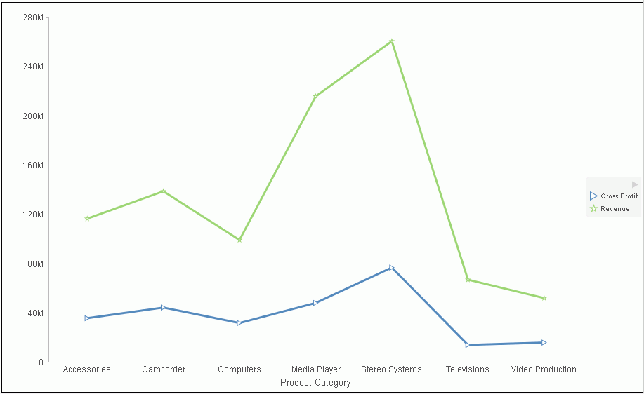
Procedure: How to Change the Appearance of a Marker
Markers are used to display points of data on a line chart. They are also used in the legend to identify the data that is on the chart. The different marker shapes distinguish one series from another.
- Create a line chart.
- Select a series on the line chart.
- On the Series tab, in the Line group, click Marker to open a drop-down menu of options.
- From the Marker drop-down menu, select the marker shape.
For example, Diamond or Hourglass.
The markers are formatted.
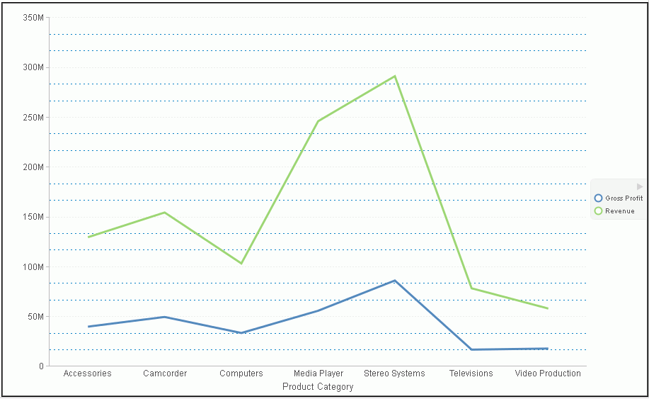
The following image shows a triangle marker for gross profit data and a star marker for revenue data.
Procedure: How to Expand Pie Slices
- Create a pie chart.
- On the Series tab, in the Select group,
from the drop-down menu, select one of the following:
- All Series expands all slices out from the center of the pie.
- A specific series expands that particular slice out from the center of the pie.
- In the Pie group, click Expand.
The pie expands accordingly.
Procedure: How to Hide a Pie Slice
- Create a pie chart.
- On the Series tab, in the Select group,
from the drop-down menu, select the series that you want to hide.
Then, in the Pie group, click Hide.
The slice is hidden.
Procedure: How to Filter Values in a Series
- Create a chart.
- Select a series on the chart.
- Open the Filter dialog box in one of the following ways:
- Ribbon: On the Field tab, in the Filter group, click Filter.
- Shortcut Menu: Right-click a series, and click Filter Values.
The Filter dialog box opens.
- Select values for values and prompts.
- Click OK to close the dialog box.
The series values are filtered.
Procedure: How to Sort the Fields in a Series
- Create a chart.
- Select a series.
- Sort the series in one of the following ways:
- Ribbon: On the Field tab, in the Sort group, click Up to sort the series values from smallest to largest, or click Down to sort the series values from largest to smallest.
- Shortcut Menu: Right click a series on the chart, and point to Sort, and then Sort again. Click Ascending to sort the series values from smallest to largest, or click Descending to sort the series values from largest to smallest. Select Limit to open a list of values to display for a sort group.
The chart appears with the series sorted accordingly.
Procedure: How to Hide a Field in a Series
- Create a chart or visualization.
- Hide a field in a series in one of the following ways:
- Select the field in the Query pane.
- Right-click the field in the chart.
- Ribbon: Select the field in the Query pane or by right-clicking it in the chart. On the Field tab, in the Display group, click Hide Field. Click Hide Field again to make the series reappear.
- Shortcut Menu: Right-click a series in the Query pane, or in the chart, point to Visibility, and then click Hide. Right-click the same series, point to Visibility, and then click Show to make the series reappear.
The field is hidden.
Procedure: How to Display Aggregations on Measure Data
You can display numeric measure data using a variety of aggregation values.
- Create a chart or visualization.
- Open the list of Aggregation options in one of the following ways:
- Ribbon: On the Field tab, in the Display group, click Aggregation.
- Shortcut Menu: Right-click a series, point to More, and then Aggregation Functions.
- Select an aggregation function.
The aggregation function is applied to the series.
Note: If you change the Measure (Sum) Query field container in the Query pane from Sum to Print, Count, or List, the change overrides all assigned aggregation values.
Procedure: How to Display Aggregations on Dimension (Non-Numeric) Data
You can use various aggregations when working with dimension (non-numeric) fields in a chart, including Count, Count Distinct, and Percent of Count. The Count aggregation counts the number of occurrences of a field. Count Distinct counts the number of distinct values within a field. Percent of Count computes a field percentage, based on the number of instances found. When a dimension (non-numeric) field is placed in the Vertical Axis field container, it is converted to a Count field. You can subsequently change the aggregation to Count Distinct or Percent of Count.
- Create a chart.
- Convert a dimension (non-numeric) field into a Count field by placing it in the Vertical Axis field container.
- Select the series on which to perform an aggregation.
- Open the list of Aggregation options in one of the following ways:
- Ribbon: On the Field tab, in the Display group, click Aggregation.
- Shortcut Menu: Right-click a series, point to More, and then click Aggregation Functions.
- Select an aggregation function.
The aggregation is applied to the series.
Procedure: How to Apply Traffic Light Conditions With Drill-Down to a Numeric Measure Field (By Constant)
- Create a chart or visualization.
- Open the Traffic Light Condition dialog box in one of
the following ways:
- Ribbon: In the Query pane, select a field, and then on the Field tab, in the Display group, click Traffic Lights.
- Shortcut Menu: Right-click a series on the chart, point to More, and then click Traffic Light Conditions.
The Traffic Light Condition dialog box opens. For more information, see Traffic Light Condition Dialog Box.
- From the Relational Operators drop-down menu below the field name, select a relational operator. For example, Equal to.
- In the field to the right of the Relational Operators
drop-down menu, click the down arrow for the Type drop-down menu.
The Type dialog box opens.
- In the Type dialog box, select Constant.
- Enter a value in the Value field, or
- From the Get Values drop-down menu, select one of the following values All, First, Last, Minimum, Maximum, From File. The value that you select appears in the Get Values field.
- Select the value in the Get Values field. The value that you selected appears in the Value field.
- Click OK.
The value that you selected appears in the field to the right of the operator drop-down menu.
- Click the Color button.
The Color dialog box opens.
- Select a color.
- Click OK.
The color appears in the Preview box.
- Click OK.
- Click the Drill Down button.
The Drill Down dialog box opens.
- In the Drill Down dialog box, specify each of the following:
- Drill down to a report or a webpage
- URL of the webpage or location of the report
- An alternate comment
- Target (New Window, Same Window)
- Parameters that you want to use (Name, Value)
- Click OK to close the dialog box.
- Click the New button to set traffic
light conditions for additional fields.
Procedure: How to Apply Traffic Light Conditions With Drilldown to a Numeric Measure Field (By Field)
- Create a chart or visualization.
- Open the Traffic Light Condition dialog box in one of
the following ways:
- Ribbon: In the Query pane, select a field, and then on the Field tab, in the Display group, click Traffic Lights.
- Shortcut Menu: Right-click a series on your chart, point to More, and then click Traffic Light Conditions.
The Traffic Light Condition dialog box opens. For more information, see Traffic Light Condition Dialog Box.
- From the Relational Operators drop-down menu below the field name, select a relational operator. For example, Greater than.
- In the field to the right of the operator drop-down menu,
click the arrow for the Type drop-down menu.
The Type dialog box opens.
- In the Type dialog box, select Field.
The Type dialog box displays the Dimensions, and Measures and Properties of your data. You can display the data in the following ways:
- View fields in business order. Select from the following options: Title, Description, Name, or Alias.
- View fields in a sortable grid. Select from the following options: Name, Title, Alias, Format, Segment, Filename, Description, or Reference.
- View the hierarchical structure of the data. Select from the following options: Title, Description, Name, or Alias.
- Select a field.
- Click OK.
The field that you selected appears in the field to the right of the operator drop-down menu.
- Click the Color button.
The Color dialog box opens.
- Select a color.
The color appears in the Preview box.
- Click OK.
- Click the Drill Down button.
The Drill Down dialog box opens.
- In the Drill Down dialog box, specify each of the following:
- Drill down to a report or a webpage
- URL of the webpage or location of the report
- An alternate comment
- Target (New Window, Same Window)
- Parameters that you want to use (Name, Value)
- Click OK to close the dialog box.
- Click the New button to set traffic light conditions for additional fields.
Procedure: How to Change the Title of a Series
- Create a chart or visualization.
- Open the Edit Title dialog box in one of the following
ways:
- Shortcut Menu: Right-click a series on the chart, and click Change Title.
- Query Pane: Right-click a series, and click Change Title.
The Edit Title dialog box opens.
- In the Enter Title field, type the new name for the series.
- Click OK to close the dialog box.
The series has a new title.
Procedure: How to Control the Color Mode
When you create a single-series chart, all series groups appear in the same color. To use a different color for each group, set the color mode to By Group.
- Create a chart or visualization.
- Right-click a series on the chart, point to Color Mode,
and then click By Group.
A different color is applied to each group in the series. To return to the default display of the series in one color, right-click the series, point to Color Mode, and then click By Series.
- Click Run to generate the report.
Procedure: How to Delete a Series
- Create a chart or visualization.
- Right-click a series on the chart, and click Delete.
The series is deleted.
Formatting Data Labels
|
Topics: |
Data labels highlight important data points on a chart. They identify exact numbers. You can customize data labels in a variety of ways to make them stand out more clearly on the chart. For example, you can change the position, angle, color, or size of data labels.
Associated Dialog Boxes
|
Topics: |
Whether you access data label options from the ribbon or the shortcut menu, you are presented with a dialog box of options. The following dialog boxes are commonly used for formatting data labels:
- Format Labels
- Style
- Line Style
For instructions on how to open these dialog boxes, see the procedures in Using Data Labels Properties.
Format Labels Dialog Box
The Format Labels dialog box contains options for editing data labels. The Format Labels dialog box offers different options depending on the chart type that you are using. Bar, line, and area charts share the same tabs.
The Format Labels dialog box contains the following tabs:
- General Options
- Advanced
- Pie Title (for pie charts only)
- Pie Labels (for pie charts only)
- Funnel Labels (for funnel and pyramid charts)
General Options Tab
Use the General Options tab to add data labels to a chart and set their position, angle, and radius.
The General Options tab contains the following options:
- Show Data Labels. Select this option to show data labels on a chart. Clear this option to suppress data labels.
-
Position. Select an option from this drop-down menu to
determine where the data label will be positioned. The options are:
- Above
- Below top edge
- Center
- Base
- Center back
- Format Labels. Select from this drop-down menu of preset formats that can be applied to the labels. Some of the options include Use Pattern, Currency General, and Date Full.
-
Custom Format. Enter a standard number format pattern
for the data label. This option is only available when you select
the Use Pattern option from the Format Labels
drop-down menu.
The following table describes the characters that you can use in a custom format.
Character
Description
#
Is a digit.
0 (zero)
Shows as absent.
. (period)
Is a placeholder for decimal separator.
, (comma)
Is a placeholder for grouping separator.
; (semicolon)
Separates formats.
- (dash)
Is the default negative prefix.
% (percent)
Divides by 100 and shows as a percentage.
x
Determines that any other characters can be used in the prefix or suffix.
‘ (apostrophe)
Is used to quote special characters in a prefix or suffix.
- Style Labels. Click this icon to open the Style dialog box, where you can style text. For more information, see Style Dialog Box.
- Show Cumulative Sums. Select this option to have the data text labels show cumulative sums. Clear this option to have data text labels show individual sums. This option is available for stacked charts.
- Show Stacked Total. Select this option to display stacked totals. Data position should be set to Center to display a stacked total. This option is available for stacked charts.
Advanced Tab
Use the Advanced tab to modify additional data labels properties.
The Advanced tab contains the following options:
- Show Zero Labels. Select this option to display zero values in a chart. Clear this option to display all data values except zero.
- Apply color to negative data labels. Select this option to style negative data labels separately from positive data labels.
- Color. Click this icon to open the Color dialog box, where you can select a color for the negative number.
Pie Title Tab
Use the Pie Title tab to create and style a pie title.
The Pie Title tab contains the following options:
- Show Pie Title. Clear this option to suppress a pie title. Select this option to display a pie title. This is the default option.
- Style Title. Click this icon to open the Style dialog box, where you can style pie title text.
Pie Labels Tab
Use the Pie Labels tab to customize your pie data labels.
The Pie Labels tab contains the following options:
- Label Position. Select from this drop-down menu an option to control the display of feeler lines and labels on a pie chart.
- Label Display. Select from this drop-down menu an option to control the format of labels displayed next to feelers on a pie chart.
- Format Labels. Select from this drop-down menu of preset formats that can be applied to labels.
- Custom Format. Select this option to use a custom format from a list of preset formats. See the following table for a list and description of the characters that you can use in a custom format.
- Style Labels. Click this button to open the Style dialog box, where you can style text.
Ring Label
- Show Ring Label. Select this option to control the display of the total label on a pie ring chart.
- Format Labels. Select from this drop-down menu of preset formats that can be applied to labels.
- Custom Format. Enter a standard number format pattern for the data label. This option is only available when you select the Use Pattern option from the Format Labels drop-down menu.
- Style Labels. Click this button to open the Style dialog box, where you can style text.
Feeler Line
- Line Style. Click this button to open the Line Style dialog box, where you can edit the color, weight, and style of the feeler line.
Funnel Labels Tab
Use the Funnel Labels tab to customize the labels on a funnel or a pyramid chart.
The Funnel Labels tab contains the following options:
- Label Position. Select an option from this drop-down menu to control the display of feeler lines and labels on a funnel chart.
- Format Labels. Select from this drop-down menu of preset formats that can be applied to labels.
- Custom Format. Select this option to use a custom format. See the table in the previous section for a list and description of the characters that you can use in a custom format.
- Style Labels. Click this button to open the Style dialog box, where you can style text.
- Style Value. Opens the Style dialog box, where you can style the value.
Feeler Line
- Show Feeler Lines. (Default) Clear this option to suppress feeler lines. Select this option to display feeler lines.
-
Line Style. Click this button to open the Line Style
dialog box, where you can edit the color, weight, and style of the
feeler line.
Note: While some style options, such as Show Pie Title and Show Feeler Lines, are enabled by default, a StyleSheet applied to the chart may contain different settings that will override these default settings.
Style Dialog Box
The Style dialog box contains options to style the data labels.
The Style dialog box contains the following options:
- Font. Use the drop-down menu to change the font.
- Font size. Use the drop-down menu to change the numeric value for the font size.
- Font style. Click the appropriate button (bold, italic, underline) to style the selected text.
- Text alignment. Click the appropriate button (left, center, right) to align the selected text.
- Font color. Click the button to open the Color dialog box, where you can select the font color.
-
Reset to Quick Styles from Template. Click the button
to reset all settings to the default settings from the template.
Note: Reset only works while the Style dialog box is open. Once you click OK, all changes are committed. To undo global styling after it has been committed, you must use the Undo command on the Quick Access Toolbar.
Line Style Dialog Box
The Line Style dialog box contains options to style lines on a chart.
The Line Style dialog box contains the following options:
- Color. Click this button to open the Color dialog box, where you can select the color for the line.
- Weight. Click this button to open a drop-down menu of line weight options.
- Style. Click this button to open a drop-down menu of line style options.
- Reset. Click this button to reset the line to the default options.
Data Labels Elements Shortcut Menu
When you right-click a data label on a bar, line, or area chart, a menu of the following options opens:
- Data Labels. Point to this option to toggle between Show and Hide.
- More Label Options. Click this option to open the Format Labels dialog box.
The shortcut menu contains options that are available on the Series tab.
Using Data Labels Properties
|
How to: |
The following sections contain procedures for customizing data labels.
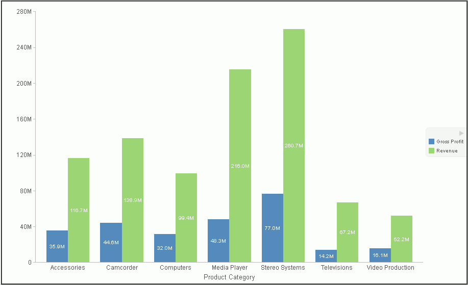
Procedure: How to Show and Hide Data Labels
- Create a chart or visualization.
- You can access the option to show data labels in one
of the following ways:
- Ribbon: On the Series tab, in the Properties group, click Data Labels, and from the drop-down menu, click More Data Label Options. The Format Labels dialog box opens. On the General Options tab, select the Show Data Labels check box, and click OK to close the dialog box. You can use this dialog box to format and style the data labels. For more information, see Format Labels Dialog Box. To hide data labels, clear this option.
- Shortcut Menu: Right-click a series on the chart, point to Data Labels, and then click Show. To hide data labels, right-click a series on the chart, point to Data Labels, and then click Hide.
The data labels appear, and are formatted and styled accordingly.
The following image shows a chart with data labels.
Procedure: How to Change the Position of Data Labels
- On the Series tab, in the Properties group, click Data Labels.
- On the menu, select the position for the data labels.
The data labels are positioned accordingly.
Formatting a Legend
|
Topics: |
A legend contains information that is necessary to accurately interpret the data on a chart. By default, a chart displays either a vertical axis title if there is a single measure field, or a legend if there are multiple measure fields.
Format Legend Dialog Box
Whether you access legend options from the ribbon or the shortcut menu, you are presented with the Format Legend dialog box of options. For instructions on how to open this dialog box, see Using Legend Properties.
The Format Legend dialog box contains options for formatting a legend on a chart or visualization. It contains the following tabs:
- Legend Options
- Markers & Labels
- Fill
- Border Styles
For instructions on how to open this dialog box, see the procedures in Using Legend Properties.
Use the Legend Options tab to customize the appearance of a legend on a chart or visualization.
The Legend Options tab is shown in the following image.
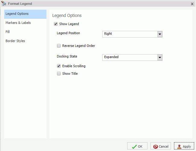
The Legend Options tab contains the following options.
- Show Legend. When selected, a legend displays on a chart or visualization. Clear this option to suppress a legend on a chart or visualization.
- Legend Position. Opens a drop-down menu of options to position the legend. For example, top or left.
- Reverse Legend Order. Specifies that the legend be drawn in reverse order. Clear this option to specify that the legend be drawn in normal order.
- Docking State. This option dictates how the legend is docked. It is set to Expanded by default, but you can set it to Collapsed, which will show that the legend is available (using the grey arrow). This option saves real estate in your chart by collapsing the categorical text labels in the legend while preserving the legend label colors. This is particularly useful when items in your legend have long labels and you wish to truncate them for the purposes of display. If you set this option to None, the ability to expand or collapse the legend is removed and the grey arrow no longer displays.
- Enable Scrolling. Select this check box to enable scrolling in your legend. This is particularly useful when you have numerous entries in your legend. This check box is selected, by default. To disable scrolling in your legend, clear the Enable Scrolling check box. All legend options display in columns, and a scroll bar does not display.
- Show Title. Select this check box to display the legend title.
Use the Markers & Labels tab to customize the appearance of markers and labels on legends.
The Markers & Labels tab contains the following options:
- Style Labels. Opens the Style dialog box, where you can style text.
- Marker Position. Opens a drop-down menu of options to set the position of text relative to the legend marker. For example, Left of Text or Above Text.
Use the Fill tab to modify the color of the legend area. For more information, see Format Series Dialog Box.
Use the Border Styles tab to place a border around a legend. For more information, see Format Series Dialog Box.
The Border Styles tab contains the following options:
- Show Border. Select this option to place a border around a legend.
- Color. With the Show Border option selected, you can click this button to open the Color dialog box, where you can select a color for the border.
Legend Elements Shortcut Menu
When you right-click a legend on a chart, a menu of options opens. The menu contains options that are available on the Format tab.
The shortcut menu options are described in the following table. The table provides links to the sections of this document in which those options are also discussed.
|
Option |
Description |
|---|---|
|
Show legend |
Controls the display of the legend. InfoAssist displays the legend by default. When you clear this option, InfoAssist suppresses the legend. For instructions, see Using Legend Properties. The background shortcut menu has an option to restore the legend after it has been suppressed. |
|
Legend Position |
Controls the placement of the legend on the chart. For instructions see, Using Legend Properties. |
|
Legend Area Color |
Enables you to specify the color of the legend background area using the Color dialog box. This option is available only when you right-click the area around the legend. For instructions see, Using Legend Properties. |
|
Legend Border Color |
Enables you to specify the color of the border around the legend background area using the Color dialog box. This option is available only when you right-click the area around the legend. For instructions see, Using Legend Properties. |
|
More Legend Options |
Opens the Format Legend dialog box. |
Using Legend Properties
|
How to: |
The following sections contain procedures for customizing the legend. The procedures are organized by the tab and group in which their associated options appear on the ribbon.
Procedure: How to Hide a Legend
- Create a chart or visualization with multiple measure fields.
- Clear the Show legend option in
one of the following ways:
- Ribbon: On the Format tab, in the Labels group, click Legend, then click Show legend to clear the option.
- Shortcut Menu: Right-click the legend, and clear the Show legend option.
The legend is hidden.
Procedure: How to Position a Legend
- Create a chart or visualization with multiple measure fields.
- Open the menu of label position options in one of the
following ways:
- Ribbon: On the Format tab, in the Labels group, click Legend, then point to Legend Position.
- Shortcut Menu: Right-click the legend, and point to Legend Position.
- Select a position for the legend. For example, Auto or Right.
Procedure: How to Specify the Color of a Legend Border
- Create a chart or visualization with multiple measure fields.
- Open the Format Legends dialog box in one of the following ways:
- Ribbon: On the Format tab, in the Labels group, click Legend, then click More Legend Options.
- Shortcut Menu: Right-click the legend, and click More Legend Options.
The Format Legends dialog box opens. For more information, see Format Legend Dialog Box.
- On the Border Styles tab, select the option to Show Border.
- Click the Color icon to open the Color dialog box, where you can specify the color of the legend border.
- Click OK to close the Color dialog box.
- Click OK to close the Format Legend
dialog box.
The legend border is formatted accordingly.
The following image is an example of a bar chart with a styled legend.
Formatting Gridlines
|
Topics: |
Gridlines are used on a chart as a reference to help you understand the quantities and values of your data and decode information on the axis. There are four types of gridlines that you can display and edit on your chart. They are:
- Horizontal major gridlines
- Horizontal minor gridlines
- Vertical major gridlines
- Vertical minor gridlines
Major gridlines enhance the display of values, while minor gridlines supplement major gridlines. If a plot point falls in between major gridlines, you can use minor gridlines for more precise interpretation of the data.
- Vertical gridlines in a vertical chart run on the X axis.
- Horizontal gridlines in a vertical chart run on the Y axis.
- Horizontal major gridlines enhance the display of values, compared to the Y-axis scale alone. They are enabled by default on many charts. They do not apply to the pie, 3D, gauge, spectral map, or funnel chart type.
- Horizontal minor gridlines are disabled by default. They do not apply to the pie, 3D, gauge, spectral map, or funnel chart type.
- Vertical major gridlines enhance the display of values, compared to the X-axis scale alone. They are enabled by default. They do not apply to the pie, 3D, gauge, spectral map, or funnel chart type.
- Vertical minor gridlines are disabled by default. They do not apply to the pie, 3D, gauge, spectral map, or funnel chart type.
Note: The orientation of a chart determines the available gridline options.
Format Grid Lines Dialog Box
You can format horizontal and vertical gridlines, color bands, and frames on a chart using the options in the Format Grid Lines dialog box. For instructions on how to open this dialog box, see the procedures in Using Gridline Properties.
Color bands come in a pair, with each band uniquely colored. They appear in a continually repeating pattern behind a series on a chart. The contrast of colors is designed to make the chart easier to read.
Alternate formatting can be used to apply different colors to sections, called regions, of an axis.
The Format Grid Lines dialog box contains the following tabs:
- Major Grid Lines
- Minor Grid Lines
- Color Bands
- Frames
Use the Major Grid Lines tab to format the major gridlines on the chart.
The Major Grid Lines tab contains the following options:
- Show Grid Lines. Select this option to display major gridlines on a chart if minor gridlines are the default for the chart.
- Line Style. Click this icon to open the Line Style dialog box, where you can edit the color, weight, and style of the gridlines.
- Show Ticks. Select this check box to enable or disable the tick mark functionality.
- Tick Style. Select from this drop-down menu of tick styles (Inside, Outside, Spanning).
- Line Style. Click this icon to open the Line Style dialog box, where you can edit the color, weight, and style of the gridlines.
Use the Minor Grid Lines tab to format the minor gridlines on your chart.
The Minor Grid Lines tab contains the following options:
- Show Grid Lines. Select this option to display minor gridlines on a chart. By default, this option is enabled.
- Line Style. Click this icon to open the Line Style dialog box, where you can edit the color, weight, and style of the gridlines.
- Grid count. Set the number of minor gridlines that will appear between major gridlines.
- Show Ticks. Select this check box to enable or disable the tick mark functionality.
- Tick Style. Select from this drop-down menu of tick styles (Inside, Outside, Spanning).
- Line Style. Click this icon to open the Line Style dialog box, where you can edit the color, weight, and style of the gridlines.
Use the Color Bands tab to format the color bands on your chart.
The Color Bands tab contains the following options:
-
Band 1. Select this option to add Band 1 to a chart.
- Color. Click this icon to open the Color dialog box, where you can edit the color of Band 1.
- Transparency. Move the slider to make Band 1 opaque (0%) or transparent (100%). The default is 0%.
- %. Enter or select the percentage of the transparency of Band 1.
-
Band 2. Select this option to add Band 2 to a chart.
- Color. Click this icon to open the Color dialog box, where you can edit the color of Band 2.
- Transparency. Move the slider to make the Band 2 opaque (0%) or transparent (100%). The default is 0%.
- %. Enter or select the percentage of the transparency of Band 2.
Use the Frames tab to enable or disable frame regions, and to set the location and style of the frame text.
The Frames tab contains the following options:
-
Show Frame Regions. Select this option to show a
frame region. Clear this option to suppress a frame region.
- Region. Select from this drop-down list, the region that you want to format.
- Add. Click this button to add a region.
- Remove. Click this button to remove a region.
- Location. Enter the location of the region.
- Color. Click this icon to open the Color dialog box, where you can edit the color of the frame.
- Border Color. Click this icon to open the Color dialog box, where you can edit the color of the frame border.
- Text. Enter the text that you want to appear on the frame.
- Style Text. Click this icon to style the frame text.
For instructions on how to open this dialog box, see the procedures in Using Gridline Properties.
Gridline Elements Shortcut Menu
When you right-click a gridline on a chart, a menu of options opens. The options for the gridline elements are described in the following table.
|
Element |
Option |
Description |
|---|---|---|
|
Horizontal Major Gridlines Horizontal Minor Gridlines Vertical Major Gridlines Vertical Minor Gridlines |
Delete |
Removes the gridlines from the chart and updates the Live Preview accordingly. |
|
Set Line Color |
Enables you to specify the color of the gridlines, using the Color dialog box. For more information, see Color Dialog Box. |
|
|
More Grid Lines Options |
Opens the Format Gridlines dialog box. |
Using Gridline Properties
|
How to: |
The following sections contain procedures for customizing gridlines.
Procedure: How to Display Horizontal Major Gridlines
If your chart does not display gridlines by default, use this procedure to generate gridlines.
- Create a chart or visualization.
- On the Format tab, in the Features group,
open the Grid drop-down menu, point to Horizontal Gridlines,
and then click Major Gridlines.
Horizontal major gridlines are added to the chart.
Procedure: How to Display Horizontal Minor Gridlines
- Create a chart or visualization.
- Access the option to show gridlines in one of the following
ways:
- Ribbon: On the Format tab, in the Features group, open the Grid drop-down menu. On the Grid drop-down menu, point to Horizontal Gridlines, and then click Minor Gridlines.
- Shortcut Menu: Right-click the gridlines on the chart, and click More Grid Lines Options. The Format Horizontal Grid Lines dialog box opens. On the Minor Grid Lines tab, select Show Grid Lines.
Horizontal minor gridlines are added to the chart.
Procedure: How to Display Vertical Major Gridlines
- Create a chart or visualization.
- Access the option to show gridlines in one of the following
ways:
- Ribbon: On the Format tab, in the Features group, open the Grid drop-down menu. On the Grid drop-down menu, point to Vertical Gridlines, and then click Major Gridlines.
- Shortcut Menu: Right-click the gridlines on the chart, and click More Grid Lines Options. The Format Vertical Grid Lines dialog box opens. On the Major Grid Lines tab, select Show Major Grid Lines.
Vertical major gridlines are added to the chart.
Procedure: How to Display Vertical Minor Gridlines
- Create a chart or visualization.
- Access the option to show gridlines in one of the following
ways:
- Ribbon: On the Format tab, in the Features group, open the Grid drop-down menu. On the Grid drop-down menu, point to Vertical Gridlines, and then click Minor Gridlines.
- Shortcut Menu: Right-click the gridlines on the chart, and click More Grid Lines Options. The Format Vertical Grid Lines dialog box opens. On the Minor Grid Lines tab, select Show Minor Grid Lines.
Vertical minor gridlines are added to the chart.
Procedure: How to Set the Color, Weight, and Style of a Gridline
- Open the Format Grid Lines dialog box
in one of the following ways:
- Ribbon: On the Format tab, in the Features group, open the Grid drop-down menu, point to the gridline type that you want to format, and click More Grid Lines Options.
- Shortcut Menu: Right-click a gridline, and click More Grid Lines Options.
The Format Grid Lines dialog box opens.
- Click the Line Style icon.
The Line Style dialog box opens.
- Set the color, weight, and style of the gridlines.
- Click OK to close the Line Style dialog box.
- Click OK again to close the Format
Grid Lines dialog box.
The gridlines are formatted accordingly.
The following image shows a line chart with styling applied to the gridlines.
Procedure: How to Set Ticks
Ticks are short lines which are perpendicular to a gridline. They are used to tick off specific increments along the gridline.
- Create a chart or visualization with gridlines.
- Open the Format Grid Lines dialog box in one of the following ways:
- Ribbon: On the Format tab, in the Features group, open the Grid drop-down menu, point to the gridline type that you want to format, and click More Grid Lines Options.
- Shortcut Menu: Right-click a gridline, and click More Grid Lines Options.
The Format Grid Lines dialog box opens.
- From the Tick Style drop-down menu select a tick style
option. The options are:
- Inside
- Outside
- Spanning
- Click the Line Style icon to open the Line Style dialog box, where you can edit the color, weight, and style of the gridline.
- Click OK to close the Line Style dialog box.
- Click OK again to close the Format
Grid Lines dialog box.
The tick marks are formatted accordingly.
The following image shows a chart with tick marks spanning both the vertical axis and horizontal axis.
Procedure: How to Set Color Bands
- Create a chart or visualization with gridlines.
- Open the Format Grid Lines dialog box in one of the following ways:
- Ribbon: On the Format tab, in the Features group, open the Grid drop-down menu, point to the gridlines that you want to format, and click More Grid Lines Options.
- Shortcut Menu: Right-click a gridline, and click More Grid Lines Options.
The Format Grid Lines dialog box opens.
- On the Color Bands tab, click the Color icon to open the Color dialog box, where you can set the color of the color bands.
- Use the transparency slider, or the percentage box, to type or select the percentage of the transparency that you want to apply to the color.
- Click OK to close the Color dialog box.
- Click OK again to close the Format
Grid Lines dialog box.
The following image shows a chart with color bands along the horizontal gridline.
Procedure: How to Delete a Gridline
- Create a chart or visualization with gridlines.
- Select a gridline.
- Delete the gridline in one of the following ways:
- Ribbon: On the Format tab, in the Features group, open the Grid drop-down menu. From the menu, point to the gridline that you want to format, and click More Grid Lines to open the Format Grid Lines dialog box. On the tab for the gridline that you want to delete, clear the Show Grid Lines option, and click OK.
- Shortcut Menu: Right-click the gridline, and from the menu, select Delete.
The gridline is deleted from the chart.
Procedure: How to Add Frames to Regions on a Chart
- Create a chart or visualization.
- On the Format tab, in the Features group, click Grid.
- On the drop-down menu, point to either Horizontal Gridlines
or Vertical Gridlines, and then click More Grid Lines
Options.
The Format Grid Lines dialog box opens.
- On the Frames tab, select the Show Frame Regions check box.
- Click Apply.
Colored frames are added to the chart, using the default styling options. Optionally, you may use the color and border color options to change these.
The following image shows a bar chart with colored frames around each region.
Formatting Axis Labels
|
Topics: |
|
Reference: |
Vertical and horizontal axes are based on the orientation of the graph. For example, in a vertical graph, the horizontal axis refers to the X axis and the vertical axis refers to the Y axis. In a horizontal graph, the horizontal axis refers to the Y axis and the vertical axis refers to the X axis. This is important to consider, since options could change depending on the orientation of the graph.
A chart can contain the following types of axis labels:
- Horizontal axis labels represent the X axis. They do not apply to pie, funnel, or gauge charts.
- Vertical axis labels represent the Y1 axis in a single axis chart. They represent a numeric scale, usually located on the left side of a vertical chart.
- Secondary horizontal and vertical labels can only be used when dual axes charts are selected.
Format Axis Dialog Box
Whether you access axis options from the ribbon, or the shortcut menu, you are presented with the Format Axis dialog box of options for formatting for both vertical and horizontal axes. The Format Axis dialog box contains the following tabs:
- Scale
- Title
- Labels
- Advanced
Reference: Format Vertical Axis Dialog Box
You use the Format Vertical Axis dialog box to specify formatting options for the vertical axis in your chart.
Use the Scale tab to modify scale properties.
The Scale tab contains the following options:
-
Automatic Minimum. Supplies
the minimum value on the Y-axis scale automatically. To use manual
scaling, clear this option. You can then set the minimum value by
entering a number into the Value text box.
- Value. Type the minimum value in this text box if you have not selected Automatic Minimum.
-
Automatic Maximum. Supplies the maximum value on the
Y-axis scale automatically. To use manual scaling, clear this option.
You can then set the maximum value by entering a number into the
Value text box.
- Value. Type the maximum value in this text box if you have not selected Automatic Maximum.
-
Automatic Grid
Step. Calculates the number of major grid steps automatically.
To use manual scaling, clear this option. You can then set the
value by typing the number into the Value text box.
- Value. Type the value in this text box if you have not selected Automatic Grid Step.
- Logarithmic Scale. Controls whether or not the Y-axis scale progresses logarithmically instead of linearly. This option is disabled by default. When selected, the logarithmic base is set to 10.0, but can be changed by entering another value.
- Include zero on scale. Controls whether or not a zero (0) value appears on the scale. This option is enabled by default.
Use the Title tab to show or hide the axis title, and create and style the title for the axis.
The Title tab contains the following options:
- Show title. Select this check box to show the axis title (default) or clear the check box to hide the axis title.
- Text. Type a title for the axis in the Text field.
- Style text. Opens the Style dialog box, where you can style the text.
Use the Labels tab to format the layout of the axis labels.
The Labels tab contains the following options:
-
Show Labels. Displays
labels next to the axis. This is enabled by default. Clear this
option to suppress labels.
- Axis side. Contains a list of position options for the labels on the axis. The options are Left (default), Right, or Both.
- Style labels. Opens the Style dialog box, where you can style text.
- Format Labels. Contains a list of preset formats that can be applied to the labels.
- Custom Format. Allows you to use a custom format. This option is activated when Use Pattern /100 or Use Pattern are selected as the label format.
The Format Labels drop-down menu provides a list of preset formats that you can apply to labels. When you select a custom format, it must be defined using a custom format pattern. See the following table for a list and description of the characters that you can use in a custom format.
|
Character |
Description |
|---|---|
|
# |
Is a digit. |
|
0 (zero) |
Shows as absent. |
|
. (period) |
Is a placeholder for a decimal separator. |
|
, (comma) |
Is a placeholder for a grouping separator. |
|
; (semicolon) |
Separates formats. |
|
- (dash) |
Is the default negative prefix. |
|
% (percent) |
Divides by 100 and shows as a percentage. |
|
x |
Determines that any other characters can be used in the prefix or suffix. |
|
‘ (apostrophe) |
Is used to quote special characters in a prefix or suffix. |
Use the Advanced tab to modify additional axis properties.
The Advanced tab contains the following options:
- Exclude Minimum Label. Excludes the label with the lowest axis value from the chart.
- Exclude Maximum Label. Excludes the label with the highest axis value from the chart.
- Descending Axis. Draws the axis in descending order.
-
Show axis line. Controls the display of the axis baseline.
- Line Style. Opens the Line Style dialog box, where you can edit the color, weight, and style of the axis line.
-
Show zero line. Controls the display of the zero line.
- Line Style. Opens the Line Style dialog box, where you can edit the color, weight, and style of the zero line.
-
Custom Baseline. Controls the display of the custom baseline.
- Value. Type a value for the custom baseline.
- Line Style. Opens the Line Style dialog box, where you can edit the color, weight, and style of the custom baseline.
For instructions on how to open this dialog box, see the procedures in Using Axis Properties.
Reference: Format Horizontal Axis Dialog Box
You use the Format Horizontal Axis dialog box to specify formatting options for the horizontal axis in your chart.
Use the Scale tab to modify scale properties.
The Scale tab contains the following options:
-
Automatic Minimum. Supplies
the minimum value on the Y-axis scale automatically. To use manual
scaling, clear this option. You can then set the minimum value by
entering a number into the Value text box.
- Value. Type the minimum value in this text box if you have not selected Automatic Minimum.
-
Automatic Maximum. Supplies the maximum value on the
Y-axis scale automatically. To use manual scaling, clear this option.
You can then set the maximum value by entering a number into the
Value text box.
- Value. Type the maximum value in this text box if you have not selected Automatic Maximum.
-
Automatic Grid
Step. Calculates the number of major grid steps automatically.
To use manual scaling, clear this option. You can then set the
value by typing the number into the Value text box.
- Value. Type the value in this text box if you have not selected Automatic Grid Step.
- Logarithmic Scale. Controls whether or not the Y-axis scale progresses logarithmically instead of linearly. This option is disabled by default. When selected, the logarithmic base is set to 10.0, but can be changed by entering another value.
- Include zero on scale. Controls whether or not a zero (0) value appears on the scale. This option is enabled by default.
Use the Title tab to create and style the title for the axis.
The Title tab contains the following options:
- Show title. Select this check box to show the axis title (default) or clear the check box to hide the axis title.
- Text. Type a title for the axis in the Text field.
- Style. Opens the Style dialog box, where you can style the text.
Use the Labels tab to format the layout of the axis labels.
The Labels tab contains the following options:
-
Show Labels. Displays
labels next to the axis. This is enabled by default. Clear this
option to suppress labels.
- Axis side. Contains a list of position options for the labels on the axis. The options are Left (default), Right, or Both.
- Style labels. Opens the Style dialog box, where you can style text.
- Stagger Labels. Sets the labels to appear staggered.
- Concatenate Labels. Concatenates the labels in your chart. This is enabled by default.
- Format Labels. Contains a list of preset formats that can be applied to the labels.
- Custom Format. Allows you to use a custom format. This option is activated when Use Pattern /100 and Use Pattern are selected as the format labels.
Use the Advanced tab to modify additional axis properties.
The Advanced tab contains the following options:
- Exclude Minimum Label. Excludes the label with the lowest axis value from the chart.
- Exclude Maximum Label. Excludes the label with the highest axis value from the chart.
- Descending Axis. Draws the axis in descending order.
-
Show zero line. Controls the display of the zero line.
- Line Style. Opens the Line Style dialog box, where you can edit the color, weight, and style of the zero line.
For instructions on how to open this dialog box, see the procedures in Using Axis Properties.
Secondary Axes Options
Formatting options are available for secondary axes in dual-axis charts. For example, in a vertical dual-axis chart, the secondary vertical axis refers to the Y2 axis.
The Format Secondary Axis dialog box contains the following tabs for both vertical and horizontal axes:
- General. For more information, see the Scale tab options in Format Axis Dialog Box.
- Title. For more information, see the equivalent tab in Format Axis Dialog Box.
- Labels. For more information, see the equivalent tab in Format Axis Dialog Box.
- Advanced. For more information, see the equivalent tab in Format Axis Dialog Box.
Axis Elements Shortcut Menu
When you right-click an axis label or title in a chart in Live Preview, a menu of options opens. The options for the right-click axis label elements are described in the following table.
|
Element |
Option |
Description |
|---|---|---|
|
Axis Title |
Delete |
Deletes the axis title from the chart and updates the Live Preview accordingly. |
|
Change Title |
Enables you to change the axis title. |
|
|
Style Title |
Enables you to apply styling to the axis title, using the Style dialog box. For more information, see Style Dialog Box. |
|
|
Horizontal Labels |
Delete |
Deletes labels from the chart and updates the Live Preview accordingly. |
|
Stagger |
Controls the positioning of the labels. The On value positions the labels in a zigzag pattern. The Off default value positions the labels in a straight row. |
|
|
Rotate |
Rotates the labels a specified number of degrees. |
|
|
Style Labels |
Enables you to apply styling to the labels, using the Style dialog box. For more information, see Style Dialog Box. |
|
|
More Axis Options |
Opens the Format Axis dialog box. For more information, see Formatting Axis Labels. |
|
|
Vertical Labels |
Delete |
Deletes labels from the chart and updates the Live Preview accordingly. |
|
Rotate |
Rotates the labels a specified number of degrees. |
|
|
Format Labels |
Formats the labels according to the value that you specify. |
|
|
Style Labels |
Enables you to apply styling to the labels, using the Style dialog box. For more information, see Style Dialog Box. |
|
|
More Axis Options |
Opens the Format Axis dialog box. For more information, see Formatting Axis Labels. |
Using Axis Properties
|
How to: |
The following sections contain procedures for customizing an axis. The procedures are organized by the tab and group in which their associated options appear on the ribbon.
Axis labels appear by default.
Procedure: How to Delete Axis Labels
- Create a chart or visualization.
- You can delete axis labels in one of the following ways:
- Ribbon: On the Format tab, in the Labels group, open the Axes drop-down menu, point to the axis that you are working with, and clear the Show Labels option.
- Shortcut Menu: Right-click an axis label on the chart, and click Delete.
The axis labels are deleted from the chart.
Procedure: How to Stagger Axis Labels
Note: You can only apply a staggered effect to horizontal axis labels.
- Create a chart or visualization with at least one axis label on display.
- Access the Stagger option in one of the following ways:
- Ribbon: On the Format tab, in the Labels group, open the Axes drop-down menu, point to the axis that you are working with, and click Stagger Labels.
- Shortcut Menu: Right-click an axis label on the chart, point to Stagger and select On.
The axis labels are staggered.
Procedure: How to Rotate Axis Labels
- Create a chart or visualization with axis labels.
- Access the Rotate option in one of the following ways:
- Ribbon: On the Format tab, in the Labels group, open the Axes drop-down menu, point to the axis that you are working with, point to Rotate Labels, and then click the degree to which you want to rotate the axis labels.
- Shortcut Menu: Right-click an axis label on the chart, point to Rotate, and then click the degree to which you want to rotate the axis labels.
The axis labels are rotated.
Procedure: How to Format Axis Labels
- Create a chart or visualization with an axis label.
- Access the list of axis label options in one of the following
ways:
- Ribbon: On the Format tab, in the Labels group, open the Axes drop-down menu, point to the axis that you are working with, and click More Axis Options to open the Format Axis dialog box. Open the Labels tab, and from the Labels option drop-down menu, select the formatting option that you want.
- Shortcut Menu: Right-click an axis label, point to Format Labels, and click the formatting option that you want.
The axis labels are formatted accordingly.
Procedure: How to Manually Set the Scale of an Axis
- Create a chart or visualization.
- Open the Format Axis dialog box in one of the following
ways:
- Ribbon: On the Format tab, in the Labels group, open the Axes drop-down menu, point to the axis that you are working with, and click More Axis Options.
- Shortcut Menu: Right-click an axis value on the chart, and click More Axis Options.
The Format Axis dialog box opens.
- On the scale tab, clear the Automatic Minimum option and enter your own minimum value in the Value text box.
- Clear the Automatic Maximum option, and enter your own maximum value in the Value text box.
- Clear the Automatic Grid Step option, and enter your own grid step value in the Value text box.
- Optionally, you can select the Logarithmic Scale option and enter the log scale base in the text field of that name. You can also clear the Include zero on scale option if you do not want zero to appear on the axis.
- Click OK to close the dialog box.
The axis scale is set accordingly.
Procedure: How to Add an Axis Title
- Create a chart or visualization with an axis label.
- Open the Format Axis dialog box in one of the following
ways:
- Ribbon: On the Format tab, in the Labels group, open the Axes drop-down menu, point to the axis that you are working with, and click More Axis Options.
- Shortcut Menu: Right-click an axis label, and click More Axis Options.
The Format Axis dialog box opens.
- On the Title tab, type the axis title in the Text field.
- Click the Style text icon to open
the Style dialog box, where you can style the text.
The axis title is styled accordingly.
Note: Right-click the axis title to delete, change, or style the axis title.
Procedure: How to Set Advanced Axis Properties
- Create a chart or visualization with an axis label.
- Open the Format Axis dialog box in one of the following
ways:
- Ribbon: On the Format tab, in the Labels group, open the Axes drop-down menu, point to the axis that you are working with, and click More Axis Options.
- Shortcut Menu: Right-click an axis label, and click More Axis Options.
The Format Axis dialog box opens.
- On the Advanced tab, set the following options:
- Exclude Minimum Label
- Exclude Maximum Label
- Descending Axis
- Show zero line
You can edit the color, weight, and style of all the lines that you set in the Line Style dialog box.
- Click OK.
The axis advanced options are set accordingly.
Formatting a Frame and a Background
|
Topics: |
The frame of a chart is the area that contains the plot points. It is also the area in which horizontal and vertical gridlines are drawn.
The background of a chart is the area around the frame.
You can adjust the appearance of the frame and background to achieve different visual effects for your charts. For example, you can change the appearance of the chart frame line, or you can change the color of the background of your chart, as shown in the following image.
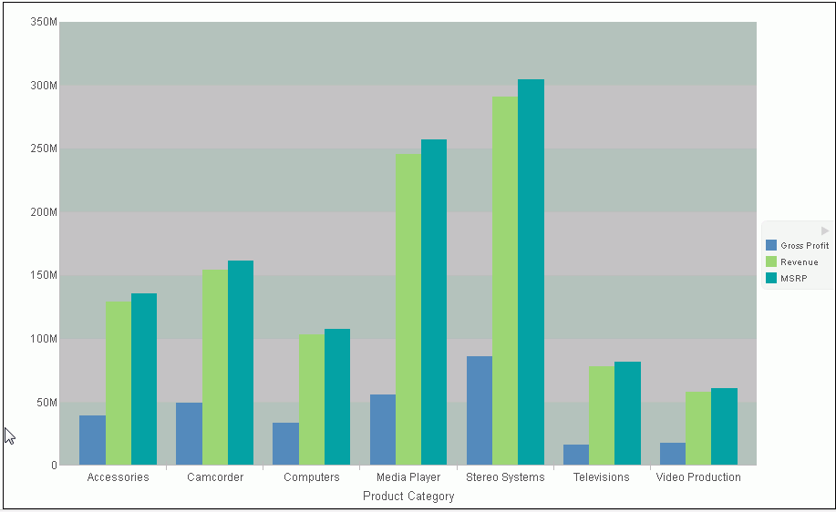
Frame & Background Dialog Box
Whether you access frame and background options from the ribbon, or the shortcut menu, you are presented with the Frame & Background dialog box of options for formatting the frame and background of a chart. The Frame & Background dialog contains the following tabs:
- Frame
- Frame Edge
- Background
The Frame & Background dialog box and pertinent tabs are discussed in this section for the following types of charts:
- 2D Charts and 2D Charts with 3D Effects (Frame and Frame Edge tabs)
- Pie Charts (Frame and Frame Edge tabs)
- 3D Charts (Left Wall, Right Wall, Floor, and Advanced tabs)
Note: The options in the Frame tab vary based on the chart type selected.
Use the Frame tab for 2D charts and 2D charts with 3D effects to set a frame depth angle and depth radius, select a fill for a frame, and set a shadow for a frame for these types of charts.
The Frame tab for 2D charts and 2D charts with 3D effects contains the following options:
- Depth Angle. Enter the angle from the front of the chart to the back where the chart risers and frames are drawn. You can set the depth angle from zero to 180 degrees, but it must be used along with Depth Radius.
- Depth Radius. Enter how far out the extruded frame will be extended. Small values, such as zero, produce very narrow charts. Large values, the maximum being 100, produce thicker charts.
Fill
- No fill. (Default). Select this option to keep the legend colorless.
-
Solid fill. Select this option to display the Color and
Transparency options.
- Color. Click this icon to open the Color dialog box, where you can select a color for a frame.
- Transparency. Move the slider to make the frame opaque (0%) or transparent (100%). The default is 0%.
-
Gradient fill. Select this option to display the direction
of the gradient, the color pattern of the gradient, and the degrees
of transparency for the two colors that make up the gradient. A
gradient is a smooth color transition or blending of one color to another.
The number of colors to use in a gradient is defined by the stop or pin elements.
- Direction. Select from this drop-down menu to set the direction of the gradient fill. For example, Gradient right or Gradient left.
Gradient style
- Color Pattern. Select the color pattern for the data series. The color pattern option on the left is an AB wash that uses two colors in the pattern color1 - color2, for example, red-green. The color pattern option on the right is an ABA wash that uses two colors in the pattern color1 - color2 - color1, for example, red-green-red.
- First Color. Click this icon to open the Color dialog box, where you can select a color for the first color.
- Second Color. Click this icon to open the Color dialog box, where you can select a color for the second color.
Shadow
- Show Shadow. Select this option to set a shadow.
Use the Frame Edge tab for 2D charts and 2D charts with 3D effects to set a frame depth angle and depth radius, select a fill for a frame, and set a shadow for a frame for these types of charts.
The Frame tab for 2D charts and 2D charts with 3D effects contains the following options:
- Automatically Shade Frame Edge. Select this option to automatically shade the frame edge. Clear this option to enable the Side Frame and Bottom Frame options.
Side Frame
- Show Color. Select this option to show the color of the side frame.
- Color. Click this icon to open the Color dialog box, where you can select a color for the side frame.
- Show Border Color. Select this option to show the color of the border of the side frame.
- Border Color. Click this icon to open the Color dialog box, where you can select a color for the border of the side frame.
Bottom Frame
- Show Color. Select this option to show the color of the bottom frame.
- Color. Click this icon to open the Color dialog box, where you can select a color for the bottom frame.
- Show Border Color. Select this option to show the color of the bottom frame.
- Border Color. Click this icon to open the Color dialog box, where you can select a color for the border of the bottom frame.
Use the Frame tab for pie charts to set pie depth and tilt, select a fill and color for a pie frame, and set a shadow for the frame.
The Frame tab for pie charts contains the following options:
- Pie Depth. Set the depth of the edge of a pie chart. You can select a value from zero to 100 to set the thickness of an edge.
- Pie Tilt. Set the tilt of the pie chart. The smaller the value you add, the flatter the pie chart appears. The larger the value you add, more of the pie edge appears.
Fill
- No fill. (Default). Results in no color added to the edge of the pie.
-
Solid fill. Select this option to display the Color and
Transparency options.
- Color. Click this icon to open the Color dialog box, where you can select a color for the frame.
- Transparency. Move the slider to make the fill opaque (0%) or transparent (100%). The default is 0%.
-
Gradient fill. Select this option to display the direction
of the gradient, the color pattern of the gradient, and the degrees
of transparency for the two colors that make up the gradient. A
gradient is a smooth color transition or blending of one color to another.
The number of colors to use in a gradient is defined by the stop or pin elements.
- Direction. Select from this drop-down menu to set the direction of the gradient fill. For example, Gradient right or Gradient left.
-
Gradient Style
- Color Pattern. Select the color pattern for the data series. The color pattern option on the left is an AB wash that uses two colors in the pattern color1 - color2, for example, red-green. The color pattern option on the right is an ABA wash that uses two colors in the pattern color1 - color2 - color1, for example, red-green-red.
- First Color. Click this icon to open the Color dialog box, where you can select a color for the first color.
- Second Color. Click this icon to open the Color dialog box, where you can select a color for the second color.
Shadow
- Show Shadow. Select this option to set a shadow around the frame.
Use the Frame Edge tab for pie charts to set the edge of a pie frame.
The Frame Edge tab for pie charts contains the following options:
- Automatically Shade Frame Edge. Select this option to automatically shade the frame edge. Clear this option to enable the Side Frame and Bottom Frame options.
- Show Color. Select this option to show the color of the side frame.
- Color. Click this icon to open the Color dialog box, where you can select a color for side frame.
- Show Border Color. Select this option to show the color of the border of the side frame.
- Border Color. Click this icon to open the Color dialog box, where you can select a color for the border of the side frame.
Bottom Frame
- Show Color. Select this option to show the color of the bottom frame.
- Color. Click this icon to open the Color dialog box, where you can select a color for the bottom frame.
- Show Border Color. Select this option to show the color of the bottom frame.
- Border Color. Click this icon to open the Color dialog box, where you can select a color for the border of the bottom frame.
Use Wall and Floor tabs to set the walls and floor of a 3D chart.
These Wall and Floor tabs contain the following options:
- Show Wall or Show Floor. Select this option to show the wall or floor (depending on the tab) of the 3D chart.
- Wall Thickness. Specify the thickness of the wall or floor.
- Cube Size. Specify the cube size of the wall or floor.
- Color. Click this icon to open the Color dialog box, where you can select a color for the wall or floor.
- Border Color. Click this icon to open the Color dialog box, where you can select a color for the border of the wall or floor.
- Show Wall (Left Wall). Select this option to show the left wall.
- Show Wall (Right Wall). Select this option to show the right wall.
- Show Floor. Select this option to show the floor.
Use the Advanced tab for 3D charts to modify additional properties for 3D frames.
The Advanced tab contains the following options:
- Viewing Angles. Select from a drop-down menu of viewing angles for three-dimensional charts. For example, Standard or Group View.
- Isometric Projection. Select this option to ignore perspective distortion in a project graph cube from an isometric view.
- Proportional Cube. Select this option to define the axis size proportional to the number of series or groups.
- Automatic shading of walls. Select this option to shade chart walls.
-
Automatically Shade Frame Edge. Select this option to
automatically shade the frame edge.
- 3D Zoom Factor. Enter a value in the text box to set the global scaling factor for zooming in and out in a 3D chart. Smaller values zoom out and produce a smaller display of the chart within a frame. Larger values zoom in and produce a larger display of the chart within a frame.
- Pan Horizontally. Enter a value in the text box to pan a 3D chart in the horizontal direction. Smaller values move the frame of the chart to the left. Larger values move the frame of the chart to the right.
- Pan Vertically. Enter a value in the text box to pan a 3D chart in the vertical direction. Smaller values move the frame of the chart upward. Larger values move the frame of the chart downward.
Use the Background tab to set and customize a border for a chart.
The Background tab contains the following options:
- Show Border Color. Select this option to show the color of the border.
- Border Color. Click this icon to open the Color dialog box, where you can select a color for the border.
-
Solid fill. Select this option to display the Color and
Transparency options.
- Color. Click this icon to open the Color dialog box, where you can select a color for the frame.
- Transparency. Move the slider to make the background opaque (0%) or transparent (100%). The default is 0%.
-
Gradient fill. Select this option to display the direction
of the gradient, the color pattern of the gradient, and the degrees
of transparency for the two colors that make up the gradient. A
gradient is a smooth color transition or blending of one color to another.
The number of colors to use in a gradient is defined by the stop or pin elements.
- Direction. Select from this drop-down menu to set the direction of the gradient fill. For example, Gradient right or Radial.
Gradient Style
- Color Pattern. Select the color pattern for the data series. The color pattern option on the left is an AB wash that uses two colors in the pattern color1 - color2, for example, red-green. The color pattern option on the right is an ABA wash that uses two colors in the pattern color1 - color2 - color1, for example, red-green-red.
- First Color. Click this icon to open the Color dialog box, where you can select a color for the first color.
- Second Color. Click this icon to open the Color dialog box, where you can select a color for the second color.
For instructions on how to open this dialog box, see the procedures in Using Frame and Background Properties.
Frame and Background Shortcut Menu
When you right-click a chart background, a menu of options opens. The options for the background and frame elements are described in the following table.
|
Element |
Option |
Description |
|---|---|---|
|
Background |
Background Color |
Enables you to specify the color of the background, using the Color dialog box. For instructions, How to Change the Color of the Background. |
|
Show legend |
Controls the display of the legend on the background. When selected, it displays the legend. When cleared, it suppresses the display of the legend. |
|
|
More Frame and Background Options |
Opens the Frame & Background dialog box. For more information, see Frame & Background Dialog Box. |
|
|
Frame |
Frame Color |
Enables you to specify the color of the frame, using the Color dialog box. For more information, see Color Dialog Box. |
|
Show 3D |
Controls the depth of the frame. The value On renders the frame in 3D depth. The value Off renders the frame in one dimension. |
|
|
More Frame and Background Options |
Opens the Frame & Background dialog box. For more information, see Frame & Background Dialog Box. |
Using Frame and Background Properties
|
How to: |
The following sections contain procedures for customizing frame and background properties. The options for the following procedures are found in the Features group of the Format tab.
Procedure: How to Change the Color of the Frame
The default color of the frame in a chart is determined by the Document Theme selected on the Options dialog box. For more information, see Changing InfoAssist User Preferences.
This procedure describes how to change the color of the frame.
- Create a chart or visualization.
- Access the Frame & Background dialog box in one of
the following ways:
- Ribbon: On the Format tab, in the Features group, click Frame & Background.
- Shortcut Menu: Right-click the chart, and click More Frame & Background Options.
The Frame & Background dialog box opens.
- On the Frame tab, in the Fill area, click the Color icon.
Note: Solid fill must be selected for the Color icon to appear.
The Color dialog box opens. Select a new color for the frame. For more information on the Color dialog box, see Color Dialog Box. You can also set the depth angle and depth radius for the frame, as well as set a shadow for the frame.
- Click OK.
The chart displays the new frame color.
Procedure: How to Change the Color of the Background
The default color of the background of a chart is determined by the Document Theme selected on the Options dialog box. For more information, see Changing InfoAssist User Preferences.
- Create a chart or visualization.
- Open the Frame & Background dialog box in one of
the following ways:
- Ribbon: On the Format tab, in the Features group, click Frame & Background.
- Shortcut Menu: Right-click the background of the chart, and click Background Color.
The Frame & Background dialog box opens.
- On the Background tab, in the Background Fill area, click the Color icon.
The Color dialog box opens. Select a new color for the background. For more information on the Color dialog box, see Color Dialog Box.
- Click OK.
The chart displays the new background color.
Formatting a Gauge Chart
|
Topics: |
A gauge chart is a circular chart that indicates the current position of a single data value within a given spectrum.
You can change the appearance of a gauge chart by using the gauge chart options found on the Format Gauge dialog box. To access the Format Gauge dialog box, on the Format tab, in the Features group, click Gauges.
Format Gauge Dialog Box
Whether you access gauge options from the ribbon, or the shortcut menu, you are presented with the Format Gauge dialog box of options for formatting a gauge chart. Such options include setting and styling a title for the gauge chart, setting tick marks, enabling and styling color bands, as well as setting advanced options, such as the gauge start and stop angle.
The Format Gauge dialog box contains the following tabs:
- General Options
- Axis Scale & Labels
- Tick Marks
- Bands
- Advanced
Use the General Options tab to set general gauge options.
The General Options tab contains the following options:
-
Gauges per row. Enter or select how many gauges appear
on each row. The default setting displays two gauge charts. A maximum
of 32 gauge charts can appear on each row.
Note: The number of charts displayed per row can differ, based on the output format selected. For example, HTML format will display two charts per row, and HTML5 will display three.
Gauge Title
- Show title. (Default) Displays a gauge title appear for each gauge. Clear this option to suppress the title.
- Position. Select a position for the gauge title. Above is the default value.
- Style. Click this icon to open the Style dialog box, where you can style text.
Gauge value
- Show value. (Default) Clear this option to suppress the gauge value.
- Style. Click this icon to open the Style dialog box, where you can style text.
- Format Value. Contains a list of preset formats that can be applied.
- Custom Format. Allows you to use a custom format. This option is activated when Use Pattern /100 or Use Pattern are selected as the label format.
Use the Axis Scale & Labels tab to set the axis scale and label properties for the gauge needle.
The Axis Scale & Labels tab contains the following options:
Scale
- Automatic Minimum. (Default) Sets the engine to automatically supply the minimum value on the scale. Clear this option to manually set the minimum value by entering a number into the Value text box.
- Value. Enter the minimum value in this text box if you have not selected Automatic Minimum.
- Automatic Maximum. (Default) Sets the engine to automatically supply the maximum value on the scale. Clear this option to manually set the maximum value by entering a number into the Value text box.
- Value. Enter the maximum value in this text box if you have not selected Automatic Maximum.
Labels
- Show Labels. (Default) Displays labels next to the axis. Clear this option to suppress labels.
- Style Labels. Click this icon to opens the Style dialog box, where you can style text.
- Format Labels. Select from a drop-down menu of present formats that can be applied to the labels. When a custom format is selected, the format must be defined using a custom format pattern. For a list and description of the characters that you can use in a custom format, see the table in Formatting Data Labels.
- Custom Format. Text field to enter the custom format that you want to use.
The Tick Marks tab contains options to format tick marks on a gauge chart.
The Tick Marks tab contains the following options for both major and minor ticks:
- Automatic Grid Step. (Default) Automatically calculates the number of major grid steps in a gauge chart. Clear this option to manually set the value by entering a number in the Value text box.
- Value. Enter the value in this text box if you have not selected Automatic Grid Step.
- Tick Color. Click this icon to open the Color dialog box, where you can select a color for the tick marks.
- Tick Mark Length. Enter a value for the relative length of major tick marks in a gauge chart. The valid range is from 0.0 to 0.5. If you set the smallest value, major tick marks do not appear.
The Bands tab contains options to format the color of the scale background on a gauge chart.
The Bands tab contains the following options:
-
Band 1. Opens a drop-down menu of available bands.
- Add. Adds the band selected from the drop-down menu of bands to the gauge chart. You can create up to five bands for a gauge chart.
- Remove. Removes the band selected from the drop-down menu of bands to the gauge chart.
- Minimum Value. Enter a minimum value to a quality band in the gauge chart.
- Maximum Value. Enter a maximum value to a quality band in the gauge chart.
- Border Color. Opens the Color dialog box, where you can edit the color of the gauge band border.
Fill
- No fill. Removes fill from the quality band.
- Solid fill. (Default) Applies a solid color to the quality band.
- Color. Click this option to open the Color dialog box, where you can select the color for the quality band.
- Transparency. Move the slider to make the band opaque (0%) or transparent (100%). The default is 0%.
The Advanced tab contains options to set additional properties for the gauge needle.
The Advanced tab contains the following options:
- Descending Axis. Select this option to draw the gauge scale in descending order. When this option is cleared (default), the gauge scale is drawn in ascending order.
- Show Zero Label. Displays the zero label on the axis scale. Clear this option to start the gauge at another value. This option is selected by default.
- Gauge Start Angle. Enter a value to rotate the gauge start angle to a specified number of degrees. Values can range from 0 to 359 degrees. The default is 220 degrees.
- Gauge Stop Angle. Enter a value to rotate the gauge stop angle to a specified number of degrees. Values can range from 0 to 359 degrees. The default is 320 degrees. Setting a start angle to 0, and a stop angle to 180, creates a semi-circle.
- Relative Inner Radius. Enter a value to define the inner radius of the gauge bands and labels relative to the outer background of the gauge. Smaller values, such as 0.0, place the inner radius closer to the center of the gauge. A maximum value of 1.0, places the inner radius close to the gauge outline.
- Relative Thickness. Enter a value to define the relative thickness of the gauge bands. Values can range from 0.0 to 1.0.
Gauge Elements Shortcut Menu
When you right-click a gauge chart, a menu containing the More Gauge Options becomes available. Select this option to open the Format Gauge dialog box. This is only available when using the HTML output format.
Using Gauge Properties
The following sections contain procedures for gauge properties. The Gauges option can be found on the Format tab, in the Features group.
Note: This option is only available when you are working with a gauge chart.
Procedure: How to Set the Number of Gauges Per Row
If you have multiple gauges on a chart, you might want to specify how many gauges appear on each row.
- Create a gauge chart that has multiple values.
- Open the Format Gauge dialog box in one of the following
ways:
- Ribbon: On the Format tab, in the Features group, click Gauges.
- Shortcut Menu: Right-click the gauge chart and select More Gauge Options.
The Format Gauge dialog box opens.
- On the General options tab, in the Gauges per row field, enter or select the number of gauges that you want to appear on one row.
- Click OK.
After changing the setting from the default of 2 gauges per row to the number of values in the chart, all the gauges now appear on one row.
Procedure: How to Set the Minimum and Maximum Axis Scale Values
- Create a gauge chart.
- Open the Format Gauge dialog box in one of the following
ways:
- Ribbon: On the Format tab, in the Features group, click Gauges.
- Shortcut Menu: Right-click the gauge chart, and click More Gauge Options.
The Format Gauge dialog box opens.
- On the Axis Scale & Labels tab, in the Scale area, either accept the minimum and maximum values for the scale automatically supplied by the chart engine, or enter your own in the Value fields.
- Click Apply.
The gauge scale reflects the selections that you have made.
Procedure: How to Style Axis Labels
- Create a gauge chart.
- Open the Style dialog box in one of the following ways:
- Ribbon: On the Format tab, in the Features group, click Gauges to open the Format Gauge dialog box. In the Format Gauge dialog box, open the Axis Scale & Labels tab. In the Labels area, click the Style Labels icon.
- Shortcut Menu: Right-click an axis label, and click Style.
The Style dialog box opens.
- Select your styling options.
- Click OK.
The scale labels reflect the style selections that you have made.
Procedure: How to Format Axis Labels
- Create a gauge chart.
- Access the menu of available format options for axis
labels in one of the following ways:
- Ribbon: On the Format tab, in the Features group, click Gauges to open the Format Gauge dialog box. In the Format Gauge dialog box, open the Axis Scale & Labels tab. In the Labels area, open the Format Labels drop-down menu.
- Shortcut Menu: Right-click an axis label, and point to Format.
The menu of available format options opens.
- Select your format option.
Note: If you select a custom format (for example, User Pattern, or Use Pattern /100), from the Format Labels menu on the Format Gauge dialog box, the Custom Format menu becomes available. When you select a custom format, it must be defined using a custom format pattern. For a list and description of the characters that you can use in a custom format, see the table in Formatting Data Labels.
- Click OK.
The scale labels reflect the format selection that you have made.
Procedure: How to Rotate Axis Labels
- Create a gauge chart.
- Right-click an axis label.
- On the shortcut menu, point to Rotate,
then select the degree to which you want the labels rotated.
Procedure: How to Set Gauge Tick Marks
This procedure describes how to set the grid step, tick color, and tick length for the major and minor tick marks.
- Create a gauge chart.
- Open the Format Gauge dialog box in one of the following
ways:
- Ribbon: On the Format tab, in the Features group, click Gauges.
- Shortcut Menu: Right-click the gauge chart and select More Gauge Options.
The Format Gauge dialog box opens.
- On the Tick Marks tab, for the Automatic Grid Step, either accept the value automatically supplied by the chart engine, or enter your own, in the Value fields.
- Click the Tick Color icon, to open the Color dialog box, where you can select a color for the tick mark.
- For the Tick Mark Length, either accept the value automatically supplied by the chart engine, or enter your own, in the Value fields.
Procedure: How to Set Gauge Color Bands
- Create a gauge chart.
- Open the Format Gauge dialog box in one of the following
ways:
- Ribbon: On the Format tab, in the Features group, click Gauges.
- Shortcut Menu: Right-click the gauge chart, and click More Gauge Options.
The Format Gauge dialog box opens.
- Set the minimum and maximum value for each band that you want to appear on the gauge chart.
- Set the color of the fill and border for each color band.
Note: The gradient fill option is not available for color bands.
- Click OK to close the Format Gauge
dialog box.
The bands are formatted accordingly.
Procedure: How to Match Needle Center Color to Band Color (Gauge Center by Quality)
This option matches the needle center color to the color of the band that the needle is pointing to.
- Create a gauge chart.
- On the Format tab, in the Features group,
click Gauges.
The Format Gauge dialog box opens.
- On the Bands tab, set the minimum and maximum value for each band that you want to appear on the gauge chart
- Set the color of the fill and border for each color band.
Note: The gradient fill and transparency options are not available for gauge needles.
- On the Advanced tab, select Gauge Center by Quality.
Note: This option displays in HTML, but not in HTML5.
- Click OK to close the Format Gauge
dialog box.
The color of the center of the gauge needle now matches the color of the band.
Procedure: How to Style a Gauge Needle
This procedure explains how to change the gauge needle from the Normal style to the Pencil style.
- Create a gauge chart.
- Open the Format Gauge dialog box in one of the following
ways:
- Ribbon: On the Format tab, in the Features group, click Gauges.
- Shortcut Menu: Right-click the gauge chart, and click More Gauge Options.
The Format Gauges dialog box opens.
- In the General Options tab, in the Gauge Needle section, from the Style drop-down menu, select Pencil.
- Click OK.
The gauge needle changes to a pencil.
Procedure: How to Set Gauge Needle Colors in a Multi Series Gauge Chart
You cannot change the fill color and border color of the needles in a multi-series gauge chart through the General Options tab of the Format Gauge dialog box. You can do so through the Format Series dialog box. However, you can still use the General Options tab to change the style of the needle.
- Create a gauge chart with more than one measure field.
- On the Series tab, from the Series drop-down menu, select the series that you want to style.
- In the Properties group, click Style.
The Format Series dialog box opens.
- On the Fill tab, select the fill and color options for the gauge needle for the selected series.
- On the Border tab, select the Show Border Color option, if you want the gauge needle to have a border. You can select the color for the border, as well.
- Click Apply.
- Repeat steps 2 through 5 for each series gauge needle that you want to style.
- When you are finished, click OK to
close the Format Series dialog box.
The color of the gauge needles and their borders changes accordingly.
Formatting Page Headings and Page Footings
|
How to: |
Page headings and page footings supply context and key information about a chart, such as its purpose, audience, and author. Page headings and page footings also enhance visual appeal.
Procedure: How to Add a Page Heading and Page Footing to a Chart
The procedure uses sample values, but you can supply values that apply to your own charts.
This feature is available in Query Design view, Live Preview, and Document view.
- Create a chart or visualization.
- On the Home tab, in the Report group, click Header
& Footer.
The Header & Footer dialog box opens.
Tip: Another way to access the Heading & Footing dialog box is to click the arrow next to the Header & Footer button. Doing so opens a drop-down menu from which you can select the heading or footing that you want to work with. After you make your selection, the Header & Footer dialog box opens, and the heading or footing that you selected is active.
- Click the tab for the page heading or page footing, depending
on which you want to add.
By default, the Page Heading tab is selected. In this procedure, accept the default to add a page heading first.
- Click inside the design area of the dialog box, and type
the text for the page heading.
For example, the text for a sample page heading might be Customers By Occupation.
- Using the styling options, apply styling to the page
heading text.
For example, 14 pt. bold Helvetica with center alignment.
- Click Apply to save the changes that you have made, without closing the dialog box.
- To add a page footing, click the Page Footer tab.
For this procedure, you are going to add one of the supplied quick text options, followed by some text of your own.
- Click the down arrow next to the preformatted text button, and click Created by from the drop-down list.
- Complete the text by typing the applicable value within the supplied text, for example, Sales Manager.
- Change the styling as you want.
- Click OK to save the page heading
and page footing and close the Header & Footer dialog box.
The chart contains the page heading and page footing that you added and styled.
The following image shows a chart with a styled header and footer.
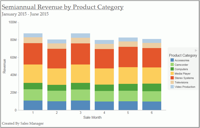
- To make changes to either the page heading or page footing, return to Design view. Right-click the header or footer, and click Edit from the drop-down menu.
Procedure: How to Control the Rendering of a Page Heading and Page Footing
You can control the way in which a page heading and page footing are rendered on a chart at run time.
- Create a chart or visualization.
- Open the Header & Footer dialog box, as described in How to Add a Page Heading and Page Footing to a Chart.
- Click the Text options for chart button
 .
.A drop-down menu, with two options for rendering the page heading and page footing, opens.
Tip: Your selection for a page heading also applies to a page footing, and vice versa.
- Create Header and Footer as text renders the heading and footing as text elements that are separate from the chart image.
- Embed Header and Footer in the chart renders the heading and footing text as part of the chart image. This is the default value.
- Click OK to save your selection and close the Heading & Footing dialog box.
Using Additional Formatting Features
|
How to: |
This section describes additional formatting features that are available for charts.
Procedure: How to Set 3D Depth on a Bar Chart
You can apply a 3D-effect to a 2D-chart.
Note: If you find that the depth of the 3D effect makes it difficult to distinguish the values on the Y-axis scale, then you can turn this option off. This procedure explains how to set the 3D effect for a default vertical bar chart.
The following image shows a bar chart before the 3D effect is applied.
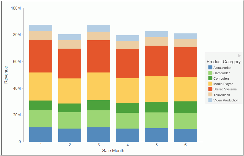
- Create a 2D chart.
- In Live Preview, apply the 3D effect in one of the following
ways:
- Ribbon: On the Format tab, in the Features group, click 3D Effect.
- Shortcut Menu: Right-click the frame of the chart, point to Show 3D, and click On.
The 3D effect is applied to the chart, as shown in the following image.
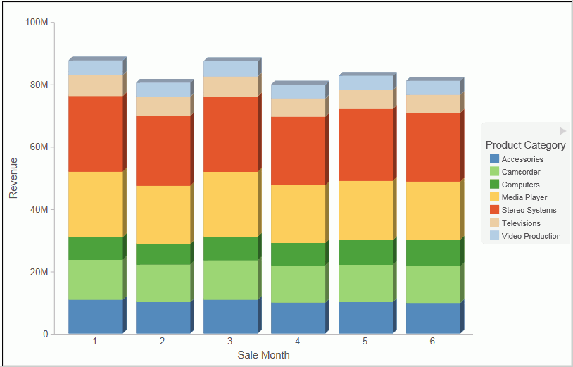
Procedure: How to Rotate a Chart
You can rotate bar, line, and area charts to change the orientation of the data.
- Create a chart or visualization.
- On the Format tab, in the Features group,
click Rotate.
The chart is rotated 90 degrees clockwise.
Procedure: How to Sort a Chart by Total Value
Once you create a bar, line, or area chart, you can sort the results in ascending or descending order. While this feature was implemented specifically for Stacked Bar charts, it also applies to other chart types, as previously mentioned. This feature enables you to view your data in numerical order, allowing you to identify trends and determine what data points are priorities.
Note: This feature is available in Chart and Visualization mode.
- Create a bar, line, or area chart with at least one measure and one dimension.
- In the Query pane, right-click on the Horizontal Axis and point to Sort by Total Value.
- From the cascading menu, select Ascending to sort the chart from the lowest value to the highest value, as shown in the following image.
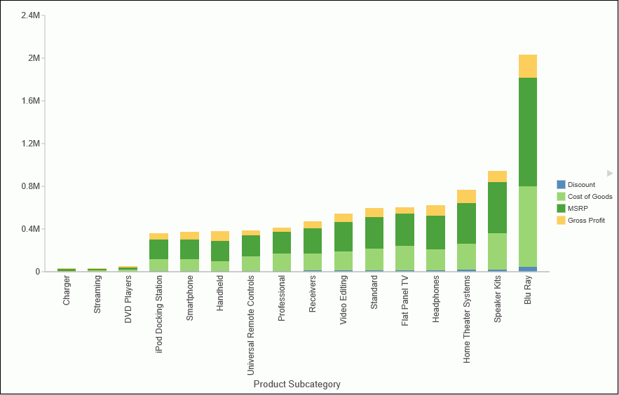
- Select Descending to sort the chart from the largest value to the lowest value.
Procedure: How to Display a Static Reference Line
Reference lines draw attention to specific data locations on a chart. You can add up to three horizontal (X axis) and three vertical (Y axis) reference lines to a chart.
Reference lines can be created using either a constant or a computed field.
Field values allow a property to be dynamic, so that the reference line can change position dynamically on the chart depending on the value of the field that is assigned to it.
Note: A reference line value should be a single value, such as 10K, for example. In the Reference Line dialog box, if you select a field with multiple values, (Quantity Sold, for example), then InfoAssist plots the last value on the chart.
- Create a chart or visualization.
- On the Format tab, in the Features group, click Reference.
- In the drop-down menu that opens, select one of the following:
- Add Reference Line to Y-Axis
- Add Reference Line to X-Axis
The Reference Line dialog box opens.
- Create the reference line with a static value that you
set.
- Select the Value option.
- In the Value text field, type the value that you want to distinguish with the reference line.
- In the Text field, type the text for the reference line.
- In the Position drop-down menu, select the position for the reference line on the chart. For example, Above Center.
- Click the Style button to set the style for the reference line. For example, Solid.
- Click the Color button to open the Color dialog box, where you can select a color for the reference line and the text.
- Click the Weight button to select the weight of the reference line. For example, 1px - Light.
- Click OK to save the options that
you have selected, and close the Reference Line dialog box.
The reference line is added to the chart.
Procedure: How to Display a Dynamic Reference Line
Reference lines can be created using either a constant or a computed field.
Field values allows a property to be dynamic, so that the reference line can change position dynamically on the chart depending on the value of the field that is assigned to it.
Note: A reference line value should be a single value, such as 10K, for example. In the Reference Line dialog box, if you select a field with multiple values, (Quantity Sold, for example), then InfoAssist plots the last value on the chart.
The following procedure provides an example of how to create a dynamic reference line, where the value changes based on the date. In this example, you can track the number of estimated delivery days per shipping company, where the number of days estimated for delivery are based on whether or not the sale date is a holiday. This example uses the wf_retail_lite sample data.
- Create a COMPUTE field to calculate the Reference Line.
- On the Data tab, in the Calculation group,
click Summary (Compute).
The Summary Field (COMPUTE) dialog box opens.
- In the Field text box, enter Reference.
- Set the format to D12.2.
- Enter IF WF_RETAIL_LITE.WF_RETAIL_TIME_SALES.TIME_HOL EQ 'Y' THEN 5 ELSE 2 into the expression.
- Click OK to close the dialog box.
- On the Data tab, in the Calculation group,
click Summary (Compute).
- Hide the Reference field from the chart.
- Add a dynamic reference line.
- On the Format tab, in the Features group, click Reference.
- From the drop-down menu, select Add Reference Line
to Y-Axis.
The Reference Line dialog box opens.
- Select the Field option.
- From the Field drop-down menu, select Reference.
- In the Text field, enter Acceptable.
- From the Weight drop-down menu, select 2px - Medium.
- From the Position drop-down menu, select Above Left.
- Optionally, you can change the color and style of the Reference line.
- Click OK to close the Reference Line dialog box.
- Run the chart.
Auto Prompt appears.
- Select 20100101 (January 1, 2010) and click Run to see that five days are acceptable since the date is a holiday.
- Select 20100202 (January 2, 2010) and click Run again to see that two days are acceptable since the date is not a holiday.
- Click Save.
Procedure: How to Display Annotations
Annotations are explanatory notes or comments. You can add up to eight annotations on a chart.
- Create a chart or visualization.
- On the Format tab, in the Features group, click Annotate.
- In the drop-down menu that opens, click Add
an annotation.
The Annotation dialog box opens.
- In the text input field, type the text for the annotation.
- In the Position drop-down menu, select the position for the annotation on the chart. For example, Top Left.
- Click OK to save the options that
you selected, and close the Annotation dialog box.
The annotation is added to the chart.
- Click Run to generate the report.
Collation in Charts
Charts that have the new attribute syntax respect collation, which provides alphabetical sorting. Collation is also used in other areas, such as filtering.
Collation is set to CODEPAGE by the WebFOCUS Business User Edition installation, by default. This can be changed in the Custom Settings section of the Administration Console. For more information, see How to Configure Collation Sequence Settings.
| WebFOCUS | |
|
Feedback |