Using Insight to Analyze Dynamic Charts
|
Topics: |
|
How to: |
In InfoAssist+, you now have access to a number of visualization tools: Chart mode, Visualization mode, and Insight. Each tool offers different options for you as you visualize your data.
Insight is a new visualization tool that allows for the interactive selection of measures and dimensions, so you can create dynamic charts that refresh as you make changes. This feature is available in HTML5 Chart mode only.
With Insight, you can build a chart that shows the data fields that you choose in real-time. It even rebuilds as you select additional fields or specify filters.
Similar to Visualization mode in InfoAssist+, you can make quick decisions regarding your data with Insight. Using logical menus and simple filtering, you can build charts interactively to suit your needs. As you select additional fields and create filters, your chart refreshes instantly, letting you see the results of your data choices as you use the tool.
In Visualization mode, you can create and work with multiple charts in a single visualization. All charts in the visual are linked to the same data source. You can use the filter prompts to narrow the data that displays.
Insight lets you build filters, as needed, to customize the data that displays. You can add and remove fields, at any time and in any pattern, to enhance your chart. You can take advantage of the customization options that are available to you right from the toolbar.
With Insight, the chart type determines the field containers that display. For example, if you are working with a pie chart, you can specify values for the following field containers: Measure, Rows, Columns, Color, and Size. In many cases, these field containers mirror the field containers that display when working with InfoAssist+.
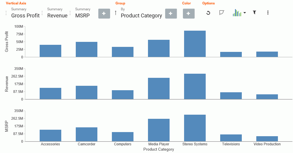
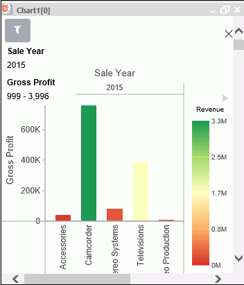
Available fields are organized into applicable Dimension and Measure categories. You can use the plus sign  to add additional fields to your chart. For example, if you want to create a bar chart that plots Gross Profit, Revenue,
and MSRP for each Product Category, click the plus sign to add fields using the drop-down field selector. Once you choose
the fields that you want to include, you can rearrange them by dragging and dropping them into the order that you prefer.
to add additional fields to your chart. For example, if you want to create a bar chart that plots Gross Profit, Revenue,
and MSRP for each Product Category, click the plus sign to add fields using the drop-down field selector. Once you choose
the fields that you want to include, you can rearrange them by dragging and dropping them into the order that you prefer.
The resulting bar chart displays, as shown in the following image.
You can use the navigational arrows in the interactive header to move between the available field containers in your chart. The following image highlights these arrows, which shift the focus of these field containers to the right or left.

All charts support a field container for Color, which adds contrast to your chart. Some charts also support the Size field container, which binds a measure to the size of the markers rendered on the chart.
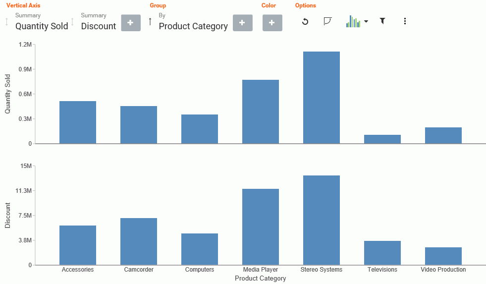
Once you have added fields to the relevant field containers, you can use the Sort arrows adjacent to each field  to sort the data in ascending or descending order. This helps identify trends and priorities within your data. You can
only sort one field at a time. Ascending order sorts your data from the smallest value to the greatest value, while descending
order sorts your data from the greatest value to the smallest value, as shown in the following image.
to sort the data in ascending or descending order. This helps identify trends and priorities within your data. You can
only sort one field at a time. Ascending order sorts your data from the smallest value to the greatest value, while descending
order sorts your data from the greatest value to the smallest value, as shown in the following image.
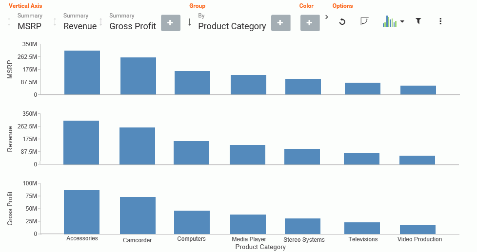
When you select a sort order for a field, the field arrow changes color, appearing bolder than the unsorted fields. In the image below, a sort order was selected for MSRP, so the field arrow appears black.

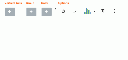
You can specify measures and dimensions for your chart in InfoAssist+ before using Insight. This pre-loads the Insight user interface (UI) with those selections. Optionally, you can use Insight without selecting any fields. In this case, the field selection options are broad, meaning that all fields will be presented. An example of an empty canvas is shown in the following image.
Procedure: How to Enable Insight From InfoAssist+
- Open InfoAssist+ in Chart mode.
- On the Format tab, in the Run with group, click the Insight icon
 .
. - On the Quick Access toolbar, click Run.
The Insight interface opens, and you can begin building your chart.
Working With Charts in Insight
|
Topics: |
|
How to: |
With Insight, you can choose individual data values for the field containers that you add. Whether you added fields into the Query pane before running Insight or you added fields to the existing field containers (or field containers that you add), creating a chart in Insight is streamlined to allow you to easily create a dynamic chart in real time. It also provides you with the flexibility of interactive comparison as you change your data selections rapidly and adjust the options for display.
You can use the default vertical bar chart or you can specify a different chart type using the Chart Picker in the Options toolbar.
In addition, you can re-order the display of field containers in your chart. This allows you to change the placement of a particular field, giving you control over where the data for this component displays in your chart.
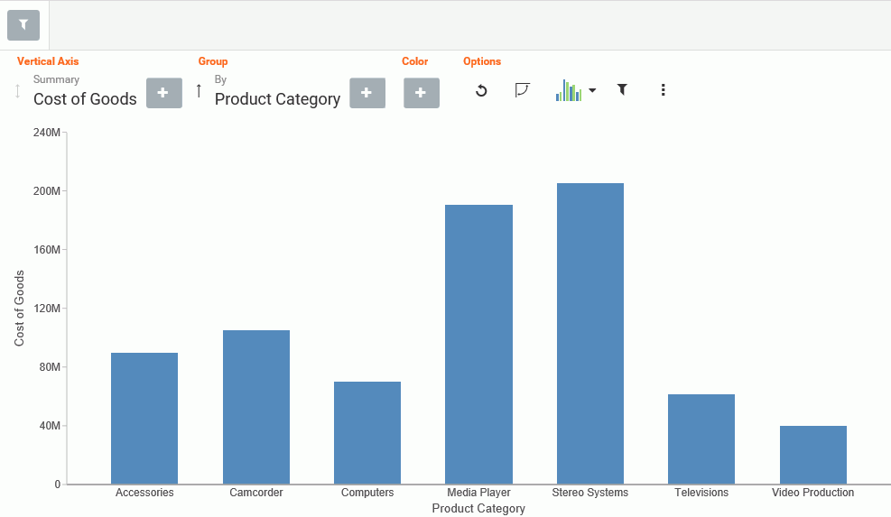
Procedure: How to Create a Basic Bar Chart Using Insight
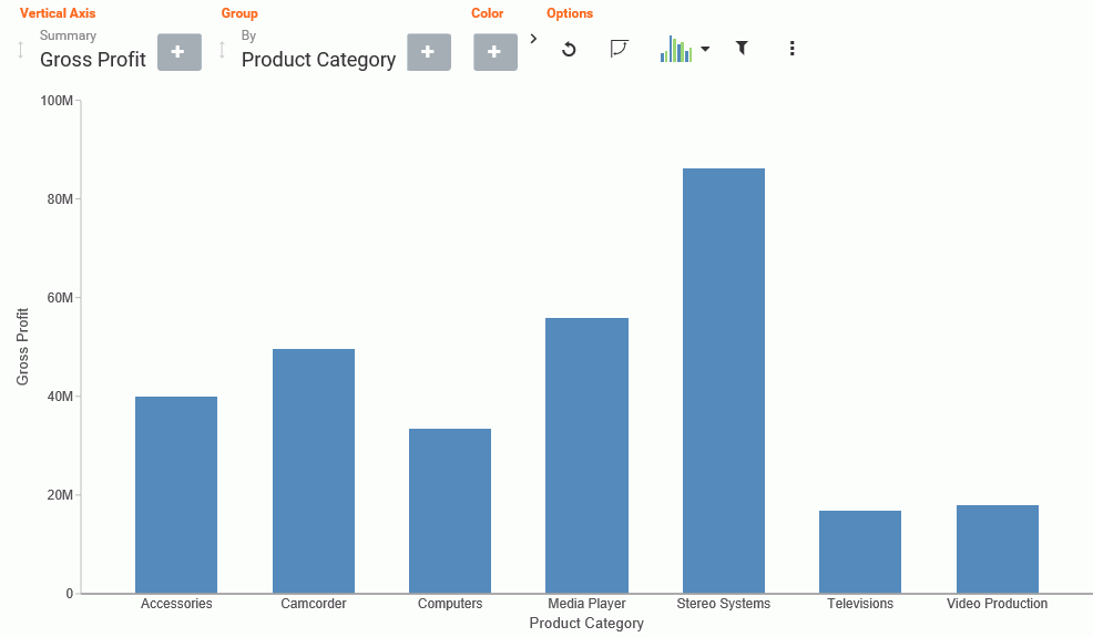
- Click the plus icon under the Vertical Axis field container.
- Choose a measure field from the drop-down list.
- Click the plus icon under the Group field container.
- Choose a dimension field from the drop-down list.
Your bar chart displays, as shown in the following image.
Procedure: How to Change the Chart Type in Insight
- On the Options toolbar, click Chart Picker.
The table of chart selections opens, as shown in the following image.
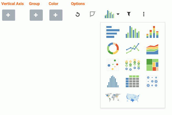
- Select a chart type.
Your chart refreshes with the new chart type, and the Insight interface refreshes to display all of the field containers that are relevant to the current chart type.
Procedure: How to Delete a Field From a Field Container
- Add one or more fields to your chart.
- Hover over the field that you want to delete and click X, as shown in the following image.
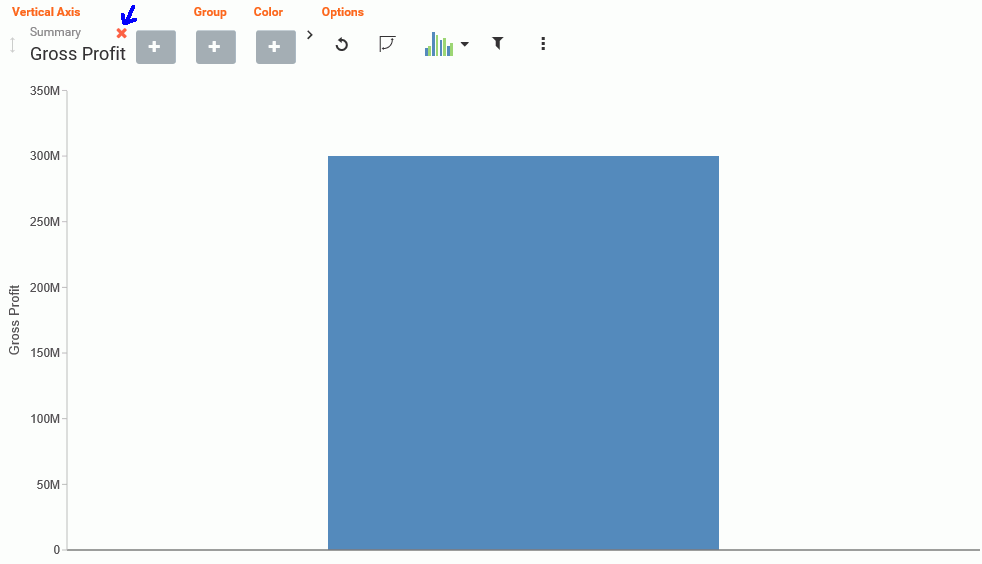
The chart refreshes to reflect your selections.
Procedure: How to Reorder the Display of Field Containers
- Add multiple fields to your chart, as shown in the following image.
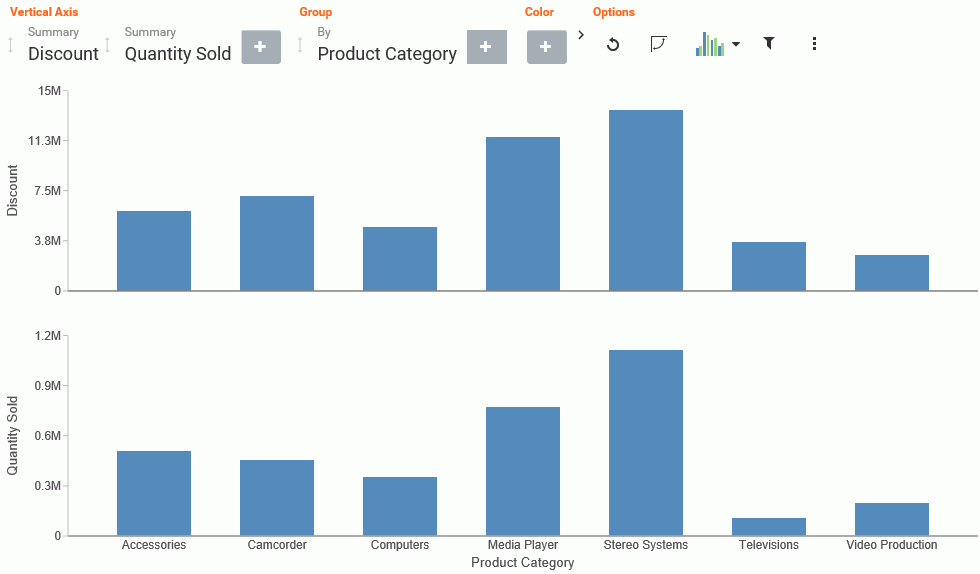
- In the Vertical Axis grouping, drag the second field container into the first position. The placement of the field is shown
by a dark blue vertical bar, as shown in the following image.
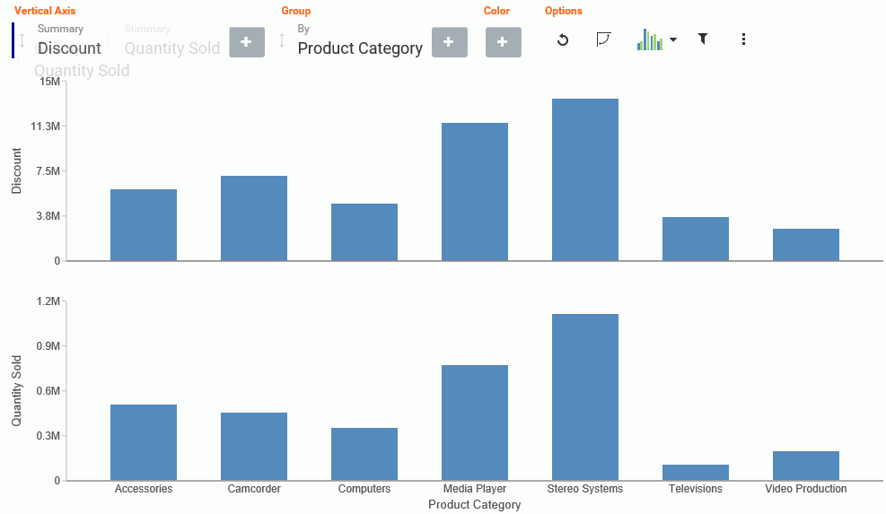
The following image shows the newly ordered fields.
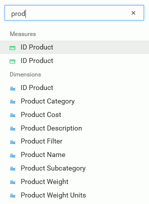
Searching for Fields
You can locate fields for your field containers using the search option. On the toolbar, click the plus sign. In the search field, start typing the field that you want to locate. You can type in whole words or partial words. The search identifies all fields that contain any instance of the characters that you specify, as shown in the following image.
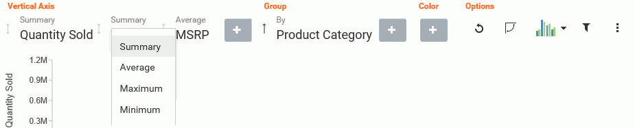
Changing Summary Operators for the Field
When working with measure fields, you can change the summary operators for the field from Summary (default) to Average, Maximum, or Minimum. You can also change a Count field to Count Distinct, using a similar menu selection.
When you make a selection, the axis of the relevant measure updates in the chart, as shown in the following image.
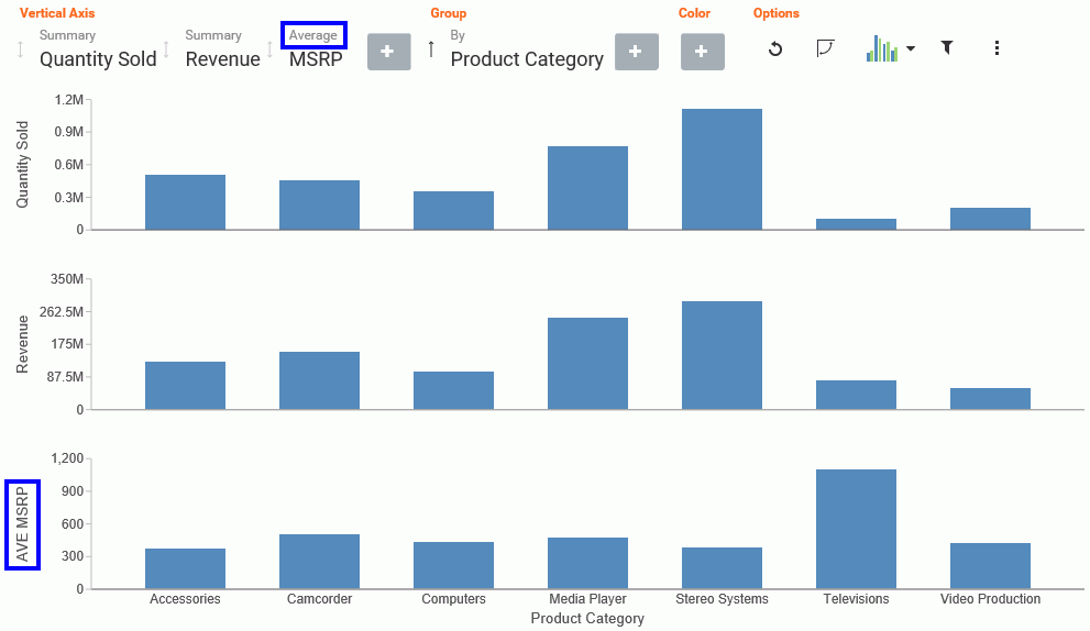
Options for changing the Summary field are shown in the following image.
Filtering in Insight
|
Topics: |
To enable filtering, click the Show Filter icon , which is located in the Options section of the toolbar. This opens the filter shelf that renders above the field container
shelf, as shown in the following image.
, which is located in the Options section of the toolbar. This opens the filter shelf that renders above the field container
shelf, as shown in the following image.
Use the filter shelf to build your filter. The filter shelf must be visible in order to add or modify a filter. In addition, filters that were created in a procedure (.fex) or InfoAssist+ session prior to launching Insight are applied, but do not show in Insight.
Types of Filters
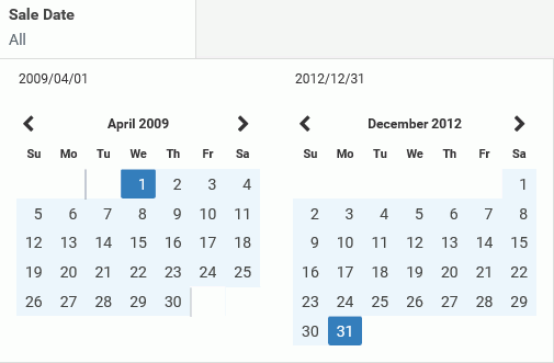
There are different types of filters in Insight. For example, if you are filtering with a date field, you can use a built in calendar to select a date range, as shown in the following image.
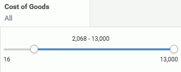
If you are filtering on a numeric value, such as a measure value, you can filter on values that are specific to a field. In this scenario, when you define the filter, a slider control opens. You can adjust the range of values that you want to include, using the slider control options, as shown in the following image.
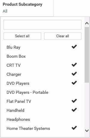
You can also filter on dimension values. You can select one or more values by simply clicking on multiple values. A check mark appears, indicating the values selected, as shown in the following image.
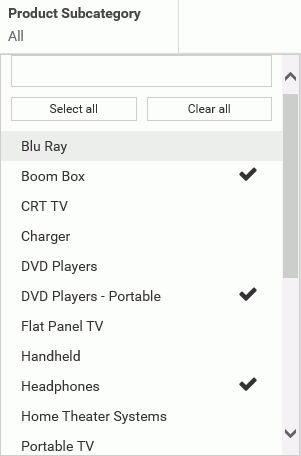
You can select all values for the dimension, select one or more, or clear all selected values, as shown in the following image.
Adding a Filter
|
How to: |
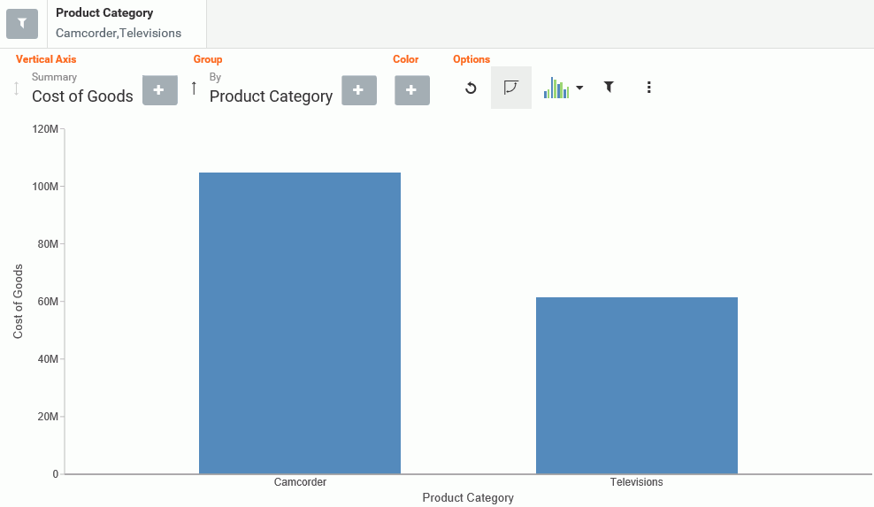
You add a filter when you want to limit the display of your data, or drill down to focus on specific data values. For example, you may want to just display data for Camcorder and Televisions, rather than all Product Categories. You can do this by adding a filter for the Camcorder and Televisions, as shown in the following image.
Procedure: How to Add a Filter in Insight
- In the Options toolbar, click Show Filter.
The filter shelf opens.
- Click the Show Filter icon.
- From the drop-down list that opens, select the field on which to filter.
- Click the identified field in the filter shelf to specify a value for the filter.
A list displays, showing the values that you can select.
- Click on the filter shelf to save your filtered items.
Your chart refreshes.
Removing a Filter
To remove a filter, hover over it and click on the X, as shown in the following image.
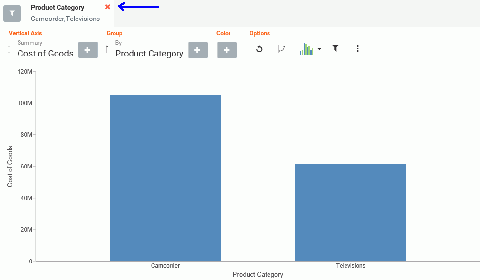
The chart refreshes and displays your data without any filter.
Using the Options Toolbar
The Options toolbar is located in the upper-right corner of the Insight interface. These options control your interactions with your data, including options such as pivoting and filtering. You can also change your chart type using the Chart Picker option.
Reference: Options Toolbar Icons
The following section describes the icons that display on the Options toolbar.
 Reset
Reset-
Returns the chart to its original state. Any filters, measures, dimensions that are added in the current Insight session are reverted. The chart type is reverted, as well.
 Swap Axis
-
Swaps the x and y axis, placing the contents of the x axis on the y axis. You can click Swap Axis again to change the chart back to its original orientation.
 Chart Picker
-
Provides options for selecting different chart types, including:
 Horizontal Bar. Offers the capability of ranking data in descending order. This chart type can also be used when x-axis labels are too long
to fit legibly side-by-side. The following field containers are available for this chart type: Horizontal Axis, Group, and
Color.
Horizontal Bar. Offers the capability of ranking data in descending order. This chart type can also be used when x-axis labels are too long
to fit legibly side-by-side. The following field containers are available for this chart type: Horizontal Axis, Group, and
Color.
 Vertical Bar. Shows different measures per dimension component using different identifying colors. The following field containers are
available for this chart type: Vertical Axis, Group, and Color.
Vertical Bar. Shows different measures per dimension component using different identifying colors. The following field containers are
available for this chart type: Vertical Axis, Group, and Color.
 Vertical Stacked Bar. Stacks values per dimension component using differentiating colors. The following field containers are available for this
chart type: Vertical Axis, Group, and Color.
Vertical Stacked Bar. Stacks values per dimension component using differentiating colors. The following field containers are available for this
chart type: Vertical Axis, Group, and Color.
 Pie. Presents values as part of a whole using colors to separate the segments. Pie charts emphasize where your data fits in relation
to the larger whole. The following field containers are available for this chart type: Rows, Columns, Measure, Color, and
Size.
Pie. Presents values as part of a whole using colors to separate the segments. Pie charts emphasize where your data fits in relation
to the larger whole. The following field containers are available for this chart type: Rows, Columns, Measure, Color, and
Size.
 Vertical Line. Creates a line chart which is representative of the data. Line charts are useful for showing trends in numerical data. The
following field containers are available for this chart type: Vertical Axis, Group, and Color.
Vertical Line. Creates a line chart which is representative of the data. Line charts are useful for showing trends in numerical data. The
following field containers are available for this chart type: Vertical Axis, Group, and Color.
 Area. Creates an area chart which is similar to a line chart except the area between the data line and the zero line (or axis)
is usually filled with color. The following field containers are available for this chart type: Vertical Axis, Group, and
Color.
Area. Creates an area chart which is similar to a line chart except the area between the data line and the zero line (or axis)
is usually filled with color. The following field containers are available for this chart type: Vertical Axis, Group, and
Color.
 Scatter. Plots data using variable scales on both axes. The following field containers are available for this chart type: Rows, Columns,
Vertical Axis, Horizontal Axis, Size, Detail, and Color.
Scatter. Plots data using variable scales on both axes. The following field containers are available for this chart type: Rows, Columns,
Vertical Axis, Horizontal Axis, Size, Detail, and Color.
 Circle. Plots differing values in rows, enabling you to draw inferences as to how the values overlap. The following field containers
are available for this chart type: Rows, Columns, Vertical Axis, Horizontal Axis, Size, Detail, and Color.
Circle. Plots differing values in rows, enabling you to draw inferences as to how the values overlap. The following field containers
are available for this chart type: Rows, Columns, Vertical Axis, Horizontal Axis, Size, Detail, and Color.
 Treemap. Displays large amounts of hierarchically structured data. This chart type uses sections to represent an aspect of the selected
measure. The following field containers are available for this chart type: Grouping, Size, and Color.
Treemap. Displays large amounts of hierarchically structured data. This chart type uses sections to represent an aspect of the selected
measure. The following field containers are available for this chart type: Grouping, Size, and Color.
 Histogram. Analyzes the distribution of a measure while assigning it to field containers based on the values you specify for the bins
that are created. The default bin count is 10. The following field containers are available for this chart type: Rows, Columns,
and Measure.
Histogram. Analyzes the distribution of a measure while assigning it to field containers based on the values you specify for the bins
that are created. The default bin count is 10. The following field containers are available for this chart type: Rows, Columns,
and Measure.
 Table. Presents data in tabular form, allowing you to compare various intersections in your data. The following field containers
are available for this chart type: Rows, Columns, and Measure.
Table. Presents data in tabular form, allowing you to compare various intersections in your data. The following field containers
are available for this chart type: Rows, Columns, and Measure.
 Matrix. Analyzes one or two measures against a crosstab of two categorical dimensions. The following field containers are available
for this chart type: Rows, Columns, Size, and Color.
Matrix. Analyzes one or two measures against a crosstab of two categorical dimensions. The following field containers are available
for this chart type: Rows, Columns, Size, and Color.
 Point Map. Uses symbols of different sizes to represent data associated with different areas or locations within the map. The following
field containers are available for this chart type: Layer, Size, and Color.
Point Map. Uses symbols of different sizes to represent data associated with different areas or locations within the map. The following
field containers are available for this chart type: Layer, Size, and Color.
 Choropleth Map. Visualizes location-based data, trends, and distributions across a geographic area. These maps are geographically-based
heat maps. The following field containers are available for this chart type: Layer and Color.
Choropleth Map. Visualizes location-based data, trends, and distributions across a geographic area. These maps are geographically-based
heat maps. The following field containers are available for this chart type: Layer and Color.
Note: The orientation of this chart icon changes if you swap an axis. In addition, the image that displays for the chart type changes, based on your selection.
- Show Filter
-
Defines filters for your data. Select this icon, and using the filter shelf that opens above the field container shelf, click the Show Filter icon to define a filter. For more information, see Filtering.
Note: To select one or more non-consecutive values, select each field. The selected values will display with a check mark to indicate that they have been selected.
 More Options
-
Opens the following additional options:
- Export Data. Exports the underlying data of the current chart to an Excel file in LOCAL file storage. You will be alerted when the file appears in the bottom left corner, similar to any other file that you download.
- Export Image. Generates an image of the current chart, which is saved in PNG format to LOCAL file storage using the current width and height of the browser window.
- Series Layout. The bar, line, and area charts in Insight support several different sub-graph types (aka Layout). The supported graph types include: horizontal bar, vertical bar, vertical stacked bar, line, and area charts. For bar,
line, and area charts, the Series Layout Options are as follows:
- Horizontal Bar: Stacked, Absolute, Percent, Side-by-Side
- Vertical Bar: Stacked, Absolute, Percent, Side-by-Side
- Vertical Stacked Bar: Stacked, Absolute, Percent, Side-by-Side
- Line: Stacked, Absolute, Percent
- Vertical Stacked Area: Stacked, Absolute, Percent
- Y-Axis Log Scale. Adjusts the log scale on the y axis. This option is always unchecked, by default. The following chart types are supported:
- Horizontal Bar
- Vertical Bar
- Vertical Stacked Bar
- Line
- Area charts
- Scatter charts
- Bubble
- Circle
- Histogram
- X-Axis Log Scale. Adjusts the log scale on the x axis. This option is always not selected, by default. The following chart types are supported:
- Scatter
- Bubble
- Change Bin Size. Changes the size of the bin (numeric value only). This option is only available for histograms. Clearing the text box switches it back to automatic bin size generation.
- Show Data Label. Turns numeric Data labels on/off on all charts, except Grids. The default for this setting is always Off except for Treemaps.
- Show Totals. Turns the Summary Row Total on Data Grid on or off. The default for this setting is always False.
- Marker Shape. Changes the marker shape used in the matrix marker chart. Options include: Circle, Square, or Fill.
Using Insight in Phone Mode
|
Topics: |
Phone mode, which is available in Insight, allows you to take advantage of the features of Insight on your phone. The interactive heading that is available in Insight on a tablet or desktop is replaced by a static heading that displays the field names in the chart, in blue text. These become summary fields that allow you to see what fields are included in the chart.
Insight is mobile aware and mobile friendly. Full functionality is available on tablet devices and other high-resolution touch displays. On smaller devices, such as an iPhone, Insight enters a special phone mode which has a useful, but more limited, set of options and features that are tuned for the small screen real-estate of the device. In this mode, you can add or modify filters to narrow your data as needed. You can also hover over data points to see the underlying data.
Measures are shown first. The first measure displays with a summation attribute (for example, Sum or Avg) and then displays of and then the name of the measure, as shown in the following image.
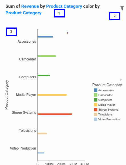
In the above image, area one is the static heading. Area two marks the filtering side option button. Lastly, area three shows the body of the chart.
Numeric measures are displayed after the measures in the order of Y-Axis and then X-axis. If you define fields in your Grouping field container, they display after the collective measures and are preceded by the word by. If you have created a matrix marker chart, the relevant field containers for these display next. They also use the word by, as do any Detail field containers that are populated in the chart. If your chart specifies a field for color, Phone mode precedes the display of this item with color by. Lastly, if you have populated the Size field container, this displays last and is introduced by size by.
User Options in Phone Mode
|
Topics: |
You have a number of options in Phone mode, including robust filtering and hover capabilities.
Filtering
In Phone mode, you can filter just like in regular desktop mode. The primary difference is that the filter shelf stacks the available filters in a vertical row, as shown in the following image.
You click the filter icon to bring up the filter shelf and then you click the X to close it. If you have defined filters, closing the filter shelf merely collapses it. The filters that you defined remain intact. To remove a filter, hover over it and click the X in the upper-right corner.
General Usability
Phone mode allows you to view your chart and filter it to refine it based on your own unique scenario.
You can hover over a data bar a segment of a chart to obtain additional, detailed information from the underlying data. The tooltips that display are based on your data selections.
You can also show and hide the legend using the right arrow above the legend. When you collapse the legend, you can see more of your chart.
The opportunities for dynamic charting are vast with Insight. Using dynamic menus, filtering options, and search features, you can quickly and effectively create charts that communicate your data.
| WebFOCUS | |
|
Feedback |