Graph Types
|
Topics: |
The following table lists each of the possible graph types that you can select using the GraphType property:
|
# |
GraphType |
# |
GraphType |
|---|---|---|---|
|
0 |
52 |
||
|
1 |
53 |
||
|
2 |
54 |
||
|
3 |
55 |
||
|
4 |
56 |
||
|
5 |
57 |
||
|
6 |
58 |
||
|
7 |
59 |
||
|
8 |
60 |
||
|
9 |
61 |
||
|
10 |
62 |
||
|
11 |
63 |
||
|
12 |
64 |
||
|
13 |
65 |
||
|
14 |
66 |
||
|
15 |
67 |
||
|
16 |
68 |
||
|
17 |
69 |
||
|
18 |
70 |
||
|
19 |
71 |
||
|
20 |
72 |
||
|
21 |
73 |
||
|
22 |
74 |
||
|
23 |
75 |
||
|
24 |
76 |
||
|
25 |
77 |
||
|
26 |
78 |
||
|
27 |
79 |
||
|
28 |
80 |
||
|
29 |
81 |
||
|
30 |
82 |
||
|
31 |
83 |
||
|
32 |
84 |
||
|
33 |
85 |
||
|
34 |
86 |
||
|
35 |
87 |
||
|
36 |
88 |
||
|
37 |
89 |
||
|
38 |
90 |
||
|
39 |
91 |
||
|
40 |
92 |
||
|
41 |
93 |
||
|
42 |
94 |
||
|
43 |
99 |
Reserved for Future Use |
|
|
44 |
100 |
||
|
45 |
101 |
||
|
46 |
102 |
||
|
47 |
103 |
||
|
48 |
104 |
||
|
49 |
105 |
||
|
50 |
106 |
||
|
51 |
111 |
||
|
124 |
|||
|
130 |
|||
|
138 |
See Using WebFOCUS Graphics for information about selecting and using the GraphType property.
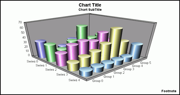
3D Graphs
This topic contains illustrations that show the different types of 3D graphs.
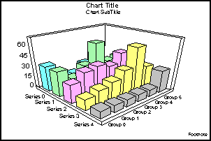
3D Bars (GraphType=0)
This is a standard 3D graph. It displays a bar for each value in the data set.
3D Pyramid (GraphType=1)
This shows pyramids to represent volume information, such as an amount of some item.
3D Octagon (GraphType=2)
This shows octagons drawn in 3D. You can make them more elliptical or more columnar.
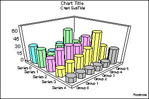
3D Cylinder (GraphType=3)
This shows cylinders drawn in 3D.
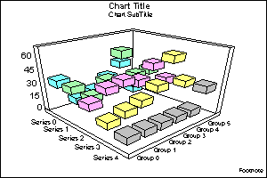
3D Floating Cubes (GraphType=4)
This shows a 3D graph type for data values that are close to each other. You can see under and around the cubes.
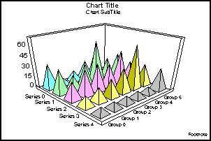
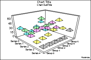
3D Floating Pyramids (GraphType=5)
This shows how the floating, diamond-shaped pyramids can trace out your data points.
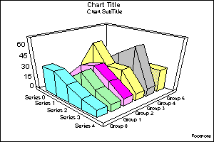
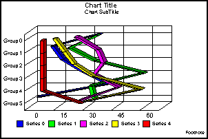
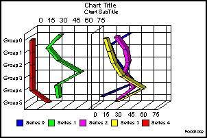
3D Connected Series Area (GraphType=6)
This shows trend information along the series dimension.
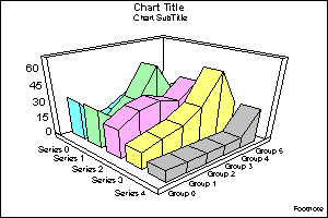
Note: This type of graph does not support drilldowns or conditional styling.
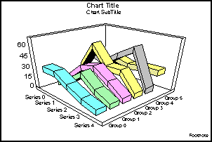
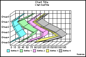
3D Connected Series Ribbon (GraphType=7)
This shows trend information (represented in ribbon-shaped bars) along the series dimension.
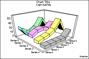
Note: This type of graph does not support drilldowns or conditional styling.
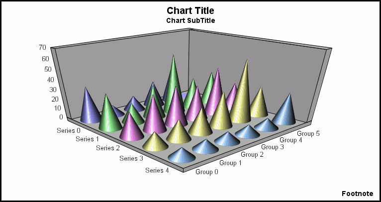
3D Cone (Graph Type=8)
This shows how cones can highlight your data points.
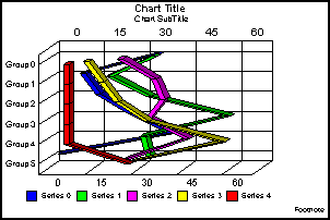
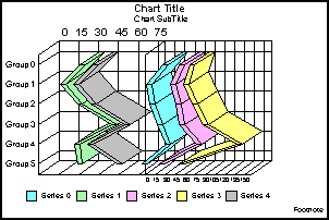
3D Connected Group Area (GraphType=9)
This shows trend information along the group dimension.
Note: This type of graph does not support drilldowns or conditional styling.
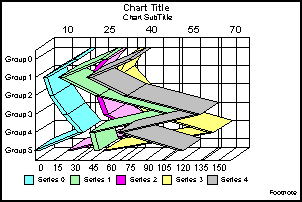
3D Connected Group Ribbon (GraphType=10)
This shows trend information (represented in ribbon-shaped bars) along the group dimension.
Note: This type of graph does not support drilldowns or conditional styling.
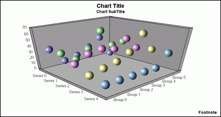
3D Sphere (GraphType=11)
This shows how spheres can highlight your data points.
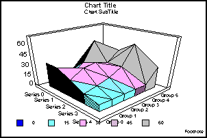
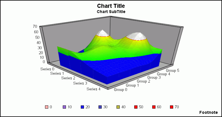
3D Surface (GraphType=12)
This graphs all data points as a 3D surface, using a rolling wave-like effect.
Note: This type of graph does not support drilldowns or conditional styling.
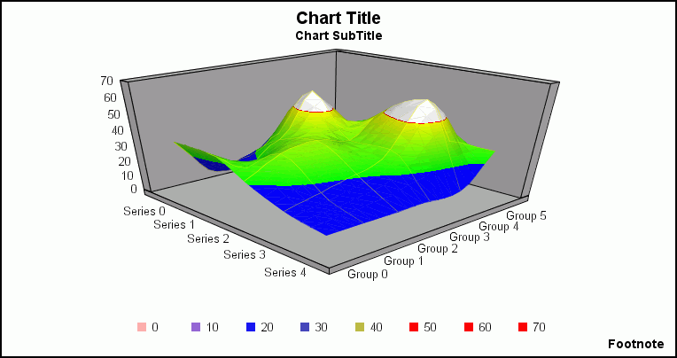
3D Surface with Sides (GraphType=13)
This graphs all data points as a 3D surface with solid sides.
Note: This type of graph does not support drilldowns or conditional styling.
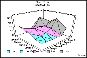
3D Honeycomb Surface (GraphType=14)
This graphs all data points as a 3D surface using a honeycomb effect.
Note: This type of graph does not support drilldowns or conditional styling.
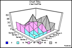
3D Smooth Surface (GraphType=15)
This graphs all data points as a 3D smooth surface.
Note: This type of graph does not support drilldowns or conditional styling.
3D Smooth Surface with Sides (GraphType=16)
This graphs all data points as a 3D smooth surface with sides.
Note: This type of graph does not support drilldowns or conditional styling.
Vertical Bar Graphs
The following illustrations show the vertical bar graphs. All of the illustrations were created without 2.5D depth applied to them (for example, DepthRadius = 0).
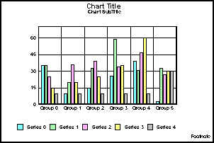
Vertical Clustered Bars (GraphType=17)
This shows bars grouped side by side. This is the standard type of two-dimensional bar graph.
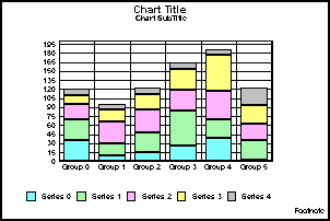
Vertical Stacked Bars (GraphType=18)
This shows stacked groups of bars. Each stack is comprised of all series in a group. The series are added together and totaled. The axis is the total value of the cumulative points.
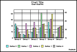
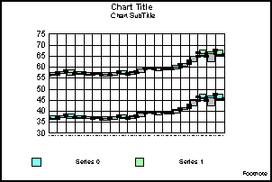
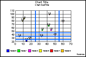
Vertical Dual-Axis Clustered Bars (GraphType=19)
This is also called a Dual-Y graph. You can assign any series to either of the two axes.
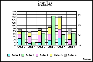
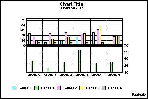
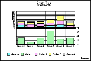
Vertical Dual-Axis Stacked Bars (GraphType=20)
This is also called a Dual-Y stacked graph. Separate stacks will be created for the data on each axis.
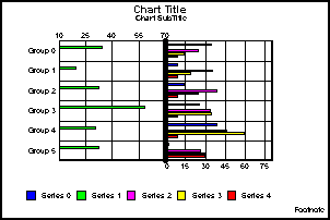
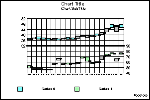
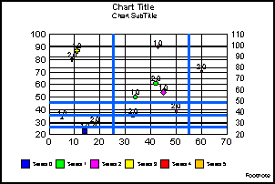
Vertical Bi-Polar Clustered Bars (GraphType=21)
This is also called a Dual-Y graph with the two axes split into different sections so that each can be viewed separately.
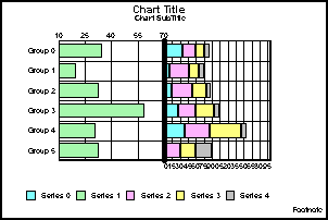
Vertical Bi-Polar Stacked Bars (GraphType=22)
This is a stacked Dual-Y graph with the two axes split into different sections so that each can be viewed separately.
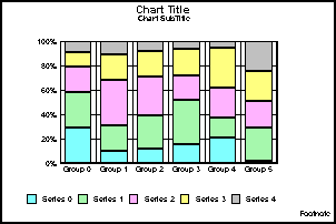
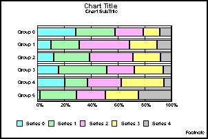
Vertical Percent Bars (GraphType=23)
This is a bar version of a pie graph. Each group calculates the percentage of the total required for each series. The axis ranges from 0 to 100%.
Horizontal Bar Graphs
The following illustrations show the horizontal bar graphs. All of the illustrations were created without 2.5D depth applied (for example, DepthRadius = 0).
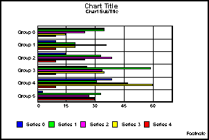
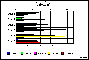
Horizontal Clustered Bars (GraphType=24)
This shows bars grouped side by side. This is the standard type of two-dimensional bar graph.
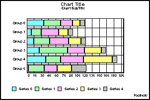
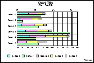
Horizontal Stacked Bars (GraphType=25)
This shows stacked groups of bars. Each stack is comprised of all series in a group. The series are added together and totaled. The axis is the total value of the cumulative points.
Horizontal Dual-Axis Clustered Bars (GraphType=26)
This is also called a Dual-Y graph. You can assign any series to either of the two axes.
Horizontal Dual-Axis Stacked Bars (GraphType=27)
This is also called a Dual-Y stacked graph. Separate stacks will be created for the data on each axis.
Horizontal Bi-Polar Clustered Bars (GraphType=28)
This is a Dual-Y graph with the two axes split into different sections so that each can be viewed separately.
Horizontal Bi-Polar Stacked Bars (GraphType=29)
This shows a stacked Dual-Y graph with the two axes split into different sections so that each can be viewed separately.
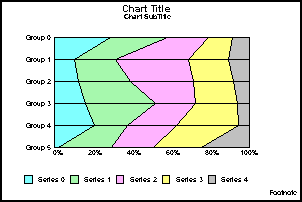
Horizontal Percent Bars (GraphType=30)
This is a bar version of a pie graph. Each group calculates the percentage of the total required for each series. The axis ranges from 0 to 100%.
Vertical Area Graphs
|
Topics: |
The following illustrations show the vertical area graphs. All of the illustrations were done without 2.5D depth applied (for example, DepthRadius = 0).
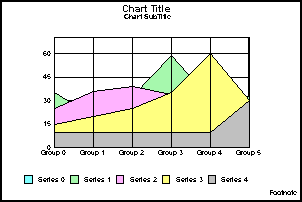
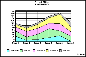
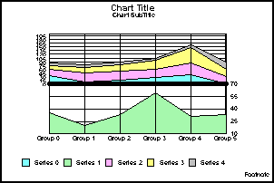
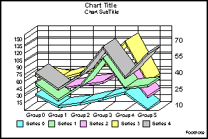
Vertical Absolute Area (GraphType=31)
This shows areas drawn on top of each other to represent the absolute relationships between data series. You can use this graph type if certain data overlaps.
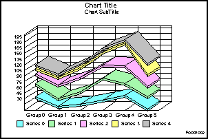
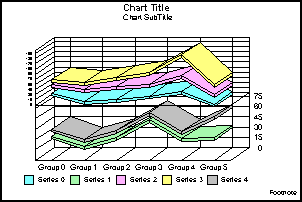
Vertical Stacked Area (GraphType=32)
This shows areas stacked on top of each other. The axis is the cumulative total of all the groups.
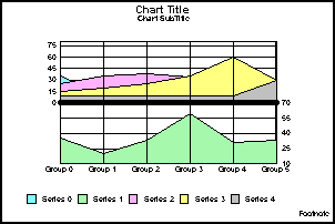
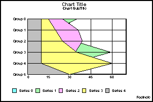
Vertical Bi-Polar Absolute Area (GraphType=33)
This shows a Dual-Y graph with the two axes split into different sections so that each can be viewed separately.
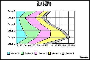
Vertical Bi-Polar Stacked Area (GraphType=34)
This shows a stacked Dual-Y graph with the two axes split into different sections so that each can be viewed separately.
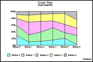
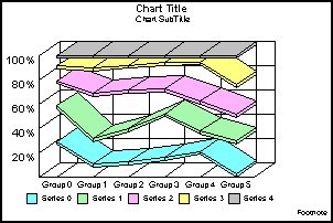
Vertical Percent Area (GraphType=35)
This shows an area version of a pie graph. Each group calculates the percentage of the total required for each series. The axis ranges from 0 to 100%.
Horizontal Area Graphs
|
Topics: |
The following illustrations show the horizontal area graphs. All of the illustrations were done without 2.5D depth applied (for example, DepthRadius = 0).
Horizontal Absolute Area (GraphType=36)
This shows areas drawn on top of each other to represent the absolute relationships between data series. You can use this graph type if certain data overlaps.
Horizontal Stacked Area (GraphType=37)
This shows areas stacked on top of each other. The axis is the cumulative total of all the groups.
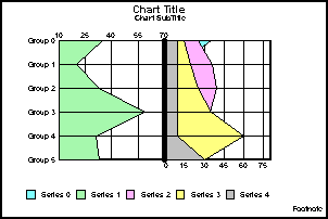
Horizontal Bi-Polar Absolute Area (GraphType=38)
This shows a Dual-Y graph with the two axes split into different sections so that each can be viewed separately.
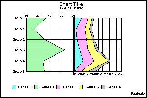
Horizontal Bi-Polar Stacked Area (GraphType=39)
This shows a stacked Dual-Y graph with the two axes split into different sections so that each can be viewed separately.
Horizontal Percent Area (GraphType=40)
This shows an area version of a pie graph. Each group calculates the percentage of the total required for each series. The axis ranges from 0 to 100%.
Vertical Line Graphs
|
Topics: |
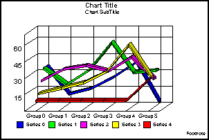
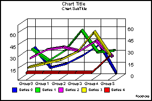
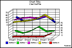
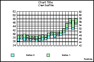
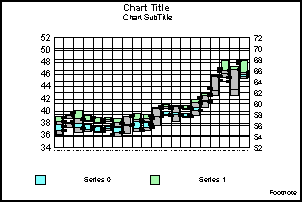
Vertical Absolute Line (GraphType=41)
This shows lines drawn on top and under each other to represent the absolute relationships between data series.
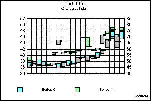
Vertical Stacked Line (GraphType=42)
This shows lines stacked on top of each other. The axis is the cumulative total of all the groups.
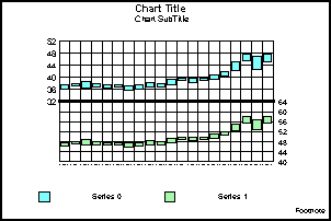
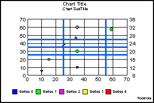
Vertical Dual-Axis Absolute Line (GraphType=43)
This is also called a Dual-Y line graph. You can assign any series to either of the two axes.
Vertical Dual-Axis Stacked Line (GraphType=44)
This is also called a Dual-Y stacked line graph. Separate stacks will be created for the data on each axis.
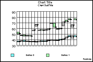
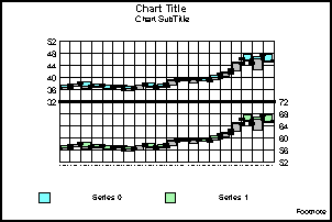
Vertical Bi-Polar Absolute Line (GraphType=45)
This is a Dual-Y graph with the two axes split into different sections so that each can be viewed separately.
Vertical Bi-Polar Stacked Line (GraphType=46)
This shows a stacked Dual-Y graph with the two axes split into different sections so that each can be viewed separately.
Vertical Percent Line (GraphType=47)
This shows a line version of a pie graph. Each group calculates the percentage of the total required for each series. The axis ranges from 0 to 100%.
Horizontal Line Graphs
Horizontal Absolute Line (GraphType=48)
This shows lines drawn on top and under each other to represent the absolute relationships between data series.
Horizontal Stacked Line (GraphType=49)
This shows lines stacked on top of each other. The axis is the cumulative total of all the groups.
Horizontal Dual-Axis Absolute Line (GraphType=50)
This is also called a Dual-Y line graph. You can assign any series to either of the two axes.
Horizontal Dual-Axis Stacked Line (GraphType=51)
This is also called a Dual-Y stacked line graph. Separate stacks will be created for the data on each axis.
Horizontal Bi-Polar Absolute Line (GraphType=52)
This shows a Dual-Y graph with the two axes split into different sections so that each can be viewed separately.
Horizontal Bi-Polar Stacked Line (GraphType=53)
This shows a stacked Dual-Y graph with the two axes split into different sections so that each can be viewed separately.
Horizontal Percent Line (GraphType=54)
This shows a line version of a pie graph. Each group calculates the percentage of the total required for each series. The axis ranges from 0 to 100%.

Pie Graphs
|
Topics: |
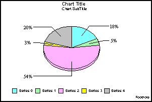
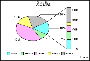
Pie (GraphType=55)
This shows the most widely used graph for displaying percentages of a total.
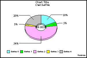
Ring Pie (GraphType=56)
This shows a ring variant of a pie graph. The total of all slices is placed in the center.
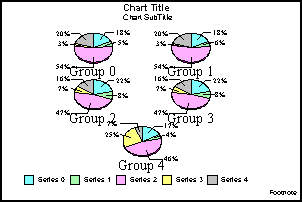
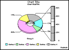
Multi Pie (GraphType=57)
This shows separate pies to represent each group in the data set. This is a pie variation on percentage bars.
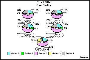
Multi Ring Pie (GraphType=58)
This shows separate ring pies to represent each group in the data set.
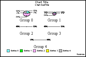
Multi Proportional Pie (GraphType=59)
This shows each pie sized in proportion to its total across the entire data set.
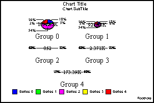
Multi Proportional Ring Pie (GraphType=60)
This shows each ring pie sized in proportion to its total across the entire data set.
Scatter Graphs
|
Topics: |
The following illustrations show the scatter graphs. All of the illustrations were created with the MarkerSizeDefault set to 90 and UseSeriesShapes set to True.
Note: The X-axis for Scatter graphs is expected to be numeric. While you are allowed to substitute with an alphanumeric X-axis, not all features will work correctly.
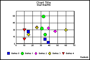
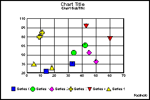
XY Scatter (GraphType=61)
This shows two values assigned to each marker, X and Y, in that order. This is a standard X-Y plot.
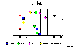
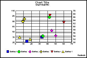
XY Scatter Dual-Axis (GraphType=62)
This is a Dual-Y scatter graph. There are two values assigned to each marker, X and Y, in that order.
XY Scatter with Labels (GraphType=63)
This shows three values assigned to each marker—X, Y, and text label—in that order. Each XY point is labeled.
XY Scatter with Labels Dual-Axis (GraphType=64)
This shows a Dual-Y scatter graph with labeled markers. It requires that three values are assigned to each marker—X, Y, and text label—in that order.
Polar Graphs
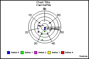
XY Polar (GraphType=65)
This shows a polar coordinate scatter graph. It requires that two values are assigned to each marker in the following order: X (degree) and Y (distance from the center).
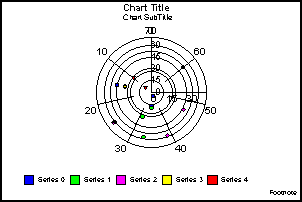
XY Polar Dual-Axis (GraphType=66)
This shows a Dual-Y polar coordinate scatter graph. It requires that two values are assigned to each marker in the following order: X (degree) and Y (distance from the center).
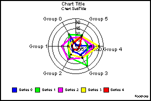
Radar Graphs
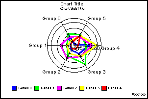
Radar Line (GraphType=67)
This shows a circular line graph. You can use it to represent cyclical data, such as hourly or monthly figures.
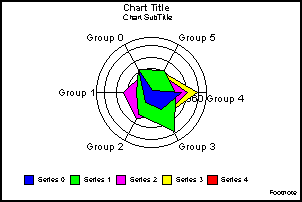
Radar Area (GraphType=68)
This shows a circular area graph. You can use it for comparisons or cyclical data sets.
Radar Line Dual-Axis (GraphType=69)
This shows a Dual-Y variation on a Radar Line graph type. You can use it to show two sets of cyclical data.
Stock Graphs
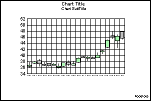
Open-Hi-Lo-Close Candle Stock Graph (GraphType=70)
This graph type requires that four values are assigned to each marker: Open, High, Low, and Close, in that order.
The following is an example of Open-Hi-Lo-Close graph output.
Open-Hi-Lo-Close Candle Stock Graph with Volume (GraphType=71)
This graph type requires that five values are assigned to each marker: Open, High, Low, Close, and Volume.

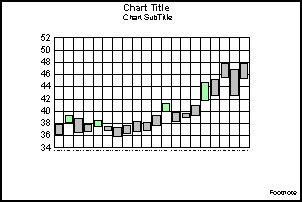
Candle Stock Open-Close (GraphType=72)
This graph type requires that two values are assigned to each marker: Open and Close.
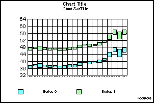
Stock Hi-Lo (GraphType=73)
This graph type requires that two values are assigned to each marker: High and Low, in that order. This is a standard financial equity graph.
Stock Hi-Lo Dual-Axis (GraphType=74)
This shows a Dual-Y HiLo graph. It requires two values per marker: High and Low.
Stock Hi-Lo Bi-Polar (GraphType=75)
This shows a Dual-Y graph with the axis split into separate sections. It requires that two values are assigned to each marker: High and Low.
Stock Hi-Lo Close (GraphType=76)
This graph type requires that three values are assigned to each marker: High, Low, and Close, in that order. This is a standard financial equity graph.
Stock Hi-Lo Close Dual-Axis (GraphType=77)
This shows a Dual-Y version of a Hi-Lo Close graph. It requires that three values are assigned to each marker: High, Low, and Close.
Stock Hi-Lo Close Bi-Polar (GraphType=78)
This shows a Dual-Y graph with the axis split into separate sections. It requires that three values are assigned to each marker: High, Low, and Close.
Stock Hi-Lo Open-Close (GraphType=79)
This graph type requires that four values are assigned to each marker: Open, High, Low, and Close. This is a standard financial equity graph.
Stock Hi-Lo Open-Close Dual-Axis (GraphType=80)
This shows a Dual-Y version of GraphType 79. It requires that four values are assigned to each marker: Open, High, Low, and Close.
Stock Hi-Lo Open-Close Bi-Polar (GraphType=81)
This shows a Dual-Y graph with two axes split into separate sections. It requires that four values are assigned to each marker: Open, High, Low, and Close.
Stock Hi-Lo with Volume (GraphType=82)
This shows stock performance along with volume. It requires that three values are assigned to each marker: High, Low, and Volume.
Stock Hi-Lo Open-Close with Volume (GraphType=83)
This shows stock performance along with volume. It requires that five values are assigned to each marker: Open, High, Low, Close, and Volume.
Candle Stock Open-Close with Volume (GraphType=84)
This shows a stock performance along with volume. It requires that three values are assigned to each marker: Open, Close, and Volume.
Stock Hi-Lo Close with Volume (GraphType=88)
This shows stock performance along with volume. It requires that four values are assigned to each marker: High, Low, Close, and Volume.
Histogram Graphs
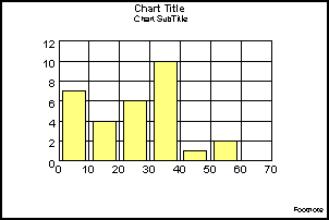
Vertical Histogram (GraphType=85)
This shows a standard histogram. It groups all of the data together and assigns it to "buckets" based on value. There are no series or groups in this graph type.
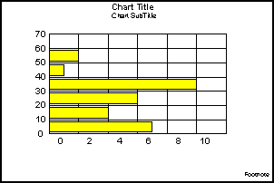
Horizontal Histogram (GraphType=86)
This groups all of the data together and assigns it to "buckets" based on value. There are no series or groups in this graph type.
Spectral Map
|
Topics: |
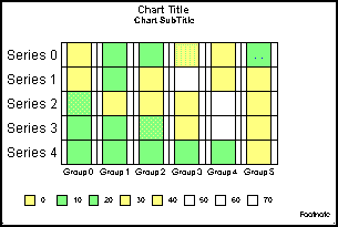
Spectral Map (GraphType=87)
This shows a row or column matrix of markers that are colored according to data values.
Bubble Graphs
|
Topics: |
Note: The X-axis for Bubble graphs is expected to be numeric. While you are allowed to substitute with an alphanumeric X-axis, not all features will work correctly.
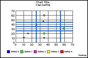
Bubble Graph (GraphType=89)
This shows three values assigned to each marker: X, Y, and Z, in that order. This has an X-Y plot in which the marker size depends on Z.
Bubble Graph with Labels (GraphType=90)
This shows that four values are assigned to each marker: X, Y, Z, and text label, in that order. This has an X-Y plot in which the marker size depends on Z, shown with labels.
Bubble Graph Dual-Axis (GraphType=91)
This shows that three values are assigned to each marker: X, Y, and Z, in that order. This has an X-Y plot in which the marker size depends on Z.
Bubble Graph with Labels Dual-Axis (GraphType=92)
This shows four values assigned to each marker: X, Y, Z, and text label, in that order. This has an X-Y plot in which the marker size depends on Z, shown with labels.
Pie-Bar Graphs
|
Topics: |
The following illustrations show different types of pie-bar graphs.
Pie-Bar Graph (GraphType=93)
This is a standard pie-bar graph.
Ring Pie-Bar Graph (GraphType=94)
This is a ring pie-bar graph.
Special Graphs
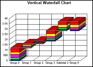
Vertical Waterfall Graph (GraphType=100)
The following is a vertical waterfall graph.
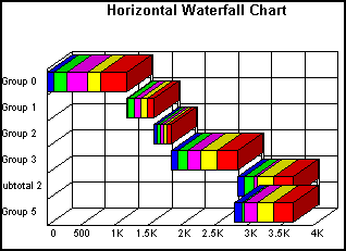
Horizontal Waterfall Graph (GraphType=101)
The following is a horizontal waterfall graph.
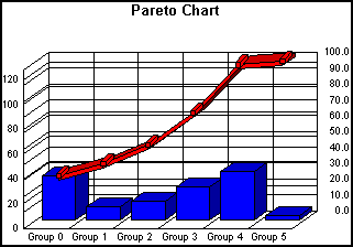
Pareto Graph (GraphType=102)
The following is a pareto graph.
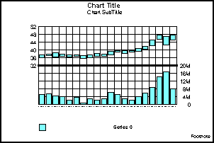
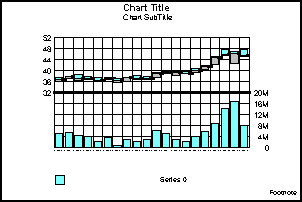
Multi-Y Y1/Y2/Y3-Axes Graph (GraphType=103)
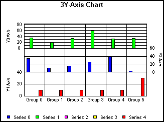
This shows a vertical bar graph with three Y-axes.
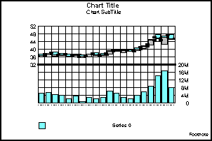
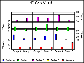
Multi-Y Y1/Y2/Y3/Y4-Axes Graph (GraphType=104)
This shows a vertical bar graph with four Y-axes.
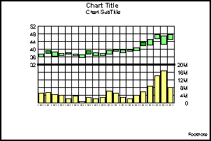
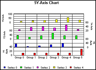
Multi-Y Y1/Y2/Y3/Y4/Y5-Axes Graph (GraphType=105)
This shows a vertical bar graph with five Y-axes.
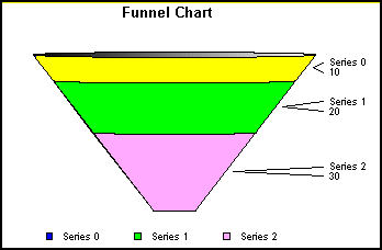
Funnel Graph (GraphType=106)
This shows a funnel graph that draws only one group of data at a time.
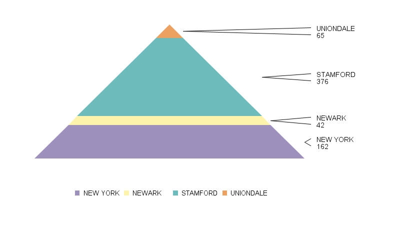
Pyramid Graph (GraphType=111)
This shows a pyramid graph that draws only one group of data at a time.
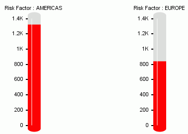
Thermometer Gauge Graph (GraphType=138)
This shows a thermometer gauge graph that compares two types of data.
Box Plot Graphs
|
Topics: |
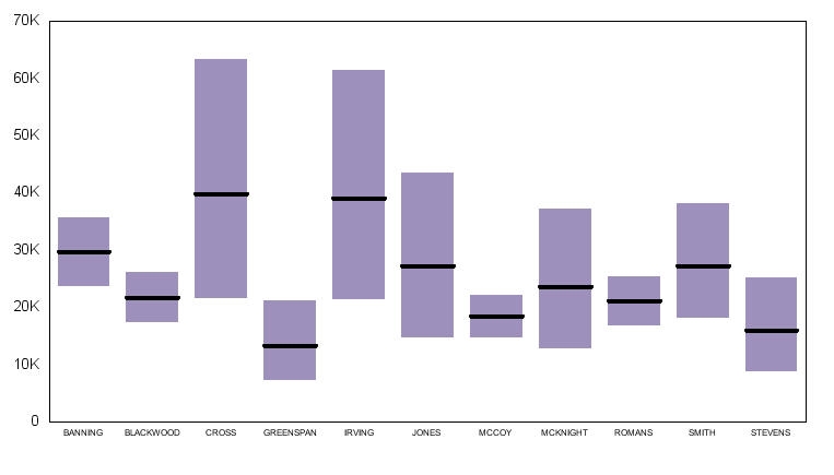
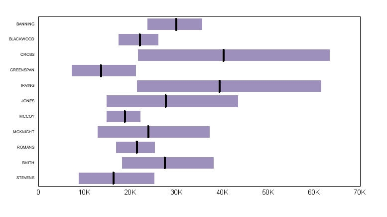
The following illustrations show the two types of box plot graphs. Box plot graphs can be displayed as either a box graph, or a whisker graph. For more information, see BoxPlotType.
Box Plot Graph (GraphType=124)
This is a standard box plot graph.
Horizontal Box Plot Graph (GraphType=130)
This is a horizontal box plot graph.
| WebFOCUS | |
|
Feedback |