Creating Responsive Web Pages
|
Topics: |
Responsive web design is an approach to webpage creation where content automatically realigns to fit a variety of different window sizes and screen sizes. This allows the content from one HTML file to automatically adapt to multiple footprints such as a desktop, laptop, tablet, or smartphone.
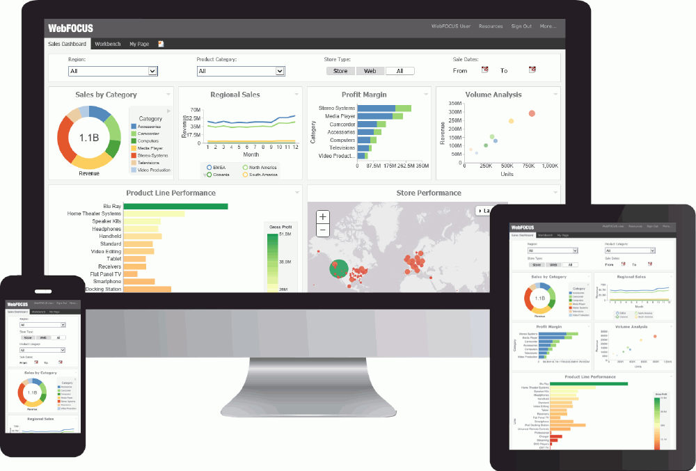
Unlike a generic HTML page, the containers in a responsive page reorder automatically as the screen size changes. Where a generic page shows partial content with a horizontal scroll bar, the responsive page shows full content, re-ordered, with no horizontal scroll bar.
How Responsive Containers Fold
|
How to: |
The behavior that makes a page responsive is called “folding.” This section details the way responsive containers fold, or re-arrange, as screen size changes. The order in which responsive containers fold is illustrated in the following image.
Figure A illustrates a responsive layout with a row-based 4-2 format, meaning there are four containers on row one and two containers on row two.
Figure A also illustrates the filter row, containing four controls. At run time, the filter row can either be hidden or displayed.
Figure B illustrates the way containers fold responsively when the screen width decreases. The content in each container resizes accordingly, as the screen width changes.
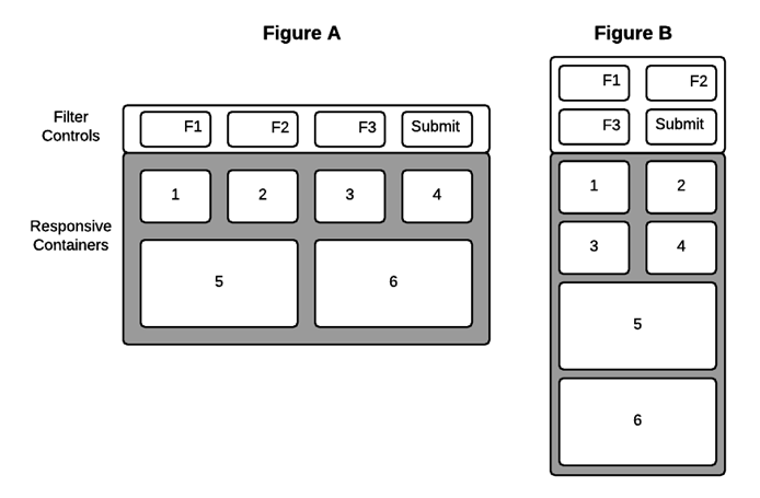
Note: Objects within a responsive container are positioned absolutely. That is, they do not fold. Responsive containers fold in relation to one another, but the objects inside the containers remain fixed.
Objects inside responsive containers can scale to defined limits, as detailed in How to Set Minimum and Maximum Panel Sizes. However, the objects within a container will not fold.
Procedure: How to Control Folding with the Flow Direction Property
You can control the column/row orientation by which responsive containers re-arrange themselves.
- Select a container in a responsive HTML page.
- Click the
drop-down arrow in the
Flow Direction field of the Properties panel and
select one of the following:
- Not Set. - Allows you to fold objects based on the available space (default).
- Row. - Allows you to fold objects horizontally by row.
- Column. - Allows you to fold objects vertically by column.
Note: The Flow Direction property does not display for a responsive container that contains an element that is not responsive. For example, a button contained in a responsive panel will disable (hide) the Flow Direction property for the panel. To prevent this, right-click the button and click Add selected to new container from the context menu. Then, when you click the original panel, the Flow Direction property is available again.
- Run the page. Resize the browser to observe the folding.
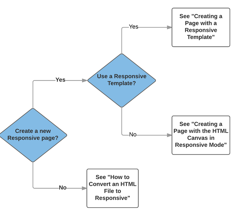
Selecting a Responsive Method
There are two ways to create responsive pages in : using a Responsive Template, and using the HTML Canvas in Responsive Mode. The following diagram shows the high-level decision tree that lets you quickly find the best way to create your responsive page:
- Using a Responsive
Template. This method lets you create a page by populating responsive
Output Widget containers in a pre-defined template or a layout that you create
at design time. You use the HTML/Document wizard to specify a layout that is
either row-based or column-based.
Key Characteristics
The Output Widget container, shown in the following image, is the key characteristic of a Responsive Template.
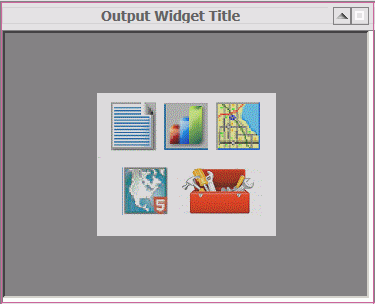
The Output Widget container has the following features:
- Title Bar. Including an editable text title.
- Image. Such as a company logo, that can be inserted on the left side of the title bar.
- Arrow Toggle. On the right side of the title bar, to display or hide widget-level controls.
- Expand Toggle. On the right side of the title bar, to make the widget contents display full screen or original size.
If you want to create a responsive page with one or more Output Widget containers, the Responsive Template method is the most efficient approach. This method is used only for creating new responsive HTML files. For more information, see Creating Content with a Responsive Template.
- Using the HTML Canvas
Responsive Mode. This “free form” method lets you create a responsive page
with no pre-defined layout. This manual approach is perhaps not as fast as
using a template, but may be preferable if you want to create a responsive page
with containers of many different types.
This method can also be used to convert an existing HTML file to responsive. For more information, see Creating Content with the Responsive Mode.
Creating a Page With a Responsive Template
There are six pre-defined responsive templates available through the HTML/Document Wizard. These represent the most commonly used page layouts. You can use the layout from a template as-is, or modify the layout further after initiating it with a template.
As an alternative to using a pre-defined template, the HTML/Document Wizard allows you to create a custom page layout at design time. You can specify the number of rows and columns, and whether the page has a row- or column-based orientation. These and other page options are detailed in the following sections.
Understanding Responsive Templates
When you select a responsive template from the HTML/Document Wizard, it generates a responsive layout with the specified number of rows (or columns) and widget containers. The parts of the responsive layout are highlighted in the following image, which was generated using the 2-2 responsive template. The image is annotated numerically with corresponding properties and explanations appearing below.
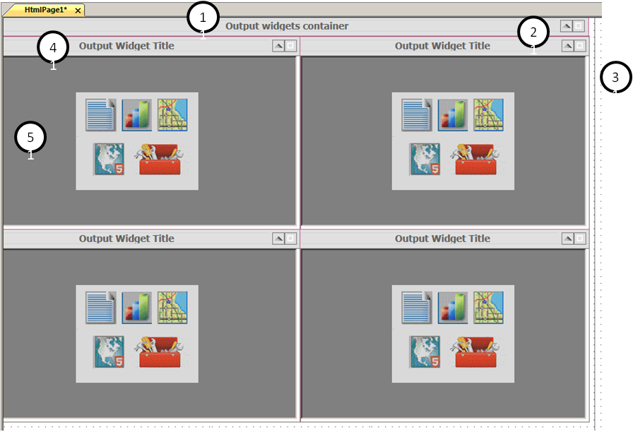
Document. Although not enumerated in the previous image, a responsive template generates an HTML document that includes the following responsive properties, editable in the Properties panel:
- Load in iFrame object. To load the entire page as a widget (a single DIV item) for use in a BI Portal. The default value for this property is Yes.
- Responsive: min width. Sets the minimum width (in pixels or percentage) beyond which the page size cannot be decreased. The default minimum width is 320 pixels.
- Responsive: max width.
Sets the maximum width (in pixels or percentage) beyond which the page will not
rescale larger. This also defines the width of the canvas at design time. This
limit is indicated by a black vertical line on the right side of the canvas, as
shown in item 3 in the previous image. The default maximum width is Full
screen.
At run time, the layout populates the full browser.
- Container alignment. Sets the alignment of containers within the page to the left (default) or centered.
1. Main Widget. Defined as windowPanel1 <DIV> in the Properties panel, the default title is Output widgets container.
- Grid margin. Defines the margin around all four edges of a cell expressed in pixels.
- Template orientation. Determines if the content folds by row or by column. The default orientation is Row-based. To change this, you can select Column-based.
- Widget Title. You can delete the default and type the desired title for the widget that encompasses the entire page contents.
- Display image. Enables you to display an image in the upper left corner of the widget. The default setting is Yes.
- Image source. Used to select the image to be displayed. Once selected, the path to the image is provided.
- Auto-hide inputs panel. The row of controls used to filter the content for the page is hidden by default. To always display the row of controls, select No.
- Select animation. Enables you to select any animations that have been set for this window panel.
2. Widget display buttons. The page, and each widget within it, has two buttons in the upper-right corner: an arrow and a box. Toggle the arrow to display or hide the row of controls. Toggle the box to expand a widget to full screen or return it to original size.
3. Vertical design boundary. This is a visual indicator on the far right side of the canvas that shows the responsive maximum width set in the Properties panel for the document. The default is 1500 pixels.
4. Widget Title. Defined as windowPanel2 <DIV> in the Properties panel (for the first widget), the default widget title is Output Widget Title. You can delete the default and type the desired widget title in the Properties panel. At design time, a red box appears around the widget title and contents to indicate a responsive container.
5. Widget contents. Defined as iframe1 <IFRAME> in the Properties panel (for the first widget), you can right-click to add content to the widget through the following shortcut menu:
- New Report. To create a new report in the widget.
- New Chart. To create a new chart in the widget.
- New Document. To create a new document in the widget.
- Import existing. To import an existing procedure into the widget.
- Reference existing procedure. To reference an existing procedure in the widget.
- Map. To create a new map control in the widget.
- ESRI. To create a new emf object in the widget.
- Use as Toolbox. A general option to use the widget as needed. For example, you may decide to create a button to execute an action.
The content in pages derived from a responsive template loads in the following order at run time: left to right - top to bottom.
To add a header to your responsive page, right-click in the title bar and select Add page header from the shortcut menu. Alternatively, you could use the Add page header option in the HTML/Document Wizard, as detailed in the following procedure.
Procedure: How to Select a Responsive Template
Select a responsive template from the HTML/Document Wizard as follows:
- Open the
HTML/Document Wizard using one of the following methods:
- On the Home tab, in the Content group, click HTML/Document; or
- In the Environments Tree panel, right-click an application folder, click New, and click HTML/Document.
The HTML/Document Wizard opens. If you used option a. above, the HTML/Document Wizard contains a navigation window that you can use to specify the folder where you want to save the new file.
- Click
Next.
The Templates, Settings, and Themes page opens, containing the Responsive Templates section, as shown in the following image.
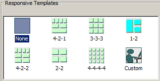
- Click on a
desired responsive template.
- Selecting None results in a generic HTML canvas that is not responsive.
- Selecting Custom lets you design a layout that differs from those offered by the responsive templates. For more information, see How to Create a Custom Layout.
For purposes of this procedure, do not select None or Custom.
- Use the
Input Controls section at the bottom of the page as follows:
- Select Auto-hidden to hide the controls input panel. This is the default. At run time, users display the panel by clicking the down arrow in the title bar.
- Select Always show to display the controls input panel. At run time, users hide the panel by clicking the up arrow in the title bar.
- Clear the check box for Use a single input control panel if you want to use widget-level controls instead of, or in addition to, page-level.
- Select Run requests on load to load the contents of all the widgets when the page first opens.
- Select Add page header if you want to add space above the title bar, within the responsive panel1 <DIV>. You could use this area to add a graphic and/or company logo, for example.
- Click
Finish to close the HTML/Document Wizard.
The HTML canvas opens with the automatically generated responsive layout corresponding to the selected template.
Note: It is a best practice to expand to full screen when working with a responsive layout. This lets you access the greatest number of widgets without having to scroll.
Reference: Populating Widgets in a Responsive Template
A layout generated by a responsive template contains blank widgets in responsive containers. This section contains guidelines for editing and adding objects to widgets.
- To add content to a header,
click the desired element from the Components tab and drag and drop it on the
header area to define it.
To increase the height of a page header, click the Title Bar and drag it down to expose more room above it. Click the header area to highlight the responsive red box. Drag the lower border of the red box down to increase the height of the header.
- To change a widget title, click the default title, Output Widget Title, and open the Properties panel. In the Widget Title field, type the new widget title.
- To display an image in the top left corner of a widget title bar, set the Display image value to Yes. Use the Image source field to lookup the desired image file.
- To add objects to a widget,
right-click in the widget to display the shortcut menu. Click the desired
object type, for example, Report, Chart, Document, Map, and so on. You can create new
content in the widget, import existing content, or reference existing content.
Note: When using a layout generated by a responsive template, you cannot add objects to the canvas outside the layout.
- To add multiple objects to
a widget, drag the additional object from the ribbon to the widget. For
example, on the Home tab, in the Content group, click the Report button and drag it to
a widget that already contains an object, and drop it. A box is automatically
drawn within the widget to contain the new report object.
Note: All of the objects in a responsive container must be responsive. You cannot include responsive and non-responsive objects in the same responsive container.
- To set an equal margin around all four sides of a widget, enter a number of pixels in the Margin property for the widget <IFRAME>.
- To move contents from one widget to another, click the Positioning tab and, in the Responsive Design group, click Toggle Selection. Drag contents between widgets as needed and click Preview Runtime, on the Utilities tab.
Procedure: How to Add or Remove a Widget
You can change the layout of your responsive page at design time by adding or removing a widget, as detailed below.
- Open a responsive HTML page.
- To add a
widget, use one of the following methods:
- Select
a widget next to the location where you want to add a new one. Right-click on
the title bar of that widget and select
Insert new widget before or
Insert new widget after from the shortcut menu.
The new widget is added.
- Alternatively, you can right-click on the title bar of the HTML
page and select
Template configuration...
from the shortcut menu. The Template
Configuration dialog box shows the row (or column) numeric configuration. For
example, 3-2.
Change the numeric configuration to include the new widget. For example, to add a new widget to the second row, change the value to 3-3.
The new widget is added.
- Select
a widget next to the location where you want to add a new one. Right-click on
the title bar of that widget and select
Insert new widget before or
Insert new widget after from the shortcut menu.
- To remove
a widget, use one of the following methods:
- Select
a widget that you want to remove. Right-click on the title bar of that widget
and select
Delete from the shortcut menu.
The widget is removed.
- Alternatively, you can right-click on the title bar of the HTML
page and select
Template configuration...
from the shortcut menu. The Template
Configuration dialog box shows the row (or column) numeric configuration. For
example, 3-2.
Change the numeric configuration to reduce the number of widgets. For example, to remove a widget from the first row, change the value to 2-2.
The widget is removed.
- Select
a widget that you want to remove. Right-click on the title bar of that widget
and select
Delete from the shortcut menu.
Procedure: How to Add an Additional Object to a Widget
You can put more than one object (such as a report or chart) in an output widget, as detailed in this procedure.
Note: A widget that contains a map will not accept an additional object.
- Click an
object that has already been added to a widget.
- If the widget contains a report or chart, you can add another report or chart, but not any other type of object.
- If the widget contains a toolbox, you can add an additional report or chart, but it will not have the Autosize option set by default. You must set this option manually.
Open the Properties panel to verify that the IFRAME is selected.
- On the
Components tab, click the object that you want to add. For example, Report or
Chart.
The widget can be divided vertically (with the two objects, side by side) or horizontally (with the two objects one above the other). Move your cursor to the right or left side, or the top or bottom of the widget.
The existing content automatically moves to the opposite side of your cursor.
- Click on
the side where you want to insert the new object.
The widget is automatically divided into two equal columns or rows. The side you selected contains the report or chart icon in an iframe.
Note: If you change your mind after you add the new iframe, you may right-click and delete it. However, the original iframe will not automatically expand to fill the original space in the widget. At run time, the content of the original iframe does fill the original space. But at design time it remains partial. You can click the original iframe and manually drag its border to fill the widget space, if you want the appearance of the page at design time to more closely reflect the appearance at run time.
- Right-click the icon and select the desired option from the shortcut menu to create the new object. For example, Reference existing procedure.
- Click the
widget title bar and open the Properties panel. The Number of columns property
defaults to
Auto.
Use the drop-down menu to select the number of columns you want in the widget.
Select
2 if
you have two objects side by side. Select
1 if
you have two objects, one above the other.
Run the page to preview widgets that have multiple objects to be sure the content remains legible.
Procedure: How to Apply Page-Level Controls in a Responsive Page
You may often have a responsive page that contains multiple reports that use the same controls. For example, if users can select region and month, they may want to show the same region and month selection for multiple reports in the page. In this case, you can apply common controls at the page level.
Your page can also include one or more reports that use controls that differ from the common ones. In this case you can apply additional controls at the widget level, as defined in How to Apply Widget-Level Controls in a Responsive Page.
This procedure details how you apply controls at the page level.
- Create
multiple reports or charts that use the same controls and add them to widgets
in a responsive layout as detailed in
How to Populate
a Layout from a Responsive Template.
When you add a report with controls to a widget, the New Parameters dialog box opens. You can use this dialog to chain controls together. Chaining lets you filter control values based on the selected value from the prior control in the chain. For example, if State and City controls are chained, the City values will be filtered to show only cities in the selected state.
For more information see Chaining in the HTML Canvas.
- Run the
page. Note that:
- The control names and values are appended to the page title in the title bar.
- The controls input panel does not display. This is the default.
- Click the
down arrow in the right corner of the title bar to display the controls input
panel.
Close the HTML output and return to the HTML canvas.
- If you
want the controls input panel to display when the page opens:
- Click
the title bar and open the Properties panel.
The properties for windowPanel1 <DIV> are displayed.
- Change the Auto-hide inputs panel value to No.
- Run the page. Note that the controls input panel now does display.
- Click
the title bar and open the Properties panel.
- To display
the controls on the left side of the input panel:
- Click the controls input panel and open the Properties panel.
- Change the Control panel value to Yes.
- Run the page and expand it to full screen. Note that the controls in the input panel display together on the left side of the panel, where the user expects them to be.
If you do not set the Control panel value to Yes, the controls will automatically expand to the right to use the full width as the page size increases.
The selections that the user makes in the controls input panel are automatically applied to all the reports on the page that share the controls.
Procedure: How to Apply Widget-Level Controls in a Responsive Page
You may often have a responsive page that contains multiple reports that use the same controls. For example, if users can select region and month, they may want to show the same region and month selection for multiple reports in the page. In this case you can apply common controls at the page level, as defined in How to Apply Page-Level Controls in a Responsive Page.
Your page can also include one or more reports that use controls that differ from the common ones. In this case you can apply additional controls at the widget level.
This procedure details how you apply controls at the widget level when different controls are used at the page level.
- Open a
responsive HTML file that uses page-level controls, such as the one created in
How to Apply
Page-Level Controls in a Responsive Page.
Add a new widget to a row as detailed in How to Add or Remove a Widget.
- Create a
report or chart that uses controls and add it to the new widget. For purposes
of this procedure, use different controls than the ones used in the other
reports in this page.
When you add a report with controls to a widget, the New Parameters dialog box opens. By default, this dialog is set to create a control. Click OK.
- Run the page. Note that the controls input panel displays in the new widget by default.
- To hide
the controls input panel in a new widget:
- Add a
new widget to a row as detailed in
How to Add
or Remove a Widget. Add the report you created in Step 2 to the new
widget.
The New Parameters dialog box opens.
- In the
Parameter grouping options field select
New single layer form and click
OK.
The New Parameters dialog box closes. The input panel is hidden.
- Add a
new widget to a row as detailed in
How to Add
or Remove a Widget. Add the report you created in Step 2 to the new
widget.
The selections that the user makes in the controls input panel at the page level are automatically applied to all the widgets on the page that share controls. Additionally, the user can make a selection in the independent widget that does not share controls.
Procedure: How to Animate the Controls Input Panel
Creating a page with a responsive template enables you to add animation that appears when a user opens or closes a controls input panel at run time. This consists of creating and naming an animation, then applying it to the window panel that corresponds with the input controls, as detailed below.
- Open an HTML page that was a) created with a responsive template; and b) contains input controls.
- Open the
Tasks & Animations panel. In the JQuery Animations section, click the New
button.
The system gives the new animation a default name. For example, Animation1. If you wish to rename the animation, click the default name and type the new name.
Note: It is not necessary to specify a selected target for the animation. Leave this field blank.
- In the Effect section, use the drop-down menu in the Type field to select an animation. If you wish, you may select an Option and Value to apply to the selected animation.
- At the
bottom of the panel, click Toggle animation.
The animation is ready to be applied to the window panel.
- In the responsive layout, click the title bar under which the control input panel appears.
- Open the Properties panel. In the Output Widget section, click the Select animation field. Use the drop down menu to highlight the desired animation name. For example, Animation1.
- Run the HTML page. Use the up/down arrow button on the title bar to see the animation when you hide/reveal the controls input panel.
Procedure: How to Set Minimum and Maximum Panel Sizes
Responsive panels automatically resize as the viewing window changes, but panels do not have a default minimum or maximum size. You can set minimum or maximum size, in pixels or percentages, to best suit the panel contents, as follows.
Note: Panels in a responsive page resize within the context of the minimum and maximum page width. To view or edit these values, open the Properties panel and select DOCUMENT from the drop-down menu at the top of the panel. For Responsive: min width, the default is 320px. For Responsive: max width, the default is Full screen.
- Click a
responsive panel that contains controls, or click the title bar of a widget,
and open the Properties panel.
The Properties panel for the panel <DIV> includes the following properties: Min-width, Max-width, Min-height, and Max-height. These values are blank by default.
- You can
manually type a number of pixels or a percentage. For example,
50px or
50%.
Alternatively, you can use the shortcut menu as follows:
- Right-click a responsive panel that contains controls, or
right-click the title bar of a widget. From the shortcut menu, select
Update Sizes.
The Update Sizes shortcut menu displays.
Select Update minimum size to populate the Min-width and Min-height properties with the number of pixels or percentages used by the selected container. In other words, the container will not scale smaller than the size shown in the responsive layout.
Note: Update minimum size does not change the object size in design time, but it does change the size in run time.
Select Use Current to use sizes from the selected container as follows:
- Size as min size. To populate the Min-width and Min-height properties with the number of pixels used by the selected container.
- Size as max size. To populate the Max-width and Max-height properties with the number of pixels used by the selected container.
- Height as min height. To populate the Min-height property with the number of pixels used by the selected container.
- Width as min width. To populate the Min-width property with the number of pixels used by the selected container.
- Height as max height. To populate the Max-height property with the number of pixels used by the selected container.
- Width as max width. To populate the Max-width property with the number of pixels used by the selected container.
Procedure: How to Load a Widget at Run Time
In some cases, the content you add to a widget might not load at run time, leaving the widget blank. This could occur if you did not select the Run requests on load option from the HTML/Document wizard, or if you added a new widget to a layout.
To cause widget content to load at run time:
- Open the Tasks & Animations panel, select the Load Task, and then select Load Trigger Type.
- In the
Requests/Actions section, click the down arrow next to the Add Request button.
The shortcut menu is displayed.
- Select
Run Request and then select an iframe, for example
iframe2.
The iframe is added to the Requests/Actions field and is highlighted.
- In the
Target Type field, select
Frame. In the Target/Template field, select the
iframe that corresponds to the one that is highlighted, for example
iframe2. Run the page.
The content loads at run time.
- Repeat these steps for all the iframes in your page that do not load at run time.
Procedure: How to Create a Custom Layout
In the HTML/Documents Wizard, the Templates, Settings, and Themes page includes six responsive templates that represent the most commonly used layouts. You can use these layouts as-is, or use them as a point of departure for a modified layout that contains more or fewer widgets. For more information, see How to Add or Remove a Widget.
Instead of using a template, you can create a custom layout, as detailed in this procedure.
- Open the
HTML/Document Wizard using one of the following methods:
- On the
Home tab, in the Content group, click
HTML/Document.
or
- In the Environments Tree panel, right-click an application folder, click New, and click HTML/Document.
The HTML/Document Wizard opens. If you used option a. above, the HTML/Document Wizard contains a navigation window that you can use to specify the folder where you want to save the new file.
- On the
Home tab, in the Content group, click
HTML/Document.
- Click
Next.
The Templates, Settings, and Themes page opens, containing the Responsive Templates section.
- In the
Responsive Templates section, click
Custom. Click Finish.
The layout opens and the Template configuration dialog is activated.
- In the Orientation field, select Row-based or Column-based.
- Use the
Select row number and Number of containers in a row field as follows:
- With
number 1 showing in the Select row number field, use the drop down list in the
Number of widgets in a row field to specify the number of widgets you want in
row 1.
Note: Use the drop down list. Do not type in the field.
- Select 2 in the drop down list in the Select row number field.
- Use the drop down list in the Number of widgets in a row field to specify the number of widgets you want in row 2.
- Repeat
this sequence as needed to define your custom layout.
Close the Template configuration dialog.
- With
number 1 showing in the Select row number field, use the drop down list in the
Number of widgets in a row field to specify the number of widgets you want in
row 1.
- Define the
page-level behavior of input controls as follows:
- In the Properties panel for windowPanel1 <DIV>, set Auto-hide inputs panel to Yes. At run time, users reveal the panel by clicking the down arrow in the title bar. This controls page-level behavior.
- In the Properties panel for windowPanel2 <DIV>, set Auto-hide inputs panel to Yes. At run time, users reveal the panel by clicking the down arrow in the title bar. This controls widget-level behavior. Repeat this for each widget for which you want to use widget-level controls.
- Select No to display the controls input panel. At run time, users hide the panel by clicking the up arrow in the title bar.
- To add a page header, right-click in the title bar of the page and select Add page header from the shortcut menu. You could use this area to add a graphic and/or company logo, for example.
Creating a Page With the HTML Canvas in Responsive Mode
|
How to: |
This “free form” method lets you create a responsive page with no pre-defined layout. This manual approach is perhaps not as fast as using a template, but may be preferable if you want to create a responsive page with containers of many different types. You can also use this method to convert an existing HTML file to responsive.
The following containers are responsive, by default:
- Report
- Chart
- Form (Single Layer and Multiple Layer)
- Tab (Top, Bottom, Left, and Right)
- Accordion (Vertical and Horizontal)
- Window
- Output Widget
- Group Box
- Panel
- Frame
- Map
- Esri Map
Procedure: How to Create New Content in Responsive Mode
You can create new responsive content using the HTML canvas in responsive mode, as defined in this procedure.
- Open the
HTML/Document Wizard using one of the following methods:
- On the Home tab, in the Content group, click HTML/Document; or
- In the Environments Tree panel, right-click an application folder, click New, and click HTML/Document.
The HTML/Document Wizard opens.
- Click
Next.
The Templates, Settings, and Themes page opens, containing the Page Settings section, as shown in the following image.
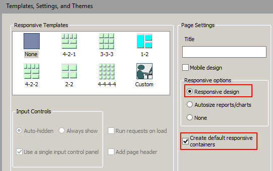
- In the
Page Settings section, select
Responsive design.
Note:
- The Create default responsive containers option is selected, by default. When you create a control using the New Parameters dialog box, the forms and the controls will be created with responsive containers.
- If you clear the Create default responsive containers check box, no responsive containers will be drawn for the form object.
- Controls are not responsive, by default. If you draw a control, right-click the control and select Add Selected to a new container to draw a responsive container around the object.
- You can make a non-responsive container responsive by selecting the container and, in the Properties panel, selecting Yes for the Enable Responsive property.
- Click
Finish.
The HTML canvas opens. In the Properties panel, in the DOCUMENT properties, the Responsive design value is set to Yes.
As an alternative to using the HTML/Document Wizard, you can open a file in the HTML canvas and manually change the Responsive design property value to Yes.
You can add content to the HTML canvas before turning Responsive Design on. However, there are advantages to turning Responsive Design on before adding content. Design time benefits include:
- Having the responsive minimum and maximum widths established
- Having the maximum width visually indicated by the horizontal line on the right side of the canvas
- Having the Preview Runtime capability to preview the run-time appearance
Procedure: How to Convert an HTML File to Responsive
- To enable
responsive behavior in an existing HTML file, double-click the file in the
Environments Tree panel, or right-click it and click
Open.
The HTML file is open in the HTML canvas.
- In the
Properties panel, select
DOCUMENT from the drop-down menu.
The Document properties are displayed.
- In the
Responsive design property, select
Yes from the drop-down menu.
A message appears asking of you want to group control elements into responsive containers.
- Indicate
your preference for responsive containers as follows:
- Click
Yes to add multiple containers in the control area
as shown in the following image.
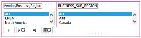
Note there are three containers within the fourth, larger container. The containers are red, indicating that they are responsive.
- Click
No to add no containers. This may be preferable if
your page contains many nested objects, otherwise each object will get its own
container.
You can add additional containers at a later time:
- Multi-click the control objects you want to group in a container.
- Right-click one of the highlighted objects and select HTML object manipulation from the shortcut menu.
- Select Merge containers.
- To make a frame responsive, select it and open the Properties panel. Set the Enable responsive property value to Yes.
The HTML canvas is now in responsive mode. The frames and controls on your HTML canvas are each enclosed in a responsive container, indicated by a red box.
Note: if the HTML file had the Autosize Children option enabled, it will be superseded by the new responsive behavior, which automatically controls sizing.
Two additional responsive properties appear in the Properties panel, whose values you may edit:
- Responsive: min width. Elements will not be repositioned or resized if the width of the container is less than this minimum, specified in pixels or percentage.
- Responsive: max width. Elements will not be repositioned or resized if the width of the container is greater than this maximum, specified in pixels or percentage.
A black vertical line appears on the right side of the HTML canvas in responsive mode, as a visual indicator of the responsive maximum width. You may need to scroll right to see this line.
- Click
Yes to add multiple containers in the control area
as shown in the following image.
- To move contents from one container to another, click the Positioning tab and, in the Responsive Design group, click Toggle Selection. Drag contents between containers as needed and click Preview Runtime, on the Utilities tab.
- Click the Run button on the Application menu and view the HTML output full screen. Gradually decrease the width to observe the responsive folding.
Procedure: How to Restrict the First Row to Controls Only
When you create a page with a responsive template, the first row of the page is automatically restricted to input controls (when applicable). Content such as reports or charts will not fold up to populate the first row, regardless of how wide the browser may stretch at run time.
When you create a page using the HTML canvas in responsive mode, this restriction is not automatic. Therefore a report or chart could fold up to populate the first row, if the browser width is increased. This behavior may be considered undesirable.
Ensure that the first row contains controls only, as follows:
- Open an
HTML page that was:
- Created with the HTML canvas in Responsive mode
and
- Contains input controls.
- Created with the HTML canvas in Responsive mode
- Verify
that the input controls are all grouped within a single container. If not:
- Hold down the Ctrl key and multi-select all the controls.
- Right-click on one of the controls and select HTML object manipulation.
- From
the shortcut menu, select
Add selected to new container.
Note that a box appears that contains all the selected controls. The box is red, indicating it is responsive.
- To display
the controls on the left side of the input panel:
- Click the controls input panel and open the Properties panel.
- Change the Control panel value to Yes.
- Run the page and expand it to full screen. Note that the first row contains controls only. Also note that the controls in the input panel display together on the left side of the panel, where the user expects them to be.
If you do not set the Control panel value to Yes, the controls will automatically expand to the right to use the full width as the page size increases.
Procedure: How to Create a Responsive Page for Use in a BI Portal
The BI Portal gives users access to BI content, including dashboards, visualizations, reports, charts, graphs, maps, and interactive InfoApps. The BI Portal allows users to analyze vital information quickly, link content and reports together, and easily tailor information to their needs.
This procedure is comprised of two parts: creating a report for use in the responsive portal and creating a responsive HTML page using the HTML canvas.
- Select or
create a report with the following criteria:
- Has dynamic parameters specified in a WHERE clause.
- Has _FOC_NULL as the default.
- Has a parameter that is a Multiselect OR.
- Has a value of No in the File/Folder Properties panel - Prompt for Parameters property.
- Create a
responsive HTML page as follows:
- Open
the HTML/Document Wizard from the Home tab, in the Content group, or from the shortcut
menu in the Environments Tree panel. Click
Next.
The Templates, Settings, and Themes page opens.
- In the
Page Settings area, click Responsive design and click
Finish.
The HTML canvas opens. In the Properties panel, in the DOCUMENT properties, verify that the Responsive design object property is set to Yes and the Load in iFrame object property is set to No.
The Load in iFrame object property is used to enable objects in a BI Portal to overlap the edges of a container. For example, when you have a pop-up calendar that populates a date field, the calendar can overlap the control container to allow the user to select a date.
Note: The Load in iFrame object property creates a <DIV> for the page instead of an <iFrame> tag. A BI Portal is limited to only one HTML Canvas page that is enclosed in a <DIV> tag.
Note that the Responsive: min width is set to 320px and the Responsive: max width is set to Full screen. These default values can be edited in pixels or percentages.
- In the
Requests and Data sources panel, click the drop down arrow next to the New
icon, and select the option Requests-Parameters-Filter Panel.
The Open File dialog box opens.
- Select
the procedure you designated in Step 1 and click
OK.
The New Parameters dialog opens.
- Click Autochain controls in above specified order,
and click
OK.
The New Parameters dialog closes and the HTML canvas is opened, showing the controls in containers. The red boxes indicate that responsive design is activated.
- Open the Tasks & Animations panel and verify that the Submit button (task 2) Requests/Actions value is Refresh1 and the Target Type is Refresh BI Portal.
- Right-click the canvas and select Preview Runtime or click the Preview Runtime button on the Utilities tab. Note that the content expands to the maximum width. The black vertical line on the right side of the canvas is a visual indicator of the specified Full screen max width.
- Save the HTML page.
- Open
the HTML/Document Wizard from the Home tab, in the Content group, or from the shortcut
menu in the Environments Tree panel. Click
Next.
Reference: Tips for Using Responsive Design
The following are some best practices in working with Responsive Design to create responsive HTML pages:
- When creating a new
responsive HTML page:
- Use a Responsive template to generate a layout with widgets. The HTML/Document Wizard lets you control the number of rows and the number of widgets per row, lets you determine how input controls will appear, lets you add a page header, and lets you run requests automatically when the page loads at run time.
- Use Responsive Design in the HTML canvas to generate a layout without widgets. This method lets you design a page for a BI Portal.
- On the Positioning tab, the
Positioning group contains the Same Width, Same Height, and Same Size commands
that behave as follows in responsive design mode:
- Same Width. Sets the minimum and maximum width to that of the control object (the previously selected object).
- Same Height. Sets the minimum and maximum height to that of the control object (the previously selected object).
- Same Size. Sets the minimum and maximum width and height to that of the control object (the previously selected object).
To use these commands:
- Click the object whose size you want to duplicate.
- User the Control key and click the secondary objects that you want to resize.
- Click the desired command button from the Positioning group.
- On the Positioning tab, the
Responsive Design group contains the Toggle Selection and Update Layout
commands. These commands are enabled in responsive design mode.
- Toggle Selection. Toggle on to allow responsive containers that include content to be dragged to a new position. Toggle off to prevent those containers from being repositioned.
- Update Layout. This command is activated in a responsive page when the Autosize children property is set to Yes. Click to refresh the HTML canvas after you reposition containers, to show how the containers will stack when folded.
- You can control the
run-time alignment of contents within a responsive container using the
Content alignment property. This property appears
for a parent responsive container that contains multiple responsive objects.
Click the down arrow to display the following property values:
- Blank <Not Set>. The objects are aligned toward the left side of the container by default.
- Start. The objects are aligned on the left side of the container.
- End. The objects are aligned on the right side of the container.
- Center. The objects are centered within the container.
- Space between. The objects are evenly distributed by width. The first object is close to the left side, the last object is close to the right side, and the objects in between are spaced equally.
- Space around. The objects are evenly distributed by width and height.
The alignment in the HTML canvas does not change after you specify a content alignment property value. Click Run on the Quick Access Toolbar to see the specified alignment in the browser.
- A black vertical line appears on the right side of the HTML canvas in responsive mode, as a visual indicator of the breakpoint width for desktop display. In order to control the behavior of your responsive containers, position them to the left of this line on the HTML canvas. Content appearing to the right of this line will fold arbitrarily.
- If you have both Mobile Design and Responsive Design enabled, Mobile Design takes precedence when you view content on the smartphone. Mobile Design uses jQuery mobile controls. Responsive Design uses browser-generated controls.
| WebFOCUS | |
|
Feedback |