Designing Content for Smartphones
|
Topics: |
You can design content specifically to be used on smartphones. Content designed in this way is automatically sized, and takes full advantage of the page-swipe navigation and touch-screen capabilities of smartphones.
Note: Tablets can display native HTML content without modification. This section pertains to designing HTML content for smartphones only.
The following steps outline how you can design HTML content for smartphones:
- Create and save your content in an HTML file that is built in the native HTML canvas.
- Enable Mobile Layout for the HTML file by using the Enable
mobile property.
For more information, see Enabling Mobile Layout in an HTML File.
- Select either the Basic or Advanced Mobile Layout.
For more information, see Working With the Basic and Advanced Mobile Layouts.
- Populate the smartphone pages with your HTML content.
- View the results on your smartphone.
For more information, see Viewing Mobile Output on a Smartphone.
Designing Output for Smartphones With the Mobile Layout Functionality
|
Topics: |
|
How to: |
Before you use the Mobile Layout functionality, you must create and save your content on the native HTML canvas. The example shown in the following image contains four objects: a text box containing a title, a drop-down control, a frame containing a report, and a frame containing a chart.
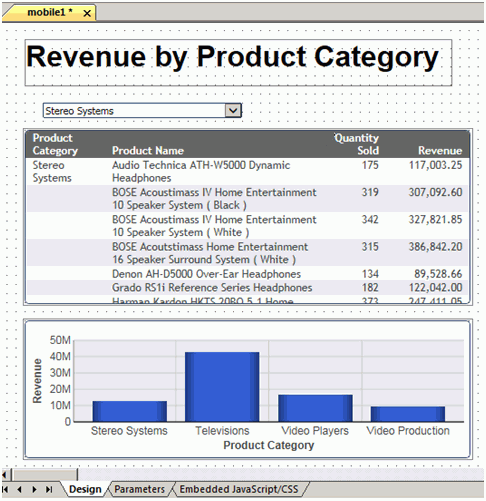
Frames
Frames in your HTML content automatically appear in the Mobile Layout. In the Basic Mobile Layout, individual frames appear separately on individual pages. In the Advanced Mobile Layout, all frames appear together on a single page. You can change either layout to display frames on pages as you like.
The page order, when viewed on a smartphone, is determined by the frame order in the Tasks area of the Tasks & Animations panel. You can change the page order in the Mobile Layout, as needed.
Animations that you have targeted to a frame included in the Mobile Layout will run on your smartphone.
Controls
To maximize the capabilities of a touch screen, single-select and multi-select controls both become listbox jQuery mobile controls, with one allowing single-select and the other multiselect.
Note: jQuery mobile controls do not display when you design your HTML page using the Mobile Layout, but will display when the page is viewed on a smartphone.
Other Objects
Some objects that you add to the HTML canvas are not automatically promoted to pages in the Mobile Layout. This is true for text boxes and images.
Objects that are not automatically promoted to pages appear below a horizontal line that underlines the page preview. You can drag objects above the line onto pages, as needed. Objects that remain below the line, and any animations targeted to them, will not appear when you view the pages on your smartphone.
Note: The size of an object that you drag into a page is accurately previewed in the page, so you can determine if the object needs to be resized. If so, you must resize it in the HTML canvas.
When you drag an object from below the horizontal line onto a page, the system recognizes this as a manual modification to the Mobile Layout. This triggers a message: Manual modification of mobile layout will stop default generation of the pages. It will be your responsibility to maintain it.
Accepting this means that changes to the underlying data will not flow automatically to the mobile pages. You must open the HTML file, right-click the canvas, and select Update Layout.
To take advantage of the default generation of the mobile pages, it is recommended that you avoid making manual modifications.
Note: You can undo manual modification of the Mobile Layout by right-clicking the canvas and clicking Reset mobile to default. This restores automatic update of the HTML pages, and removes any manual modifications.
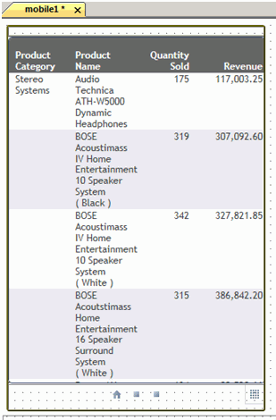
A page in Mobile Layout appears as shown in the following image. In this example, the page content displays in a frame, which is scrollable when you view it on a smartphone. Below the frame is the navigation area.
Styling for the components of the Mobile Layout is controlled by the cascading style sheet. For more information, see Cascading Style Sheet Class Mapping List for Mobile Components.
The Navigation Area
The following image displays the navigation area that appears below the page content.
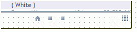
The icons in our example indicate that there is a home page, which is represented by the house icon, and two additional pages, which are represented by two square icons. In addition, there is a page combination tool, which is represented by a tile icon.
The default home page appears first in the page order. You can change the home page as needed.
You can use the square icons  and the house
icon
and the house
icon  to navigate between
the pages.
to navigate between
the pages.
You can use the tile icon  to vertically
combine objects in a page, in cases where there is more than one
object on a page. Toggle the tile icon to change vertical combinations.
to vertically
combine objects in a page, in cases where there is more than one
object on a page. Toggle the tile icon to change vertical combinations.
Adding/Removing Pages
The following list describes the shortcut menu options on the Mobile Layout canvas, which you can use to add and remove pages.
- Show all pages. Displays all pages on the Mobile Layout canvas. Both the Basic and Advanced Mobile Layouts show one page, by default.
- Add empty page. Adds an empty page to the Mobile Layout canvas. You can then drag content into the page.
- Remove empty page. Deletes any empty pages on the Mobile Layout canvas.
- Remove selected page. Deletes a page that
has content. The system recognizes this as a manual modification
to the Mobile Layout. This triggers a message: Manual modification
of mobile layout will stop default generation of the pages. It will
be your responsibility to maintain it.
Accepting this means that changes to the underlying data will not flow automatically to the mobile pages. You must open the HTML file, right-click the HTML canvas, and select Update Layout.
- Reset mobile to default. Restores automatic update of the HTML pages, and removes any manual modifications.
Note: When you delete content from the HTML canvas, you must also manually delete it from the Mobile Layout. Deleting content from the Mobile Layout that was previously deleted from the HTML canvas is not interpreted as a manual modification, and will preserve the default generation of the pages.
Moving Content Between Pages
You can change the order of the pages or display more than one object on a page.
To display more than one object on a page horizontally, click the object in one screen and drag it to another.
To display more than one object on a page vertically, use the
tile icon . Toggle the
tile icon to remove vertical combinations.
To move a control or an object that appears below the horizontal line, drag the object to the desired page. The system recognizes this as a manual modification to the Mobile Layout. This triggers a message: Manual modification of mobile layout will stop default generation of the pages. It will be your responsibility to maintain it.
Accepting this means that changes to the underlying data will not flow automatically to the mobile pages. You must open the HTML file, right-click the HTML canvas, and select Update Layout.
Note: You can undo manual modification of the Mobile Layout by right-clicking the canvas and clicking Reset mobile to default. This restores automatic update of the HTML pages, and removes any manual modifications.
To take advantage of the default generation of the pages, it is recommended that you avoid making manual modifications.
Enabling Mobile Layout in an HTML File
An HTML file is designated for mobile output when the Enable mobile property is set to Yes. This designation enables a Mobile Layout option, where you can edit and preview your mobile output.
Note: An HTML file that has Mobile Layout enabled can additionally be viewed on a desktop or tablet. In these cases, page design is derived from the HTML canvas and the page design on the Mobile Layout is ignored. This eliminates the need to maintain different copies of the same pages for different output.
You can enable mobile output for an existing HTML file, or create a new file with mobile output enabled.
Procedure: How to Enable Mobile Output for an Existing HTML File
- Open the HTML file.
The HTML canvas opens.
- Open the Properties panel.
- Change the Mobile property
from No to Yes.
The HTML canvas shortcut menu now includes mobile output options.
Procedure: How to Create a New File With Mobile Output Enabled
- On the Home tab, in the Content group,
click HTML/Document. You can also create
a new HTML file from the Application menu or by using the shortcut
menu in the Environments tree panel, for a folder that supports
content creation.
The HTML/Document Wizard opens.
- Navigate to where you want to create your HTML page and
click Next.
The Themes and Settings window of the HTML/Document Wizard opens.
- Select the Mobile design check box.
Selecting this option automatically sets the Mobile property to Yes in the Properties panel.
- Click Finish.
The HTML canvas opens. The canvas shortcut menu now includes mobile output options.
Working With the Basic and Advanced Mobile Layouts
There are two different layouts for designing HTML output for smartphones, Basic and Advanced.
- Basic Mobile Layout. Enables you to build simple smartphone pages that you can navigate using graphical icons and page-swipe. The Basic Mobile Layout displays individual frames from your HTML canvas on individual mobile pages, by default. You can change this as needed.
- Advanced Mobile Layout. Offers the same features as the Basic, but also gives you the additional ability to add a table of contents with or without a logo, and add a logo on each page.
In the Advanced Mobile Layout, all frames from your HTML canvas appear together on a single mobile page, by default. You can change this as needed.
Having selected one layout, you may choose to switch to the other, if needed. For more information, see How to Change Between Basic and Advanced Mobile Layouts.
Procedure: How to Use the Basic Mobile Layout
You can work with the Basic Mobile Layout when you have saved content in the HTML canvas and when you have set the Enable mobile property to Yes.
- Right-click the HTML canvas and click Show Mobile
Layout (basic).
The Basic Mobile Layout is displayed.
Styling for the components of the Mobile Layout is controlled by the cascading style sheet. For more information, see Cascading Style Sheet Class Mapping List for Mobile Components.
- Edit the mobile content in the following ways:
- To preview all pages, right-click the Mobile Layout canvas and click Show all pages. This displays all pages side-by-side.
- A horizontal line appears below the navigation area. Any objects
that appear below the line come from the HTML canvas, but were not
automatically added to the Mobile Layout.
To add objects to the Mobile Layout, drag them from the area below the line to the desired place in the layout.
The system recognizes this as a manual modification to the Mobile Layout. This triggers a message: Manual modification of mobile layout will stop default generation of the pages. It will be your responsibility to maintain it.
Accepting this means that changes to the underlying data will not flow automatically to the mobile pages. You must open the HTML file, right-click the HTML canvas, and select Update Layout.
Note: You can undo manual modification of the Mobile Layout by right-clicking the canvas and clicking Reset mobile to default. This restores automatic update of the HTML pages, and removes any manual modifications.
To take advantage of the default generation of the pages, it is recommended that you avoid making manual modifications.
- To combine pages horizontally, drag one page to another.
- To change the home page, select the desired page, right-click
the Mobile Layout canvas, and click Set current page
as home page.
Additionally, you can drag a page to the home page screen. If necessary, drag the old page to a different screen.
Note: When you change the page order by manually dragging in the Mobile Layout, it overrides the page order specified in the Tasks & Animations panel.
- If there are any empty pages in your preview, right-click the canvas and click Remove empty pages.
- Save the HTML file.
You can now view the HTML file on a smartphone. The layout is derived from the Mobile Layout. For more information, see Viewing Mobile Output on a Smartphone.
Additionally, you can view the HTML file on a desktop or tablet. The layout is derived from the HTML canvas.
Procedure: How to Change Between Basic and Advanced Mobile Layouts
To change between Basic and Advanced Mobile Layouts:
- Right-click the existing Mobile Layout canvas
and click Reset mobile to default.
This restores the Mobile Layout to its original state.
- Right-click the existing Mobile Layout canvas and click
Back to desktop.
The HTML canvas opens.
- Right-click the HTML canvas and click the new layout, Show Mobile Layout (basic) or Show Mobile Layout (advanced).
Procedure: How to Create a Table of Contents for Mobile Output
With the Advanced Mobile Layout, you can include a table of contents page to help users navigate quickly. This may be useful when your mobile output contains a large number of pages.
To design output for smartphones that includes a table of contents:
- Create an HTML page.
- Right-click the HTML canvas and click Show
mobile layout (advanced).
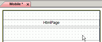
The Mobile Layout opens and displays the table of contents preview, as shown in the following image.
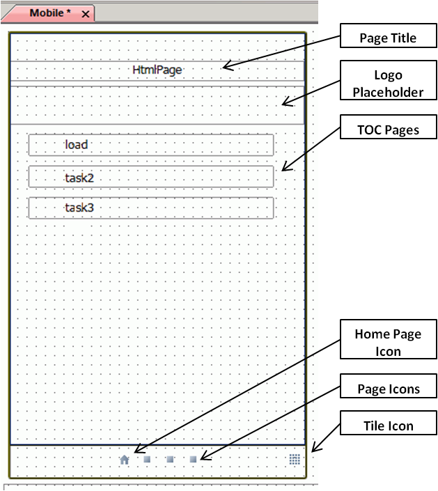
The Mobile Layout default display shows a single page, which previews the appearance of the table of contents in a smartphone format.
In our example, this rectangle contains the title HtmlPage.
Styling for the components of the Mobile Layout is controlled by the cascading style sheet. For more information, see Cascading Style Sheet Class Mapping List for Mobile Components.
- Edit your layout in the following ways:
- To change the title, use the drop-down at the top
of the Properties panel and select table_of_contents.
In the Title field, type the new title.
The new title now appears in the table of contents preview.
- You can choose to show or to hide the table of contents on a
smartphone. The default is to show it.
To hide the table of contents on a smartphone, select No from the Show at run time property field.
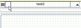
In the preview, the rectangles for each page represent hyperlinks in the table of contents, which open the selected page. In our example, there are hyperlinks for the task2 and load page titles.
- To change page titles, select the Title property
field for a specified page and type the desired title.
The new titles appear at the top of the page and on the table of contents.
- To change the title, use the drop-down at the top
of the Properties panel and select table_of_contents.
In the Title field, type the new title.
- Save the HTML file.
You can now view the HTML file with a table of contents on a smartphone. For more information, see Viewing Mobile Output on a Smartphone.
Procedure: How to Add a Logo to a Mobile Table of Contents
You can add a logo to the table of contents page of your mobile layout.
- Open the Advanced Mobile Layout of an HTML file
that has a table of contents.
The logo placeholder is indicated by the cursor in the following image.
- In the drop-down at the top of the Properties panel,
click table_of_contents.
The table of contents properties display.
- In the Logo field, click the
ellipsis button.
The Open File dialog box appears.
- Select the desired logo file and click OK.
The logo now appears in the table of contents preview.
Note: The logo placeholder box provides an accurate preview of the way the logo will appear on a smartphone. It will indicate if the graphic file you selected needs to be resized.
- Save the HTML file.
You can now view the HTML file with a table of contents on a smartphone. For more information, see Viewing Mobile Output on a Smartphone.
Procedure: How to Add a Logo to Each Page of the Contents
You can add a logo to each page of the table of the contents in your mobile layout.
- Open the Advanced Mobile Layout of an HTML file that has a table of contents.
- Open a page, other than the table of contents page.
The small square near the top left of the page, indicated by the cursor in the following image, is a placeholder for a logo.
- In the drop-down at the top of the Properties panel,
click table_of_contents.
The table of contents properties fields display.
- In the All swipes logo field,
click the ellipsis button.
The Open File dialog box appears.
- Select the desired logo file and click OK.
The logo now appears on each page of the preview.
Note: The logo placeholder for the individual pages is a small box. It provides an accurate preview of the way the logo will appear on a smartphone, and indicates whether the graphic file that you selected needs to be resized.
- Save the HTML file.
You can now view the HTML file with a table of contents on a smartphone. For more information, see Viewing Mobile Output on a Smartphone.
Viewing Mobile Output on a Smartphone
There are multiple ways that mobile output from can be viewed on a smartphone, depending upon the configuration of your environment. These include:
- Data Servers
- Mobile Favorites
- The Mobile Faves App
These ways are outlined in the following section.
Note: Check with your system administrator for your best practice in viewing mobile output.
Data Servers - APPROOT
During installation, and set certain variables that affect the implementation. Your system administrator has the option of changing the values for these variables to meet site-specific needs. Most sites use the default values supplied during installation.
You can optionally specify the path in which files will reside on the web server and the Reporting Server. The path is defined by the APPROOT variable, which you can set in two different files, one for the web server and one for the Reporting Server.
In , the Applications/baseapp folder typically resides on the APPROOT server. To view mobile output through Data Services:
- Copy the mobile-enabled HTML file to the baseapp folder.
- Open the baseapp copy of the file and run it.
A browser window opens showing the HTML content.
- Copy the resulting URL from the browser, and email it to an account that is available on your smartphone.
- Click the URL in your email.
The output opens in a browser, as designed in the Mobile Layout that you selected.
Note: Check with your system administrator if you need assistance viewing mobile output on your smartphone through Data Servers - APPROOT.
Mobile Favorites
Mobile Favorites are HTML files, reports, graphs, hyperlinks, and other item types residing in the Domains area, that you can add to the Mobile Favorites list in the BI Portal. Adding items to the Mobile Favorites list enables you to display them on mobile devices. For more information, refer to the Business Intelligence Portal manual.
Note: Content residing on your local folder is not accessible through Mobile Favorites. It must reside in the Domains area of .
Mobile Faves App
The Mobile Faves app is automatically set up to obtain content from a server on the Internet, where you can view sample business content. You can add your own servers to the list, including those that contain the HTML files that are enabled for mobile output. You will see a list of available folders saved to the selected server connection. These folders contain all of the content previously selected as Mobile Favorites from your portal.
iPhone or Android users can download the free Mobile Faves app from the App Store or the Google Play Store. For more information, refer to the Mobile Faves for Android User’s Manual or the Mobile Faves for iOS User’s Manual.
Cascading Style Sheet Class Mapping List for Mobile Components
This section contains a list of IBI classes that are used to style various components and controls for Mobile design.
|
Components/Controls |
Classes Used |
|---|---|
|
Smartphone container border color |
.IBI_SmartPhoneContainer {
    border-color:#4C5E76;
} |
|
Control panel border color |
.IBI_MobileControlPanel {
    border-top-color: #4C5E76;
} |
|
Control panel font |
.IBI_MobileControlPanel {
    font-size:small;
    color: green;
} |
|
Page content font |
.IBI_MobilepageContent {
    font-size: large;
    color: Red;
} |
|
TOC content font |
.IBI_MobileTocContent {
    font-size: large;
    color: Blue;
} |
|
Label font |
.IBI_MobileLabel {
    font-size: large;
    color: Azure;
} |
|
HTML title |
.IBI_MobileTocTitle {
    font-size: x-large;
    color: BlueViolet;
} |
|
Task name in TOC |
.IBI_MobileTocItem {
    font-size: x-large;
    color: ForestGreen;
} |
|
Control panel text |
.IBI_MobileSwipeHeaderText {
     font-size: small;
    color: Crimson;
} |
| WebFOCUS | |
|
Feedback |