Accessing HTML Page Components
The following topics describe the tabs and panels that are available when you are developing HTML pages in the HTML canvas.
Inserting Components in an HTML Page Using the Components Tab
|
Topics: |
You can add a variety of components to an HTML page found in the command groups in the Components tab. For example, suppose you want to add a button to your page that a user can click to refresh the data. The button is a component. You select it from the Generic Elements command group in the Components tab, then add it to your page as desired.
The Components tab contains the Reports, Generic Elements, Containers, and Objects groups, as shown in the following image.

When you click a command from a ribbon, your mouse pointer turns into a cross-hair to let you draw the object in the HTML canvas. If you click a command in error, press the Escape key to return your mouse to a pointer.
Inserting a Report or Chart in an HTML Page Using the Reports Group
|
How to: |
From the Reports group, you can add a report or chart to your HTML page. The Reports group is shown in the following image.

The commands in the Reports group are:
- Report
-
Inserts a report object. You can add reports to the HTML canvas that will display when you run the layout. You can either embed or reference reports. Double-clicking a blank report object opens the Report canvas where you can create and style a report to be used in the HTML page.
You can also include parameters in a report whose values can be assigned with controls that are added with the HTML canvas.
- Chart
-
Inserts a chart object. You can add charts to the HTML canvas that will display when you run the layout. You can either embed or reference charts. Double-clicking on a blank chart object will open the Chart canvas where you can create and style a chart to be used in the HTML canvas.
Procedure: How to Add a New Report or Chart to an HTML Page
- Insert a report or chart object by doing
one of the following:
- On the Components tab, in the Reports group, click the Report or Chart.
- Right-click in the layout and select New Report or New Chart from the shortcut menu.
The pointer changes into a crosshair.
- Drag the crosshair to create a report or chart object
and adjust it to the size that you want.
A report or chart object is created in the layout and assigned the name report(n) or chart(n), where n is a number. The object will appear in gray and white to indicate that the placeholder does not have a report or chart associated with it. Once a report or chart is associated with the object, the object displays the contents of the report or chart if live or simulated data is active (live data is the default) or a colored placeholder if preview is off in the HTML Page tab, located in the Options dialog box.
- Create a report or chart by doing one of the following:
- Double-click the placeholder.
or
- Right-click the placeholder and select New Report for a report, or New Chart for a chart.
The Open File dialog box appears.
- Double-click the placeholder.
- Select the Master File you want to use and click OK.
The Report canvas opens for reports and the Chart canvas opens for charts.
- Optionally, after creating the report or chart, you can change its properties by adjusting the properties displayed in the Properties panel.
Procedure: How to Add an Existing Report or Chart to a Layout
- Insert a report or chart object by doing
one of the following:
- On the Components tab, in the Reports group, click Report or Chart.
- Right-click in the layout and select New Report or New Chart from the shortcut menu.
The pointer changes into a crosshair. Drag the crosshair to create a report or chart object and adjust it to the size you want.
A report or chart object is created in the layout and assigned the name report(n) or chart(n), where n is a number. The object will appear in gray and white to indicate that the placeholder does not have a report or chart associated with it. Once a report or chart is associated with the object, the object displays the contents of the report or chart if live or simulated data is active (live data is the default) or a colored placeholder if preview is off in the HTML Page tab, located in the Options dialog box.
- Right-click the report or chart.
- Select Reference existing procedure.
- For a report, right-click the report object and select Import existing report.
- For a chart, right-click the chart object and select Import existing chart.
The Open File dialog box appears.
- Enter the name of the procedure you want to add to the layout.
- Click OK.
The report or chart object appears in the Design view of the HTML canvas.
Adding Basic Elements to an HTML Page Using the Generic Elements Group
|
How to: |
You can add a variety of basic elements. The Generic Elements group is shown in the following image.
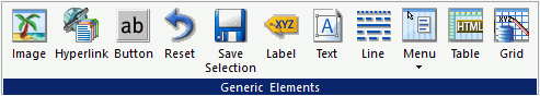
The commands in the Generic Elements group are:
- Image
-
Inserts an image. You can add an image to the layout. This is useful for including graphics, such as a company logo.
You can insert an image into your report layout and add a hyperlink. After you run your report and click the image, you can launch a URL or run a report the same way by clicking a hyperlink or push button.
Note: When inserting images, images must be referenced from a specific directory location.
- Hyperlink
-
Inserts a hyperlink.
- Button
-
Inserts a button. A push button enables you to execute a report or link to a URL or HTML file. This behavior is similar to a hyperlink.
Note: You can either double click to change the text or can use the Text property in the Properties panel.
- Reset
-
Inserts a reset button. A reset button enables you to revert the entire page back to its initial settings.
- Save Selection
-
Inserts a Save Selection button. At run time, the user can select given parameters and save them in a snapshot by clicking the Save Selection button. This creates a static HTML file in the same folder as the source file.
The static Save Selection files are not editable in the HTML canvas or in the text editor. To verify that a file is a Save Selection file:
- Right-click the file in the Configured Environments tree and
select Properties from the shortcut menu.
The File/Folder Properties panel opens.
- The value for the Properties attribute is tool=saveparam. This indicates that the file is not editable in the HTML canvas or in the text editor.
- Right-click the file in the Configured Environments tree and
select Properties from the shortcut menu.
- Label
-
Inserts a label. The label component lets you create and name a label, and link it to a control. To link a label to a control, you can select a value from the HtmlFor property drop-down list in the Properties panel, or you can select the Bind label to option from the shortcut menu, when the label and control are both selected.
- Text
-
Inserts a text box. You can add text to the layout. This is useful for including headings for your webpage, or adding directions or explanations for your report or chart.
- Line
-
Inserts a line. You can add a horizontal or vertical line to the layout. This is useful for distinguishing between sections of your launch or display page.
- Menu
-
Inserts a menu. You can add a horizontal or vertical menu to the layout. This component can be used with Maintain code.
- Table
-
Inserts a table. This component can be used with Maintain code.
- Grid
-
Inserts a grid.
Procedure: How to Format Text in an HTML Page
You may apply various formatting and style options to words and individual text characters within the text object.
Note: Any formatting and styling that you have applied to individual text strings within the text object will remain unchanged. Changes made to the entire text object are only applied to part of the text string that has not been formatted.
- On the
Components tab, in the Generic Elements group, click Text.
The pointer changes to a crosshair.
- Drag your pointer across the canvas to create a text
object.
A text object with the default text, Enter text, is created.
- Select
the text that you wish to format:
- To format the entire text object, single-click the text object in the layout.
- To format an individual word or text character, highlight part of the text within the text object.
- Right-click the text, point to Style,
and then click Font.
The Style Composer dialog box opens with Font selected automatically.
Note: You can also access font formatting options in the Properties panel.
- Select from the formatting options available. You can
change the type, style, color, size, and effect of the font.
Note: When you enter a Specific font size, the unit defaults to px (pixels).
- Click OK to close the Style Composer dialog box.
The formatting options that you selected are applied to the text.
Procedure: How to Insert a Bulleted List or Numbered List Into a Text Element
To insert a bulleted list or numbered list into a text object:
- On the Components tab, in the Generic
Elements group, click Text.
The pointer changes to a crosshair.
- Drag your pointer across the canvas to create a text
object.
A text object with the default text, Enter text, is created.
- Add multiple lines of text to the text object.
- Highlight and right-click the text that you want to include in the list.
- In the shortcut menu, select one of the following list
options:
- Bullets
- Disc
- Circle
- Square
- None
- Numbering
- Numbers
- Lowercase Letters
- Uppercase Letters
- Small Roman numerals
- Large Roman numerals
- None
Note:
- Alternatively, you can select a bullet type before typing text to begin the list. Pressing enter will begin the next item in the list on a separate line.
- To change the bullet or number list type of an existing list, place your pointer on the list level you want to change and reselect a bullet or number list type. Selecting None will remove the bullets or numbers for that level and move any nested lists up one level. In order to switch between bullets and numbers, you must first remove the current list option by selecting None and then applying the list option you want.
- Bullets
Procedure: How to Insert Nested Lists Into a Text Element
To insert a nested list into the text object:
- On the Components tab, in the Generic
Elements group, click Text.
The pointer changes to a crosshair.
- Drag your pointer across the canvas to create a text
object.
A text object with the default text, Enter text, is created.
- Add a list to the text object. For more information, see How to Insert a Bulleted List or Numbered List Into a Text Element.
- Place your pointer after a list item.
- Right-click, point to Nested List and
then select a bulleted or numbered list option.
A list is started within the current list, allowing you to enter text on that list level.
Note: Pressing Tab while your pointer is on the same line as a list item will move that item one level down, resulting in a nested list. The bullet or number type selected is the next list type in the right-click shortcut menu. For example, if you have a bulleted list that uses the disc bullet type, pressing Tab to move an item down one level will cause that nested list to have the circle bullet type.
You can continue to nest lists within other lists by using the same steps shown above.
Note: You cannot skip a list level. For example, in order to insert a nested bulleted list or nested numbered list on a lower level, there must be a list one level up from it.
Adding Containers to an HTML Page Using the Containers Group
|
Topics: |
|
How to: |
You can add specific containers that group objects together on an HTML page. The Containers group is shown in the following image.
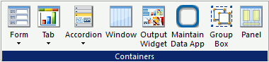
The commands in the Containers group are:
- Form
-
Inserts either a multi-layer form or single-layer form.
- Tab
-
Inserts a tab control. Tab controls enable you to create multiple pages in one HTML form and present a better display for viewing secondary information. You can select Top, Bottom, Left, or Right. This means you can choose to add a tab control that displays tabs at the top, bottom, left, or right on the control.
You can drag and resize this object, at run time, if the Enable dragging and Enable resizing properties, in the Properties panel, are set to Yes.
To change the header text, you can either double click and change the header text or enter a value in the Selected Page: Title property.
When a tab control object is added to the layout, each tab control consists of:
- A tab item.
A tab item is the tab label. You may edit the name of the tab item, style the tab item, and add multiple tab items. Each tab item is associated with a tab body.
- A tab body.
A tab body is the tab page where you associate your components, such as report and graph objects, images, and lines.
The Tab control can be displayed as a full screen or part of an HTML page.
- A tab item.
- Accordion
-
Inserts an Accordion styled box. You can drag and resize this object, at run time, if the Enable dragging and Enable resizing properties, in the Properties panel, are set to Yes.
To change the header text, you can either double click and change the header text or enter a value in the Selected Page: Title property.
- Window
-
Inserts a window. You can drag and resize this object, at run time, if the Enable dragging and Enable resizing properties, in the Properties panel, are set to Yes.
To change the header text, you can either double click and change the header text or enter a value in the Selected Page: Title property.
- Output Widget
-
Inserts an output widget. The output widget container includes buttons in the widget title bar that let you display or hide filter controls and that let you maximize to display full-screen, and minimize to return it to its original size.
- Maintain Data App
-
Inserts a Maintain Data app window. You can drag and resize this object, at run time, if the Enable dragging and Enable resizing properties, in the Properties panel, are set to Yes.
- Group Box
-
Inserts a group box. A group box can be used to create a border around a group of objects, for example, forms or reports and charts.
- Panel
-
Inserts a panel to group objects together. The panel is invisible at run time.
Procedure: How to Use a Form Object to Create a Pop-Up Dialog Box
You can use a form object to create a pop-up dialog box.
- Create a form object.
- Create a button.
- Select the form.
- In the Properties panel, change the Display container as property to As popup dialog.
- Create a new task in the Tasks section of the Tasks & Animations panel.
- Use the button you create as the trigger.
- Make the button object toggle the visibility of the form you created.
- Run the page and click the button to display the form as a dialog box.
Procedure: How to Create a Pop-Up Dialog Box or Pop-Up Window From a Form Control
- Add a button object to your HTML page.
- Add a form control to your HTML page.
- Delete the run and back buttons created with the form control.
- While the form control is selected, in the Properties
panel, change the Display container as property to either As
popup dialog or As popup window.
As popup dialog causes the form to display as a pop-up dialog box. When the dialog box is displayed, you must click Close to return to your HTML page.
As popup window causes the form to display as a pop-up window. When the window is displayed, you can resize and move the window around your screen.
- Create a new task in the Tasks section of the Tasks and Animations panel that uses the button object to toggle the visibility of the form you created.
- Run your HTML page.When you click the button you added to the HTML page, the form will be displayed as either a pop-up dialog box or a pop-up window, depending on what option you selected.
Reordering Tabs, Accordions, and Windows
You can reorder tabs, accordions, and windows by dragging the page that you want to appear first onto the page that you want it to display before. For example, if you have 3 tabs, Tab1, Tab2, and Tab3, and you drag Tab3 onto Tab1, Tab3 will now display ahead of Tab1. The order of the tabs will then be Tab3, Tab1, Tab2. You can reorder windows when they are in tile view.
Adding Objects to an HTML Page Using the Objects Group
You can add objects other than reports, charts, elements, or containers to customize your HTML page. The Objects group is shown in the following image.
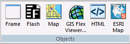
The commands in the Objects group are:
- Frame
-
Inserts a frame object. You can use a frame to embed additional web sources or run reports. You can also use a frame as the output location or target for a drill-down report. You can also use a frame to run a table of contents report, an OLAP report, a PDF report, or an Excel® report.
- Flash
-
Inserts a Flash component. You can add SWF files that are Adobe® Flash Player compatible to accompany reports or graphs on an HTML page.
Note: When inserting Flash animations, only files that are 1 MB or smaller can be run using the HTML canvas.
- Map
-
Inserts a map object. You can add a Google™ or ESRI map to your HTML page. Maps are services offering powerful, user-friendly mapping technology that can be customized to show points on a map with drill-down capabilities. You can customize the map properties and bind them to a report or chart.
- GIS Flex Viewer
-
Inserts a GIS Flex Viewer object. The GIS Flex Viewer contains numerous controls, a report, and a map object. This command is available only from the Data Servers area.
- HTML
-
Inserts an HTML object. Developers can use the Settings panel to type a valid snippet of HTML code for the HTML object, such as HTML code to browse for a file.
- ESRI Map
-
Inserts an ESRI map object. You can use the Settings panel to configure the properties and components.
Changing Load Order With HTML Object Manipulation
In an HTML page, objects load in the order in which they were added to the canvas. A developer using raw HTML has the option of editing the source code to change the load order. Such edits leverage the Document Object Model (DOM) for HTML and XML documents.
In , however, the source code cannot be edited. Therefore, the HTML object manipulation menu is provided to allow you to change the load order, if necessary.
To change the load order, select multiple objects or components in the HTML canvas, then right-click and select HTML object manipulation. The following menu options are available:
- Add selected to new container. To put a container around two or more multiselected objects. Objects in a container load at the same time.
- Append selected. Available when the last multi-selected object is a container. Use this option to move one or more multi-selected objects into the container.
- Insert selected before. To load the last multiselected object before the other selected objects.
- Insert selected after. To load the last multiselected object after the other selected objects.
- Swap selected. To swap positions for two multiselected objects.
Accessibility Support for Displaying Objects in the Order of the Document Object Model
|
How to: |
You can add elements/objects independently of screen reading order and then change the order later on during the development process.
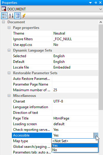
Using the Accessible property, available on the Properties panel for a document, you can indicate that the Document Object Model (DOM) should be rewritten in the order of objects on the page, left to right, top to bottom. In addition, all tab index values should be set to the value -1.
Procedure: How to Display Objects in the Order of the DOM
- Create a new HTML page with multiple controls on the page.
- On the Properties panel for the document, select Yes from the Accessible drop-down menu, as shown in the following image.
The following tab order warning message appears, as shown in the following image.
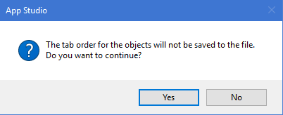
Note: The Warning message displays only once, when the Accessibility property is set to Yes.
Selecting Yes will write the tab order of objects on the page, left to right, top to bottom. Selecting No will keep the tab order in the page.
Inserting Controls in an HTML Page Using the Controls Tab
|
Topics: |
|
How to: |
You can use the Controls tab and group to insert controls in an HTML page or a Guided Report page. Controls enable you to prompt users for a parameter value. When you create a parameter as part of a report or graph, the HTML canvas automatically adds a control, Submit button, and Reset button for the parameter to your layout, and the parameter appears on the Parameters tab. You can also add an input control and bind it to a parameter.
Controls, with the exception of a text box which does not supply a list of possible values, can supply values with a dynamic or static list of values:
- A dynamic list retrieves values from a specified data source when the request is run.
- A static list consists of a list of values you supply. These values do not change unless you change them.
An active report control lists active report values that mimic active report menu items. The active report controls cannot be associated to any parameters in the layout. This type of control can only be associated with an active report in the layout.
The properties of a control, as well as the parameters associated with each control, can be controlled with the Properties tab of the Properties window, and with the Parameters tab. The Controls tab is shown in the following image.
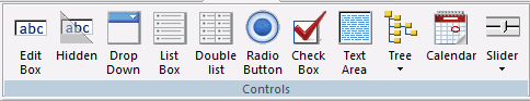
The controls are:
- Edit Box
-
Inserts a text box. A text box enables you to enter a value in an entry field. You can specify a list of static or dynamic accepted values in Settings panel and, at run time, when you type the first letter of a value into the text box, that value will be listed as an autocomplete suggestion.
- Hidden
-
Inserts a hidden control. A hidden input control allows parameter values to be used in a control without the user seeing them. When a hidden control is used, the current input control assigned to the parameter will not be visible. The value of the parameter can be entered in the Properties panel of the Parameters tab, or supplied through chaining.
- Drop Down
-
Inserts a drop-down list. A drop-down list enables you to select single or multiple values from a list of supplied values. In order to provide multiple values, the procedure must be set up to accept multiple values.
-
A single-select drop-down list enables you to select only one value for each time a request is run.
-
A multiselect drop-down list enables you to select multiple values using the check boxes adjacent to the values.
You can use a dynamic or static list of values for the drop-down list.
-
- List Box
-
Inserts a list. This enables you to select single or multiple values at one time:
-
A single-select list enables you to select only one value for each time a request is run.
-
A multiselect list enables you to select multiple values by using the Ctrl key while selecting values.
In order to provide multiple values, the procedure must be set up to accept multiple values.
List box values can be dynamic or static.
-
- Double list
-
Inserts a double list. Displays multiselect values. This enables you to view a list of the available values and add or remove them from one list to another. At run time, a report is generated based on the values that are added.
- Radio Button
-
Inserts a radio button. Radio buttons enable you to select a single value from a list of supplied values. Radio button values can be static or dynamic.
Use the Type property to control the appearance of the radio buttons. From the drop-down list box in the Type field, select Standard to display standard radio buttons.
From the drop-down list box in the Type field, select Push button to display push buttons.
- Check Box
-
Inserts a check box. Check boxes enable you to select a single value from a list of supplied values. Note that if there are multiple check box input controls that are grouped together, you may select the Multiple properties for each control. Multiple ensures that you can select a single value from each check box control. Check box list values can be dynamic or static.
Use the Type property to control the appearance of the check boxes. From the drop-down list box in the Type field, select Standard to display standard check boxes.
From the drop-down list box in the Type field, select Push button to display push buttons.
- Text area
-
Inserts a text area. A text area is a single-select control that enables you to enter multiple lines of text that can be assigned to a single variable. The behavior is similar to a text box, but you are not restricted to entering just one line of text. For example, if you want to assign a paragraph (multiple lines of text) to a variable that can be referenced by a procedure, you can add the paragraph to a text area from the Properties panel on the Parameters tab.
If you want to display text in the control:
- When hard wrap is enabled, at run time, a line break is shown at the point where it was specified.
- For soft wrap, the line should wrap automatically depending on the size of the text area control.
If you want to submit values in the control:
- For single-select text area controls, only the first value up to the end of the line will be submitted.
- For multiselect text area controls, all of the values separated by OR or AND will be submitted.
- Tree
-
Inserts either a single-source tree control or multi-source tree control. By using a tree structure in an HTML report, you can show hierarchical data from a multi-dimensional data source (for example, SAP BW), that uses the parent/child model. You may also use a tree control for non-hierarchical data sources. Level hierarchies are not supported. The behavior of the tree control is integrated with the parameter definition. If a parameter is defined as a single value and that parameter is bound to a tree control, the tree control uses option buttons for each node in the hierarchy. If the parameter is defined as Multiselect OR or Multiselect AND, and that parameter is bound to a tree control, then the tree control uses check boxes for each node in the hierarchy, enabling you to select multiple nodes.
- Calendar
-
Inserts a calendar. Date parameters can utilize a built-in calendar control that enables you to select the desired date or range of dates in a pop-up dynamic calendar. A procedure or parameter that is added to or referenced in the HTML canvas, and contains date parameters, will have a Calendar control type available in the New Parameters dialog box. When you select the Calendar control type, a text box with a calendar icon displays in the Design view of the layout. The text box is the only control available for the calendar, and the icon always displays to the right of the text box. The icon cannot be positioned independently from the text box. Note that when programmatically returning a date to the calendar, the date must be in a date format that specifies the complete date from the list of supported data types in Calendar Properties.
- Slider
-
Inserts a horizontal or vertical slider control that has a numeric range of values to be used with a report or chart. This enables you to use a slider bar to select from a range of values.
Adding Paging/Search Capabilities to a Control
|
How to: |
With a List Box, Drop Down List, or the first control of a Double List, you can add additional paging and search capabilities. Designed for controls that have a large number of valid values, this functionality enables you to:
- Page through a large list of values before making a selection.
- Search for a value within a control.
These options give you a quick way of narrowing your search when you know the value, or partial value, that you want to use to filter your page.
The Add 'Paging/Search' control function is available on the HTML canvas through the right-click context menu for the List Box, Drop Down List, and the first control of a Double List.
Use this function to enhance the capabilities of an individual control. If you want to create a single Paging/Search option that applies to multiple controls on a page, see Adding a Paging/Search Control to an HTML Page.
Procedure: How to Add Paging/Search Capability to a Control
To add paging and search capabilities to a control that has a large number of valid values:
- On the HTML canvas, select a List Box, Drop Down List, or the first control of a Double List, then right-click the control
and select Add 'Paging/Search' control from the context menu.
The paging/search control is added to the canvas below the input control. The following image shows the paging/search control added below a Drop Down List for Product Subcategory:
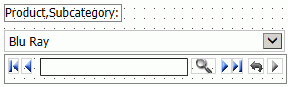
Note, the blue left and right arrow buttons are for paging. The gray magnifying glass and arrow buttons are for searching.
At run time, the paging/search control shows a number or page range of values. The default range is 1-50, meaning the input control starts at the first value and displays a range of 50 values per page.
To change the default range, click the paging/search control and view the Number or Range attribute on the Properties tab. Change the value here as needed.
- Run the HTML page.
The paging/search control shows the specified range. For example, 1-50.
- Use the arrow buttons to page through the values to be displayed for the input control. You may select First, Previous, Next,
or Last.
For searching, enter a search term in the paging/search control and press the Enter key or click the Search (magnifying glass) button.
To display search criteria, click the search arrow button on the far right. The search criteria list is displayed. You can select any of the following options:
- Match Prefix. Search value prefix must match the prefix of the value in the input control.
- Match Case. Search value must match the value in the input control exactly.
- Match Whole Word Only. Search value word must exist in the string.
- Instant Search. The value is automatically searched as you type in the input control.
Toggle the search arrow button to hide the search criteria list.
- Click the Run button to refresh the report, showing the value selected in the input control.
Adding a Paging/Search Control to an HTML Page
|
How to: |
The Global search/paging control property lets you add additional capabilities to an HTML page that contains multiple instances of the following controls: List Box, Drop Down List, and the first control of a Double List. Designed for controls that have a large number of valid values, this functionality enables you to:
- Page through a large list of values before making a selection.
- Search for a value within multiple controls.
The Global search/paging control is a DOCUMENT level property.
Use this option to enhance the functionality of an HTML page. If you want to enhance the functionality of an individual control, see Adding Paging/Search Capabilities to a Control.
Procedure: How to Add a Paging/Search Control to an HTML Page
Use this procedure to add global paging and search capabilities to an HTML page with multiple controls.
The Global control option overrides individual control options. If Keep selected values is selected for Global searching/paging, that will override whether the double-list has it, regardless of whether it is set for the control itself.
- Click the Global search/paging control property in the Properties tab for the DOCUMENT object and select Yes from the drop-down menu.
- Run the HTML page.
The Search/Paging control appears in the upper right corner of the window (Home position).
- Click an input control.
The Search/Paging control appears below the selected input control.
The label for the input control is displayed showing that it is linked to that input control. If no label is associated with the input control, the window will show the unique identifier for the input control, for example, combobox1.
If you want multiple pages, type a range in the Search/Paging field in the format 1-2 of 4 and press the Enter key.
- Click the Show settings button on the Global Search and Paging window to expand the window and show the search and paging options.
The Search/Paging options are:
- Match Prefix. Search value prefix must match the prefix of the value in the input control.
- Match Case. Search value must match the value in the input control exactly.
- Match Whole Word Only. Search value word must exist in the string.
- Instant Search. The value is automatically searched as you type in the input control.
- Auto-link to selected control. Link the Search/Paging control to the selected control (default).
- Keep selected values. This option only affects a double-list. When selected, this option accumulates the values you searched for, in the right-side pane. When you search for another value, the previously searched values will not be deleted.
Toggle the Up arrow button to display and collapse the Search/Paging options. Click the Home icon on the Search/Paging window to move the window back to the Home position.
Procedure: How to Format Selected and Unselected Push Buttons for Radio Button and Checkbox Controls
This procedure shows how you create a push button form from a radio button or checkbox control. It also shows how you can apply background color to push buttons to distinguish between selected and unselected values.
- In the HTML canvas, create a radio button or check box control by clicking Radio Button or Check Box on the Controls tab of the ribbon. Populate the control with multiple values.
- Select the control and open the Properties panel.
- In the Properties panel, from the Type drop-down menu,
select Push button.
Two additional properties appear: Selected pushbutton background color and Unselected pushbutton background color.
- From the Selected pushbutton background color drop-down menu, select a background color.
- From the Unselected pushbutton background color drop-down menu, select a different background color.
- Save and run the HTML file.
The specified background colors appear for the selected and unselected values.
Procedure: How to Set Calendar Properties
- Add a calendar to the HTML page by clicking
the Calendar command on the Controls tab.
Position the cursor over the HTML canvas. The pointer changes to a crosshair.
- Drag the crosshair to create a calendar and adjust it
to the size you want.
A calendar placeholder is created in the layout and assigned the name calendar(n), where (n) is a number.
- Optionally, change the calendar properties by adjusting the properties displayed in the Properties panel.
- Bind an existing parameter to the calendar.
Binding a parameter to a calendar control creates an incoming parameter. The incoming parameter value must be in a date format that specifies the complete date from the list of supported data types in Calendar Properties. The incoming parameter value will populate the calendar with date values.
- Click the Parameters view tab.
- Select the center of the parameter name object, drag the parameter to the center of the calendar object, and release the mouse to complete the binding.
- To unbind the parameter from the calendar, select the arrow head on the line, so that the line is bold. Right-click and click Break binding.
- Bind the calendar to a parameter.
Binding the calendar to a parameter will populate the parameter with a date value.
- Click the Parameters view
tab.
The Settings panel opens, showing the calendar setup options. The calendar setup options enable you to set the range of dates available to the user at run time. Available dates are represented as an active hyperlink (blue and underlined). Unavailable dates are static (black without underlines).
Note: The Settings panel for a calendar contains different options depending on the selected data type.
- Create the values for the calendar. You can create Static or
Dynamic values.
When the Current/Start date option is checked, the current date will be used in the calendar control at run time.
The Date Range options for setting up the calendar include:
- Static. This option will set a static date range in which
the developer will select a start date and an end date using a pop-up
calendar icon, or by clicking the month, day, or year from the controls.
The pop-up calendar icon appears in the From and To sections when the Static Date Range is selected. If you click the pop-up calendar icon, a pop-up calendar appears and shows the current date selected and circled in red by default. As you scroll through the calendar with the left/right arrows, the currently selected day will remain highlighted for each month. Clicking a date will add that date to the control. Dates can be selected by scrolling left to right, entering the month, day, and year as text, or by selecting the month, day, and year from the drop-down list and spin boxes.
- Relative. This option allows you to set a specific number of days, months, and years relative to the current date. The current date (at run time) will always be the reference or starting point and the calendar will show a number of days, months, and years relative to the current date. The range could be all in the past (for example, five years prior to the current date) or all in the future (for example, five years in the future). This is selected as the default Date Range.
- Dynamic. This option allows you to point to a request that returns a range of dates. Clicking the Select custom request drop-down list box allows you to choose a preexisting request. The request must return two date values on the same data line in XML format. The date values must be returned in a format that returns two digits for the month and day, and four digits for the year, for example, MM/DD/YYYY.
- Static. This option will set a static date range in which
the developer will select a start date and an end date using a pop-up
calendar icon, or by clicking the month, day, or year from the controls.
- Select the center of the calendar, drag the calendar to the center of the parameter object, and release the mouse to complete the binding.
- Click the Parameters view
tab.
Working With a Double-Head Slider Control
|
How to: |
A double-head slider control is a new control you can access from the HTML canvas. A double-head slider control is a type of slider control in which you can select a range of values for displaying data in a report or chart. Rather than having one slider head, you have two. In order to use a double-head slider control, you must have two variables in the report or chart that will be controlled by the double-head slider control. One variable will be controlled by one head of the double-head slider control and the other variable will be controlled by the other head of the double-head slider control. The variables need to be specified in the procedure as FROM and TO.
Note: You can use the Report canvas to create a parameter that accepts a range of values using the Expression Builder dialog box. The Chart canvas requires you to manually create a parameter that accepts a range of values.
Procedure: How to Create a Report That Can Be Used With a Double-head Slider Control
- Create a new report.
- Add the fields you want displayed in your report.
- On the Report tab, in the Filter group, select Filter,
and then click Where to create a Where filter.
The Expression Builder dialog box opens.
- Double-click the field you want to use in conjunction with the Double-head slider control.
- From the Logical Relation drop-down list, select Is From.
This indicates that the parameter that you are creating is a range of values.
- Double-click the Compare Value cell to open the Range
Builder dialog box.
In the Range Builder dialog box, you can name the parameters you will use for the Double-head slider control or select a field whose values you want to create a range from.
- Type an amper variable name in the From text box. For example, &Value1.
This is the FROM value.
- Type an amper variable name in the To text box. For example, &Value2.
This is the TO value.
These are the names of the two parameters that will be controlled by the double-head slider control.
- Save and close the report.
This report can now be used with a double-head slider control once you set up your HTML page.
Procedure: How to Create a Double-head Slider Control From the Ribbon
- While in the HTML canvas, click either Horizontal or Vertical,
from the Slider command, in the Controls group,
on the Controls tab.
The pointer changes to a crosshair.
- Drag the crosshair to create a single-head slider control.
- While the single-head slider control is selected, in
the Properties panel, change the Range property from No to Yes.
Changing the Range property to Yes changes the single-head slider control to a double-head slider control. You can now use this control to select a range of values to display.
Procedure: How to Create a Double-head Slider Control Using the New Parameters Dialog Box
- Create a report object or chart object
on the HTML canvas.
The pointer changes to a crosshair.
- Drag the crosshair to create a report or chart
- Create, import, or reference a report or chart with two
variables used in a FROM... TO... relationship.
The New Parameters dialog box opens.
- In the Control Type column of the New Parameters dialog
box, right-click the first parameter and then click Slider,
and select either Double-head Horizontal or Double-head Vertical.
Note that the Control Type for the second parameter changes to Append to Above. This means that the second parameter has been recognized as being part of a range and will be controlled by the double-head slider control specified in the first parameter.
Procedure: How to Create an HTML Page That Uses a Double-head Slider Control
- Create a new HTML page.
- Add a report object to the HTML canvas.
- Create, import, or reference a report that contains a
variable that accepts a range of values.
The New Parameters dialog box opens.
- In the Control Type column of the New Parameters dialog
box, right-click the first parameter, click Slider,
and then select either Double-head Horizontal or Double-head Vertical.
Note that the Control Type for the second parameter changes to Append to Above. This means that the second parameter has been recognized as being part of a range and will be controlled by the double-head slider control specified in the first parameter.
- Click OK to close the New Parameters dialog box and add the double-head slider control to the HTML page.
- Click the Parameters view tab at the bottom of the HTML canvas.
- Drag the unbound parameter out of the Unbound Parameters box.
- Drag the second half of the slider control to the unbound parameter.
- Click the slider control and click the Settings panel.
- In the Input Control Population section, change the Data type to Dynamic.
- Select the data source you used in the Data Source drop-down list.
- In the Value Field, click the ellipsis (...) and select the field being controlled by the double-head slider control.
- Save and run your HTML page.
The double-head slider control controls what you see in your report or chart by allowing you to select a range of values rather than one specific value or all values. The first head updates the FROM value and the second head updates the TO value.
Procedure: How to Enter Masked Text in a Text Box
When entering a value in a text box at run time, you may set the Mask text property so that the text is not displayed as text, but masked by default characters. This is recommended when using passwords or other sensitive information.
- Select the Edit Box object to view the associated properties in the Properties panel.
- From the Mask text property field, select Yes.
- Run the report and enter a value in the text box.
The value being entered appears as masked text.
Using Multi-Select Lists
Two types of multi-select lists can be used in a report: a regular list box or a drop-down list. When using either type of multi-select input control to supply parameter values, the Multiple property value indicates whether multiple values can be selected from a list of supplied values at run time.
Procedure: How to Create a List Box with Multiple Values
A multi-select list box enables you to select multiple values by using the Ctrl key while selecting values. In order to select multiple values in the list box, the procedure must be set up to accept multiple values. Ensure that the Variable Type for the parameter value is Multiselect OR or Multiselect AND in the procedure.
- From the HTML canvas, insert a report with parameters
that accept multiple values.
For example, create a report with Multiselect OR as the variable type for the parameter, accepting a dynamic list of values from a Master File.
- When the New Parameters dialog box is displayed, accept
the default control type of List box and
click OK.
A list box is created in the layout and assigned the name listbox(n), where (n) is a number.
- Select Multiple from the Multiple
drop-down list in the Properties panel.
This indicates that multiple items can be selected from the list box.
- Save and run the HTML page.
- Select multiple values by using the Ctrl key while selecting values from the list box.
- Click the Run button to run the report with the selected value parameters.
Procedure: How to Create a Drop-Down Check Box List with Multiple Values
A multiselect drop-down list enables you to select multiple values using the check boxes adjacent to the values. In order to select multiple values in the drop-down list, the procedure must be set up to accept multiple values. Ensure that the Variable Type for the parameter value is Multiselect OR or Multiselect AND in the procedure.
- From the HTML canvas, insert a report with parameters
that accept multiple values.
For example, create a report with Multiselect OR as the variable type for the parameter, accepting a dynamic list of values from a Master File.
- When the New Parameters dialog box appears, accept the
default control type of List box and click OK.
A list box is created in the layout and assigned the name listbox(n), where (n) is a number.
- Right-click the control, select Set Control Type, and
select Drop down list to change the control
type.
Note: In the Properties panel, the Multiple property for the control is automatically set to Multiple.
- Save and run the HTML page.
- Select multiple values using the check boxes displayed when you click the down arrow.
- Click outside of the control to close the drop-down list.
- Click the Run button to run the report with the selected value parameters.
Saving Control Selections in a Browser Session
|
How to: |
You can link the controls on HTML pages so that they automatically default to the same selected value when you switch between multiple pages in the same browser session. To do this, you need to assign a common value to the Global name property for each control that you want to link.
For example, you may have two HTML pages that contain controls with information that relates to regional sales. You can assign a value to the Global name property, such as Region, to each of the controls that you want to link. When you run those pages in the same browser session, and choose a value from one of the linked controls, such as Southeast, the controls on the other pages will refresh and display the information for the Southeast, by default.
Note: A selected value is retained as the default only during a single browser session. The value is not retained after you close the browser.
Procedure: How to Save Control Selections in a Browser Session
This procedure describes how to assign a value to the Global name property, which enables you to save control selections within a browser session.
Note: A selected value is retained as the default only during a single browser session. The value is not retained after you close the browser.
- Create or open an HTML page that contains a control.
- Click the control to highlight it.
- In the Properties panel, under Miscellaneous, type a value in the Global name field. This value can be any alphanumeric string, such as GlobalRegion1.
- Save the HTML page.
- Repeat steps 1-4 for any controls that you want to link. You must assign the same Global name property value for each control that you want to link.
Using Tree Controls
|
How to: |
|
Reference: |
You can insert a single-source tree control or a multi-source tree control in an HTML page.
Procedure: How to Add a Tree Control to an HTML Page Using a Default Procedure
This procedure describes how to add a tree control for a multi-dimensional data source, using a default procedure.
Note: In prior releases, a default procedure was known as an “Embedded Procedure.”
- In the HTML canvas, insert a tree control from
the Controls tab.
Tip: You may select Single source Tree control or Multi source Tree control. If no type is selected, Single source Tree control is the default. Single source Tree controls must be populated from a multi-dimensional data source such as SAP BW, SSAS, or Essbase.
The pointer changes to a crosshair.
- Drag the crosshair to create a tree control, and adjust
it to the size you want.
A tree control is created in the layout and assigned the name treecontrol(n), where (n) is a number.
- Optionally, you may click the Expanded property from the Properties panel to show the tree control expanded at run time.
- Optionally, you may click the Hyperlink property from the Properties panel to show the tree nodes as hyperlinks, instead of radio buttons at run time.
- From the Settings panel, click Dynamic as the Data type.
- Keep Default selected and click
the browse (...) button adjacent to the Data
Source field.
The Open File dialog box appears.
- Select a multi-dimensional data source and click OK.
The multi-dimensional data source is added as the default procedure.
- Click the browse (...) button
adjacent to Value from field to select a
field from the hierarchy.
The Value from field is the data source field from which the values will be retrieved.
- Click the browse (...) button
adjacent to Display from field to select
a field from the hierarchy.
The Display field is the text that represents the parameter value in the tree control.
- Save and run the page to view the multi-dimensional data source in the tree control.
Procedure: How to Add a Tree Control to an HTML Page Using an Existing Procedure
You can select an existing procedure to add to the tree control in an HTML page. When you select a procedure, it should use fields from the parent/child hierarchy and be set up as follows:
TABLE FILE file
SUM FST.dispfield
BY ParentUniqueField
BY UniqueField
BY datafield
ON TABLE PCHOLD FORMAT XML
END
where:
- file
-
Is the name of the data source.
- dispfield
-
Is the field whose values display in the tree control.
- ParentUniqueField
-
Is the field that represents the parent for the parent/child hierarchy (PROPERTY = PARENT_OF).
- UniqueField
-
Is the field that represents the unique IDs for the hierarchy members (PROPERTY=UID).
- datafield
-
Is the field whose values are passed as the parameter value.
After the procedure is set up, follow these steps:
- From the Controls tab, insert a tree control.
Tip: You may select Single source Tree control or Multi source Tree control. If no type is selected, Single source Tree control is the default. Single source Tree controls must be populated from a multi-dimensional data source such as SAP BW, SSAS, or Essbase.
The pointer changes to a crosshair.
- Drag the crosshair to create a tree control, and adjust
it to the size you want.
A tree control is created in the layout and assigned the name treecontrol(n), where (n) is a number.
- Optionally, you may click the Expanded property from the Properties panel to show the tree control expanded at run time.
- Optionally, you may click the Hyperlink property from the Properties panel to show the tree nodes as hyperlinks, instead of radio buttons at run time.
- From the Settings panel, click Dynamic as the Data type.
- Select Explicit (Requests panel),
select a procedure from the Request drop-down list, and then click OK.
The procedure name is added as the explicit procedure.
Note: In prior releases, an explicit procedure was known as an “external” procedure.
- Click the browse (...) button
adjacent to Value from field to select a
field from the hierarchy or type the field manually.
The Value from field is the data source field from which the values will be retrieved.
- Click the browse (...) button
adjacent to Display from field to select
a field from the hierarchy or type the field manually.
The Display field is the text that represents the parameter value in the tree control.
- Save and run the page to view the multi-dimensional data source in the tree control.
Procedure: How to Populate a Multi Source Tree Control
You can show a tree structure for a non-hierarchical data source by using a tree control. By identifying the number of levels for the tree control, you are able to populate each level of the tree control with its own procedure. Setting the number of levels creates a tree structure by which each level is its own subcontrol, chained together with no conditions.
This procedure describes how to add parameters for a tree control, where the number of levels property is set.
- In the HTML canvas, insert a Multi source tree
control.
- Click Multi source Tree control from the Tree control drop-down list, located on the Controls tab.
The pointer changes to a crosshair.
- Drag the crosshair to create a tree control, and adjust
it to the size you want.
A tree control is created in the layout and assigned the name treecontrol(n), where (n) is a number.
- From the Properties panel, type in the Number of levels
for the tree control, and press the Enter key.
This enables you to specify the number of levels to populate.
- Optionally, you may click the Expanded property from the Properties panel to show the tree control expanded at run time.
- With the tree control selected, click the Parameters tab.
The tree control object shows the set number of levels.
- Select each level of the tree control and create the
settings for its data population.
When creating a Multi source Tree control, the static data type is not available. If creating static values for the tree control, you must create a single source tree control.
- Optionally, to add an additional level for the tree control,
right-click the tree control object on the Parameters tab and select Add level.
Note: Add level only appears for a Multi source tree control object.
- Click the added level to view the Settings panel for that level.
- Switch to the Design tab of the
HTML canvas to preview the populated tree control.
Note that the Properties window drop-down list for the tree control shows each level of input values.
- Save and run the page.
Note: If a user selects a lower level node in one level and a higher level node in another level, when the procedure is executed, only the lowest level selections will take effect. For example, you have 3 levels: COUNTRY, CAR, and MODEL. Under ENGLAND, TRIUMPH you select TR7. Under FRANCE, you select PEUGEOT. At run time you will only receive the records for TR7 because you did not select a MODEL under the FRANCE node.
The tree control populates each level with values.
Note: A value must be selected for each level before you can click the Save Selection button.
If a selected value is specified for a field that is not in level1, then corresponding selected values must also be specified for the preceding levels.
Only the first and second levels load at run time. If a selected value is specified for a field in level1, only values from the first two levels will be selected.
Procedure: How to Add a Tree Control to an HTML Page Using Static Values
This procedure describes how to add static data type parameters for a tree control, where the Number of levels property for the tree control is not set. This enables you to add a static list of values.
- In the HTML canvas, insert a tree control.
- From the Settings panel, select Static as
the Data type.
Static is selected, by default. You may select an item, delete it, or add a subitem.
- Create the parameter values for the control:
- Click the New button to add a list of values. The values are added in a sequential hierarchical structure. The last value added appears in the Value and Display Value fields.
- To edit the value, manually type the desired value in the Value and Display Value fields.
- Click Append child item from the Static values drop-down list to append a value at the level currently selected, and create a new value as the child of the selected value.
- Click Insert before from the Static values drop-down list to insert a value before the selected value. Note the number of the value.
- Click Insert after from the Static values
drop-down list to insert a value after the selected value. Note
the number of the value.
Repeat these steps until the list contains all of the values you want to include.
- Optionally, click the Delete button to eliminate any values.
- Click the Selected check box to show the entry in the Value field as the default value.
- Select the Send display value check box to send the display value, rather than the actual data, to the parameter.
- Save and run the page to populate the tree control with static values.
Procedure: How to Create a New Tree Control From the New Parameters Dialog Box
When a report contains one or more new amper variable parameters, the New Parameters dialog box opens when you save the report and return to the HTML canvas. You can assign a new Single source or Multi source Tree control from the HTML page to the parameter from the New Parameters dialog box.
For each parameter, you will find Name and Control Type fields, a Create control check box, and options to set the Control Type to a Single source or Multi source Tree control.
- Import or create a report that contains parameters.
When importing a report with parameters, the New Parameters dialog box opens, prompting you to create the control type.
- Select the new tree control from the New Parameters dialog box.
The Control Type column refreshes, showing the selected control.
- Click OK to close the New Parameters
dialog box.
The report is added and the associated parameters are bound to the tree control.
Reference: Usage Notes for Chaining Tree Controls
The following usage notes apply when chaining tree controls. You may chain controls from the New Parameters dialog box and from the Parameters tab.
- When the Multi source Tree control is a link in the chain, the New Parameters dialog box enables you to share parameters with the same multi source control.
- You can chain a Multi source Tree control to a Single source Tree control.
- You can chain a Single source Tree control to another Single source Tree control.
- You can chain a Multi source Tree control to another Multi source Tree control.
- You can chain a tree control to another non-tree control, such as Drop down list or List box.
- Chaining cannot be done with only field names.
- Dynamic population of controls with field names need to use SYSCOLUMN calls.
Positioning Objects in an HTML Page Using the Positioning Tab
|
Topics: |
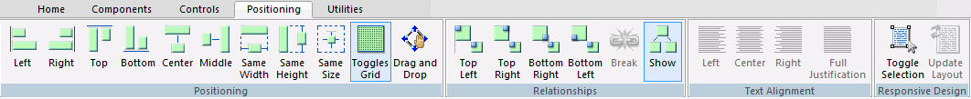
Positioning options enable you to multi-select objects and position them relative to one another. The Positioning tab contains the Positioning, Relationships, Text Alignment, and Responsive Design groups, as shown in the following image.
Aligning Objects in an HTML Page Using the Positioning Group
|
How to: |
The Positioning group contains the Left, Right, Top, Bottom, Center, Middle, Same Width, Same Height, Same Size, Toggles Grid, and Drag and Drop commands.
- Left
-
Aligns the objects to the left. This works in relationship positioning.
Relates an object to the left of another object.
- Right
-
Aligns the objects to the right. This works in relationship positioning.
Relates an object to the right of another object.
- Top
-
Aligns the objects to the top of the highest selected object. This works in relationship positioning.
- Bottom
-
Aligns the objects by the bottom of the lowest selected object. This works in relationship positioning.
- Center
-
Aligns the objects to the center of the page. This works in relationship positioning.
Aligns objects at the horizontal center point of the object.
- Middle
-
Aligns the objects to the middle of the page. This works in relationship positioning.
Aligns objects at the vertical center point of the object.
- Same Width
-
Makes two or more objects the same width.
- Same Height
-
Makes two or more objects the same height.
- Same Size
-
Makes two or more objects the same size.
- Toggles Grid
-
Turns the grid on and off.
- Drag and Drop
-
Turns parent/child Drag and Drop on and off.
When this command is off (default), drag and drop is used only to reposition objects on the HTML canvas.
When this command is on, drag and drop is used to designate a parent/child relationship between two objects.
Procedure: How to Designate a Parent/Child Relationship using Drag and Drop
There are instances where you want an object in your HTML canvas to be a child to another object. For example, you may have a report (child) that you want to place within a tab container (parent).
- Open an HTML file in which the two objects have been created.
- Click the Positioning tab.
- Click the Drag and Drop command to toggle it on.
Alternatively, you can select Toggle Drag and Drop from the HTML canvas shortcut menu.
The Drag and Drop command on the Positioning tab is now highlighted.
- Click the designated child object and drag it toward
the designated parent object.
A small rectangle appears below your cursor, but the child object itself does not move.
- Move your cursor to the designated parent object and
drop.
The parent/child relationship is now created.
- To restore the default drag and drop, click the Drag
and Drop command to toggle it off.
Note: When the Drag and Drop command is on, you are unable to reorder tabs or page containers, when using the Tab, Accordion, or Window components.
Relating Objects in an HTML Page Using the Relationships Group
The Relationships group contains the Top Left, Top Right, Bottom Right, Bottom Left, Break, and Show commands. The Top Left, Top Right, and Bottom Right commands are only available for HTML pages and Guided Report pages.
- Top Left
-
Relates two or more objects on a page. Two objects must be selected. Relates an object to the top left of another object.
- Top Right
-
Relates two or more objects on a page. Two objects must be selected. Relates an object to the top right of another object.
- Bottom Right
-
Relates two or more objects on a page. Two objects must be selected. Relates an object to the bottom right of another object.
- Bottom Left
-
Relates two or more objects on a page. Two objects must be selected. Relates an object to the bottom left of another object.
Note: The above four commands have been deprecated and will be removed from a future release of .
- Break
-
Breaks the relationship between the objects selected.
- Show
-
Shows or hides the relationship between objects.
Aligning Text in an HTML Page Using the Text Alignment Group
The Text Alignment group contains the Left, Center, Right, and Full Justification commands. These commands align text within the HTML page.
- Left
-
Aligns selected text to the left.
- Center
-
Aligns selected text to the center.
- Right
-
Aligns selected text to the right.
- Full Justification
-
Fully justifies the selected text, meaning that the text fills the width of the text box.
Enabling Responsive Design for an HTML Page Using the Responsive Design Group
The Responsive Design group contains the Toggle Editing, Toggle Selection, and Update Layout commands. These commands are enabled when the Responsive design property is set to Yes.
- Toggle Selection
-
Toggle on to allow containers that include content to be dragged to a new position. Toggle off to prevent those containers from being repositioned.
- Update Layout
-
Click to refresh the HTML canvas after you reposition containers, to show how the containers will stack when folded. This command is activated when the Autosize Enable property is set to Yes for both the document and the object.
Changing HTML Page Properties Using the Utilities Tab
You can change HTML page properties using the Utilities tab. For example, suppose you want to test your HTML page in a specific browser. The default browser specification is considered a property of your HTML page. To run your page in a different browser, open the Utilities tab and select the desired browser from the Preview command group.
The Utilities tab is shown in the following image.
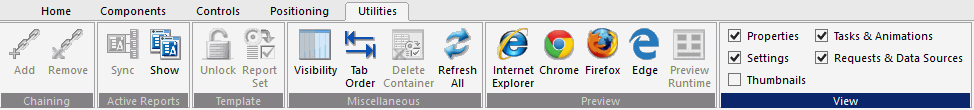
Chaining Objects in an HTML Page Using the Chaining Group
You can add or remove chaining options using the Chaining group. The Chaining group is shown in the following image.
The commands are:
- Add
-
Chains two or more objects that are selected in the Parameters tab.
- Remove
-
Unchains two or more selected, chained objects in the Parameters tab.
Synchronizing an Active Technologies Report in an HTML Page Using the Active Reports Group
You can synchronize an active report. This group is available only for an HTML page and a Guided Report page. The active reports group is shown in the following image.

The commands are:
- Sync
-
Syncs an active report.
- Show
-
Shows the synchronization of the canvas.
Unlocking a Template for an HTML Page Using the Template Group
You can unlock a template to add controls, text, and buttons. This group is available only for an HTML page and a Guided Report page. The Template group is shown in the following image.

The commands are:
- Unlock
-
Unlocks the template that you are using and allows for full control of the page.
- Report Set
-
In template mode, this adds a title bar and a form with controls, text, and buttons as a set.
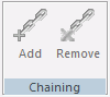
Working With the Miscellaneous Group in the HTML Canvas
|
How to: |
The Miscellaneous group contains the Visibility, Tab order, Delete Container, and Refresh All commands. This group is available only for an HTML page and a Guided Report page. The Miscellaneous group is shown in the following image.
The commands are:
- Visibility
-
Toggles the visibility of hidden objects. Hidden objects are objects that have the Visibility property, in the Properties panel, set to hidden.
For more information on using the Visibility command, see How to Toggle the Visibility of a Hidden Object.
- Tab order
-
Shows the order of the tabs.
- Delete Container
-
Deletes the selected container, without deleting the container content.
- Refresh All
-
Refreshes the HTML page.
Procedure: How to Toggle the Visibility of a Hidden Object
- Insert an object into the HTML canvas.
- Select the object you created, if it is not already selected.
- In the Properties panel, change the Visibility property
to hidden.
The object on the canvas is hidden from view.
- On the Utilities tab, in the Miscellaneous group, click
the Visibility command.
The hidden object is now displayed on the canvas. You can click the Visibility command again to hide the object again. At run time, this object will be hidden.
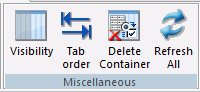
Previewing HTML Output Using the Preview Group
The Preview group, as shown in the following image, allows you to preview HTML output in Internet Explorer, Chrome, Firefox, and Edge browsers to be sure that your content displays correctly.
The Preview Runtime option is available for Responsive HTML pages only. It uses your default browser to preview your HTML run time layout with simulated data. This may be faster than running the page if it contains large amounts of data.
Note: Alternatively, you can right-click in the HTML canvas, select Preview, and select a browser or Preview Runtime.
The browser preview options are:
- Internet Explorer
-
Preview your HTML output in Internet Explorer.
- Chrome
-
Preview your HTML output in Chrome.
- Firefox
-
Preview your HTML output in Firefox.
- Edge
-
Preview your HTML output in Edge.
- Preview Runtime
-
Available for Responsive HTML pages only. It uses your default browser to preview your HTML run time layout with simulated data.
Displaying Panels in an HTML Page Using the View Group
The View group allows you to display or hide the panels associated with an HTML Page or Guided Report page. This group is accessible in the Utilities tab of the HTML canvas and in the Text Editor tab when accessing the Embedded JavaScript and Embedded CSS view tabs. The View group is shown in the following image.
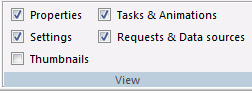
The commands are:
- Properties
-
Toggles the visibility of the Properties panel.
- Settings
-
Toggles the visibility of the Settings panel.
- Thumbnails
-
Toggles the visibility of the Thumbnails panel.
- Tasks & Animations
-
Toggles the visibility of the Tasks & Animations panel.
- Requests & Data sources
-
Toggles the visibility of the Requests & Data sources panel.
| WebFOCUS | |
|
Feedback |