Understanding the Resources Panel
|
Topics: |
|
Reference: |
The Resources panel is comprised of the Data pane, the Filter pane, and the Query pane. It is located on the left side of the InfoAssist interface and is visible by default. You can customize how the Resources panel displays by using the options on the Home tab and View tab. For example, on the View tab, in the Design group, click Query to display only the Query and Filter panes.
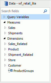
The following image shows the default view of the Resources panel, which displays the Data pane next to the Query and Filter panes when you create a chart.
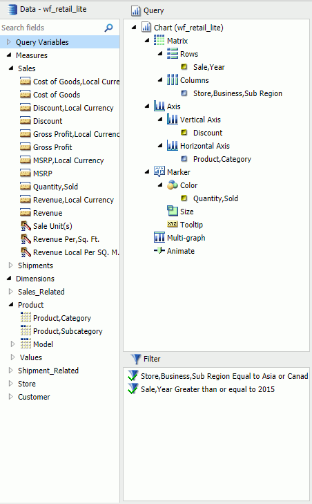
The Data pane, which contains all the fields from the selected data sources, is always displayed.
You can manually adjust the size of the Resources panel. To do so, move the mouse pointer over the border. When the pointer changes to a two-way arrow, drag the border.
Reference: Field Image List
In the Resources panel, each field has an image associated with it. The following table displays each image and describes what it represents.
Note: This list of icons changes based on the type of database that is in use.
|
Icon |
Type |
|---|---|
|
|
Blob |
|
|
Calculated Date Field |
|
|
Calculated Numeric Field |
|
|
Calculated Other Field |
|
|
Calculated Text Field |
|
|
Cube Property |
|
|
Date or Date and Time Field |
|
|
Dimension Field (Standalone or Drillable) |
|
|
Dimension Field (Drillable, Second-level) |
|
|
Dimension Field (Drillable, Third-level) Note: There are 17 dimension field levels. Level 0 is specific to certain databases. |
|
|
Geographic Role Dimension Field (Standalone or Drillable) |
|
|
Geographic Role Dimension Field (Drillable, Second-level) |
|
|
Geographic Role Dimension Field (Drillable, Third-level) Note: There are 17 geographic role dimension field levels. Level 0 is specific to certain databases. |
|
|
Funnel (filter) |
|
|
Geolocation |
|
|
Index Field |
|
|
Key Field |
|
|
Measure |
|
|
Numeric Field |
|
|
Text or Alpha Field |


Reference: Filter Pane
Using the Data Pane
The Data pane contains the data fields that are used to construct reports, charts, or visualizations. The default structure of data in the Data pane displays your data by field type, for example, measure field or dimension field. You can explore this structure using the sample retail database that is included with InfoAssist. The structure of this sample database, which is a cube database, includes measure groups, measure fields, dimension hierarchies, dimension fields, and attributes.
The data fields that display in the Data pane may vary. Depending on the underlying structure of your metadata, these fields may be organized and presented differently. For example, you may have just measures and dimensions, or you may have fields that represent multiple drill levels. You can also have any combination of these field types.
The structure of your metadata dictates the order of the fields, as well as the hierarchy that they employ. InfoAssist displays this hierarchy based on the structure defined for the master file that you choose. For more information on the specific field types, see Field Image List.
If you are using a Business View (BV) data source, which is built based on a pre-determined targeted hierarchy or structure, the view of your Data pane will be set to Structured, by default. When using a BV data source, Logical view is disabled. These options are available on the View tab, in the Data Panel group.
Note: When you open a BV data source, you will have access to common components, such as measures, dimensions, and filters, but values will not be displayed.
When navigating folders and content in the Data pane, you can double-click a folder to expand or collapse its contents. This applies to folders based on the hierarchy of your data source. It does not apply to fields that have additional fields within them.
Note: You can also use the arrow adjacent to the folder name to expand and collapse folders.
The Expand Data Source Tree check box in the Administration Console controls the initial view of the fields in the Data pane. For example, if you are working with a data source that has numerous fields and you wish to collapse the list to limit their view, contact your administrator to clear this check box. All items in the Data pane will collapse into their highest categorical level.
The fields in the database structure are displayed in Logical view, by default. You can use the commands in the View tab to change how your data fields are organized in the Data pane. These commands display the data fields in a Logical, List, or Structured view. All three views provide options for displaying each data source field as a Title, Description, Field, or Alias. The List view also includes options to show the Alias, Format, and Reference of each field.
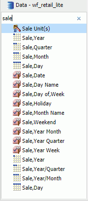
Field list search functionality is also available in the Data pane, which you can use to search for specific fields within a tree or list. When conducting a search in the Tree view, the search functionality searches only the attribute that is displayed.
When searching in List view, all attributes are searched at once.
Note: There are additional options on which you can search, including Name, Title, Alias, Format, Segment, Filename, Description, and Reference.
As you enter search criteria, InfoAssist begins the search process. When you enter just a few letters, the list of records that is returned is typically long. As your search criteria gets more specific, the list of returned fields narrows.
If you are conducting a search that you wish to cancel, click the X icon in the field list search tool to abort the search.
Note: The X icon displays only when you have search criteria specified in the Search fields box.
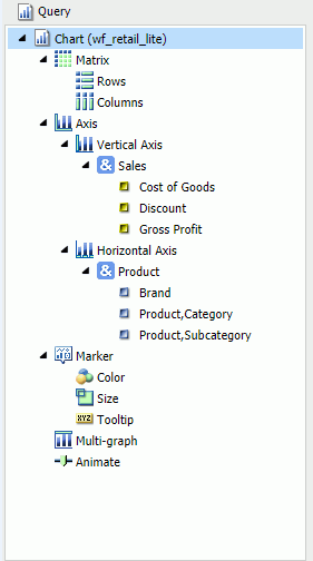
The following is an example of the default Logical view, displaying the Title of each field.
Using the Data Pane to Add Fields to a Report
There are several ways that you can add data source fields to a report. You can drag, double-click, or right-click data source fields in the Data pane to add them to a Query field container or the Filter pane. You can also replace an existing field in the Query pane by dragging the new field from the Data pane so that it is over the data field in the Query pane. You can also drag fields from other field containers in the Query pane over a field in a different field container. A dotted line displays, indicating that this new field will replace the existing field. Release your mouse to confirm placement of the new data field.
Note: When you drag a field from the Data pane to the Query pane, Filter pane, or canvas, a tooltip displays to indicate the name of the field.
When rearranging fields in the Query pane, a solid line is used to indicate placement. A solid line is also used when you are dragging a data field from the Data pane into the Query pane in between existing fields or into an empty field container. You can also use the solid line to drop a field onto a field container directly, which places that data field into that specific field container.
After you add data source fields to a Query field container, you can change the order of the fields by dragging and dropping one field above or below another field.
Drag. This method provides the most control. You can drag data source fields from the Data pane to the appropriate Query field container or Filter pane.
For a larger work area in which to drop data source fields in the appropriate Query field container, make sure that Query Design view is selected, and then, on the View tab, in the Query Panel group, click Areas 2x2 or Areas 1x4.
You can select Query Design view on the Home tab, in the Design group, by clicking Query or on the View tab, in the Design group by clicking Query. That selection expands the Query and Filter panes.
Multi-Select. You can multi-select data source fields that you want to add to a report in Live Preview, Query Design view, and Document mode. To select multiple data source fields to add to a report, click the appropriate fields while holding the Ctrl key on the keyboard. You can drag fields onto the canvas, or add them to the Query field container.
Double-Click. To automatically add a field to the appropriate Query field container in the Query pane, you can double-click a data source field in the Data pane.
- When you double-click a measure field in the Data pane, it is automatically added to the Sum Query field container.
- When you double-click a dimension field in the Data pane, it is added to the By (Row Label) Query field container for a report, or to the X-axis Query field container for a chart.
You cannot automatically add a field to the Across (Column Label) Query field container for a report, or to the Legend (Series) and Multi-graph Query field containers for a chart.
Right-Click. You can right-click a field in the Data pane to add it to the Filter area or a Query field container in the Query pane. For reports, the available shortcut menu options are as follows:
- Across. For dimension fields.
- Add to Query. Opens a menu of available Query field containers, to which you can add your data.
- Create Group. Allows you to create a group of elements based on the field data type that you select.
- Include as Category Axis. For dimension fields.
- Include as Coordinated. Only available in Document mode.
- Include as Legends Series. For dimension fields.
- Filter. For all types of fields.
- Slicers. For all types of fields.
- Sort. Adds the field to the Sort field container. This is for all types of fields.
- Sum. For measure fields.
- Create Bins. Allows you to create a bin for the selected measure. Bins are used with the Binning functionality. For more information, see Binning.
A measure is a numeric value, such as Gross Profit or Cost of Goods Sold, that you may want to aggregate. All numeric values that can be summed are measures. Numeric fields that cannot be summed, such as product number and miles per gallon, are not treated as measures. Instead, they may be used in the same way as dimension fields to analyze measures. It is up to you to understand your data and determine whether each numeric field can be summed. Related measures can be organized into measure groups. For example, Gross Profit and Cost of Goods Sold can be part of a Sales measure group.
A dimension is a way to categorize data. You can use a dimension to analyze and compare measures. Generally, any field that is not a measure, usually an alphanumeric field such as product, is a dimension. Dimensions can be organized into hierarchies to define the relationships between the fields in the hierarchies. For example, a Geography hierarchy can contain the Continent, Country, State, and City dimensions. You can also define dimension fields that are not part of a dimension hierarchy.
Using the Query Pane and Filter Pane
The Query and Filter panes appear to the right of the Data pane, except when you select Query Design view, which expands the size of the Query and Filter panes. There are different Query field containers for reports and charts.
Note: If you have more than one item in either Sum, By, or Across Query field containers (for reports) or Measure (Sum) or X-axis Query field containers (for charts), you can drag them up or down in the Query pane to rearrange the order in which they display in your report or chart. When you drag fields to rearrange them, an indicator line displays, providing guidance as to where the field will be placed. The color of this line is determined by the theme. Once you have performed the rearrangement, the Live Preview refreshes based on the newly indicated order.
Reports. For all reports, the Query field containers in the Query pane include Sum, By, and Across.
- Use the Sum
 field container
to aggregate or display numeric measure fields. Its context menu
provides options to Sum (default), Print, Count, or List the fields
in the report.
field container
to aggregate or display numeric measure fields. Its context menu
provides options to Sum (default), Print, Count, or List the fields
in the report.
- Use the By Query field container to vertically sort dimension fields to produce row labels in the report output. Dimension fields are normally non-numeric or date fields.
- Use the Across Query field container to horizontally sort dimension fields to produce column labels in the report output.
Charts. For most charts, the Query field containers in the Query pane include Measure (Sum), X Axis, Legend (Series), Multi-graph and Coordinated. More complex charts that require additional dimension fields have alternative Query field containers.
- Measure (Sum). Use this Query field container to aggregate or display numeric measure field values.
- Location. Use this Query field container to display a location field. This Query field container displays for maps only.
- X Axis. Use this Query field container to sort dimension fields in the chart output.
- Legend (Series). Use this Query field container to display dimension fields as color-coded values (lines, bars, areas, scatter plots) that match the color-coded dimension values displayed in the legend below the chart. Legend (Series) provides functionality that is similar to an Across field in a report.
- Multi-graph. Use this Query field container to create outermost sort fields and to serve as a page break for working with multiple charts. The sort field added to this Multi-graph Query field container is not plotted on the chart, but each unique sort field value is listed for every chart.
- Coordinated. Use this Query field container to collectively sort and collate by a common sort group (for documents only).
For pie charts, the Query field containers in the Query pane include Measure (Sum), Slices, Category, Multi-graph, and Coordinated.
- Measure (Sum). Use this Query field container to aggregate or display numeric measure field values in the pie.
- Pie slices. Use this Query field container to display dimension fields as color-coded pie slices that match the color-coded dimension values displayed in the legend below the chart. The Pie slices Query field container is equivalent to the Legend (Series) Query field container used for other chart types.
- Multi-graph. Use this Query field container to create outermost sort fields and to serve as a page break for working with multiple charts. The sort field added to this Multi-graph Query field container is not plotted on the chart, but each unique sort field value is listed for every chart.
- Category. Use this Query field container to sort dimension fields in the chart output. Category is equivalent to the X-axis Query field container used for other chart types.
- Coordinated. Use this Query field container to collectively sort and collate by a common sort group (for documents only).
Using Field Containers
|
Topics: |
Field containers are used to hold fields that you select based on the function that you want it to perform. For example, in Chart and Visualization mode, you can add a field to the Color field container, which will color your data based on the selected field.
For reports, the available field containers are different than those presented for charts and visualizations. This section reviews all of the field containers, providing you with a reference point when working with field containers.
Field Containers for Reports
The following field containers display when creating reports.
- Across
-
Enables you to display column headings across the top of the report for the measure or dimension that is placed in this field container.
- By
-
Enables you to specify sort fields for your report.
Note: You can rearrange the display order of your By sorts by dragging them into the desired order in the Query pane.
- Sum
-
Displays numeric totals for numeric (measure) fields that are added to this field container.
Field Containers for Charts and Visualizations
The following field containers display when creating charts and visualizations.
- Animate
-
Enables you to animate time progression using a slider control. As you move the control along the slider bar, an animation effect results. The slider control has a Play button that allows you to play and pause the animation. When you click Play, the Pause option is activated, enabling you to pause the progression and analyze your data. Slider controls are limited to one sort field and should be time or sequence related, such as month or year. This field container displays for many different chart types.
- By
-
Use this field container to differentiate data types in a field that contains multiple categorical values. For example, when creating a gauge chart, the field that you specify in this field container becomes a By field, by which all values are displayed as a separate chart.
- Category
-
Enables you to display data categorically in a chart. This field container displays for Tag Cloud charts, which are available in the Other charts category.
- Category Axis
-
Use this field container to specify a field that contains categorical data. These categories display on the categorical portion of a 3D bar chart. The other axis, Series Axis, is plotted against the categorical data.
- Close
-
Enables you to specify a numeric field to indicate the closing value of a stock. Other required values include: Open, High, and Low. This field container displays for Stock charts, which are available in the Other charts category.
- Color
-
Enables the application of different colors based on the underlying data set for the field in this field container. When you place a numeric field in the Color field container, the legend displays as a heat scale. When you place an alphanumeric or a date field (non-measure) in the Color field container, the legend displays as colored markers. To change how the legend displays, right-click the Color field container and click Color BY.
- Columns
-
Enables you to specify a field to display column data in a matrix chart in a visual. The use of measure fields is supported. Column data is displayed at the top of the visual, along the X axis. This field container is available for charts and visualizations.
- Detail
-
Use this field container to add detail to your visual by adding a data field to it. For example, if you add Sale,Quarter to the Detail field container in your Scatter plot, the points on the plot are quadrupled, one for each quarter. In addition, the field that you specify in the Detail field container also displays on the hover menu for each point in the plot.
- Geolocation
-
Enables you to specify a Geolocation field for use in a map.
Note: Geolocation fields are listed in the Data pane with a Geolocation icon
 .
.
- Grouping
-
Enables you to specify a field by which to present your data in categories or groups. For example, this data field controls how a treemap is grouped.
- High
-
Enables you to specify a numeric field to indicate the high value of a stock. Other required values include: Open, Low, and Close. This field container displays for Stock charts, which are available in the Other charts category.
- Horizontal Axis
-
Displays the data for the selected along the X axis. This field container is available for charts and visualizations.
Note: You can specify up to three fields on the horizontal axis.
- Latitude
-
Enables you to specify a geolocation field that contains latitudinal data. This field container displays for Leaflet bubble maps.
- Longitude
-
Enables you to specify a geolocation field that contains longitudinal data. This field container displays for Leaflet bubble maps maps.
- Legend (Series)
-
Enables you to add a field to specify for the legend of the chart. This field container displays for a number of charts that are available in the Other chart category.
- Low
-
Enables you to specify a numeric field to indicate the low value of a stock. Other required values include: Open, High, and Close. This field container displays for Stock charts, which are available in the Other charts category.
- Lower Limit
-
Enables you to specify a numeric (measure) field by which to establish a lower limit. This field container displays for Vertical Box Plot charts, which are available in the Other chart category.
- Lower quartile
-
Enables you to specify a numeric (measure) field by which to establish a lower quartile. This field container displays for Vertical Box Plot charts, which are available in the Other chart category.
- Measure
-
Use this field container to specify a measure that will serve as the basis for a pie chart. The Measure metric is used with the Color field container for pie charts to create sections based on your field selections. It is also used with Gauge charts.
- Measure (Sum)
-
Enables you to specify a numeric (measure field) by which to sum data. This field container displays for a number of charts that are available in the Other chart category.
- Median
-
Enables you to specify a numeric (measure) field by which to establish an median. This field container displays for Vertical Box Plot charts, which are available in the Other chart category.
- Multi-graph
-
Enables the creation of multiple graphs based on the field that you place in this field container. This field container displays for many different chart types, including Spectral Heatmaps, which are available from the Other dialog box.
- Open
-
Enables you to specify a numeric field to indicate the opening value of a stock. Other required values include: High, Low, and Close. This field container displays for Stock charts, which are available in the Other charts category.
- Rows
-
Enables you to specify a field to display row data in a matrix chart in a visual. The use of measure fields is supported. Row data is displayed on the left side of the visual, along the Y axis. This field container is available for charts and visualizations.
- Series Axis
-
Use this field container to specify a series to plot against the data presented on the Categorical Axis. This field container displays for 3D bar charts.
- Size
-
Controls the size of markers or other data points.
- Size (Sum)
-
Enables you to specify a numeric (measure) field, which will control the size of the data presented in a chart. This field container displays for Tag Cloud charts, which are available in the Other charts category.
- Slices
-
Enables you to specify a field whose data values will dictate the size of the slices in a chart. This field container is available for Funnel charts, which are available in the Other chart category.
- Tooltip
-
When you place a field in this field container, InfoAssist enables you to view additional information in the tooltip for a chart or visual.
- Upper limit
-
Enables you to specify a numeric (measure) field by which to establish an upper limit. This field container displays for Vertical Box Plot charts, which are available in the Other chart category.
- Upper quartile
-
Enables you to specify a numeric (measure) field by which to establish an upper quartile. This field container displays for Vertical Box Plot charts, which are available in the Other chart category.
- Vertical Axis
-
Displays the data for the selected field along the Y axis. This field container is available for charts and visualizations.
- X Axis
-
Enables the specification of a field on the X Axis of certain chart types. For example, XY Polar. This field container displays for a number of charts that are available in the Other chart category.
- Y1 Measure (Sum)
-
Enables you to specify a measure (numeric) field for the Y Axis in a Pareto and certain line charts, which can be accessed from the Other chart category.
- Y2 Measure
-
Use this field container to indicate a measure to serve as the basis for second Y axis. This field is used in various line charts, which can be accessed from the Other chart category.
Adding Parameters for Data Selection at Run Time
|
How to: |
You can add new parameters to your report or chart to create parameter options for selection at run time. This enables you to dynamically select and review different scenarios with your data, offering you on-demand, dynamic report or chart creation at run time.
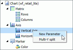
When you add a parameter, it becomes a field container into which you can add one or more measures and dimensions. You create a new parameter by right-clicking on a field container in the Query pane and clicking New Parameter. This creates a numbered parameter (for example, Parameter 1). In cases where you have multiple parameters defined, the numbering is applied sequentially.
Once you add a parameter, you can define the parameter prompt by right-clicking the Parameter-n field container and clicking Parameter Prompt, where n is the number of the parameter that was added. The new parameter prompt will display in the Query pane and at run time. This allows you to easily identify the parameters while categorizing the data fields that you want each to contain. For example, if you add a number of Sales-related fields to a parameter, you can rename the parameter with a title of Sales to encapsulate the data fields that you selected. Parameters should be renamed before you run the report or chart so that they are easy to identify.
In order to populate parameters in your report or chart, data fields must be placed in the parameter field container. You can do this by selecting fields from the Data pane and dragging them into the relevant parameter field containers that you create.
Note: Double-clicking the data fields in the Data pane places the data field in the default field containers in the Query pane, not the parameter field container. For example, in a report, if you double-click Discount, the data field is placed in the Sum container (outside of the parameter field container that you created). You can always drag a data field into a parameter container from another field container in the Query pane if you wish to consider it a parameter.
You can also reorder the data fields that you have placed in a given parameter field container by dragging them into the order that you wish to display them at run time.
Parameters can be specified in any field container, with the exception of Multi-graph. Once you have defined your parameters and selected the relevant data fields, run the report or chart. Using the drop-down lists for each parameter, you can select different options from the parameter lists to view the data in your report or chart dynamically. To load different scenarios, select the values and then click Run.
The following image shows the Query pane with a number of parameters and data fields specified.
Procedure: How to Add a Parameter
- Create a new report or chart or open an existing one.
- Add a new parameter by right-clicking a field container
and clicking New Parameter, as shown in the
following image.
A new parameter field container is added.
- Add the data fields that you would like to display in a parameter list at run time to the new parameter field container.
- Optionally, rename the parameter by right-clicking the
parameter and clicking Parameter Prompt.
This is not required, but it does help in differentiating the various numbered parameters that display, depending on how many you define.
Note: When the defining parameter prompt, you can include a space in any position in the prompt string. The first character cannot be a single quotation mark (') and the following characters cannot be used within the parameter prompt: & . ; ( )
- Optionally, add one or more additional parameters, and relevant data fields, into the field containers for which you would like to select data values at run time.
- On the Quick Access toolbar, click Run.
You can use the Parameter drop-down lists that display at run-time to create different views of your data, as shown in the following image.
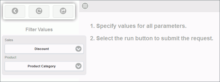
Note: You can optionally run your report or chart using the default parameters without making a selection. Click the down arrow on the Run button in the Quick Access toolbar and select Run with Default Parameter Values.
The following navigational icons display at run time:
Icon
Description

Close Filter Panel. Click this option to collapse the filter panel, displaying more of the report or chart in the right pane.

Reset filter values. Click this option to reset the filter values to their default values, as indicated when the parameter was initially set up.

Run with filter values. Click this option to run the report or chart based on your selections.

Show filter panel. Click this option to show the filter panel when viewing a report or chart. When viewing the filter panel, you can close it by clicking Close Filter panel.
Using Shortcut Menu Options in the Query Pane
|
Topics: |
|
Reference: |
In the Query pane, you can right-click any field and select from a list of available options that are displayed in the menu that appears. The options that you can select vary, depending on the type of Query field container in which the field is located and the type of report that you are creating.
You can also rename the content type in the Query pane. You can right-click the component and click Rename to change the title, as shown in the following image
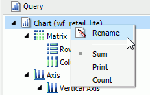
This allows you to customize the title in the Query pane. In addition, when working in Excel format, the name that you provide is used as the worksheet name in the workbook that is generated at run-time.
- If you are working with a report or chart in HTML format, you can also access Sum, Print, List, and Count aggregations from the shortcut menu on the report or chart component.
- When working with an -INCLUDE component in Document mode, you can change the Title text of the included .fex or component. However, this only affects active dashboard prompts. The title text of an included .fex will not be shown as a tab title in the related Excel document.
Related Information:
Reference: Right-Click Field Options in the Query and Filter Panes
The following table lists and describes all the right-click field options available in the Query and Filter panes for a selected field.
|
Option |
Description |
|---|---|
|
# of Columns |
Opens the Number of Columns dialog box, where you can indicate the number of columns in which you wish to display multiple graphs. This is only available for the Multi-graph field container. |
|
Aggregation Functions |
Provides a menu for selecting options to assign an aggregation type value to a selected numeric or dimension (non-numeric) field in a report or chart. |
|
Break |
Provides a menu of options to enable page breaks and subtotals, and resetting page numbers. This option is available for any measure or dimension field used in a report. |
|
Color BY |
Changes the Color field container to Color BY. The field container also changes to Color BY when you place a field into the Color field container. You can disable Color BY, which changes a dimension field into a measure field. This option is only available for charts and visualizations. |
|
Create Group |
Allows you to create a group of elements based on the field data type that you select. Once you define a new group, a higher-level field is created that contains the selected elements. This option is available for dimension fields of non-numeric format or attribute. For more information, see How to Create a Dynamic Group. |
|
Change Title |
Opens the Edit Title dialog box, where you can change the title of the selected field by typing the new title in the Enter Title field. This option is available for all fields. Note: When changing the title of a column heading, you can place a comma between words in the Enter Title field to create a multi-line header. |
|
Data Bars |
Provides a menu for enabling the data bar representation functionality. Selecting On adds a data visualization column to the right of a selected numeric field. The column displays values in each row using horizontal bars that extend from left to right in varying lengths, depending on the corresponding data values. This option is available for fields within the Sum field container in a report. |
|
Delete |
Deletes the selected field. This option is available for all fields in every field container. Note: In the Query and Filter panes, you can select and delete multiple data fields at one time. Using the CTRL key, select two or more data fields, right-mouse click, and then click Delete. |
|
Drill Down |
Opens the Drill Down dialog box, where you can create multiple drilldown links on a data field to external procedures or websites. This option is available for any measure or dimension field in a report or chart. |
|
Edit Format |
Opens the Field Format Options dialog box, where you can edit the field type and display options. This option is available for fields within the Sum field container in a report, as well as measure fields in a chart or visualization. Note: Any changes to the format of a field will be reflected in the tooltip for charts at run time, as well as for visualizations at design and run time. |
|
Filter Values |
Opens the Filter dialog box for creating WHERE statements, which enable you to select only the data that you want and to exclude all unwanted data. This option is available for all fields, except for a field in the Multi-graph field container. |
|
Geographic Role |
Opens the Location Type dialog box, from which you can make a location selection. Note: This option is only available when working with Leaflet maps. |
|
Multi-Y split |
Allows you to display individual charts for each measure field where multiple measures are specified. Located on the Vertical Axis, this option is available for charts and visualizations. |
|
New Parameter |
Allows you to add new parameters to your report or chart, which creates parameter options for selection at run time. You can create a new parameter in a report or chart in any field container. Note: When working with charts, a new parameter can only be added for charts that use the new attribute syntax. |
|
Missing |
Allows you to show or hide fields with no value. This option is available for fields in the Sum and By field containers in reports. For charts, the option appears but is disabled. |
|
Sort |
Provides access to the Sort, Rank, and Limit menus. The Sort menu allows you to sort your data either in ascending or descending order. The Limit menu allows you to specify the number of unique values displayed for a sort group that has been added. The Rank menu allows you to insert a rank column immediately to the left if a Sort By field is selected and adds a rank column to the left of the Sort By field if a Measure field is selected. Ranking a Measure field results in two copies of the field, the original Measure field and the Sort By field that is created during ranking. This option is available for any measure or dimension field used in a report or chart. |
|
Sub Footer |
Opens the Sub Header & Sub Footer dialog box, where you can edit and style your footers. This option is available for fields within the By field container in a report. |
|
Sub Header |
Opens the Sub Header & Sub Footer dialog box, where you can edit and style your headers. This option is available for fields within the By field container in a report. |
|
Suppress Empty Group |
Suppresses any part of your chart that is empty. You can deselect this option, which is enabled, by default. This option is available on the Horizontal axis in both Chart and Visualization mode. |
|
Sort by Total Value |
Enables you to sort the output in a chart or visualization using the values from the y-axis (Horizontal axis) of a stacked bar chart. While this feature was implemented specifically for Stacked Bar charts, it also applies to regular bar charts, as well as line and area charts. This enables you to view your data as ranked, or sorted, from highest value to lowest value. Accordingly, this option sorts the output by the bar (or other) with the highest total. This option is set to Off by default, but you can select Ascending or Descending to sort your data. This option is available on the Horizontal axis in both Chart and Visualization mode. Note: If you rotate your chart horizontally, the Sort By Total Value menu option displays on the Vertical Axis. For more information, see How to Sort a Chart by Total Value. |
|
Traffic Light Conditions |
Opens the Traffic Light Condition dialog box, where you can add new conditional styling or modify existing conditional styling by applying traffic light (and other) colors to a selected field in the report output when the field meets specified criteria. This option is available for both measure and dimension fields in reports and measure fields in charts. |
|
Visibility |
Provides a menu for controlling the visibility of the selected field. Clicking Hide removes the selected field from the report output. Clicking Show (default) displays the selected field in the report output. This option is available for all fields, except for the Multi-graph field container or parameters. |
All of the shortcut menu options that are available in the Query and Filter panes are also available in the Field tab. For more information, see Field Tab.
Dynamic Grouping
|
How to: |
Dynamic grouping allows you to create groups of elements based on the field data type that you select. For example, in the wf_retail_lite database, there are a number of brands of televisions. Using the dynamic grouping functionality, you can create groups based on the popularity of a particular brand. The first group might include top sellers such as LG and Sony. The second group might contain the remaining brands (Panasonic, GPX, Supersonic, Tivax, and Audiovox). This would allow you to group top sellers into one group, and the remaining brands into another group.
Note: The Create Group option is only available for dimension fields of non-numeric format or attribute.
You can also specify multiple, unique groupings in the same session. For example, you might want to group the data to indicate groups or products, or specific regions.
Note: If you want to exclude a specific data element from your analysis, you can use the filter functionality.
The grouping that you specify is applied and this new group then replaces the original field that you selected in the Query pane. The name that you specify when creating the group is reflected in the Query pane.
The process of dynamic grouping creates a Define field, which can then be used in other reports or charts in the same session. Dynamic grouping also supports Auto Drill, enabling you to drill through the hierarchy of your data just like any other data field. For more information, see Using Auto Drill.
- You can edit the group once it has been created by right-clicking on the higher-level field and clicking Edit Group.
- When working with Reporting Objects, Dynamic Grouping is not supported.
Procedure: How to Create a Dynamic Group
- From the Data pane, add one or more
data fields to your report or chart.
Note: You can use the dynamic grouping functionality on non-numeric dimension fields only.
- In the Query pane, right-click the data field for which
you want to apply dynamic grouping.
Note: The Create Group option is also available in the Data pane shortcut menu.
- Click Create Group.
The Create a Group dialog box displays.
- In the Field text box, optionally type a name for the
new group.
Note: The fully qualified field name is displayed in the Field Origin text field. This field is enabled and has a read-only attribute. The display of the fully qualified field name is particularly useful when renaming or editing a group, as it identifies the data source followed by the hierarchical location of the field within a data set. For example, WF_RETAIL_LITE.WF_RETAIL_PRODUCT.BRAND.
- Select the data values that you want to group. Use CTRL
+ click to select more than one value, as shown in the following
image.
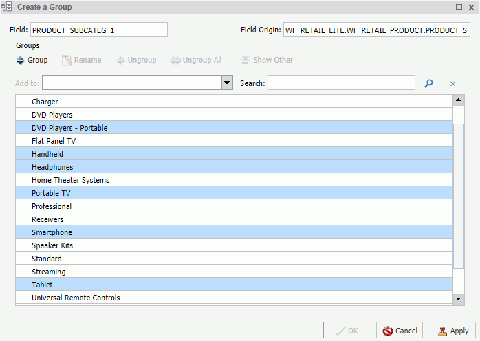
- Click Group.
Note: To ungroup values, click a group and then click Ungroup.
- Optionally, create additional groups, as shown in the
following image.
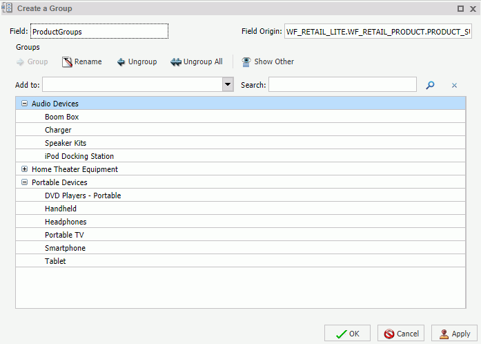
- Click OK.
Your grouped data will display in the Data pane when your report, chart, or visualization refreshes, as shown in the following image.
| WebFOCUS | |
|
Feedback |