Making an HTML Page Responsive
|
How to: |
Responsive web design is an approach to webpage creation where content automatically realigns to fit a variety of different window sizes and screen sizes. This allows the content from one HTML file to automatically adapt to multiple footprints such as a desktop, laptop, tablet, or smartphone.
There are two ways to create responsive pages in App Studio:
- Using a Responsive Template. This method lets you create a page by populating responsive Output Widget containers in a pre-defined template or a layout that you create at design time. You can use the HTML/Document wizard to specify a layout that is either row-based or column-based. For more information, see How to Select a Responsive Template.
- Using the HTML Canvas
Responsive Mode. This “free form” method lets you create a responsive page
with no pre-defined layout. This manual approach is perhaps not as fast as
using a template, but may be preferable if you want to create a responsive page
with containers of many different types. For more information, see How to Create New Content in Responsive Mode.
This method can also be used to convert an existing HTML file to responsive. For more information, see How to Convert an HTML File to Responsive.
Procedure: How to Select a Responsive Template
Select a responsive template from the HTML/Document Wizard as follows:
- Open the
HTML/Document Wizard using one of the following methods:
- On the Home tab, in the Content group, click HTML/Document; or
- In the Environments Tree panel, right-click an application folder, click New, and click HTML/Document.
The HTML/Document Wizard opens. If you used option a. above, the HTML/Document Wizard contains a navigation window that you can use to specify the folder where you want to save the new file.
- Click
Next.
The Templates, Settings, and Themes page opens, containing the Responsive Templates section, as shown in the following image.
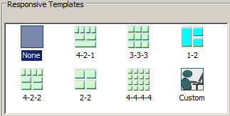
- Click on a
desired responsive template.
- Selecting None results in a generic HTML canvas that is not responsive.
- Selecting Custom lets you design a layout that differs from those offered by the responsive templates.
For purposes of this procedure, do not select None or Custom.
- Use the
Input Controls section at the bottom of the page as follows:
- Select Auto-hidden to hide the controls input panel. This is the default. At run time, users display the panel by clicking the down arrow in the title bar.
- Select Always show to display the controls input panel. At run time, users hide the panel by clicking the up arrow in the title bar.
- Clear the check box for Use a single input control panel if you want to use widget-level controls instead of, or in addition to, page-level.
- Select Run requests on load to load the contents of all the widgets when the page first opens.
- Select Add page header if you want to add space above the title bar, within the responsive panel1 <DIV>. You could use this area to add a graphic and/or company logo, for example.
- Click
Finish to close the HTML/Document Wizard.
The HTML canvas opens with the automatically generated responsive layout corresponding to the selected template.
Note: It is a best practice to expand App Studio to full screen when working with a responsive layout. This lets you access the greatest number of widgets without having to scroll.
Procedure: How to Create New Content in Responsive Mode
You can create new responsive content using the HTML canvas in responsive mode, as defined in this procedure.
- Open the
HTML/Document Wizard using one of the following methods:
- On the Home tab, in the Content group, click HTML/Document; or
- In the Environments Tree panel, right-click an application folder, click New, and click HTML/Document.
The HTML/Document Wizard opens.
- Click
Next.
The Templates, Settings, and Themes page opens, containing the Page Settings section, as shown in the following image.
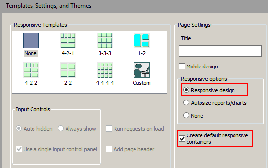
- In the
Page Settings section, select
Responsive design.
Note:
- The Create default responsive containers option is selected, by default. When you create a control using the New Parameters dialog box, the forms and the controls will be created with responsive containers.
- If you clear the Create default responsive containers check box, no responsive containers will be drawn for the form object.
- You can make a non-responsive container responsive by selecting the container and, in the Properties panel, selecting Yes for the Enable Responsive property.
- Click
Finish.
The HTML canvas opens. In the Properties panel, in the DOCUMENT properties, the Responsive design value is set to Yes.
As an alternative to using the HTML/Document Wizard, you can open a file in the HTML canvas and manually change the Responsive design property value to Yes.
You can add content to the HTML canvas before turning Responsive Design on. However, there are advantages to turning Responsive Design on before adding content. Design time benefits include:
- Having the responsive minimum and maximum widths established
- Having the maximum width visually indicated by the horizontal line on the right side of the canvas
- Having the Preview Runtime capability to preview the run-time appearance
Procedure: How to Convert an HTML File to Responsive
- To enable
responsive behavior in an existing HTML file, double-click the file in the
Environments Tree panel, or right-click it and click
Open.
The HTML file is open in the HTML canvas.
- In the
Properties panel, select
DOCUMENT from the drop-down menu.
The Document properties are displayed.
- In the
Responsive design property, select
Yes from the drop-down menu.
A message appears asking of you want to group control elements into responsive containers.
- Indicate
your preference for responsive containers as follows:
- Click
Yes to add multiple containers in the control area
as shown in the following image.
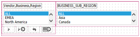
Note there are three containers within the fourth, larger container. The containers are red, indicating that they are responsive.
- Click
No to add no containers. This may be preferable if
your page contains many nested objects, otherwise each object will get its own
container.
You can add additional containers at a later time:
- Multi-click the control objects you want to group in a container.
- Right-click one of the highlighted objects and select Add selected to new container from the shortcut menu.
- To merge multiple containers, multi-select the containers, select HTML object manipulation from the shortcut menu, and then select Merge containers.
- To make a frame responsive, select it and open the Properties panel. Set the Enable responsive property value to Yes.
- Click
Yes to add multiple containers in the control area
as shown in the following image.
- To move contents from one container to another, right-click the HTML canvas and select Toggle Drag and Drop from the shortcut menu. The cursor changes to a crosshair to indicate that objects can be moved. Select an object and drag it to any container you want. Click Preview Runtime on the Utilities tab to preview your changes.
- Click the Run button on the Application menu and view the HTML output full screen. Gradually decrease the width to observe the responsive folding.
| WebFOCUS | |
|
Feedback |