Associating Bar Graphs With Report Data
|
Topics: |
|
How to: |
|
Reference: |
To make PDF, HTML, DHTML, PPTX, PPT, and PS reports more powerful, you can insert visual representations of selected data directly into the report output. These visual representations are in the form of vertical or horizontal bar graphs that make relationships and trends among data more obvious. You can add the following:
- Vertical Bar Graph. You can apply
a vertical bar graph to report columns associated with an ACROSS
sort field. The report output displays a vertical bar graph in a
new row above the associated data values, as shown in the following image.
Bar graphs that emanate above the zero line represent positive values, while bar graphs that emanate below the zero line represent negative values.
To see how each of these types of reports is generated, see the example following Associate Data Visualization Bar Graphs With Report Columns.
- Horizontal Bar Graph. You can
apply a horizontal bar graph to report columns. The report output
displays a horizontal bar graph in a new column to the right of
the associated data values, as shown in the following image.
Bar graphs that emanate to the right of the zero line represent positive values, while bar graphs that emanate to the left of the zero line represent negative values.
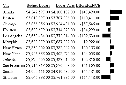
The length of each vertical or horizontal bar graph is proportional to the magnitude of its associated data value. The shortest bar graph is displayed for the value with the minimum magnitude, the longest bar graph for the value with the maximum magnitude, and bar graphs of varying length are displayed for each value within the minimum-maximum magnitude range. Notice in the figure above that a value of 147,490.00 produces a longer horizontal bar graph than a value of 50,153.00. Therefore, a complete row of vertical bar graphs or a complete column of horizontal bar graphs forms a bar chart.
You can only apply data visualization bar graphs to numeric report columns (integer, decimal, floating point single-precision, floating point double-precision, and packed). Bar graphs applied to alphanumeric, date, or text field formats are ignored. For details about assigning field formats, see the Describing Data With WebFOCUS Language manual.
You apply data visualization bar graphs to columns by adding a declaration to your WebFOCUS StyleSheet that begins with the GRAPHTYPE attribute. This attribute adds either a vertical or horizontal bar graph to the specified data.
Note: Data visualization bar graphs are not supported in a request that includes the OVER option.
Reference: Formatting Options for Data Visualization Bar Graphs
You can specify optional formatting attributes for data visualization bar graphs in the GRAPHTYPE declaration, for example, graph color, length, and width. The following table lists the formatting attributes and a description of each:
|
Formatting Attribute |
Description |
|---|---|
|
GRAPHBASE |
Sets whether the scale should start from zero or the minimum value. |
|
GRAPHCOLOR |
Sets the color of the bar graphs. |
|
GRAPHCOLORNEG |
Sets a color for the bar graphs that represent negative values. |
|
GRAPHLENGTH |
Sets the length of the longest bar graph. The value for GRAPHLENGTH determines the length in measurement units (inches, centimeters, and so on) of the longest bar graph in a vertical or horizontal bar graph. The length value is expressed in the current units, which is set using the UNITS StyleSheet attribute. The GRAPHLENGTH value is then converted into pixels. |
|
GRAPHSCALE |
Specifies the relative bar graph scaling for multiple report columns under a common ACROSS sort field in which you have applied data visualization graphics. GRAPHSCALE is a report-level setting (TYPE=REPORT). |
|
GRAPHWIDTH |
Sets the width of the bar graphs. The width value is expressed in the current units. See GRAPHLENGTH, above, for more information about units. |
Syntax: How to Incorporate Data Visualization Formatting Attributes
TYPE=REPORT, [GRAPHSCALE={UNIFORM|DISTINCT}]
TYPE=DATA, GRAPHTYPE=DATA, [{COLUMN|ACROSSCOLUMN|FIELD}=identifier],
 [GRAPHBASE={ZERO|MINIMUM},]
 [GRAPHCOLOR={color|RGB({r g b|#hexcolor}},]
 [GRAPHNEGCOLOR={color|RGB({r g b|#hexcolor}},]
 [GRAPHLENGTH=lengthvalue,]
 [GRAPHWIDTH=widthvalue,] $
Note: TYPE=DATA, GRAPHTYPE=DATA is the equivalent of GRAPHTYPE=DATA.
where:
- GRAPHBASE
-
Specifies whether the scale should start at zero (the default) or the minimum value. GRAPHBASE=MINIMUM makes it easier to compare values that are not close to zero. If negative values are present, GRAPHBASE=MINIMUM is ignored and will not be enabled.
GRAPHBASE=MINIMUM is visually indicated in the graph with a break in the bar (the small piece of the bar before the break symbolizes the compressed space between 0 and the minimum value).
Note: The minimum value is identified by a double bar of equal heights. For all values greater than the minimum, the top bar grows proportionally taller. If the minimum value is actually zero, having this double bar may make it look as if the minimum value is not zero. Therefore, you should use the default (GRAPHBASE=ZERO) in your procedure if you expect to have zero values in the column.
- GRAPHCOLOR
-
Specifies the color of the bar graphs. Black is the default color, if you omit this attribute from the declaration.
- color
-
Is one of the supported color values. In addition to the supported named colors, HEX or RGB color values are valid options. For a list of supported values, see Color Values in a Report.
- RGB(r g b)
-
Specifies the font color using a mixture of red, green, and blue. (r g b) is the desired intensity of red, green, and blue, respectively. The values are on a scale of 0 to 255, where 0 is the least intense and 255 is the most intense. Note that using the three color components in equal intensities results in shades of gray.
- RGB(#hexcolor)
-
Is the hexadecimal value for the color. For example, FF0000 is the hexadecimal value for red. The hexadecimal digits can be in upper or lowercase, and must be preceded by a pound sign (#).
- GRAPHNEGCOLOR
-
Defines a color for the bar graphs that represent negative values.
- GRAPHLENGTH
-
Specifies the length of the longest bar graph. The default length is 60 pixels for a vertical bar graph and 80 pixels for a horizontal bar graph.
- lengthvalue
-
Sets the value used to display the vertical or horizontal bar graph for the maximum data value in the associated report column. This value must be a positive number.
This value is initially expressed in the current units (using the UNITS attribute). This value is then converted into the corresponding number of pixels.
- GRAPHSCALE
-
Specifies the relative bar graph scaling for multiple report columns under a common ACROSS sort field in which you have applied data visualization graphics. GRAPHSCALE is a report-level setting (TYPE=REPORT).
- UNIFORM
-
Scales each vertical bar graph based on the minimum and maximum values of the entire set of values compiled from each ACROSS column in which you have applied data visualization graphics
- DISTINCT
-
Scales each vertical bar graph based on the distinct minimum and maximum values for each ACROSS column in which you have applied data visualization graphics.
- GRAPHWIDTH
-
Specifies the width of the bar graphs in a report.
- widthvalue
-
Sets the value used to display the width of the bar graphs in a report. This value must be a positive number.
This value is initially expressed in the current units (defined by the UNITS attribute). This value is then converted into the corresponding number of pixels.
Syntax: How to Associate Data Visualization Bar Graphs With Report Columns
To add data visualization graphics to report output, add the following declaration to your WebFOCUS StyleSheet.
GRAPHTYPE=DATA, {COLUMN|ACROSSCOLUMN}=identifier, $where:
- GRAPHTYPE=DATA
-
Generates vertical or horizontal bar graphs for the data component of a report. Currently, you can only specify DATA as the report component.
- COLUMN
-
Displays a horizontal bar graph to the right of the specified report column.
- ACROSSCOLUMN
-
Displays a vertical bar graph above every occurrence of the data value associated with an ACROSS sort field.
- identifier
-
Is any valid identifier. For details, see Identifying a Report Component in a WebFOCUS StyleSheet.
You can define WHEN conditions and bar graph features associated with those conditions using StyleSheet syntax. For details, see Formatting Report Data.
Example: Generating Data Visualization Bar Graphs in a Report
The following illustrates how to generate a bar graph for data in your report. Since this report is sorted with the BY field CITY, horizontal bar graphs display in the output. You can change this to vertical bars be changing the sort field to ACROSS CITY and the StyleSheet declaration to GRAPHTYPE=DATA, ACROSSCOLUMN=DIFFERENCE, $. Bar graphs that represent positive values display in the color blue. Bar graphs that represent negative values display in the color red.
DEFINE FILE GGSALES
DIFFERENCE/D7M=BUDDOLLARS-DOLLARS;
END

TABLE FILE GGSALES
BY CITY
SUM BUDDOLLARS/D7M DOLLARS/D7M DIFFERENCE
ON TABLE SET PAGE-NUM OFF
ON TABLE SET STYLE *
GRID=OFF, $
GRAPHTYPE=DATA, COLUMN=N4, GRAPHCOLOR=BLUE, GRAPHNEGCOLOR=RED, $
ENDSTYLE
END
The output is:
Controlling Bar Graph Scaling in Horizontal (ACROSS) Sort Fields
|
How to: |
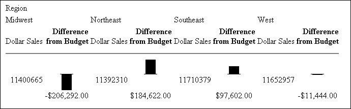
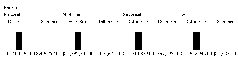
You can apply vertical bar graphs to different columns above a common ACROSS sort field. The entire set of values for each column is grouped over an ACROSS sort field that has bar graphs applied. Therefore, the longest bar graph corresponds to the maximum value of the entire set of values.
This action is acceptable for separate column values that have ranges that are close. Many times, however, there is a marked discrepancy between the sets of values for separate columns. The following image illustrates such a discrepancy.

As you can see from the figure above, the values for the Dollar Sales field ($11,392,310.00 to $11,710,379.00) is much larger in magnitude than the set of values for the Difference field ($206,292.00 to -$184,622.00). Also notice that the vertical bar graphs associated with the Difference values all but disappear when graphed against the entire set of values.
To display separate vertical bar graphs based on the set of values for each column, use the GRAPHSCALE StyleSheet attribute. This attribute modifies data visualization graphics to use the minimum and maximum values for each column below a common ACROSS sort field to construct a distinct vertical bar graph.
Syntax: How to Set Orientation for Visualization Bars
The VISBARORIENT parameter enables you to set horizontal or vertical orientation for visualization bars for ACROSS columns.
SET VISBARORIENT = {H|V} where:
- H
-
Indicates horizontal bar orientation for visualization bars.
- V
- Indicates vertical bar orientation for visualization bars. This is the default value.
Example: Setting Orientation for Visualization Bars
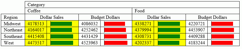
The following report creates vertical bars for the ACROSS column values (DOLLARS, BUDDOLLARS, UNITS, BUDUNITS).
SET VISBARORIENT=V
TABLE FILE GGSALES
SUM DOLLARS BUDDOLLARS UNITS BUDUNITS
BY REGION
ACROSS CATEGORY
WHERE CATEGORY EQ 'Coffee' OR 'Food'
ON TABLE SET PAGE NOLEAD
ON TABLE SET STYLE *
TYPE =REPORT , BORDER=light,$
GRAPHTYPE=DATA, ACROSSCOLUMN=DOLLARS, GRAPHCOLOR=GREEN,BACKCOLOR=RGB(#ffff00), $
GRAPHTYPE=DATA, ACROSSCOLUMN=BUDDOLLARS, GRAPHCOLOR=RGB(255 0 0), $
GRAPHTYPE=DATA, ACROSSCOLUMN=UNITS, GRAPHCOLOR=blue, $
GRAPHTYPE=DATA, ACROSSCOLUMN=BUDUNITS, GRAPHCOLOR=thistle, $
ENDSTYLE
END
The output is:
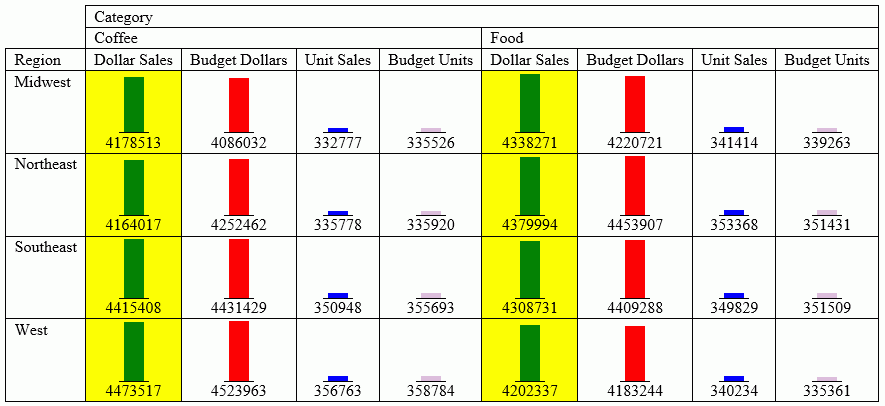
The following report creates horizontal bars for the ACROSS column values ( DOLLARS and BUDDOLLARS.
SET VISBARORIENT=H
TABLE FILE GGSALES
SUM DOLLARS BUDDOLLARS
BY REGION
ACROSS CATEGORY
WHERE CATEGORY EQ 'Coffee' OR 'Food'
ON TABLE SET PAGE NOLEAD
ON TABLE SET STYLE *
TYPE =REPORT ,BORDER=light,$
GRAPHTYPE=DATA, ACROSSCOLUMN=DOLLARS, GRAPHCOLOR=GREEN,BACKCOLOR=RGB(#ffff00), $
GRAPHTYPE=DATA, ACROSSCOLUMN=BUDDOLLARS, GRAPHCOLOR=RGB(255 0 0), $
ENDSTYLE
END
The output is:
Applying Scaling to Data Visualization Bar Graphs
|
How to: |
The GRAPHSCALE parameter specifies the relative bar graph scaling for multiple report columns under a common ACROSS sort field in which you have applied data visualization graphics. GRAPHSCALE can only be set for an entire report (TYPE=REPORT).
Syntax: How to Apply Scaling to Data Visualization Bar Graphs
TYPE=REPORT, GRAPHSCALE={UNIFORM|DISTINCT}where:
- TYPE=REPORT
-
Specifies that the declaration applies to the entire report, and not to a specific bar graph within the report.
- GRAPHSCALE
-
Specifies the relative bar graph scaling for multiple report columns under a common ACROSS sort field in which you have applied data visualization graphics. GRAPHSCALE is a report-lever setting (TYPE=REPORT).
- UNIFORM
-
Scales each vertical bar graph based on the minimum and maximum values of the entire set of values compiled from each ACROSS column in which you have applied data visualization graphics.
- DISTINCT
-
Scales each vertical bar graph based on the distinct minimum and maximum values for each ACROSS column in which you have applied data visualization graphics.
Example: Using GRAPHSCALE to Display Distinct Vertical Bar Graphs
The following report request displays vertical bar graphs for two columns (DOLLARS and DIFFERENCE) associated with a common ACROSS field (REGION):
DEFINE FILE GGSALES
Difference/D12.2M=DOLLARS-BUDDOLLARS;
END

TABLE FILE GGSALES
SUM DOLLARS/D12.2M Difference
ACROSS REGION
ON TABLE SET STYLE *
TYPE=REPORT,GRID=OFF,$
GRAPHTYPE=DATA, ACROSSCOLUMN=N1,$
GRAPHTYPE=DATA,ACROSSCOLUMN=N2,$
ENDSTYLE
END
This request produces the following report output:
Since the GRAPHSCALE attribute is not specified, the default setting UNIFORM is applied to the report. This setting uses the entire set of values (values from Dollar Sales and Difference) to plot the bar graphs for both columns.
The following request is the same as the above request, except it has the GRAPHSCALE=DISTINCT attribute included in the StyleSheet.
DEFINE FILE GGSALES
Difference/D12.2M=DOLLARS-BUDDOLLARS;
END

TABLE FILE GGSALES
SUM DOLLARS/D12.2M Difference
ACROSS REGION
ON TABLE SET STYLE *
GRAPHTYPE=DATA, ACROSSCOLUMN=N1,$
GRAPHTYPE=DATA, ACROSSCOLUMN=N2,$
TYPE=REPORT, GRAPHSCALE=DISTINCT,$
ENDSTYLE
END
Notice the difference in the output:
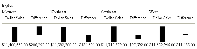
Now each bar graph is plotted based on the set of values for each field.
| WebFOCUS | |
|
Feedback |