Viewing Data Behind Visuals
|
Topics: |
|
How to: |
You can use InfoAssist to analyze your data by creating or building interactive visualizations. As you develop these visualizations, you can create different views of the data, and find patterns or trends.
As you gain insight and spot patterns, you may want to share only the underlying data that comprises a specific visual with others in your enterprise. You can do this using the data options, as shown in the following image.
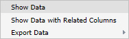
The Show data option provides options for you to view and share this data. The Export data option enables you to export the data specific to your visualization in a summary or detailed format. You can also review related data by using the Show Data with Related Columns option.
The Show Data with Related Columns functionality allows you to review more specific underlying data based on the fields that you have selected. Specifically, it displays data related to other fields that are part of the dimension hierarchy that you select. For example, if you selected the Product,Category dimension field, the related column data would include data from the Product,Subcategory and Model dimension fields, because these data fields are part of that dimension hierarchy.
Similar to the Show data option, the Show Data with Related Columns option provides more detailed data based on the data fields that you select. You can sort and review the data columns, which display in a separate browser window. Depending on the size and breadth of your dimension hierarchy, a multiple page report may be produced.
Note: You can export data in .xls or .csv format.
When you select the option to show data or show data with related columns, a report is generated in a separate browser window. This report is an active report, which you can review, sort, and modify using the drop-down menus that are available.
When you point to the Export Data option, you can:
- Export data in summary format, which includes totals for categories based on the data fields that you selected for your visual.
- Export more granular data based on the data values that you selected in your visual.
- When exporting data using the Summary or Data Detail options, you can save the resulting data file, which is in Microsoft® Excel® format, to your local machine for further analysis and sharing.
- The maximum number of records that can be exported is 100,000.
Procedure: How to Show the Data Behind Your Visual
- Create a visual, such as a chart, map, or grid.
- In the upper-right corner of the visual cell, click the down arrow.
- In the menu that appears, click Show Data.
A new browser window opens. This window displays the data for your visual as a WebFOCUS active report. You can use this active report to create and share lightweight, browser-based data discovery analytics that are portable, and only require access to a browser.
Procedure: How to Show Data With Related Columns
- Create a visual, such as a chart, map, or grid.
- In the upper-right corner of the visual cell, click the down arrow.
- In the menu that appears, click Show Data
with Related Columns.
A new browser window opens. This window displays the data for your visual as a WebFOCUS active report. You can use this active report to sort and work with the underlying hierarchical data in your visual.
Procedure: How to Export the Data Behind Your Visual
- Create a visual, such as a chart, map, or grid.
- In the upper-right corner of the visual cell, click the down arrow.
- In the menu that appears, point to Export
Data, and then click one of the following:
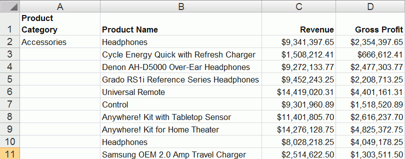
-
Summary. A prompt appears, asking you to open
or save a Microsoft Excel file. This file is a summary of your data
from a high level for a general analysis, as shown in the following
image.
- Data Detail. Generates a detailed report that provides specific data regarding your data analysis.
-
Summary. A prompt appears, asking you to open
or save a Microsoft Excel file. This file is a summary of your data
from a high level for a general analysis, as shown in the following
image.
Creating Multi-Y Axis Comparative Visuals
|
How to: |
When creating a chart with more than one measure (numeric) field, you can split the Y axis to create multiple charts, based on each unique measure field.
Note: Measure fields are selected from the Data pane and display under the Vertical Axis (Y) in the Query pane.
This functionality is useful when analyzing trends for multiple measure fields, as you can view data for each measure field separately within the same chart, as shown in the following image.
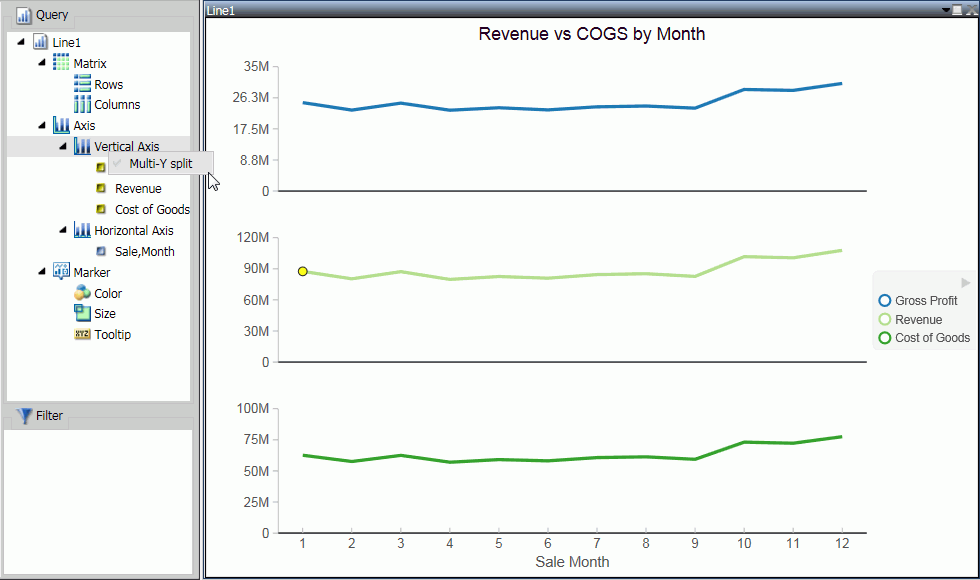
This functionality is available for Bar, Bar Stacked, Line, Area, and Area Stacked charts.
Procedure: How to Create a Multi-Y Axis Comparative Visual
- Launch InfoAssist in visualization mode.
- On the Home tab, in the Visual group, click Change.
- Select one of the following visual types: Bar, Bar Stacked,
Line, Area, or Area Stacked.
Note: Bar Stacked is the default visual type.
- Add multiple measure fields to the visual. For example, Gross Profit and Revenue.
- Add at least one dimension field to the visual. For example, Product Category.
- In the Query pane, right-click Vertical Axis.
- Click Multi-Y split.
The chart changes to display individual charts for each measure field.
Note: You can revert your chart to an integrated display by right-clicking Vertical Axis and then clicking Multi-Y split.
| WebFOCUS | |
|
Feedback |