Selecting a Chart Type
|
Topics: |
InfoAssist provides a complete chart library of both basic and advanced charts. You can choose from a wide variety of charts to best represent the data that you want to display.
It is important that you choose a chart that is appropriate for your data. When working with chart types in the Other category, which is available in the Chart Types group on the Format tab in Chart mode, you can quickly access a description for each chart, simply by hovering over the chart type with your mouse in the Select a chart dialog box. This facilitates quick identification of the relevant chart type, making it easy to create the right type of chart based on your data.
- To change the chart type of a migrated chart procedure that contains bar, line, or area charts, click the Type button on the Series tab, instead of the Format tab.
- As of Release 8.2 Version 02, the new chart attribute syntax has been applied to the following chart types: Dual Bar and Line, Tag Cloud, Streamgraph, Mekko, Funnel, and Pyramid. In InfoAssist, specific field containers display for each chart type. For information on the field containers for charts, see Field Containers for Charts and Visualizations.
Bar Charts
|
Topics: |
Bar charts plot numerical data by displaying rectangular blocks against a scale (numbers or variable measure fields that appear along the axis). The length of a bar corresponds to a value or amount. You can clearly compare data series (fields) by the relative heights of the bars. Use a bar chart to display the distribution of numerical data. You can create horizontal and vertical bar charts.
- If you are working with a large dataset, you can enable the display of a scroll bar under your chart, allowing you to easily scroll through your data from left to right. If you want to enable, disable or re-enable scroll bars, click the Format tab and then click Interactive Options. In the Interactive Options dialog box, select the Auto Enable X-Axis Scrolling check box.
- When working with stacked bar charts in either Chart or Visualization mode, borders can be enabled to show each series or
measure in the chart. When enabled, the borders outline each measure in a stacked bar chart. This allows you to differentiate
between the measures when they are displayed using the same color on a riser.
You can specify a border for all series in the Style dialog box, which is accessible from the Series tab.
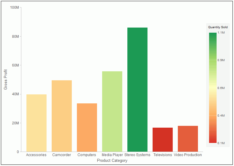
When to use: Use a bar chart when individual values are important. For example, a basic vertical bar chart can compare the individual products sold to the total amount in sales for each product. A retailer would find it important to know which pieces of inventory are selling and how much revenue each item is generating for the company.
The following image is an example of a bar chart showing gross profit and quantity sold by product category.
A horizontal bar chart becomes useful when you want to emphasize a ranking relationship in descending order, or the X-axis labels are too long to fit legibly side-by-side. For example, a basic horizontal bar chart can rank in descending order which products are generating the most revenue for the retailer.
Bar Chart Types
The following table lists the available bar chart types.
|
Available Bar Chart Types |
|
|---|---|
|
Vertical Clustered Bar |
Horizontal Clustered Bar |
|
Vertical Stacked Bar |
Horizontal Stacked Bar |
|
Vertical Dual-Axis Clustered Bar |
Horizontal Dual-Axis Clustered Bar |
|
Vertical Dual-Axis Stacked Bar |
Horizontal Dual-Axis Stacked Bar |
|
Vertical Bi-Polar Clustered Bar (Not in HTML5) |
Horizontal Bi-Polar Clustered Bar (Not in HTML5) |
|
Vertical Bi-Polar Stacked Bar (Not in HTML5) |
Horizontal Bi-Polar Stacked Bar (Not in HTML5) |
|
Vertical Percent Bar |
Horizontal Percent Bar |
|
Vertical Histogram |
Horizontal Histogram |
|
Vertical Waterfall |
Horizontal Waterfall |
|
Vertical Multi-3Y Bar (Not in HTML5) |
Vertical Multi-5Y Bar (Not in HTML5) |
|
Vertical Multi-4Y Bar (Not in HTML5) |
Error Bar |
Pie Charts
|
Topics: |
A pie chart is a circular chart that represents parts of a whole. A pie chart emphasizes where your data fits, in relation to a larger whole. Pie charts work best when the data consists of several large segments. As a best practice, limit your pie chart to five measure fields. Too many measure fields can divide a pie into many thin components that could become difficult to see. Use color on individual segments to create visual contrast.
In addition, you can add one or more measures to the Measure field container. Each measure will be used to create a separate, unique pie chart, to which you can add a measure or dimension to the Color field container to add color to your chart.
Note:
- When working with pie charts, you can add one measure field to the Color field container. This adds the measure as a By field, and determines how the pie chart is colored. Depending on your measure data, this may result in a large number of pie segments.
- You cannot plot negative data on a pie chart.
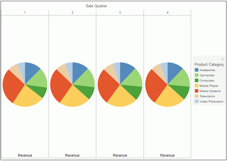
When to use: Use a pie chart when you have several large segments of data that you want to display as a whole.
For example, the following image is a pie chart showing the product revenue by sale quarter.
Pie Chart Types
The following table lists the available pie chart types.
|
Available Pie Chart Types |
|
|---|---|
|
Multi Pie |
Multi Ring Pie |
|
Multi Proportional Pie (Not in HTML5) |
Multi Proportional Ring Pie (Not in HTML5) |
|
Single Pie |
Single Ring Pie |
|
Pie-Bar (Not in HTML5) |
Ring Pie-Bar (Not in HTML5) |
Line Charts
|
Topics: |
Line charts are useful for emphasizing the movement or trend of numerical data over time. They allow you to trace the evolution of a data point by working backwards or interpolating. Highs and lows, rapid or slow movement, or a tendency towards stability are all types of trends well suited to a line chart.
You can also plot line charts with two or more scales to present a comparison of the same value, or set of values, in different time periods.
Note: If you are working with a large dataset, you can enable the display of a scroll bar under your chart, allowing you to easily scroll through your data from left to right. If you want to enable, disable or re-enable scroll bars, click the Format tab and then click Interactive Options. In the Interactive Options dialog box, select the Auto Enable X-Axis Scrolling check box.
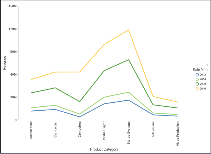
When to use: Use a line chart when you want to trend data over time. For example, monthly changes in employment figures, or yearly sales of an item in your inventory.
For example, the following image is a line chart that traces product revenue over a four-year period.
Radar charts are essentially analogous to line charts, except that the scale wraps around. Radar charts compare two or more data sets. They work well with data that is cyclical, such as the months of a year. A radar line chart is available in the line chart category, and a radar area chart is available in the area chart category. You can use axes or polygons to represent values in a star or spider configuration.
Line Chart Types
The following table lists the available line chart types.
|
Available Line Chart Types |
|
|---|---|
|
Vertical Absolute Line |
Horizontal Absolute Line |
|
Vertical Stacked Line |
Horizontal Stacked Line |
|
Vertical Dual-Axis Absolute Line |
Horizontal Dual-Axis Absolute Line |
|
Vertical Dual-Axis Stacked Line |
Horizontal Dual-Axis Stacked Line |
|
Vertical Bi-Polar Absolute Line (Not in HTML5) |
Horizontal Bi-Polar Absolute Line (Not in HTML5) |
|
Vertical Bi-Polar Stacked Line (Not in HTML5) |
Horizontal Bi-Polar Stacked Line (Not in HTML5) |
|
Vertical Percent Line |
Horizontal Percent Line |
|
Radar Line |
|
Area Charts
|
Topics: |
Area charts are similar to line charts except that the area between the data line and zero line (or axis) is usually filled with color. Area charts allow you to stack data on top of each other. Stacking allows you to highlight the relationship between data series, showing how some data series approach a second series.
Note: If you are working with a large dataset, you can enable the display of a scroll bar under your chart, allowing you to easily scroll through your data from left to right. If you want to enable, disable or re-enable scroll bars, click the Format tab and then click Interactive Options. In the Interactive Options dialog box, select the Auto Enable X-Axis Scrolling check box.
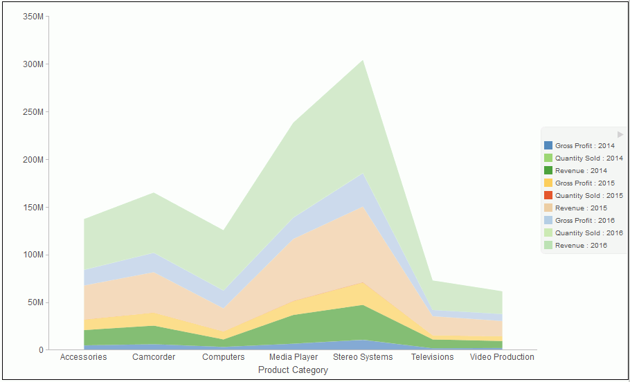
When to Use: Use an area chart when you want to distinguish the data more dramatically by highlighting volume with color. For example, the following image is a stacked area chart depicting the gross profit, revenue, and quantities sold for products over a three-year time period.
Area Chart Types
The following table lists the available area chart types.
|
Available Area Chart Types |
|
|---|---|
|
Vertical Absolute Area |
Horizontal Absolute Area |
|
Vertical Stacked Area |
Horizontal Stacked Area |
|
Vertical Bi-Polar Absolute Area (Not in HTML5) |
Horizontal Bi-Polar Absolute Area (Not in HTML5) |
|
Vertical Bi-Polar Stacked Area (Not in HTML5) |
Horizontal Bi-Polar Stacked Area (Not in HTML5) |
|
Vertical Percent Area |
Horizontal Percent Area |
|
Radar Area |
|
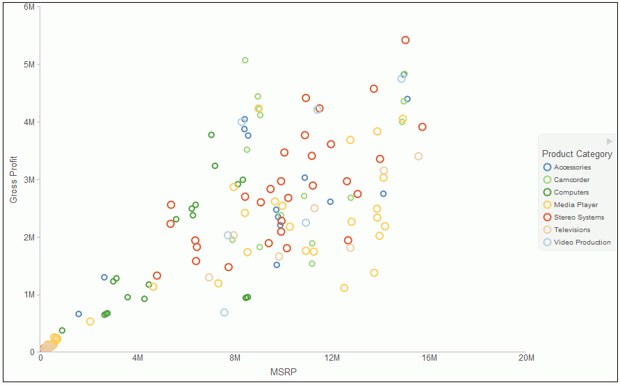
Scatter Charts
Scatter charts enable you to plot data using variable scales on both axes. When you use a scatter chart, the data is plotted with a hollow marker, so that you can visualize the density of individual data values around particular points, or discern patterns in the data. A numeric X axis, or sort field, always yields a scatter chart, by default, however you can optionally specify a non-measure (dimension) field on either the vertical or horizontal axis. You can also specify a non-measure field on both axes, which results in a vertical display of your dimension data.
If your chart reveals clouds of points, there is a strong relationship between X and Y values. If data points are scattered, there is a weak relationship, or no relationship.
When to use: Use a scatter chart when you want to determine patterns in your data.
The following image is a scatter chart that shows gross profit and MSRP data for product categories.
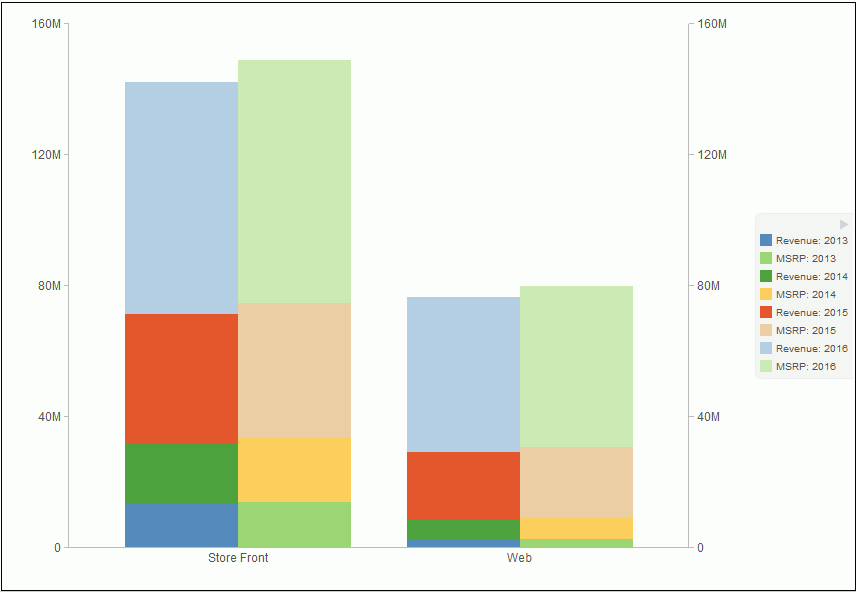
Multi-Axis Charts
Bar, line, and area chart types have multi-axis options, such as dual-axis charts and multi-Y charts, where you can compare one X-axis value to several Y-axis measure fields.
InfoAssist allows you to assign each individual series to the Y1 through Y5 axis.
When to use: Use a multi-axis chart when you want to plot values on an additional axis, or multiple axes, to compare multiple sets of data that are on different scales.
For example, the following image is a dual-axis bar chart that shows the revenue and MSRP by store type over a four-year time period.
XY Plot Charts
|
Topics: |
An XY plot chart depicts the relationships among the numeric values in several data series. It plots two groups of numbers, where for every X value, there is a corresponding Y value. This results in a single point of XY coordinate.
When to use: Use XY plot charts when you have two sets of numbers to compare and want to perform trend analysis.
- Scatter. Scatter
charts show a relationship between X and Y values. They compare
two sets of numbers at once, possibly revealing patterns and trends.
You can plot data using variable scales on both axes. When you use a scatter chart, the data is plotted with a basic line pattern so that you can visualize the density of individual data values around particular points, or discern patterns in the data. A numeric X axis, or sort field, always yields a scatter chart by default.
If your chart reveals clouds of points, there is a strong relationship between X and Y values. If data points are scattered, there is a weak or no relationship.
Scatter charts share many of the characteristics of basic line charts. Scatter charts and line charts are distinguishable from one another only by virtue of their X-axis format. Line charts can appear without connecting lines, making them look like scatter charts, and scatter charts can appear with connecting lines, making them look like line charts.
- Polar. A polar chart is a circular chart. Data is displayed on a polar chart in terms of values and angles. Polar charts share characteristics with scatter charts. Only one column field is allowed, in the following order: X (degree) for the column field, and Y (distance from the center) for the Across or By field.
- Bubble. A
bubble chart is a chart in which the data points are represented by
bubbles. Bubble charts can have two column fields representing X
and Y data values, or have three column fields representing X, Y,
and Z data values, in that order. The third variable (Z) represents
size. The size of each bubble is used to show the relative importance
of the data.
Note: You can specify a non-measure (dimension) data field on the horizontal or vertical axis, or both.
XY Plot Chart Types
The following table lists the available XY plot chart types.
|
Available XY Plot Chart Types |
|
|---|---|
|
XY Scatter |
XY Polar |
|
Bubble |
|
3D Charts
|
Topics: |
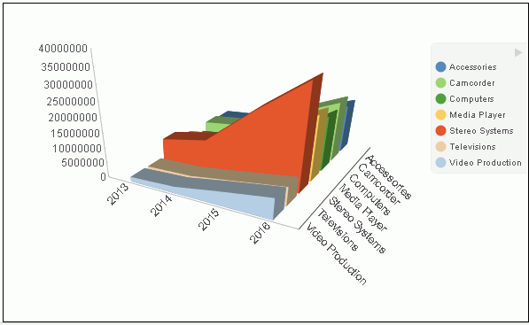
A 3D chart uses three axes, X, Y, and Z to display data from two or more data sets so that trends are most apparent.
When to use: Use a 3D bar chart when you want to look at the general shape of the data, but add visual depth to a chart presentation. A 3D chart would not be a good choice for presenting exact values, since it is difficult to determine values in a 3D chart.
Note: When working with charts in HTML5 format, the 3D Effect option is not supported.
The following image is a 3D chart that shows the revenue for products categories over a four-year time period.
3D Chart Types
The following table lists the available 3D chart types.
|
Available 3D Chart Types |
|
|---|---|
|
3D Bar |
3D Pyramid (Not in HTML5) |
|
3D Octagon (Not in HTML5) |
3D Cylinder (Not in HTML5) |
|
3D Floating Cubes (Not in HTML5) |
3D Floating Pyramids (Not in HTML5) |
|
3D Connected Series Area |
3D Connected Series Ribbon (Not in HTML5) |
|
3D Connected Group Area (Not in HTML5) |
3D Connected Group Ribbon (Not in HTML5) |
|
3D Cone (Not in HTML5) |
3D Sphere (Not in HTML5) |
|
3D Surface |
3D Surface with Sides (Not in HTML5) |
|
3D Smooth Surface (Not in HTML5) |
3D Smooth Surface with Sides (Not in HTML5) |
|
3D Honeycomb Surface (Not in HTML5) |
|
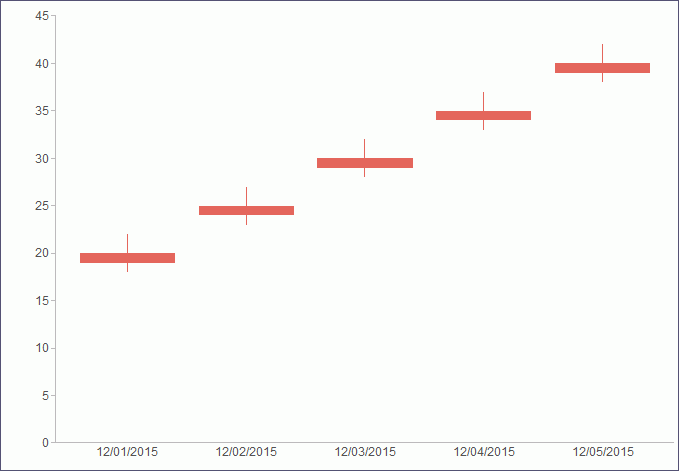
Stock Charts
|
Topics: |
Stock charts track the trend of a particular stock. They show the trading volume of the stock, its opening and closing values, and its high and low values over a specific time period. The data is represented by sets of bars or lines.
Stock Chart Types
The following table lists the available stock chart types.
|
Available Stock Chart Types |
|
|---|---|
|
Stock Hi-Lo (Not in HTML5) |
Stock Hi-Lo with Volume (Not in HTML5) |
|
Stock Hi-Lo Open-Close (Not in HTML5) |
Stock Hi-Lo Open-Close with Volume (Not in HTML5) |
|
Open-Hi-Lo-Close Candle Stock |
Open-Hi-Lo-Close Candle Stock with Volume (Not in HTML5) |
Special Charts
Special charts include a variety of additional chart types.
- Gauge. A gauge chart indicates the current position of a single data value within a given spectrum. This chart has a circular shape.
- Gauge Thermometer. A gauge thermometer chart indicates the current position of a single data value within a given scale. This chart has the shape of a thermometer. It is not available in HTML5.
- Pareto. A Pareto chart uses the X axis to show group members, and the Y axis to show the percent of the total of all groups that each group represents. This chart highlights the differences between groups of data.
- Vertical Box Plot. A vertical box plot is oriented vertically, and shows the distribution of data through five-number summaries: Upper limit, Upper Quartile, Median, Lower Quartile, and Lower Limit. This chart can be represented with or without outliers, also known as whiskers.
- Horizontal Box Plot. A horizontal box plot is oriented horizontally, and shows the distribution of data through five-number summaries: Upper limit, Upper Quartile, Median, Lower Quartile, and Lower Limit. This chart can be represented with or without outliers, also known as whiskers.
- Funnel. A funnel chart is essentially a pie chart, displaying only one group of data at a time, from the first series to the last series at the bottom of the funnel.
- Pyramid. A pyramid chart is essentially a pie chart, displaying only one group of data at a time, from the first series to the last series at the top of the pyramid.
- Spectral Map. A spectral map contains a row or column matrix of markers that are displayed in different colors, according to the data values.
HTML5 Charts
The following HTML5 charts are available:
- Parabox. Parabox charts are used to visualize and analyze multivariate data. In a typical scenario, hundreds of possible outcomes can be compared by filtering along any dimension.
- Mekko Chart. Mekko charts compare two related variables by percent of total and magnitude. They are popular in business and marketing.
- Streamgraph. Streamgraph charts are typically used to illustrate how data has changed over time. They resemble a stacked area chart. However, the x-axis is not fixed. Streamgraphs are commonly used to illustrate trends in the Social Media arena.
- Tag Cloud. Tag Cloud charts display the most prominent terms in a visual representation for text data. They are noted for their quick display of relevant information, allowing you to make quick decisions and narrow your search for terminology. Tag Cloud charts are typically used to depict keywords on websites or to visualize free form text.
- Treemap. Treemap charts are used to display large amounts of hierarchically structured data. In a sectioned format, each rectangle represents an aspect of the selected measure. When a second measure is indicated, color coding is applied, emphasizing the unique sections of the treemap.
- Grid. Grids present data in tabular form. For example, in Chart mode, you can use the Grid chart type to create a table that summarizes your data. This option is also available in Visualization mode.
| WebFOCUS | |
|
Feedback |