Using WebFOCUS Designer
These topics introduce WebFOCUS Designer, and how you can begin using it to create pages and InfoApps.
Introducing WebFOCUS Designer
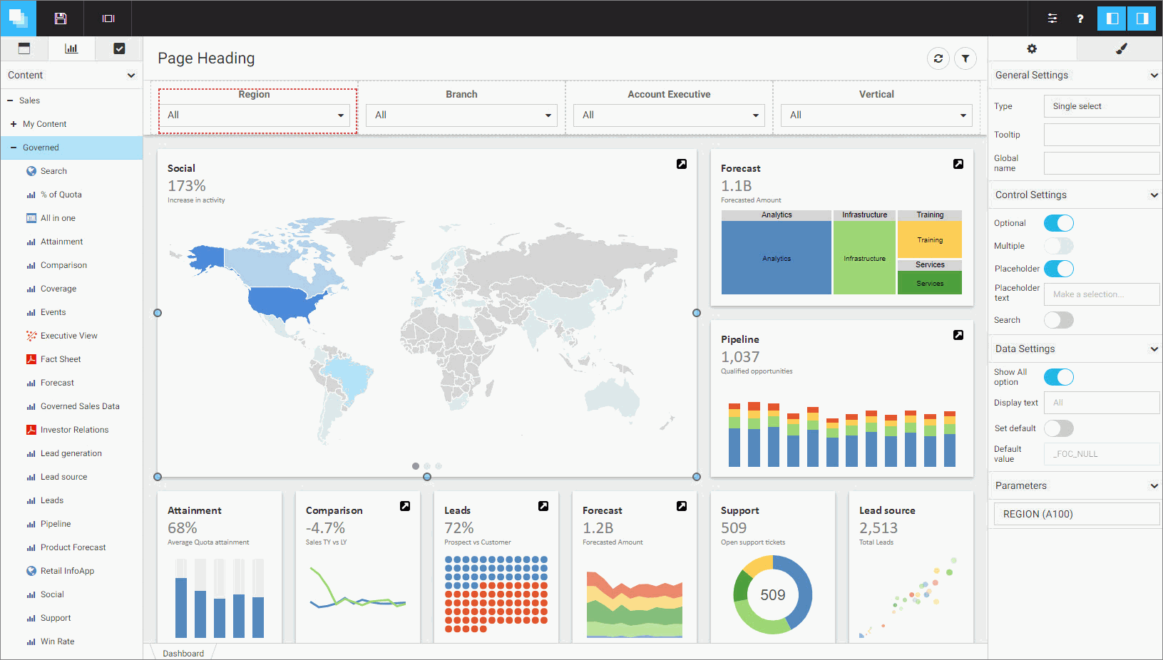
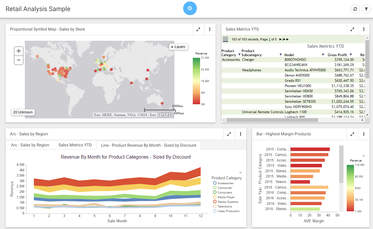
WebFOCUS Designer is a web-based development tool that you can use to create interactive, responsive pages, using content that you or other members of your organization create. This content can be added to a page by utilizing drag-and-drop actions. With the interactive canvas, you can resize and rearrange resources with ease. Additionally, you can use the integrated filter control capability to create instant, compelling applications and InfoApps from your content.
WebFOCUS Designer is shown in the following image.
Navigating the WebFOCUS Designer
|
Topics: |
The WebFOCUS Designer features a modern user interface with intuitive navigation, streamlined content creation, and the flexibility to build filtered responsive pages that are instantly compatible with any browser or mobile device.
The WebFOCUS Designer Interface
The WebFOCUS Designer interface is shown in the following image.
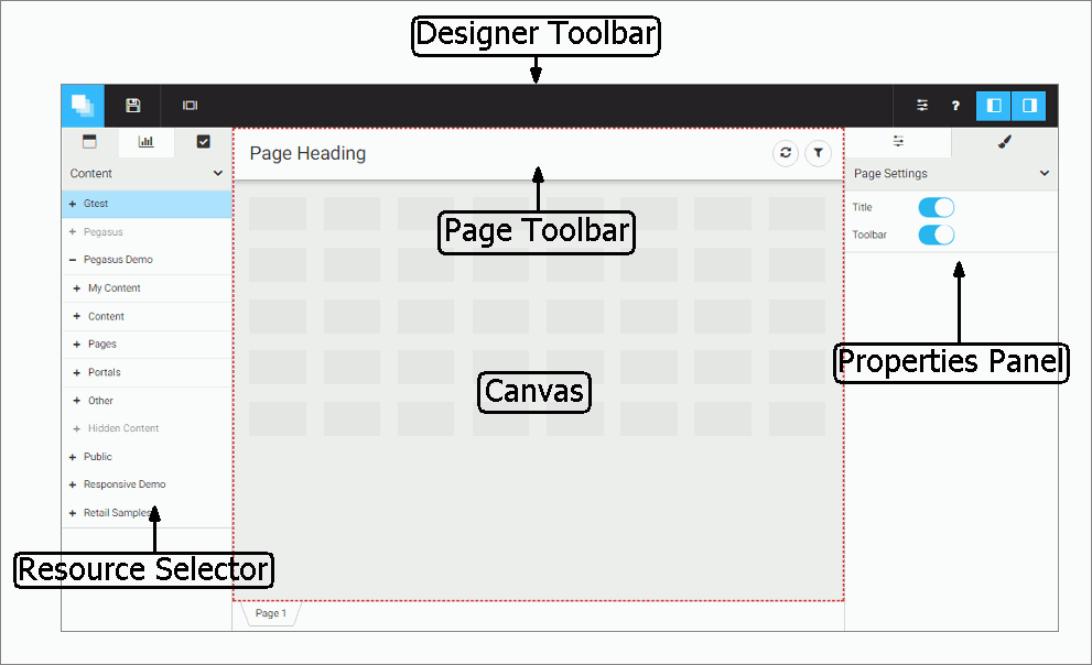
- Designer toolbar
- Resource selector
- Canvas
- Page toolbar
- Properties panel
Designer Toolbar
The Designer toolbar provides access to general properties and interface controls that you use to help develop content in the WebFOCUS Designer, as shown in the following image.

The following table lists and describes the controls that you can access from the Designer toolbar.
|
Icon |
Description |
|---|---|
 |
Application Menu. Opens a menu that you can use to open an existing page, create a new page, save the current page, and close the WebFOCUS Designer. |
 |
Save. Opens the Save dialog box, where you can save the page to a specific location in your environment. |
 |
Preview. Shows the page in preview mode, allowing you to view how the page will appear when run. To exit the preview mode of the Designer, click the back arrow. |
 |
Quick Filter. Configures filters that automatically appear when new unbound parameters are found in the content on the page. The badge icon shows the number of parameters available. |
 |
Page Filter Configuration. Opens the Page Filter Configuration dialog box, where you can choose to display filters in a filter bar above your content or in a modal window. |
 |
Help. Launches the online Help content. |
 |
Resources. Hides or shows the Resource selector. |
 |
Properties. Hides or shows the Properties panel. |
Resource Selector
You can use the Resource selector to access content, containers, and controls for your page. The Resource selector has the following tabs:
- Containers
- Content
- Controls
The Containers tab is shown in the following image.
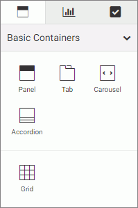
Using this tab, you can select empty containers, which you can drag to the canvas, and populate with the content of your choice. The types of containers available to you include:
- Panel
- Tabbed
- Carousel
- Accordion
- Grid
The Content tab is shown in the following image.
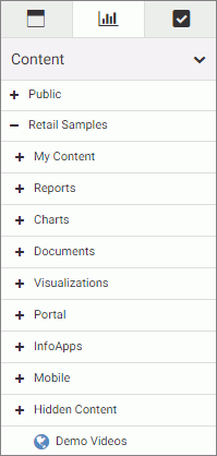
This tab shows your Resources tree, where you can navigate to your content by expanding and collapsing folders, selecting content items, and dragging to the canvas.
The Controls tab is shown in the following image.
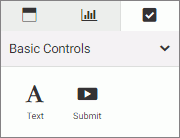
Using this tab, you can add a text label or a Submit button to your page.
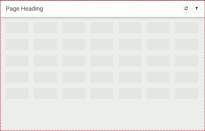
Canvas
The canvas is the design area. It provides a responsive grid for all your containers and content and resizes automatically to fit any browser or device. The canvas is shown in the following image.
When you right-click the grid area, you access a shortcut menu of options that include the following:
- Settings. Opens Section Settings inside the Properties panel, which you can use to make the current section collapsible.
- Style. Opens the Style tab inside the Properties panel, which you can use to apply styles to the current section.
- Delete section. Deletes the current section.
- Insert section above. Inserts a section before the current section.
- Insert section below. Inserts a section after the current section.
The Page toolbar is located above the canvas. Here you can edit the page title by double-clicking the text and typing the new text. You can hide the page title by disabling Title in the Properties panel.
The Page toolbar also contains two options, described in the following table.
|
Icon |
Description |
|---|---|
 |
Refresh. Refreshes the content on the canvas. |
 |
Filter. Toggles the page filter, which can be displayed as a filter bar or a filter modal window. This option is only visible when filters are added to the page. |
You can hide the options by disabling Toolbar in the Properties panel. To hide the Page toolbar completely, disable both Title and Toolbar in the Properties panel.
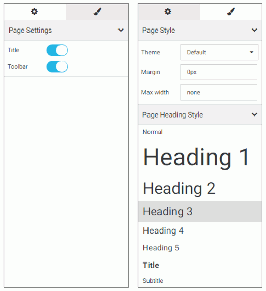
Properties Panel
You can use the Properties panel to configure properties for the element that you selected on the page. An example of the Properties panel for a page is shown in the following image. Under the Settings tab, you can toggle the title and toolbar visibility. Under the Style tab, you can configure page style and page heading.
Creating and Editing Pages in WebFOCUS Designer
|
Topics: |
Using the responsive grid, drag-and-drop operations, and other features, arranging content on a page in WebFOCUS Designer is quick.
Creating Pages in WebFOCUS Designer
|
How to: |
You can create pages in WebFOCUS Designer that you can add to a portal or portal page to share with other users in your organization. Additionally, pages that you create in Designer can be run as content items from the Home page or directly from a browser. You can share a Designer page as a stand-alone repository resource or a URL.
Procedure: How to Create a Page Using WebFOCUS Designer
- To launch WebFOCUS Designer, from the Home page, in the Resources tree, select the domain or folder where you want to create
the page, and then click Page.
The New Page dialog box opens, as shown in the following image.
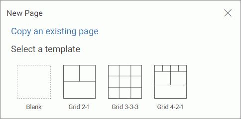
- Choose a template for your page. The options include Blank, Grid 2-1, Grid 3-3-3, and Grid 4-2-1.
Designer opens, and the canvas shows the template that you selected.
Editing Pages in WebFOCUS Designer
After creating a page in WebFOCUS Designer, you can edit it at any time, in one of the following ways:
- From the Home page, select the domain or folder where the page resides. Right-click the page, and click Edit.
- From the Home page, select the domain or folder where the page resides, and then click Page. In the New Page dialog box, click Copy an Existing Page. In the Open dialog box, click the name of the page, and then click Open.
- From WebFOCUS Designer, click the Application Menu button, and then click Open. In the Open dialog box, click the name of the page, and then click Open.
Note: You can only use WebFOCUS Designer to edit pages that were created in this tool.
Adding Content to a Page
|
How to: |
In the WebFOCUS Designer, you can create interactive pages or InfoApps, using content that you create in InfoAssist+ as well as images and URLs to external content. You can also add content to these pages using content that was created by another user in your organization. You can access the content that is available to you from the Content tab in the Resource Selector.
Procedure: How to Add Content to a Page
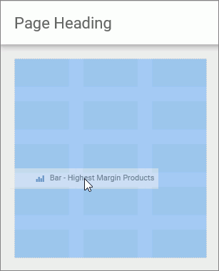
- From the Resources tree, in the WebFOCUS Designer, drag a content item of your choice to the canvas such as, a chart.
As you drag the item to your canvas, a shaded placement area appears, as shown in the following image.
- Repeat Step 1 to add more content to your page.
After adding content to your page, you can resize or rearrange items, add a heading, or add filters. Before closing the page, be sure to save any changes.
Creating Multi-Content Containers
|
How to: |
In the WebFOCUS Designer, you can create multi-content containers that show multiple content items at the same time. For example, you can create a carousel that rotates images or an accordion container that maximizes space on your page.
The multi-content container types include:
- Tab. Displays content items using tabs that you can click to view secondary content items.
- Carousel. Displays content as slides that rotate between other content items automatically.
- Accordion. Displays content items in an accordion-styled container that you can expand or collapse to view different content items.
Procedure: How to Create a Multi-Content Container
- Add a content item to your page.
- Drag a new content item to your page, and place it over the existing container.
The Add Content dialog box opens, and presents the following options.
- Replace content. Replaces the content item with the new one.
- Add content as new tab. Creates a tabbed container.
- Add content as new slide. Converts the container to a carousel, and adds content as slides.
- Add content as new accordion area. Creates an accordion container.
- Cancel. Closes the Add Content dialog box.
- Select an option to modify the container.
The item refreshes and shows the multi-content container. You can modify the container title and adjust the placement on your page.
Note: Once you have selected a new tab, new slide, or new accordion area, the options in this menu only allow you to replace an item or add an item.
Resizing Content on a Page
You can resize content on a page at any time using the sizing handles and the shaded placement area that appear on the canvas. When you hover over an item on the canvas, a series of handles appear. Drag a handle in the direction that you want to resize the item, as shown in the following image.
Previewing Pages
As you create pages in the WebFOCUS Designer, you can preview how the page will appear when run by clicking the Preview button
. This opens a preview mode of the Designer, which is shown in the following image.
In preview mode, you can interact with your content, view tooltips, as well as access menu options only available when
the page is run. You can also explore the responsive capabilities of the page by adjusting the width of your browser. These
functions are not available when you create the pages, as interactive features are disabled. The Maximize / Restore button
 behaves in the same way when you create a page or preview a page, by maximizing the item to fill the entire canvas. If you
save the page while an item is maximized, it will appear maximized the next time that you open or run the page, by default.
behaves in the same way when you create a page or preview a page, by maximizing the item to fill the entire canvas. If you
save the page while an item is maximized, it will appear maximized the next time that you open or run the page, by default.
To exit the preview mode of the Designer, click the arrow  .
.
Dividing Pages into Sections
The WebFOCUS Designer canvas uses a responsive grid layout that you can divide into sections to organize your content, and achieve multiple, complex layouts. You can also collapse selected sections to allow users to maximize space on a page.
When you open a blank page, only one section displays inside the canvas. To add more sections, right-click the canvas and then click Insert section above or Insert section below.
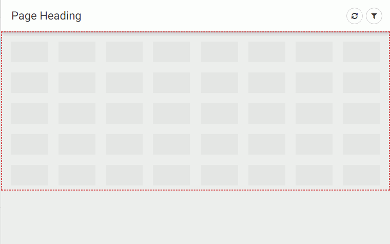
When a section is selected, a red dotted line appears to indicate the border of the section, as shown in the following image.
To delete a section, right-click the section, and then click Delete section.
To make a section collapsible, enable the Collapsible setting in the Properties panel. Right-click the section, and click Settings, or click Properties on the toolbar to open the Properties panel. You must enable the Collapsible setting for each section that you want to make collapsible.
When the page is run, you can expand or collapse sections using the section indicator, which is shown in the following image.
When you save the page, the collapsed state of the section is saved and will appear collapsed the next time you open or run the page.
Editing Page and Contain Properties
The Properties panel displays the properties for the element that is selected. To access container properties, click a container or item with the Properties panel open. To access page properties, click the page header or the toolbar. If the page header and the toolbar are hidden, you can access page properties by clicking the canvas outside a grid section.
The following properties are available for pages.
Settings tab:
- Title. Toggles between hiding and showing the title in the header.
- Toolbar. Toggles between hiding and showing the page toolbar.
Style tab:
- Theme. Allows you to select a theme for the page. The options are Default, Light, and Midnight. Administrators can configure additional themes that will be available to users from this property.
- Margin. Controls the size of the margin between the border of the page and the content.
- Max Width. Controls the maximum width of the page.
- Page Heading Style. Provides a selection of typeface styles for the page heading.
The following properties are available for containers and items.
Settings tab:
- Title. Toggles between hiding and showing the title.
- Toolbar. Toggles between hiding and showing the container toolbar.
Style tab:
- Container Style. Allows you to choose a color style for the selected container or item.
Working With Filters in WebFOCUS Designer
|
Topics: |
|
How to: |
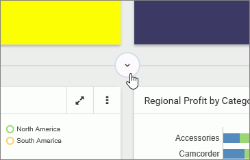
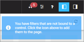
Creating a page filter in WebFOCUS Designer is a quick and intuitive process. Whenever you add parameterized content item to the canvas, such as a report with parameters or chart with parameters, the Designer recognizes the parameters and creates filters for them automatically. The tool then notifies you of any available filters with a notification, and a badge count is overlaid on the Quick Filter button, as shown in the following image.
There are three ways to add filters to a page in WebFOCUS Designer:
- Automatically, by clicking the Quick Filter button.
- Manually, by creating an empty filter bar or filter modal window and populating it with select filters.
- Manually, inside a Grid container.
Procedure: How to Automatically Add Filters to a Page Using the Quick Filter Button
- In the Resource selector, drag a parameterized item of your choice from the Resources tree to the canvas.
The Quick Filter button appears on the toolbar with the badge icon showing the number of unbound filters.
- Optionally, add more content with the same set of parameters.
- Click the Quick Filter button.
The filter bar with all available filters appears above your content.
- Optionally, customize your filter bar as described below.
- Right-click a cell to access shortcut menu options, as shown in the following image.
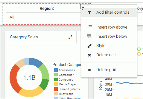 The available options are:
- Add filter controls. Opens the Add Filter Controls dialog box, where you can choose from the list of available controls and add them to the filter grid.
- Insert row above. Inserts an empty row above the current one in the filter grid.
- Insert row below. Inserts an empty row below the current one in the filter grid.
- Style. Opens the Properties panel, where you can customize grid style and cell alignment.
- Delete cell. Deletes the current cell.
- Delete grid. Deletes the entire filter bar.
- Right-click a control to access shortcut menu options, as shown in the following image.
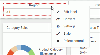 The available options are:
- Edit label. Makes the label of the control an editable text.
Note: Another way to edit a control label is to double-click the field, type the new text, and press Enter.
- Convert. Opens the Convert Control To dialog box, where you can choose between various control types.
- Settings. Opens the Properties panel, where you can customize label position, label alignment, and control object width.
- Style. Opens the Properties panel, where you can customize cell styling options.
- Delete control. Deletes the current control.
- Edit label. Makes the label of the control an editable text.
- Drag any filter cell to a new location in the grid.
- Multi-select two controls, right-click one of them, and then click Combine to combine the two controls into one. An example of two combined controls is shown in the following images.
- Drag a control into a cell with other controls. This action puts two separate controls into one cell. The drag marker is shown allowing you to position one control in front or behind another control. You can separate the controls again by dragging one control out of the cell.
- Right-click a cell to access shortcut menu options, as shown in the following image.
- Save your changes.
Procedure: How to Add Filters to a Page Manually
- In the Resource selector, drag a parameterized item of your choice from the Resources tree to the canvas.
The Quick Filter button appears on the toolbar with the badge icon showing the number of unbound filters.
- Optionally, add more content with the same set of parameters.
- Click the Page filter configuration button .
The Page Filter Configuration dialog box opens.
- Click Create empty filter bar, as shown in the following image.
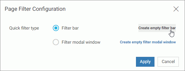
Note: If you prefer a floating modal window instead of a filter bar, click Create empty filter modal window.
- Right-click inside any filter cell, and then click Add filter controls.
The Add Filter Controls dialog box opens, and lists all available controls selected by default, as shown in the following image.
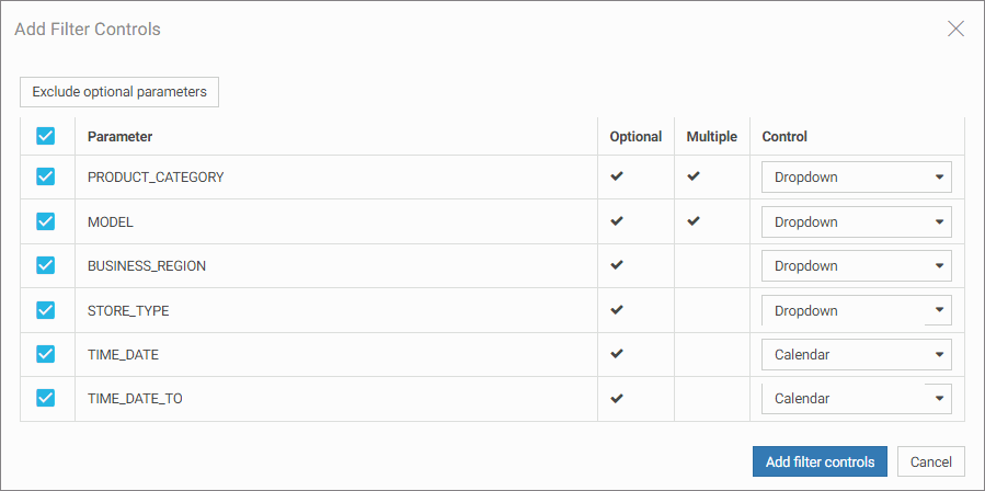
- Clear the controls that you want to exclude.
- Optionally, change the types of your controls where applicable by selecting a desired option in the Control column, as shown
in the following image.
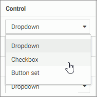
Note: When working with button sets, keep in mind that they look best when positioned in a single line.
- Click Add filter controls.
The controls are added to the filter bar.
- Save your changes.
Procedure: How to Add Filters to Page Using a Grid Container
- In the Resource selector, drag a parameterized item of your choice from the Resources tree to the canvas.
The Filter button appears on the toolbar with the badge icon showing the number of available filters.
- Optionally, add more content with the same set of parameters.
- In the Resource selector, click the Containers button.
- Drag the Grid container onto the canvas.
- Right-click inside the grid container, and then click Add filter controls.
The Add Filter Controls dialog box opens, and lists all available controls selected by default.
- Clear the controls that you want to exclude.
- Click Add filter controls.
The controls are added to the grid container.
Note: You can also drag a control from the filter bar to a grid container directly, if the filter bar is open and populated with controls.
- Optionally, move and resize your grid container and content to achieve the desired alignment.
An example of a simple layout featuring a grid container with filter controls is shown in the following image.
- Save your changes.
Configuring Filter Grid Properties
You can configure the properties of the filter grid using the Properties panel, which is content-sensitive. For example, when you click a filter cell, the cell style properties open in the Properties panel. When you click a filter control, the general and style properties for this control open in the Properties panel.
The Properties panel for a cell is shown in the following image. When you configure these properties, you modify the alignment of content within a cell or change the style layout of the filter grid.
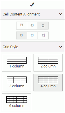
The properties for a grid cell are:
- Cell Content Alignment. Controls the alignment of the label and control inside the cell. The options include top, middle, bottom, left, center, and right.
- Grid Style. Controls the grid layout of the filter bar. The options include 1-Column, 2-Column, 3-Column, 4-Column, and 6-Column.
The Properties panel for a filter control is comprised of two tabs: general and style properties. The settings tab is displayed in the following image. Using these properties, you can define the type of filter control that shows on the page, add a tooltip or placeholder text, and set the default value.
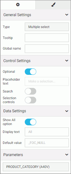
The settings tab contains the following properties:
- General Settings. This section includes the following options:
- Type. Displays the type of the control.
- Tooltip. Displays a tooltip when you hover over the filter control.
- Global name. Designates a global name to the control.
- Control Settings. This section includes the following options:
- Optional. Toggles between optional and mandatory control.
- Placeholder Text. Displays a placeholder text inside the control selection field.
- Search. Adds a search field to the filter drop-down menu.
Note: If the select list contains 50 or more values, the Search option is enabled automatically.
- Selection controls. Adds Select All and Clear buttons to the filter drop-down menu. This property is only available for multiple select lists.
Note: The Selection controls and Show All options cannot be selected at the same time.
- Data Settings. This section includes the following options:
- Show All option. Adds an All option to the control that the user can select. This option is hidden when the Selection controls option is enabled.
Note: Choosing this option results in the parameter receiving a _FOC_NULL value. If this parameter is used in a WHERE condition, it results in the WHERE condition being removed from the request and all data values for this field displaying the page.
- Display text. Allows you to specify a custom value for the Show All option in the control. The default text is All.
- Default value. Displays the default value of the control. You can edit this field and override the control value.
- Show All option. Adds an All option to the control that the user can select. This option is hidden when the Selection controls option is enabled.
- Parameters. Shows the name of the parameters that were used for this control.
The style tab is displayed in the following image. Similar to the properties of a cell, you can modify the positions of labels in a control, define the alignment, and set the object width.
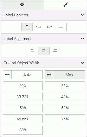
The style properties are:
- Label Position. Controls the position of the filter label in the relation to the control. The options are above, right, left, and no label.
- Label Alignment. Controls the alignment of the filter label. The options are left, right, and center.
- Label/Control Split. Controls the space ratio between the label and control inside the cell. This option is only available when the label position is set to right or left.
- Direction. Controls the organization of all selectable options in the filter cell. The options are Horizontal and Vertical.
- Control Object Width. Sets the width of the control in relation to the filter cell. The options are:
- Auto. Adjusts the width of the control automatically to accommodate the name of each value.
- Max. Fills the entire filter cell. This is the default value.
- Percentages. Set the control width to various percentages, as they relate to the filter cell.
Using Filters in WebFOCUS Designer
WebFOCUS Designer filter controls are versatile and allow you to facilitate multiple filtering scenarios. Depending on the needs of your enterprise and on the specifics of the data that you are using, you can configure filter controls to fit your unique needs. Examples below show you different types of controls and how to use them.
Choosing an Event Model for Your Page Filter
|
How to: |
WebFOCUS Designer supports two event models for passing parameters to your page content:
- On-selection Change. Whenever you change a value of any filter control on the page, parameterized content refreshes to reflect your selection. This model is enabled, by default.
- Submit Button. After you make all desired changes to filter controls on the page and click the Submit button, parameterized content refreshes to reflect all your selections. This model can be enabled by dragging a Submit button control into the filter grid.
Procedure: How to Use One-selection Change Filters
- Add filters to a page as described in wf_designer_filters.htm#concept_5BB24142A4104BD098E02B0A23F68E0B.
- Click the Preview button.
The preview mode is activated, allowing you to interact with content and filters.
- Make filter selections.
Each time you make a selection, the content refreshes to reflect it.
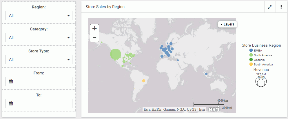
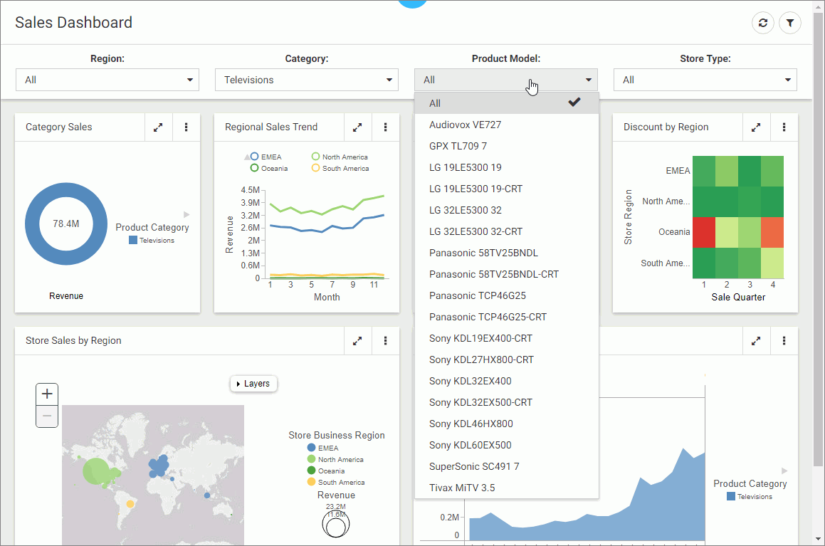
Note: Notice that the filter controls are chained in such a way that each selection automatically reflects the available choices in other filters. In our example, we set Category to Televisions. Now, the Product Model filter only shows models of televisions, as shown in the following image. WebFOCUS Designer chains controls automatically, if the parameters are defined in the metadata layer with the WITHIN keyword to relate them.
- Exit the preview mode and save your changes.
Procedure: How to Use Filters With a Submit Button
- Add filters to a page, as described in wf_designer_filters.htm#concept_5BB24142A4104BD098E02B0A23F68E0B.
- From the Resource selector, click the Controls tab, and then drag the Submit button onto the filter grid.
The Submit and Reset buttons display in the filter grid.
- Optionally, customize the Submit and Reset buttons in any of the following ways:
- Align the Submit and Reset buttons by selecting the cell in which the buttons reside and customize the Cell Content Alignment option on the Style tab of the Properties panel. In this example, we selected Align control bottom and Align control center.
- Add a tooltip to the buttons by selecting each one and populating our the Tooltip field on the Settings tab of the Properties panel.
- Customize the width of the buttons in relation to the filter cell by selecting one of the options under the Control Object Width property. In this example we selected 50%.
Note: You can delete one or both buttons by right-clicking them and clicking Delete.
- Click the Preview button.
The preview mode is activated, allowing you to interact with content and filters.
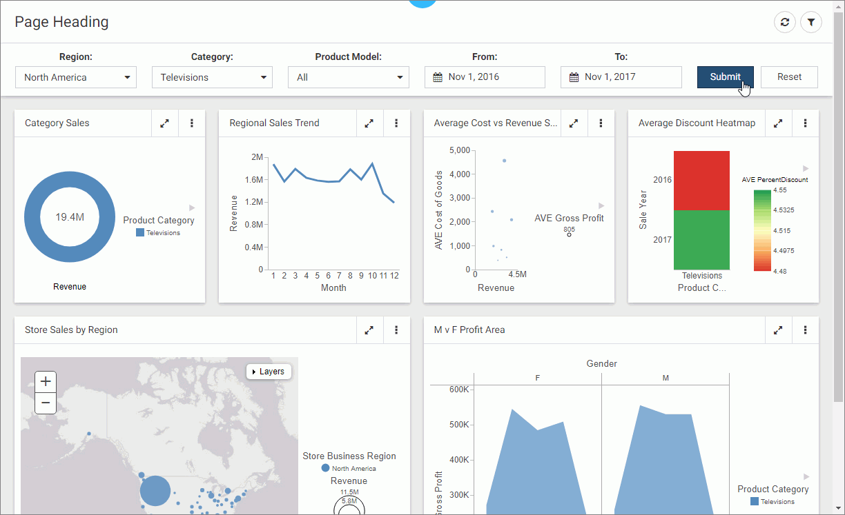
- Make filter selections and click Submit.
The content refreshes to reflect all your selections upon clicking the Submit button, as shown in the following image.
- Click Reset.
The filters return to their default values.
- Optionally, click Submit again to refresh the content with the default values.
Note: If you deleted the Reset button in the previous step, you must select default values manually, and then click Submit to return to the default state.
- Exit the preview mode and save your changes.
Working With Required Parameters
|
How to: |
When you have required parameters in your content, WebFOCUS Designer interprets them as required filter controls. Required controls are marked in red, prompting you to make a selection for the request to be processed. The image below shows an example of a required filters control.
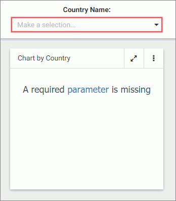
With a required parameter in place, your content does not refresh until you select filter values.
There are two ways to create a required filter control:
- By adding a required parameter to a chart or report in InfoAssist+.
- By converting an optional control to a required one in WebFOCUS Designer.
Procedure: How to Add a Parameter to a Content Item
- On the WebFOCUS Home Page, on the actions bar, click Report or Chart.
The Open dialog box opens.
- Select a data source in the Open dialog box and click Open.
InfoAssist+ opens.
- Create a report or chart.
To learn more about creating content in InfoAssist+, see the WebFOCUS InfoAssist+ User's Manual.
- On the Data tab, click Filter.
The Create a filleting condition dialog box opens.
- Double-click the Double-click or press F2 to edit text, select a field, leave the condition at Equal to, and then click Value.
The drop-down dialog box opens.
- Set the Type field to Parameter and select the Dynamic radio button.
- Optionally, select the Select multiple values at runtime check box to create a multiple select filter control and Optional check box to create an optional filter control.
In our example, we are creating a multiple select required control. An example of a complete configuration is shown in the following image.
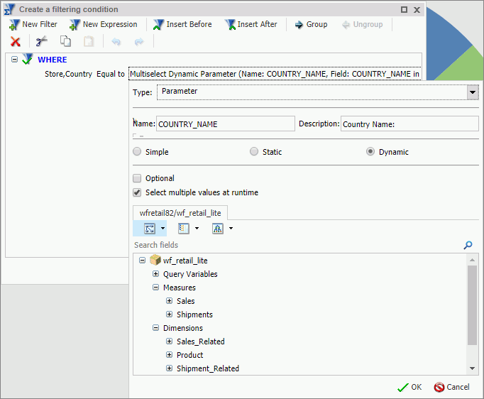
- Save your changes and exit InfoAssist+.
- In WebFOCUS Designer, in the Resource selector, drag your new content item to the canvas.
The content item does not load. Instead, a blank container displays a message: A required parameter is missing. The Quick Filter button appears on the toolbar with the badge icon showing one available filter.
- Click the Quick Filter button.
The filter bar with one filter appears above the content item. The filter control is marked in red and the Make a selection text displays inside the control field.
- Click the Preview button.
The preview mode opens.
- Select one or more values from the list.
The filter control is no longer red. It displays your selections. The content refreshes to reflect the filter values, as shown in the following image.
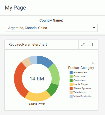
- Exit the preview mode and save your changes.
Procedure: How to Convert an Optional Filter Control to a Required One
- In WebFOCUS Designer, add filters to a page, as described in wf_designer_filters.htm#concept_5BB24142A4104BD098E02B0A23F68E0B.
- Click an optional filter control and then click the Properties button .
The Properties panel opens.
- In the Settings tab, disable the Optional setting and then disable the Show All option setting.
The filter control is marked in red and the Make a selection text displays inside the control field.
- Click the Preview button.
The preview mode opens. The content does not refresh.
- Select a value for the required filter control.
The content refreshes to reflect your selection.
- Exit the preview mode and save your changes.
Working With Single and Multiple Select Lists
There are two types of list controls in WebFOCUS Designer:
- Single Select List. Allows you to pick a single value at run time.
- Multiple Select List. Allows you to pick multiple values at run time.
An example of a single select list control is shown in the following image.
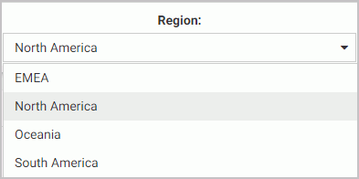
Once you have made a selection in a single select list, your content instantly refreshes to reflect that selection.
An example of a multiple select list control is shown in the following image.
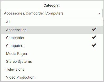
Once you have made all your selections in the multiple select list, you must click outside of the control for the content to refresh.
You can customize your list controls with the search feature by enabling the Search setting in the Properties panel. Once enabled, it adds the search field to your list and allows you to quickly navigate to a specific value. Simply start typing any word or syllable and all values that contain it will display. When a list contains 50 or more values, the search feature is enabled automatically. You can disable it at any time by disabling the Search setting in the Properties panel.
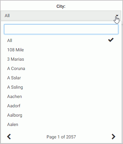
If a list contains 200 or more values, the paging feature is added to the bottom of the control. When paging is active, 10 values display per page. An example of a long list with the paging feature enabled is shown in the following image.
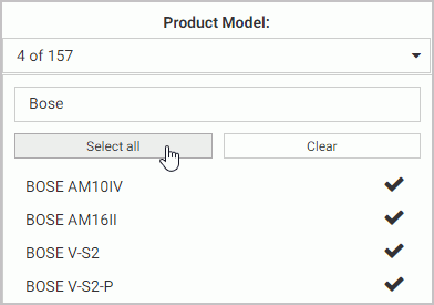
You can further enhance a multiple select list by enabling the Selection controls option in the Properties panel. Once enabled, it adds the Select all and Clear buttons to the list. This feature is especially useful when you need to eliminate just a few values from your results. You can click Select All, clear the values that you need to eliminate, and click outside of the control to refresh your content.
If the Selection controls and Search features are enabled at the same time, you can use the Select all button to select all search results, as shown in the following image.
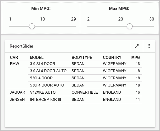
Working With Slider Controls
|
How to: |
A slider control is a horizontal track with a marker that you can slide between a minimum and maximum value. This versatile control is often used to choose a value within a fixed range. An example of a slider control is shown in following image.

Procedure: How to Create a Slider Control
- On the WebFOCUS Home Page, on the actions bar, click Report or Chart.
The Open dialog box opens.
- Select a data source in the Open dialog box and click Open.
InfoAssist+ opens.
- Create a report or chart.
To learn more about creating content in InfoAssist+, see the WebFOCUS InfoAssist+ User's Manual.
- On the Data tab, click Filter.
The Create a filleting condition dialog box opens.
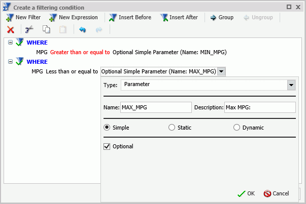
- Create two parameters representing minimum and maximum values and make them optional.
In this example we create the minimum and maximum parameters for the MPG field in the car report. An example of the completed filtering condition is shown in the following image.
- Save your changes and exit InfoAssist+.
- One the Home Page, right-click your new content item, and then click Edit with text editor.
The Text Editor window opens.
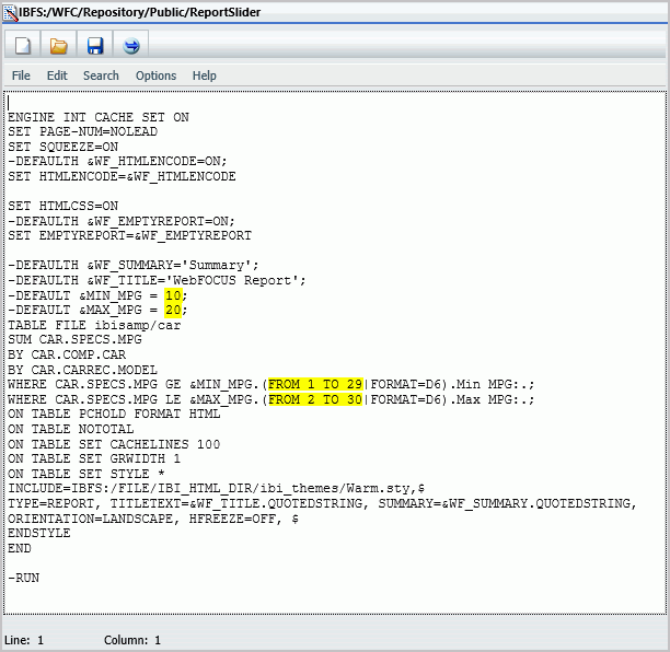
- Edit the syntax by providing the data range values.
An example of the modified syntax is shown in the following image.
- Save your changes and exit the Text Editor.
- In WebFOCUS Designer, in the Resource selector, drag your new content item to the canvas.
The Quick Filter button appears on the toolbar with the badge icon showing two available filters.
- Click the Quick Filter button.
The slider controls display in the filter grid, as shown in the following image.
- Optionally, combine two controls together. Multi-select both controls, right-click one of them, and then click Combine.
Your controls are combined. You can edit the label to reflect your new combined control. An example of the combined slider control is shown in the following image.
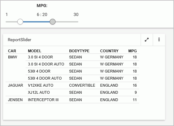
- Save your changes.
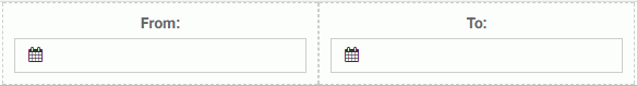
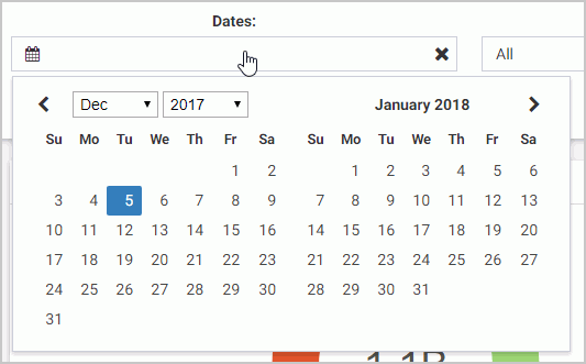
Working With Date Controls
Parameters that contain date ranges are recognized by WebFOCUS Designer as date range controls. An example of the date range controls on the page is shown in the following image.
The calendar feature inside a date control allows you to select a specific date value. Once you pick a specific date, it is always spelled out, so that it can be supported by all internationalized applications.
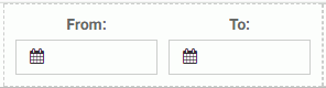
Optionally, you can combine two date control into one date range control. To do so, multi-select two date controls and then click Combine. An example of a combined date range control is shown in the following image.
| WebFOCUS | |
|
Feedback |