Working With Pages
|
Topics: |
Pages are a vital part of the BUE portal architecture. Depending on the type of a page, the BUE portal allows different levels of versatility in the way you organize, share, and interact with this page.
There are three types of pages in a portal. These include:
- Base Page. Created in the Page Designer and added to the BUE portal by a manager or developer. If a base page is unlocked, users can customize it at run time. If the user removes customizations, all changes made by the user are removed, and the base page reverts to its default state.
- Personal Page. Added to the BUE portal at run time by the user. Personal pages are stored in the repository but they are not visible in the Resources tree. Personal pages are only visible to the user that has created these pages.
- Domain Page. Created with the Page Designer directly in a domain or folder. A domain
page can be copied or added to a portal, in which case it becomes a base page. If a page is removed from a portal,
it becomes a stand-alone domain page and can be edited, moved, unpublished, or hidden.
Note: To avoid unwanted behaviors, you should not edit pages in the Page Designer, or move or hide pages in the repository, while users are running these pages in the BUE portal.
Page Designer Overview
|
Topics: |
|
How to: |
The Page Designer allows you to create domain pages inside domains and folders of your choice. This section explains how to use the Page Designer to create a domain page. It also describes the different components of the Page Designer interface.
Procedure: How to Use the Page Designer to Create a Domain Page
- In the
Resources tree, right-click a domain or folder, point to
New, and then click
Page.
The Page Designer opens, and the Add Page dialog box opens inside the Page Designer.
- Select a page template and, optionally, edit the Title and Name fields.
- Click
Create.
The page displays in the Page Designer.
- Optionally
add content to the page.
If left blank, panels behave like Easy Selector containers at run time. To learn more about the Easy Selector, see Using the Easy Selector.
- Optionally,
unlock the page to allow run time edits. Clear the
Lock
Page
check box in the Properties panel.
Note: The Lock Page option is enabled, by default.
- Save and
close the Page Designer.
A new domain page is created and now displays inside the selected domain or folder. It is ready to be added to the BUE portal.
Page Designer Interface
The following image shows the Page Designer.
The Page Designer contains the following components, located from the top of the interface to the bottom:
- Page Templates
- Application menu
- Quick Access toolbar
- Ribbon
- Canvas
- Properties panel
- Breadcrumb trail
The components are described in the following topics.
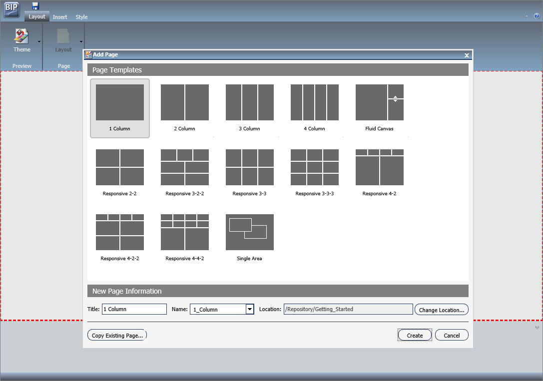
Page Templates
Page templates provide a quick way of creating page layouts . When you create a new domain page, the Add Page window opens and displays layout presets from which you can choose before adding any content.
Note: Page templates are only available for domain pages.
The Add Page window is shown in the following image.
The Add Page window contains the following options:
- Page Templates. This
area contains custom and default page templates. Each template is accompanied
by a thumbnail, which allows you to preview the layout. The default templates
are:
- 1 Column
- 2 Column
- 3 Column
- 4 Column
- Fluid Canvas
- Responsive 2-2
- Responsive 3-2-2
- Responsive 3-3
- Responsive 3-3-3
- Responsive 4-2
- Responsive 4-2-2
- Responsive 4-4-2
- Single Area
- New Page Information.
This area provides access to the following options:
- Title. The title of the page. The default title matches the name of the selected page template.
- Name. The name of the page. The default name matches the name of the selected page template.
- Location. The location of the page in the repository. To change the location, click Change Location and navigate to a different domain or folder.
- Copy Existing Page. Creates a copy of an existing page in the repository.
Application Menu
You can access the Application menu through the BIP icon at the upper-left corner of the Page Designer window.
The menu contains options to:
- Create a page
- Open an existing page in the Page Designer
- Save the current page
- Save the current page as specified
- Exit
Quick Access Toolbar
The Quick Access toolbar allows you to save your changes to the current page.
Ribbon
The ribbon is a rectangular area of distinct groups of buttons that spans the top of the Page Designer window and provides access to commonly used tools.
The ribbon contains three tabs:
- Layout.Specifies the theme and layout settings.
- Insert.Inserts content into the page.
- Style.Applies styles to common properties (background, border, and font).
Note: You can hide the ribbon by clicking the arrow in the upper right corner of your page.
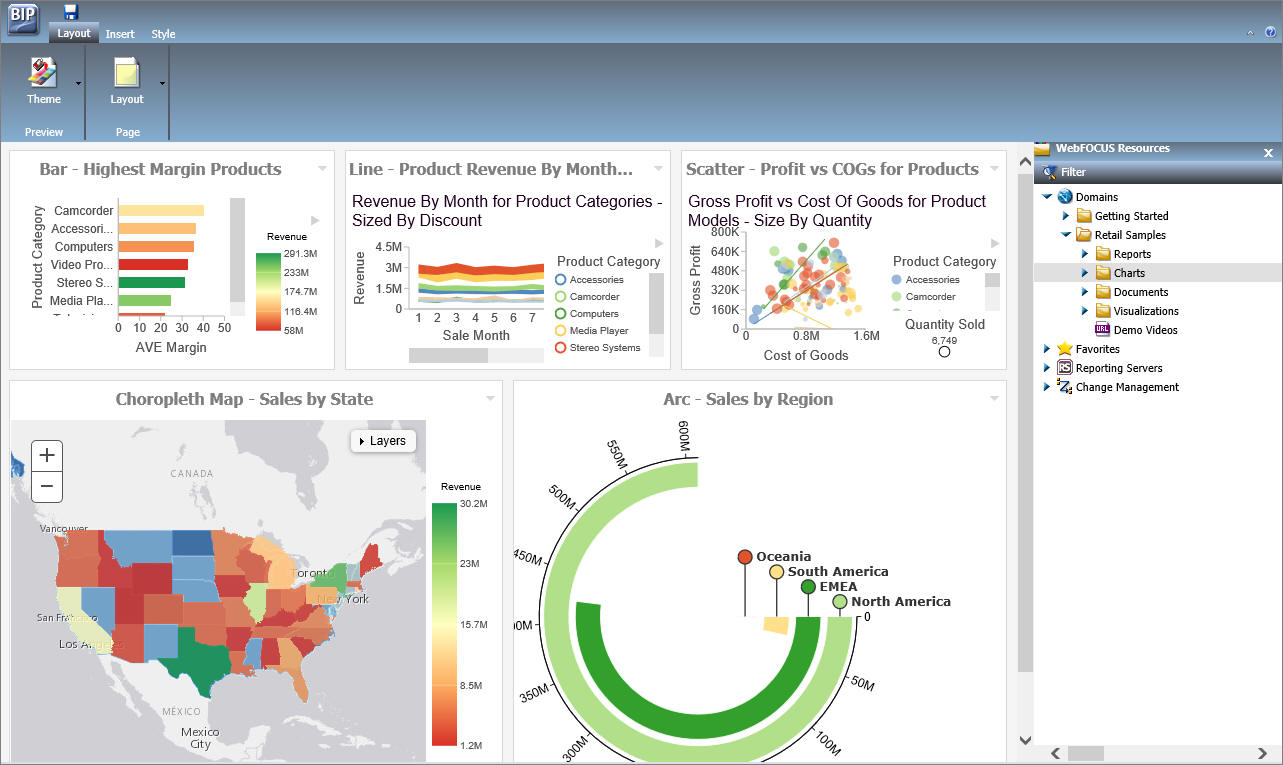
Layout Tab
|
Topics: |
The following image shows the Layout tab.
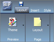
The layout tab has two groups, Preview and Page.
Preview Group
The Preview group has a single Theme button. The Theme menu consists of two parts:
- Portal Theme Files Browser. Allows you to configure CSS files, apply a predefined theme, including a Custom theme.
- CSS Editor. Enables you to edit specific components of the existing CSS theme.
The default theme is Neutral.
Page Group
The Page group has a single Layout button. You can use the Layout option to change to a column-based layout or to a fluid layout. In a column-based layout, dragging a panel results in a drop indicator, showing where the panel goes. In a fluid layout, the content automatically fills the page area in equal proportions. You can manually rearrange and nest these elements on the page. The display area changes its size depending on your browser dimensions.
The Layout menu has the following options:
- Single Area. There is no grid, and all items are free flowing.
- Fluid Canvas. Items are dragged to a floating drop target that arranges the content evenly and redistributes space as more items are added.
- One Column. The content stretches to fill the entire page area.
- Two Columns. The page is evenly divided into two columns.
- Three Columns. The page is evenly divided into three columns.
- Four Columns. The page is evenly divided into four columns.
When you choose any option other than Single Area, items snap to place within the area.
Insert Tab
- Containers. Adds a panel, accordion, tabbed, responsive, or easy selector container to the page.
- Content. Inserts WebFOCUS content (for example, visualizations, reports, charts, documents, dashboards, and URLs), images, and text.
Style Tab
|
Topics: |
The following image shows the Style tab.
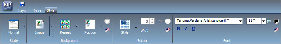
The Style tab is used to configure styling of objects, options for the background and borders, as well as fonts and colors of the text. This tab functions in the same way as does the Style tab in the Portal Designer.
State
From the State group, you choose which of the available states you are styling for an object. The state options are:
- Normal. This is the default state of an object in which an event, such as a hover, is not occurring, or if styling for that event is not defined.
- Active. This is the state in which the object is currently in use. An example is the background color of the current page tab.
- Hover. This is the state in which the mouse cursor is resting on the object.
Background
|
Topics: |
You can use an image, a color, or a combination of options when styling the background of an object.
Image
The Image button is a split button. Clicking the left side of the button launches an Open dialog box. Clicking the right side of the button displays the Background Image Options. The Background Image Options allow you to change or remove an image.
Click Change Image to launch the Open dialog box. From this dialog box, select an existing image in the Repository to use as the background, and click Open.
To add a new image, use the Resources tree, and right-click the folder that you wish to place the new image in. Point to Upload and click Image.
Repeat
The Select Background Repeat menu enables you to choose whether or not to repeat the background. The options are:
- None. Displays the background image only once.
- Everywhere. Repeats the background image horizontally and vertically. This is the default value.
- Horizontally. Repeats the background image horizontally.
- Vertically. Repeats the background image vertically.
Position
If you do not choose to repeat the image everywhere, you can select a background position using a visual menu. For example, you can position the background image at the bottom of the window, on the right. This feature is similar to Menu Bar positioning.
The default background position is top left.
Background Color
The
Background Color icon
 launches the color selection dialog box for setting a page background color.
The same icon is used in the Border and Font groups to set the border and font
colors, respectively.
launches the color selection dialog box for setting a page background color.
The same icon is used in the Border and Font groups to set the border and font
colors, respectively.
Reset Background
The Reset
Background icon
 in the Background group resets the background styling to the theme settings for
the currently selected state. The same icon is used in the Border and Font
groups to reset those groups.
in the Background group resets the background styling to the theme settings for
the currently selected state. The same icon is used in the Border and Font
groups to reset those groups.
Border
|
Topics: |
In addition to color and reset, the Border group has style and width controls.
Style
The Select Border Style menu is a visual menu that enables you to choose one of nine border styles. In the order of left to right (by row), the styles are:
- None (This is the default border style.)
- Solid
- Dotted
- Dashed
- Double
- Groove
- Ridge
- Outset
- Inset
Width
The Width control sets the border thickness in pixels (px). If the style is set to none (the default for most objects), the Width control has no effect.
Color
|
Topics: |
The Border
Color icon
launches the color selection dialog box for setting the Border color.
Reset Border
The Reset
Border icon
in the Border group resets the border styling to the theme settings for the
currently selected state.
Font
|
Topics: |
The Font group enables you to set:
- Font family
- Font size in pixels
- Formatting
- Bold
- Italic
- Underline
In addition, the Font group contains:
Color
The Font
Color icon
 launches the color selection dialog box for setting the font color.
Reset Font
The Reset
Font icon
in the Font group resets the font styling to the theme settings for the
currently selected state.
Canvas
The following image shows the canvas of the Page Designer.
The canvas is the design area of your page.
Properties Panel
The Properties panel appears near the bottom of the window, below the canvas. It shows properties that apply specifically to the currently selected item.
Breadcrumb Trail
The breadcrumb trail appears at the bottom of the Page Designer window. It serves two purposes:
- It indicates the currently selected item.
- You can use it to change the currently selected item.
Click any portion of the breadcrumb trail to change the currently selected item on the page canvas. This feature is another way to select an item, in addition to selecting it through the canvas. This feature is especially useful when you are working with hidden or layered content.
Page Components
|
Topics: |
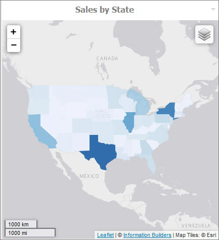
The page is made up of different components, such as columns, containers, and resources. This section describes the different components of a page and their properties.
Page
The Page, while not a component itself, does have properties that you can set.
The following are the properties of a page.
- Title. The title or label shown in the navigation menu and any tree that displays the list of pages in the portal.
- Page Icon.
- This is an icon displayed to the left of the page name throughout WebFOCUS. You can turn it on or off. It is disabled, by default.
- The maximum display size of the icon is 16 x 16 pixels. Upload an image that is visible at that size.
- Change the portal icon by clicking the preview icon or the Change Image button.
- Lock Page. Turns off
customization on the page. Customization includes moving content and adding
content.
Note: The Lock Page check box is selected by default. Clear it to grant permission to end users from moving and adding content.
- Refresh on Click. Refreshes the page when you click the page title. This feature is useful if another page changes the parameters used by the reports on this page. When you switch back, the reports rerun with the appropriate parameters.
- Show in Navigation. Used to hide the page from the navigation. You can use this property to create a Home page for a portal that displays the first time that a user runs the portal, but the user cannot navigate to it again. In a future WebFOCUS release, there will be support for a URL for each page, allowing you to link to a page that is not included in the navigation.
- Prevent Layout Change. Restricts layout changes on unlocked pages at run time. This option is only active when the Lock Page option is disabled.
- Relative Path. References a specific path for the content that was added to a page and allows you to move the page in the repository without losing any content or resources.
- Show Refresh. If enabled, displays the Refresh option in the page menu at run time.
- Margins. Sets page margins in pixels or as a percentage. Use the Same for All option to set equal margins on all four edges of a page.
- Comments. Controls the placement of the comments on a page. The options include: none, top, bottom, left, and right.
- Container Defaults. Opens the Container Defaults dialog box, where you can set a default size, appearance, and list of behaviors for all containers on a page.
Columns
Columns have the following properties:
- Column Number. A label that indicates the column that is selected on the page.
- Width. Set in pixels or as a percentage.
- Lock Width. Prevents a designated column width from being changed at run time. This option is disabled, by default.
- Container Padding. The space between either container and the column edge (left and right of each container, the top of the first container, and the bottom of the last container) or each other (vertical space between each container). These work like page margins, but are set only in pixels.
- Freeze Column. Prevents users from adding content to the column or any of the containers inside this column at run time. It also prevents users from removing any content or containers from this column at run time. This option is not available when the Lock Page option is selected.
- Show Easy Selector. Activates the Easy Selector function at run time.
- Select Folder. Opens the Browse For Folder dialog box, where you can select a folder that is available from the Easy Selector option at run time.
Containers
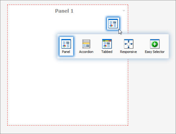
There are five types of containers:
- Panel. A simple container that can hold a single piece of content.
- Accordion. A compound container that can hold one or more pieces of content. It uses accordion panes to switch between the content.
- Tabbed. Similar to the accordion, but uses tabs to switch between the content.
- Responsive. A compound container that responds to the layout changes based on the size of the browser or device.
- Easy Selector. A simple container that a flexible way of adding content to a portal at run time without opening the Resources tree.
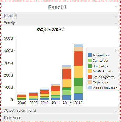
Panels
|
Topics: |
The panel container holds a single piece of content, as shown in the following image.
The panel consists of three sections:
- Overall panel
- Title Bar
- Content Area
When you hover over a panel in Page Designer, the Change Panel Type button is illuminated. When you then hover over this button, you are presented with a menu where you can change the type of the panel.
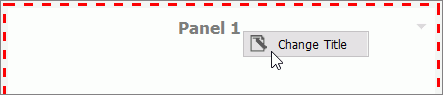
To change the title of the panel, right-click the title bar and click Change Title, as shown in the following image.
Panel Properties
The properties for all panel types are:
- Properties Tab.
Contains the properties that apply to the panel.
- Panel Title. This is the name of the panel. In a simple panel, the title begins as Paneln, where n is a unique number, starting at 1.
- Size. In a single area layout, this is both height and width in pixels. In column-based layouts, this is height only. You can set the height, in pixels, to Auto, Dynamic, or a numeric value. The Dynamic height option is only available when you use a responsive container.
- Responsive Properties. Opens the Responsive Panel Properties dialog box, where you can edit the layout of the responsive container.
- Behaviors. You can
configure how the panel behaves. By default, all options are on. The options
that require a menu click are available by hovering over the title bar and
accessing the menu at the upper-right (in accordion and tabbed containers, each
area has a menu as well). The options are as follows:
- Move. If selected, allows you to move a panel on a page at run time.
- Resize. If selected, allows you to resize a panel at run time.
- Minimize. Adds the Minimize option to the panel drop-down menu.
- Maximize. Adds the Maximize option to the panel drop-down menu.
- Refresh. Adds the Refresh option to the panel drop-down menu.
- Hide. Adds the Hide option to the panel drop-down menu.
- Delete. Adds the Delete option to the panel drop-down menu. When a user deletes a panel, they delete it only from their version.
- Show Comments. Displays comments on a panel, and adds the Show/Hide Comments option to the panel drop-down menu, if selected.
- Appearance. You can
control the following options:
- Hide Panel. When this option is selected, the panel is not initially visible. The user can add it by clicking Hidden Content in the page shortcut menu or the Menu Bar. You can use the Hidden Content feature to give the user a choice of widgets to view on their page.
- Freeze Container. Prevents users from adding content to and removing content from the container at run time. This option also restricts any interaction with the container at run time except minimizing, maximizing, and restoring the panel to its original size. This option is not available when the Lock Page option is selected.
- Title Tab. Contains
the properties that apply to the title bar of the panel.
- Title. This is the text displayed in the title bar. When you add content, it automatically changes to the current title of that content. You can edit this field to override the automatic change.
- Panel Icons. Works just like the page icon. It is disabled by default.
- Change Image. Allows you to select a different image for the icon.
- Appearance. You can
control the following options:
- Hide Title Bar. You can hide the title bar to save space. This feature is very useful when you have only a single piece of content on a page.
- Show Menu Icons. Determines whether the icons that display with the options in a container shortcut menu are visible.
- Content Tab. Contains
the properties for a content item that is displayed inside the panel.
- Content Area. The properties for the Content Area differ based on the type of content. A blank panel has a blank properties panel.
- Auto Refresh. If enabled, refreshes the content automatically. This property is off by default. When it is enabled, the default time is 30 seconds.
- Dynamic Report Styling. When this property is enabled, all reports that run within the BUE portal inherit their styling from the portal.
- Tabs/Areas Tab. Contains the properties that apply to tabs and areas. This tab is only visible in the properties panel of a tabbed or accordion container. Here you can style different areas of the container by selecting Buttons or Bar. You can also hide the new tab button from a tabbed container, or the new area button from an accordion container, to restrict adding more tabs and areas to this container at run time.
Accordion Container
The accordion container can hold more than one piece of content, as shown in the following image.
In the preceding image, notice how the chart fits perfectly in the container. WebFOCUS InfoAssist+ has an option to AutoFit charts. When enabled, it accepts the sizing from the portal. This prevents the person who develops the chart and the person who uses it from having to coordinate sizing. Additionally, you can easily resize the container and see the entire chart.
The title bar and content area properties are the same. The overall properties have an additional section labeled Area.
In the Area section, you can use the icons in the order in which they appear to add, rename, delete, and reorder the areas. You can also create a new area using the new area bar in the container or delete containers using the menus. You must use the Properties panel to rename or reorder the areas.
There is also an additional Properties panel, the Pane Title Bars, which is accessible only through the breadcrumb trail. This feature lets you style the title bars of the areas. They are all styled together, but you can style the different states to distinguish the currently active one from the one on which the mouse pointer is resting.
Tabbed Container
The tabbed container can hold more than one piece of content, as shown in the following image.
The tabbed container has all the same properties as the accordion container. Instead of the Pane Title Bars properties, it has a property panel called Tab Bar. You can access this property panel by clicking it.
Unlike the Pane Title Bars, it is not blank. You can choose to style the buttons or the bar.
Responsive Container
|
Topics: |
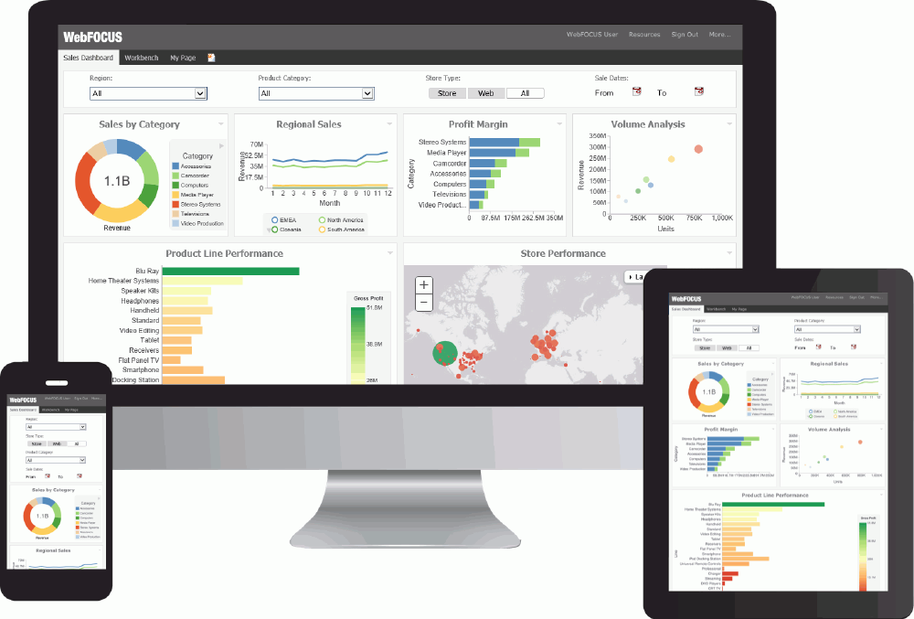
The responsive container is designed to help you build a responsive portal that automatically adapts to different screen sizes and mobile devices, providing an optimal viewing experience for users everywhere. You can build your responsive portal on your desktop, and make it available to users on different platforms. The following image shows an example of a responsive portal displayed on a desktop, tablet, and smartphone.
The responsive container intuitively changes its layout when you change the size of your browser. The default width and height of the container, and the inserted items, are pre-configured to offer the best positioning of the elements on the screen. You can manually change the dimensions of the items in the Responsive Item Properties dialog box. You can also change the layout options in the Responsive Panel Properties dialog box.
Responsive Item Properties
The Responsive Item Properties dialog box provides options to change the dimensions of an individual item within the responsive container. You can access the Advanced Responsive Item Properties dialog box at design time by clicking the Responsive Properties button in the property sheet.
The properties for a responsive item are:
- Custom CSS Classes. Enables custom CSS classes for the item.
- Width. Defines the width of the item.
- Height. Defines the height of the item.
- Margin. Defines the space between the adjacent items.
- Shrink. Defines the ability of the item to shrink if necessary.
- Grow. Defines the ability of the item to grow if necessary.
- Basis. Specifies the initial size of the item, before any available space is distributed according to the responsive factors.
- Minimum Width. Sets the minimum width of the specified element. This setting overrides the Width setting.
- Maximum Width. Sets the maximum width of the specified item. This setting overrides the Width setting.
- Minimum Height. Sets the minimum height of the specified item. This setting overrides the Height setting.
- Maximum Height. Sets the maximum height of the specified item. This setting overrides the Height setting.
- Self Align. Provides
access to the following options:
- Auto. Intuitively places the item in the best available space inside the responsive container.
- Start. Aligns the item to the left side of the responsive container.
- End. Aligns the item to the right side of the responsive container.
- Center. Aligns the item to in the center of the responsive container.
- Stretch. Stretches the item to fill the available space inside the responsive container, while respecting width and height constraints.
- Baseline (text). Aligns the baseline of text inside the responsive container.
Note: In a responsive layout, setting fixed dimensions for items is not recommended, because the viewport width and height continually change from device to device. Responsive layouts need to adapt to this change, whereas fixed dimensions create too many constraints. For this reason, you must only set a range between minimum and maximum width and height, defining an amplitude with which the item can vary in size.
Easy Selector Container
The easy selector container provides a simple way to add content to a portal at run time, without opening the Resources tree. It also gives you the option to control which items users can access. When you insert an easy selector container into a page at design time, the Browse For Folders dialog box opens, as shown in the following image. Here you can select a folder that users can access at run time.
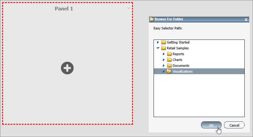
To change a target folder, click the Change Folder button in the Properties panel.
Content
You can add content to a page in a few ways. The first way is to use the ribbon. Navigate to the Insert tab and choose a type of content in the Content group. The second way is to insert a blank panel, area, or tab container, and use the WebFOCUS Resources option to populate it. The Resources tree opens, allowing you to drag content into the page.
Note: When you click and drag one or multiple resources or folders from a tree to a blank page, a tabbed container is created, showing each resource.
The other three options (Image, Resource Tree, and Text) place their content in the content area that is selected, if applicable. Alternatively, they create a new panel with the content on the page.
WebFOCUS Resources
The WebFOCUS Resource option opens the Resources tree on the right-hand side of the window. The tree shows you the content stored in the WebFOCUS Repository. You can access this content in the Domains section of the tree. Alternatively, you can find a resource that you marked as a Favorite.
The Resources tree is docked on the right. When it is docked, you can keep it open, close it, or unpin it so that it collapses to the side. The Resources tree is shown in the following image.
Text
The last type of content is text. The text area is simple to use. All styling is applied to all the text. You cannot style individual words or characters.
The text area has no properties other than the content type and the Area ID.
| WebFOCUS | |
|
Feedback |