Generating Sample Content
|
Topics: |
This topic describes how to generate sample content from uploaded or existing data using the Samples Generator. It also provides information about how to interpret and analyze the sample content.
Generating Sample Content Overview
|
How to: |
The Samples Generator automatically generates a suite of analytic content based on uploaded Excel workbooks, CSV files, or existing single-segment Master Files in your repository. The Samples Generator populates your directory with sample charts, reports, and dashboards. Additionally, the suite contains charts and reports that provide quick and easy navigation through the levels of each available hierarchy. You can view, edit, or delete this content, or use it as a starting point to create new dashboards.
The Samples Generator feature is useful to the novice user, because it introduces all major analytic content types in the InfoAssist+ toolset. Depending on the structure of your source worksheet or synonym, the Samples Generator automatically creates the following items:
- Active dashboards:
- Initial Dashboard
- Initial Dashboard by Year
Note: This item is only generated if your source dataset includes an eligible date, which contains data for minimum three unique months.
- Reports:
- Auto-drill report starting at the top of each identified hierarchy
- Overview accordion report
- Overview active report
- Charts:
- Pie chart
- Bar chart
- Line chart
Note: Line charts are only created if your source dataset includes an eligible date, which contains data for minimum three unique months.
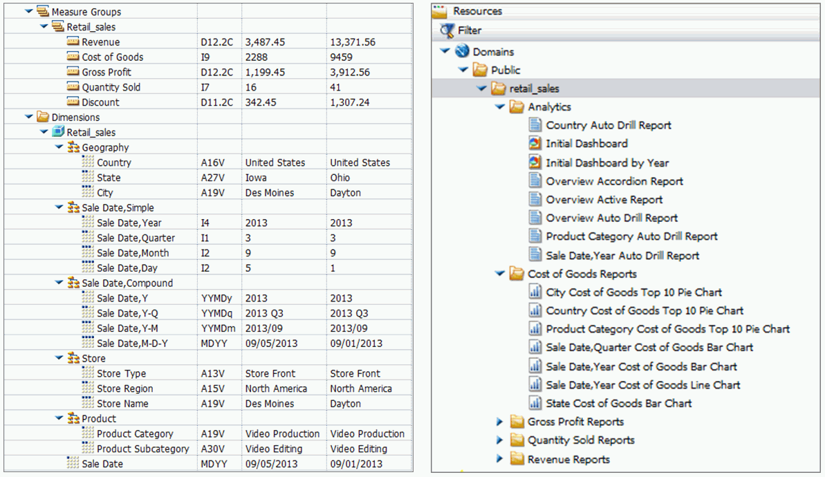
The dashboards, auto-drill reports, overview accordion report, and overview active report are stored in the Analytics folder. All other items are placed in the folders that are named after the measures for which they are created. The content may vary depending on the structure and size of your synonym.
To see the most complete suite of analytical content, it is recommended that you use a data source that contains at least four measures, six dimensions, and data for a minimum of three unique months. Additionally, a record count called Trans appears in the sample content, if there are not sufficient measures available for analysis.
Note: Virtual fields, such as COMPUTE and DEFINE, are not eligible for selection as dimensions or measures in the generated content.
The following image shows an example of a synonym and the suite of sample content generated from this synonym and displayed in the Resources tree.
Note: If you generate sample content more than once from the same source worksheet or synonym in the same location, the Samples Generator creates a new folder with an underscore and number appended to the title. For example, if a retail_sample folder already exists in a domain or folder, a new folder with the new set of content is created and titled retail_sample_1. The number is incremented each time you repeat this action.
You can generate sample content from one of the following ways:
- By navigating to the Sample Content option from the New option in the Resources tree for access to existing data.
- By uploading an Excel spreadsheet or CSV file and selecting the Gain Insight option at the end of the upload procedure.
Procedure: How to Generate Sample Content From the Resources Tree
- In the
Resources tree, right-click a domain or folder, point to
New, and then click
Sample Content.
The Open dialog box opens.
Note: Only single-segment Master Files are displayed for selection.
- Locate a
single-segment Master File that you want to use for generating sample content
and click
Open.
The new folder with the same name as your Master File appears in your chosen directory. It contains sample charts, reports, and dashboards.
Procedure: How to Generate Sample Content From the Upload Wizard
- Upload a
spreadsheet.
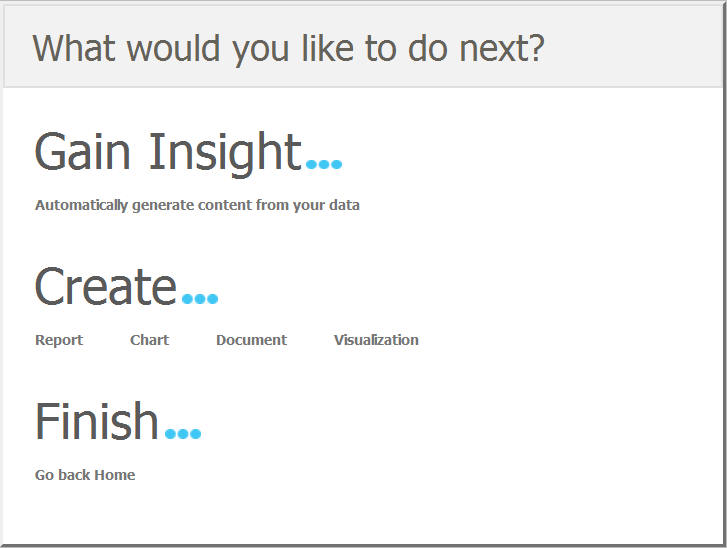
After the Upload procedure is complete, a selection screen opens, as shown in the following image.
Note: Generating sample content on Master Files uploaded to a temporary folder, such as FOCCACHE, may produce unexpected results.
- Click
Automatically generate content from your data.
The sample content is generated in the same folder that you selected for your upload.
Analyzing Sample Content
The following section provides a closer look at each content type, and explains how this content is generated. These examples have been generated using the retail_data_extract.xlsx spreadsheet that is provided with your WebFOCUS installation.
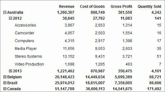
- Initial Dashboard by Year
-
The Initial Dashboard gives you a quick overview of your data. It is comprised of three charts and one report, as shown in the following image. Additionally, it displays a drop-down menu, which allows you to narrow down your results to a specific year. The Initial Dashboard by Year is only generated if your source worksheet or synonym includes an eligible date, which contains data for a minimum of three unique months.
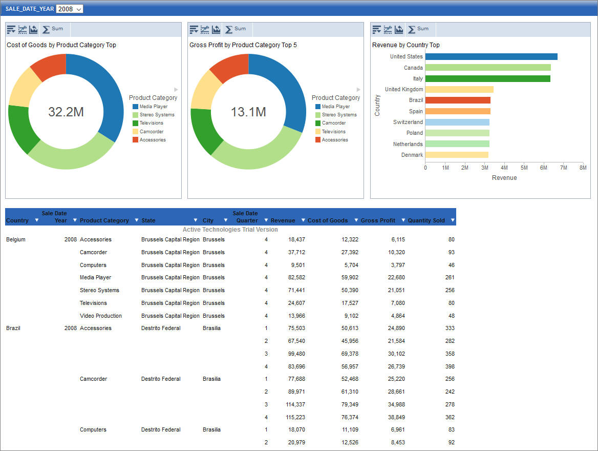
The bar chart is generated from the first measure and first dimension in the source spreadsheet or synonym. It shows the Top 10 values.
The first pie chart is generated from the second measure and second dimension. It shows the Top 5 values.
The second pie chart is generated from the third measure and third dimension. It shows the Top 5 values.
The active report shows an overview of all measures and dimensions in the source worksheet or synonym.
- Initial Dashboard
-
The Initial Dashboard is identical to the Initial Dashboard by Year, with the exception that the year drop-down menu is not displayed.
- Auto-drill reports
-
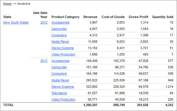
The auto-drill reports are generated for each of the identified hierarchies in the synonym. For example, if your data set contains three hierarchies, the Samples Generator automatically creates three auto-drill reports and one overview auto-drill report. In each auto-drill report, the first four measures in the data set will be summed up by the dimension values in the hierarchy. The report also features data bars and grand totals for each dimension in the hierarchy. The name of the hierarchy is reflected in the title of the report. For example: Dimension_Auto_Drill_Report.fex where Dimension is the top level of the hierarchy. The following image shows an example of an Overview Auto-Drill Report.
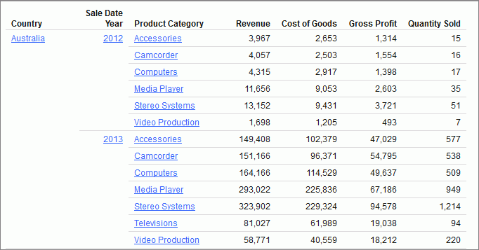
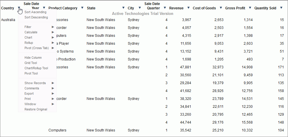
Click one of the links to drill-down to the lower level, as shown in the following image. You can use the breadcrumbs to navigate back to the original report.
- Overview Accordion Report
-
The Overview Accordion Report provides a way to control the amount of sorted data that appears on a page with the expandable views of data for each vertical sort field. It contains up to three dimensions and the first four measures that are found in your source synonym. The report displays total values for each measure. The following image shows an example of an Overview Accordion Report.
- Overview Active Report
-
The Overview Active Report contains one BY field for each dimension. The report displays maximum of six dimensions and four measures. The total values are displayed for each measure. Each field features a drop-down menu, where you can access active report options. The Overview Active Report is always generated and resides in the Analytics folder. The following image shows an example of an Overview Active Report.
- Pie Charts
-
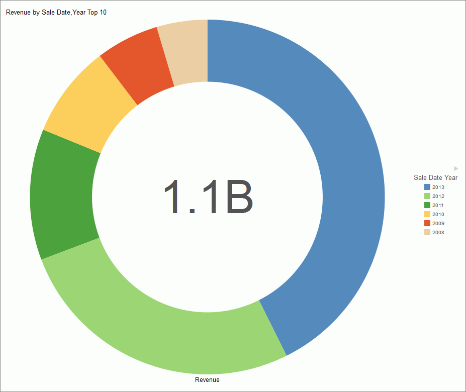
The Samples Generator uses the first four measures to create Pie charts, by pairing these measures with up to three different dimensions found in the source synonym. Each pie chart shows the Top 10 values. The number of pie charts may vary depending on your synonym structure. The following image shows an example of a pie chart created by the Samples Generator.
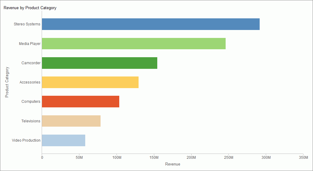
- Bar Charts
-
The Sample Generator creates bar charts for each measure paired with up to three different dimensions. Each bar chart shows all values in the dataset for that dimension. If there are more values than can be displayed on the screen, a scrollbar appears. The number of bar charts may vary depending on the structure of your synonym. The following image shows an example of an automatically generated bar chart.
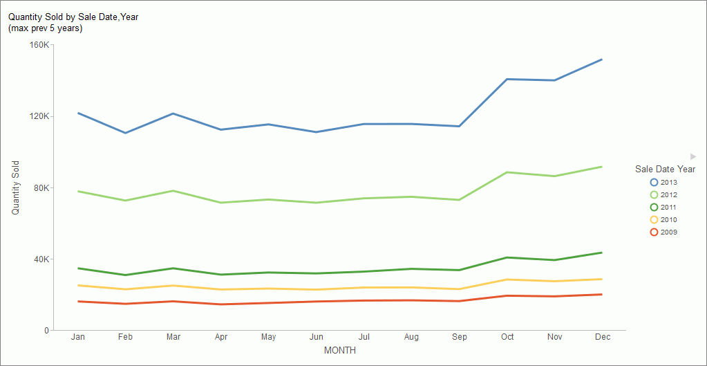
- Line Charts
-
Line charts are only generated, if your source dataset includes an eligible date, which contains data for minimum three unique months. If this data is present in the dataset, a line chart is created for each measure. The following image shows an example of a line chart.
| WebFOCUS | |
|
Feedback |