Topics: How to: |
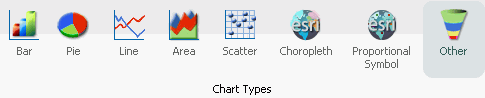
On the Format tab, the Chart Types group provides buttons for each of the five most commonly-used chart types. These include Bar (default), Pie, Line, Area, and Scatter. You also have access to Esri Choropleth and Proportional Symbol maps. A button labeled Other gives you access to the complete chart library of advanced charts.
The Chart Types group is shown in the following image.
When switching between chart formats that use a different syntax, you are prompted with a message that allows you to proceed with the change, or cancel your request. This message is shown in the following image.
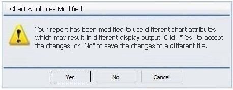
On the Chart Attributes Modified dialog box, you can click Yes to accept the changes or click No to save the changes to a different file and preserve the originating procedure (.fex).
You can run this procedure in Query Design view or Live Preview.
-
On the Format tab, in the Chart Types group, click
the button of the chart that you want to create. Bar chart is the
default.
The chart appears on the canvas.
-
Populate the chart with your data in one of the following
ways:
- Drag the dimension fields and measure fields onto the chart.
- Drag the dimension fields and measure fields into the appropriate Query field containers in the Query pane.
You can run this procedure in Query Design view or Live Preview.
-
On the Format tab, in the Chart Types group, click Other.
The Select a chart dialog box opens. The chart types, depicted by icons, display on the left side of the dialog box.
-
To display the name of a chart type, hover over the chart
type with the mouse.
From top to bottom, the chart type categories are Bar, Line, Area, Pie, XY Plots, 3D, Stock, Special, HTML5, and Map.
Note: For streamgraphs, which are in the HTML5 category, the tooltip has been enhanced to display specific information, by data point, depending on the underlying data source.
-
Click a chart type.
All supported variations of the chart type appear as thumbnail images in the dialog box.
-
Click an image to display a detailed description of that
chart type.
If you are not familiar with a chart type, be sure to read the description carefully before finalizing your selection. Some chart types require a certain number of data values, or a certain type of data values. If your data does not satisfy the requirements, the chart will not accurately represent the data.
You can also hover over an image with your mouse to display the chart type name.
- In the Select a chart dialog box, click OK to finalize your selection and close the dialog box.
-
Populate the chart with your data in one of the following
ways:
- Drag the dimension fields and measure fields onto the chart.
- Drag the dimension fields and measure fields into the appropriate Query field containers in the Query pane.
You can run this procedure in Query Design view or Live Preview.
-
On the Format tab, in the Chart Types group, click
the button of the chart that you want to create. Bar chart is the
default.
The chart appears on the canvas.
-
Populate the chart with your data in one of the following
ways:
- Drag the dimension fields and measure fields onto the chart.
- Drag the dimension fields and measure fields into the appropriate Query field containers in the Query pane.
-
Change a series type in one of the following ways:
- Ribbon: On the Series tab, in the Select group, select the series that you want to display in a different chart type. Then, in the Properties group, from the Type drop-down menu, select the chart type.
- Shortcut Menu: Right-click the series that you want to display in a different chart type, point to Series Type, and click the chart type.
The series appears in the new chart type.
When you create a dual-axis chart, you assign one data series to the Y1 axis and another data series to the Y2 axis.
- Create a chart.
-
On the Format tab, in the Chart Types group,
click Other.
The Select a chart dialog box opens.
- Select a dual-axis chart, such as dual-axis bar, and then click OK.
- Drag one field onto the Y1 field, and then drag another field onto the Y2 field.
When you create a multi-axis chart, you assign one data series to the Y1 axis and another data series to the Y2, Y3, Y4, and Y5 axes (as needed).
- Create a chart.
-
On the Format tab, in the Chart Types group,
click Other.
The Select a chart dialog box opens.
- Select a multi-axis chart, and then click OK.
- Drag fields onto the Y1, Y2, Y3, Y4, and Y5 fields, as needed.
You can create charts using one of the following output formats:
- HTML
- HTML5 (default)
- active report
- Excel
- PowerPoint
The HTML5 output format allows you to render a chart in the browser using a built-in JavaScript engine. Charts with this output format utilize the very latest capabilities of the HTML5 Web standard, including animation, high-quality vector output, and attractive alpha-channel and gradient effects.
Note: Not every chart type can be output in every format listed here. To make sure that the chart that you are creating can be output in the format that you want, please see the topic for that particular chart type.
| WebFOCUS |
Feedback |