WebFOCUS InfoAssist+ Enhancements
|
Topics: |
InfoAssist+ is a powerful report generation tool that enables business users to leverage ad hoc functionality. With InfoAssist+, you can generate highly complex reports, charts, and documents from any enterprise information source without IT intervention. You can also analyze multiple reports and charts simultaneously and output report data in a variety of formats.
Esri On Premise (Offline) Mapping Capabilities in InfoAssist+
|
Topics: |
The Esri On Premise functionality enables you to download and access mapping files through the use of a local Application Programming Interface (API). Once you download and configure the API, you do not need an internet connection to utilize the robust mapping features that Esri provides.
The Esri On Premise functionality provides you with local access to Esri mapping files. The following components are supported when using this functionality:
- Offline Basemaps. Basemaps are an offering from ArcGIS. Standard basemaps are provided for your use offline. In InfoAssist+, these basemaps are known as backgrounds. In an online setting, there are 10 basemaps available. In order to use offline basemaps, you need to use a tiled mapservice published in the ArcGIS Server.
- Offline Geographic Roles. Geographic Roles are used to visualize measures with commonly known dimensions (for example, Country, State, Cities, and so on). These provide the location information often in the form of (x/y) needed to plot on a map. Geographic roles are pre-defined for online users through ArcGIS Online. In InfoAssist+, a geographic role defines the geographic component that you can select when creating a map (for example, State or Continent). For an offline user, the options that display can be customized in the geoservices.xml file.
Note: Demographic Layers are not supported in an Esri On Premise environment.
Learn More
For more information about this feature, see the Creating Maps to Illustrate Trends topic in the InfoAssist+ Technical Library.
Dynamic Navigation: Auto Drill and Auto Linking
|
Topics: |
Auto Drill and Auto Linking enable you to navigate your data and streamline the effort needed to create drill downs. Auto Drill enables you to navigate through different levels within the dimension hierarchy of your data source. This allows you to review underlying data for a particular area, and move through the structure of your data source based on your informational needs. All that is required is a hierarchical data source.
Auto Linking makes it easy to connect reports and charts in your development environment, expanding the reporting capabilities of your organization. Using Auto Linking, you can dynamically link HTML reports, active reports, and HTML5 charts with a single report or chart of any format, based on their common sort (BY) fields and parameters referenced in any filters. It is this commonality that dynamically links content in your WebFOCUS repository, allowing you to discover new possibilities in your data, and explore new relationships within your reporting enterprise. In addition, Auto Linking saves development time and effort, because drill downs do not need to be manually created and maintained.
Auto Drill and Auto Linking give you the advantage of navigating your data dynamically by simply selecting these report options. These features broaden your analytical insights, giving you access to different views of your data through these dynamic links.
Learn More
For more information about these features, see the Using Auto Drill and Using the Auto Linking Feature to Link Content topics in the InfoAssist+ Technical Library.
Mapping: Esri Online
|
Topics: |
Using InfoAssist+, you can create maps to identify patterns or trends in your data. By converting data into values that can be displayed on a map, you are able to visualize scenarios, illustrate hot spots, and identify potential problem areas. For example, a law enforcement agency may use the mapping functionality to identify areas of higher crime within the locations they cover. You can also use maps to determine how places are related, understand where things are located, and identify the best actions to take. By illustrating trends on a map, a decision maker can identify patterns easily, and reach conclusions sooner.
There are two types of maps in InfoAssist+: Choropleth and Proportional Symbol (Bubble). A Choropleth map is a common thematic map that uses geographical measures (for example, states and countries), representing the values aerially while employing a varying intensity of colors. A Proportional Symbol (Bubble) map represents coordinates, such as an address or intersection, using symbols of different sizes to represent any measure. These maps focus on specific areas, for which data concentrations may vary. When the data concentration is larger, the bubble will be bigger. You can experiment with both types of maps to explore your data in different ways.
- Backgrounds. Display a layer that positions data as it is located, in context to other geographical features, such as streets, terrain, and imagery. Some standard Background options may combine road, aerial, and topographic data using a variety of symbols. Hosted on Arc GIS, you can change your background at any time, to review your data in a different context. When you apply a Background to your map, its appearance changes. You can then adjust the view of your data, showing different terrain or geographical views. Backgrounds provide at least 17 levels of zoom. For more information, see https://developers.arcgis.com/javascript/jsapi/esri.basemaps-amd.html.
- Reference Layers. Display a layer of boundaries and locations that range from a continental scale to country, state, and even local neighborhood. For example, if you are viewing World data on electricity usage, you may want to add a Reference Layer that displays the borders and concentration of your data within each country.
- Demographic Layers. Display a layer of information about people and businesses in a specific demographic area. This includes the United States and 120 other countries. Demographic Layers are thematic maps that provide additional information about the location, such as spending habits, population, and lifestyles. You can add Demographic Layers to a map about sales data, to identify new locations for stores, based on the spending habits for a specific area.
WebFOCUS InfoAssist+ with the Esri integration delivers insight into your data, helping you illustrate and identify trends so that you can make informed decisions and take action quickly.
Learn More
For more information about this feature, see the Creating Maps to Illustrate Trends topic in the InfoAssist+ Technical Library.
Parameter-Driven Charts and Reports
|
Topics: |
When creating reports, charts, or documents, you can add parameters to enable options for selection at run-time. This gives you the full advantage of reviewing and comparing your data using convenient drop-down lists that help you quickly gain insight into your data.
You add parameters by right-clicking on any field container, except Multi-graph, and simply clicking New Parameter. This creates a new, unique Parameter field container, into which you can place any number of measures and dimensions in accordance with how you want them to display at run time. You can also rename the parameter, using a relevant label, to organize different parameters categorically.
Once you have defined your parameters and selected the relevant data fields, run the report, chart or document. Using the drop-down lists for each parameter, you can select different options from the parameter lists to view the data in your report, chart, or document dynamically. You can then select different parameter options and re-run the report, chart, or document and your data is refreshed based on these new selections.
When you define parameters, you can dynamically select different options at run time, giving you the advantage of reviewing different data scenarios on the fly. Once your parameters are set up, the run- time options enable you to quickly and easily navigate different data relationships and make relevant, rapid decisions with your data.
Learn More
For more information about this feature, see the Adding Parameters for Data Selection at Run Time topic in the InfoAssist+ Technical Library.
Data Enrichment and Esri Tapestry Segmentation
|
Topics: |
When working with maps, you can use Demographic Layers to enrich your BI data. These Demographic Layers display a layer of information about people and businesses in a specific demographic area. This includes the United States and 120 other countries. Demographic Layers are thematic maps that provide additional information about the location, such as spending habits, population, and lifestyles. You can add Demographic Layers to a map about sales data, to identify new locations for stores, based on the spending habits for a specific area.
The mapping functionality of InfoAssist+ with the Esri integration, through ArcGIS Online, supports the most recent demographic and Tapestry Segmentation lifestyle information. This includes metrics such as total population, family size, household income, and more. It also includes consumer spending information on many types of products. In InfoAssist+, you can access and apply these Demographic Layers, which provide added context and information to any map that you create.
When selecting Demographic Layers, you can choose from any of the pre-defined demographic profiles. You can select multiple options in either category (Lifestyle or Population) to gain additional insight into your data. Specifically, each Demographic Layer has its own profile and provides a layering option, when comparing values across different layers or profiles.
Demographic Layers give you the added insight that you need to make accurate, quick decisions. By providing you with layers that contain information about people, businesses, and other trends, you can easily identify patterns in your data and make the decisions that matter most.
Learn More
For more information about this feature, see the Creating Maps to Illustrate Trends topic in the InfoAssist+ Technical Library.
InfoAssist+ Report, Chart and Visualization, Document, and General New Features
|
Topics: |
The following new features apply to InfoAssist+ reports, charts, visualizations, and documents. General new features are also described.
Reports
|
Topics: |
The following new features have been added for reports.
Using Auto Drill to Navigate the Hierarchy of Your Data
Auto Drill, which can be enabled from the Navigation group on the Format tab, allows you to navigate the hierarchy of your data. You can drill down or drill up on a data field, depending on your location in the hierarchy, as shown in the following image.
Note: This new feature is available in Report and Chart modes. Auto Drill is automatic in Visualization mode.

As you are navigating the levels of hierarchy in your data, Auto Drill places a breadcrumb header at the top of the report with identifying information about the current category that displays. This enables you to quickly identify your location in the structure of your data and aids in navigating the hierarchy.
Adding Parameters for Data Selection at Run-Time
You can add new parameters to your report or chart to create parameter options for selection at run-time. Each parameter that you add becomes a field container into which you can add one or more measures and dimensions. This feature offers on-demand, dynamic report and chart creation at run time.
Note: This new feature is available in Report and Chart mode, but not Visualization mode.
You can add one or more parameters to your report or chart. The parameters that you add and the data fields that you specify determine the parameter and drop-down list contents at run time, as shown in the following image.

You add parameters by right-clicking a field container in the Query pane, as shown in the following image.

AutoFit Functionality
You can now use the AutoFit functionality when working with reports. To enable this functionality, on the Layout tab, in the Report group, click AutoFit, and then click Report. This feature enables HTML reports to grow proportionally at design time, as additional fields are added. It automatically resizes the report output at run time to fit into the container in which it is placed. The AutoFit button also allows you to specify Column, which compresses the report columns to the width of the widest data instance. Column is the default, as shown in the following image.

AutoFit functionality is also available in the Size & Arrange group on the Layout tab when working with charts.
Note: This new feature is also available in Chart mode.
Support for Date Field Values in Filter Dialog Box
When creating a filter using a date field, the Value option is set to Today. You can optionally select Beginning of Month, End of Month, Beginning of Quarter, End of Quarter, Beginning of Year, End of Year, or Custom date using the calendar that displays when you make that selection. These options are shown in the following image.
Note: This new feature applies to all modes, except Visualization mode.

Options for Aligning Your Page Footer
The Additional alignment options icon  , which is located in the Page Footer section of the Header & Footer dialog box, provides options for aligning your page footer.
You can place the footing that you specify at the bottom of your report relative to the data or to the page.
, which is located in the Page Footer section of the Header & Footer dialog box, provides options for aligning your page footer.
You can place the footing that you specify at the bottom of your report relative to the data or to the page.
Charts and Visualizations
The following new features have been added for charts and visualizations, as specified.
Narrative Charts
Narrative charts tell the story of your data. When creating a bar, line, area, or pie chart or visual in chart or visualization mode, respectively, you can bring it to life with words that describe your data, as shown in the following image.

If your administrator has activated this feature for you, you can enable Narrative Charts from the ribbon. On the Format tab, in the Features group, click Narrative. This will add descriptive text for the current chart or visual.
Narrative charts let you communicate about your data, summarizing data values and providing an interpretation of the results. For more information on the syntax behind narrative charts, see the Creating HTML5 Charts With WebFOCUS Language manual.
New Legend Properties Added for Docking and Scrolling
When working with legends in InfoAssist+, you can now specify how your legend will be docked. This feature controls the display of entries in your legend.
The Docking State is set to Expanded by default, but you can optionally specify Collapsed or None. If your legend is set to Expanded, you can use the grey arrow to expand or collapse it, as needed. If you set the Docking State to Collapsed, InfoAssist+ will show that the legend is available (using the grey arrow). This option saves real estate in your chart by collapsing the categorical text labels in the legend while preserving the legend label colors. This is particularly useful when items in your legend have long labels and you wish to truncate them for the purposes of display. If you specify None, the ability to expand or collapse the legend is removed and the grey arrow no longer displays.
You can also enable and disable scrolling for your legend. The Enable Scrolling check box is selected, by default. The ability to scroll is particularly useful when you have numerous entries in your legend. To disable scrolling in your legend, clear the Enable Scrolling check box. All legend options display in columns and a scroll bar does not display.
The Docking State and Enable Scrolling options are shown in the following image.

Show Axis Title Capability Added
Using the Show title option on the Format Axis (Horizontal or Vertical) dialog box, you can show or hide axis titles in your chart. This gives you control over the display of your axis titles, enabling you to show or hide them, as needed. The Show title option, which is located on the Title tab, is shown in the following image.

Scrolling Capability Added for Various Chart Types
The ability to scroll across a large dataset has been added for bar, line, area, scatter, bubble, and all matrix charts. When working in visualization mode, scrolling capability automatically engages when the underlying dataset is large enough to warrant scrolling. In all other modes, you must enable the functionality. You can enable or disable this functionality by selecting the Auto Enable X-Axis Scrolling check box in the Interactive Options dialog box, as shown in the following image.

Color BY Option Changes Legend Heat Scale to Markers
When you place a numeric field in the Color field container when creating a chart, the legend displays as a heat scale. When you place an alphanumeric or a date field (non-measure) in the Color field container, the legend displays as colored markers. To change how the legend displays, right-click the Color field container and click Color BY, as shown in the following image.

Ability to Select Chart Extensions in Visualization Mode
For visualization mode, you have access to the standard chart types, as well as a number of chart extensions that can be made available to you by your administrator. By default, a certain number of chart extensions are installed with WebFOCUS. Contact your administrator to access and use these extensions.
Enabling Trendlines in Charts and Visualizations
Using the Trendline option in the Properties group on the Series tab, you can add a trendline to your chart or visualization. A trendline is a line that is drawn over the plot area of a chart or visual to show the pattern of data points. The pattern reveals a statistical trend, as shown in the following image.

The mathematical equation for the selected trendline option is only available in chart mode. It is not available in visualization mode.
Addition of Heatmap Visual
Heatmaps have been added to visualization mode in InfoAssist+. A heatmap is a graphical representation of data where the individual values that comprise a matrix are represented as colors. Using radiant hues, you can track the intensity of a data relationship using the colors defined in the legend.
Heatmaps are useful when you are looking for hot spots in your data, or areas of focus or interest, as shown in the following image.

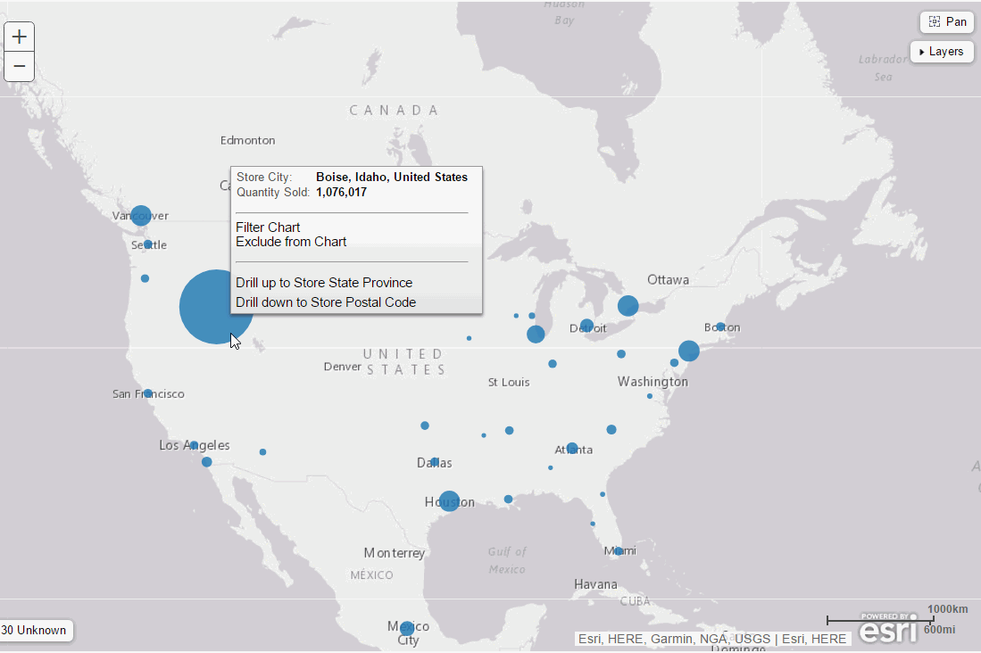
Drill Up and Down Through a Data Hierarchy in a Map
When working with maps in Visualization mode in InfoAssist+, you can drill up and down through the hierarchy of your data. To do so, use the tooltips that display when you hover over an area of a choropleth or proportional symbol (bubble) map, as shown in the following image.
Bubbles on Proportional Symbol (Bubble) Map Sorted by Radius
When working with a Proportional Symbol (Bubble) map, bubbles are sorted by radius. The bubbles are layered on top of one another, with the smallest bubble on top, as shown in the following image.
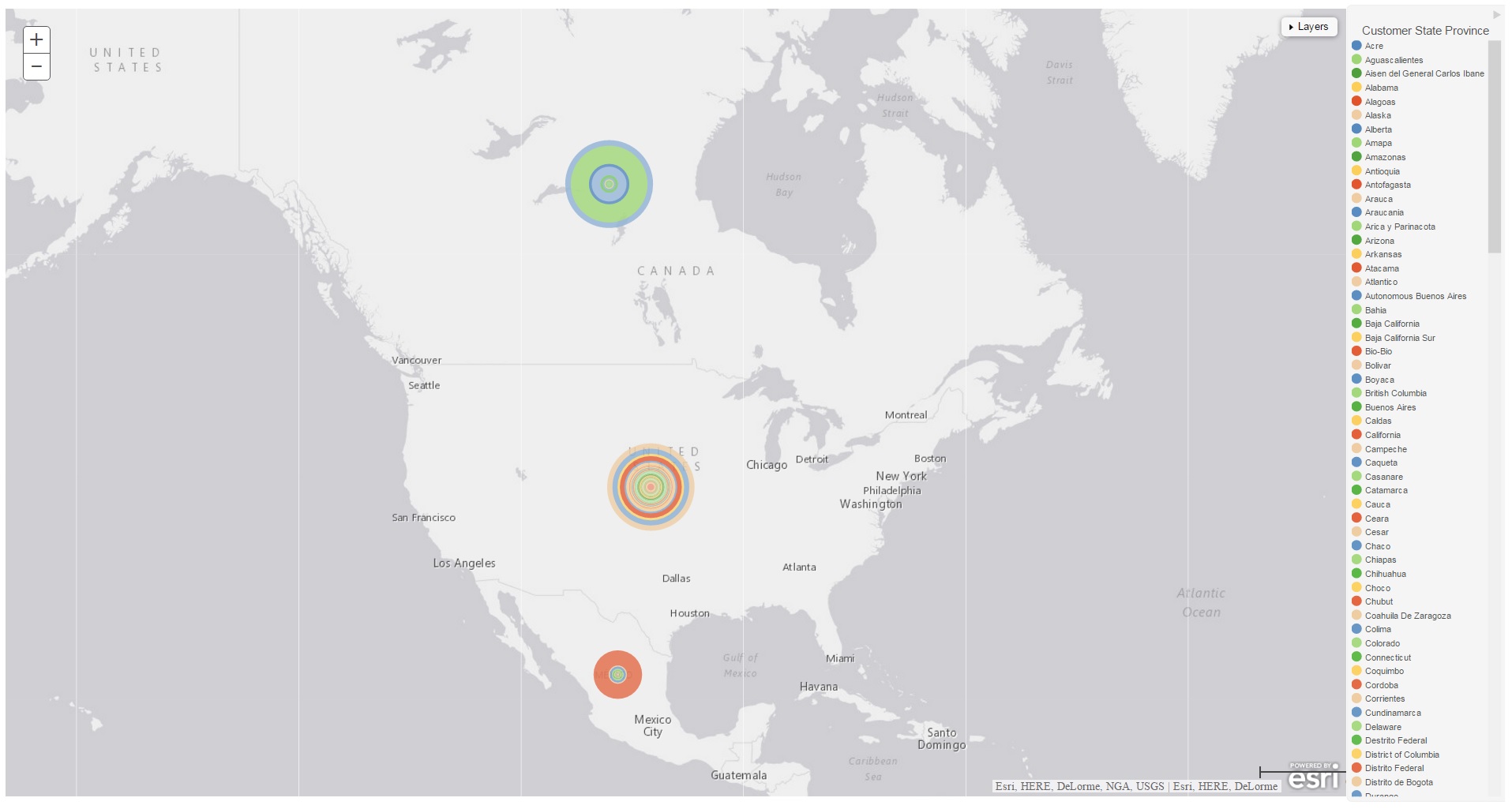
This layering makes it easy to review tooltip information for the relevant bubble. This applies to a single series or multiple series.
New Global Preference Added for Leaflet Maps
A new global preference has been added for InfoAssist+ in the WebFOCUS Administration Console for Leaflet maps. The option is located in the Chart Types section. The Leaflet Maps option enables the icons required for the use of Leaflet maps in both chart and visualization mode. The two Leaflet map icons enable you to select either a Choropleth or a Proportional Symbol (Bubble) map based on the Leaflet open-source JavaScript library for mobile-friendly interactive maps.
In chart mode, these icons are available in the Select a chart dialog box. In visualization mode, these icons are available in the Select a Visual dialog box.
If this setting is not selected in the WebFOCUS Administration Console, the Leaflet map icons do not appear. The Leaflet Maps option is selected, by default.
New Animate Field Container
The Animate field container enables you to animate time progression using a slider control. When you place a data field in this field container, a slider control displays in Live Preview. As you move the control along the slider bar, an animation effect results. The slider control has a Play button that allows you to play and pause the animation. When you click Play, the Pause option is activated, enabling you to pause the progression and analyze your data. Slider controls are limited to one sort field and should be time or sequence related, such as month or year. This field container displays for many different chart types, including pie charts, as shown in the following image.
Note: This new feature is available in Chart mode only.

Improvements to the Tooltip Information for Streamgraphs
The tooltip information that displays for streamgraphs, which are HTML5 charts, has been improved. The tooltip now includes more detailed information about the underlying data source, as shown in the following image.
Note: This new feature is available in Chart mode only.

Updates to Description Information for Charts Listed in the Other Chart Types Dialog Box
When working with chart types in the Other Chart Types dialog box, the description information for each chart type dynamically changes as you rest your mouse over each unique chart type. This provides you with quick access to a description for each chart, enabling you to quickly identify the relevant chart type. This facilitates the creation of the right type of chart based on your data.
Note: This new feature is available in Chart mode only.
An example of the description information that is available is shown in the following image.

Documents
|
Topics: |
The following new features have been added for documents.
Ability to Sort in an Active Dashboard
You can now sort values (ascending or descending) in an active dashboard. This option is specified on the Active Dashboard Properties dialog box, as shown in the following image.

Inserting Images in Documents
When working in document mode, you can insert existing images from your WebFOCUS Content folder or browse to any other directory in the repository that contains the required image files. The Open dialog box is shown in the following image.

General
The following general new features have been added.
Using Auto Linking to Connect Reports and Charts in Your Development Environment
Using the powerful features of Auto Linking, you can connect reports and charts in your development environment. Auto Linking enables you to dynamically link HTML reports, active reports, and HTML5 charts with a single report or chart in any format, based on their common sort (BY) fields and parameters references in any filters. You set one report as your Auto Link enabled report. This sets the reports or charts that can be auto-linked. In addition, you must also set reports or charts to be Auto Link targets.
Once your reports and charts are set with the relevant parameters, they display, at run time, in a cascading list, as shown in the following image.
Note: This new feature is available in Report and Chart mode only.

New Multi-Drill Functionality
You can create multiple drill-down links on a data field to external procedures or websites using the Drill Down dialog box. This is accessible from the Drill Down option in the Links group on the Field tab. You can also access this functionality by right-clicking on a data field in the Query pane. A configured multi-drill scenario is shown in the following image.
Note: This new feature is available in all modes, except Visualization mode.

When you run the report, the multi-drill links that you defined display when you click on a hyperlinked component of the report, as shown in the following image.

Replacing Existing Data Fields in the Query Pane
You can replace an existing field in the Query pane by dragging the new field from the Data pane so that it is over the data field in the Query pane. You can also drag fields from other field containers in the Query pane over a field in a different field container. A dotted line displays, indicating that this field will replace the existing field, as shown in the following image.

Release your mouse to confirm placement of the new data field. When replacing data fields, InfoAssist+ displays the field name of the replacement data field in a tooltip.
Multi-selecting Fields for Deletion in the Query Design Pane
In the Query Design pane, you can select and delete multiple data fields at one time. Press the Ctrl key, select two or more data fields, right-click, and then click Delete, as shown in the following image.

Enabling the Display of Missing Values for a DEFINE or COMPUTE
When working with DEFINEs and COMPUTEs, you can use the Missing Values option to enable or disable the display of missing values for a DEFINE or COMPUTE field. This allows you to accurately display missing values in reports, charts, and visualizations. The Missing Values option, which is accessible through the Additional Options button, is shown in the following image.

Search and Type Ahead When Creating Filters
When creating a filter, you can use the Search option to locate records in the list of values that displays, as shown in the following image.
Note: This new feature is available in all modes, except Visualization mode.

This functionality supports the ability to type ahead, as well as the use of wildcards, such as asterisks, to identify the values to include.
Integration of the Time Functions in the InfoAssist+ Filter Dialog Box
When working with date fields in the Filter dialog box in InfoAssist+, the Value field is set to Today. You can optionally select Beginning of Month, End of Month, Beginning of Quarter, End of Quarter, Beginning of Year, End of Year, or you can specify a custom date using the calendar that displays when you make that selection. The options in the Value field are shown in the following image.
Note: This new feature is available in all modes, except Visualization mode.

Additionally, if you create a filter on a full date field, the Value field will have a calendar icon adjacent to it, as shown in the following image.

You can use this icon to select a date using a calendar control.
Renaming a Report or Chart Component
You can define a custom title for a report or chart component in the Query pane by right-clicking on the component and clicking Rename, as shown in the following image.

Support for Double-Click on Folders in the Data Pane to Expand or Collapse Contents
When navigating folders and content in the Data pane, you can now double-click a folder to expand or collapse its contents. This applies to folders based on the hierarchy of your data source. It does not apply to fields that have additional fields within them.
You can also use the arrow adjacent to the folder name to expand and collapse folders.
New Default StyleSheet
In InfoAssist+, there is a new default StyleSheet, Warm.sty. It uses a clean and simple layout and design. You can take advantage of this StyleSheet when working with styling options for your reports and charts. It offers consistent text and color schemes, as well as a common look and feel. The primary difference between Warm.sty and ENWarm.sty, which is the new default StyleSheet for the WebFOCUS toolset, is that the selected font in Warm.sty should be language specific. This StyleSheet is selected, by default, in the Options dialog box, as shown in the following image.

The Warm.sty StyleSheet is stored in the following directory: c:\ibi\WebFOCUS82\IBI_HTML\ibi_themes
Changes to the Themes Dialog Box
In InfoAssist+, the Environment and Styling area provides settings for styling reports and charts through the specification of a Document Theme. Click the Browse button to open the Templates - Browse predefined template files dialog box, in which you can search for an existing WebFOCUS StyleSheet. The default StyleSheet is Warm.sty, but you can select from the other themes that are available (Dark.sty or Flat.sty).
StyleSheets are stored in the following directory of your WebFOCUS installation:
drive:\ibi\WebFOCUS82\IBI_HTML\ibi_themes
In addition, you can access a repository of additional themes by accessing the Legacy Templates, under Libraries, as shown in the following image.

The theme that you select determines the coloring and hues that display within InfoAssist+, as shown in the following image.

The default templates in the Templates section apply to all languages, whereas some of those in the Legacy Templates sections are specific to just one language (for example, EN=English).
Change in Default State of Excel Formats in InfoAssist+ Global Preferences
The default values for Microsoft Excel include: Excel 2000 format, Excel 2000 Formula, Excel 2007 Format, and Excel 2007 Formula. Enabled by default, you can modify their display by disabling them in the WebFOCUS Administration Console, in the Format tab section.
Updates to the Save As Dialog Box
When saving a read-only, non-writable procedure (.fex) in the Save As dialog box, the first writable folder is selected in the Resources tree, by default.
Opening Multiple Dashboards or Visualizations
From within InfoAssist+, you can use the Open option on the Quick Access Toolbar or the Application Main Menu to open one or more dashboards or visualizations at the same time. The Open option on the Application Main Menu is shown in the following image.

Using Field Containers to Control the Display of Data
InfoAssist+ provides a number of field containers that allow you to control the display of data. Field containers, which are part of the Query pane, hold the data fields that you select for inclusion in your report, chart, or visualization. This can be for an axis of a bar chart or the color of the pie slices in your pie chart. To add a data field to a field container, you can double-click a data field in the Data pane, or drag the data field to the desired field container. You can also rearrange data fields once they have been placed into a field container.
Some field containers are used for developing matrix charts, while others add size, color, and tooltip information to your chart or visualization. For example, the Tooltip field container allows you to specify the display of information in the tooltip for a data field that you place in this field container. Once you have added fields into certain field containers, InfoAssist+ allows you to specify additional options on the Field tab or through the shortcut menu. For a full list of field containers in InfoAssist+, see the InfoAssist+ Online Help.
The field containers that are available for charts are shown in the following image.

RStat Scoring Routines in InfoAssist+
RStat Scoring Routines have been added to InfoAssist+. The Define and Compute functionality in InfoAssist+, which is used to create virtual fields, supports the use of functions. These functions can be used to create expressions and calculations for use in your reports and charts.
Predictive models or scoring routines, built with the separately licensed WebFOCUS RStat for Predictive Analytics, allow you to add predictive analytics to your reports and charts in InfoAssist+. In order to access a scoring routine, an administrator or other designated individual must first deploy the scoring routine using App Studio. Once the scoring routine is deployed, it will appear in the RStat Scoring Routines folder and can be used when creating a virtual field. The following image shows RStat Scoring Routines that have been deployed and are ready for use.

Updated InfoAssist+ Splash Screen
The InfoAssist+ splash screen has been updated with the new Build a Visualization option. Selecting this option brings you directly to Visualization mode in InfoAssist+, where you can build visualizations and create storyboards. The updated splash screen is shown in the following image.

Running a Report or Chart with Default Parameter Values
From the Quick Access toolbar, you can now seamlessly run a report or chart with default parameter values. If you have parameters defined, the default value is the first data field defined for the parameter. If you do not have parameters defined, the report or chart will run, regardless.
The Run with Default Parameter Values option is shown in the following image.

| WebFOCUS | |
|
Feedback |