Generating a Docked Legend
|
How to: |
A docked legend is a minimized (collapsed) legend that shows only an active expand button and can also show pictograms of the legend.
Syntax: How to Generate a Docked Legend
legend:
        {
           dock:{
             enabled: enboolean,
             animate: anboolean,
             minimized: minboolean,
             resizeFrame: reboolean,
             showMarkers: shboolean,
             expandDirection: 'direction',
             button: {
               size: bsize,
               color: 'buttoncolor',
               hoverColor: 'hovcolor',
               border: {
                      width: borwidth,
                      color: 'bordercolor',
                     dash: 'dstyle'
                       }
                     }
                  }
        }
where:
- enboolean
-
Controls whether a docked legend will be generated. Valid values are:
- true, which enables a docked legend.
- false, which disables a docked legend. This is the default value.
- anboolean
-
Controls whether the expansion and contraction of the legend is animated using a slide action. Valid values are:
- true, which animates the expansion and contraction of the legend. This is the default value.
- false, which disables animation.
- minboolean
-
Controls whether a docked legend is initially collapsed or expanded. Valid values are:
- true, which initially displays a collapsed docked legend.
- false, which initially displays an expanded docked legend. This is the default value.
- reboolean
-
Controls whether the frame shrinks and expands as the legend is collapsed and expanded. Valid values are:
- true, which resizes the frame as the legend collapses or expands. This is the default value
- false, which does not resize the frame as the legend collapses or expands.
- shboolean
-
Controls whether a collapsed docked legend displays the legend markers. Valid values are:
- true, which displays legend markers on a collapsed legend. This is the default value.
- false, which disables does not display markers on a collapsed legend.
- 'direction'
-
Specifies the direction of expansion ('left', 'right', 'top', 'bottom' for a legend whose position is free. For legends whose positions are not free, the value is undefined, and the chart engine determines the direction of expansion.
- bsize
-
Defines the size of the button (defined as two times the distance from the center of the object to the furthest corner of the shape) in pixels, or can be 'auto' to draw the button the same size as the legend markers. The default value is 'auto'.
- 'buttoncolor'
-
Is a color specification string that defines the button color. The default value is 'grey'.
- 'hovcolor'
-
Is a color specification string that defines the button color when the mouse hovers over it or clicks it. The default value is 'black'.
- borwidth
-
Defines the width of the button border in pixels. The default value is zero (0).
- 'bordercolor'
-
Is a color specification string that defines the color of the button border. The default value is 'transparent'.
- 'dstyle'
-
Is a string that defines the dash style of the border. The default value is '' (a solid line). Use a string of numbers that defines the width of a dash in pixels followed by the width of the gap between dashes in pixels (for example, dash: '1 1' draws a dotted line).
Multiple dashes can be defined within the dash string (for example, '2 4 4 2'), in which case, the dash types will alternate along the border.
Example: Generating a Docked Legend
The following request generates a legend that is initially collapsed but shows the legend markers. The expand button has a diameter of 25 pixels, is lime green with a blue border, and turns yellow when the mouse hovers over or clicks it:
GRAPH FILE WF_RETAIL_LITE
SUM COGS_US
GROSS_PROFIT_US
MSRP_US
REVENUE_US
BY PRODUCT_CATEGORY
ON GRAPH PCHOLD FORMAT JSCHART
ON GRAPH SET LOOKGRAPH BAR
ON GRAPH SET STYLE *
*GRAPH_JS
xaxis: {majorGrid: {visible:false}},
yaxis: {majorGrid: {visible:false}},
legend: {
dock:{
enabled: true,
animate: true,
minimized: true,
resizeFrame: true,
showMarkers: true,
expandDirection: undefined,
button: {
size: 25,
color: 'limegreen',
hoverColor: 'yellow',
border: {
width: 1,
color: 'blue',
dash: ''
}
}
}
}
*END
TYPE=DATA, COLUMN=COGS_US, BUCKET=y-axis, $
TYPE=DATA, COLUMN=GROSS_PROFIT_US, BUCKET=y-axis, $
TYPE=DATA, COLUMN=MSRP_US, BUCKET=y-axis, $
TYPE=DATA, COLUMN=REVENUE_US, BUCKET=y-axis, $
TYPE=DATA, COLUMN=PRODUCT_CATEGORY, BUCKET=x-axis, $
ENDSTYLE
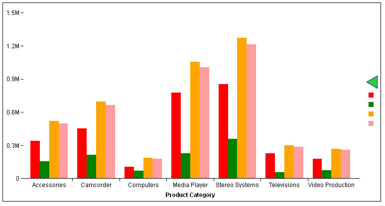
ENDThe following image shows the initial view, with the legend collapsed:
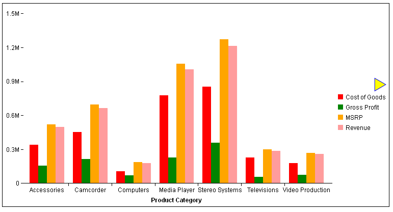
The following image shows the legend expanded, with the mouse hovering over the button (the hover color is displaying). The chart frame has resized:
| WebFOCUS | |
|
Feedback |