Data Grid Properties (dataGridProperties)
|
Topics: |
A data grid is a tabular representation of data, similar to a tabular report. The grid can have multiple rows, columns, and measures. Unlike the tabular reports generated with the WebFOCUS TABLE FILE command, data grids are generated in a GRAPH FILE request using PCHOLD FORMAT JSCHART.
Data grids are only available using chart attribute syntax. For information, see WebFOCUS Chart Attribute Syntax.
Note: The HTML5 data grid visualization does not support changing the theme (WebFOCUS StyleSheet), as the grid visualization does not currently support the WebFOCUS TABLE formatting syntax.
The following code segment shows the supported properties and their default values:
dataGridProperties: {
 altRowFill: undefined,
 cell: {
  layout: {
   width: {
     rule: "maxSize",
    value: 300
          },
   height: {
    rule: "maxSize",
    value: 500
            }
  },
innerGridLines: {
horizontal: {
width: 1,
color: '#E0E0E0',
dash: ''
},
vertical: {
width: 1,
color: '#EEEEEE',
dash: ''
}
},
labels: {
font: '10pt Sans-Serif',
color: 'rgb(20, 20, 20)',
numberFormat: 'auto',
align: 'right',
valign: 'top'
},
tooltip: undefined,
formatList: [
]
}, rowHeader: {
fill: '#FAFAFA',
border: {
width: 1,
color: '#D0D0D0',
dash: ''
},
innerGridLines: {
horizontal: {
width: 1,
color: '#D8D8D8',
dash: ''
},
vertical: {
width: 1,
color: '#E0E0E0',
dash: ''
}
},
dividerLine: {
width: 1,
color: '#D0D0D0',
dash: ''
},
title: {
text: [],
font: 'bold 10pt Sans-Serif',
color: 'rgb(20, 20, 20)',
align: 'left',
valign: 'top',
tooltip: undefined,
dividerLine: {
width: 1,
color: '#D0D0D0',
dash: ''
}
},
labels: {
font: '10pt Sans-Serif',
color: 'rgb(20, 20, 20)',
align: 'left',
valign: 'top',
mergeMatching: true,
content: []
}
},
 colHeader: {
  sorting: {
   enabled: false
  },
  resize: {
   enabled: false
  },
  fill: '#FAFAFA',
  border: {
   width: 1,
   color: '#D0D0D0',
   dash: ''
  },
  innerGridLines: {
   horizontal: {
    width: 1,
    color: '#E0E0E0',
    dash: ''
   },
   vertical: {
    width: 1,
    color: '#ECECEC',
    dash: ''
   }
  },
  dividerLine: {
   width: 1,
   color: '#D0D0D0',
   dash: ''
  },
  title: {
   text: [],
   font: 'bold 10pt Sans-Serif',
   color: 'rgb(20, 20, 20)',
   align: 'right',
   valign: 'top',
   tooltip: undefined,
   dividerLine: {
    width: 1,
    color: '#EEEEEE',
    dash: ''
   }
  },
 labels: {
   font: '10pt Sans-Serif',
   color: 'rgb(20, 20, 20)',
   align: 'center',
   valign: 'top',
   mergeMatching: true,
   content: []
  },
  lastLabels: {
   font: 'bold 10pt Sans-Serif',
   color: 'rgb(20, 20, 20)',
   align: 'right',
   valign: 'center'
  }
 },
columnTotals: {
  visible: false,
  calculation: 'sum',
  headerLabel: {
   text: 'TOTAL',
   font: 'bold 10pt Sans-Serif',
   color: 'rgb(20, 20, 20)',
   align: 'left',
   valign: 'center'
  },
  cellLabel: {
   font: 'bold 10pt Sans-Serif',
   color: 'rgb(20, 20, 20)',
   align: 'right',
   valign: 'top'
  },
  border: {
   width: 1,
   color: '#D0D0D0',
   dash: ''
  },
  dividerLine: {
   width: 2,
   color: '#D0D0D0',
   dash: ''
  }
 },
scroll: {
enabled: true,
freezeRowHeader: true,
freezeColHeader: true,
size: 15,
color: 'rgb(240, 240, 240)',
handle: {
color: '#C2C2C2',
hoverColor: '#A8A8A8',
border: {
width: 0,
color: 'transparent',
dash: ''
}
}
}
}Defining a Background Color for Alternate Rows in a Data Grid
|
How to: |
Using the dataGridProperties:altRowFill property, you can define background colors that alternate on successive rows of the grid. If you define one color, rows will alternate between that color and the default fill.
Syntax: How to Define a Background Color for Alternate Rows in a Data Grid
dataGridProperties: {
 altRowFill: 'string'
                           }
where:
- altRowFill: 'string'
-
Defines a background to fill alternating rows of the data grid.
Can be one of the following.
- undefined. This is the default value.
- A string that defines a single color, for example, 'red'.
- A string that defines an array of colors, for example, ['red','green'].
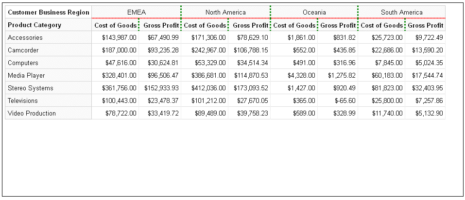
Example: Defining Alternating Background Colors for Rows in a Data Grid
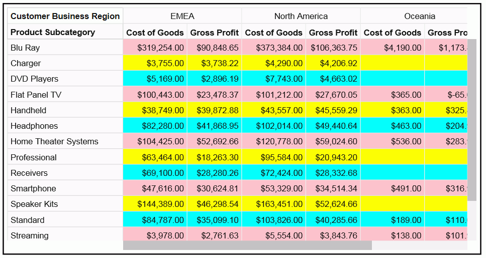
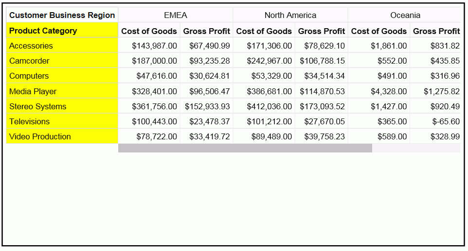
The following request defines an array of colors that alternate as background colors for the rows in the data grid.
GRAPH FILE WF_RETAIL_LITE
SUM COGS_US GROSS_PROFIT_US
BY PRODUCT_SUBCATEG
BY BUSINESS_REGION
ON GRAPH PCHOLD FORMAT JSCHART
ON GRAPH SET LOOKGRAPH DATAGRID
ON GRAPH SET STYLE *
type=data, column=product_subcateg,  bucket=row, $
type=data, column=business_region,   bucket=column, $
type=data, column=cogs_us,    bucket=measure, $
type=data, column=gross_profit_us, bucket=measure, $
*GRAPH_JS
dataGridProperties: {
  altRowFill: ['pink', 'yellow', 'cyan']
                             }
*END
ENDSTYLE
END
The output is shown in the following image.
Formatting Cells in a Data Grid
|
How to: |
You can format the layout of the cells, the grid lines, and the labels.
Syntax: How to Format the Cell Layout in a Data Grid
The dataGridProperties:cell:layout properties format the width and height of the data cells in the grid.
dataGridProperties:
{
cell: {
  layout: {
    width: {width    },
    height: {height  }
      }
          }
 }
where:
- width: width
-
Defines the width of the cells in the grid. If undefined, the grid will be sized to completely fill the available space. Can be:
- A number of pixels.
- A rule and value pair in the following form.
{rule: 'string', value: number}where:
- rule: 'string'
-
Is one of the following.
- 'exactSize', which makes each cell exactly the size specified by n
- 'minSize', which makes each cell at least the size specified by n
- 'maxSize', which makes each cell at most the size specified by n
The default value is {rule: 'maxSize', value: 300}
- value: number
-
Is a number of pixels.
- height: height
-
Defines the height of the cells in the grid. If undefined, the grid will be sized to completely fill the available space. Can be:
- A number of pixels.
- A rule and value pair in the following form.
{rule: 'string', value: number}where:
- rule: 'string'
-
Is one of the following.
- 'exactSize', which makes each cell exactly the size specified by n
- 'minSize', which makes each cell at least the size specified by n
- 'maxSize', which makes each cell at most the size specified by n
The default value is {rule: 'maxSize', value: 500}
- value: number
-
Is a number of pixels.
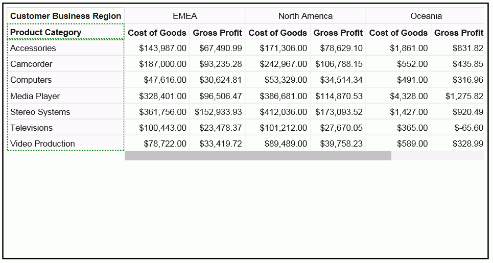
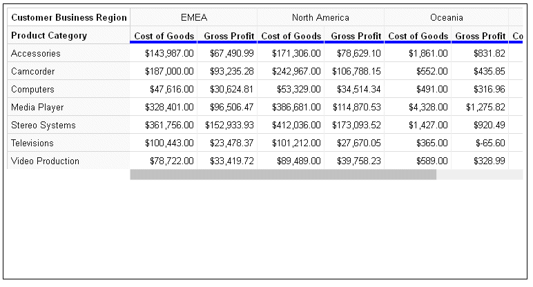
Example: Formatting the Cell Layout in a Data Grid
The following request sets the cell width to 100 pixels and the cell height to 20 pixels.
GRAPH FILE WF_RETAIL_LITE
SUM COGS_US GROSS_PROFIT_US
BY PRODUCT_SUBCATEG
BY BUSINESS_REGION
ON GRAPH PCHOLD FORMAT JSCHART
ON GRAPH SET LOOKGRAPH DATAGRID
ON GRAPH SET STYLE *
type=data, column=product_subcateg,  bucket=row, $
type=data, column=business_region,   bucket=column, $
type=data, column=cogs_us,    bucket=measure, $
type=data, column=gross_profit_us, bucket=measure, $
*GRAPH_JS
dataGridProperties: {
cell:{
  layout:{
     width: 100,
     height: 20
            }
    }
                               }
*END
ENDSTYLE
END
The output is shown in the following image. Some of the column headers do not fit into the 100-pixel width, and are truncated. This could be solved by increasing the width or setting the minSize to 100 (width: {rule:'minSize', value:100}) .
Syntax: How to Format the Inner Grid Lines in a Data Grid
Inner grid lines are the divider lines between inner cells and the right (for horizontal grid lines) or bottom (for vertical grid lines) edge of the grid.
dataGridProperties: {
 cell:{
  innerGridLines: {
   horizontal: {
    width: number,
    color: 'string',
    dash: 'string'
              },
   vertical: {
    width: number,
    color: 'string',
    dash: 'string'
               }
                 }
       }
                            }
where:
- width: number
-
Is a number of pixels that defines the width of the horizontal inner grid lines. The default value is 1.
- color: 'string'
-
Is a string that defines the color of the horizontal inner grid lines. The default value is '#E0E0E0'.
- dash: 'string'
-
Is a string that defines the dash style of the horizontal inner grid lines. The default value is '' (a solid line). Use a string of numbers that defines the width of a dash in pixels followed by the width of the gap between dashes in pixels (for example, dash: '1 1' draws a dotted line).
Multiple dashes can be defined within the dash string (for example, '2 4 4 2'), in which case, the dash types will alternate along the inner grid lines.
- width: number
-
Is a number of pixels that defines the width of the vertical inner grid lines. The default value is 1.
- color: 'string'
-
Is a string that defines the color of the vertical inner grid lines. The default value is '#EEEEEE''.
- dash: 'string'
-
Is a string that defines the dash style of the vertical inner grid lines. The default value is '' (a solid line). Use a string of numbers that defines the width of a dash in pixels followed by the width of the gap between dashes in pixels (for example, dash: '1 1' draws a dotted line).
Multiple dashes can be defined within the dash string (for example, '2 4 4 2'), in which case, the dash types will alternate along the inner grid lines.
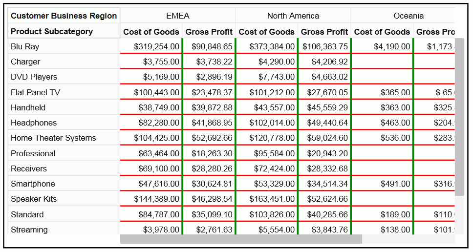
Example: Formatting the Inner Grid Lines of a Data Grid
The following request makes the horizontal grid lines red, with a width of 2, and the vertical grid lines green, with a width of 3.
GRAPH FILE WF_RETAIL_LITE
SUM COGS_US GROSS_PROFIT_US
BY PRODUCT_SUBCATEG
BY BUSINESS_REGION
ON GRAPH PCHOLD FORMAT JSCHART
ON GRAPH SET LOOKGRAPH DATAGRID
ON GRAPH SET STYLE *
type=data, column=product_subcateg,  bucket=row, $
type=data, column=business_region,   bucket=column, $
type=data, column=cogs_us,    bucket=measure, $
type=data, column=gross_profit_us, bucket=measure, $
*GRAPH_JS
dataGridProperties: {
cell:{
 innerGridLines: {
   horizontal: {
    width: 2,
    color: 'red',
    dash: ''
                },
   vertical: {
    width: 3,
    color: 'green',
    dash: ''
              }
                  }
         }
                       }
*END
ENDSTYLE
END
The output is shown in the following image.
Syntax: How to Format the Cell Labels in a Data Grid
The dataGrid:cell:labels properties format the values and tooltips in the grid cells. In order to override default tooltips, you must use a *GRAPH_JS_FINAL block in the WebFOCUS StyleSheet. For more information, see WebFOCUS Chart Attribute Syntax.
dataGrid:{
cell{
labels: {
   font: 'string',
   color: 'string',
   numberFormat: 'string',
   align: 'string',
   valign: 'string'
  },
  tooltip: 'string',
  formatList: [
   {row: number, col: number, repeat: number,
      color: 'string',
     labels: {font: 'string', color: 'string'}} ...
   ]
 }
 }
 }
where:
- font: 'string'
-
Is a string that defines the font attributes for the cell labels. The default value is '10pt Sans-Serif'.
- color: 'string'
-
Is a string that defines the color of the cell labels. The default value is 'rgb(20, 20, 20)'.
- numberFormat: 'string'
-
Is a number format for the cell labels. The default is 'auto'. For information about number formats, see Introduction to JSON Properties for HTML5 Charts.
- align: 'string'
-
Is a string that defines the horizontal alignment for the cell labels. The default value is 'right'.
- valign: 'string'
-
Is a string that defines the vertical alignment for the cell labels. The default value is 'top'.
- tooltip: 'string'
-
Is a custom tooltip for the cell label. A custom tooltip requires that the properties be in a *GRAPH_JS_FINAL block in the WebFOCUS StyleSheet. For information, see WebFOCUS Chart Attribute Syntax.
- formatList
-
Is an array of formats for specific cells that you want to format differently from other cells. A formatList requires that the properties be in a *GRAPH_JS_FINAL block in the WebFOCUS StyleSheet. For information, see WebFOCUS Chart Attribute Syntax. You can use the following properties for each element in the array.
- row:number
-
Is a row number.
- col:number
-
Is a column number.
- repeat:number
-
Is an increment. After the first row and/or column to use the format, the increment will be added to format additional cells with this format.
- color: 'string'
-
Is a string that defines the fill color for the specified cells.
- font: 'string'
-
Is a string that defines the font attributes for the specified cells.
- color: 'string'
-
Is a string that defines the color for the labels in the specified cells.
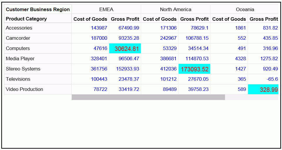
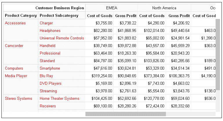
Example: Formatting Cell Labels in a Data Grid
The following request formats most of the cell labels as blue. However, it formats the cell in row 2 and column 1 with a red 12-pt Arial font and an aqua fill color, and applies that format to all cells found by repeatedly incrementing the row and column number by 2.
GRAPH FILE WF_RETAIL_LITE
SUM COGS_US GROSS_PROFIT_US
BY PRODUCT_CATEGORY
BY BUSINESS_REGION
ON GRAPH PCHOLD FORMAT JSCHART
ON GRAPH SET LOOKGRAPH DATAGRID
ON GRAPH SET STYLE *
type=data, column=product_category,  bucket=row, $
type=data, column=business_region,   bucket=column, $
type=data, column=cogs_us,    bucket=measure, $
type=data, column=gross_profit_us, bucket=measure, $
*GRAPH_JS_FINAL
dataGridProperties: {
cell:{
labels: {
  color: 'blue',
          },
    formatList: [
       {row: 2, col:1, repeat:2, color:'aqua',
        labels: {font: '12pt arial', color: 'red'}}    ]
     }
                               }
*END
ENDSTYLE
END
The output is shown in the following image. Note that since row and column numbers start at zero (0), row 2 is the third row, and column 1 is the second column.
Formatting the Row Header in a Data Grid
|
How to: |
Using the dataGrid:rowHeader properties, you can format the row header fill color, border, inner grid lines, divider line, title, and labels.
Syntax: How to Format the Row Header Fill Color in a Data Grid
dataGridProperties:{
rowHeader: {
  fill: 'string',
          }
                      }
where:
- fill: 'string'
-
Is a string that defines the fill color for the row header cells. The default value is '#FAFAFA'.
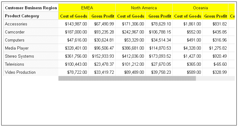
Example: Formatting the Row Header Fill Color in a Data Grid
The following request makes the data grid row header fill color yellow.
GRAPH FILE WF_RETAIL_LITE
SUM COGS_US GROSS_PROFIT_US
BY PRODUCT_CATEGORY
BY BUSINESS_REGION
ON GRAPH PCHOLD FORMAT JSCHART
ON GRAPH SET LOOKGRAPH DATAGRID
ON GRAPH SET STYLE *
type=data, column=product_category,  bucket=row, $
type=data, column=business_region,   bucket=column, $
type=data, column=cogs_us,    bucket=measure, $
type=data, column=gross_profit_us, bucket=measure, $
*GRAPH_JS
dataGridProperties: {
 rowHeader: {
   fill: 'yellow'
           }
                     }
*END
ENDSTYLE
END
The output is shown in the following image.
Syntax: How to Format the Row Header Border in a Data Grid
dataGridProperties:{
rowHeader: {
  border: {
   width: number,
   color: 'string',
   dash: 'string'
  },
  }
}
where:
- width: number
-
Is a number that defines the row header border width, in pixels. The default value is 1.
- color: 'string'
-
Is a string that defines the row header border color. The default value is '#D0D0D0'.
- dash: 'string'
-
Is a string that defines the dash style of the row header border. The default value is '' (a solid line). Use a string of numbers that defines the width of a dash in pixels followed by the width of the gap between dashes in pixels (for example, dash: '1 1' draws a dotted line).
Example: Formatting the Row Header Border in a Data Grid
The following request formats the row header border to be 3 pixels wide, green, and to have a dash style in which each dash is 2 pixels long and the space between dashes is 2 pixels.
GRAPH FILE WF_RETAIL_LITE
SUM COGS_US GROSS_PROFIT_US
BY PRODUCT_CATEGORY
BY BUSINESS_REGION
ON GRAPH PCHOLD FORMAT JSCHART
ON GRAPH SET LOOKGRAPH DATAGRID
ON GRAPH SET STYLE *
type=data, column=product_category,  bucket=row, $
type=data, column=business_region,   bucket=column, $
type=data, column=cogs_us,    bucket=measure, $
type=data, column=gross_profit_us, bucket=measure, $
*GRAPH_JS
dataGridProperties: {
 rowHeader: {
  border: {
   width: 3,
   color: 'green',
   dash: '2 2'
                 }
           }
                       }
*END
ENDSTYLE
END
The output is shown in the following image.
Syntax: How to Format the Row Header Inner Grid Lines in a Data Grid
The row header inner grid lines are the lines between the rows and columns in the row header.
dataGridProperties:{
rowHeader: {
    innerGridLines: {
   horizontal: {
    width: number,
    color: 'string',
    dash: 'string'
               },
   vertical: {
    width: number,
    color: 'string',
    dash: 'string'
             }
                      }
           }
                                          }
where:
- width: number
-
Is a number that defines the width of the row header horizontal inner grid lines, in pixels. The default value is 1.
- color: 'string'
-
Is a string that defines the color of the row header horizontal inner grid lines. The default value is '#D8D8D8'.
- dash: 'string'
-
Is a string that defines the dash style of the row header horizontal inner grid lines. The default value is '' (a solid line). Use a string of numbers that defines the width of a dash in pixels followed by the width of the gap between dashes in pixels (for example, dash: '1 1' draws a dotted line).
- width: number
-
Is a number that defines the width of the row header vertical inner grid lines, in pixels. The default value is 1.
- color: 'string'
-
Is a string that defines the color of the row header vertical inner grid lines. The default value is '#E0E0E0'.
- dash: 'string'
-
Is a string that defines the dash style of the row header vertical inner grid lines. The default value is '' (a solid line). Use a string of numbers that defines the width of a dash in pixels followed by the width of the gap between dashes in pixels (for example, dash: '1 1' draws a dotted line).
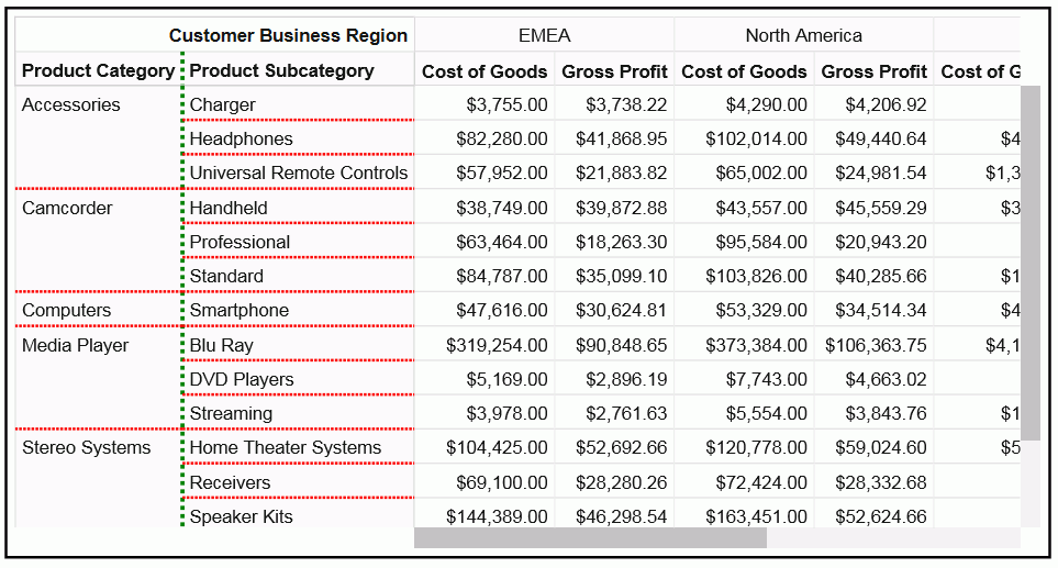
Example: Formatting the Row Header Inner Grid Lines in a Data Grid
The following request formats the row header horizontal inner grid lines to be red, 2 pixels wide, and have dashes that are 2 pixels long with 2 pixels between dashes. The vertical inner grid lines are formatted to be green, 3 pixels wide, and with dashes that are 3 pixels long with 3 pixels between the dashes.
GRAPH FILE WF_RETAIL_LITE
SUM COGS_US GROSS_PROFIT_US
BY PRODUCT_CATEGORY
BY PRODUCT_SUBCATEG
BY BUSINESS_REGION
ON GRAPH PCHOLD FORMAT JSCHART
ON GRAPH SET LOOKGRAPH DATAGRID
ON GRAPH SET STYLE *
type=data, column=product_category,  bucket=row, $
type=data, column=product_subcateg,  bucket=row, $
type=data, column=business_region,   bucket=column, $
type=data, column=cogs_us,    bucket=measure, $
type=data, column=gross_profit_us, bucket=measure, $
*GRAPH_JS
dataGridProperties: {
rowHeader: {
  innerGridLines: {
   horizontal: {
    width: 2,
    color: 'red',
    dash: '2 1'
               },
   vertical: {
    width: 3,
    color: 'green',
    dash: '3 3'
             }
                  }
           }
                     }
*END
ENDSTYLE
END
The output is shown in the following image.
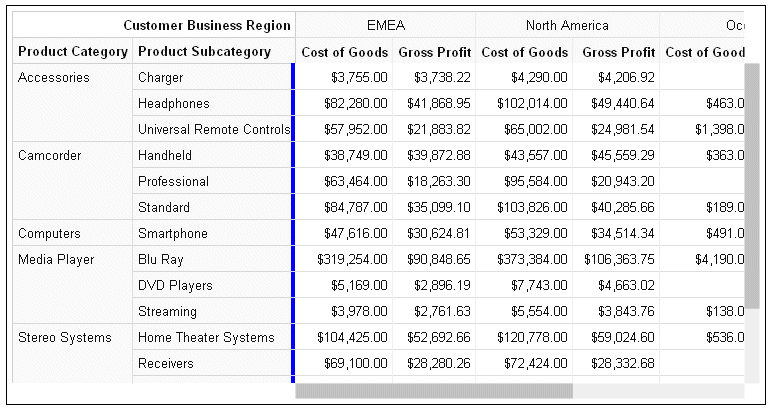
Syntax: How to Format the Row Header Divider Line in a Data Grid
The row header divider line in a data grid is the line between the row header and the grid body cells.
dataGridProperties:{
rowHeader: {
    dividerLine: {
   width: number,
   color: 'string',
   dash: 'string'
                 },
            }
                       }
where:
- width: number
-
Is a number that defines the width of the row header divider line, in pixels. The default value is 1.
- color: 'string'
-
Is a string that defines the color of the row header divider line. The default value is '#D0D0D0'.
- dash: 'string'
-
Is a string that defines the dash style of the row header divider line. The default value is '' (a solid line). Use a string of numbers that defines the width of a dash in pixels followed by the width of the gap between dashes in pixels (for example, dash: '1 1' draws a dotted line).
Example: Formatting the Row Header Divider Line in a Data Grid
The following request formats the row header divider line to be 8 pixels wide and blue.
GRAPH FILE WF_RETAIL_LITE
SUM COGS_US GROSS_PROFIT_US
BY PRODUCT_CATEGORY
BY PRODUCT_SUBCATEG
BY BUSINESS_REGION
ON GRAPH PCHOLD FORMAT JSCHART
ON GRAPH SET LOOKGRAPH DATAGRID
ON GRAPH SET STYLE *
type=data, column=product_category,  bucket=row, $
type=data, column=product_subcateg,  bucket=row, $
type=data, column=business_region,   bucket=column, $
type=data, column=cogs_us,    bucket=measure, $
type=data, column=gross_profit_us, bucket=measure, $
*GRAPH_JS
dataGridProperties: {
rowHeader: {
 dividerLine: {
   width: 8,
   color: 'blue'
             }
             }
                      }
*END
ENDSTYLE
END
The output is shown in the following image.
Syntax: How to Format the Row Header Titles in a Data Grid
Row header titles, by default, are defined in the Master File or the request. In order to override the default titles and tooltips, the properties must be included in a *GRAPH_JS_FINAL block in the WebFOCUS StyleSheet. For information, see WebFOCUS Chart Attribute Syntax.
dataGridProperties:{
rowHeader: {
   title: {
   text: ['string',...],
   font: 'string',
   color: 'string',
   align: 'string',
   valign: 'string',
   tooltip: 'string',
   dividerLine: {
    width: number,
    color: 'string',
    dash: 'string'
   }
  },
    }
 }
}
where:
- text: ['string',...]
-
Defines the row header title text. It can be a single string or an array of strings. Nested row titles are not supported. The default row header title is the AS name from the request or the field name or title from the Master File. Changing the row header titles requires that the properties be in a *GRAPH_JS_FINAL block in the WebFOCUS StyleSheet. For information, see WebFOCUS Chart Attribute Syntax.
- font: 'string'
-
Is a string that defines the font attributes for the row header titles. The default value is 'bold 10pt Sans-Serif'.
- color: 'string'
-
Is a string that defines the color of the row header titles. The default value is 'rgb(20, 20, 20)'.
- align: 'string'
-
Is a string that defines the horizontal alignment for the row header titles. The default value is 'left'.
- valign: 'string'
-
Is a string that defines the vertical alignment for the row header titles. The default value is 'top'.
- tooltip: 'string'
-
Defines a tooltip for the row header titles. The default value is undefined. Changing the row header titles requires that the properties be in a *GRAPH_JS_FINAL block in the WebFOCUS StyleSheet. For information, see WebFOCUS Chart Attribute Syntax. For information about creating custom tooltips using callback functions, see Introduction to JSON Properties for HTML5 Charts.
- width: number
-
Is a number that defines the width of the row header title divider line, in pixels. The default value is 1.
- color: 'string'
-
Is a string that defines the color of the row header title divider line. The default value is '#D0D0D0'.
- dash: 'string'
-
Is a string that defines the dash style of the row header title divider line. The default value is '' (a solid line). Use a string of numbers that defines the width of a dash in pixels followed by the width of the gap between dashes in pixels (for example, dash: '1 1' draws a dotted line).
Example: Formatting the Row Header Titles in a Data Grid
The following request formats the row header titles. The text for the two titles is navy blue and center aligned, with the values Category and Subcategory. The row header title divider line is aqua and 5 pixels wide. Note that the properties are in a *GRAPH_JS_FINAL block in the WebFOCUS StyleSheet.
GRAPH FILE WF_RETAIL_LITE
SUM COGS_US GROSS_PROFIT_US
BY PRODUCT_CATEGORY
BY PRODUCT_SUBCATEG
BY BUSINESS_REGION
ON GRAPH PCHOLD FORMAT JSCHART
ON GRAPH SET LOOKGRAPH DATAGRID
ON GRAPH SET STYLE *
type=data, column=product_category,  bucket=row, $
type=data, column=product_subcateg,  bucket=row, $
type=data, column=business_region,   bucket=column, $
type=data, column=cogs_us,    bucket=measure, $
type=data, column=gross_profit_us, bucket=measure, $
*GRAPH_JS_FINAL
dataGridProperties: {
rowHeader: {
 title: {
  text: ['Category','Subcategory'],
  font: 'bold 10pt Sans-Serif',
  color: 'navy',
  align: 'center',
  valign: 'top',
  dividerLine: {
   width: 5,
   color: 'aqua',
            }
        }
              }
                      }
*END
ENDSTYLE
END
The output is shown in the following image.
Syntax: How to Format the Row Header Labels in a Data Grid
The row header labels in a data grid are the sort field values for each BY field assigned to the row attribute category. You can format the font, color, horizontal and vertical alignment, and content of the labels. You can also specify whether to merge consecutive labels with the same content or keep them separate.
dataGridProperties:{
 rowHeader: {
  labels: {
    font: 'string',
    color: 'string',
    align: 'string',
    valign: 'string',
    mergeMatching: boolean,
   content: ['string',...]
  }
 }
}
where:
- font: 'string'
-
Is a string that defines the font attributes of the row header labels. The default value is '10pt Sans-Serif'.
- color: 'string'
-
Is a string that defines the color of the row header labels. The default value is 'rgb(20, 20, 20)'.
- align: 'string'
-
Is a string that defines the horizontal alignment of the row header labels. The default value is 'left'.
- valign: 'string'
-
Is a string that defines the vertical alignment of the row header labels. The default value is 'top'.
- mergeMatching: boolean
-
Defines whether to repeat consecutive duplicate labels on each row or merge them. Valid values are:
- true, which merges consecutive duplicate row header labels. This is the default value.
- false, which repeats duplicate row header labels.
- content: ['string',...]
-
Defines the row header labels. It can be a single string, an array of strings, or an array of nested objects whose leaves are arrays of strings.
Note: If you replace the labels, your arrays of labels will be applied to the incoming data as you define them, without regard to the actual structure of the row header label arrays.
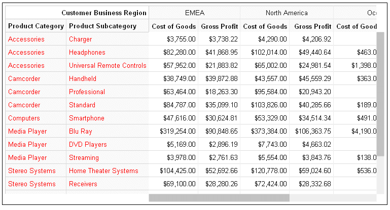
Example: Formatting the Row Header Labels in a Data Grid
The following request makes the row header labels red and uses the defaults for all other row header label properties.
GRAPH FILE WF_RETAIL_LITE
SUM COGS_US GROSS_PROFIT_US
BY PRODUCT_CATEGORY
BY PRODUCT_SUBCATEG
BY BUSINESS_REGION
ON GRAPH PCHOLD FORMAT JSCHART
ON GRAPH SET LOOKGRAPH DATAGRID
ON GRAPH SET STYLE *
type=data, column=product_category,  bucket=row, $
type=data, column=product_subcateg,  bucket=row, $
type=data, column=business_region,   bucket=column, $
type=data, column=cogs_us,    bucket=measure, $
type=data, column=gross_profit_us, bucket=measure, $
*GRAPH_JS_FINAL
dataGridProperties: {
 rowHeader: {
  labels: {
    color: 'red'
        }
         }
                    }

*END
ENDSTYLE
END
The output is shown in the following image.
Adding mergeMatching:false to the row header labels properties generates the following data grid, in which duplicate row header labels are displayed on each row.
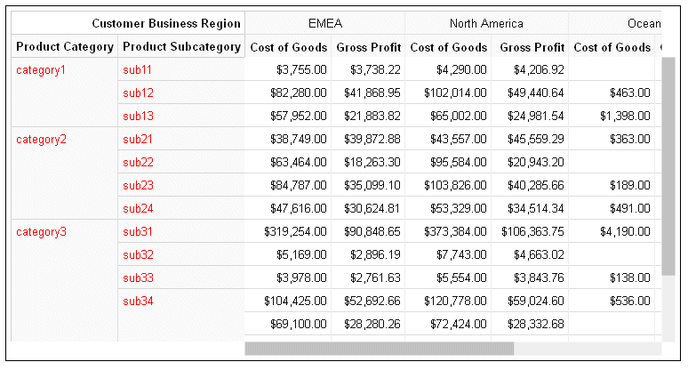
The following version of the request specifies custom labels in the form of arrays of labels within objects. The structure of the arrays in the request does not match the actual array structure of the labels generated by default.
GRAPH FILE WF_RETAIL_LITE
SUM COGS_US GROSS_PROFIT_US
BY PRODUCT_CATEGORY
BY PRODUCT_SUBCATEG
BY BUSINESS_REGION
ON GRAPH PCHOLD FORMAT JSCHART
ON GRAPH SET LOOKGRAPH DATAGRID
ON GRAPH SET STYLE *
type=data, column=product_category,  bucket=row, $
type=data, column=product_subcateg,  bucket=row, $
type=data, column=business_region,   bucket=column, $
type=data, column=cogs_us,    bucket=measure, $
type=data, column=gross_profit_us, bucket=measure, $
*GRAPH_JS_FINAL
dataGridProperties: {
rowHeader: {
 labels: {
   font: '10pt Sans-Serif',
   color: 'red',
   align: 'left',
   valign: 'top',
   mergeMatching: true,
   content:[
       {'category1': ['sub11','sub12', 'sub13']},
       {'category2': ['sub21','sub22', 'sub23', 'sub24']},
       {'category3': ['sub31','sub32', 'sub33', 'sub34']}
           ]
         }
             }
                      }
*END
ENDSTYLE
END
The output is shown in the following image. The data is assigned to the labels as described in the content object in the request.
Formatting the Column Header in a Data Grid
Using the dataGrid:colHeader properties, you can format the column header sorting, sizing, fill color, border, inner grid lines, divider line, title, labels, and last row labels.
The last row of the column header displays the column titles for the measure fields in the data grid. This row must be formatted separately using the dataGrid:colHeader:lastLabels properties.
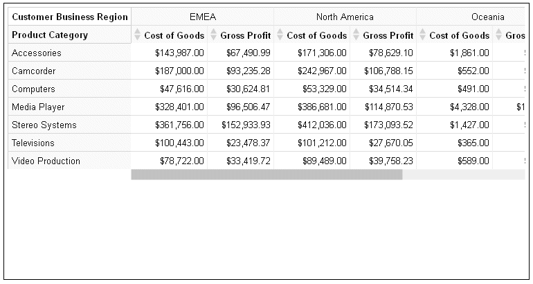
Syntax: How to Format Interactive Sorting in a Data Grid
If you enable column header sorting, up and down arrows display in the last row of each column header cell. Clicking the up arrow sorts the grid output in ascending order, and clicking the down arrow sorts the grid in descending order, of the data values in that column.
dataGridProperties:{
colHeader: {
  sorting: {
   enabled: boolean
          }
            }
                      }
where:
- enabled: boolean
-
Enables or disables column header sorting. Valid values are:
- true, which enables sorting the grid interactively based on a column.
- false, which disables interactive grid sorting. This is the default value.
Example: Enabling Interactive Data Grid Sorting
The following request enables interactive data grid sorting.
GRAPH FILE WF_RETAIL_LITE
SUM COGS_US GROSS_PROFIT_US
BY PRODUCT_CATEGORY
BY BUSINESS_REGION
ON GRAPH PCHOLD FORMAT JSCHART
ON GRAPH SET LOOKGRAPH DATAGRID
ON GRAPH SET STYLE *
type=data, column=product_category,  bucket=row, $
type=data, column=business_region,   bucket=column, $
type=data, column=cogs_us,    bucket=measure, $
type=data, column=gross_profit_us, bucket=measure, $
*GRAPH_JS
dataGridProperties: {
 colHeader: {
   sorting: {enabled:true}
           }
                     }
*END
ENDSTYLE
END
The output is shown in the following image. Clicking an up arrow in a column header sorts the grid based on ascending values of that column. Clicking a down arrow in a column header sorts the grid in descending order based on that column.
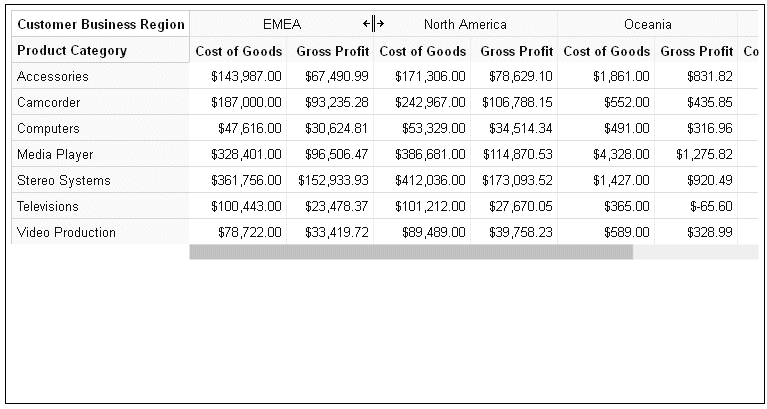
Syntax: How to Enable Interactive Column Resizing in a Data Grid
If you enable column resizing in a data grid, the user can drag the left edge of a column to resize it.
dataGridProperties:{
colHeader: {
  resize: {
   enabled: boolean
          }
            }
                      }
where:
- enabled: boolean
-
Enables or disables column resizing. Valid values are:
- true, which enables resizing the grid columns.
- false, which disables resizing the grid column. This is the default value.
Example: Enabling Interactive Column Resizing in a Data Grid
The following request enables column resizing.
GRAPH FILE WF_RETAIL_LITE
SUM COGS_US GROSS_PROFIT_US
BY PRODUCT_CATEGORY
BY BUSINESS_REGION
ON GRAPH PCHOLD FORMAT JSCHART
ON GRAPH SET LOOKGRAPH DATAGRID
ON GRAPH SET STYLE *
type=data, column=product_category,  bucket=row, $
type=data, column=business_region,   bucket=column, $
type=data, column=cogs_us,    bucket=measure, $
type=data, column=gross_profit_us, bucket=measure, $
*GRAPH_JS
dataGridProperties: {
 colHeader: {
   resize: {enabled:true}
           }
                     }
*END
ENDSTYLE
END
Positioning the mouse on the left edge of a column in the column header, other than the column right next to the row header, displays sizing handles that you can drag to resize the column, as shown in the following image.
Syntax: How to Format the Column Header Fill Color in a Data Grid
dataGridProperties:{
colHeader: {
  fill: 'string',
          }
                      }
where:
- fill: 'string'
-
Is a string that defines the fill color for the column header cells. The default value is '#FAFAFA'.
Example: Formatting the Column Header Fill Color in a Data Grid
The following request makes the data grid column header fill color yellow.
GRAPH FILE WF_RETAIL_LITE
SUM COGS_US GROSS_PROFIT_US
BY PRODUCT_CATEGORY
BY BUSINESS_REGION
ON GRAPH PCHOLD FORMAT JSCHART
ON GRAPH SET LOOKGRAPH DATAGRID
ON GRAPH SET STYLE *
type=data, column=product_category,  bucket=row, $
type=data, column=business_region,   bucket=column, $
type=data, column=cogs_us,    bucket=measure, $
type=data, column=gross_profit_us, bucket=measure, $
*GRAPH_JS
dataGridProperties: {
 colHeader: {
   fill: 'yellow'
           }
                     }
*END
ENDSTYLE
END
The output is shown in the following image.
Syntax: How to Format the Column Header Border in a Data Grid
dataGridProperties:{
colHeader: {
  border: {
   width: number,
   color: 'string',
   dash: 'string'
  },
  }
}
where:
- width: number
-
Is a number that defines the column header border width, in pixels. The default value is 1.
- color: 'string'
-
Is a string that defines the column header border color. The default value is '#D0D0D0'.
- dash: 'string'
-
Is a string that defines the dash style of the column header border. The default value is '' (a solid line). Use a string of numbers that defines the width of a dash in pixels followed by the width of the gap between dashes in pixels (for example, dash: '1 1' draws a dotted line).
Example: Formatting the Column Header Border in a Data Grid
The following request formats the column header border to be 3 pixels wide and green.
GRAPH FILE WF_RETAIL_LITE
SUM COGS_US GROSS_PROFIT_US
BY PRODUCT_CATEGORY
BY BUSINESS_REGION
ON GRAPH PCHOLD FORMAT JSCHART
ON GRAPH SET LOOKGRAPH DATAGRID
ON GRAPH SET STYLE *
type=data, column=product_category,  bucket=row, $
type=data, column=business_region,   bucket=column, $
type=data, column=cogs_us,    bucket=measure, $
type=data, column=gross_profit_us, bucket=measure, $
*GRAPH_JS
dataGridProperties: {
 colHeader: {
  border: {
   width: 3,
   color: 'green'
                   }
            }
                       }
*END
ENDSTYLE
END
The output is shown in the following image.
Syntax: How to Format Column Header Inner Grid Lines in a Data Grid
The column header inner grid lines are the lines between the rows and columns in the column header.
dataGridProperties:{
colHeader: {
    innerGridLines: {
   horizontal: {
    width: number,
    color: 'string',
    dash: 'string'
               },
   vertical: {
    width: number,
    color: 'string',
    dash: 'string'
             }
                      }
           }
                                          }
where:
- width: number
-
Is a number that defines the width of the column header horizontal inner grid lines, in pixels. The default value is 1.
- color: 'string'
-
Is a string that defines the color of the column header horizontal inner grid lines. The default value is '#E0E0E0'.
- dash: 'string'
-
Is a string that defines the dash style of the column header horizontal inner grid lines. The default value is '' (a solid line). Use a string of numbers that defines the width of a dash in pixels followed by the width of the gap between dashes in pixels (for example, dash: '1 1' draws a dotted line).
- width: number
-
Is a number that defines the width of the column header vertical inner grid lines, in pixels. The default value is 1.
- color: 'string'
-
Is a string that defines the color of the column header vertical inner grid lines. The default value is '#ECECEC'.
- dash: 'string'
-
Is a string that defines the dash style of the column header vertical inner grid lines. The default value is '' (a solid line). Use a string of numbers that defines the width of a dash in pixels followed by the width of the gap between dashes in pixels (for example, dash: '1 1' draws a dotted line).
Example: Formatting Column Header Inner Grid Lines in a Data Grid
The following request formats the column header horizontal inner grid lines to be red, 2 pixels wide, and have dashes that are 2 pixels long with 2 pixels between dashes. The vertical inner grid lines are formatted to be green, 3 pixels wide, and with dashes that are 3 pixels long with 3 pixels between the dashes.
GRAPH FILE WF_RETAIL_LITE
SUM COGS_US GROSS_PROFIT_US
BY PRODUCT_CATEGORY
BY BUSINESS_REGION
ON GRAPH PCHOLD FORMAT JSCHART
ON GRAPH SET LOOKGRAPH DATAGRID
ON GRAPH SET HAXIS 950
ON GRAPH SET STYLE *
type=data, column=product_category,  bucket=row, $
type=data, column=business_region,   bucket=column, $
type=data, column=cogs_us,    bucket=measure, $
type=data, column=gross_profit_us, bucket=measure, $
*GRAPH_JS
dataGridProperties: {
colHeader: {
  innerGridLines: {
   horizontal: {
    width: 2,
    color: 'red',
    dash: '2 1'
               },
   vertical: {
    width: 3,
    color: 'green',
    dash: '3 3'
             }
                  }
           }
                     }
*END
ENDSTYLE
END
The output is shown in the following image.
Syntax: How to Format the Column Header Divider Line in a Data Grid
The column header divider line in a data grid is the line between the column header and the grid body cells.
dataGridProperties:{
colHeader: {
    dividerLine: {
   width: number,
   color: 'string',
   dash: 'string'
                 },
            }
                       }
where:
- width: number
-
Is a number that defines the width of the column header divider line, in pixels. The default value is 1.
- color: 'string'
-
Is a string that defines the color of the column header divider line. The default value is '#D0D0D0'.
- dash: 'string'
-
Is a string that defines the dash style of the column header divider line. The default value is '' (a solid line). Use a string of numbers that defines the width of a dash in pixels followed by the width of the gap between dashes in pixels (for example, dash: '1 1' draws a dotted line).
Example: Formatting the Column Header Divider Line in a Data Grid
The following request formats the column header divider line to be 8 pixels wide and blue.
GRAPH FILE WF_RETAIL_LITE
SUM COGS_US GROSS_PROFIT_US
BY PRODUCT_CATEGORY
BY BUSINESS_REGION
ON GRAPH PCHOLD FORMAT JSCHART
ON GRAPH SET LOOKGRAPH DATAGRID
ON GRAPH SET STYLE *
type=data, column=product_category,  bucket=row, $
type=data, column=business_region,   bucket=column, $
type=data, column=cogs_us,    bucket=measure, $
type=data, column=gross_profit_us, bucket=measure, $
*GRAPH_JS
dataGridProperties: {
colHeader: {
 dividerLine: {
   width: 8,
   color: 'blue'
             }
             }
                      }
*END
ENDSTYLE
END
The output is shown in the following image.
Syntax: How to Format Column Header Titles in a Data Grid
Column header titles, by default, are defined in the Master File or the request. In order to override the default titles and tooltips, the properties must be included in a *GRAPH_JS_FINAL block in the WebFOCUS StyleSheet. For information, see WebFOCUS Chart Attribute Syntax.
dataGridProperties:{
colHeader: {
   title: {
   text: ['string',...],
   font: 'string',
   color: 'string',
   align: 'string',
   valign: 'string',
   tooltip: 'string',
   dividerLine: {
    width: number,
    color: 'string',
    dash: 'string'
   }
  },
    }
 }
}
where:
- colHeader:
- Defines the properties of the data grid column header.
- text: ['string',...]
-
Defines the column header title text. It can be a single string or an array of strings. Nested column titles are not supported. The default column header title is the field name or title from the Master File or the AS name from the request. Changing the row header titles requires that the properties be in a *GRAPH_JS_FINAL block in the WebFOCUS StyleSheet. For information, see WebFOCUS Chart Attribute Syntax.
- font: 'string'
-
Is a string that defines the font attributes for the column header titles. The default value is 'bold 10pt Sans-Serif'.
- color: 'string'
-
Is a string that defines the color of the column header titles. The default value is 'rgb(20, 20, 20)'.
- align: 'string'
-
Is a string that defines the horizontal alignment for the column header titles. The default value is 'right'.
- valign: 'string'
-
Is a string that defines the vertical alignment for the column header titles. The default value is 'top'.
- tooltip: 'string'
-
Defines a tooltip for the column header titles. The default value is undefined. Changing the column header tooltip requires that the properties be in a *GRAPH_JS_FINAL block in the WebFOCUS StyleSheet. For information, see WebFOCUS Chart Attribute Syntax. For information about creating custom tooltips using callback functions, see Introduction to JSON Properties for HTML5 Charts
- dividerLIne:
- Defines the properties of the column header title divider line.
- width: number
-
Is a number that defines the width of the column header title divider line in pixels. The default value is 1.
- color: 'string'
-
Is a string that defines the color of the column header title divider line. The default value is '#EEEEEE'.
- dash: 'string'
-
Is a string that defines the dash style of the column header title divider line. The default value is '' (a solid line). Use a string of numbers that defines the width of a dash in pixels followed by the width of the gap between dashes in pixels (for example, dash: '1 1' draws a dotted line).
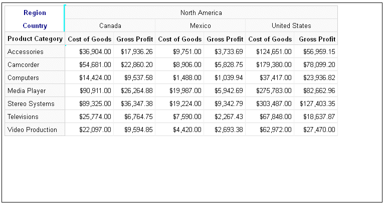
Example: Formatting the Column Header Titles in a Data Grid
The following request formats the column header titles. The text for the two titles is navy blue and center aligned, with the values Region and Country. The column header title divider line is aqua and 5 pixels wide. Note that the properties are in a *GRAPH_JS_FINAL block in the WebFOCUS StyleSheet.
GRAPH FILE WF_RETAIL_LITE
SUM COGS_US GROSS_PROFIT_US
BY PRODUCT_CATEGORY
BY BUSINESS_REGION
BY COUNTRY_NAME
WHERE BUSINESS_REGION EQ 'North America'
ON GRAPH PCHOLD FORMAT JSCHART
ON GRAPH SET LOOKGRAPH DATAGRID
ON GRAPH SET STYLE *
type=data, column=product_category,  bucket=row, $
type=data, column=business_region,   bucket=column, $
type=data, column=country_name,   bucket=column, $
type=data, column=cogs_us,    bucket=measure, $
type=data, column=gross_profit_us, bucket=measure, $
*GRAPH_JS_FINAL
dataGridProperties: {
colHeader: {
 title: {
  text: ['Region','Country'],
  font: 'bold 10pt Sans-Serif',
  color: 'navy',
  align: 'center',
  valign: 'top',
  dividerLine: {
   width: 5,
   color: 'aqua',
            }
        }
              }
                      }
*END
ENDSTYLE
END
The output is shown in the following image.
Syntax: How to Format Column Header Labels in a Data Grid
The column header labels in a data grid are the sort field values for each BY field assigned to the column attribute category. You can format the font, color, horizontal and vertical alignment, and content of the labels. You can also specify whether to merge consecutive labels with the same content or keep them separate.
dataGridProperties:{
 colHeader: {
  labels: {
    font: 'string',
    color: 'string',
    align: 'string',
    valign: 'string',
    mergeMatching: boolean,
   content: ['string',...]
  }
 }
}
where:
- font: 'string'
-
Is a string that defines the font attributes of the column header labels. The default value is '10pt Sans-Serif'.
- color: 'string'
-
Is a string that defines the color of the column header labels. The default value is 'rgb(20, 20, 20)'.
- align: 'string'
-
Is a string that defines the horizontal alignment of the column header labels. The default value is 'center'.
- valign: 'string'
-
Is a string that defines the vertical alignment of the column header labels. The default value is 'top'.
- mergeMatching: boolean
-
Defines whether to repeat duplicate consecutive labels on each column or merge them. Valid values are:
- true, which merges duplicate column header labels. This is the default value.
- false, which repeats duplicate row header labels.
- content: ['string',...]
-
Defines the column header labels. Can be a single string, an array of strings, or an array of nested objects whose leaves are arrays of strings. You must account for the last row of the column header (the row that contains the column titles for the measure fields) in your arrays.
Note: If you replace the labels, your arrays of labels will be applied to the incoming data as you define them, without regard to the actual structure of the column header label arrays.
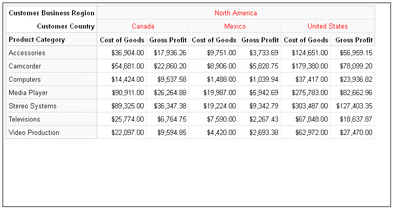
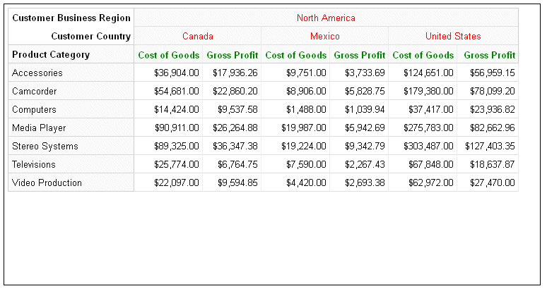
Example: Formatting the Column Header Labels in a Data Grid
The following request makes the column header labels red and uses the defaults for all other column header label properties.
GRAPH FILE WF_RETAIL_LITE
SUM COGS_US GROSS_PROFIT_US
BY PRODUCT_CATEGORY
BY BUSINESS_REGION
BY COUNTRY_NAME
WHERE BUSINESS_REGION EQ 'North America'
ON GRAPH PCHOLD FORMAT JSCHART
ON GRAPH SET LOOKGRAPH DATAGRID
ON GRAPH SET STYLE *
type=data, column=product_category,  bucket=row, $
type=data, column=business_region,   bucket=column, $
type=data, column=country_name,   bucket=column, $
type=data, column=cogs_us,    bucket=measure, $
type=data, column=gross_profit_us, bucket=measure, $
*GRAPH_JS_FINAL
dataGridProperties: {
colHeader: {
 labels: {
    color: 'red'
        }
         }
                    }
*END
ENDSTYLE
END
The output is shown in the following image.
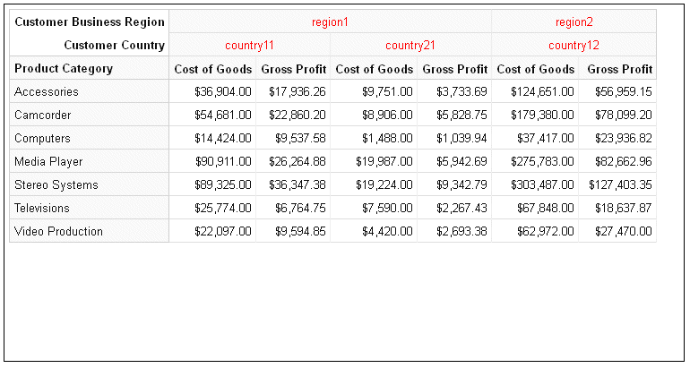
The following version of the request specifies custom labels in the form of arrays of labels within objects. In order to describe the arrays and objects correctly, you must account for the last row in the column header, which contains the column titles of the measure fields. In this example, the structure of the arrays in the request does not match the actual array structure of the default labels.
GRAPH FILE WF_RETAIL_LITE
SUM COGS_US GROSS_PROFIT_US
BY PRODUCT_CATEGORY
BY BUSINESS_REGION
BY COUNTRY_NAME
WHERE BUSINESS_REGION EQ 'North America'
ON GRAPH PCHOLD FORMAT JSCHART
ON GRAPH SET LOOKGRAPH DATAGRID
ON GRAPH SET STYLE *
type=data, column=product_category,  bucket=row, $
type=data, column=business_region,   bucket=column, $
type=data, column=country_name,   bucket=column, $
type=data, column=cogs_us,    bucket=measure, $
type=data, column=gross_profit_us, bucket=measure, $
*GRAPH_JS_FINAL
dataGridProperties: {
colHeader: {
 labels: {
    color: 'red' ,
 content: [{
   region1: [
    {country11: ['Cost of Goods', 'Gross Profit']},
    {country21: ['Cost of Goods', 'Gross Profit']}
   ],
   region2: [
    {country12: ['Cost of Goods', 'Gross Profit']}
   ]
  }]
        }
         }
                    }
*END
ENDSTYLE
END
The output is shown in the following image. The data is assigned to the labels as described in the content object in the request.
Syntax: How to Format the Last Row of Labels in the Column Header of a Data Grid
The last row of column header labels is the row that corresponds to the measure field column titles in the data grid. Using the dataGridProperties:colHeader:lastLabels properties, you can apply formatting to these labels.
dataGridProperties:{
 colHeader: {
  labels: {
    font: 'string',
    color: 'string',
    align: 'string',
    valign: 'string',
        }
           }
               }
where:
- font: 'string'
-
Is a string that defines the font attributes of the last row of column header labels. The default value is '10pt Sans-Serif'.
- color: 'string'
-
Is a string that defines the color of the last row of column header labels. The default value is 'rgb(20, 20, 20)'.
- align: 'string'
-
Is a string that defines the horizontal alignment of the last row of column header labels. The default value is 'right'.
- valign: 'string'
-
Is a string that defines the vertical alignment of the last row of column header labels. The default value is 'center'.
Example: Formatting the Last Row of Column Header Labels in a Data Grid
The following request makes the last row of titles in the column header green, while the other rows are red:
GRAPH FILE WF_RETAIL_LITE
SUM COGS_US GROSS_PROFIT_US
BY PRODUCT_CATEGORY
BY BUSINESS_REGION
BY COUNTRY_NAME
WHERE BUSINESS_REGION EQ 'North America'
ON GRAPH PCHOLD FORMAT JSCHART
ON GRAPH SET LOOKGRAPH DATAGRID
ON GRAPH SET STYLE *
type=data, column=product_category,  bucket=row, $
type=data, column=business_region,   bucket=column, $
type=data, column=country_name,   bucket=column, $
type=data, column=cogs_us,    bucket=measure, $
type=data, column=gross_profit_us, bucket=measure, $
*GRAPH_JS_FINAL
dataGridProperties: {
colHeader: {
 labels: {
    color: 'red'} ,
 lastLabels: {
     color:'green' }
         }
                    }
*END
ENDSTYLE
END
The output is shown in the following image.
Generating and Formatting Column Totals in a Data Grid
|
How to: |
Using the dataGridProperties:columnTotals properties, you can generate column totals on the data grid and format their properties, calculations, titles, and divider lines.
Syntax: How to Generate and Format Column Totals on a Data Grid
dataGridProperties:
{
columnTotals: {
  visible: boolean,
  calculation: 'string',
  headerLabel: {
   text: 'string',
   font: 'string',
   color: 'string',
   align: 'string',
   valign: 'string'
  },
  cellLabel: {
   font: 'string',
   color: 'string',
   align: 'string',
   valign: 'string'
  },
  border: {
   width: number,
   color: 'string',
   dash: 'string'
  },
  dividerLine: {
   width: number,
   color: 'string',
   dash: 'string'
  }
 }
}
where:
- visible: boolean
-
Controls whether column totals display on the data grid. Valid values are:
- true, which displays column totals.
- false, which does not display column totals. This is the default value.
- calculation: 'string'
-
Controls how the column totals are calculated. Valid values are
- 'sum', which adds the values in each column to produce the column total. This is the default value.
- 'min', which calculates the minimum value in each column to produce the column total.
- 'max', which calculates the maximum value in each column to produce the column total.
- 'mean', which averages the values in each column to produce the column total.
- headerLabel:
- Defines the properties of the header label for the column total row.
- text: 'string'
-
Is a string that defines the header label for the column total row. The default value is 'TOTAL'.
- font: 'string'
-
Is a string that defines the font attributes for the column total header label. The default value is 'bold 10pt Sans-Serif'.
- color: 'string'
-
Is a string that defines the color of the column total header label. The default value is 'rgb(20, 20, 20)'.
- align: 'string'
-
Is a string that defines the horizontal alignment of the column total header label. The default value is 'left'.
- valign: 'string'
-
Is a string that defines the vertical alignment of the column total header label. The default value is 'center'.
- cellLabel:
- Defines the properties of the cells in the column total row.
- font: 'string'
-
Is a string that defines the font attributes of the values in the cells of the column total row. the default value is 'bold 10pt Sans-Serif'.
- color: 'string'
-
Is a string that defines the color of the values in the cells of the column total row. The default value is 'rgb(20, 20, 20)'.
- align: 'string'
-
Is a string that defines the horizontal alignment of the values in the cells of the column total row. The default value is 'right'.
- valign: 'string'
-
Is a string that defines the vertical alignment of the values in the cells of the column total row. The default value is 'top'.
- border:
- Defines the properties of the border around the
bottom and sides of the column total row.
- width: number
-
Is a number that defines the width of the border around the bottom and sides of the column total row, in pixels. The default value is 1.
- color: 'string'
-
Is a string that defines the color of the border around the bottom and sides of the column total row. The default value is '#D0D0D0'.
- dash: 'string'
-
Is a string that defines the dash style of the border around the bottom and sides of the column total row. The default value is '' (a solid line). Use a string of numbers that defines the width of a dash in pixels followed by the width of the gap between dashes in pixels (for example, dash: '1 1' draws a dotted line).
- dividerLine:
- Defines the properties of the divider line above the column total row.
- width: number
-
Is a number that defines the width of the divider line on top of the column total row, in pixels. The default value is 2.
- color: 'string'
-
Is a string that defines the color of the divider line on top of the column total row. The default value is '#D0D0D0'.
- dash: 'string'
-
Is a string that defines the dash style of the divider line on top of the column total row. The default value is '' (a solid line). Use a string of numbers that defines the width of a dash in pixels followed by the width of the gap between dashes in pixels (for example, dash: '1 1' draws a dotted line).
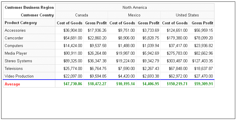
Example: Generating and Formatting a Column Total Row on a Data Grid
The following request generates a column total row using the 'mean' calculation. The header label for the column total row is Average and it is red. The calculated values in the cells of the row are green. The divider line is blue.
GRAPH FILE WF_RETAIL_LITE
SUM COGS_US GROSS_PROFIT_US
BY PRODUCT_CATEGORY
BY BUSINESS_REGION
BY COUNTRY_NAME
WHERE BUSINESS_REGION EQ 'North America'
ON GRAPH PCHOLD FORMAT JSCHART
ON GRAPH SET LOOKGRAPH DATAGRID
ON GRAPH SET HAXIS 800
ON GRAPH SET STYLE *
type=data, column=product_category,  bucket=row, $
type=data, column=business_region,   bucket=column, $
type=data, column=country_name,   bucket=column, $
type=data, column=cogs_us,    bucket=measure, $
type=data, column=gross_profit_us, bucket=measure, $
*GRAPH_JS_FINAL
dataGridProperties: { columnTotals: {
  visible: true,
  calculation: 'mean',
  headerLabel: {
   text: 'Average',
   color: 'red',
  },
  cellLabel: {
     color: 'green',
             },
  dividerLine: {
    width: 2,
    color: 'blue'
             }
                }
                    }
*END
ENDSTYLE
END
The output is shown in the following image.
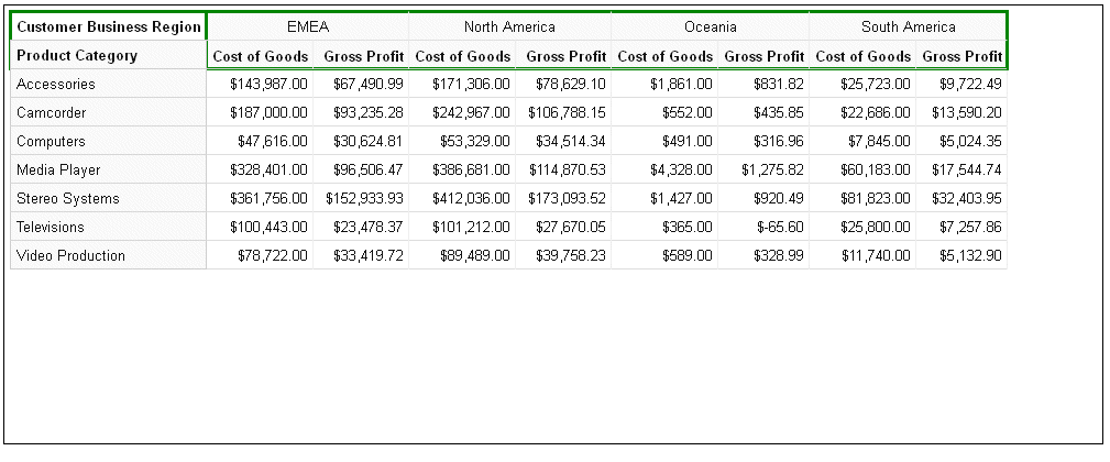
Generating and Formatting Scroll Bars on a Data Grid
|
How to: |
By default, scroll bars are generated on a data grid when the entire grid does not fit in the draw area. Using the dataGridProperties:scroll properties, you can disable scroll bars, format scroll bars, and specify whether to freeze column and row headers.
Syntax: How to Generate and Format Scroll Bars on a Data Grid
dataGridProperties: {
scroll: {
  enabled: boolean,
  freezeRowHeader: boolean,
  freezeColHeader: boolean,
  size: number,
  color: 'string',
  handle: {
   color: 'string',
   hoverColor: 'string',
   border: {
    width: number,
    color: 'string',
    dash: 'string'
           }
          }
        }
               }
where:
- enabled: boolean
-
Enables or disables scroll bars on a data grid. Valid values are:
- true, which enables scroll bars. This is the default value.
- false, which disables scroll bars.
- freezeRowHeader: boolean
-
Defines whether to freeze or scroll the row header on a data grid. Valid values are:
- true, which freezes the row header. This is the default value.
- false, which scrolls the row header.
- freezeColHeader: boolean
-
Defines whether to freeze or scroll the column header on a data grid. Valid values are:
- true, which freezes the column header. This is the default value.
- false, which scrolls the column header.
- size: number
-
Is a number that defines the height of the scroll bars, in pixels. The default value is 15.
- color: 'string'
-
Is a string that defines the color of the scroll bars. The default value is 'rgb(240, 240, 240)'.
- handle:
- Defines the properties of the scroll bar handle.
- color: 'string'
-
Is a string that defines the color of the scroll bar handles (the pieces you drag in order to scroll the data grid). The default value is '#C2C2C2'.
- hoverColor: 'string'
-
Is a string that defines the color of a scroll bar handle when the mouse hovers over it. The default value is '#A8A8A8'.
- border:
- Defines the properties of the scroll bar handle border.
- width: number
-
Is a number that defines the width of the scroll bar handle border, in pixels. The default value is zero (0).
- color: 'string'
-
Is a string that defines the color of the scroll bar handle border. The default value is 'transparent'.
- dash: 'string'
-
Is a string that defines the dash style of the scroll bar handle border. The default value is '' (a solid line). Use a string of numbers that defines the width of a dash in pixels followed by the width of the gap between dashes in pixels (for example, dash: '1 1' draws a dotted line).
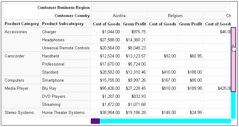
Example: Formatting the Scroll Bars on a Data Grid
The following request makes the scroll bar aqua and the handle purple with a navy 2-pixel border and a pink hover color.
GRAPH FILE WF_RETAIL_LITE
SUM COGS_US GROSS_PROFIT_US
BY PRODUCT_CATEGORY
BY PRODUCT_SUBCATEG
BY BUSINESS_REGION
BY COUNTRY_NAME
ON GRAPH PCHOLD FORMAT JSCHART
ON GRAPH SET LOOKGRAPH DATAGRID
ON GRAPH SET STYLE *
type=data, column=product_category,  bucket=row, $
type=data, column=product_subcateg,  bucket=row, $
type=data, column=business_region,   bucket=column, $
type=data, column=country_name,   bucket=column, $
type=data, column=cogs_us,    bucket=measure, $
type=data, column=gross_profit_us, bucket=measure, $
*GRAPH_JS_FINAL
dataGridProperties: {
 scroll: {
  color: 'aqua',
   handle: {
    color: 'purple',
    hoverColor: 'pink',
    border: {
      width: 2,
      color: 'navy'
                   }
     }
  }
                            }
*END
ENDSTYLE
END
The output is shown in the following image, with the mouse hovering over the vertical scroll bar handle.
| WebFOCUS | |
|
Feedback |