Adding Data to an Infographic Template
|
How to: |
You add data to your infographic template using WebFOCUS InfoAssist. When you open the infographic template in InfoAssist, it becomes a compound document. Specifically, each object that you marked with a WebFOCUS tag in the template becomes a component of the compound document, where you can add your data. Text objects become report components, where you can add the data field to the SUM field container or Header. Image objects become report components that are replaced by a binary large object (BLOB) database reference, a field reference that contains the name of an image file in a Reporting Server application path, or an external URL. Basic chart objects become WebFOCUS grid charts, and WebFOCUS chart objects become chart components that use the standard charting functionality available in InfoAssist.
You can add data to your infographic with InfoAssist in one of two ways:
- Beginning with a Reporting Object, which enables you to make all of the data preparation steps in a single place for all components in the compound document. This option enables you to reuse filters, and modularize the development of each component in the infographic. It also allows you to leverage a Reporting Object for reuse later.
- Starting with a Master File, where you add filters and Where conditions directly in the infographic template you open in InfoAssist. When you add data in this way, each component is automatically connected to the Master File you select. However, you can change the Master File for each individual component using the Add Data Source and the Switch Data Source options. When you coordinate and burst a compound document, each component does not need to be associated with the same Master File, but all components must have a common data key.
Note: In the example used throughout this topic, we used a Reporting Object to create Where conditions that narrowed down our data to only show a specific quarter and product category.
Procedure: How to Add Data Using a Reporting Object
- Sign in to WebFOCUS.
The WebFOCUS Home Page opens.
- Navigate to the domain of your choice, and under Create New, click More, and then click Upload File
 .
. - Navigate to the WebFOCUS Infographic template on your machine and click Open.
The file uploads to your domain folder.
- In the same domain, under Create New, click Reporting Object
 .
. - In the Open dialog box, select a Master File, and then click Open.
In our example, we used wf_retail.mas.
The Reporting Object interface opens, as shown in the following image.
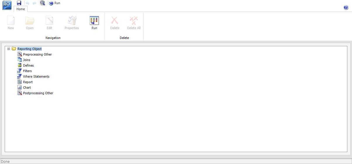
Here, you can create Where statements and filtering conditions for your infographic. These Where statements are applied to the infographic, but remain invisible. Filters, instead, appear in InfoAssist, and can be manually included or excluded for each individual component.
- Right-click the Where Statements node and click New.
The Create a filtering condition dialog box opens.
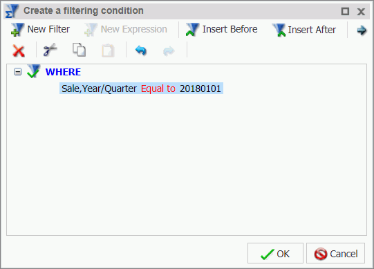
- Create a Where statement with your data. For example, you can create a Where statement that specifies that a field, such as
Sale,Year/Quarter, is equal to a constant value such as the first quarter of 2018. This Where statement would be Sale,Year/Quarter Equal to 20180101, as shown in the following image.
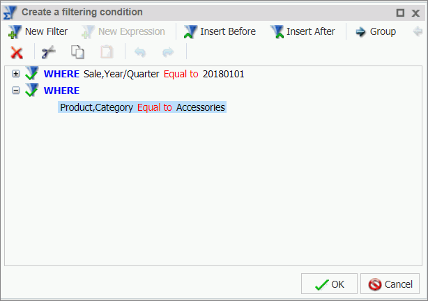
- Click New Filter to add more Where statements, if you have another metric that applies to the entire infographic. For example, if your infographic
highlights accessories, you can add a Where statement that narrows the Product,Category field down to Accessories, as shown in the following image.
- After creating your Where statements, click OK to return to the Reporting Object interface.
- Right-click the Filters node and then click New.
The Reporting Object Filter Group dialog box opens.
- Name the filter group and click OK.
The filter group appears below the Filters node, as shown in the following image.

- Right-click the filter group you created, and click New.
The Reporting Object Filter dialog box opens.
- Name the filter and click Add New.
The Create a filtering condition window opens.
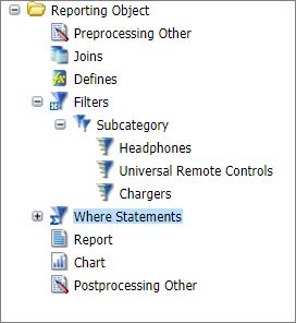
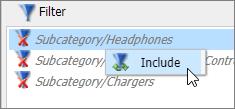
- Add one or more filters that you want to enable manually inside the infographic.
For example, if you want to refine the view of your data, you can create a filter to specify that Product Subcategory, when used, should equal Chargers, Universal Remote Controls, or Headphones. An example of these configured filters is shown in the following image.
- Save the Reporting Object. On the Quick Access Toolbar, click Save.
- In the Save As dialog box, name the Reporting Object, and click Save.
- Close the Reporting Object interface and return to the Home Page.
- On the Home Page, right-click your infographic template, point to New Infographic, and click Reporting Object.
The Reporting Object dialog box opens and displays the list of the available Reporting Objects, as shown in the following image.
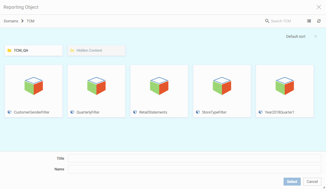
- Click your newly created Reporting Object, and click Select.
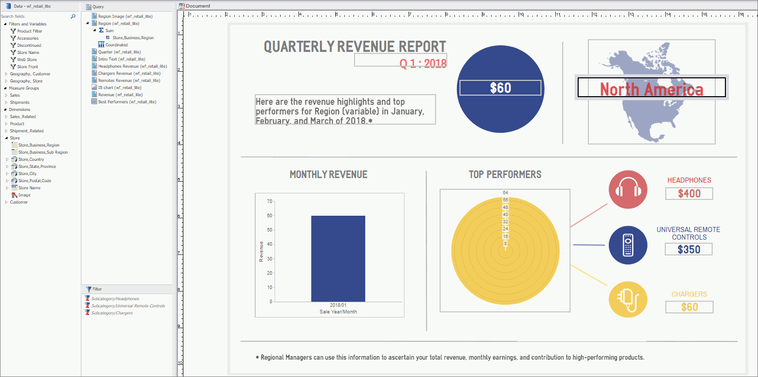
InfoAssist opens in Document mode, and your template loads on the canvas. Notice that the WebFOCUS-tagged objects on the canvas correspond to the components in the Query pane. In the following image, the Region Image object is selected, and is shown as a report component in the Query pane with Sum and Coordinated field containers that can accept data values.
You can now build a WebFOCUS procedure that connects the infographic with your data.
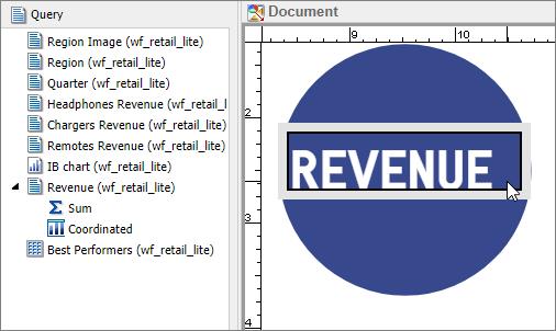
- On the canvas, click an object to which you attached a WebFOCUS tag.
The data component for this object opens in the Query pane, as shown in the following image.
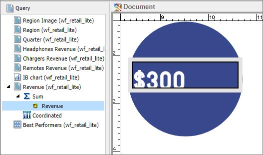
- Populate the component with appropriate data by dragging the field from the Data pane to the Query pane or to the component
on the canvas. In our example, we dragged Revenue to the Sum field container of the Revenue report component.
When the canvas refreshes, it displays the data, as shown in the following image.
Notice that if you created Where statements in the Reporting Object, all your data is automatically narrowed down to those parameters.
- Populate any remaining components with your data. In our example, we populated the three Subcategory Revenue components, Headphones,
Universal Remote Controls, and Chargers, but we wanted to refine the data, so that it only showed the revenue for these specific
accessories.
To do this, we enabled the individual filters in the Filter pane, as shown in the following image.
Note: In InfoAssist, you can aggregate measure fields so they display as percentages, sums, averages, or several other value types. To do this, right-click a measure field, point to More, point to Aggregation Functions, and then select one of the options.
- Populate any chart placeholders with data that is relevant to your infographic. Both basic charts and WebFOCUS charts have corresponding field containers in the Query pane.
- Optionally, you can change the styling of the WebFOCUS chart to fit your template.
- Right-click any chart component, and then click Series Color.
The Color window opens.
- Select the desired color or complete the RGB information, and then click OK.
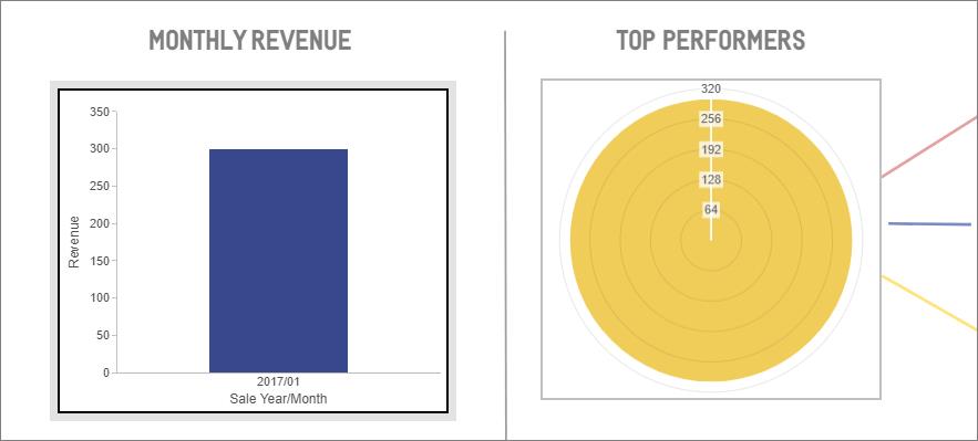
An example of completed charts is shown in the following image.
- Right-click any chart component, and then click Series Color.
- Populate text components.
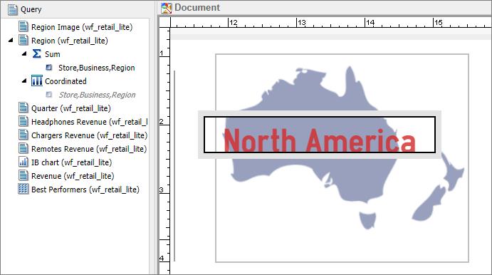
In our example, we highlighted Region on the canvas and dragged Store,Business,Region to Sum. The component now reflects the field data, as shown in the following image.
You can also modify the image that each user sees when you burst the infographic. For example, if you want to display an individual image for each region, you would create a Define that points to different image files that you upload to the Reporting Server application path.
- Ensure that your images are uploaded to the Reporting Server. You can use the Legacy Home Page to upload them to the server path corresponding to the same domain in which the infographic resides.
- On the Data tab, in the Calculation group, click Detail (Define).
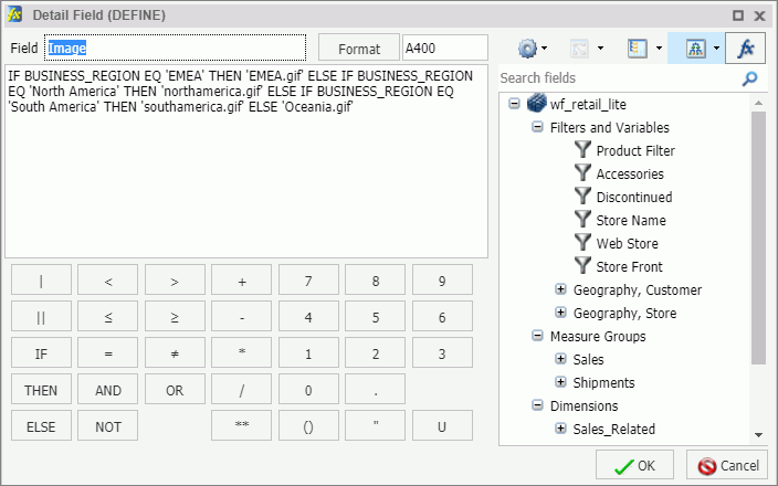
- In the Define Field dialog box, create an expression that links your image to a specific field value. For example, if you
want to show images based on Business Region, you would create an expression to accomplish this, as shown in the following
image.
- After you create your Define, it appears in the Data pane. You can then add it to the Sum field container for an image component.
- In the Define Field dialog box, create an expression that links your image to a specific field value. For example, if you
want to show images based on Business Region, you would create an expression to accomplish this, as shown in the following
image.
- You can also modify portions of your text components and personalize them for bursting. Specifically, you can insert a variable
value in a line or lines of text that are custom for each recipient.
For example, if you want to create a variable word in the introduction text component that changes for each region when the infographic is distributed, you can do this, using the following steps:
- Select the intro text and click Header & Footer.
The Header & Footer dialog box opens.
- Add the text that you want to modify, and drag the corresponding data field from the Data pane to the dialog box.
Drag any field from the data pane into the canvas to incorporate it into the text.
In our example, we replaced the word Region (variable) with the Store,Business,Region field, so the message reflected the region of our recipient, as shown in the following images.
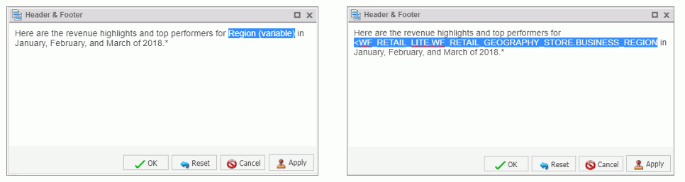
- Click OK.
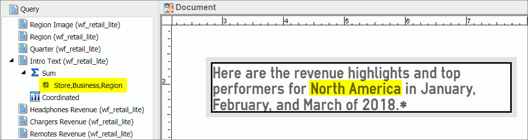
- Drag the same field to the Query pane, under the Sum bucket.
The text portion changes to reflect the field value, as shown in the following image.
- Select the intro text and click Header & Footer.
- Optionally, you can coordinate components of the infographic procedure for bursting. This means that when you apply a data
value to all components, it customizes the output of information that you send to each recipient.
In our example, we wanted to coordinate our data by region, so each Regional Manager received a specific revenue report narrowed down to their area. To do this, we dragged Store,Business,Region in to a Coordinated field container in the Query pane.
- Once you have populated your infographic with data, you can run it to preview the output. On the Quick Access Toolbar, click
Run.
The infographic runs in the preview mode.
Since our example was created for bursting, the preview displays four versions of the infographic, one for each region. In each version, the values, headlines, and images relate to each of the four regions in our data, as shown in the following images.
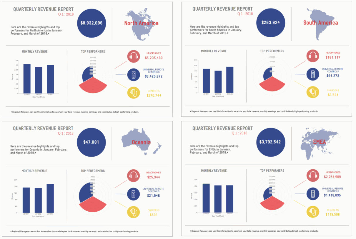
You can use the same principle to generate bursts by any other field or metric, and distribute a different infographic to different stakeholders. For example, you could distribute new versions for each quarter, or change the Product Category represented to highlight other areas of the product line.
- Save your infographic. On the Quick Access Toolbar, click Save, and then name your infographic.
You can now share your infographic with others by email, in a form of an email burst across different groups of stakeholders, as well as publishing or sharing it in the WebFOCUS Repository.
Procedure: How to Add Data From a Master File
- Create an infographic template and upload it to WebFOCUS.
- On the WebFOCUS Home Page, right-click the infographic template, point to New Infographic, and then click Master File.
The Open dialog box opens and displays the list of Master Files that are available to you, as shown in the following image.
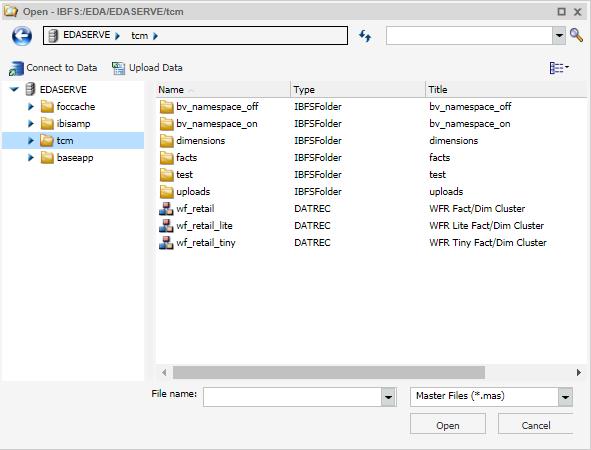
- Select a Master File and click Open.
The infographic template opens in InfoAssist Document mode, where you can connect it to your data.
- Drag data fields from the Data pane to the Query pane to add data to your components.
- Optionally, filter your data within the InfoAssist session in one of the following ways:
- Right-click a field in the Query pane, click Filter Values, and create a filtering condition of your choice.
- Drag a field from the Query pane to the Filter pane, and proceed with creating a filtering condition.
- Select a field in the Query pane, and on the ribbon, from the Data tab, click Filter, and then follow the steps to create a filtering condition.
- Save your infographic procedure.
You are now ready to share it with others.
| WebFOCUS | |
|
Feedback |