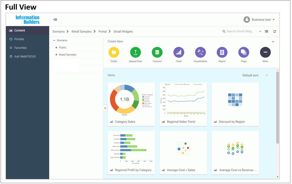
Viewing the Home Page on Mobile Devices
The WebFOCUS Home Page is optimized for viewing on mobile devices. It automatically adjusts to a smaller screen or browser width. Additionally, there are several interface and functionality changes that occur when you switch from the full view to the mobile view. The following images show the difference between the full view of the Home Page and its version on a mobile device-sized screen.
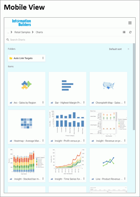
When you view the Home Page on a mobile device, the sidebar is hidden from view to allow more space for your content. You
can bring the sidebar back by tapping the menu button  on the navigation bar, as shown in the following image.
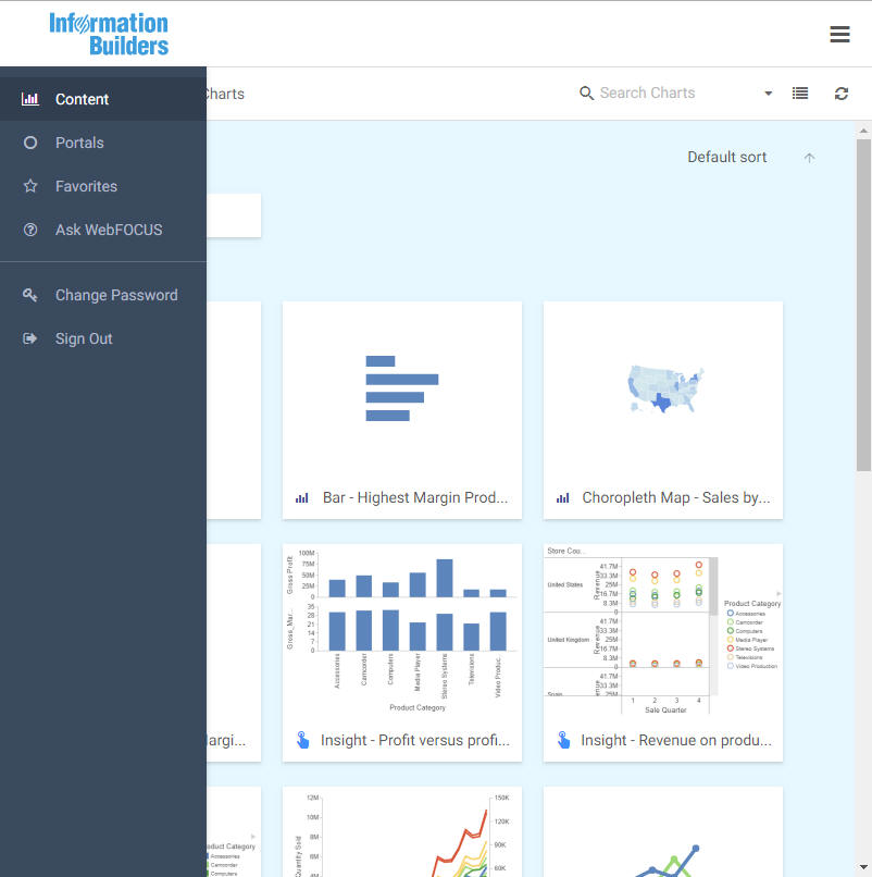
The actions bar and the drop-down button on the navigation bar are also hidden in the mobile view. To access the functionality available from these features, you need to use the full desktop version of the software. The Change Password and Sign Out options display on the bottom of the sidebar in the mobile view.
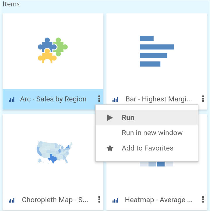
You can run content in the mobile view by tapping on an item. Select shortcut menu options are also available on mobile devices.
To access the shortcut menu options, tap the ellipsis button  in the bottom-right corner of the item, as shown in the following image. The shortcut menu options are context sensitive,
and vary, depending on the item or element you want to access.
in the bottom-right corner of the item, as shown in the following image. The shortcut menu options are context sensitive,
and vary, depending on the item or element you want to access.
To navigate between domains and folders on a mobile device, you must use the breadcrumb trail. The arrows between the directories allow you to switch between different folders. Click the ellipsis to navigate between the levels that are hidden from view.
You can also search, switch between list and grid views, refresh and sort content in the mobile view. These functions perform in the same way as they do in the full desktop view.
| WebFOCUS | |
|
Feedback |