Hiding Content From Devices
|
How to: |
You can choose to hide certain content items from smaller devices, especially when dealing with large or multi-faceted items like maps or visualizations. When an item is hidden from a device, the other items around it re-flow into the empty space and retain the responsive layout.
Procedure: How to Hide a Content Item From Devices
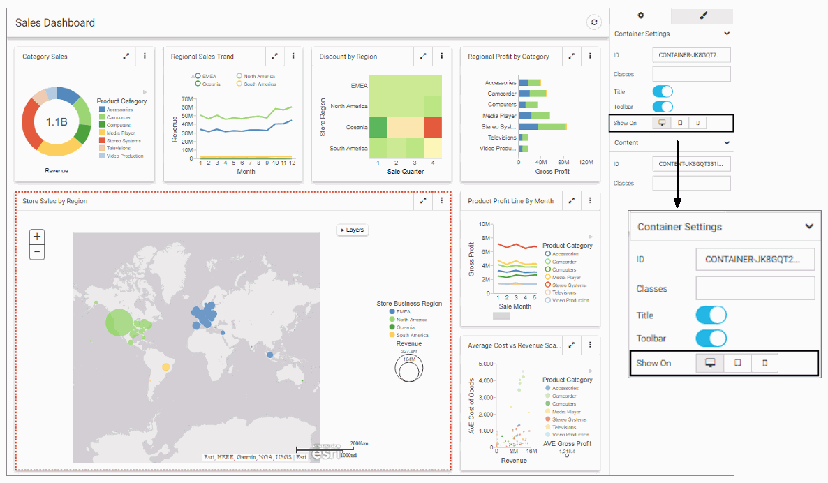
- In WebFOCUS Designer, select a large item that you want to hide from small-screen devices.
- In the Properties panel, in the Setting tab, under the Show On property, click the device icon to remove it from the list
of devices on which this item will be shown.
Note: All three device buttons are selected, by default, making the item visible on all devices. Manually clear the buttons to hide the item from specific device types.
An example of hiding a large item from mobile phones and tablets is shown in the following image.
- Save the page.
- Run the page on a device, from which the item was hidden.
The item does not display. All remaining content items rearrange to cover the empty space, as shown in the following image.

| WebFOCUS | |
|
Feedback |