Portal Components
|
Topics: |
A portal is made up of different components, such as a Menu Bar, navigation area, and banner. This topic describes the different components of a portal and their properties.
Portal
The properties are:
- Portal Title. This is a unique name that is used to describe the portal throughout WebFOCUS.
- Portal Icon
- This is an icon displayed to the left of the portal name throughout WebFOCUS. For example, it appears in the Resources tree.
- The maximum display size of the icon is 16 x 16 pixels. Upload an image that is visible at that size.
- Change the portal icon by clicking the preview icon or the Change Image button.
- Published. This check box determines whether or not the portal is ready for others to use. When this box is checked, the portal is live for anyone who has been given access to it.
- Dynamic Report Styling. When this property is enabled, all reports that run within the portal inherit their styling from the portal. Each portal theme has a default WebFOCUS StyleSheet (.sty file). You can choose from any of the StyleSheets, as well as create and apply your own.
- Width. This is the width of the portal. You can set it as default, auto, responsive, or specify a percentage or number of pixels. By default, the width is set to 100%.
- Alignment. When the width is not 100%, you can choose how to align the content (left, center, or right). Center is the default alignment.
- Page Height Mode. You
can choose from one of two different page height modes.
- Fill (default). The page takes up 100% of the viewable space in your browser. If there is more content than can fit in that space, the page area will scroll, but the top and bottom banner (if enabled) will always be visible. Use this when you want to make the complete site, including the banners, visible.
- Auto. The page height is set to that of the page content. In this mode, the banners scroll with the page content. Use this feature when you want pages to grow as the user adds content.
- Summary. This is an optional explanation of the portal. It is displayed in the tooltip of the portal tree when the mouse hovers over a portal.
- Show live content. This check box allows content to change in real time.
- Broadcast height for embedding. Enables a third-party web application to embed the portal content and display it correctly within a responsive layout.
- Default Page. Selects
the page that the users see upon their login to the portal.
Note: If set to None, all users, upon their first login to the portal, see the page that was viewed by the Designer at the moment of saving a portal. Upon subsequent logins, users with portal customization privileges will see the last page that they viewed at run time. This behavior is especially useful when you need to show a specific page to users once, for example a disclaimer or a tutorial.
Menu Bar
The Menu Bar has the following properties:
- Location. Works just like the Menu Bar button on the ribbon.
- Margins. Used to fine-tune the Menu Bar position. You can adjust the Menu Bar horizontally (left or right) or vertically (top or bottom). The labels and choice of units (pixel or percentage) vary, based on the starting position. The vertical option is disabled when the Menu Bar is in the top or bottom bar. The vertical and horizontal options are disabled when the location is middle and center, respectively.
- Separator. Color of the vertical bar between items.
- Items. List of available and selected options.
- Max Items. Maximum number of items to show in the Menu Bar. Any additional items become the sub-items of an option labeled More.
- Theme. The Theme button and check box become active when you add Theme from the Available list to the Selected list, and allows you to select the themes that will be in the Menu Bar drop-down list.
- Refresh content on theme change. If enabled, refreshes all content items on the page to reflect a new theme.
Navigation
The Navigation area is located on top of pages. The properties panel for this component lets you choose if the Style tab is styling the Buttons or the Area (non-button space in the Navigation section).
Additionally, the following are the properties of the navigation area:
- Hide New Page. Removes the option to create a new page at run time, when it is selected.
- Hide Link to Page. Removes the option to add a linked page at run time, when it is selected.
Note: If the Hide New Page option is enabled and the Hide Link to Page option is disabled, the run-time New Page button opens the Open dialog box, where you can link to an existing page. If the Hide Link to Page option is enabled and the Hide New Page option is disabled, the run-time New Page button opens the Add Page dialog box. The Link to Page button is not displayed in the Add Page dialog box. If both Hide New Page and Hide Link to Page options are enabled, the New Page icon is not displayed in the navigation area at run time.
Banners
Banners are areas that are visible above the pages of the portal.
The following are the properties of a banner.
- Height. Set in pixels or as a percentage.
- Lock Banner. Turns off customization of the banner. Customization includes changing the height and visibility settings.
-
Collapsible. Allows optional visibility at run time. If this
check box is selected, the banner becomes collapsible, allowing you to expand
the display area of the portal. To hide or reveal a banner at run time, click
the collapsible banner indicator, as shown in the following image.

Portal Pages
Portal pages are the main content area of a portal. The default page, when a user loads the portal, is the portal page that was visible in the Portal Designer when you last saved the portal. You can rearrange portal pages using a drag-and-drop operation.
The following are the properties of a page.
- Title. Identifies the title or label shown in the navigation menu and any tree that lists pages in a portal.
- Page Icon. Works just
like the portal icon, except that you can turn it on or off. It is disabled, by
default.
Note: You can upload a custom image of any size for a portal page icon. Larger images can be used for side navigation on the Legacy Home Page and as buttons on mobile devices. Changing the portal page icon in the Properties tab of the Portal Page Designer does not change the default icon that displays on the WebFOCUS Home Page.
- Change Image. Allows you to select a different image for the icon.
- Lock Page. Turns off
customization on the portal page. Customization includes moving content and adding
content.
Note: The Lock Page check box is selected by default. Clear it to grant permission to end users for moving and adding content.
- Refresh on Click. Refreshes the portal page when you click the page title. This feature is useful if another portal page changes the parameters used by the reports on this page. When you switch back, the reports rerun with the appropriate parameters.
- Show in Navigation. Used to hide the portal page from the navigation. You can use this property to create a home page for a portal that displays the first time that a user runs the portal, but the user cannot navigate to it again.
- Prevent Layout Change.
Restricts layout changes on unlocked portal pages at run time. This option is only
active when the Lock Page option is disabled.
Note: In a collaborative portal, this behavior varies depending on the template that you choose. For the columnar layouts, Fluid Canvas, and Single Area, the Prevent Layout Change check box is clear by default. This gives users the freedom to switch between these layouts at run time. For all responsive layouts, the Prevent Layout Change check box is selected, by default, to prevent users from breaking the template and impairing the responsive function.
- Relative Path. References a specific path for the content that was added to a portal page and allows you to move the page or the portal in the repository without losing any content or resources. This option is only available for collaborative portals.
- Show Refresh. If enabled, displays the Refresh option in the portal page menu at run time.
- Margins. Sets page margins in pixels or as a percentage. Use the Same for All option to set equal margins on all four edges of a portal page.
- Comments. Controls the placement of the comments on a portal page. The options include: none, top, bottom, left, and right. This option is only available for collaborative portals.
- Container Defaults. Opens the Container Defaults dialog box, where you can set a default size, appearance, and list of behaviors for all containers on a portal page.
- Summary. Appears in a tooltip when you are exploring the portal in a tree. Applies to the portal page.
- Page Name. Sets a descriptive name of your portal page. The name is used throughout the WebFOCUS application.
Columns
Columns can be found in both banners and portal pages. Columns have the following properties:
- Column Number. A label that indicates the column that is selected on the portal page.
- Width. Set in pixels or as a percentage.
- Lock Width. Prevents a designated column width from being changed at run time. This option is only active if the column width is set in pixels or as a percentage. It is disabled when the column width is set to Auto.
- Container Padding. The space between either container and the column edge (left and right of each container, the top of the first container, and the bottom of the last container) or each other (vertical space between each container). These work like page margins, but are set only in pixels.
- Freeze Column. Prevents users from adding content to the column or any of the containers inside this column at run time. It also prevents users from removing any content or containers from this column at run time. This option is not available when the Lock Page option is selected.
- Show Easy Selector. Activates the Easy Selector function at run time.
- Select Folder. Opens the Browse For Folder dialog box, where you can select a folder that is available from the Easy Selector option at run time.
Logo
A logo has the following properties:
- Reset. Click the
reset
 icon to reset the logo.
- Show Logo. Clear the check box to hide the logo.
- Change Image. Click Change Image to select your own logo.
- Logo Size. Set the logo size in pixels or as a percentage. Click the lock icon to lock the aspect ratio (changing the width changes the height proportionately and vice versa).
- Location. Position the logo in the top banner. This feature works just like the background positioning on the Style tab.
- Margins. Used to fine-tune the image location. Works just like the Menu Bar margins.
Containers
There are five types of containers. They are:
- Panel. A simple container that can hold a single piece of content.
- Accordion. A compound container that can hold one or more pieces of content. It uses accordion panes to switch between the content.
- Tabbed. Similar to the accordion, but uses tabs to switch between the content.
- Responsive. A compound container that responds to the layout changes based on the size of the browser or device.
- Easy Selector. A simple container that a flexible way of adding content to a portal at run time without opening the Resources tree.
Panels
|
Topics: |
The panel consists of three sections:
- Overall panel
- Title Bar
- Content Area
If you hover over a panel, the Change Panel Type button appears, as shown in the following image.

This button opens a menu, where you can select a different type of panel.
Note: When adding pages created in the WebFOCUS Designer, the Change Panel Type button opens over the Refresh and Filter options for the page. However, when you run the portal or portal page, these options are accessible.
To change the title of the panel, right-click the title bar and click Change Title, as shown in the following image.

Panel Properties
The properties for all panel types are:
- Properties Tab.
Contains the properties that apply to the panel.
- Size. In a single area layout, this is both height and width in pixels. In column-based layouts, this is height only. You can set the height, in pixels, to Auto, Dynamic, or a numeric value. The Dynamic height option is only available when you use a responsive container.
- Responsive Properties. Opens the Responsive Panel Properties dialog box, where you can edit the layout of the responsive container.
- Behaviors. You can
configure how the panel behaves. By default, all options are on. The options
that require a menu click are available by hovering over the title bar and
accessing the menu at the upper-right (in accordion and tabbed containers, each
area has a menu as well). The options are:
- Move. If selected, allows you to move a panel on a page at run time.
- Resize. If selected, allows you to resize a panel at run time.
- Minimize. Adds the Minimize option to the panel drop-down menu.
- Maximize. Adds the Maximize option to the panel drop-down menu.
- Refresh. Adds the Refresh option to the panel drop-down menu.
- Hide. Adds the Hide option to the panel drop-down menu.
- Delete. Adds the Delete option to the panel drop-down menu. When a user deletes a panel, they delete it only from their version.
- Show Comments. Displays comments on a panel, and adds the Show/Hide Comments option to the panel drop-down menu, if selected. This option is only available for collaborative portals.
- Appearance. You can
control the following options:
- Hide Panel. When this option is selected, the panel is not initially visible. The user can add it by clicking Hidden Content in the page shortcut menu or the Menu Bar. You can use the Hidden Content feature to give the user a choice of widgets to view on their page.
- Freeze Container. Prevents users from adding content to and removing content from the container at run time. This option also restricts any interaction with the container at run time except minimizing, maximizing, and restoring the panel to its original size. This option is not available when the Lock Page option is selected.
- Show Easy Selector. Activates the Easy Selector function at run time.
- Select Folder. Opens the Browse For Folder dialog box, where you can select a folder that is available from the Easy Selector option at run time.
- Title Tab. Contains
the properties that apply to the title bar of the panel.
- Title. This is the text displayed in the title bar. When you add content, it automatically changes to the current title of that content. You can edit this field to override the automatic change.
- Panel Icons. Works just like the portal and page icon, except that you can turn it on or off. It is disabled by default.
- Change Image. Allows you to select a different image for the icon.
- Appearance. You can control the following options:
-
- Hide Title Bar. You can hide the title bar to save space. This feature is very useful when you have only a single piece of content on a portal page.
- Show Menu Icons. Determines whether the icons that display with the options in a container shortcut menu are visible.
- Content Tab. Contains
the properties for a content item that is displayed inside the panel.
- Content Area. The properties for the Content Area differ based on the type of content. A blank panel has a blank properties panel.
- Auto Refresh. If enabled, refreshes the content automatically. This property is off by default. When it is enabled, the default time is 30 seconds.
- Dynamic Report Styling. When Dynamic Report Styling is enabled at the portal level, this box is checked for a piece of content by default. To disable Dynamic Report Styling for a specific piece of content, clear this option.
- Tabs/Areas Tab. Contains the properties that apply to tabs and areas. This tab is only visible in the properties panel of a tabbed or accordion container. Here you can style different areas of the container by selecting Buttons or Bar. You can also hide the new tab button from a tabbed container, or the new area button from an accordion container, to restrict adding more tabs and areas to this container at run time.
Accordion Container
The accordion container can hold more than one piece of content, as shown in the following image.

In the preceding image, notice how the chart fits perfectly in the container. WebFOCUS InfoAssist has an option to AutoFit charts. When enabled, it accepts the sizing from the portal. This prevents the person who develops the chart and the person who uses it from having to coordinate sizing. Additionally, you can easily resize the container and see the entire chart.
In the Area section, you can use the icons in the order in which they appear to add, rename, delete, and reorder the areas. You can also create a new area using the New Area bar in the container or delete containers using the menus. You must use the Properties panel to rename or reorder the areas.
Note: When you click the New Area bar multiple times to add new areas, you may need to resize the container to view the bar, as it could be covered by newly created areas.
There is also an additional Properties panel, the Pane Title Bars, which is accessible only through the breadcrumb trail. This feature lets you style the title bars of the areas. They are all styled together, but you can style the different states to distinguish the currently active one from the one on which the mouse pointer is resting.
Tabbed Container
The tabbed container can hold more than one piece of content, as shown in the following image.

The tabbed container has all the same properties as the accordion container. Instead of the Pane Title Bars properties, it has a property panel called Tab Bar. You can access this property panel by clicking it.
Unlike the Pane Title Bars, it is not blank. You can choose to style the buttons or the bar. This feature is similar to styling the Navigation buttons versus the Navigation area.
Responsive Container
|
Topics: |
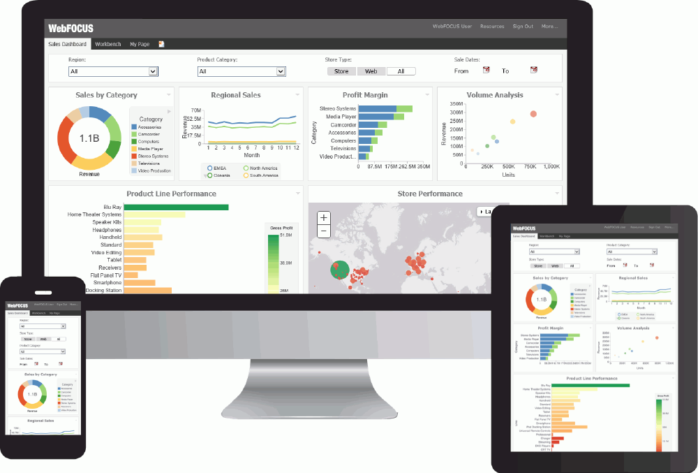
The responsive container is designed to help you build a responsive portal that automatically adapts to different screen sizes and mobile devices, providing an optimal viewing experience for users everywhere. You can build your responsive portal on your desktop, and make it available to users on different platforms. The following image shows an example of a responsive portal displayed on a desktop, tablet, and smartphone.
The responsive container intuitively changes its layout when you change the size of your browser. The default width and height of the container, and the inserted items, are pre-configured to offer the best positioning of the elements on the screen. You can manually change the dimensions of the items in the Responsive Item Properties dialog box. You can also change the layout options in the Responsive Panel Properties dialog box.
Responsive Item Properties
The Responsive Item Properties dialog box provides options to change the dimensions of an individual item within the responsive container. You can access the Advanced Responsive Item Properties dialog box at design time by clicking the Responsive Properties button in the property sheet.
- Custom CSS Classes. Enables custom CSS classes for the item.
- Width. Defines the width of the item.
- Height. Defines the height of the item.
- Margin. Defines the space between the adjacent items.
- Shrink. Defines the ability of the item to shrink if necessary.
- Grow. Defines the ability of the item to grow if necessary.
- Basis. Specifies the initial size of the item, before any available space is distributed according to the responsive factors.
- Minimum Width. Sets the minimum width of the specified element. This setting overrides the Width setting.
- Maximum Width. Sets the maximum width of the specified item. This setting overrides the Width setting.
- Minimum Height. Sets the minimum height of the specified item. This setting overrides the Height setting.
- Maximum Height. Sets the maximum height of the specified item. This setting overrides the Height setting.
- Self Align. Provides
access to the following options:
- Auto. Intuitively places the item in the best available space inside the responsive container.
- Start. Aligns the item to the left side of the responsive container.
- End. Aligns the item to the right side of the responsive container.
- Center. Aligns the item to in the center of the responsive container.
- Stretch. Stretches the item to fill the available space inside the responsive container, while respecting width and height constraints.
- Baseline (text). Aligns the baseline of text inside the responsive container.
Note: In a responsive portal, setting fixed dimensions for items is not recommended, because the viewport width and height continually change from device to device. Responsive layouts need to adapt to this change, whereas fixed dimensions create too many constraints. For this reason, you must only set a range between minimum and maximum width and height, defining an amplitude with which the item can vary in size.
Easy Selector Container
The easy selector container provides a simple way to add content to a portal at run time, without opening the Resources tree. It also gives you the option to control which items users can access. When you insert an easy selector container into a page at design time, the Browse For Folders dialog box opens, as shown in the following image. Here, you can select a folder that users can access at run time.

To change a target folder, click the Change Folder button in the Properties panel.
Content
You can add content to a portal in a few ways. The first way is to use the ribbon. Navigate to the Insert tab and choose a type of content in the Content group. The second way is to insert a blank panel, area, or tab, and use the WebFOCUS Resources option to populate it. The Resources tree opens, allowing you to drag content into the portal.
Note: When you click and drag one or multiple resources or folders from a tree to a blank page, a tabbed container is created, showing each resource. For more information, see Tabbed Container.
The other four options (Image, Resource Tree, Portal List, and Text) place their content in the content area that is selected, if applicable. Alternatively, they create a new panel with the content in the current page or banner that you are on.
When you add Insight-enabled content to a portal page, it will run as a standard HTML5 chart. An Explore with Insight icon displays, as highlighted in the following image.
You can view the content in Insight mode by clicking the Explore with Insight icon. Content opens in a new browser tab.
WebFOCUS Resources
|
Topics: |
The WebFOCUS Resource option opens the Resources tree on the right-hand side of the window. The tree shows you the content stored in the WebFOCUS Repository. You can access this content in the Content section of the tree. Alternatively, you can find a resource that you marked as a Favorite.
Depending on security, you may also have access to the Reporting Servers section to manage metadata. You cannot insert a report that is stored on the Reporting Server into a portal.
The Resources tree is docked on the right. When it is docked, you can keep it open, close it, or unpin it so that it collapses to the side. The Resources tree is shown in the following image.

URLs
A URL is a link to a website. To create one, right-click a folder in the Content section of the tree, point to New, and click URL. In the Create URL dialog box that opens, type a display title, a file name, and the URL itself. Optionally, you can provide a summary that is displayed in a tooltip when the mouse pointer rests on the URL in the tree.
If you insert a URL inside the portal, be aware that some sites may not work, as their owners may not allow them to run inside a frame. Internet Explorer will show a message. Firefox® and Chrome™ browsers display just a blank frame.
Resources Tree
You can insert a Resources tree to allow users to perform activities such as run content, create content, and schedule content. In addition to the tree nodes shown in the pop-out tree, you can also choose to show a node named Portals, which lists all the portals that the user can access.
Note: If you place a Resources tree into a column (which is a percentage of the whole horizontal size), it cannot be resized.
Click the Filter button to access the Filter option. The Filter feature is not a search feature. To access search, right-click the Domains node or any folder in it, and click Search. As you browse through the tree, the filter returns only items that meet the filter criteria.
Note: Folders published from the WebFOCUS Portal Designer or Portal Page Designer display as published in the WebFOCUS Resources panel, but display as private in the Resources tree on the Legacy Home Page. Refresh folders in the Resources tree to display them as published.
When the Resources tree is placed inside a panel, the following properties display in the Properties panel, in the Content tab:
- Resources tree
From the following list, choose which sections of the tree to show:
- Filter
- Content
- Favorites
- Reporting Server
- Portals
- Change Management
By default, all sections are enabled. The enabled sections appear for any user that has security access to those sections. A portal designer can deny access to a section by hiding it, even from a user who has access, but a designer cannot grant access to a user who does not have access.
- Hide Scrollbar. When selected, this option removes the horizontal scrollbar from the Resources tree. This feature improves usability of the component at run time and on mobile devices.
- Run Location. You can
choose to run content in a window or in a panel in the portal. Reporting Server
content always runs in a new window.
When the first option is set to Window, there is a second option named Window, giving you the ability to choose a New Window or name the window in which to run.
When the first option is set to Panel, you can choose to create a new panel, accordion, or tabbed container, as well as choose from one of the existing content areas on the page. In the case of an existing accordion or tabbed container, choosing the title of the container itself creates a new area or tab in that container. Choosing an existing area replaces that area.
Note: If the Freeze Container option is selected on the target panel, the content will still run, but all additional changes to that panel will be restricted.
Portal List
The Portal List has properties that display in the Content tab of the Properties panel, such as:
- Portal List. Allows you to change the name of the panel, in which the Portal List is displayed.
- Hide Scrollbar. Removes the horizontal scrollbar from the Resources tree, when selected. This feature improves usability of the component at run time and on mobile devices.
Text
The text area has no properties other than the content type and the Area ID.
| WebFOCUS | |
|
Feedback |