Defining or Hiding a Tooltip for Risers
|
How to: |
The tooltip property defines a tooltip for one or more risers. The tooltip string is shown when the mouse hovers over a riser. A tooltip can be assigned to all risers and markers, a single riser and marker (identified by a series and group), or all risers and markers in a series.
You can prevent the tooltip for displaying for specific risers using the null property for the series tooltip.
When chart objects, such as risers, are in close proximity, and the tooltip has a menu (such as a drill-down menu), clicking an object to display its tooltip and then hovering the mouse over a nearby object may not change the tooltip being displayed to the one associated with the new object.
You can use the chart template engine to customize tooltips with macros. For information see Introduction to JSON Properties for HTML5 Charts.
You can also use autoNumberFormats to apply a number format to tooltips. For information about number formats, see Formatting Numbers.
Note:
- If you are using chart attribute syntax, you must use a *GRAPH_JS_FINAL block in the WebFOCUS StyleSheet in order to override the server-generated tooltips. For information about chart attribute syntax, see WebFOCUS Chart Attribute Syntax.
- Chart requests that do not use chart attribute syntax display an older style of tooltips than the new style tooltips generated by requests that use chart attribute syntax.
Syntax: How to Define a Tooltip for Risers
"series": [
{
   "series": number,
   "group": number, // Optional
   "tooltip": "string"}
]
where:
- "series": number
-
Is a zero-based series number, "all" to assign the tooltip to all series, or "reset" to remove default values. If the series does not exist in the chart, the property is ignored.
- "group": number
-
Is an optional zero-based group number. If not specified, the property is applied to all groups in the series.
- "tooltip": "string"
-
Is a string, or a function that returns a string, to display when the mouse hovers over the riser. You can inhibit the display of the tooltip for specific series using the value null for the tooltip object.
If htmlTooltip is enabled, you can use the special string "auto" to automatically populate the tooltip with series labels, group labels, and values. The content will be different for different chart types. See HTML Tooltips (htmlToolTip) for examples.
A callback function is invoked with three arguments: value, series ID, and group ID. For example:
tooltip: function(value, series, group) {
 return this.title.text + ", value: " + value + ", s: " + series + ", g: " + group;
}
Note that single and double quotation marks are both supported to enclose text in the function definition.
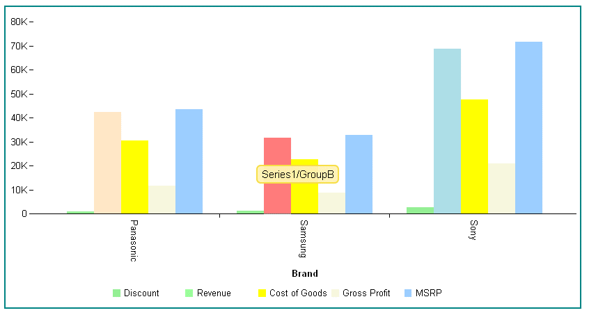
Example: Defining Series Tooltips
The following request assigns a tooltip to series 1, group 1:
GRAPH FILE WF_RETAIL_LITE
SUM DISCOUNT_US REVENUE_US COGS_US GROSS_PROFIT_US MSRP_US
BY BRAND
WHERE BRAND EQ 'Sony' OR 'Samsung' OR 'Panasonic'
ON GRAPH PCHOLD FORMAT JSCHART
ON GRAPH SET LOOKGRAPH VBAR
ON GRAPH SET STYLE *
*GRAPH_JS
"border": {"width": 2, "color": "teal"},
"series": [
	{"series": 0, "color": "lightgreen"},
	{"series": 1, "group": 0, "color": "bisque"},
	{"series": 1, "group": 1, "color": "red", "tooltip": "Series1/GroupB"},
	{"series": 1, "group": 2, "color": "lightblue"},
	{"series": 2, "color": "yellow"},
	{"series": 3, "color": "beige"}]
*END
ENDSTYLE
END
The tooltip displays when the mouse hovers over the specified riser:
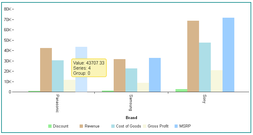
The following request uses a callback function to generate the tooltips. In order to remove all default tooltips so that the callback function will be used, you must use series "reset" or set each individual series tooltip to undefined. HTML tags can also be used in the function. In this example, <br> tags are used to generate line breaks in the tooltips:
GRAPH FILE WF_RETAIL_LITE
SUM DISCOUNT_US REVENUE_US COGS_US GROSS_PROFIT_US MSRP_US
BY BRAND
WHERE BRAND EQ 'Sony' OR 'Samsung' OR 'Panasonic'
ON GRAPH PCHOLD FORMAT JSCHART
ON GRAPH SET LOOKGRAPH VBAR
ON GRAPH SET STYLE *
*GRAPH_JS
"border": {"width": 2, "color": "teal"},
"series": [
	{"series": "reset", "tooltip": function(v, s, g) {return "Value: " + v +"<br>Series: " + s +"<br>Group: " + g;}},
	{"series": 0, "color": "lightgreen"},
	{"series": 1, "color": "tan"},
	{"series": 2, "color": "lightblue"},
	{"series": 3, "color": "beige"}]
*END
ENDSTYLE
END
The output shows the custom tooltip returned by the callback function:
Note: When a tooltip is defined for one or all series, the htmlToolTip property can be used to define HTML-based (div) style tooltips for any chart tooltips. For information on HTML-based tooltips, see Generating HTML Tooltips (htmlToolTip).
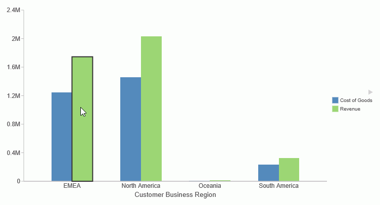
Example: Turning Tooltips Off for a Series
The following request turns tooltips off for series 1.
GRAPH FILE wf_retail_lite
SUM COGS_US REVENUE_US
BY BUSINESS_REGION
ON GRAPH PCHOLD FORMAT JSCHART
ON GRAPH SET LOOKGRAPH BAR
ON GRAPH SET AUTOFIT ON
ON GRAPH SET STYLE *
INCLUDE=IBFS:/FILE/IBI_HTML_DIR/ibi_themes/Warm.sty,$
TYPE=DATA, COLUMN=N1, BUCKET=x-axis, $
TYPE=DATA, COLUMN=N2, BUCKET=y-axis, $
TYPE=DATA, COLUMN=N3, BUCKET=y-axis, $
*GRAPH_JS_FINAL
"series": [ {"series": 1, "tooltip": null} ],
*END
ENDSTYLE
END
The output is shown in the following image. Although the mouse is hovering over a riser for series 1, no tooltip displays.
Syntax: How to Define Tooltip Submenus
Tooltips can be defined as arrays of submenus with entries and children. Nested submenus, in which the child entries have their own submenus, are supported. You can use htmlToolTip properties to style these menus, as described in Generating HTML Tooltips (htmlToolTip).
"series":[
 {"series": number,
   "tooltip": [
	  {
    "entry": "Submenu1",
    "children": [
                "Child1",
                "Child2"
                ]
  	},
   {
    "entry": "Submenu2",
    "children": [
                 {
                 "entry": "Nested Submenu",
                 "children": [
                             "NestedChildl",
                             "NestedChild2"
                             ]
                }
              	]
	}

       ]
  }]
where:
- "series": number
-
Specifies the series ID for the tooltip.
- "entry": "Submenu1", "entry": "Submenu2" ...
-
Defines the text of a tooltip submenu. You can use a combination of tooltip components, such as literal values and template macros.
- "children": [ "Child1", "Child2" ... ]
-
Defines the text of submenu children. A child can also have submenus. You can use a combination of tooltip components, such as literal values and template macros.
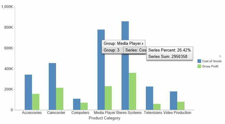
Example: Defining Tooltip Submenus
In the following request, series 0 has two submenus. The second submenu is a nested submenu.
GRAPH FILE wfretail82/wf_retail_lite
SUM COGS_US
GROSS_PROFIT_US
BY PRODUCT_CATEGORY
ON GRAPH PCHOLD FORMAT JSCHART
ON GRAPH SET LOOKGRAPH BAR
ON GRAPH SET AUTOFIT ON
ON GRAPH SET STYLE *
INCLUDE=IBFS:/FILE/IBI_HTML_DIR/ibi_themes/Warm.sty,$
TYPE=DATA, COLUMN=N1, BUCKET=x-axis, $
TYPE=DATA, COLUMN=N2, BUCKET=y-axis, $
TYPE=DATA, COLUMN=N3, BUCKET=y-axis, $
*GRAPH_JS_FINAL
"series":[
 {"series": "0",
   "tooltip": [
	  {
	  	"entry": "Group: {{group_label}}",
	  	"children": [
                "Series Label: {{series_label}}",
                "Series ID: {{series_id}}"
              ]
  	},
   {
    "entry": "Group: {{group_id}}",
    "children": [
                 {
                 "entry": "Series: {{series_label}}",
                 "children": [
		                  "Series Percent: {{series_percent}}",
                    "Series Sum: {{series_sum}}"
                             ]
                }
              	]
	}

       ]
  }
 ]
*END
ENDSTYLE
END
The output is shown in the following image.
| WebFOCUS | |
|
Feedback |