Treemap Chart Properties (treemapProperties)
|
Topics: |
These properties control the appearance of header cells and cell borders in a treemap chart.
Note: In a treemap, if "legend": {"visible": true} is in effect, you will get a color scale legend only if the chart includes color data. You will get a series legend only if the chart includes series IDs data.
If a data label in a treemap does not fit into its rectangle, it will be truncated and appended with ellipsis (...), as in the following image.

This code segment shows the default values.
"treemapProperties": {
	"scaleCellFonts": false,
	"header": {
		"height": undefined,
		"fill": "lightgrey",
		"border": {
			"width": 0,
			"color": "lightgrey",
			"dash": ""},
		"label": {
			"visible": true,
			"font": "8pt Sans-Serif",
			"color": "black"}},
	"cellBorder": {
		"width": 1,
		"color": "white",
		"dash": "",
		"outerCellWidth": 3}}
Scaling Fonts in Treemap Cells
|
How to: |
The scaleCellFonts property controls how labels are drawn in the treemap cells.
Syntax: How to Scale Fonts in Treemap Cells
"treemapProperties": {
	"scaleCellFonts": boolean,
	}
where:
- "scaleCellFonts": boolean
-
Valid values are:
- true, which scales font sizes for labels drawn inside each cell according to the cell area.
- false, which uses the same font size for all cell labels and does not draw labels when the label size exceeds the cell size. The default value is false.
Example: Scaling Fonts in Treemap Cells
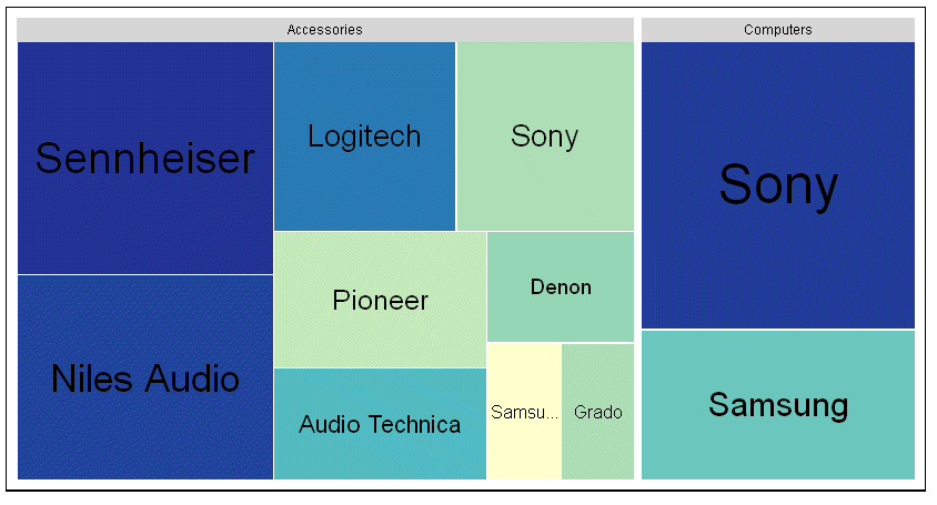
The following request generates a treemap chart. The scaleCellFonts property is set to true:
GRAPH FILE WF_RETAIL_LITE
SUM GROSS_PROFIT_US COGS_US
BY PRODUCT_CATEGORY
BY BRAND
WHERE PRODUCT_CATEGORY EQ 'Computers' OR 'Accessories'
ON GRAPH PCHOLD FORMAT JSCHART
ON GRAPH SET LOOKGRAPH TREEMAP
ON GRAPH SET STYLE *
*GRAPH_JS
"dataLabels": {"visible": true},
"treemapProperties": {"scaleCellFonts": true}
*END
ENDSTYLE
END
On the output, the cells with larger areas have labels with larger font sizes:
Formatting the Treemap Header
|
How to: |
These properties format the header in a treemap chart.
Syntax: How to Format a Treemap Header
"treemapProperties": {
      "header": {
      "height": height,
      "fill": "string",
      "border": {
         "width": width,
         "color": "string",
         "dash": "string"
      },
      "label": {
         "visible": boolean,
         "font": "string",
         "color": "string"
}- "height": height
-
Defines the height of the header. Valid values are:
- undefined, which automatically calculates the header height to be 33% larger than the header label height. This is the default value.
- A number that defines the height in pixels.
- A string that includes a percent symbol, enclosed in single quotation marks (for example, "5%"). When this property is set to a percent string, the header height will be the specified percentage of the overall height of the treemap.
- "fill": "string"
-
Can be undefined, a color definition, or a gradient definition. The default value is "lightgrey". For information about defining colors and gradients, see Colors and Gradients.
- "border":
- Defines the properties of the header border.
- "width": width
-
Is a number of pixels that defines the width of the header border. The default value is 0.
- "color": "string"
-
Is a color or gradient definition string that defines the border color. The default value is "lightgrey".
- "dash": "string"
-
Is a string that defines the dash style of the header border. The default value is "", which produces a solid line. Use a string of numbers that defines the width of a dash followed by the width of the gap between dashes (for example, dash: "1 1" draws a dotted line).
- "label":
- Defines the properties of the header labels.
- "visible": boolean
-
Controls the visibility of the header label. Valid values are:
- true, which makes the header label visible. This is the default value.
- false, which makes the header label not visible.
- "font": "string"
-
Is a font string that defines the font of the header label. The default value is "8pt Sans-Serif".
- "color": "string"
-
Is a color definition string that defines the color of the header label. The default value is "black".
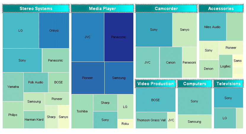
Example: Formatting a Treemap Header
The following request generates a treemap chart. The header is 25 pixels high. Its border is a grey dashed line 4 pixels wide, filled with a linear gradient that transitions from teal to cyan. The label in the header is white and bold 10pt Sans-Serif:
GRAPH FILE WF_RETAIL_LITE
SUM GROSS_PROFIT_US COGS_US
BY PRODUCT_CATEGORY
BY BRAND
ON GRAPH PCHOLD FORMAT JSCHART
ON GRAPH SET LOOKGRAPH TREEMAP
ON GRAPH SET STYLE *
*GRAPH_JS
"treemapProperties": {
	"header": {
		"height": 25,
		"fill": "linear-gradient(0%,0%,100%,0%, 20% teal, 95% cyan)",
		"border": {"width": 4, "color": "grey", "dash": "1 1"},
		"label": {"visible": true, "font": "bold 10pt Sans-Serif", "color": "white"}}}
*END
ENDSTYLE
END
The output is:
Formatting Treemap Cell Borders
|
How to: |
These properties format the treemap cell borders.
Syntax: How to Format Treemap Cell Borders
"treemapProperties": {
    "cellBorder": {
      "width": number,
      "color": "string",
      "dash": "string",
      "outerCellWidth": number   }
},
where:
- "width": number
-
Is a number that defines the width of the cell border in pixels. The default value is 1.
- "color": "string"
-
Is a color or gradient definition string that defines the cell border color. The default value is "white".
- "dash": "string"
-
Is a string that defines the dash style of the cell border. The default value is "", which produces a solid line. Use a string of numbers that defines the width of a dash followed by the width of the gap between dashes (for example, dash: "1 1" draws a dotted line).
- "outerCellWidth": number
-
Is a number of pixels that defines the width of the border to draw around the top-level of cells. This property controls the width of the borders around only the top-level (root) nodes. The default value is 3.
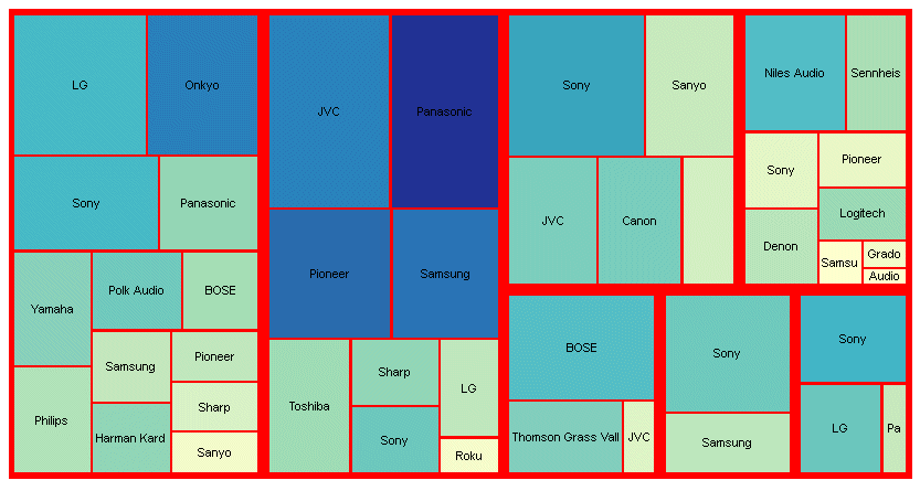
Example: Formatting Treemap Cell Borders
The following generates a treemap chart. The headers are eliminated by making their height zero (0). The cell borders are red with a width of 2 pixels, and the outer border has a width of 4 pixels:
GRAPH FILE WF_RETAIL_LITE
SUM GROSS_PROFIT_US COGS_US
BY PRODUCT_CATEGORY
BY BRAND
ON GRAPH PCHOLD FORMAT JSCHART
ON GRAPH SET LOOKGRAPH TREEMAP
ON GRAPH SET STYLE *
*GRAPH_JS
"treemapProperties": {
	"header": {"height": 0},
	"cellBorder": {"width": 2, "color": "red", "outerCellWidth": 4}}
*END
ENDSTYLE
END
The output is:
| WebFOCUS | |
|
Feedback |