Converting Pie Chart Requests to Chart Attribute Syntax
|
Reference: |
Pie charts slice a measure based on a sort field. A pie chart can have a hole. The defaults for several properties vary depending on whether the request uses traditional WebFOCUS syntax, chart attribute syntax, or a StyleSheet.
Reference: LOOKGRAPH Conversions for Pie Charts
The following table lists the traditional LOOKGRAPH values and the new LOOKGRAPH values along with additional properties that may be needed for the chart type.
|
LOOKGRAPH Parameter |
|
|---|---|
|
Traditional |
Convert to |
|
PIE |
PIE |
|
PIEMULTI |
PIE |
|
PIERING |
PIE Add the following JSON property: *GRAPH_JS
"pieProperties": {
"holeSize": "10%"
}
You can change the percentage used for the hole size. |
|
PIEMULTR |
PIE Add the following JSON property: *GRAPH_JS
"pieProperties": {
"holeSize": "10%"
}
You can change the percentage used for the hole size. |
Reference: Attribute Category Assignments for Pie Charts
The following table lists the attribute category conversions for pie charts.
|
Type of Column or Parameter |
Attribute Category |
|---|---|
|
measure field |
measure |
|
Either GRLEGEND or GRXAXIS sort field |
color, column, or row |
|
GRMULTIGRAPH sort field |
page |
For a pie chart, the WebFOCUS tools have allowed limited multiple sort fields, even with traditional syntax. The user dragged these fields to the Category and Slices components. However, the tools now convert these requests to chart attribute syntax before running them. Depending on the number and types of these additional sort fields, the tools assign them to the column and color attribute categories, as shown in the following table. The column category generates a matrix of pie charts, one in each column (or row, depending on your configuration options) of a single-row (column) matrix. For complete information about chart attribute categories, see WebFOCUS Chart Attribute Syntax.
|
# of Category Fields |
# of Slices Fields |
Assigned to Column Attribute Category |
Assigned to Color Attribute Category |
|---|---|---|---|
|
1 |
0 |
0 |
Category field |
|
0 |
1 |
0 |
Slices field |
|
1 |
1 |
Category field |
Slices field |
|
2 |
0 |
First field |
Second field |
|
2 |
1 |
Slices field first, then first Category field |
Second Category field |
Example: Converting a Pie Chart Request to Chart Attribute Syntax
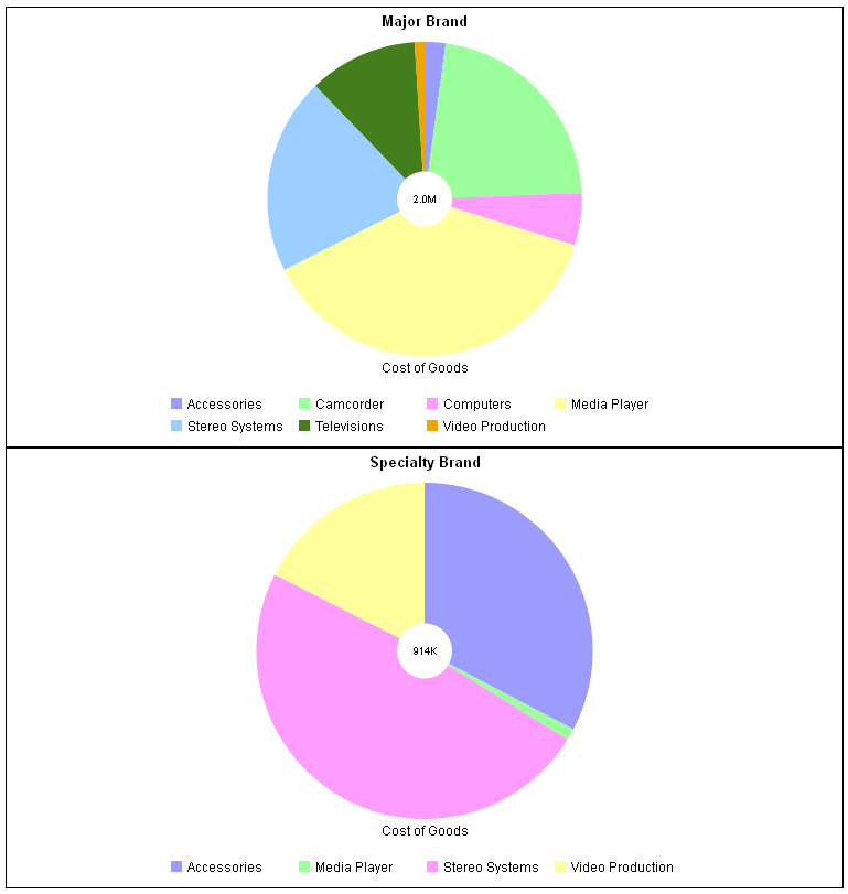
The following example generates multiple pie ring charts using traditional syntax (LOOKGRAPH value is PIEMULTR). The high-level sort field (BRANDTYPE) is the GRMULTIGRAPH sort field. Separate pie charts are generated for each value of BRANDTYPE. The PRODUCT_CATEGORY sort field is the GRLEGEND sort field:
GRAPH FILE WF_RETAIL_LITE
SUM COGS_US
BY BRANDTYPE
BY PRODUCT_CATEGORY
ON GRAPH PCHOLD FORMAT JSCHART
ON GRAPH SET GRMERGE ADVANCED
ON GRAPH SET GRMULTIGRAPH 1
ON GRAPH SET GRLEGEND 1
ON GRAPH SET GRXAXIS 0
ON GRAPH SET LOOKGRAPH PIEMULTR
END
The output is shown in the following image:
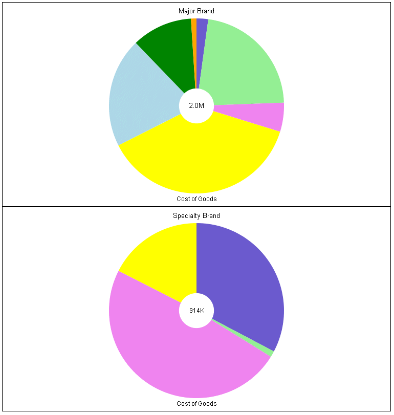
The following is the same request converted to chart attribute syntax. The LOOKGRAPH value is PIE. The measure (COGS_US) is assigned to the measure attribute category, the high-level sort field (BRANDTYPE) is assigned to the page attribute category, and the low-level sort field (PRODUCT_CATEGORY) is assigned to the color attribute category. The pieProperties:holeSize property is set to 20%. Some other JSON properties are set to assign colors to the slices and make the legend not visible:
GRAPH FILE WF_RETAIL_LITE
HEADING CENTER
"<BRANDTYPE"
SUM COGS_US
BY BRANDTYPE
BY PRODUCT_CATEGORY
ON GRAPH PCHOLD FORMAT JSCHART
ON GRAPH SET EMBEDHEADING ON
ON GRAPH SET LOOKGRAPH PIE
ON GRAPH SET STYLE *
TYPE=DATA, COLUMN=COGS_US, BUCKET=measure,$
TYPE=DATA, COLUMN=PRODUCT_CATEGORY, BUCKET=color,$
TYPE=DATA, COLUMN=BRANDTYPE, BUCKET=page,$
*GRAPH_JS
"legend": {"visible": false},
"series": [
	{"series": 0, "color": "slateblue"},
	{"series": 1, "color": "lightgreen"},
	{"series": 2, "color": "violet"},
	{"series": 3, "color": "yellow"},
	{"series": 4, "color": "lightblue"},
	{"series": 5, "color": "green"},
	{"series": 6, "color": "orange"}],
"pieProperties": {
	"holeSize": "20%",
	"label": {"visible": true},
	"totalLabel": {"visible": true}}
*END
ENDSTYLE
END
The output is shown in the following image:
Example: Converting a Pie Chart Request to a Columnar Chart Layout
For a pie chart, the WebFOCUS tools have allowed limited multiple sort fields, even with traditional syntax. The user dragged these fields to the Category and Slices components. However, the tools now convert these requests to chart attribute syntax before running them.
Depending on the number and types of these additional sort fields, the tools assign them to the column and color attribute categories. The column category generates a matrix of pie charts, one in each column (or row, depending on your configuration options) of a single-row (column) matrix. This generates a layout for the multiple pie charts that looks different from the layout generated by the traditional syntax, where all of the pies were in the same frame.
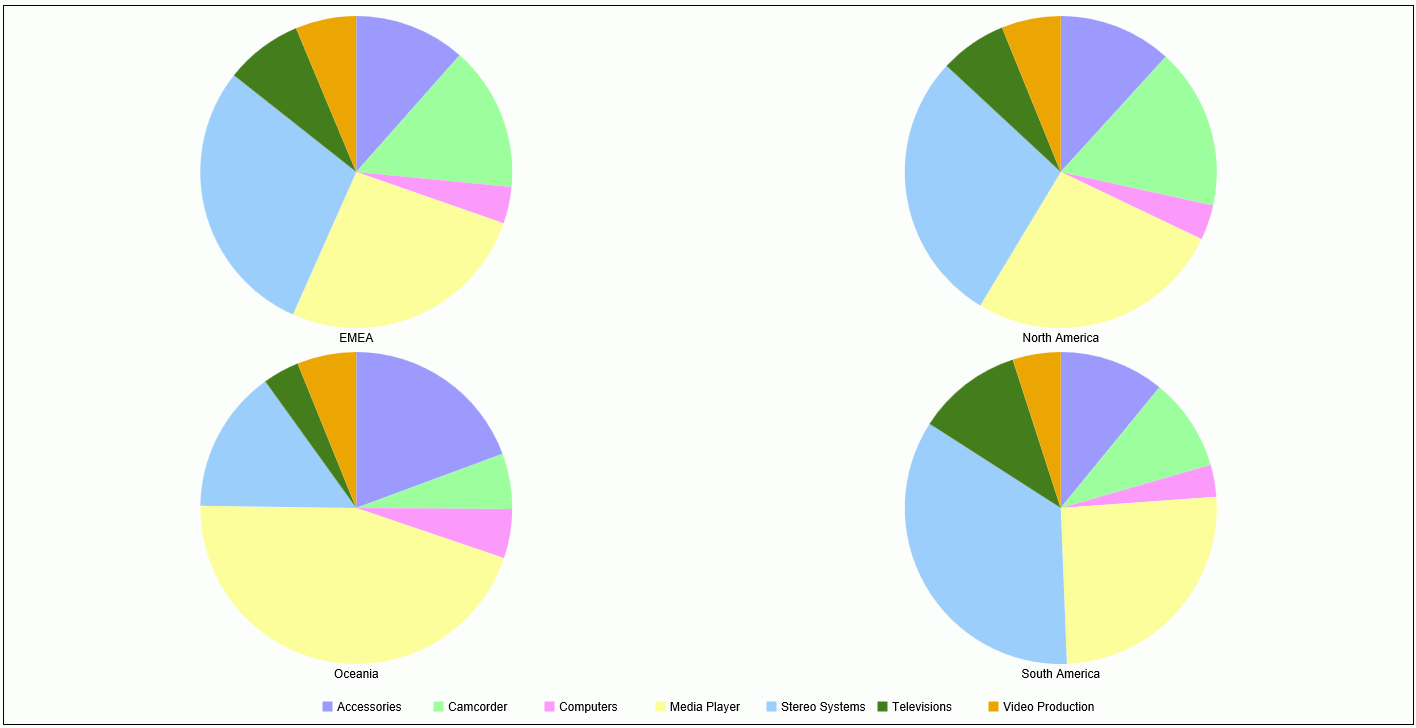
The following example generates multiple pie charts using traditional WebFOCUS chart syntax and assigns the PRODUCT_CATEGORY sort field to the GRLEGEND parameter and the BUSINESS_REGION sort field to the GRXAXIS parameter.
GRAPH FILE WF_RETAIL_LITE
SUM COGS_US
ACROSS BUSINESS_REGION
BY PRODUCT_CATEGORY
ON GRAPH SET AUTOFIT ON
ON GRAPH PCHOLD FORMAT JSCHART
ON GRAPH SET GRMERGE ADVANCED
ON GRAPH SET GRMULTIGRAPH 0
ON GRAPH SET GRLEGEND 1
ON GRAPH SET GRXAXIS 1
ON GRAPH SET LOOKGRAPH PIEMULTI
END
The output is shown in the following image.
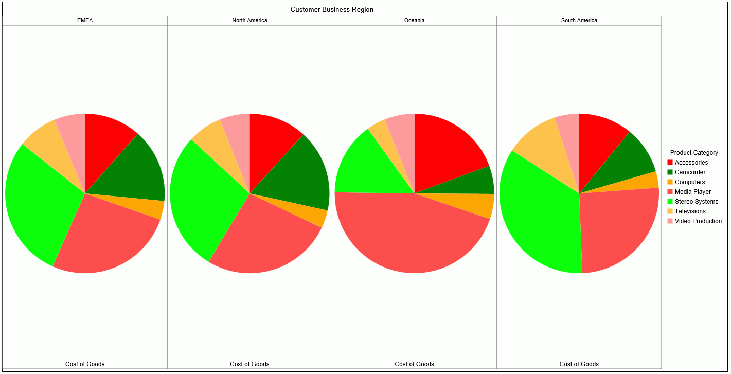
The following version of the request uses chart attribute syntax. The PRODUCT_CATEGORY sort field is assigned to the color category, and the BUSINESS_REGION sort field is assigned to the column category.
GRAPH FILE WF_RETAIL_LITE
SUM COGS_US
BY BUSINESS_REGION
BY PRODUCT_CATEGORY
ON GRAPH PCHOLD FORMAT JSCHART
ON GRAPH SET AUTOFIT ON
ON GRAPH SET LOOKGRAPH PIE
ON GRAPH SET STYLE *
TYPE=DATA, COLUMN=COGS_US, BUCKET=measure,$
TYPE=DATA, COLUMN=PRODUCT_CATEGORY, BUCKET=color,$
TYPE=DATA, COLUMN=BUSINESS_REGION, BUCKET=column,$
END
The output is shown in the following image. Note that each pie is in its own column.
| WebFOCUS | |
|
Feedback |