Converting Mekko Chart Requests to Chart Attribute Syntax
|
Reference: |
A mekko chart is a percent bar chart, except that the width of each bar riser is based on the overall value of the stack.
Reference: LOOKGRAPH Conversions for Mekko Charts
The following table lists the traditional LOOKGRAPH values and the new LOOKGRAPH values along with additional properties that may be needed for the chart type.
|
LOOKGRAPH Parameter |
|
|---|---|
|
Traditional |
Convert to |
|
MEKKO |
MEKKO |
Reference: Attribute Category Assignments for Mekko Charts
The following table lists the attribute category conversions for mekko charts.
|
Type of Column or Parameter |
Attribute Category |
|---|---|
|
measure field |
y-axis |
|
GRXAXIS sort field |
x-axis |
|
GRLEGEND sort field |
color |
|
GRMULTIGRAPH sort field |
page |
Example: Converting a Mekko Chart Request to Chart Attribute Syntax
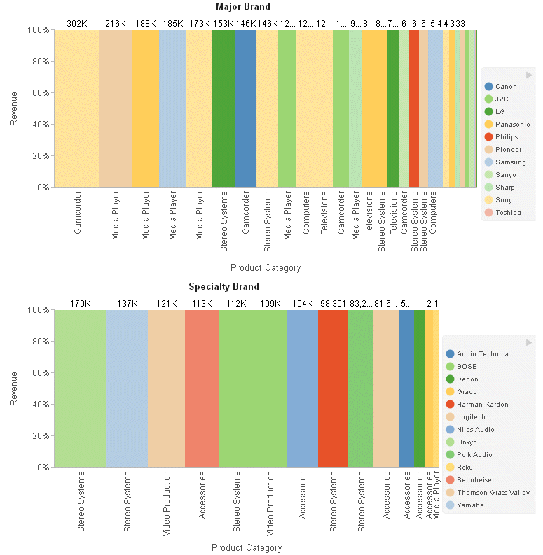
The following example generates a mekko chart that separates the outermost sort field (BRANDTYPE) onto separate charts, distinguishes the next sort field (BRAND) by placing it on the graph legend, and places the PRODUCT_CATEGORY sort field on the x-axis:
GRAPH FILE WF_RETAIL_LITE
SUM REVENUE_US
BY BRANDTYPE
BY BRAND
BY PRODUCT_CATEGORY
ON GRAPH SET GRMERGE ADVANCED
ON GRAPH SET GRMULTIGRAPH 1
ON GRAPH SET GRLEGEND 1
ON GRAPH SET GRXAXIS 1
ON GRAPH SET LOOKGRAPH MEKKO
ON GRAPH PCHOLD FORMAT JSCHART
ON GRAPH SET STYLE *
INCLUDE=IBFS:/FILE/IBI_HTML_DIR/javaassist/intl/EN/combine_templates/ENWarm.sty,$
ENDSTYLE
END
The output is shown in the following image:
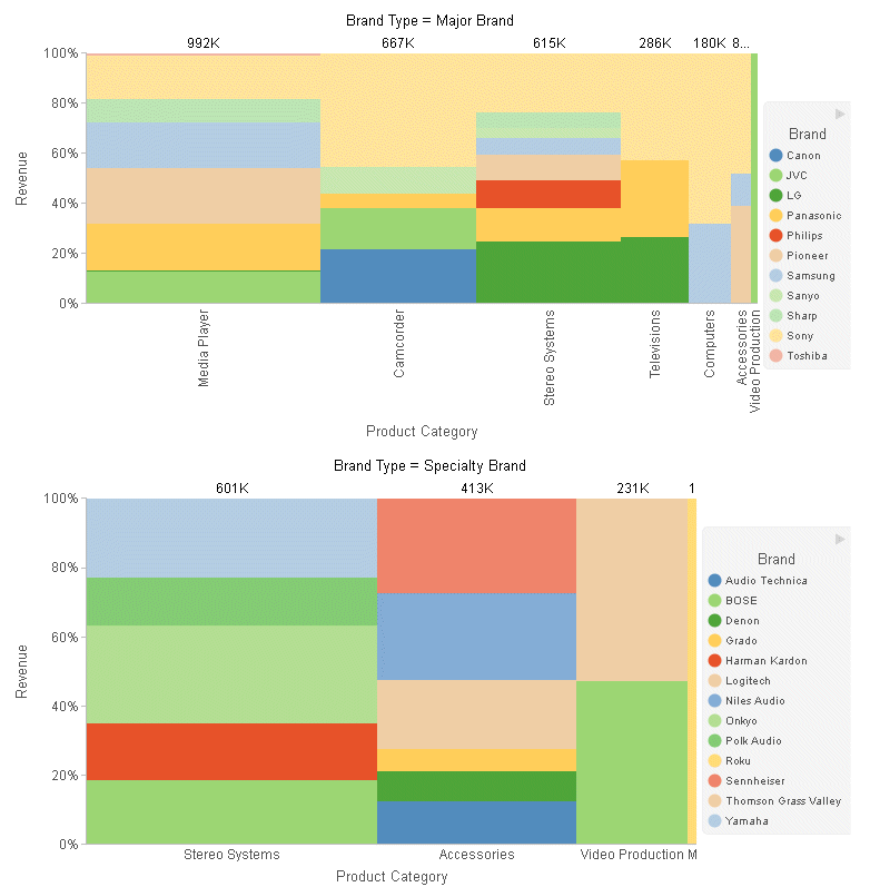
The following is the same request converted to chart attribute syntax. The BRANDTYPE sort field is assigned to the page category, the BRAND sort field is assigned to the color category, the PRODUCT_CATEGORY sort field is assigned to the x-axis category, and the REVENUE_US measure is assigned to the y-axis category. The chart type is MEKKO:
GRAPH FILE WF_RETAIL_LITE
HEADING CENTER
"Brand Type = <BRANDTYPE"
SUM REVENUE_US
BY BRANDTYPE
BY BRAND
BY PRODUCT_CATEGORY
ON GRAPH SET LOOKGRAPH MEKKO
ON GRAPH SET EMBEDHEADING ON
ON GRAPH PCHOLD FORMAT JSCHART
ON GRAPH SET STYLE *
INCLUDE=IBFS:/FILE/IBI_HTML_DIR/javaassist/intl/EN/combine_templates/ENWarm.sty,$
TYPE=DATA, COLUMN=BRANDTYPE, BUCKET=page,$
TYPE=DATA, COLUMN=BRAND, BUCKET=COLOR,$
TYPE=DATA, COLUMN=PRODUCT_CATEGORY, BUCKET=x-axis,$
TYPE=DATA, COLUMN=REVENUE_US, BUCKET=y-axis,$
END
The output shown in the following image looks different from the GRMERGE output, since chart attribute syntax clusters similar x-axis values together. For example, the media players from all of the brands are displayed as one stacked bar:
| WebFOCUS | |
|
Feedback |