Narrating Charts
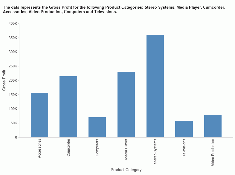
Narrative charts tell the story of your data. When creating a bar, line, area, or pie chart, you can bring your chart to life with words that describe your data, as shown in the following image.
If your administrator has activated this feature for you, you can enable Narrative Charts from the ribbon. On the Format tab, in the Features group, click Narrative. This will add descriptive text for the current chart or visual.
Narrative charts let you communicate about your data, summarizing data values and providing an interpretation of the results. For more information on the syntax behind narrative charts, see the Creating HTML5 Charts With WebFOCUS Language manual.
| WebFOCUS | |
|
Feedback |