Formatting a Gauge Chart
|
Topics: |
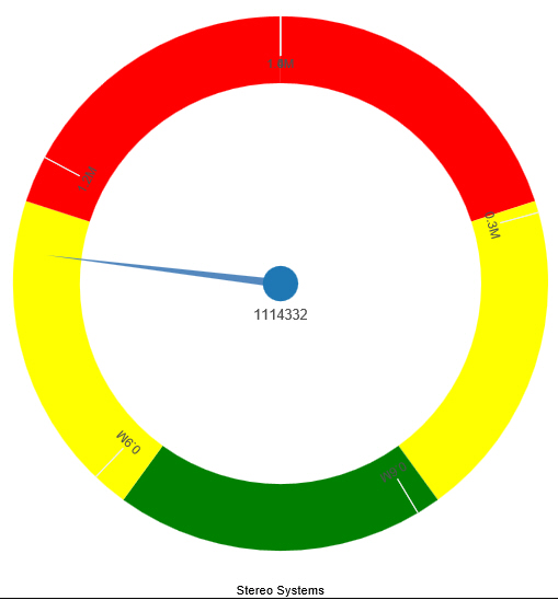
A gauge chart is a circular chart that indicates the current position of a single data value within a given spectrum.
A gauge chart is shown in the following image.
You can change the appearance of a gauge chart by using the gauge chart options found on the Format Gauge dialog box. To access the Format Gauge dialog box, on the Format tab, in the Features group, click Gauges.
Format Gauge Dialog Box
Whether you access gauge options from the ribbon, or the shortcut menu, you are presented with the Format Gauge dialog box of options for formatting a gauge chart. Such options include setting and styling a title for the gauge chart, setting tick marks, enabling and styling color bands, as well as setting advanced options, such as the gauge start and stop angle.
The Format Gauge dialog box contains the following tabs:
- General Options
- Axis Scale & Labels
- Tick Marks
- Bands
- Advanced
Use the General Options tab to set general gauge options.
The General Options tab contains the following options:
- Gauges per row. Enter
or select how many gauges appear on each row. The default setting
displays two gauge charts. A maximum of 32 gauge charts can appear
on each row.
Note: The number of charts displayed per row can differ, based on the output format selected. For example, HTML format will display two charts per row, and HTML5 will display four.
Gauge Title
- Show title. (Default) Displays a gauge title appear for each gauge. Clear this option to suppress the title.
- Position. Select a position for the gauge title. Above is the default value.
- Style. Click this icon to open the Style dialog box, where you can style text.
Gauge value
- Show value. (Default) Clear this option to suppress the gauge value.
- Style. Click this icon to open the Style dialog box, where you can style text.
- Format Value. Contains a list of preset formats that can be applied.
- Custom Format. Allows you to use a custom format. This option is activated when Use Pattern /100 and Use Pattern are selected as the format labels.
Use the Axis Scale & Labels tab to set the axis scale and label properties for the gauge needle.
The Axis Scale & Labels tab contains the following options:
Scale
- Automatic Minimum. (Default) Sets the engine to automatically supply the minimum value on the scale. Clear this option to manually set the minimum value by entering a number into the Value text box.
- Value. Enter the minimum value in this text box if you have not selected Automatic Minimum.
- Automatic Maximum. (Default) Sets the engine to automatically supply the maximum value on the scale. Clear this option to manually set the maximum value by entering a number into the Value text box.
- Value. Enter the maximum value in this text box if you have not selected Automatic Maximum.
Labels
- Show Labels. (Default) Displays labels next to the axis. Clear this option to suppress labels.
- Style Labels. Click this icon to opens the Style dialog box, where you can style text.
- Format Labels. Select from a drop-down menu of present formats that can be applied to the labels. When a custom format is selected, the format must be defined using a custom format pattern. For a list and description of the characters that you can use in a custom format, see the table in Formatting Data Labels.
- Custom Format. Text field to enter the custom format that you want to use.
The Tick Marks tab contains options to format tick marks on a gauge chart.
The Tick Marks tab contains the following options for both major and minor ticks:
- Automatic Grid Step. (Default) Automatically calculates the number of major grid steps in a gauge chart. Clear this option to manually set the value by entering a number in the Value text box.
- Value. Enter the value in this text box if you have not selected Automatic Grid Step.
- Tick Color. Click this icon to open the Color dialog box, where you can select a color for the tick marks.
- Tick Mark Length. Enter a value for the relative length of major tick marks in a gauge chart. The valid range is from 0.0 to 0.5. If you set the smallest value, major tick marks do not appear.
The Bands tab contains options to format the color of the scale background on a gauge chart.
The Bands tab contains the following options:
- Band 1. Opens
a drop-down menu of available bands.
- Add. Adds the band selected from the drop-down menu of bands to the gauge chart. You can create up to five bands for a gauge chart.
- Remove. Removes the band selected from the drop-down menu of bands to the gauge chart.
- Minimum Value. Enter a minimum value to a quality band in the gauge chart.
- Maximum Value. Enter a maximum value to a quality band in the gauge chart.
- Border Color. Opens the Color dialog box, where you can edit the color of the gauge band border.
Fill
- No fill. Removes fill from the quality band.
- Solid fill. (Default) Applies a solid color to the quality band.
- Color. Click this option to open the Color dialog box, where you can select the color for the quality band.
- Transparency. Move the slider to make the band opaque (0%) or transparent (100%). The default is 0%.
The Advanced tab contains options to set additional properties for the gauge needle.
The Advanced tab contains the following options:
- Descending Axis. Select this option to draw the gauge scale in descending order. When this option is cleared (default), the gauge scale is drawn in ascending order.
- Show Zero Label. Displays the zero label on the axis scale. Clear this option to start the gauge at another value. This is the default.
- Gauge Center by Quality. Select this option to have the center of the gauge needle appear in the same the color as the band to which it is pointing. This option is available for HTML charts only.
- Gauge Start Angle. Enter a value to rotate the gauge start angle to a specified number of degrees. Values can range from 0 to 359 degrees. The default is 220 degrees.
- Gauge Stop Angle. Enter a value to rotate the gauge stop angle to a specified number of degrees. Values can range from 0 to 359 degrees. The default is 320 degrees. Setting a start angle to 0, and a stop angle to 180, creates a semi-circle.
- Relative Inner Radius. Enter a value to define the inner radius of the gauge bands and labels relative to the outer background of the gauge. Smaller values, such as 0.0, place the inner radius closer to the center of the gauge. A maximum value of 1.0, places the inner radius close to the gauge outline.
- Relative Thickness. Enter a value to define the relative thickness of the gauge bands. Values can range from 0.0 to 1.0.
- Same Size Gauges. This option applies to multi-category gauge charts. If you are working with three or more gauges per row, you can select this option to have the gauges display in the same size.
Gauge Elements Shortcut Menu
When you right-click a gauge chart, a menu containing the More Gauge Options becomes available. Select this option to open the Format Gauge dialog box. This is only available when using the HTML output format.
Using Gauge Properties
The following sections contain procedures for gauge properties. The Gauges option can be found on the Format tab, in the Features group.
Note: This option is only available when you are working with a gauge chart.
Procedure: How to Set the Number of Gauges Per Row
If you have multiple gauges on a chart, you might want to specify how many gauges appear on each row.
- Create a gauge chart that has multiple values.
- Open the
Format Gauge dialog box in one of the following ways:
- Ribbon: On the Format tab, in the Features group, click Gauges.
- Shortcut Menu: Right-click the gauge chart and select More Gauge Options.
The Format Gauge dialog box opens.
- On the General options tab, in the Gauges per row field, enter or select the number of gauges that you want to appear on one row.
- Click OK.
The gauges now appear on one row.
After changing the setting from the default of 2 gauges per row to 3 gauges per row, all the charts now appear on one row.
Procedure: How to Set the Minimum and Maximum Axis Scale Values
- Create a
gauge chart.
- Open the
Format Gauge dialog box in one of the following ways:
- Ribbon: On the Format tab, in the Features group, click Gauges.
- Shortcut Menu: Right-click the gauge chart, and click More Gauge Options.
The Format Gauge dialog box opens.
- On the Axis Scale & Labels tab, in the Scale area, either accept the minimum and maximum values for the scale automatically supplied by the chart engine, or enter your own in the Value fields.
- Click Apply.
The gauge scale reflects the selections that you have made.
Procedure: How to Style Axis Labels
- Create a gauge chart.
- Open the
Style dialog box in one of the following ways:
- Ribbon: On the Format tab, in the Features group, click Gauges to open the Format Gauge dialog box. In the Format Gauge dialog box, open the Axis Scale & Labels tab. In the Labels area, click the Style Labels icon.
- Shortcut Menu: Right-click an axis label, and click Style.
The Style dialog box opens.
- Select your styling options.
- Click OK.
The scale labels reflect the style selections that you have made.
Procedure: How to Format Axis Labels
- Create a gauge chart.
- Access the
menu of available format options for axis labels in one of the following
ways:
- Ribbon: On the Format tab, in the Features group, click Gauges to open the Format Gauge dialog box. In the Format Gauge dialog box, open the Axis Scale & Labels tab. In the Labels area, open the Format Labels drop-down menu.
- Shortcut Menu: Right-click an axis label, and point to Format.
The menu of available format options opens.
- Select your
format option.
Note: If you select a custom format (for example, Use Pattern, or Use Pattern /100), from the Format Labels menu on the Format Gauge dialog box, the Custom Format menu becomes available. When you select a custom format, it must be defined using a custom format pattern. For a list and description of the characters that you can use in a custom format, see the table in Formatting Data Labels.
- Click OK.
The scale labels reflect the format selection that you have made.
Procedure: How to Rotate Axis Labels
- Create a gauge chart.
- Right-click an axis label.
- On the shortcut menu, point to Rotate, then select the degree to which you want the labels rotated.
Procedure: How to Set Gauge Tick Marks
This procedure describes how to set the grid step, tick color, and tick length for the major and minor tick marks.
- Create a gauge chart.
- Open the
Format Gauge dialog box in one of the following ways:
- Ribbon: On the Format tab, in the Features group, click Gauges.
- Shortcut Menu: Right-click the gauge chart and select More Gauge Options.
The Format Gauge dialog box opens.
- On the Tick Marks tab, for the Automatic Grid Step, either accept the value automatically supplied by the chart engine, or enter your own, in the Value fields.
- Click the Tick Color icon, to open the Color dialog box, where you can select a color for the tick mark.
- For the Tick Mark Length, either accept the value automatically supplied by the chart engine, or enter your own, in the Value fields.
Procedure: How to Set Gauge Color Bands
- Create a gauge chart.
- Open the
Format Gauge dialog box in one of the following ways:
- Ribbon: On the Format tab, in the Features group, click Gauges.
- Shortcut Menu: Right-click the gauge chart, and click More Gauge Options.
The Format Gauge dialog box opens.
- On the Bands tab, set the minimum and maximum value for each band that you want to appear on the gauge chart.
- Set the
color of the fill and border for each color band.
Note: The gradient fill option is not available for color bands.
- Click OK to
close the Format Gauge dialog box.
The bands are formatted accordingly.
Procedure: How to Match Needle Center Color to Band Color (Gauge Center by Quality)
This option matches the needle center color to the color of the band that the needle is pointing to.
- Create a gauge chart.
- On the Format tab,
in the Features group, click Gauges.
The Format Gauge dialog box opens.
- On the Bands tab, set the minimum and maximum value for each band that you want to appear on the gauge chart
- Set the
color of the fill and border for each color band.
Note: The gradient fill and transparency options are not available for gauge needles.
- On the Advanced
tab, select Gauge Center by Quality.
Note: This option displays in HTML, but not in HTML5.
- Click OK to
close the Format Gauge dialog box.
The color of the center of the gauge needle now matches the color of the band.
Procedure: How to Style a Gauge Needle
This procedure explains how to change the gauge needle from the Normal style to the Pencil style.
- Create a gauge chart.
- Open the
Format Gauge dialog box in one of the following ways:
- Ribbon: On the Format tab, in the Features group, click Gauges.
- Shortcut Menu: Right-click the gauge chart, and click More Gauge Options.
The Format Gauge dialog box opens.
- In the General Options tab, in the Gauge Needle section, from the Style drop-down menu, select Pencil.
- Click OK.
The gauge needle changes to a pencil.
Procedure: How to Set Gauge Needle Colors in a Multi Series Gauge Chart
You cannot change the fill color and border color of the needles in a multi-series gauge chart through the General Options tab of the Format Gauge dialog box. You can do so through the Format Series dialog box. However, you can still use the General Options tab to change the style of the needle.
- Create a gauge chart with more than one measure field.
- On the Series tab, from the Series drop-down menu, select the series that you want to style.
- In the Style
group, click Style.
The Format Series dialog box opens.
- On the Fill tab, select the fill and color options for the gauge needle for the selected series.
- On the Border tab, select the Show Border Color option, if you want the gauge needle to have a border. You can select the color for the border, as well.
- Click Apply.
- Repeat steps 2 through 5 for each series gauge needle that you want to style.
- When you
are finished, click OK to close the Format
Series dialog box.
The color of the gauge needles and their borders changes accordingly.
| WebFOCUS | |
|
Feedback |