Navigating the WebFOCUS Home Page
The Home Page is the default landing page that opens when you first sign in to WebFOCUS. It serves as a centralized place for creating, organizing, and sharing content, performing administrative tasks, scheduling reports and procedures, and working with your data. These functions are controlled by the permissions that are assigned to role of a user. To learn more about the available roles in WebFOCUS, see the WebFOCUS Security and Administration technical content.
The default Home Page is shown in the following image. The appearance of this page may vary, depending on the configuration or setup of your organization. For example, the administrator in your organization may configure a custom sign-in page and home page.
- Banner
- Sidebar
- Explorer
Banner
The banner is located on the upper-right corner of the Home Page.
- Administration:
- Access the Security Center, where you define users and groups, and grant access permissions.
- Access the Administration Console, where you configure, administer, and monitor the components of the WebFOCUS environment.
- Access the Magnify Console, where you specify settings, configure security, and perform maintenance and diagnostic tasks for Magnify.
- View and administer private resources for groups and users.
- Switch between Normal mode, seeing your own content, and Manager mode, managing other user content.
- Tools:
- Access the ESRI Configuration Utility to create or edit a file.
- View the status of deferred reports, and manage them.
- Stop outstanding interactive requests that are running.
- Access the ReportCaster Explorer, where you view ReportCaster content within columns that provide detailed information specific to the displayed ReportCaster item, such as Schedules, Distribution Lists, Library Access Lists, Library Reports, and Watch List Reports.
- Access the ReportCaster Status, where you view the status of your scheduled jobs and log reports. Authorized users can also view the status of the ReportCaster Distribution Server and perform configuration and administration tasks.
- Access the Magnify Search Page.
- Configure the Home Page preferences.
- Access the online Help and other resources, including the WebFOCUS Information Center, Information Builders web site, and Community.
- Access the Legacy Home Page.
- Change your password.
- Sign out of WebFOCUS.
From the banner, you can also toggle the sidebar. Click the
toggle button
 to expand or collapse the sidebar.
Note: Expanding or collapsing the sidebar is remembered as a preference. The last status of the sidebar before you sign off is applied when you sign in.
Sidebar
- Content. Displays your repository content and provides options so you can create, share, and modify domains and content. Here, you can also upload files and spreadsheets, connect to data, create portals and pages, and generate sample content.
- Portals. Displays all of the existing portals in your repository. If tags are created for these portals, tag buttons display on top of the portals.
- Favorites. Displays the items that you designate as favorites. To designate an item as a Favorite, right-click the item, and click Add to Favorites.
- Mobile Favorites. Displays the items that you designate as Mobile Favorites. To designate an item as a Mobile Favorite, right-click the item, and click Add to Mobile Favorites.
- Ask WebFOCUS. Provides access to WebFOCUS InfoSearch, where you can search your repository for content and data values, compare statistics, and perform other analytical tasks. To use WebFOCUS InfoSearch, type your inquiry in the search field or click the microphone icon and ask a question.
WebFOCUS Explorer
|
Topics: |
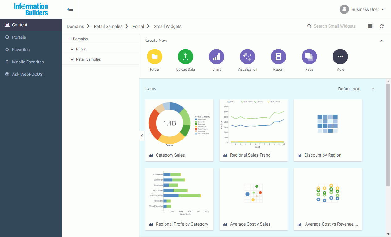
The WebFOCUS Explorer is the main component of the Home Page. Here, you can create and interact with content, work with data, create sample content, organize your repository structure and perform other essential tasks. The WebFOCUS Explorer is shown in the following image.
- Navigation bar
- Resources tree
- Actions bar
- Content area
Navigation Bar
The navigation bar is located beneath the banner and above the WebFOCUS Explorer area. You can use the navigation bar to move between folders in your repository, search the contents of a domain or folder, change the view of items in the content area, and refresh content in a domain or folder you select.
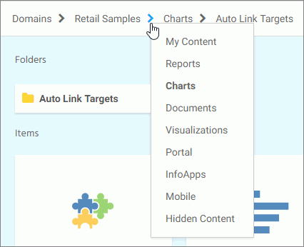
When you drill down into folders in your repository, the navigation bar generates a breadcrumb trail that you can use to move between folders. You can move back one folder or multiple folders in a single click. You can click a folder name to view the contents of that folder. You can also click arrows between the folders, to see the file structure that is currently displayed, as shown in the following image. The selected folder appears in bold text.
From the navigation bar, you can also search for items in your repository. To search for an item, type a key word in the Search field and press Enter. The results of your search display in the content area.
Note: Until you enter text, the Search field contains the name of the domain or folder as placeholder text. When you enter text into the Search field, an X appears. Click the X to clear the Search field. The X does not appear if you use a Firefox browser.
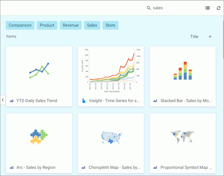
If the items in your results contain tags, these tags display with your search results. An example of user-defined tags in a search is shown in the following image.
You also can toggle the view of your content between Grid View and List View and refresh all content in a domain or folder.
By default, content displays in Grid View. Click the Grid view icon  or List view icon
  to change your view.
Grid View allows you to see the thumbnails of your items, which you can customize to add transparency to your display. When you hover over a thumbnail image in Grid view that contains a summary, the image fades and the summary displays.
Note: When using an Internet Explorer 11 browser, the private status of an item is not indicated by the state of its icon in Grid view or font in the Resources tree. However, Internet Explorer 11 users can see a dashed line around icons for private items in Grid view, and a checkmark for published items in List view.
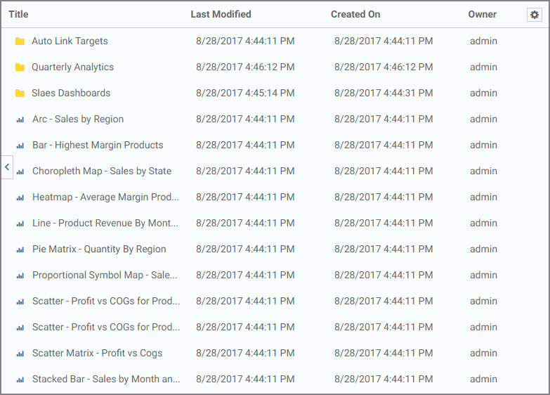
The List View is useful when you need to see a large number of items at a glance. You can sort your items by various criteria. An example of a List View is shown in the following image.
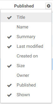
You can sort the list by clicking any column title. Each column features a three-step toggle sorting: ascending, descending, and back to default. You can also specify which columns display in the content area by clicking the Settings button, and selecting the desired columns from the list. An example of an expanded settings menu is shown in the following image.
To refresh all content in a selected domain or folder,
click Refresh  .
.
Resources Tree
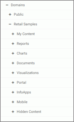
The Resources tree provides a way to view your repository structure and navigate between domains and folders that are available to you. The following image shows an example of a Resources tree.
You can expand or collapse folders by clicking the plus (+) or minus (-) sign . When you click a folder, its contents display in the content area. You can also right-click a folder to access a shortcut menu of available options. From the shortcut menu, you can perform the following actions:
- Expand or Collapse a folder
- Duplicate a folder
- Cut or Copy a folder
- Paste content or another folder inside a folder
- Delete a folder
- Allow or suppress access to a folder
- Show or hide a folder
- Configure security rules for a folder
- View and edit properties for a folder
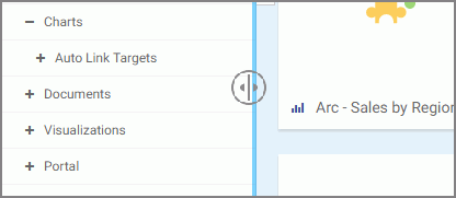
You can customize the width of the Resources tree. To do so, put your cursor on top of the right edge of the Resources tree area, as shown in the following image, and drag the edge to achieve the desired width. Your new width is remembered, and displays the next time you sign in to WebFOCUS.
You can also collapse the Resources tree to allow more room for the content area. To collapse the Resources tree, click the arrow on the left side of the tree. Click the arrow again to expand the Resources tree.
Actions Bar
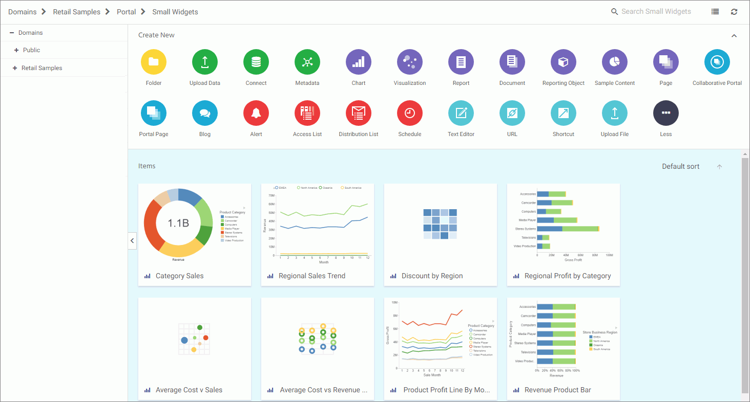
You can use the actions bar to create analytical content, upload files and spreadsheets, connect to data, build portals and pages, schedule procedures, and generate sample content using the options available to you for a domain or folder. The following image shows an example of the actions bar an advanced or basic user has access to for a domain or folder.
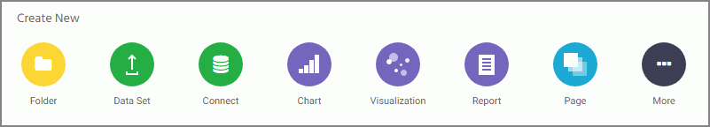
The default view of the actions bar displays the most common options available to you. You can access additional options by clicking More.
The actions bar only displays the items that you can create for the domain or folder that is currently selected. If you click the Domains node, the actions bar only displays the Domain and Folder options. The items displayed on the actions bar are also subject to permissions. You can only see the items that are available to you based on your role. To learn more about roles, see the WebFOCUS Security and Administration technical content.
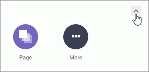
Similar to the Resources tree, you can collapse the actions bar to make more room for the content area. To collapse the actions bar, click the arrow in the upper-right corner of the actions bar, as shown in the following image.
Content Area
The content area displays the items contained within a domain or folder that is currently selected. An example of a content area is shown in the following image.
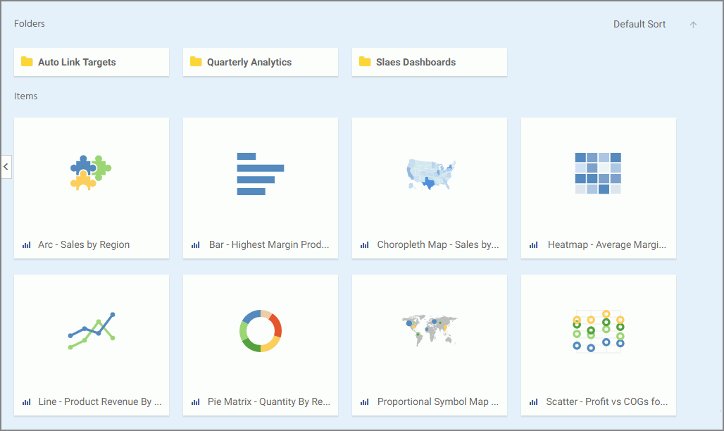
If a resource contains folders and items, the folders are always displayed first, followed by the items. Items shown in the content area include reports, charts, pages, portals, and more.
You can sort your content by using the two sorting menus in the upper-left corner of the Content Area. One allows you to sort by various criteria, such as title, summary, size, last modified and published dates. The other menu toggles between the descending and an ascending orders. You can also create a customized sorting order, by configuring the Sort Order property for the item. If the sort order is configures, the Default Sort option is added to the menu.
You can right-click any folder or item to access a shortcut menu of options. The following options are available when you right-click a folder or item in the content area.
- Expand/Collapse
-
Expands or collapses a folder. This option is only available for folders.
- Run
-
Runs the report procedure or schedule.
- Run in new window
-
Runs the selected item in a new browser window or tab.
- Run deferred
-
Submits a report procedure or a schedule for deferred execution.
- Run with SQL trace
-
Runs a report and includes an SQL trace of the report results.
Note: The Run with SQL Trace option is not available for visualizations.
- Schedule
-
Launches the scheduling tool, where you can schedules a report procedure to be run. Scheduling options include Email, FTP, Printer, Report Library, and Repository.
- View log
-
Launches the Schedule Log Options dialog box, where you can select whether to view the most recent log report for the schedule, or specify a time range for which to obtain log reports. This option is only available for schedules.
- View
-
Enables you to launch the URL or download a copy of the file to your browser. This option is available for URLs, Excel Workbooks, PDF, HTML, and Image Files.
- Edit
-
Edits an item with the tool that was used to create it.
- Edit with text editor
-
Edits an item in the Text Editor.
- Create shortcut
-
Creates a shortcut to this item.
- Duplicate
-
Makes a copy of the folder or item with an underscore and number appended to the title, for example, duplicating Sales_Report creates Sales_Report_1 in the same location. The number is incremented each time a duplicate is created.
- Cut, Copy, and Paste
-
Cuts, copies, or pastes the folder and its contents or item.
- Delete
- Deletes the folder and its contents or item.
- Publish/Unpublish
-
Allows or suppresses public access to the content.
- Show/Hide
-
Shows or hides the folder or item.
- Share/Unshare
-
Shares content with all users that are permitted to access this content. Unshare stops sharing content with all users.
- Security
-
Provides access to the following options:
- Rules
-
Opens the rules defined for the folder or item. Here you can modify the rules for a given item.
- Rules on this resource
-
Shows the security rules for the folder or item.
- Effective policy
-
Shows the defined rules that specify the permitted functionality on the folder or item.
- Owner
-
Allows you to set the resource owner, either Published (no specific owner), or a specific group or user.
- Customizations
-
Provides access to the following options:
- Remove my customizations
-
Removes your own customizations from a portal and its pages.
- Remove customizations for all users
-
Removes all user customizations and custom pages created at run time.
Note: These options are only available for portals and portal pages.
- Manage alias
-
Opens the Manage Alias dialog box, where you can create an alias for the selected collaborative portal. This feature is only available to Administrators. This option is only available for portals.
- Open item location
-
Redirects to the folder where the item is located. This option is only available for portals in the Portals view.
- Comments
-
Provides access to the following options:
- View comments
-
Opens the blog item and expands all comments.
- Remove all comments
-
Clears all comments from the blog.
Note: These options are only available for blogs.
- Unlink
-
Removes the page from all portals. This option is only available for portal pages.
- Add to Favorites
-
Adds the item to the Favorites folder.
- Add to Mobile Favorites
-
Adds the item to the Mobile Favorites folder.
- Remove favorite
-
Removes the Favorite from the list. This option is only available for Favorites.
- Remove mobile favorite
-
Removes the Mobile Favorite from the list. This option is only available for Mobile Favorites.
- Properties
-
Opens the Properties panel to display the properties of the folder or item..
Folder and Item Properties
Authorized users can select the Properties option to review information about a folder or item, including when it was created, the date it was last modified, title, name, and settings that control the Reporting Server and applications it will access. There are also settings that control the functionality available to users when they access the folder, run, or schedule an item.
The following image shows the Properties panel for a stacked bar chart.
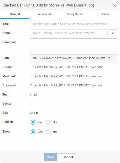
The General Properties tab includes the following settings:
- Title. Displays the value that you can use to identify the content in the Resources tree.
-
Name. Refers to the unique name of the item or folder. Click the
Edit button
 to change the name.
- Summary. Detailed explanation that provides additional information about the item.
- Path. Full path of the folder or item in the WebFOCUS repository.
- Created. Shows the date the folder or item was created.
- Modified. Shows the date the folder or item properties were last modified, and identifies the user that modified them.
- Accessed Shows the date the folder or item was last opened, and identifies the user that opened it.
- Tool. Specifies the type of an item.
- Owner. Identifies the user who created the folder or item.
- Size. Displays N/A bytes for folders. For items, displays the size in bytes.
- Publish. Provides an option to publish or unpublish the folder or item.
- Show. Provides an option to show or hide the folder or item.
The Advanced tab, which is shown in the following image, allows you to customize the functionality and behavior of the folder or item.
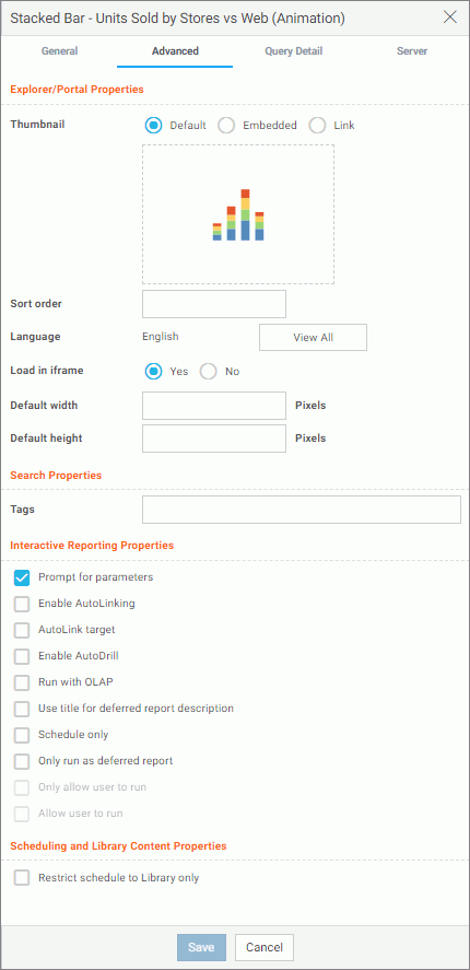
The Advanced Properties tab includes the following properties.
Explorer/Portal Properties:
- Thumbnail. Allows you to preview and change the thumbnail for an item.
- Sort order. Specifies the order to list the folder in the tree or item within other items in a folder.
- Language. Indicates the current language of your environment.
- View All. Opens the Language Properties dialog box, where you can select a language.
- Load in iframe. Grants or suppresses a permission to load an item in an iFrame container.
- Default width. Sets a default width value for the item, when it is displayed inside a portal at run time.
- Default height. Sets a default height value for the item, when it is displayed inside a portal at run time.
Search Properties:
- Tags. Adds tag values to the item that display in the search results and portal lists.
Interactive Reporting Properties:
- Prompt for parameters. Indicates whether to display the Autoprompt HTML page to allow the user to view and select parameter values. When this check box is clear, users will still be prompted if there are any parameters that do not have a value supplied.
- Enable AutoLinking. Establishes drill-down links from column data to the target reports that you link together.
-
AutoLink
target. Identifies a report as the target report that is run when the
drill-down link is triggered.
Note: The Auto Linking between reports only works if it the target report contains a parameterized field that corresponds to one of the fields in the primary Auto Link report. For more information on Auto Linking, see the WebFOCUS User’s Manual.
- Enable AutoDrill. Creates drill-down links in reports and charts that contain hierarchical data.
- Run with OLAP. OLAP-enables the report.
- Use title for deferred report description. Indicates whether or not to prompt for a custom deferred report description. If selected, this option gives you an alternative to being prompted for a custom deferred report description. If you want to disable prompting for custom deferred report descriptions for all reports, see the Custom Deferred Report Description setting content in the WebFOCUS Security and Administration technical content.
- Schedule only. Indicates that the report can only be scheduled using ReportCaster when the user does not have write access. This option is not available for reporting objects.
- Only run as deferred report. Runs the report in deferred mode.
- Only allow user to run. Specifies to not allow users to use with a reporting object. Depending on the effective policy, users can only use the Run or Run Deferred options.
- Allow user to run. Allows a user not permitted to access the Reporting Object tool to run the reporting object interactively, using the Run or Run Deferred options.
Scheduling and Library Content Properties:
- Restrict schedule to Library only. Prevents emails distribution for security-sensitive scheduled reports, and restricts them to the library distribution only.
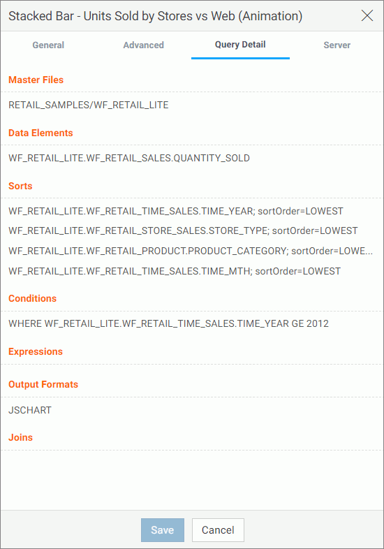
The Query Detail Properties tab, which is shown is the following image, is only available for reports, charts, and visualizations. It shows which data elements, parameters, and conditions were used in an item.
The Server Properties tab, which is shown in the following image, allows you to manage the server and application path settings.
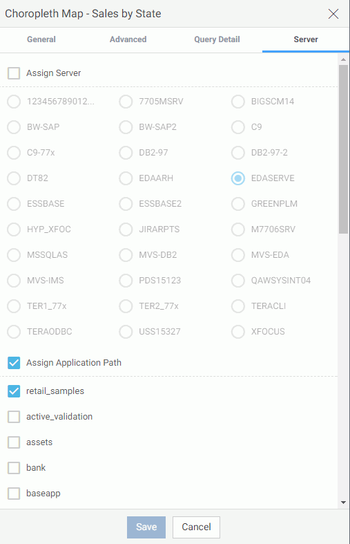
To change the server, select the Assign Server check box, and then select a server from the list. You can also change the application path in the same way.
By default, the Properties panel remains open while you browse between folders and items, allowing you to configure several resources quickly without closing the panel. To close the Properties panel, click the Close button in the upper-right corner of the panel.
| WebFOCUS | |
|
Feedback |