Using Filters in WebFOCUS Designer
|
Topics: |
WebFOCUS Designer filter controls are versatile and allow you to facilitate multiple filtering scenarios. Depending on the needs of your enterprise and on the specifics of the data that you are using, you can configure filter controls to fit your unique needs. Examples below show you different types of controls and how to use them.
Choosing an Event Model for Your Page Filter
|
How to: |
WebFOCUS Designer supports two event models for passing parameters to your page content:
- On-selection Change. Whenever you change a value of any filter control on the page, parameterized content refreshes to reflect your selection. This model is enabled, by default.
- Submit Button. After you make all desired changes to filter controls on the page and click the Submit button, parameterized content refreshes to reflect all your selections. This model can be enabled by dragging a Submit button control into the filter grid.
Procedure: How to Use One-selection Change Filters
- Add filters to a page as described in Adding Filters to a Page.
- Click the Preview button.
The preview mode is activated, allowing you to interact with content and filters.
- Make filter selections.
Each time you make a selection, the content refreshes to reflect it.
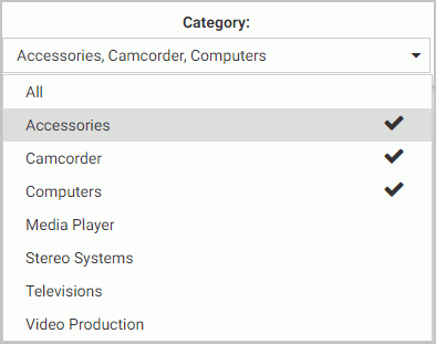
Note: Notice that the filter controls are chained in such a way that each selection automatically reflects the available choices in other filters. In our example, we set Category to Televisions. Now, the Product Model filter only shows models of televisions, as shown in the following image. WebFOCUS Designer chains controls automatically, if the parameters are defined in the metadata layer with the WITHIN keyword to relate them.

- Exit the preview mode and save your changes.
Procedure: How to Use Filters With a Submit Button
- Add filters to a page, as described in wf_designer_filters.htm#concept_5BB24142A4104BD098E02B0A23F68E0B.
- From the Resource selector, click the Controls tab, and then drag the Submit button onto the filter grid.
The Submit and Reset buttons display in the filter grid.
- Optionally, customize the Submit and Reset buttons in any of the following ways:
- Align the Submit and Reset buttons by selecting the cell in which the buttons reside and customize the Cell Content Alignment option on the Style tab of the Properties panel. In this example, we selected Align control bottom and Align control center.
- Add a tooltip to the buttons by selecting each one and populating our the Tooltip field on the Settings tab of the Properties panel.
- Customize the width of the buttons in relation to the filter cell by selecting one of the options under the Control Object Width property. In this example we selected 50%.
Note: You can delete one or both buttons by right-clicking them and clicking Delete.
- Click the Preview button.
The preview mode is activated, allowing you to interact with content and filters.
- Make filter selections and click Submit.
The content refreshes to reflect all your selections upon clicking the Submit button, as shown in the following image.

- Click Reset.
The filters return to their default values.
- Optionally, click Submit again to refresh the content with the default values.
Note: If you deleted the Reset button in the previous step, you must select default values manually, and then click Submit to return to the default state.
- Exit the preview mode and save your changes.
Working With Required Parameters
|
How to: |
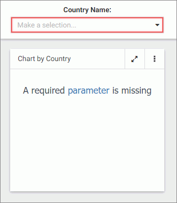
When you have required parameters in your content, WebFOCUS Designer interprets them as required filter controls. Required controls are marked in red, prompting you to make a selection for the request to be processed. The image below shows an example of a required filters control.
With a required parameter in place, your content does not refresh until you select filter values.
There are two ways to create a required filter control:
- By adding a required parameter to a chart or report in .
- By converting an optional control to a required one in WebFOCUS Designer.
Procedure: How to Add a Parameter to a Content Item
- On the WebFOCUS Home Page, on the actions bar, click Report or Chart.
The Open dialog box opens.
- Select a data source in the Open dialog box and click Open.
opens.
- Create a report or chart.
To learn more about creating content in , see the WebFOCUS User's Manual.
- On the Data tab, click Filter.
The Create a filleting condition dialog box opens.
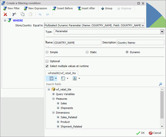
- Double-click the Double-click or press F2 to edit text, select a field, leave the condition at Equal to, and then click Value.
The drop-down dialog box opens.
- Set the Type field to Parameter and select the Dynamic radio button.
- Optionally, select the Select multiple values at runtime check box to create a multiple select filter control and Optional check box to create an optional filter control.
In our example, we are creating a multiple select required control. An example of a complete configuration is shown in the following image.
- Save your changes and exit .
- In WebFOCUS Designer, in the Resource selector, drag your new content item to the canvas.
The content item does not load. Instead, a blank container displays a message: A required parameter is missing. The Quick Filter button appears on the toolbar with the badge icon showing one available filter.
- Click the Quick Filter button.
The filter bar with one filter appears above the content item. The filter control is marked in red and the Make a selection text displays inside the control field.
- Click the Preview button.
The preview mode opens.
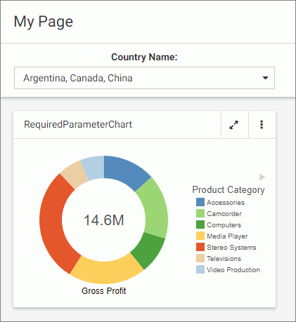
- Select one or more values from the list.
The filter control is no longer red. It displays your selections. The content refreshes to reflect the filter values, as shown in the following image.
- Exit the preview mode and save your changes.
Procedure: How to Convert an Optional Filter Control to a Required One
- In WebFOCUS Designer, add filters to a page, as described in Adding Filters to a Page.
- Click an optional filter control and then click the Properties button
 .
.The Properties panel opens.
- In the Settings tab, disable the Optional setting and then disable the Show All option setting.
The filter control is marked in red and the Make a selection text displays inside the control field.
- Click the Preview button.
The preview mode opens. The content does not refresh.
- Select a value for the required filter control.
The content refreshes to reflect your selection.
- Exit the preview mode and save your changes.
Working With Single and Multiple Select Lists
There are two types of list controls in WebFOCUS Designer:
- Single Select List. Allows you to pick a single value at run time.
- Multiple Select List. Allows you to pick multiple values at run time.
An example of a single select list control is shown in the following image.
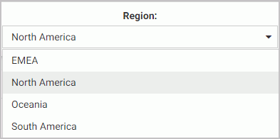
Once you have made a selection in a single select list, your content instantly refreshes to reflect that selection.
An example of a multiple select list control is shown in the following image.
Once you have made all your selections in the multiple select list, you must click outside of the control for the content to refresh.
You can customize your list controls with the search feature by enabling the Search setting in the Properties panel. Once enabled, it adds the search field to your list and allows you to quickly navigate to a specific value. Simply start typing any word or syllable and all values that contain it will display. When a list contains 50 or more values, the search feature is enabled automatically. You can disable it at any time by disabling the Search setting in the Properties panel.
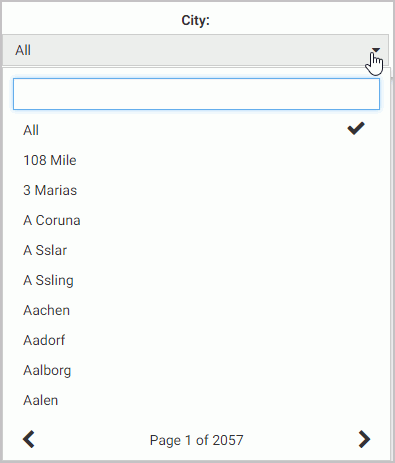
If a list contains 200 or more values, the paging feature is added to the bottom of the control. When paging is active, 10 values display per page. An example of a long list with the paging feature enabled is shown in the following image.
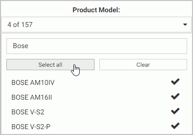
You can further enhance a multiple select list by enabling the Selection controls option in the Properties panel. Once enabled, it adds the Select all and Clear buttons to the list. This feature is especially useful when you need to eliminate just a few values from your results. You can click Select All, clear the values that you need to eliminate, and click outside of the control to refresh your content.
If the Selection controls and Search features are enabled at the same time, you can use the Select all button to select all search results, as shown in the following image.
Working With Slider Controls
|
How to: |
A slider control is a horizontal track with a marker that you can slide between a minimum and maximum value. This versatile control is often used to choose a value within a fixed range. An example of a slider control is shown in following image.

Procedure: How to Create a Slider Control
- On the WebFOCUS Home Page, on the actions bar, click Report or Chart.
The Open dialog box opens.
- Select a data source in the Open dialog box and click Open.
opens.
- Create a report or chart.
To learn more about creating content in , see the WebFOCUS User's Manual.
- On the Data tab, click Filter.
The Create a filleting condition dialog box opens.
- Create two parameters representing minimum and maximum values and make them optional.
In this example we create the minimum and maximum parameters for the MPG field in the car report. An example of the completed filtering condition is shown in the following image.

- Save your changes and exit .
- One the Home Page, right-click your new content item, and then click Edit with text editor.
The Text Editor window opens.
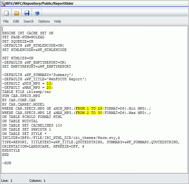
- Edit the syntax by providing the data range values.
An example of the modified syntax is shown in the following image.
- Save your changes and exit the Text Editor.
- In WebFOCUS Designer, in the Resource selector, drag your new content item to the canvas.
The Quick Filter button appears on the toolbar with the badge icon showing two available filters.
- Click the Quick Filter button.
The slider controls display in the filter grid, as shown in the following image.
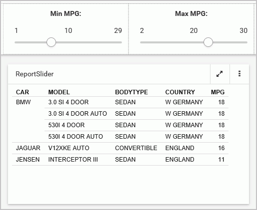
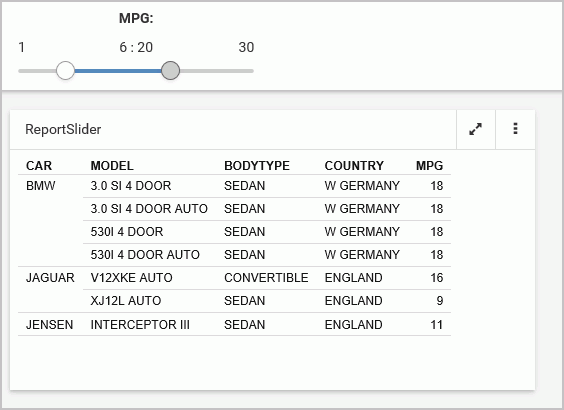
- Optionally, combine two controls together. Multi-select both controls, right-click one of them, and then click Combine.
Your controls are combined. You can edit the label to reflect your new combined control. An example of the combined slider control is shown in the following image.
- Save your changes.
Working With Date Controls
Parameters that contain date ranges are recognized by WebFOCUS Designer as date range controls. An example of the date range controls on the page is shown in the following image.

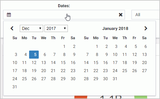
The calendar feature inside a date control allows you to select a specific date value. Once you pick a specific date, it is always spelled out, so that it can be supported by all internationalized applications.
Optionally, you can combine two date control into one date range control. To do so, multi-select two date controls and then click Combine. An example of a combined date range control is shown in the following image.
Using Global Name to Synchronize Filter Controls
|
How to: |
The Global Name property is a powerful tool that allows you to quickly synchronize filter control values between different pages. The Global Name property is configured on the Settings tab of the Properties panel for a filter control. Once enabled, it allows you to match your filter selections across multiple pages at run time within the same browser session.
Procedure: How to Configure Global Name Filter Control Property
- In WebFOCUS Designer, add filters to a page, as described in Adding Filters to a Page.
- Click a filter control that you want to synchronize and then click the Properties button .
The Properties panel opens.
- In the Settings tab, populate the Global Name field, as shown in the following image.
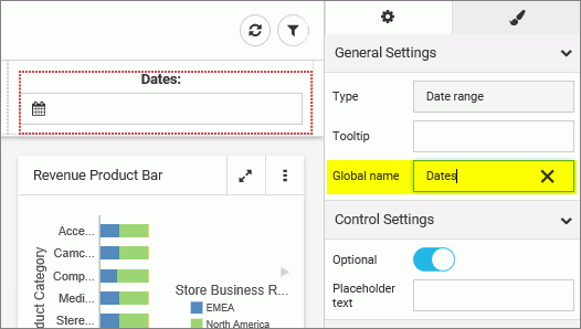
Note: You can choose any text as a global name for your control. Combined controls, such as date ranges and slider controls, have a single global name property.
- Optionally, repeat step 3 for all the filter controls that you want to synchronize.
- Save the page.
- Create a second page, populate it with parameterized content, and add the same set of filter controls as you did in step 1.
Note: To streamline this process, you can use the Save As option to create a new version of the existing page, leave the configured filters intact, and replace the content on the canvas. Make sure the Global Name values are identical between the filter controls on both pages.
- Save the second page and exit WebFOCUS Designer.
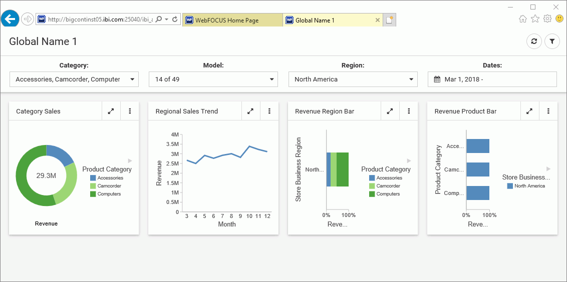
- Run one of your newly created pages.
- Select filter control values.
An example of the filter control selections is shown in the following image.
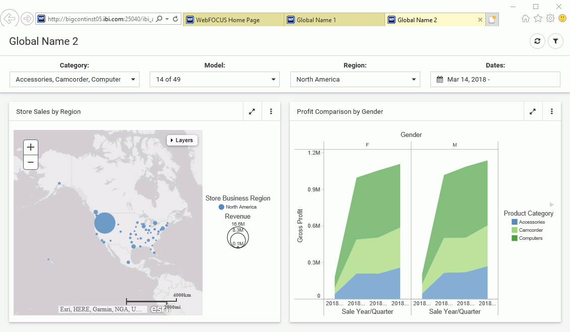
- Run the second page.
The page runs with the same filter control values as the ones you have selected on the previous page, as shown in the following image.
- Optionally, change the filter control values on the second page and see how they synchronize with the ones on the first page.
| WebFOCUS | |
|
Feedback |