Navigating and Using the Social Media Demo
|
Topics: |
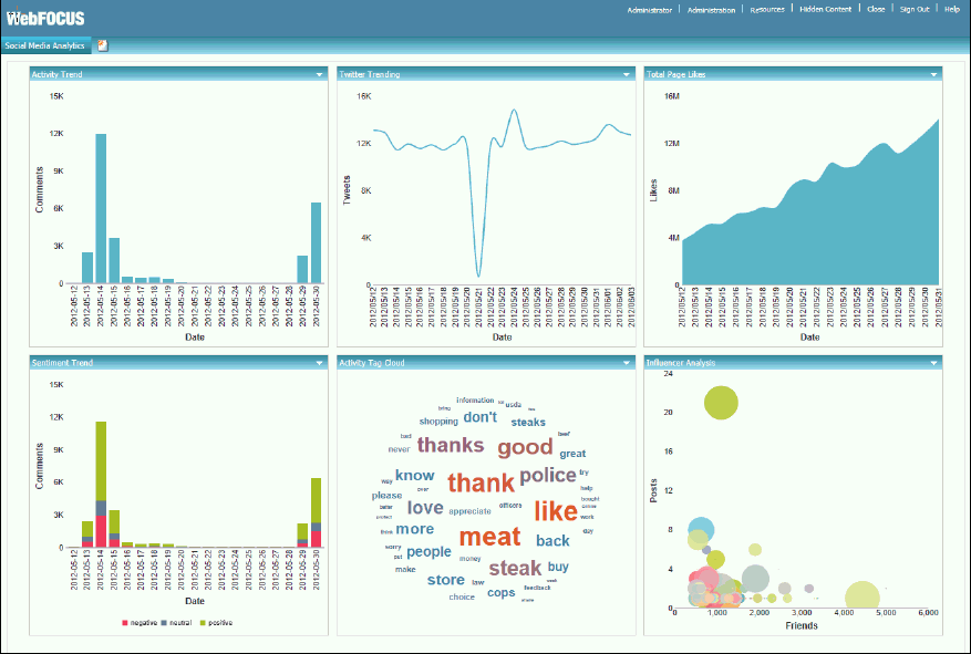
As a social media or marketing analyst, the sample portal that is provided with this demo allows you to gain insight towards several aspects of the social activity for your business enterprise. After running the Walmart Social Media portal, the Social Media Analytics tab opens, which displays metrics and analytics for the social media demo data in a dashboard layout, as shown in the following image.
Engagement Level and Listening Level Data Analysis
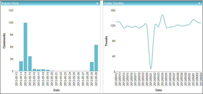
In the upper-left corner of the Social Media Analytics tab you will find the Activity Trend metric, where you can view the activity on the Walmart Facebook page for the specified time period. The total number of comments are counted for a given date. To the right you can see the Twitter Trending metric. Here, tweets for the Walmart Twitter account are measured for the same time period.
Both of these metrics are examples of what is referred to as engagement level data, which informs you if, when, and how much activity is taking place on a specific website or social media account. This information is nice to know, but not overly insightful.
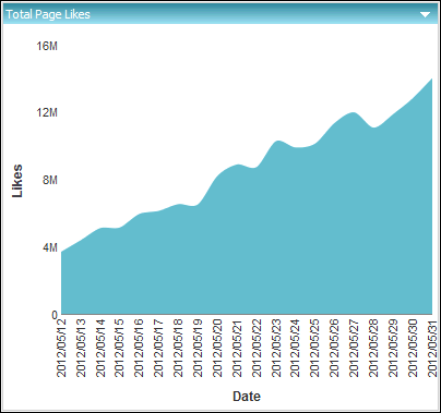
In the upper-right corner of the dashboard is the Total Page Likes metric. Some analysts in the social media industry call this a vanity metric, because they struggle to put a dollar value on it. Here, you are looking at the total page Likes on the Walmart Facebook page.
For example, on May 31, 2012, Walmart had about 14 million people who liked their page.
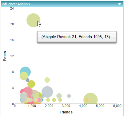
Below the Total Page Likes metric is the Influencer Analysis metric, which shows everyone who has posted on the Walmart Facebook page during a given time period.
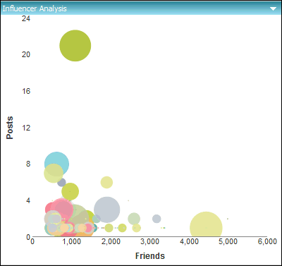
A social media analyst would be looking for individuals who fall into the upper quadrants of the chart because it shows how active they are in terms of posting, as well as how many people see and like their posts. It is those active individuals (known as Brand Champions) who may help your business bring in the most revenue. It is that critical information that is enhanced by data above and beyond social media.
When you hover the cursor over the largest green dot on the upper left quadrant, the information it provides will help you understand the impact customers can bring your business on a social media platform. For example, Abigale Rusnack posted 21 times on Facebook, and each of those posts were potentially seen by over 1000 people, as shown in the following image. This results in Walmart wanting Abigale to post more positive experiences about their stores.
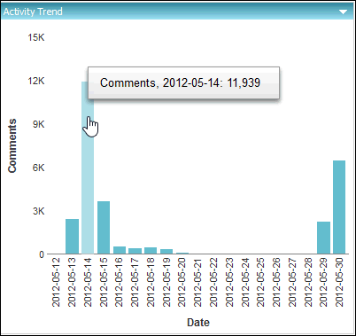
All of the metrics and analytics that you have reviewed so far are at the engagement level. The other two visualizations on the dashboard provide more listening level data analysis. You can take a closer look. If you focus on the spike in Facebook activity in the Activity Trend metric, you can see that there were almost 12,000 comments on a certain day, as shown in the following image.
In this bar chart, click on the 2012-05-14 bar that shows the spike in activity, as shown in the following image.
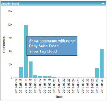
In the drill-down list that appears, you can select from the following options:
- Show comments with posts. Shows all comments with posts. In this case, a request is run to retrieve all 12,000 post and comments.
- Daily Sales Trend. Drills out to the sales system to see if this spike in social activity had any impact on sales for that day.
- Show Tag Cloud. Show word frequency for that specific day.
Both options (Show comments with posts and Daily Sales Trend) are cases that start with social media data, but have access to other data to help add context to the analysis. To proceed with this social media demo, select the last option, which is Show Tag Cloud.
Word Frequency and Sentiment Data Analysis
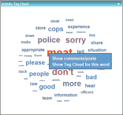
Clicking Show Tag Cloud from the drill-down list in the Activity Trend metric updates the Activity Tag Cloud component in the dashboard to show word frequency that is specific to the selected date, as shown in the following image.
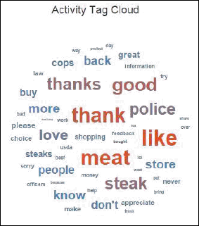
This action that you just performed is considered word frequency analysis. The engine looks at all 12,000 posts and comments, and then counts the frequency that each term is mentioned in order to provide the general theme of what is being discussed without you having to read each post and comment.
From the sample above, note that from all the common words that could be found in the Walmart Facebook page such as thanks, good, and like, another term called meat, also appeared. It is that term that needs to be investigated and will be discussed in detail later on.
Click meat to show the drill-down options, and then select Show comments/posts, as shown in the following image.
When the report opens, scroll down to where you see the post, We think you'll love our new USDA Choice steaks, so that's why we're offering a 100% money-back guarantee., as shown in the following image.
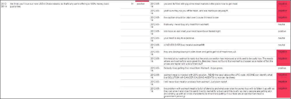
As it turns out, Walmart was running a very specific campaign around a money back guarantee for their steaks, which is should be largely positive, but instead, the comments generated a handful of negative response.
How much negativity did it actually generate?
Close the report to proceed and find an answer to this question.
The Sentiment Trend pane in the lower left corner breaks the individual days down by Positive, Negative, and Neutral posts. Being able to blend this data provides you with more context and information. Hover your cursor over the negative portion of the tallest bar in the chart, as shown in the following image.
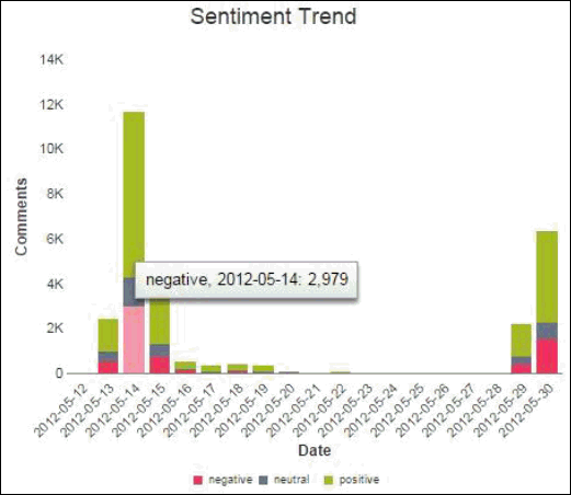
As shown in the sample above, almost 3000 of the 12000 posts and comments (about 25% which is considered high) on that day scored negatively. The average consumer products company has about 6%-12% negativity on their page on any given day.
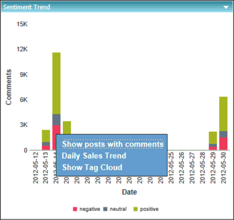
Confirm that the negativity is centered on that promotion and the meat by clicking on the negative section of the bar for 2013-05-14 and then selecting Show Tag Cloud, as shown in the following image.
The Activity Tag Cloud component in the dashboard will update to show you only the word frequency analysis for the negative posts and comments, as shown in the following image.

Sure enough, the majority of the negative posts are centered on the meat.
To see what is said about the most commonly used word (for example, meat in this case), click on the word meat and then select Show Tag Cloud for this word from the menu, as shown in the following image.
The most commonly used word for the subject (for example, sucks) will appear in red in a larger font than that next most commonly used word (for example, nasty), as shown in the following image.
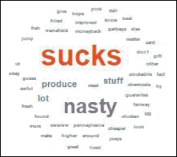
Note: The data in this example does not depict the actual data of Walmart products, and is only used for sample purposes only.
Now that word frequency and sentiment data analysis has been performed (in addition to engagement level and listening level analysis earlier), Walmart wants to know if all of this social activity has had any impact on sales. The sales data for this time period is not available in the data taken from Facebook, but it is enterprise data that was accessible with the WebFOCUS platform.
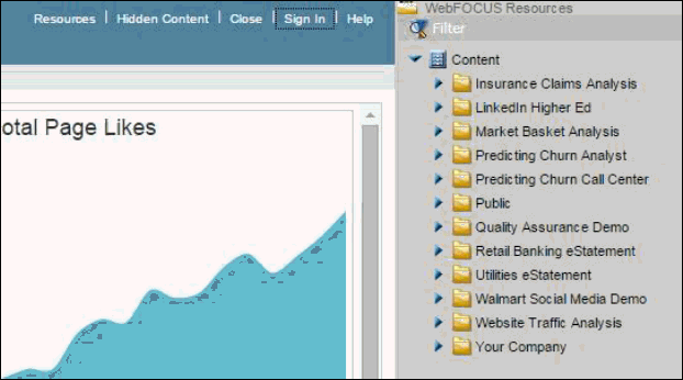
- In the upper right corner, click the Resources link, as shown in the following image.
- Locate the Sales Trend chart by expanding the Walmart Social Media Demo folder and then expanding the Demo Content sub folder, as shown in the following image.
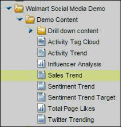
- Drag the Sales Trend node into the Total Page Likes pane in the portal.
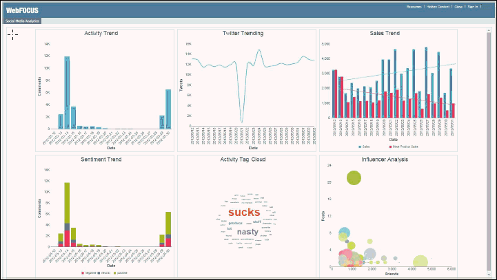
You now have Sales data along with Social Media data on the same dashboard. Putting the sales data on the same screen as the social activity provides a business user at Walmart with a better understanding of how their social activities impacts business results.
| WebFOCUS | |
|
Feedback |