Viewing Magnify Data
|
Topics: |
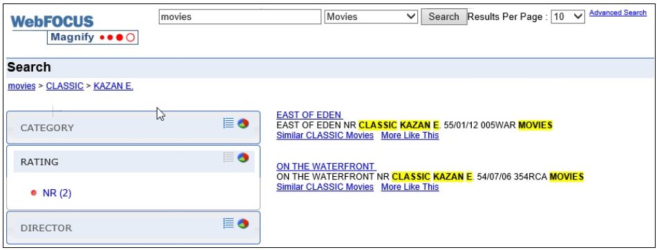
When you conduct a search, the returned data is sorted into categories. These categories can be any type of dimension, range of values, or other high-level groupings, such as Gender (Male) or Country (US). These are defined as part of the indexing process created by developers. Magnify presents these categories to allow users to discover high-level attributes and drill down on them to refine searches. The following image shows an example of categories that are returned by a search.
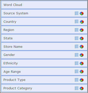
There are two views, list and chart. By default, the values within a given category are loaded on demand when expanding each category. They display in list view by default. Otherwise, if a view was previously selected, that view is presented.
Word Cloud
|
How to: |
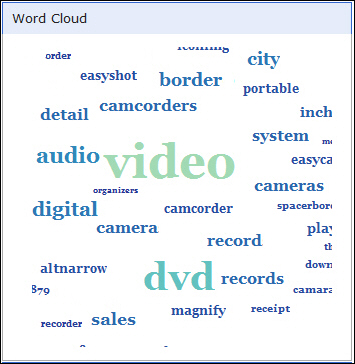
The Word Cloud is a textual chart that is built into Magnify to make it easier to narrow a search. The Word Cloud is an accumulation of the most frequently found words across the search results returned. The Word Cloud always shows words as part of the latest result set.
Word Cloud presents words related to your search in a cloud-like image. You can click on these words to quickly refine the search.
Specifically, when you click on a word or a sequential series of words in the Word Cloud, your search results are modified based on what you select. For example, if a search was conducted on the word video, some of the words that might display in the Word Cloud include DVR, camera, and recording. When you click on one of these words, your results narrow based on that selection. In most cases, the search results in the display of fewer records.
Note: Word Cloud terms are populated based on the most frequent terms found for each search result and then aggregated for all search results returned. In contrast, clicking the More Like This link for a search result locates the words that are most frequently found in the index for each search result.
The following image shows the Word Cloud when a search has been conducted on the term video.
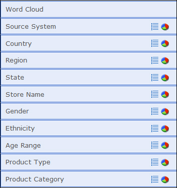
You can access Word Cloud by clicking the top box in the list of categories, as shown in the following image. You can collapse Word Cloud by clicking the box again.
Note: You may encounter instances where the Word Cloud is empty or disappears from the left pane of the search result area. This occurs when performing a search where a very limited number of results are returned or where the original searchable content is also very limited. There may not be a large enough pool of words to create the Word Cloud.
The following image shows an example when the World Cloud is empty for a search result.
The following image shows an example when the World Cloud category has disappeared from the left pane of the search result area.
Procedure: How to Narrow a Search Using Word Cloud
- In the main search field, enter a term to search.
- From the list of categories that display, click Word Cloud.
- From the Word Cloud, click on a term in order to narrow
the search result set.
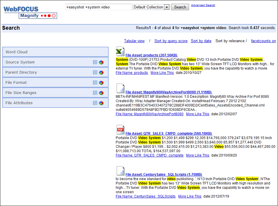
Note: When you select one or more terms in the Word Cloud, the search field is updated with a plus (+) sign to indicate that an additional search term has been specified. This occurs for every additional term you add. For example, if your initial search term was video and you clicked system then easyshot in the Word Cloud, the following displays in the search field: +easyshot +system video. This is shown in the following image.
List View
The list view, accessed by clicking the list icon ![]() , typically contains
a list of items within a specific category (for example, France
within the Country category). The list view presents all the values
found among the returned search result set for each given category.
In the list view, these specific items are listed alphabetically
with a numerical reference that indicates the number of returned
records, based on your search, for that particular item. Once accessed,
the List view can be collapsed by clicking the category label (for
example, Country). The following image shows the list view for Country.
, typically contains
a list of items within a specific category (for example, France
within the Country category). The list view presents all the values
found among the returned search result set for each given category.
In the list view, these specific items are listed alphabetically
with a numerical reference that indicates the number of returned
records, based on your search, for that particular item. Once accessed,
the List view can be collapsed by clicking the category label (for
example, Country). The following image shows the list view for Country.
Note: There will always be one value preceded with a red dot to represent the item with the highest count.
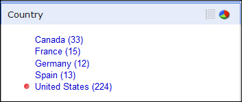
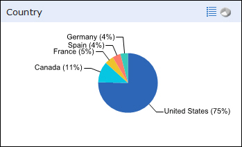
Chart View
|
Topics: |
The chart view, accessed by clicking the chart icon
![]() , provides a simplified
graphical representation of the same categorizations presented in
the list view of a Category, based on a 100 percent value. A combination
of total count of values found or the percentage a category value
comprises can be presented as metrics within each slice.
, provides a simplified
graphical representation of the same categorizations presented in
the list view of a Category, based on a 100 percent value. A combination
of total count of values found or the percentage a category value
comprises can be presented as metrics within each slice.
Note: Percentage is the default for all charts.
The following image shows a chart with percentage values for each entry.
Note: On Android 2.x devices, charts are not supported and are therefore hidden from the interface.
By default, a chart has seven slices (excluding the Other slice), each representing a category of data. If more than seven values are found, any remaining values will be presented together in a slice labeled Other.
Note: The number of slices that have been specified to display can impact the colors presented. For example, if the number of slices to show is set to 100 and there are only 18 colors established, some colors will be used more than once.
You can click the Other slice to drill down into the more specific underlying data. The following image shows the contents of the Other slice for State, a category that typically has more than eight underlying categories.
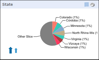
When working with a chart that has a number of underlying data layers, you can drill down through these items by clicking on the Other slice portion of the chart. You can navigate the layers of the chart using the arrows provided. The smaller arrow takes you up one level (to the previous data layer) and the larger arrow returns you to the originating display of the chart.
Note: When you click on a section of a chart, the data that was originally returned is narrowed by the value of your chart selection. For example, if you conduct a search and you want to view only the data for Germany, you can click the Country category and then from the Chart icon, select Germany. The data that is returned is specific to Germany (based on your search).
Usage Considerations
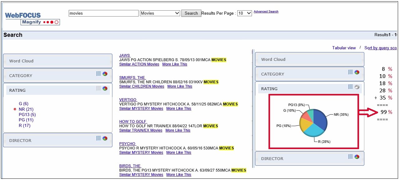
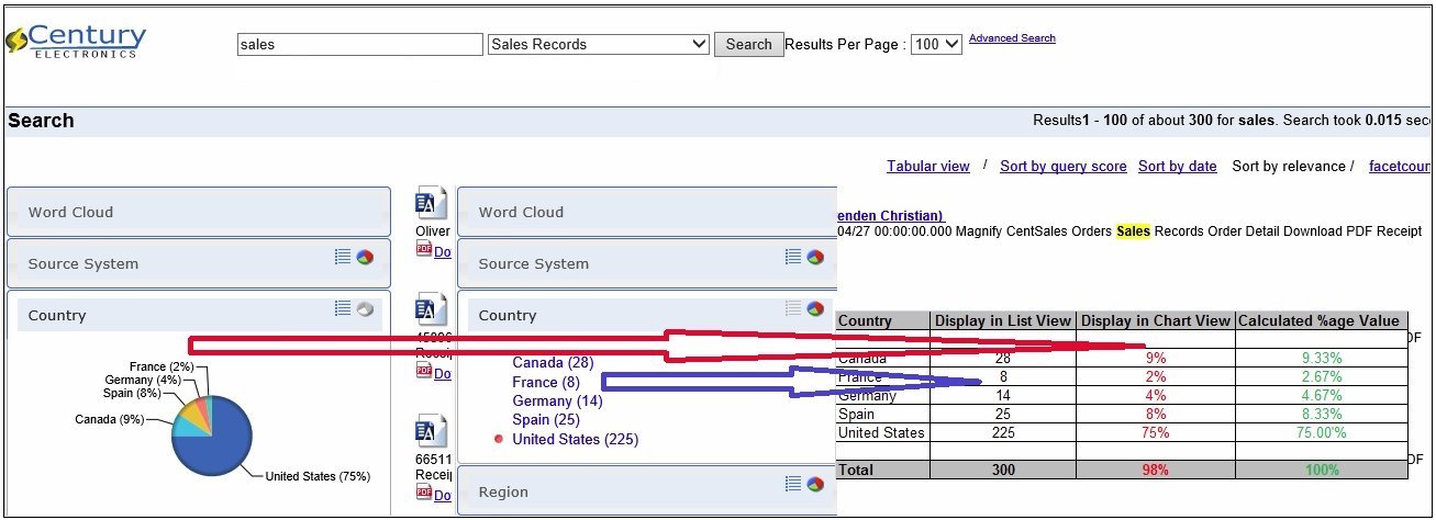
Category tree percentages are based on a truncated decimal value and not a whole number value. As a result of the deviation, data may be displayed in the chart view (as a grand total) that is not a 100 percent value in all cases.
The following image shows an example where the total percentage of the chart should be 100, but a total of 99 percent is shown instead.
The following image shows an example where the Display in Chart View column should total 100 percent, but shows a 98 percent value instead.
This will be resolved in a future release where the Magnify administrator will be able to define how this is calculation is handled (for example, by showing the decimal precision and controlling truncating and rounding of values).
| WebFOCUS | |
|
Feedback |