Formatting Minor Grid Lines and Tick Marks
|
How to: |
The minorGrid properties control the visibility and format of minor grid lines and tick marks.
Syntax: How to Format Minor Grid Lines and Tick Marks
"axisname": {
"minorGrid": {
  "visible": boolean,
  "count": number,
  "lineStyle": {
    "width": number,
    "color": "string",
    "dash": "string"
   },
    "ticks": {
      "length": number,
      "visible": boolean,
      "style": "string",
      "lineStyle": {
        "width": number,
        "color": "string"}
    }
  }
}
where;
- "axisname"
-
Can be:
- "xaxis"
- "yaxis"
- "y2axis"
- "zaxis"
- "minorGrid":
-
Defines the properties of the minor grid lines.
- "visible": boolean
-
Controls the visibility of the minor grid lines. Valid values are:
- true, which draws the minor grid lines.
- false, which does not draw the minor grid lines. This is the default value.
- "count": number
-
Is the number of minor grid lines to draw between each major grid line. The default value is undefined.
- "lineStyle":
-
Defines the line style of the minor grid lines.
- "width": number
-
Is a number that defines the width of minor grid lines in pixels. The default value is 1.
- "color": "string"
-
Is a string that defines the color of minor grid lines using a color name or numeric specification string. The default value is "black".
For information about defining colors, see Colors and Gradients.
- "dash": "string"
-
Is a string that defines the dash style. The default value is "" (which generates a solid line). Use a string of numbers that defines the width of a dash followed by the width of the gap between dashes (for example, dash: "1 1" draws a dotted line).
- "ticks":
-
Defines the properties of the minor grid line tick marks.
- "length": number
-
Is a number that defines the length of tick marks in pixels. The default value is 5.
- "visible": boolean
-
Controls the visibility of tick marks. Valid values are
- true, which draws the tick marks.
- false, which does not draw the tick marks. This is the default value.
- "style": "string"
-
Is a string that defines the tick mark style. Valid values are:
- "inner", which places the tick marks inside the minor grid lines. This is the default value.
- "outer", which places the tick marks outside of the minor grid lines. This is the default value.
- "span", which places half of each tick mark outside the minor grid line, and half of the tick mark inside the minor grid line.
- "lineStyle":
-
Defines the line style of the minor grid line tick marks.
- "width": number
-
Is a number that defines the width of the tick marks in pixels. The default value is 1.
- "color": "string"
-
Is a string that defines the color of tick marks using a color name or numeric specification string. The default value is "black".
Example: Formatting Minor Grid Lines and Tick Marks
The following request generates y-axis minor grid lines that are solid tan lines and minor grid lines that are dashed pink lines:
GRAPH FILE WF_RETAIL_LITE
SUM COGS_US
BY MODEL
WHERE PRODUCT_CATEGORY EQ 'Computers'
ON GRAPH PCHOLD FORMAT JSCHART
ON GRAPH SET LOOKGRAPH VLINE
ON GRAPH SET STYLE *
*GRAPH_JS
"blaProperties": {"lineConnection": "curved"},
"yaxis": {
	"majorGrid": {"visible": true, "lineStyle": {
		"width": 2, "color": "tan"}},
	"minorGrid": {"visible": true, "lineStyle": {
		"width": 2, "color": "pink", "dash": "2 2"}
	}}
*END
ENDSTYLE
END
The output is:
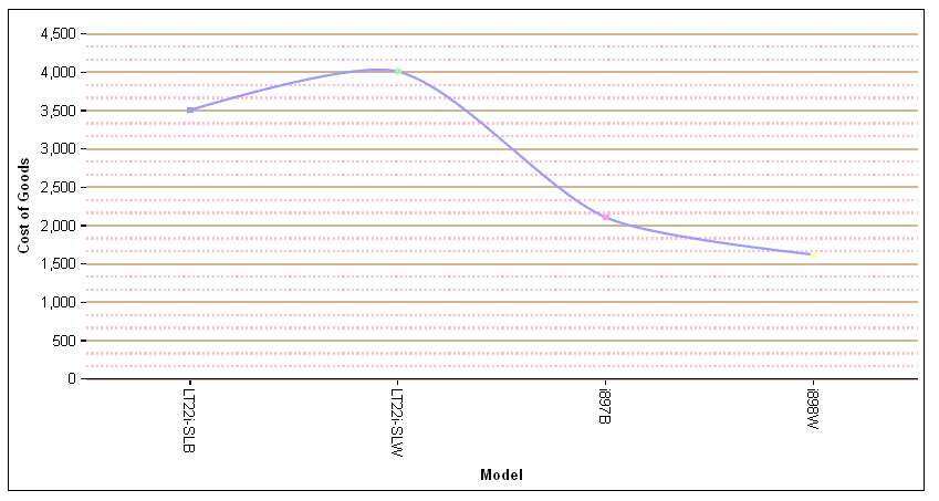
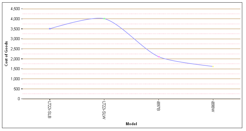
By default, two minor grid lines are being drawn between each major grid line. To change that number to one minor grid line between major grid lines, change the y-axis properties to the following:
"yaxis": {
"majorGrid": {"visible": true, "lineStyle": {
		"width": 2, "color": "tan"}},
"minorGrid": {"visible": true, "count": 1, "lineStyle": {
		"width": 2, "color": "pink", "dash": "2 2"}}}
The output is:
| WebFOCUS | |
|
Feedback |