Formatting the Axis Labels
|
How to: |
The labels properties control the visibility and format of the axis labels.
Note: HTML5 charts do not support showing axis labels on BOTH right and left axes at the same time (only LEFT or RIGHT is supported).
Syntax: How to Format Axis Labels
"axisname": {
  "labels": {
    "visible": boolean,
    "font": "string",
    "color": "string",
    "excludeMin": boolean,
    "excludeMax": boolean,
    "nestingConcatSymbol": "string",
    "nestingLineStyle": {
            "width": number,
            "color": "string",
            "dash": "string"
             },
    "rotation": number  }
}
where:
- "axisname"
-
Can be:
- "xaxis"
- "yaxis"
- "y2axis"
- "zaxis"
- "visible": boolean
-
Controls the visibility of the axis labels. Valid values are:
- true, which makes the axis labels visible. This is the default value.
- false, which makes the axis labels not visible.
- "font": "string"
-
Is a string that defines the size, style, and typeface of the axis labels. The default value is "7.5pt Sans-Serif".
- "color": "string"
-
Is a string that defines color of the axis labels using a color name or numeric specification string. The default value is "black".
For information about defining colors, see Colors and Gradients.
- "excludeMin": boolean
-
Controls the visibility of the label for the minimum value. Valid values are:
- true, which makes the minimum label not visible.
- false, which makes the minimum label visible. This is the default value.
- "auto", which lets the chart engine control whether to draw the minimum label. It will not draw the label if it is too close to or overlaps another label.
- "excludeMax": boolean
-
Controls the visibility of the label for the maximum value. Valid values are:
- true, which makes the maximum label not visible.
- false, which makes the maximum label visible. This is the default value.
- "auto", which lets the chart engine control whether to draw the maximum label. It will not draw the label if it is too close to or overlaps another label.
- "nestingConcatSymbol": "string"
-
Controls the generation of nested x-axis labels when multiple hierarchical sort fields are assigned to the x-axis.
By assigning multiple sort fields to the x-axis, you can create two different effects (layouts). The x-axis will be drawn with either a nested layout, where the hierarchy of the sorts is presented on the x-axis, or a concatenated layout, where each label contains its fully qualified sort path, separated by a concatenation symbol.
If this property is not set, or is set to null (the default value) or undefined, nested x-axis labels are generated. If this property is set to a string (for example, ":"), the x-axis labels are concatenated, with the specified string placed between the sort field values.
- "nestingLineStyle"
-
Controls the style of the line connecting the nested groups.
- "width": number
-
Is the width of the line in pixels. The default value is 1.
- "color": "string"
-
Is a color specification string that defines the color of the line. The default value is 'black'.
- "dash": "string"
-
Is a string that defines the dash style. The default value is "" (which generates a solid line). Use a string of numbers that defines the width of a dash in pixels followed by the width of the gap between dashes in pixels (for example, dash: "1 1" draws a dotted line).
- "rotation": number
-
Defines the rotation of axis labels, in degrees. Valid values are 0 (no rotation), 45, 90, 135, 180, 270, or undefined. The default value is undefined. Any value other than undefined will disable automatic layout of axis labels. For information, see Controlling Automatic Layout of Ordinal Axis Labels.
Note:
- If you choose 45-degree rotated labels, the labels may appear clipped if you have also activated a scrolling x-axis. A possible workaround is to use rotated 90-degree labels instead.
- Y-axis labels cannot be rotated.
Note: HTML5 charts do not support automatic wrapping of x-axis labels.
Example: Formatting Axis Labels
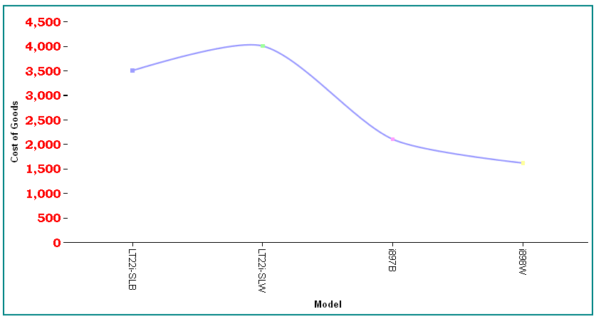
The following request generates a vertical line chart and makes the y-axis labels bold with a 12pt Bookman Old Style font, in red:
GRAPH FILE WF_RETAIL_LITE
SUM COGS_US
BY MODEL
WHERE PRODUCT_CATEGORY EQ 'Computers'
ON GRAPH PCHOLD FORMAT JSCHART
ON GRAPH SET LOOKGRAPH VLINE
ON GRAPH SET STYLE *
*GRAPH_JS
"border": {"width": 2, "color": "teal"},
"blaProperties": {"lineConnection": "curved"},
"yaxis": {"labels": {
	"color": "red", "font": "bold 12pt 'Bookman Old Style'"}}
*END
ENDSTYLE
END
The output is:
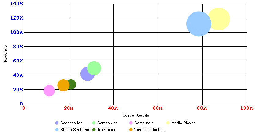
The following request generates a bubble chart and formats the axes labels to have the font "bold 10pt 'Bookman Old Style'". The y-axis labels are blue, and the x-axis labels are red:
GRAPH FILE WF_RETAIL_LITE
SUM COGS_US REVENUE_US DISCOUNT_US
BY PRODUCT_CATEGORY
ON GRAPH PCHOLD FORMAT JSCHART
ON GRAPH SET LOOKGRAPH BUBBLE
ON GRAPH SET STYLE *
*GRAPH_JS
"border": {"width": 0},
"series": [{"series": "all", "marker": {"shape": "circle"}}],
"xaxis": {
	"labels": {"font": "bold 10pt 'Bookman Old Style'", "color": "red"}},
"yaxis": {
	"labels": {"font": "bold 10pt 'Bookman Old Style'", "color": "blue"}}
*END
ENDSTYLE
END
The output is:
Example: Excluding the Minimum Axis Labels
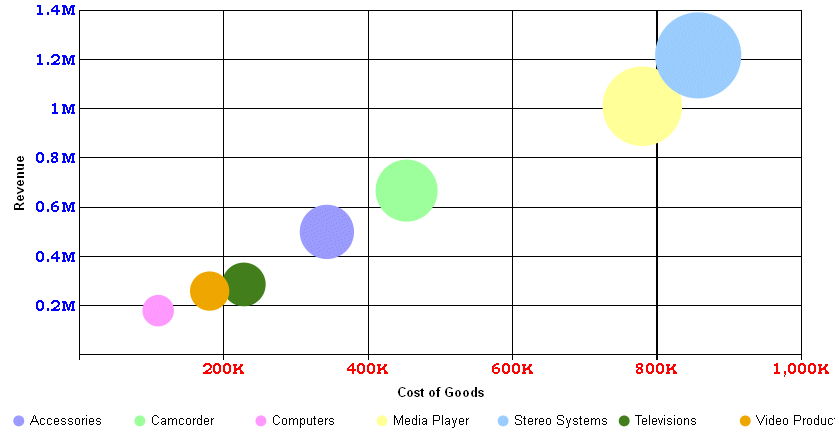
The following request does not draw the minimum axis labels (0,0):
GRAPH FILE WF_RETAIL_LITE
SUM COGS_US REVENUE_US DISCOUNT_US
BY PRODUCT_CATEGORY
ON GRAPH PCHOLD FORMAT JSCHART
ON GRAPH SET LOOKGRAPH BUBBLE
ON GRAPH SET STYLE *
*GRAPH_JS
"border": {"width": 0},
"series": [{"series": "all", "marker": {"shape": "circle"}}],
"xaxis": {"labels": {
	"font": "bold 10pt Bookman Old Style",
	"color": "red", "excludeMin": true}},
"yaxis": {"labels": {
	"font": "bold 10pt Bookman Old Style",
	"color": "blue", "excludeMin": true}}
*END
ENDSTYLE
END
The output is:
Example: Controlling Nesting of X-Axis Labels
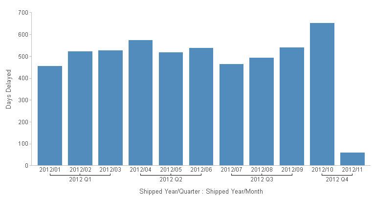
By assigning multiple sort fields to the x-axis, you can create two different effects (layouts). The x-axis will be drawn with either a nested layout, where the hierarchy of the sorts is presented on the x-axis, or a concatenated layout, where each label contains its fully qualified sort path, separated by a concatenation symbol.
The following request generates nested x-axis labels.
GRAPH FILE WF_RETAIL_LITE
SUM DAYSDELAYED
BY TIME_DATE_QTR
BY TIME_DATE_MONTH
ON GRAPH PCHOLD FORMAT JSCHART
ON GRAPH SET LOOKGRAPH BAR
ON GRAPH SET STYLE *
TYPE=DATA, COLUMN=DAYSDELAYED, BUCKET=y-axis, $
TYPE=DATA, COLUMN=TIME_DATE_QTR, BUCKET=x-axis, $
TYPE=DATA, COLUMN=TIME_DATE_MONTH, BUCKET=x-axis, $
INCLUDE=IBFS:/FILE/IBI_HTML_DIR/javaassist/intl/EN/combine_templates/ENWarm.sty,$
*GRAPH_JS
"xaxis": {"labels": {"nestingConcatSymbol": null}}
*END
ENDSTYLE
END
The output is shown in the following image.
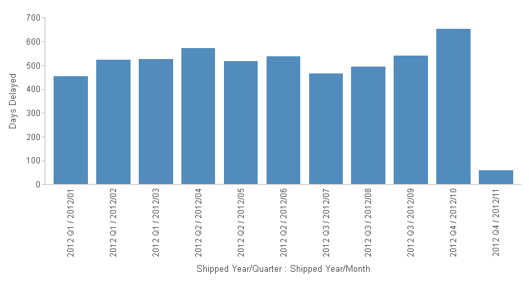
The following version of the request makes the concatenation string a slash surrounded by spaces (" / ").
GRAPH FILE WF_RETAIL_LITE
SUM DAYSDELAYED
BY TIME_DATE_QTR
BY TIME_DATE_MONTH
ON GRAPH PCHOLD FORMAT JSCHART
ON GRAPH SET LOOKGRAPH BAR
ON GRAPH SET STYLE *
TYPE=DATA, COLUMN=DAYSDELAYED, BUCKET=y-axis, $
TYPE=DATA, COLUMN=TIME_DATE_QTR, BUCKET=x-axis, $
TYPE=DATA, COLUMN=TIME_DATE_MONTH, BUCKET=x-axis, $
INCLUDE=IBFS:/FILE/IBI_HTML_DIR/javaassist/intl/EN/combine_templates/ENWarm.sty,$
*GRAPH_JS
"xaxis": {"labels": {"nestingConcatSymbol": " / "}}
*END
ENDSTYLE
END
The output is shown in the following image.
Example: Styling Nested Label Connector Lines
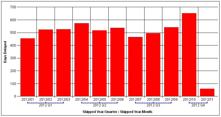
The following request makes the nested label connector lines 2 pixels wide, blue, and dashed.
GRAPH FILE WF_RETAIL_LITE
SUM DAYSDELAYED
BY TIME_DATE_QTR
BY TIME_DATE_MONTH
ON GRAPH PCHOLD FORMAT JSCHART
ON GRAPH SET LOOKGRAPH BAR
ON GRAPH SET STYLE *
TYPE=DATA, COLUMN=DAYSDELAYED, BUCKET=y-axis, $
TYPE=DATA, COLUMN=TIME_DATE_QTR, BUCKET=x-axis, $
TYPE=DATA, COLUMN=TIME_DATE_MONTH, BUCKET=x-axis, $
*GRAPH_JS
"xaxis": {"labels": {"nestingLineStyle": {
		"width": 2,
		"color": "blue",
		"dash": "3 3"
		}}}
*END
ENDSTYLE
END
The output is shown in the following image.
| WebFOCUS | |
|
Feedback |