Configuring Filter Control and Filter Grid Properties
You can configure the properties of the filter grid using the Properties panel, which is content-sensitive. For example, when you click a filter cell, the cell style properties open in the Properties panel. When you click a filter control, the general and style properties for this control open in the Properties panel.
The Properties panel for a cell is shown in the following image. When you configure these properties, you modify the alignment of content within a cell or change the style layout of the filter grid.
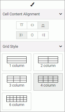
The properties for a grid cell are:
- Cell Content Alignment. Controls the alignment of the label and control inside the cell. The options include top, middle, bottom, left, center, and right.
- Grid Style. Controls the grid layout of the filter bar. The options include 1-Column, 2-Column, 3-Column, 4-Column, and 6-Column.
The Properties panel for a filter control is comprised of two tabs: general and style properties. The settings tab is displayed in the following image. Using these properties, you can view the type of filter control that shows on the page, add a tooltip or placeholder text, and set the default value.
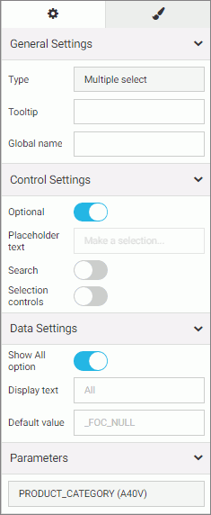
The settings tab contains the following properties:
- General Settings. This section includes the following options:
- Type. Displays the type of the control.
- Tooltip. Displays a tooltip when you hover over the filter control.
- Global name. Designate a global name to the control.
- Control Settings. This section includes the following options:
- Optional. Toggles between optional and required control.
- Placeholder text. Enables a configurable placeholder text that you can show users inside a required control when it has no value. The default text is Make a selection.
- Search. Adds a search field to the filter drop-down menu.
Note: If the select list contains 50 or more values the Search option is enabled automatically.
- Selection controls. Adds Select all and Clear buttons to the filter drop-down menu. This property is only available for multiple select lists.
Note: The Selection controls and Show All options cannot be selected at the same time.
- Data Settings. This section includes the following options:
- Show All option. Adds an All option to the control that the user can select.
Note: Choosing this option results in the parameter receiving a _FOC_NULL value. If this parameter is used in a WHERE condition, it results in the WHERE condition being removed from the request and all data values for this field displaying the page.
- Display text. Allows you to specify a custom value for the Show All option in the control. The default text is All.
- Default value. Displays the default value of the control. For optional parameters you can edit this field and override the control value.
- Show All option. Adds an All option to the control that the user can select.
- Parameters. Shows the name of the parameters that are associated with this control.
The style tab is displayed in the following image. Similar to the properties of a cell, you can modify the positions of labels in a control, define the alignment, and set the object width.
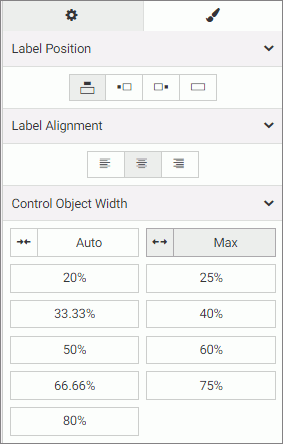
The style properties are:
- Label Position. Controls the position of the filter label in the relation to the control. The options are above, right, left, and no label.
- Label Alignment. Controls the alignment of the filter label. The options are left, right, and center.
- Label/Control Split. Controls the space ratio between the label and control inside the cell. This option is only available when the label position is set to right or left.
- Control Object Width. Sets the width of the control in relation to the filter cell. The options are:
- Auto. Adjusts the width of the control automatically to accommodate the name of each value.
- Max. Fills the entire filter cell. This is the default value.
- Percentages. Set the control width to various percentages, as they relate to the filter cell.
| WebFOCUS | |
|
Feedback |