Topics: |
Using InfoAssist+, you can create maps to identify patterns or trends in your data. By converting data into values that can be displayed on a map, you are able to visualize scenarios, illustrate hot spots, and identify potential problem areas. For example, a law enforcement agency may use mapping functionality to identify areas of higher crime within the locations they cover. You can also use maps to determine how places are related, understand where things are located, and identify the best actions to take. By illustrating trends on a map, a decision maker can identify patterns easily, and reach conclusions sooner.
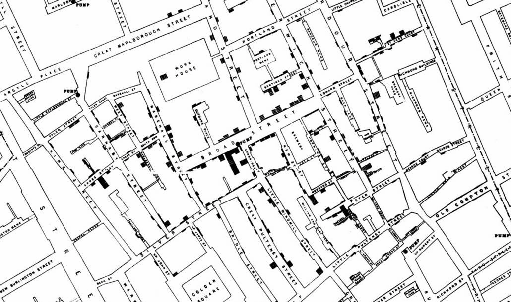
An early example of how maps can be used to illustrate trends is the case of Dr. John Snow, an epidemiologist who was one of the first to use data to map occurrences of cholera to find the cause of infection. By plotting the cholera data on a map of a town, Dr. Snow was able to visualize a trend that showed higher incidences of cholera closest to water pumps. This example is shown in the following image.
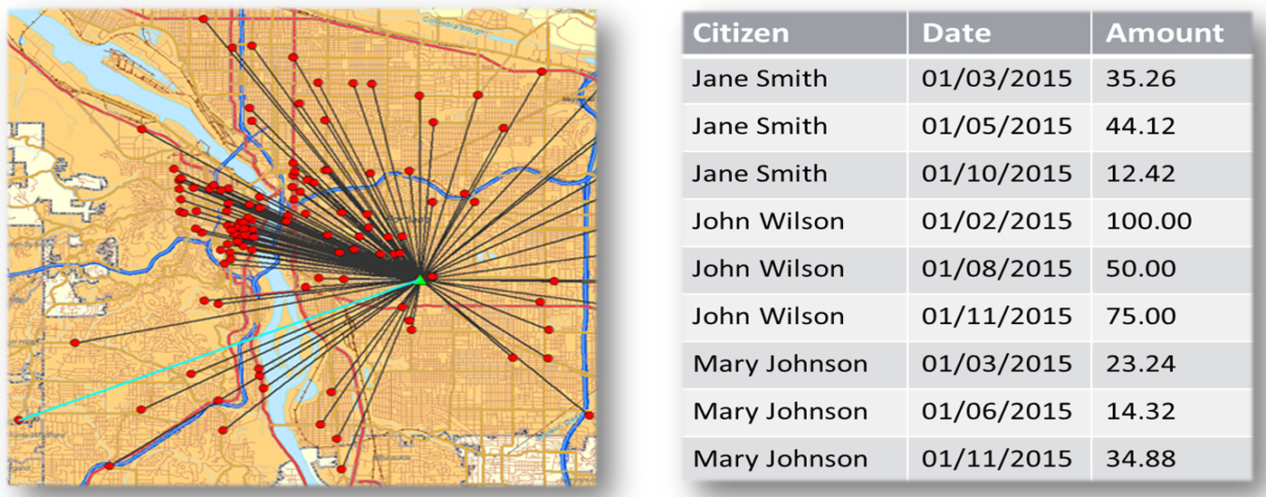
Maps also allow you to measure size, shape, and distribution to detect and quantify patterns, and even perform predictive analytics. An example of how maps can help detect and quantify patterns is the scenario in which a state agency used a WebFOCUS mapping application to solve a problem with their food stamp system. Using this application, odd food stamp redemptions, such as rounded numbers transactions, were discovered. By plotting those transactions on a map, the agency discovered that the redemptions appeared in the same geographic location. Upon further investigation, the agency identified that individuals were selling their food stamps at reduced prices, $50 worth of food stamps for $40 in cash, to others instead using them as intended. This map example is shown in the following image.
When working with maps, the concepts of location intelligence and business intelligence are important to understand. A Geographic Information System (GIS) captures, stores, analyzes, manages, and presents data linked to a location, while Business Intelligence (BI) relies on the conversion of raw data into meaningful information. Location intelligence is the process of analyzing data to make better business decisions. It combines GIS and BI/Analytics to allow the recognition of patterns in your data, including the visualization and discovery of geospatial outliers, which would not be easily discovered if you use the technology independently and separately.
More specifically, maps use non-intrusive GIS workflows with existing data. You can view symbol layers for data bound to a geo-location, such as state, country, and ZIP code, in an integrated map viewer. Using metrics from your data, you can also visualize geographic roles or dimensions. Geographic roles, or dimensions, can be built directly into your Metadata or assigned to a data field when you create a map.
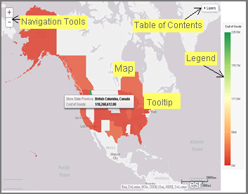
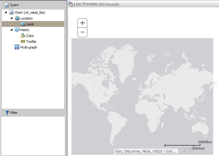
Using WebFOCUS InfoAssist+ with the Esri integration, you can create maps that help you illustrate or identify trends so you can take action quickly. WebFOCUS architecture provides the framework in which this system operates. Using a Javascript map viewer, you can navigate the interface easily, as shown in the following image.
In addition, this integration utilizes the capabilities of Esri by leveraging the ArcGIS Javascript API and content. Specifically, you can integrate data into maps with published content in ArcGIS Online platform. For more information, see http://www.esri.com/software/arcgis/arcgisonline. Additionally, by using this integration, you can include information about demographics, spending habits, crime, and lifestyle to maps that contain your data. These maps include layers with extensive demographic or reference detail and topography and allow you to view information about people, businesses, climate, and much more.
You can create the following maps in InfoAssist+:
- Choropleth. A common thematic map that uses geographical measures (for example, states and countries), representing the values aerially while employing a varying intensity of colors. It is useful for visualizing location-based data, trends, and distributions across a geographic area. The color hues for Choropleth maps are dictated by the legend, based on the selected measure, enabling you to determine data concentration across your map.
- Proportional Symbol (Bubble). A map that represents coordinates, such as an address or intersection, using symbols of different sizes to represent any measure. These maps focus on specific areas, for which data concentrations may vary. When the data concentration is larger, the bubble will be bigger.
Both maps can be created in chart or visualization mode. Built-in zooming capabilities, allow you to drill down to a specific geographic area of focus easily. This allows you to get a closer look at regional or local data, draw inferences, and make recommendations, without changing the initial view of your data.
In chart mode, you can also use the Auto Drill and Auto Linking features that are available when you create charts or reports in InfoAssist+. Auto Drill allows you to navigate through the geographical hierarchy of your map data at run time. You can use this information to visualize the same measure at different geographical hierarchies, such as Countries to States and States to Cities. Auto Linking allows you to connect to related charts or reports in your environment that share similar data parameters.
Using the Esri integration in InfoAssist+, you can also add the following layers to your map:
-
Backgrounds. Display a layer that positions data
as it is located, in context to other geographical features, such
as streets, terrain, and imagery. Some standard Background options
may combine road, aerial, and topographic data using a variety of
symbols. Hosted on ArcGIS, you can change your background at any
time, to review your data in a different context.
When you apply a Background to your map, its appearance changes. You can then adjust the view of your data, showing different terrain or geographical views. Backgrounds provide at least 17 levels of zoom. For more information, see https://developers.arcgis.com/javascript/jsapi/esri.basemaps-amd.html.
- Reference Layers. Display a layer of boundaries and locations that range from a continental scale to country, state, and even local neighborhood. For example, if you are viewing World data on electricity usage, you may want to add a Reference Layer that displays the borders and concentration of your data within each country.
- Demographic Layers. Display a layer of information about people and businesses in a specific demographic area. This includes the United States and 120 other countries. Demographic Layers are thematic maps that provide additional information about the location, such as spending habits, population, and lifestyles. You can add Demographic Layers to a map about sales data, to identify new locations for stores, based on the spending habits for a specific area.
Both mapextent and the Layers menu functionality are applied to your map when you select a Background, Reference Layer, or Demographic Layer. Mapextent is an automatic view of the map. Layers is a menu that appears on the map and provides access to options that allow you to adjust the information that is being displayed.
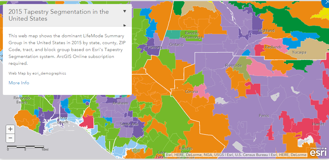
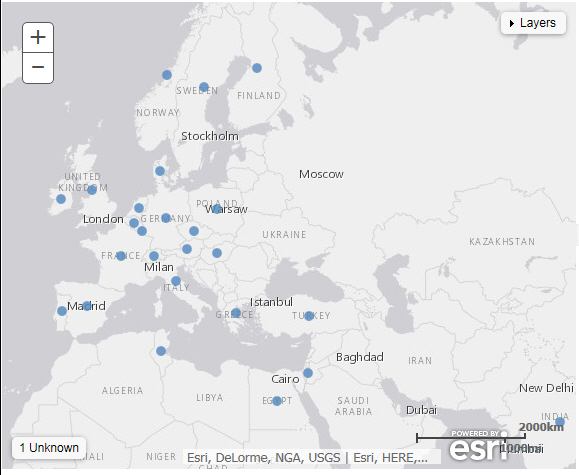
The map example in the following image shows the use of layers.
Note: Backgrounds, Demographic Layers, and Reference Layers can be accessed from the Format tab for maps in both chart and visualization mode. These layers are static, standard options that Esri provides for use with InfoAssist+, and do not change based on the data source that you select.
The following procedures provide step-by-step instructions on how to create and customize maps.
As you create your maps, you can use the following built-in map viewer features:
- You can use the plus (+) and minus (-) symbols,
 , within the map to zoom in and
out of different areas of the map. You can also click your left
mouse button to zoom in to a specific location.
, within the map to zoom in and
out of different areas of the map. You can also click your left
mouse button to zoom in to a specific location. - Like all HTML5 visualizations, the highlighted markers and regions on a map support drill, multi-drill, auto-linking, and informational tooltip features.
- When working with maps in chart mode, you can use the Pan / Selection button to alternate between the Pan and Selection controls. This option is in the upper-right corner of the map.
- When working with maps in visualization mode, you can toggle the Pan or Selection button to make a selection. The Pan control allows you to click, hold, and move the map with your mouse. The Selection control allows you to lasso a specific area of the map and select data in the map.
Note: The default option of creating a map utilizes the ArcGIS Javascript API that Esri provides.
-
Launch InfoAssist+ in chart or visualization mode.
- In chart mode, on the Format tab, in the Chart Types group, click Choropleth.
- In visualization mode, on the Home tab, in the Visual group, click Change and click Choropleth.
A blank map displays and the Layer field container is enabled, as shown in the following image.
-
Add a Geolocation field to the Layer field container.
This field, which already has a geographic role assigned, is denoted with a Layer icon,
 , in the Data panel, as shown in
the following image. You can also hover over a data field to view
the geographic role assignment.
, in the Data panel, as shown in
the following image. You can also hover over a data field to view
the geographic role assignment.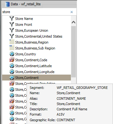
For more information, see Geographic Roles.
The canvas refreshes, and your map displays.
-
Before saving your map, to add insight, you can also
do following:
- Click Run, to preview your map.
- Add a measure or dimension to the Color field container, to color your chart by that underlying data value. When you add a measure or dimension field to the Color field container, a legend displays for that data value. If you specify a dimension in the Color field container, the label changes to Color BY.
- Add a dimension or measure to the Tooltip field container, which will display tooltip information when you place your mouse over an area of the map.
- Add a Background, Demographic Layer, or Reference Layer.
- Click Save to save your map.
-
Launch InfoAssist+ in chart or visualization mode.
- In chart mode, on the Format tab, in the Chart Types group, click Proportional Symbol.
- In visualization mode, on the Home tab, in the Visual group, click Change and select Proportional Symbol.
A blank map displays and the Layer field container is enabled.
-
Place a data field with a defined geographic role in
the Layer field container.
This field, which already has a geographic role assigned, is denoted with a Layer icon,
, in the Data panel, as shown in
the following image. You can also hover over a data field to view
the geographic role assignment.
For more information, see Geographic Roles.
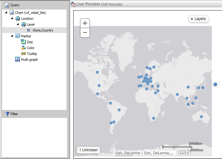
A basic bubble map displays, as shown in the following image.
-
Before saving your map, to add insight, you can also
do following:
- Click Run, to preview your map.
- Add a measure or dimension to the Color field container, to color your chart by that underlying data value.
- Add a measure to the Size field container, to control the size of the bubbles on your map.
- Add a measure to the Tooltip field container, to display tooltip information when you place your mouse over an area of the map at run time.
- Add a Background, Demographic Layer, or Reference Layer.
- Click Save to save your map.
-
Launch InfoAssist+ in chart or visualization mode.
- In chart mode, on the Format tab, in the Chart Types group, click Choropleth.
- In visualization mode, on the Home tab, in the Visual group, click Change and click Choropleth.
- In the Data pane, select a data field without a geolocation assignment.
-
Perform one of the following tasks to open the Map dialog
box and assign a geographic role:
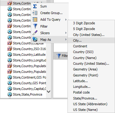
- Right-click the desired data field, click Map As and
select a geographic role, as shown in the following image.
- Drag the desired data field into the Layer field container.
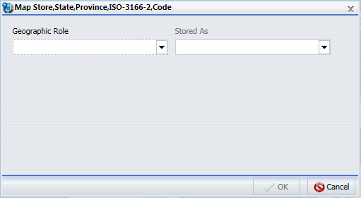
The Map dialog box displays, as shown in the following image.
- Right-click the desired data field, click Map As and
select a geographic role, as shown in the following image.
-
In the Map dialog box, select a geographic role. For
example, State.
Note: When specifying a geographic role, you can use Name or an ISO-2 value for countries. The ISO-2 codes are recognized worldwide, as published in http://www.iso.org/iso/country_codes
The Map dialog box refreshes and shows the Depends on section, as shown in the following image.
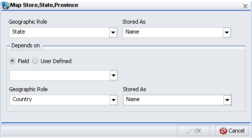
Note: If you used the Map As option, the Depends on section automatically displays, since a geographic role was selected at that time.
-
In the Depends on section, choose from the following
options:
- Field. Identifies a specific field on which the geographic role depends. For example, you can select Country or Continent.
- User Defined. Enables the definition of a specific value from the data source. Selections can be as simple as a specific country. For example, you can select US.
The Geographic Role field automatically populates based on the hierarchy of your data source. For example, if your primary geographic role was State, and in your metadata hierarchy, State depends on Country, this option displays.
-
Click OK.
If you used the Map As option, you must place the data field
with the defined geographic role in the Layer field container. If
you placed a data field in the Layer field container and defined
a geographic role, the field is automatically added to the Layer field
container.
A basic map displays, as shown in the following image.
-
Before saving your map, to add insight, you can also
do following:
- Click Run, to preview your map.
- Add a measure or dimension to the Color field container, to color your chart by that underlying data value.
- Add a measure to the Size field container, to control the size of the bubbles on your map.
- Add a measure to the Tooltip field container, to display tooltip information when you place your mouse over an area of the map at run time.
- Add a Background, Demographic Layer, or Reference Layer.
- Click Save to save your map.
You can change the geographic role assignment of any geolocation field using the following steps.
-
Launch InfoAssist+ in chart or visualization mode.
- In chart mode, on the Format tab, in the Chart Types group, click Choropleth.
- In visualization mode, on the Home tab, in the Visual group, click Change and click Choropleth.
- From the Data pane, right-click a geolocation field and click Map As.
-
Select a geographic role.
The Map dialog box displays using the selected Geographic Role.
-
In the Map dialog box, optionally select a geographic
role from the drop-down list. For example, Country.
Note: This changes the selection that you made on the Map As list.
- Accept the default value for Stored As, or choose a new value from the drop-down list, for example, ISO code. Stored As indicates how the data values are represented in the table.
-
Click OK.
The geographic role changes for the selected Geolocation field in the Data pane, and the map refreshes using the new geolocation that you specified.
- Create a new map or open an existing map in InfoAssist+.
-
On the Format tab, expand the Map group and click Background,
as shown in the following image.
-
Select one of the following options:
- World Street Map
- Terrain with Labels
- Oceans Basemap
- OpenStreetMap
- World Imagery
- Light Gray Canvas
- National Geographic World Map
- Dark Gray Canvas
- None
Note: The Imagery with Labels Background provides the terrain for your map, ranging from land contours to city streets.
Once you make a selection, the background of the map refreshes. You can continue to change your background until it displays the desired information.
- Create a new map or open an existing map in InfoAssist+.
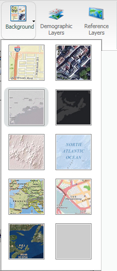
- On the Format tab, expand the Map group and click Demographic Layers.
-
Select from various population and lifestyle groups,
as shown in the following image.
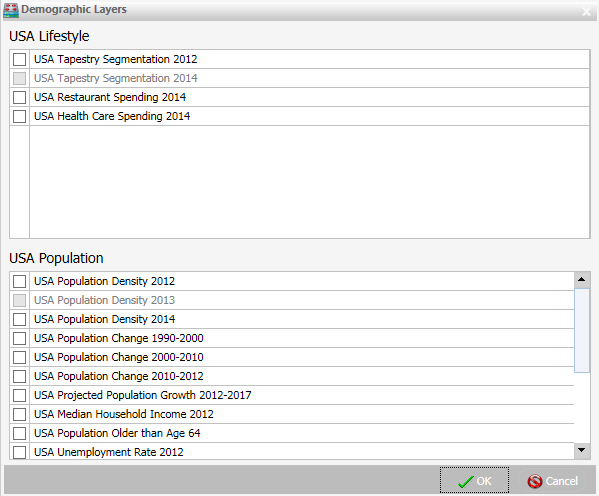
Note: These are pre-defined demographic profiles, provided by ArcGIS. You can select multiple options in either category to gain additional insight into your data. Specifically, each Demographic Layer has its own profile and provides a layering option, when comparing values across different layers or profiles.
-
Click OK.
The Demographic Layers that you select are applied to your map. The map engine displays the different groups with unique hues and coloring. You can use the Table of Contents or Layers option, to toggle between the different layers that you have specified. The Layers option is shown in the following image.
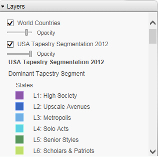
Note: You can select and clear the check boxes to enable the display of one or more Demographic Layers to compare and contrast the different demographic scenarios.
- Create a new map or open an existing map in InfoAssist+.
-
On the Format tab, expand the Map group and click Reference
Layers.
The Reference Layers dialog box displays, as shown in the following image.
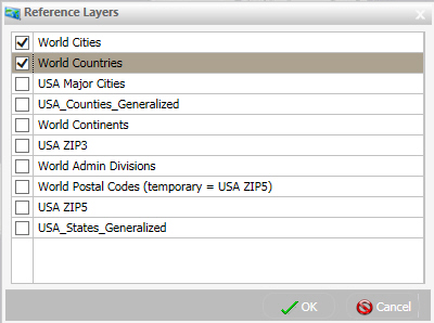
-
Select one or more Reference Layers, such as World Countries,
to add to your map, and then click OK.
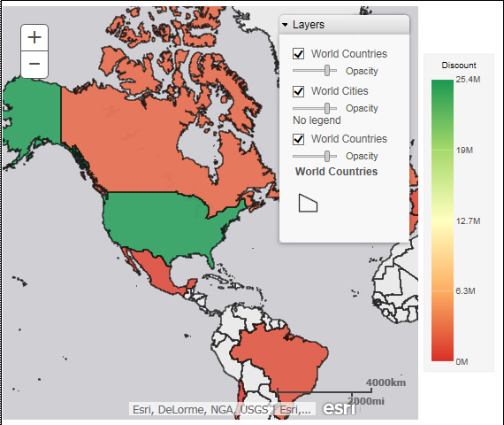
Your map refreshes, and the definitions and borders of the References Layers display on the canvas. You can use the Table of Contents or Layers option, to toggle different Reference Layers in your map. These options are shown in the following image.
This section presents the Query field containers that display for both charts and visualizations, by map type.
|
Query field container |
Chart mode |
Visualization mode | ||
|---|---|---|---|---|
|
Choropleth Map |
Proportional Symbol Map |
Choropleth Map |
Proportional Symbol Map | |
|
Layer. One data field, specifically a field containing location data (for example, State). |
|
|
|
|
|
Color. One data field. |
|
|
|
|
|
Tooltip. Up to one data field (not required). |
|
|
|
|
|
Multi-graph. Up to one data field (not required). |
|
|
|
|
|
Size. One data field. |
|
|
|
|


This section contains information on the geographic roles that are supported for Esri maps in InfoAssist+.
|
Geographic Role |
Description |
Maps Supported |
|---|---|---|
|
POINT OF INTEREST |
Points of Interest |
Proportional Symbol |
|
CITY |
World Cities |
Proportional Symbol |
|
CONTINENT |
World Continents |
Choropleth, Proportional Symbol |
|
COUNTRY |
World Countries |
Choropleth, Proportional Symbol |
|
COUNTRY_ISO_CC |
World Countries (ISO2 Code) |
Choropleth, Proportional Symbol |
|
STATE |
World Admin Divisions |
Choropleth, Proportional Symbol |
|
STATE_ISO_SUB |
World Admin Divisions (by ISO_SUB) |
Choropleth, Proportional Symbol |
|
USCITY |
USA Major Cities |
Proportional Symbol |
|
USCOUNTY |
USA_Counties |
Choropleth, Proportional Symbol |
|
USSTATE |
USA_States |
Choropleth, Proportional Symbol |
|
USSTATE_ABBR |
USA_States (by abbreviation) |
Choropleth, Proportional Symbol |
|
ZIP3 |
USA ZIP3 |
Choropleth, Proportional Symbol |
|
ZIP5 |
USA ZIP5 |
Choropleth, Proportional Symbol |
The following table illustrates the geographic roles and their dependencies. Level 1 indicates the highest level of hierarchy and level 5 is the lowest level of hierarchy.
|
Region |
Hierarchy Level |
Geographic Role |
|---|---|---|
|
United States |
1 |
COUNTRY, COUNTRY_ISO_CC |
|
2 |
USSTATE, USSTATE_ABBR | |
|
3 |
USCOUNTY | |
|
4 |
USCITY | |
|
5 |
ZIP3, ZIP5 | |
|
World |
1 |
CONTINENT, CONTINENT_ISO_CC |
|
2 |
COUNTRY, COUNTRY_FIPS, COUNTRY_ISO_CC | |
|
3 |
STATE, STATE_ISO_SUB | |
|
4 |
CITY | |
|
5 |
POSTAL CODE |
| WebFOCUS |
Feedback |